Commons:Featured picture candidates/Log/November 2013
Voting period is over. Please don't add any new votes.Voting period ends on 30 Oct 2013 at 21:39:42 (UTC)
Visit the nomination page to add or modify image notes.
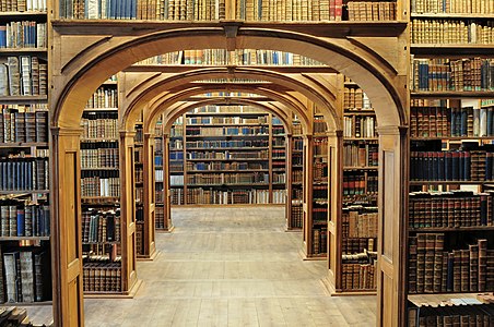
 Info Interior of the Market Hall, built in 1895 in Gdansk, Poland. All by me, Poco2 21:39, 21 October 2013 (UTC)
 Support -- Poco2 21:39, 21 October 2013 (UTC)
 Support I miss the CA in the Windows, are there calvinized? ;) --Ralf Roleček 22:24, 21 October 2013 (UTC)
 Support --Kadellar (talk) 11:15, 23 October 2013 (UTC)
 Support --Joydeep Talk 17:03, 24 October 2013 (UTC)
 Support --JLPC (talk) 10:00, 25 October 2013 (UTC)
 Comment Windows are overprocessed, unnatural colors. --Ivar (talk) 10:08, 25 October 2013 (UTC)
 Oppose I could see no excelence. The construction of the hall is blurred. Most of the right side is to dark. Colors are strange. -- Qflieger (talk) 11:18, 26 October 2013 (UTC)
- Ok, I uploaded a new version and improved some areas: symmetry (crop and perspective), colors, windows overexposure correction, vertical perspective and curves. Thanks for your feedback, Poco2 09:17, 27 October 2013 (UTC)
- Shadowed areas and colors are looks much better, but now the windows in the back are heavy overexposed. (I think its very difficult to make a good picture with this light circumstances in a hall) -- Qflieger (talk) 17:59, 27 October 2013 (UTC)
- Ok, I reworked the brigther areas a bit (according to LR not overexposed, though). Poco2 07:02, 28 October 2013 (UTC)
- Shadowed areas and colors are looks much better, but now the windows in the back are heavy overexposed. (I think its very difficult to make a good picture with this light circumstances in a hall) -- Qflieger (talk) 17:59, 27 October 2013 (UTC)
- Ok, I uploaded a new version and improved some areas: symmetry (crop and perspective), colors, windows overexposure correction, vertical perspective and curves. Thanks for your feedback, Poco2 09:17, 27 October 2013 (UTC)
 Oppose --Yikrazuul (talk) 18:38, 27 October 2013 (UTC)
 Support Yarl ✉ 21:13, 27 October 2013 (UTC)
 Support --Martin Falbisoner (talk) 05:24, 28 October 2013 (UTC)
 Support Blurred Lines 15:10, 30 October 2013 (UTC)
File:BIGBANG Extraordinary 20's.JPG, not featured
[edit]Voting period is over. Please don't add any new votes.Voting period ends on 3 Nov 2013 at 08:50:45 (UTC)
Visit the nomination page to add or modify image notes.
 Info South Korean K-pop band BIGBANG, photo donated by their agency, from their "Extraordinary 20's" photoshoot. Created by en:YG Entertainment - uploaded by Ygent ebiz - nominated by Teemeah -- Teemeah (talk) 08:50, 25 October 2013 (UTC)
 Support Professional photoshoot, topic is rarely covered in featured photos of Commons. -- Teemeah (talk) 08:50, 25 October 2013 (UTC)
 Oppose Hard (flash) light, bad crop and not a very compelling composition. Kleuske (talk) 10:06, 25 October 2013 (UTC)
 Oppose The crop at the left is imho really bad. I do not understand why an obviously professional photographer (Canon 1D) crops a people shot at the elbow joint - you can read in every book about portrayal photography that this is unfortunate. --Tuxyso (talk) 10:59, 25 October 2013 (UTC)
 Oppose per Kleuske and Tuxyso. --Joydeep Talk 15:02, 25 October 2013 (UTC)
 Oppose Blurry for a this type of photo, too tight crop, green CAs around shadows. --Laitche (talk) 00:07, 28 October 2013 (UTC)
File:Stenbocki maja 30-04-2013.jpg, featured
[edit]Voting period is over. Please don't add any new votes.Voting period ends on 3 Nov 2013 at 05:26:38 (UTC)
Visit the nomination page to add or modify image notes.
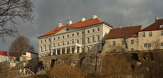
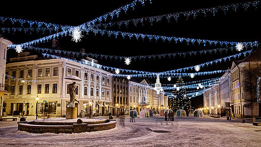
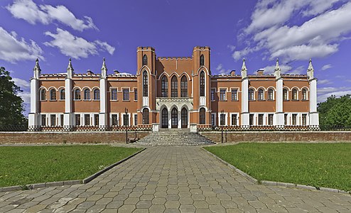
 Info Stenbock house, all by Ivar (talk) 05:26, 25 October 2013 (UTC)
 Abstain -- Ivar (talk) 05:26, 25 October 2013 (UTC)
 Support -- Christian Ferrer (talk) 05:41, 25 October 2013 (UTC)
 Support Exquisite light, interesting motive, very high quality stitch. What else when not FP? --Tuxyso (talk) 06:45, 25 October 2013 (UTC)
 Support --ArildV (talk) 09:29, 25 October 2013 (UTC)
 Support --Joydeep Talk 12:59, 25 October 2013 (UTC)
 Support --Laitche (talk) 16:34, 25 October 2013 (UTC)
 Support --The High Fin Sperm Whale 19:54, 25 October 2013 (UTC)
 Support -- Colin (talk) 20:44, 25 October 2013 (UTC)
- Weak
 Support. I love this type of lighting, but composition-wise, the distortion feels a little awkward. --King of ♥ ♦ ♣ ♠ 22:50, 25 October 2013 (UTC)
  Support --Alex Florstein (talk) 07:30, 26 October 2013 (UTC)
 Support -- MJJR (talk) 09:18, 26 October 2013 (UTC)
 Support Michael Barera (talk) 00:23, 27 October 2013 (UTC)
 Support --AmaryllisGardener (talk) 03:15, 27 October 2013 (UTC)
 Support -- Felix König ✉ 20:12, 27 October 2013 (UTC)
 Support --JLPC (talk) 21:15, 27 October 2013 (UTC)
 Support Remarkable quality. Kruusamägi (talk) 21:38, 27 October 2013 (UTC)
 Support Cathy Richards (talk) 21:31, 30 October 2013 (UTC)
File:" 13 - ITALIAN automotive engineering - Alfa Romeo 4C chassis - monocoque carbon fiber - aluminum platform (architecture) DxO 02.jpg, not featured
[edit]Voting period is over. Please don't add any new votes.Voting period ends on 4 Nov 2013 at 11:53:43 (UTC)
Visit the nomination page to add or modify image notes.
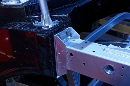
 Info chassis of the Alfa Romeo 4C to IAA 2013 where is very clear refined monocoques carbon fiber and aluminum frame. created by youkeys- uploaded by Flickr upload bot - nominated by Pava -- Pava (talk) 11:53, 26 October 2013 (UTC)
 Support The content, rare and very valuable encyclopedic level, and the quality of photography in enhancing the assembly and the surfaces of materials -- Pava (talk) 11:53, 26 October 2013 (UTC)
 Comment I don't doubt the encyclpedic value, but since it is very dark and has a low "Wow!-factor" the chances for this to become featured appear to be rather small. I'd suggest to nominate it for COMMONS:VI instead. --El Grafo (talk) 12:05, 29 October 2013 (UTC)
Voting period is over. Please don't add any new votes.Voting period ends on 3 Nov 2013 at 18:07:46 (UTC)
Visit the nomination page to add or modify image notes.
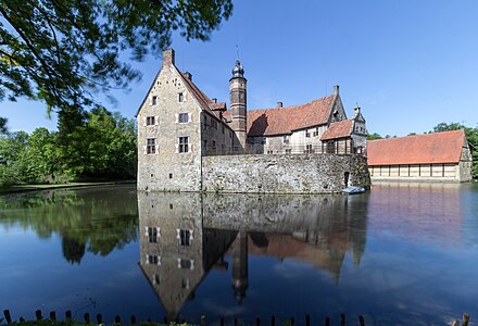
 Info created by Tuxyso - uploaded by Tuxyso - nominated by Tuxyso -- Tuxyso (talk) 18:07, 25 October 2013 (UTC)
 Support -- Tuxyso (talk) 18:07, 25 October 2013 (UTC)
 Support --The High Fin Sperm Whale 19:54, 25 October 2013 (UTC)
 Support -- Colin (talk) 20:42, 25 October 2013 (UTC)
 Comment Did you use a polarizer? The sky in the center seems unnaturally dark. Also, I feel the image as a whole could be brighter. --King of ♥ ♦ ♣ ♠ 22:48, 25 October 2013 (UTC)
 Done I've very slightly increased brightness and worked a bit on the sky. As far as I can remember I've used a polarizer. Is it a crime? The sun is about 45° to the right thus you have a certain gradient in the sky. Further corrections would destroy the mood of the image - I like the deep blue of the sky especially here very much. --Tuxyso (talk) 06:48, 26 October 2013 (UTC)
 Support --Alex Florstein (talk) 07:29, 26 October 2013 (UTC)
 Support Very interesting. — Julian H.✈ (talk/files) 08:55, 26 October 2013 (UTC)
 Support --Joydeep Talk 08:57, 26 October 2013 (UTC)
 Support -- MJJR (talk) 09:16, 26 October 2013 (UTC)
 Support --Martin Falbisoner (talk) 10:05, 26 October 2013 (UTC)
 Support --King of ♥ ♦ ♣ ♠ 10:37, 26 October 2013 (UTC)
 Support Michael Barera (talk) 00:24, 27 October 2013 (UTC)
 Support --AmaryllisGardener (talk) 03:13, 27 October 2013 (UTC)
 Support very nice reflection! -- Felix König ✉ 20:11, 27 October 2013 (UTC)
 Support --JLPC (talk) 14:53, 28 October 2013 (UTC)
 Support Christian Ferrer (talk) 18:51, 28 October 2013 (UTC)
 Support Very good --Rjcastillo (talk) 13:22, 29 October 2013 (UTC)
 Support -- Arcalino (talk) 15:14, 29 October 2013 (UTC)
 Support Poco2 21:12, 29 October 2013 (UTC)
 Support Great work! Blurred Lines 14:19, 30 October 2013 (UTC)
Voting period is over. Please don't add any new votes.Voting period ends on 3 Nov 2013 at 12:50:41 (UTC)
Visit the nomination page to add or modify image notes.
 Info created & uploaded by Vassil - nominated by Tomer T (talk) 12:50, 25 October 2013 (UTC)
 Support -- Tomer T (talk) 12:50, 25 October 2013 (UTC)
Voting period is over. Please don't add any new votes.Voting period ends on 4 Nov 2013 at 17:39:33 (UTC)
Visit the nomination page to add or modify image notes.
 InfoEnglish: The Cascade fountain in the baroque gardens of Česky Krumlov castleČeština: Kašna - soubor kašen, Zámecká zahrada v Českém KrumlověPolski: Fontanna w barokowych ogrodach zamku w Českém Krumlověcreated by Jerzy Strzelecki - uploaded by Jerzy Strzelecki - nominated by Jerzy Strzelecki -- Jerzystrzelecki (talk) 17:39, 26 October 2013 (UTC)
 Support -- Jerzystrzelecki (talk) 17:39, 26 October 2013 (UTC)
 Oppose Clipping on the right, halos around the trees from darkening the sky. I also think the people are distracting here, and avoidable. — Julian H.✈ (talk/files) 17:56, 26 October 2013 (UTC)
![]() Jerzystrzelecki (talk) 18:17, 29 October 2013 (UTC)
Jerzystrzelecki (talk) 18:17, 29 October 2013 (UTC)
File:Parco Acquedotti.JPG, not featured
[edit]Voting period is over. Please don't add any new votes.Voting period ends on 4 Nov 2013 at 16:25:55 (UTC)
Visit the nomination page to add or modify image notes.
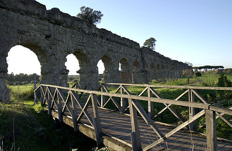
 Info: Parco degli Acquedotti, Rome, Italy: created by Photomarco - uploaded by Photomarco - nominated by Pava -- Pava (talk) 16:25, 26 October 2013 (UTC)
 Support for the subject of the photo, heritage and the beauty of the scenery and the city of Rome. To care for the angle and the light effect in the materials that infers the surface. For the beauty of the composition: bridge, arch, nature. -- Pava (talk) 16:25, 26 October 2013 (UTC)
 Oppose regretfully. Composition is great but exposure leaves so much to be desired, with an overly dark aqueduct in the rear and/or a blown sky behind it ruining it. Daniel Case (talk) 17:34, 26 October 2013 (UTC)
 Oppose per Daniel Case Blurred Lines 14:15, 30 October 2013 (UTC)
Voting period is over. Please don't add any new votes.Voting period ends on 6 Nov 2013 at 11:19:32 (UTC)
Visit the nomination page to add or modify image notes.
 Info created by Christian Ferrer - uploaded by Christian Ferrer - nominated by Christian Ferrer -- Christian Ferrer (talk) 11:18, 28 October 2013 (UTC)
 Support -- Christian Ferrer (talk) 11:18, 28 October 2013 (UTC)
 Support Everything I said before but now it looks even better with the color fixed. Daniel Case (talk) 04:40, 29 October 2013 (UTC)
- Weak
 Support More of an interesting picture than a beautiful one. Good detail. -- Colin (talk) 13:44, 29 October 2013 (UTC)
  Support --JLPC (talk) 14:33, 29 October 2013 (UTC)
 Support --Joydeep Talk 18:02, 29 October 2013 (UTC)
 Oppose Colors look a bit dull to me. Shooting towards the direction of the sun is not ideal for this type of picture IMO. --King of ♥ ♦ ♣ ♠ 18:24, 29 October 2013 (UTC)
 Oppose With King: Light is unfortunate. Most of the building in the foreground are in shadow. Due to shadow areas especially all white building have a strong blue cast (try WB on the white areas there). All in all a photo with a good (but not outstanding) composition, high resolution but unfortunate light. Especially light (besides composition) is the most important aspect for an excellent landscape shot. --Tuxyso (talk) 19:31, 29 October 2013 (UTC)
 Oppose Agree with KoH/Tusyxo, sorry Poco2 21:18, 29 October 2013 (UTC)
 I withdraw my nomination Ok, it will be almost unanimity or nothing, I will try another... -- Christian Ferrer (talk) 11:58, 30 October 2013 (UTC)
File:Tobermory Main Street 2012-08-09.jpg, featured
[edit]Voting period is over. Please don't add any new votes.Voting period ends on 31 Oct 2013 at 20:14:00 (UTC)
Visit the nomination page to add or modify image notes.
 Info created by Colin - uploaded by Colin - nominated by Colin -- Colin (talk) 20:14, 22 October 2013 (UTC)
 Support Tobermory is famous for its colourful houses. This high-resolution photo captures the entire main street along the waterside.-- Colin (talk) 20:14, 22 October 2013 (UTC)
 Support --ArildV (talk) 20:44, 22 October 2013 (UTC)
 Support -- -donald- (talk) 09:38, 23 October 2013 (UTC)
 Support --Böhringer (talk) 10:11, 23 October 2013 (UTC)
 Support --Christian Ferrer (talk) 10:16, 23 October 2013 (UTC)
 Comment Nice panorama, but trees look strange (sharpening + NR combination?) --Kadellar (talk) 11:12, 23 October 2013 (UTC)
 Comment per Kadellar, Very good except trees. --Laitche (talk) 19:18, 23 October 2013 (UTC)
- I've uploaded a new version reworked from scratch. Only applied NR to the lower half of the picture, keeping detail in the trees and reduced the sharpening. Was ISO 400 1/60s 50mm hand-held evening light, so this is as much detail as I can get from the source frames. I think it is much better now. Colin (talk) 22:12, 23 October 2013 (UTC)
- Btw, if you've looked at the picture already, you may need to force a refresh to override the cached version (use Ctrl-F5 on Firefox). -- Colin (talk) 07:28, 24 October 2013 (UTC)
 Support Thanks for reworking, better now. --Kadellar (talk) 00:15, 25 October 2013 (UTC)
- Btw, if you've looked at the picture already, you may need to force a refresh to override the cached version (use Ctrl-F5 on Firefox). -- Colin (talk) 07:28, 24 October 2013 (UTC)
 Support new version. --Laitche (talk) 16:19, 24 October 2013 (UTC)
 Support --JLPC (talk) 16:53, 24 October 2013 (UTC)
 Support --Joydeep Talk 17:03, 24 October 2013 (UTC)
 Oppose You all excuse me, for sure it's a technically fine panorama, but the light/weather conditions do not impress me. --A.Savin 21:20, 24 October 2013 (UTC)
 Oppose as per A.Savin, the light in this one really does detract from what could be a WOW scenic photograph. russavia (talk) 19:50, 25 October 2013 (UTC)
 Oppose per lighting. Yes, the "reflection on a lake with blue sky and green trees" is fairly clichéd, but clichés are there for a reason: it just looks visually appealing that way. --King of ♥ ♦ ♣ ♠ 22:53, 25 October 2013 (UTC)
- I like the gentle evening light produced by the soft clouds in the sky. This is the Isle of Mull on the West Coast of Scotland, where on average it rains on 22 days in August. So one could argue this is more honest than a sunshine one, though I understand the appeal of that. -- Colin (talk) 17:53, 26 October 2013 (UTC)
 Support Michael Barera (talk) 00:19, 27 October 2013 (UTC)
 Support --Neptuul (talk) 18:57, 27 October 2013 (UTC)
 Support--Jebulon (talk) 09:47, 29 October 2013 (UTC)
 Support Poco2 21:11, 29 October 2013 (UTC)
 Support JKadavoor Jee 08:20, 30 October 2013 (UTC)
 Support Blurred Lines 15:08, 30 October 2013 (UTC)
File:Durga, Burdwan, 2011.JPG, featured
[edit]Voting period is over. Please don't add any new votes.Voting period ends on 2 Nov 2013 at 18:18:47 (UTC)
Visit the nomination page to add or modify image notes.
 Info Renomination. Durga idol from a temple at Burdwan. Created / uploaded / nominated by Joydeep Talk 18:18, 24 October 2013 (UTC)
 Support -- Joydeep Talk 18:18, 24 October 2013 (UTC)
 Support --A.Savin 21:26, 24 October 2013 (UTC)
 Support --JLPC (talk) 10:02, 25 October 2013 (UTC)
 Support Nikhil (talk) 14:33, 25 October 2013 (UTC)
 Support --Alex Florstein (talk) 07:31, 26 October 2013 (UTC)
 Question Can you describe what it is? I cannot extract it from the description. --Tuxyso (talk) 07:50, 26 October 2013 (UTC)
 Done. Description modified. --Joydeep Talk 08:39, 26 October 2013 (UTC)
 Support Michael Barera (talk) 00:22, 27 October 2013 (UTC)
 Support JKadavoor Jee 04:16, 27 October 2013 (UTC)
 Support --Ivar (talk) 17:33, 28 October 2013 (UTC)
 Support nice --Rjcastillo (talk) 13:24, 29 October 2013 (UTC)
 Support --Dey.sandip (talk) 11:33, 31 October 2013 (UTC)
File:Bač fortress (Bačka tvrđava).JPG, featured
[edit]Voting period is over. Please don't add any new votes.Voting period ends on 2 Nov 2013 at 11:30:21 (UTC)
Visit the nomination page to add or modify image notes.
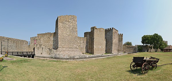
 Info all by Pudelek -- Pudelek (talk) 11:30, 24 October 2013 (UTC)
 Support -- Pudelek (talk) 11:30, 24 October 2013 (UTC)
 Support --Böhringer (talk) 21:25, 24 October 2013 (UTC)
 Support -- Christian Ferrer (talk) 05:36, 25 October 2013 (UTC)
 Support --Joydeep Talk 12:59, 25 October 2013 (UTC)
 Support Michael Barera (talk) 00:21, 27 October 2013 (UTC)
 Support A little too much sharpening imo but still ok (and very little noise). — Julian H.✈ (talk/files) 08:55, 27 October 2013 (UTC)
 Support -- Felix König ✉ 20:15, 27 October 2013 (UTC)
 Support Blurred Lines 15:07, 30 October 2013 (UTC)
 Support great --Wladyslaw (talk) 14:01, 31 October 2013 (UTC)
 Support JKadavoor Jee 05:53, 1 November 2013 (UTC)
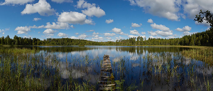
File:Old Pier, Salen, Isle of Mull.jpg, featured
[edit]Voting period is over. Please don't add any new votes.Voting period ends on 4 Nov 2013 at 20:11:18 (UTC)
Visit the nomination page to add or modify image notes.
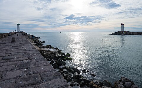
 Info created by Colin - uploaded by Colin - nominated by Colin -- Colin (talk) 20:11, 26 October 2013 (UTC)
 Support -- Colin (talk) 20:11, 26 October 2013 (UTC)
 Support Michael Barera (talk) 00:25, 27 October 2013 (UTC)
 Support -- Christian Ferrer (talk) 05:41, 27 October 2013 (UTC)
 Support -- Felix König ✉ 20:09, 27 October 2013 (UTC)
 Support --JLPC (talk) 21:18, 27 October 2013 (UTC)
 Support --Joydeep Talk 12:41, 28 October 2013 (UTC)
 Support very nice! --Martin Falbisoner (talk) 17:03, 28 October 2013 (UTC)
 Support — Julian H.✈ (talk/files) 17:48, 28 October 2013 (UTC)
 Support something different. Good --Rjcastillo (talk) 13:21, 29 October 2013 (UTC)
 Support -- Arcalino (talk) 15:10, 29 October 2013 (UTC)
 Support JKadavoor Jee 16:35, 29 October 2013 (UTC)
 Support Very nice composition Poco2 21:07, 29 October 2013 (UTC)
 Support per Martin Falbisoner & Poco2 Blurred Lines 14:14, 30 October 2013 (UTC)
File:Vranov nad Dyji03(js).jpg, featured
[edit]Voting period is over. Please don't add any new votes.Voting period ends on 4 Nov 2013 at 16:22:43 (UTC)
Visit the nomination page to add or modify image notes.
 InfoVranov nad Dyjí, Castle created by Jerzy Strzelecki - uploaded by Jerzy Strzelecki - nominated by Jerzy Strzelecki -- Jerzystrzelecki (talk) 16:22, 26 October 2013 (UTC)
 Support -- Jerzystrzelecki (talk) 16:22, 26 October 2013 (UTC)
 Support —Mono 20:25, 26 October 2013 (UTC)
 Support --AmaryllisGardener (talk) 03:12, 27 October 2013 (UTC)
 Support -- Felix König ✉ 20:10, 27 October 2013 (UTC)
 Info I uploaded new version with a bit more sharpness. Please revert, if it's not better. --Ivar (talk) 17:47, 28 October 2013 (UTC)
 Neutral Ładne zdjęcie, ale przy maksymalnym zbliżeniu widać niedoskonałości - szumy, kilka miejsc prześwietlonych, ostrość też nie taka super. Może zmniejszyć rozmiar? --Pudelek (talk) 17:50, 28 October 2013 (UTC)
 Support --Tuxyso (talk) 22:19, 28 October 2013 (UTC)
 Support --Ivar (talk) 07:55, 29 October 2013 (UTC)
 Support...And seven.--Jebulon (talk) 09:51, 29 October 2013 (UTC)
 Support -- Colin (talk) 14:11, 29 October 2013 (UTC)
 Support -- Arcalino (talk) 15:11, 29 October 2013 (UTC)
 Comment Very nice, but IMHO it needs some additional contrast Poco2 21:09, 29 October 2013 (UTC)
- Really additional contrast? IMHO the darker areas are quite black. --Tuxyso (talk) 21:23, 29 October 2013 (UTC)
 Support --Pine✉ 06:53, 30 October 2013 (UTC)
 Support Blurred Lines 14:17, 30 October 2013 (UTC)
Voting period is over. Please don't add any new votes.Voting period ends on 4 Nov 2013 at 23:08:55 (UTC)
Visit the nomination page to add or modify image notes.
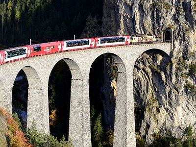
 Info Regionalzug auf der Berninalinie am Lago Bianco c/u/n by -- Böhringer (talk) 23:08, 26 October 2013 (UTC)
 Support -- Böhringer (talk) 23:08, 26 October 2013 (UTC)
 Support Kruusamägi (talk) 23:28, 26 October 2013 (UTC)
 Support Michael Barera (talk) 00:26, 27 October 2013 (UTC)
 Support Great colors. --King of ♥ ♦ ♣ ♠ 03:32, 27 October 2013 (UTC)
 Comment Nice view but CAs at left on the snow and on the rocks in foreground, and on the top of the mountain (see notes) Christian Ferrer (talk) 05:31, 27 October 2013 (UTC)
 Support Nice. It would be great if the blue clipping in the sky and red clipping on the train could be corrected, but they are both not very noticeable. — Julian H.✈ (talk/files) 08:51, 27 October 2013 (UTC)
 Support
- Not enough wdits to vote. 50 edits are needed. -- Joydeep Talk 12:40, 28 October 2013 (UTC)
 Neutral
 Support --Laitche (talk) 11:48, 29 October 2013 (UTC)
 Support --Berthold Werner (talk) 07:19, 28 October 2013 (UTC)
 Oppose
 Support Fine with me now. --Ivar (talk) 07:53, 29 October 2013 (UTC)
 Oppose
 Support Christian Ferrer (talk) 10:44, 29 October 2013 (UTC)
 Done --Böhringer (talk) 22:19, 28 October 2013 (UTC)
 Support Good composition --Rjcastillo (talk) 13:18, 29 October 2013 (UTC)
 Support -- Colin (talk) 14:13, 29 October 2013 (UTC)
 Support --Pudelek (talk) 17:20, 29 October 2013 (UTC)
 Support Poco2 21:06, 29 October 2013 (UTC)
 Support Blurred Lines 14:09, 30 October 2013 (UTC)
 Comment Great details; but not eye catching compared to this or this. JKadavoor Jee 16:23, 30 October 2013 (UTC)
Voting period is over. Please don't add any new votes.Voting period ends on 5 Nov 2013 at 11:53:47 (UTC)
Visit the nomination page to add or modify image notes.
 Info created by Christian Ferrer - uploaded by Christian Ferrer - nominated by Christian Ferrer -- Christian Ferrer (talk) 11:53, 27 October 2013 (UTC)
 Support -- Christian Ferrer (talk) 11:53, 27 October 2013 (UTC)
 I withdraw my nomination -- Christian Ferrer (talk) 14:15, 1 November 2013 (UTC)
File:Grönskär February 2013 04.jpg, featured
[edit]Voting period is over. Please don't add any new votes.Voting period ends on 5 Nov 2013 at 10:21:14 (UTC)
Visit the nomination page to add or modify image notes.
 Info Grönskär is a Swedish island and lighthouse station located in the south Stockholm archipelago, east of Sandhamn. Created, uploaded and nominated by -- Arild Vågen (talk) 10:21, 27 October 2013 (UTC)
 Support -- ArildV (talk) 10:21, 27 October 2013 (UTC)
 Support--Jebulon (talk) 20:26, 27 October 2013 (UTC)
 Support --King of ♥ ♦ ♣ ♠ 23:56, 27 October 2013 (UTC)
 Support --Joydeep Talk 12:38, 28 October 2013 (UTC)
 Support --JLPC (talk) 14:51, 28 October 2013 (UTC)
 Support --Martin Falbisoner (talk) 15:29, 28 October 2013 (UTC)
 Support --Christian Ferrer (talk) 18:24, 28 October 2013 (UTC)
 Support --Pine✉ 07:15, 29 October 2013 (UTC)
 Support --Böhringer (talk) 11:29, 29 October 2013 (UTC)
 Comment Nice, but it is ccw tilted Poco2 21:04, 29 October 2013 (UTC)
 Done--ArildV (talk) 13:36, 30 October 2013 (UTC)
 Support --Kikos (talk) 21:07, 29 October 2013 (UTC)
 Support nice view. --Alchemist-hp (talk) 22:28, 29 October 2013 (UTC)
 Neutral View is pretty nice, though I would have liked to see more of the blue sea and less of the foreground land. A re-compose with more sea and carefully placed land portion would have made this an excellent image with good asthetics --Dey.sandip (talk) 08:01, 30 October 2013 (UTC)
- I feel the opposite, I would have preferred more exciting rock and less water. But good quality though. --V-wolf (talk) 12:31, 30 October 2013 (UTC)
- Thanks for your comments. I thought it was a good compromise between land and water. Anyway, many have already voted now so I wouldn't change the composition. I uploaded a uncut version and a new overall view.--ArildV (talk) 13:36, 30 October 2013 (UTC)
- Like the uncut version --Dey.sandip (talk) 11:19, 31 October 2013 (UTC)
- Thanks for your comments. I thought it was a good compromise between land and water. Anyway, many have already voted now so I wouldn't change the composition. I uploaded a uncut version and a new overall view.--ArildV (talk) 13:36, 30 October 2013 (UTC)
- I feel the opposite, I would have preferred more exciting rock and less water. But good quality though. --V-wolf (talk) 12:31, 30 October 2013 (UTC)
 Support Blurred Lines 13:54, 30 October 2013 (UTC)
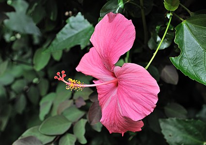
File:Hibiscus rosa-sinensis Santiago Cape Verde.jpg, not featured
[edit]Voting period is over. Please don't add any new votes.Voting period ends on 5 Nov 2013 at 07:50:26 (UTC)
Visit the nomination page to add or modify image notes.
 Info Flower of a Hibiscus rosa-sinensis cultivar in the National Botanical Garden Grandvaux Barbosa at São Jorge dos Órgãos on the isle of Santiago, Cape Verde. Created, uploaded and nominated by --Cayambe (talk) 07:50, 27 October 2013 (UTC)
 Support -- Cayambe (talk) 07:50, 27 October 2013 (UTC)
 Oppose The flower is very good and nice, but the background is also very disturbing : lot of foliage, green oversatured, too much black, too much noise (maybe oversharpening), and there is a mark of painting -- Christian Ferrer (talk) 18:31, 27 October 2013 (UTC)
 Oppose per Christian Ferrer. Blurred Lines 14:01, 30 October 2013 (UTC)
Voting period is over. Please don't add any new votes.Voting period ends on 8 Nov 2013 at 14:19:30 (UTC)
Visit the nomination page to add or modify image notes.
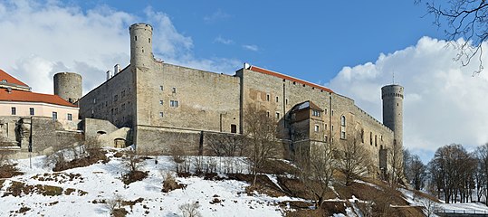
 Info Toompea castle, all by Ivar (talk) 14:19, 30 October 2013 (UTC)
 Abstain -- Ivar (talk) 14:19, 30 October 2013 (UTC)
 Comment Nice but the Landskrone Tower (left tower on the image) seem to be tilted on left, I've search on internet and it seem to be normally straight. Christian Ferrer (talk) 09:09, 01 November 2013 (UTC)
 Comment There is no tilt, but distortion. I can't fix it, so...
 I withdraw my nomination --Ivar (talk) 11:30, 1 November 2013 (UTC)
Voting period is over. Please don't add any new votes.Voting period ends on 10 Nov 2013 at 11:35:28 (UTC)
Visit the nomination page to add or modify image notes.
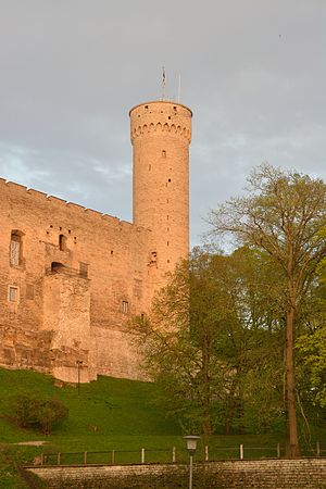
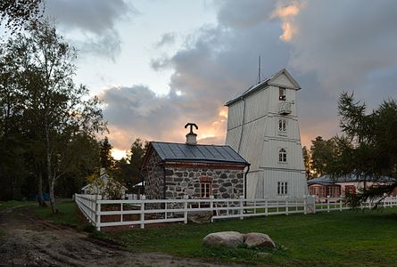
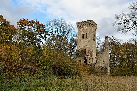
 Info Tall Hermann Watchtower, all by Ivar (talk) 11:35, 1 November 2013 (UTC)
 Abstain -- Ivar (talk) 11:35, 1 November 2013 (UTC)
 Comment Lack of details on the hill, and IMO the tint is too much green and the color temperature is too much warm and also there is not enough highlights -- Christian Ferrer (talk) 13:30, 1 November 2013 (UTC)
 Comment This shot is taken on the last minutes of the golden hour. That's why there is less contrast and light is very warm. --Ivar (talk) 13:55, 1 November 2013 (UTC)
- I've tried with LR5 temperature (-10) and tint (+4), it's much according to my tastes -- Christian Ferrer (talk) 14:03, 1 November 2013 (UTC)
- This photo is not postprocessed, no additional saturation/warmth were added, those were the conditions at that moment. --Ivar (talk) 14:12, 1 November 2013 (UTC)
- Ok, you decide and you're right : we must not misuse of the image editing, only just to improve that it can be improved. -- Christian Ferrer (talk) 14:29, 1 November 2013 (UTC)
- This photo is not postprocessed, no additional saturation/warmth were added, those were the conditions at that moment. --Ivar (talk) 14:12, 1 November 2013 (UTC)
- I've tried with LR5 temperature (-10) and tint (+4), it's much according to my tastes -- Christian Ferrer (talk) 14:03, 1 November 2013 (UTC)
 I withdraw my nomination --Ivar (talk) 06:51, 3 November 2013 (UTC)
Voting period is over. Please don't add any new votes.Voting period ends on 9 Nov 2013 at 18:49:03 (UTC)
Visit the nomination page to add or modify image notes.
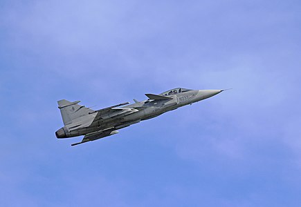
 Info create, uploaded and nominated by me. — Julian H.✈ (talk/files) 18:49, 31 October 2013 (UTC)
 Abstain as author. — Julian H.✈ (talk/files) 18:49, 31 October 2013 (UTC)
 Comment Nice but there is like a blue halo aroud the empennage. — Christian Ferrer (talk 13:58, 1 November 2013 (UTC)
- Thanks, I reduced the clarity to almost zero and hope that helps. I don't know why there would be a blue halo though, since I made no local colour adjustments. — Julian H.✈ (talk/files) 09:30, 2 November 2013 (UTC)
- I see it again in the latest version — Christian Ferrer (talk 07:14, 3 November 2013 (UTC)
 I withdraw my nomination, I don't know where it comes from. It's not the editing, so it's either the trees happening to be brighter there or some optical effect in the lens. — Julian H.✈ (talk/files) 09:40, 3 November 2013 (UTC)
- I see it again in the latest version — Christian Ferrer (talk 07:14, 3 November 2013 (UTC)
- Thanks, I reduced the clarity to almost zero and hope that helps. I don't know why there would be a blue halo though, since I made no local colour adjustments. — Julian H.✈ (talk/files) 09:30, 2 November 2013 (UTC)
File:General Rafael Urdaneta Bridge.jpg, featured
[edit]Voting period is over. Please don't add any new votes.Voting period ends on 6 Nov 2013 at 13:44:30 (UTC)
Visit the nomination page to add or modify image notes.
 Info created by The Photographer - uploaded by The Photographer - nominated by Rjcastillo -- Rjcastillo (talk) 13:44, 28 October 2013 (UTC)
 Support -- Rjcastillo (talk) 13:44, 28 October 2013 (UTC)
 Support --Böhringer (talk) 21:27, 28 October 2013 (UTC)
 Support --Pine✉ 07:11, 29 October 2013 (UTC)
 Support --JLPC (talk) 14:34, 29 October 2013 (UTC)
 Support --Joydeep Talk 18:02, 29 October 2013 (UTC)
 Support --King of ♥ ♦ ♣ ♠ 18:23, 29 October 2013 (UTC)
 Support Poco2 21:19, 29 October 2013 (UTC)
 Support very good --Pava (talk) 23:05, 29 October 2013 (UTC)
 Support --Christian Ferrer (talk) 13:02, 30 October 2013 (UTC)
 Support -- Blurred Lines 13:43, 30 October 2013 (UTC)
 Support very good, showing all relevant details of a complex construction --AHert (talk) 16:53, 30 October 2013 (UTC)
 Support Daniel Case (talk) 15:09, 31 October 2013 (UTC)
 Support and sad to see him retired. Rjcastillo, does the situation of Venezuela is going that much bad? :( JKadavoor Jee 10:29, 2 November 2013 (UTC)
File:Prignitz 07-13 img14 Demerthin.jpg, featured
[edit]Voting period is over. Please don't add any new votes.Voting period ends on 6 Nov 2013 at 09:30:41 (UTC)
Visit the nomination page to add or modify image notes.
 Info all by A.Savin
 Support --A.Savin 09:30, 28 October 2013 (UTC)
 Support nice --Pudelek (talk) 17:45, 28 October 2013 (UTC)
 Support Christian Ferrer (talk) 18:40, 28 October 2013 (UTC)
 Question Please identify the CoAs, and...I'll support !--Jebulon (talk) 20:27, 28 October 2013 (UTC)
- The left one is the house of von Klitzing (compare here [1]), the right one von Oppen ([2]), both names you can read in the inscription straight below. --A.Savin 22:21, 28 October 2013 (UTC)
 Support Thank you. Interesting.--Jebulon (talk) 09:40, 29 October 2013 (UTC)
 Support JKadavoor Jee 12:40, 29 October 2013 (UTC)
 Support --Rjcastillo (talk) 13:16, 29 October 2013 (UTC)
 Support Interesting subject. -- Colin (talk) 13:46, 29 October 2013 (UTC)
 Support --JLPC (talk) 14:29, 29 October 2013 (UTC)
 Support --Joydeep Talk 18:02, 29 October 2013 (UTC)
 Support Poco2 21:18, 29 October 2013 (UTC)
 Support --Alex Florstein (talk) 18:54, 31 October 2013 (UTC)
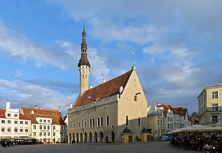
File:Tallinna Raekoda 11-06-2013.jpg, featured
[edit]Voting period is over. Please don't add any new votes.Voting period ends on 5 Nov 2013 at 19:54:33 (UTC)
Visit the nomination page to add or modify image notes.
 Info Tallinn Town Hall, all by Ivar (talk) 19:54, 27 October 2013 (UTC)
 Abstain -- Ivar (talk) 19:54, 27 October 2013 (UTC)
 Support very good. -- Felix König ✉ 20:06, 27 October 2013 (UTC)
 Comment Yes, but featurable ? --Jebulon (talk) 20:22, 27 October 2013 (UTC)
 Support Excellent image about the oldest town hall in the whole of the Baltic and Scandinavia. Definitely featurable. Kruusamägi (talk) 21:25, 27 October 2013 (UTC)
 Support --Christian Ferrer (talk) 05:44, 28 October 2013 (UTC)
 Comment Slightly cw tilt or distorted. --Laitche (talk) 10:33, 28 October 2013 (UTC)
 Comment Please add a note, where iyo is cw tilt/distortion. --Ivar (talk) 10:53, 28 October 2013 (UTC)
- The tower seems tilted clockwise for me. --Laitche (talk) 11:25, 28 October 2013 (UTC)
- Maybe it's optical illusion but seems slightly distorted central part of photo for me. --Laitche (talk) 11:38, 28 October 2013 (UTC)
- It looks good to me, however this is stitched image of very old building. --Ivar (talk) 12:00, 28 October 2013 (UTC)
- Maybe you are right. I added the note, especially that part seems strange. --Laitche (talk) 12:08, 28 October 2013 (UTC)
- That part is easy to prove. The house by the town hall has tilted walls. Diego has a photo from it and a single shot version of the Town Hall. --Ivar (talk) 12:31, 28 October 2013 (UTC)
- Okay I'm convinced. --Laitche (talk) 15:46, 28 October 2013 (UTC)
 Support --JLPC (talk) 14:48, 28 October 2013 (UTC)
 Support -Pudelek (talk) 17:47, 28 October 2013 (UTC)
 Support Per the image itself, and convinced by Kruusamägi, thanks.--Jebulon (talk) 20:31, 28 October 2013 (UTC)
 Question It a nice motive and technically well done. If you take a look on Suncalc there are two possible recording times for the photo - VERY early in the morning, shortly after sunrise at 3.30 am [3] or shortly before sunset at 8.30pm (as you've choosen). The problem with the recording time in the evening is that most parts of your main motive are in shadow. Have you ever seen the lighting situation early in the morning and can you judge if it is better? Or are there other shortcomings in the morning? --Tuxyso (talk) 20:52, 28 October 2013 (UTC)
 Comment Nice to see, that I'm not the only one, who calculates sun's position. Town Hall has this kind of evening light only some three weeks during whole year. Early morning light was my second choice, because if the sun shines from that side, the neighbor buildings and some of the Town Hall itself would have been in the shadow, whilst foreground would have more light. --Ivar (talk) 07:49, 29 October 2013 (UTC)
 Support Thanks for the information. I think you did the best here - north fassades are quite unthankful :) --Tuxyso (talk) 08:13, 29 October 2013 (UTC)
 Support -- Arcalino (talk) 13:56, 29 October 2013 (UTC)
 Support I was going to vote neutral because although the top half is good, the market is in shadow. I encourage people to explain lighting difficulties/features in their nomination rather than leave reviewers to second-guess. -- Colin (talk) 14:04, 29 October 2013 (UTC)
 Support --V-wolf (talk) 17:34, 29 October 2013 (UTC)
 Support Poco2 20:50, 30 October 2013 (UTC)
 Support --Alex Florstein (talk) 18:53, 31 October 2013 (UTC)
Voting period is over. Please don't add any new votes.Voting period ends on 2 Nov 2013 at 18:39:39 (UTC)
Visit the nomination page to add or modify image notes.
 Info created by Jwrodgers - uploaded by Jwrodgers - nominated by kasir -- Kasir (talk) 18:39, 24 October 2013 (UTC)
 Support -- Kasir (talk) 18:39, 24 October 2013 (UTC)
 Support Nikhil (talk) 14:32, 25 October 2013 (UTC)
 Support Michael Barera (talk) 00:23, 27 October 2013 (UTC)
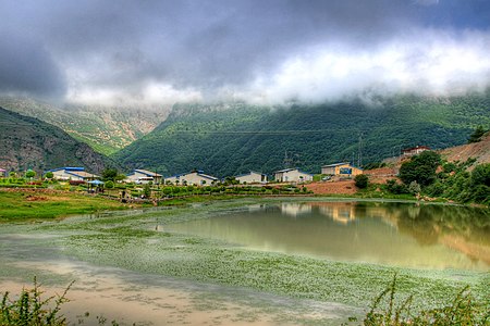
 Support −ebraminiotalk 17:08, 31 October 2013 (UTC)
 Support − Bkouhi (talk) 10:09, 1 November 2013 (UTC)
 Support--Freshman404 (talk) 06:34, 4 November 2013 (UTC)
Voting period is over. Please don't add any new votes.Voting period ends on 2 Nov 2013 at 18:33:08 (UTC)
Visit the nomination page to add or modify image notes.
 Info created by shahram sharif/Flickr uploaded by Fabienkhan - nominated by kasir -- Kasir (talk) 18:33, 24 October 2013 (UTC)
 Support -- Kasir (talk) 18:33, 24 October 2013 (UTC)
 Oppose Interesting picture from a place we don't get enough images from; alas, blown highlight in cloud. Daniel Case (talk) 22:13, 24 October 2013 (UTC)
 Oppose per Daniel, also tilted. — Julian H.✈ (talk/files) 09:05, 25 October 2013 (UTC)
 Support Michael Barera (talk) 00:22, 27 October 2013 (UTC)
 Oppose blurry on the left side of the image. --Pine✉ 06:54, 30 October 2013 (UTC)
Pine Trees screen, featured
[edit]Voting period is over. Please don't add any new votes.Voting period ends on 1 Nov 2013 at 17:30:43 (UTC)
Visit the nomination page to add or modify image notes.
 Info Pine Trees screen (Shōrin-zu byōbu) left hand screen and right hand screen, created by Hasegawa Tōhaku - uploaded by Bamse - nominated by Laitche -- Laitche (talk) 17:30, 23 October 2013 (UTC)
 Support -- Laitche (talk) 17:30, 23 October 2013 (UTC)
 Neutral -- Love the pine forest in the fog. Not a big fan of the excessive resolution, though. It just brought my computer to a screeching halt. Kleuske (talk) 09:39, 24 October 2013 (UTC)
- I guess this is the first time an image doesn't get its well-deserved support because of too high resolution... --Martin Falbisoner (talk) 10:59, 24 October 2013 (UTC)
- There's a first time for everything. Even resolution can be excessive. If you want to show something, crashing all but the most well-endowed computers does not help. Kleuske (talk) 10:09, 25 October 2013 (UTC)
- For featured pictures more detail is better. If you need a smaller version you can use the previews or request someone to make a smaller version that doesn't freeze your computer. --Pine✉ 07:00, 30 October 2013 (UTC)
- There's a first time for everything. Even resolution can be excessive. If you want to show something, crashing all but the most well-endowed computers does not help. Kleuske (talk) 10:09, 25 October 2013 (UTC)
 Support --Martin Falbisoner (talk) 10:59, 24 October 2013 (UTC)
 Support I love the touch of the drawing and the delicacy of the texture on the frame, and they are viewable only with this fine resolution. --whym (talk) 11:51, 25 October 2013 (UTC)
 Support --King of ♥ ♦ ♣ ♠ 22:51, 25 October 2013 (UTC)
 Support — Julian H.✈ (talk/files) 10:23, 26 October 2013 (UTC)
 Support Michael Barera (talk) 00:17, 27 October 2013 (UTC)
 Support JKadavoor Jee 04:23, 27 October 2013 (UTC)
 Support The level of detail is excellent. --Pine✉ 06:55, 30 October 2013 (UTC)06:55, 30 October 2013 (UTC)
 Support Yann (talk) 14:51, 1 November 2013 (UTC)
Alternative
[edit] Info Low resolution version. --Laitche (talk) 11:48, 25 October 2013 (UTC)
 Support --Laitche (talk) 11:48, 25 October 2013 (UTC)
 Support also good --Martin Falbisoner (talk) 10:07, 26 October 2013 (UTC)
 Support No hesitations. Kleuske (talk) 15:53, 26 October 2013 (UTC)
 Support JKadavoor Jee 04:23, 27 October 2013 (UTC)
 Support --AmaryllisGardener (talk) 13:37, 27 October 2013 (UTC)
 Oppose I strongly prefer higher detail versions when we can get them. --Pine✉ 06:55, 30 October 2013 (UTC)
File:Flickr - Government Press Office (GPO) - King Hussein of Jordan lights P.M.Yitzhak Rabin's cigarette at royal residence in Akaba.jpg, featured
[edit]Voting period is over. Please don't add any new votes.Voting period ends on 3 Nov 2013 at 12:29:55 (UTC)
Visit the nomination page to add or modify image notes.
 Info created by Sa'ar Ya'akov (Goverment Press Office, Israel) - uploaded by Matanya - nominated by Tomer T (talk) 12:29, 25 October 2013 (UTC)
 Support King Hussein of Jordan lights Israeli Prime Minister Yitzhak Rabin's cigarette at royal residence in Akaba, shortly after signing the Israel–Jordan peace treaty at Arava border-crossing, 26 October 1994. -- Tomer T (talk) 12:29, 25 October 2013 (UTC)
 Oppose Nothing remarkable in this photo IMO, distracting background. --King of ♥ ♦ ♣ ♠ 22:48, 25 October 2013 (UTC)
- Just explaining why I nominated this and why I think it's so special: this is a photo taken just after the signing on a peace treaty between two enemy countries, Israel and Jordan, and it depicts a special personal moment between the leaders of both countries: Rabin and Hussein. It reflects something unique about the relationship between the two great leaders. Tomer T (talk) 07:15, 26 October 2013 (UTC)
- The moment captured is quite historic and interesting, too. I like the lighting of the cigarette as symbolic of relaxation between the two. The actual quality of the photograph leaves something to be desired, though, especially in the "sharpness"-department. Kleuske (talk) 11:19, 27 October 2013 (UTC)
- Just explaining why I nominated this and why I think it's so special: this is a photo taken just after the signing on a peace treaty between two enemy countries, Israel and Jordan, and it depicts a special personal moment between the leaders of both countries: Rabin and Hussein. It reflects something unique about the relationship between the two great leaders. Tomer T (talk) 07:15, 26 October 2013 (UTC)
 Support Nothing remarquable ? A peaceful and friendly meeting between an arab king and an israeli premier ? Wow ! Unsharp ? A 1994 picture ? Wow ! Highest EV and very good quality for the period.--Jebulon (talk) 20:41, 27 October 2013 (UTC)
 Support --JLPC (talk) 14:32, 29 October 2013 (UTC)
 Support JKadavoor Jee 16:33, 29 October 2013 (UTC)
 Support -- Sometimes history suffices. To hell with the sharpness department. Kleuske (talk) 16:58, 29 October 2013 (UTC)
 Support --Joydeep Talk 17:47, 31 October 2013 (UTC)
 Support — TintoMeches, 18:10, 31 October 2013 (UTC)
 Support - Godot13 (talk) 22:46, 1 November 2013 (UTC)
Voting period is over. Please don't add any new votes.Voting period ends on 7 Nov 2013 at 20:39:05 (UTC)
Visit the nomination page to add or modify image notes.
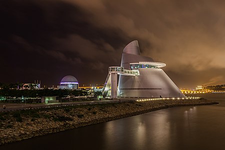
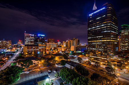
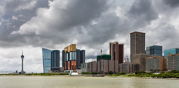
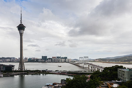
 Info Night view of the Macau Science Center, Macau, China. All by me, Poco2 20:39, 29 October 2013 (UTC)
 Support -- Poco2 20:39, 29 October 2013 (UTC)
 Support Sky could be better denoised, but motive and composition definitely work for me. --Tuxyso (talk) 21:18, 29 October 2013 (UTC)
 Support per Tuxyso --Martin Falbisoner (talk) 21:45, 29 October 2013 (UTC)
- I have uploaded a new version with the target to improve the noise level of the sky, thanks Poco2 21:55, 29 October 2013 (UTC)
- much better! --Martin Falbisoner (talk) 05:31, 30 October 2013 (UTC)
 Support Colors, composition (leading line), lighting (which draws the attention on the right hand side) are all excellent. Given the fact that this shot was technically challenging, the result is very good. I'd like to see this picture being used in more articles on Wikipedia though. Great shot, Diego! --Frank Schulenburg (talk) 01:59, 30 October 2013 (UTC)
 Comment Very good composition, but noise level is still notable, one dust spot on the water and please add geolocation. --Ivar (talk) 10:11, 30 October 2013 (UTC)
 All done Poco2 20:05, 30 October 2013 (UTC)
 Support --Ivar (talk) 14:13, 31 October 2013 (UTC)
 Support per Tuxyso -- Blurred Lines 13:42, 30 October 2013 (UTC)
 Support--JLPC (talk) 15:08, 30 October 2013 (UTC)
 Support --Joydeep Talk 17:36, 30 October 2013 (UTC)
 Support Very good. --Rjcastillo (talk) 20:46, 30 October 2013 (UTC)
 Support But, isn't it be attributed to the architect as the author too? (The building was designed by Pei Partnership Architects in association with I. M. Pei.) JKadavoor Jee 03:07, 31 October 2013 (UTC)
 Comment You're forgetting that, like Hong Kong, Macau is a Special Autonomous Region of China, retaining (among other things) its own currency, customs and laws—including copyright. HK and mainland China have different FoP provisions, with attribution not required in the former. I don't know if Macau is different (they may have retained Portugal's), but they do not use Chinese copyright law yet. Daniel Case (talk) 15:07, 31 October 2013 (UTC)
 Support Good image, and there is your 10th
  --Dey.sandip (talk) 11:12, 31 October 2013 (UTC)
 Support Not all the nighttime beauty in Macau is casino-related. Daniel Case (talk) 15:03, 31 October 2013 (UTC)
 Support --King of ♥ ♦ ♣ ♠ 00:59, 1 November 2013 (UTC)
 Support Christian Ferrer (talk) 10:36, 1 November 2013 (UTC)
 Support Good composition.--ArildV (talk) 15:15, 1 November 2013 (UTC)
 Support --Böhringer (talk) 23:02, 2 November 2013 (UTC)
 Support Michael Barera (talk) 00:16, 3 November 2013 (UTC)
File:Wroclaw - Hala Stulecia 03.jpg, featured
[edit]Voting period is over. Please don't add any new votes.Voting period ends on 1 Nov 2013 at 21:40:43 (UTC)
Visit the nomination page to add or modify image notes.
 Info created by Jar.ciurus - uploaded by Jar.ciurus - nominated by Yarl -- Yarl ✉ 21:40, 23 October 2013 (UTC)
 Support -- Yarl ✉ 21:40, 23 October 2013 (UTC)
 Oppose It's an eye-catching picture. But the contrast has been boosted too far resulting in clipped highlights (loss of detail on the building) and blocked shadows. The JPG has no defined/embedded colour-space either. Colin (talk) 22:04, 23 October 2013 (UTC)
- Weak
 Support. Agree with Colin that there is some clipping, but mostly it's just specular highlights and patches of red-channel clipping, so good enough for me to support. --King of ♥ ♦ ♣ ♠ 22:19, 23 October 2013 (UTC)
- I agree that fussing about blown specular highlights is often mistaken, but brick/stone/concrete doesn't produce specular highlights -- you need something mirror smooth like metal or water to get specular highlights. I think more subtle processing could save the detail while still producing a bold image. It is clearly not straight-from-camera (there's very little EXIF data, so some program has removed it) so I hope the creator can rework it. Colin (talk) 22:42, 23 October 2013 (UTC)
- I was referring to the windows. As for the wall, at least it's not blown out in all three channels. --King of ♥ ♦ ♣ ♠ 04:25, 24 October 2013 (UTC)
- I agree that fussing about blown specular highlights is often mistaken, but brick/stone/concrete doesn't produce specular highlights -- you need something mirror smooth like metal or water to get specular highlights. I think more subtle processing could save the detail while still producing a bold image. It is clearly not straight-from-camera (there's very little EXIF data, so some program has removed it) so I hope the creator can rework it. Colin (talk) 22:42, 23 October 2013 (UTC)
 Support
 Support per King of Hearts, Tuxyso --Martin Falbisoner (talk) 10:55, 24 October 2013 (UTC)
 Oppose per Colin -- Christian Ferrer (talk) 17:30, 24 October 2013 (UTC)
 Support --Ivar (talk) 05:37, 25 October 2013 (UTC)
 Oppose Overprocessing, per Colin.
 Support for 2013-10-29T17:17:33. — Julian H.✈ (talk/files) 19:13, 29 October 2013 (UTC)
 Support --Alex Florstein (talk) 07:33, 26 October 2013 (UTC)
 Oppose Enhancement is not bad thing though this one is too far.
 Support current (at the time I'm voting.) version. Nice composition anyway. --Laitche (talk) 19:43, 29 October 2013 (UTC)
 Support Michael Barera (talk) 00:18, 27 October 2013 (UTC)
 Support -- Felix König ✉ 20:16, 27 October 2013 (UTC)
 Oppose Per Laitche.--Jebulon (talk) 20:40, 28 October 2013 (UTC)
 Info I've done some changes to this picture. Take look at it now. Some overexposed areas are still there - but I think it is ok. The sun have been reflecting from building's windows. --Jar.ciurus 08:04, 29 October 2013 (UTC)
- Sorry, the previous version was imho much better. I've changed my vote to neutral. --Tuxyso (talk) 08:11, 29 October 2013 (UTC)
- I like both versions. Previous has strong contrast and is darker. Actual is more soft and lighter. But if we discuss the "previous" image, so I've decided to restore previous version. I shoot photos in RAW, so I can develop RAW images in many ways. --Jar.ciurus 08:45, 29 October 2013 (UTC)
- In such a case it is better to make an alternative nomination because the previous pro votes are for the original version. --Tuxyso (talk) 08:52, 29 October 2013 (UTC)
- Agree with Tuxyso that using a different filename & alt-nomination helps. I think your intermediate version is over-exposed, but at least it shows all the detail was captured. So I'd prefer something a little darker overall, showing texture on the building, but perhaps with shadows lifted a bit to retain detail in the trees. Also, what raw converter and/or editor are you using? Please make sure you pick a colourspace (sRGB is best for the web) and make sure it saves this detail in the JPG. Colin (talk) 09:01, 29 October 2013 (UTC)
 Info Colin gave quite good solution. ;) - I've uploaded new wersion. :) Shadows have been lifted and highlights corrected. There are details both in lights and shadows. What do you think now? (Next time I'll just upload a new file, but this time let it be) I use LR 4.4 and PS. I export images in "to the web" mode, every image has added sRGB profile. --Jar.ciurus User talk:Jar.ciurus 16:30, 29 October 2013 (UTC)
 Support version 16:17, 29 October 2013. However, you're still not saving the colour profile and I would appreciate if you could fix this so it displays the right colours for everyone. Have you got the "Metadata" section of the export dialog set to strip everything but copyright? Perhaps that's removing this vital info? Test it with this tool. I would strongly recommend you post your latest as another file with alternative nomination, though, as I don't consider any of your previous votes as valid for this one, and some may still not like this one. Colin (talk) 17:56, 29 October 2013 (UTC)
Alternative
[edit]- I've uploaded new version of the file and nominated it to QI. Please look at it. I think now everything is ok. --Jar.ciurus User talk:Jar.ciurus 20:23, 29 October 2013 (UTC)
 Comment It needs a perspective correction, see right side where everything is leaning in. Poco2 21:14, 29 October 2013 (UTC)
- Where it needs perspective correction? Vertical lines are not tilted. Jar.ciurus User Talk:Jar.ciurus 13:01, 30 October 2013 (UTC)
- I don't know whether that comment is about the original or alt. I edited your comment to make the alt. JKadavoor Jee 13:13, 30 October 2013 (UTC)
- Where it needs perspective correction? Vertical lines are not tilted. Jar.ciurus User Talk:Jar.ciurus 13:01, 30 October 2013 (UTC)
Voting period is over. Please don't add any new votes.Voting period ends on 5 Nov 2013 at 12:13:35 (UTC)
Visit the nomination page to add or modify image notes.
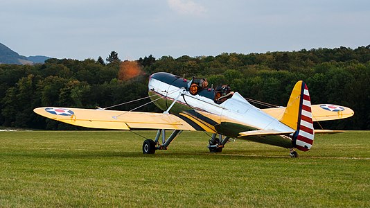
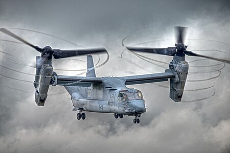
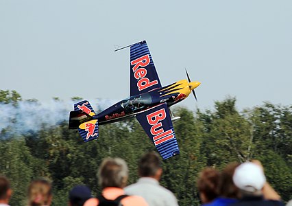
 Info created, uploaded and nominated by me. — Julian H.✈ (talk/files) 12:13, 27 October 2013 (UTC)
 Abstain as author. — Julian H.✈ (talk/files) 12:13, 27 October 2013 (UTC)
 Support --Ivar (talk) 19:56, 27 October 2013 (UTC)
 Support - very good! -- Felix König ✉ 20:07, 27 October 2013 (UTC)
 Support Kruusamägi (talk) 21:29, 27 October 2013 (UTC)
 Support Christian Ferrer (talk) 18:39, 28 October 2013 (UTC)
 Support Barcex (talk) 18:59, 28 October 2013 (UTC)
 Support -- Arcalino (talk) 15:08, 29 October 2013 (UTC)
 Support --V-wolf (talk) 17:32, 29 October 2013 (UTC)
 Support with a special mention for the reflections on the aluminium and the trace of the running propeller. --Myrabella (talk) 15:32, 1 November 2013 (UTC)
 Support Michael Barera (talk) 00:11, 3 November 2013 (UTC)
 Support JKadavoor Jee 10:03, 4 November 2013 (UTC)
Voting period is over. Please don't add any new votes.Voting period ends on 11 Nov 2013 at 08:47:44 (UTC)
Visit the nomination page to add or modify image notes.
 Info created by 丫鸭2000 - uploaded by Russavia - nominated by Russavia -- russavia (talk) 08:47, 2 November 2013 (UTC)
 Support -- russavia (talk) 08:47, 2 November 2013 (UTC)
 Support Michael Barera (talk) 00:26, 3 November 2013 (UTC)
| Nomination denied. Thank you for nominating this image. Unfortunately, it does not fall within the Guidelines because only two active nominations per user are allowed. --JKadavoor Jee 03:02, 3 November 2013 (UTC) |
- "Featured picture candidate policy: General rules: Only two active nominations by the same user (that is, nominations under review and not yet closed) are allowed. The main purpose of this measure is to contribute to a better average quality of nominations, by driving nominators/creators to choose carefully the pictures presented to the forum." The bot is down for long time and Bawolff is trying to fix the issue. Thanks for the understanding. JKadavoor Jee 03:02, 3 November 2013 (UTC)
- I have reverted this nomination back to the one where it was denied. User:Russavia, User:Harej please read the instructions before nominating and please do not abuse the process. There is a reason for the limit. Colin (talk) 16:51, 3 November 2013 (UTC)
Voting period is over. Please don't add any new votes.Voting period ends on 11 Nov 2013 at 18:31:43 (UTC)
Visit the nomination page to add or modify image notes.
 Info created by Gage - uploaded by Gage - nominated by Blurred Lines -- Blurred Lines 18:31, 2 November 2013 (UTC)
 Support -- Blurred Lines 18:31, 2 November 2013 (UTC)
 Support Michael Barera (talk) 00:28, 3 November 2013 (UTC)
| Nomination denied. Thank you for nominating this image. Unfortunately, it does not fall within the Guidelines because only two active nominations per user are allowed. --JKadavoor Jee 03:02, 3 November 2013 (UTC) |
- "Featured picture candidate policy: General rules: Only two active nominations by the same user (that is, nominations under review and not yet closed) are allowed. The main purpose of this measure is to contribute to a better average quality of nominations, by driving nominators/creators to choose carefully the pictures presented to the forum." The bot is down for long time and Bawolff is trying to fix the issue. Thanks for the understanding. JKadavoor Jee 03:02, 3 November 2013 (UTC)
Voting period is over. Please don't add any new votes.Voting period ends on 11 Nov 2013 at 20:36:18 (UTC)
Visit the nomination page to add or modify image notes.
 Info created by Evan-Amos - uploaded by Evan-Amos - nominated by Blurred Lines -- Blurred Lines 20:36, 2 November 2013 (UTC)
 Support -- Blurred Lines 20:36, 2 November 2013 (UTC)
| Nomination denied. Thank you for nominating this image. Unfortunately, it does not fall within the Guidelines because only two active nominations per user are allowed. --JKadavoor Jee 03:02, 3 November 2013 (UTC) |
- "Featured picture candidate policy: General rules: Only two active nominations by the same user (that is, nominations under review and not yet closed) are allowed. The main purpose of this measure is to contribute to a better average quality of nominations, by driving nominators/creators to choose carefully the pictures presented to the forum." The bot is down for long time and Bawolff is trying to fix the issue. Thanks for the understanding. JKadavoor Jee 03:02, 3 November 2013 (UTC)
File:10 Taunton Berlin NJ HD CamdenCo.JPG, not featured
[edit]Voting period is over. Please don't add any new votes.Voting period ends on 4 Nov 2013 at 20:24:13 (UTC)
Visit the nomination page to add or modify image notes.
 Info created by Smallbones - uploaded by Smallbones - nominated by Mono -- —Mono 20:24, 26 October 2013 (UTC)
 Support -- —Mono 20:24, 26 October 2013 (UTC)
 Support Michael Barera (talk) 00:26, 27 October 2013 (UTC)
 Oppose CA at left, perspectives issues, blurred -- Christian Ferrer (talk) 05:38, 27 October 2013 (UTC)
 Oppose far below the quality level required for a FP. russavia (talk) 10:11, 27 October 2013 (UTC)
 Oppose per Christian Ferrer & Russavia --Blurred Lines 14:12, 30 October 2013 (UTC)
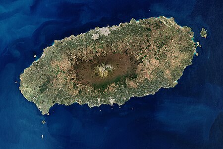
File:Cheju etm 2000097 lrg.jpg, featured
[edit]Voting period is over. Please don't add any new votes.Voting period ends on 4 Nov 2013 at 21:00:34 (UTC)
Visit the nomination page to add or modify image notes.
 Info Jeju Island, South Korea, 2000, created by NASA/Robert Simmon - uploaded by Jyusin - nominated by Brandmeister -- Brandmeister (talk) 21:00, 26 October 2013 (UTC)
 Support -- Brandmeister (talk) 21:00, 26 October 2013 (UTC)
 Support Kruusamägi (talk) 23:27, 26 October 2013 (UTC)
 Support Michael Barera (talk) 00:26, 27 October 2013 (UTC)
 Support --King of ♥ ♦ ♣ ♠ 03:42, 27 October 2013 (UTC)
 Support JKadavoor Jee 16:37, 29 October 2013 (UTC)
 Support Poco2 21:06, 29 October 2013 (UTC)
 Support Blurred Lines 14:10, 30 October 2013 (UTC)
 Support — Julian H.✈ (talk/files) 14:36, 30 October 2013 (UTC)
Voting period is over. Please don't add any new votes.Voting period ends on 5 Nov 2013 at 00:55:21 (UTC)
Visit the nomination page to add or modify image notes.
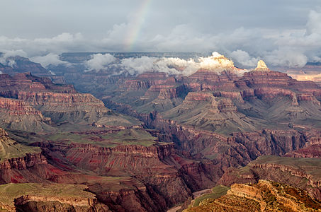
 Info created by User:Tuxyso - uploaded by Tuxyso - nominated by Tuxyso -- Tuxyso (talk) 00:55, 27 October 2013 (UTC)
 Support -- Tuxyso (talk) 00:55, 27 October 2013 (UTC)
 Oppose Good quality, not a bad picture but not wow IMO -- Christian Ferrer (talk) 18:09, 27 October 2013 (UTC)
 Support definitely enough wow for me. -- Felix König ✉ 20:08, 27 October 2013 (UTC)
 Support I've never seen greenery there before. -- Colin (talk) 14:16, 29 October 2013 (UTC)
 Support --Laitche (talk) 15:16, 29 October 2013 (UTC)
 Support Maybe a few minutes to late, but what a wow !! Please open it and enjoy !--Jebulon (talk) 18:02, 29 October 2013 (UTC)
- Thanks for your friendly words. At this evening I stood my very first time at the Grand Canyon and was deeply impressed by the beyond belief dimensions (from the viewpoint of an European citizen) and by the beautiful mood from the clouds and light. It is fantanstic to hear that I could transfer something of this special moment to the photo :) --Tuxyso (talk) 19:13, 29 October 2013 (UTC)
 Oppose I think something's wrong with the color balance. I've looked at some of our other pictures of the Grand Canyon and none of them have green to the degree this does. With some color editing of the photo I might change my vote. --
 - IMHO there is nothing wrong with the color balance. At the time I've visited the Grand Canyon National Park there had been massive rain falls the days and weeks before. Opposing because the photo shows the Grand Canyon in an unfamiliar way (as pointed out by Jebulon) in not really understandable for me. Look also at the photo on the next day or on this or this one. Please take also a look on this blog entry at the same date or into this travel diary (both not by me but at the same time). Coupled with the nice evening light everything is as it should be. --Tuxyso (talk) 07:53, 30 October 2013 (UTC)
 Support I think this is a bit green but I'll AGF. --Pine✉ 07:09, 31 October 2013 (UTC)
- IMHO there is nothing wrong with the color balance. At the time I've visited the Grand Canyon National Park there had been massive rain falls the days and weeks before. Opposing because the photo shows the Grand Canyon in an unfamiliar way (as pointed out by Jebulon) in not really understandable for me. Look also at the photo on the next day or on this or this one. Please take also a look on this blog entry at the same date or into this travel diary (both not by me but at the same time). Coupled with the nice evening light everything is as it should be. --Tuxyso (talk) 07:53, 30 October 2013 (UTC)
 Support Blurred Lines 14:08, 30 October 2013 (UTC)
 Support Nice image.-Godot13 (talk) 06:23, 31 October 2013 (UTC)
 Support Not Bad ! -- Dey.sandip (talk) 11:26, 31 October 2013 (UTC)
 Support --Ivar (talk) 14:14, 31 October 2013 (UTC)
 Support --Stu Phillips (talk) 21:21, 2 November 2013 (UTC)
 Support --Ximonic (talk) 13:27, 3 November 2013 (UTC)
File:Hortus conclusum Tapestry.jpg, not featured
[edit]Voting period is over. Please don't add any new votes.Voting period ends on 8 Nov 2013 at 22:26:14 (UTC)
Visit the nomination page to add or modify image notes.
 Info created by Moroder - uploaded by Moroder - nominated by Moroder -- Wolfgang Moroder (talk) 22:26, 30 October 2013 (UTC)
 Support -- Wolfgang Moroder (talk) 22:26, 30 October 2013 (UTC)
 Neutral Congratulations for this nice and valuable work but it's blurred on the edges. -- Christian Ferrer (talk) 09:23, 1 Nonember 2013 (UTC)
Voting period is over. Please don't add any new votes.Voting period ends on 5 Nov 2013 at 03:18:58 (UTC)
Visit the nomination page to add or modify image notes.
 Info created by King of Hearts - uploaded by King of Hearts - nominated by King of Hearts -- King of ♥ ♦ ♣ ♠ 03:18, 27 October 2013 (UTC)
 Support -- King of ♥ ♦ ♣ ♠ 03:18, 27 October 2013 (UTC)
 Support -- Christian Ferrer (talk) 05:35, 27 October 2013 (UTC)
 Comment Wonderful sharpness. Is the clipping correctable? — Julian H.✈ (talk/files) 08:48, 27 October 2013 (UTC)
- Oops! When I developed it from the RAW I kept clipping under control, but my later contrast adjustments must have ruined it. I've uploaded a new version. --King of ♥ ♦ ♣ ♠ 09:35, 27 October 2013 (UTC)
- Nice,
 Support. — Julian H.✈ (talk/files) 10:44, 27 October 2013 (UTC)
- Nice,
- Oops! When I developed it from the RAW I kept clipping under control, but my later contrast adjustments must have ruined it. I've uploaded a new version. --King of ♥ ♦ ♣ ♠ 09:35, 27 October 2013 (UTC)
 Support --Joydeep Talk 12:38, 28 October 2013 (UTC)
 Support --Rjcastillo (talk) 13:30, 29 October 2013 (UTC)
 Support -- Arcalino (talk) 15:09, 29 October 2013 (UTC)
 Support Blurred Lines 14:06, 30 October 2013 (UTC)
 Support --Dey.sandip (talk) 11:23, 31 October 2013 (UTC)
 Support Michael Barera (talk) 00:11, 3 November 2013 (UTC)
Voting period is over. Please don't add any new votes.Voting period ends on 8 Nov 2013 at 09:10:17 (UTC)
Visit the nomination page to add or modify image notes.
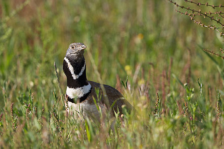
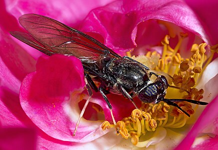
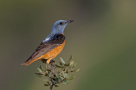
 Info created by Milan Nykodym - uploaded by Russavia - nominated by Russavia -- russavia (talk) 09:10, 30 October 2013 (UTC)
 Support -- russavia (talk) 09:10, 30 October 2013 (UTC)
 Comment It had been better to wait for an candidature until the running deletion request is finished. --Tuxyso (talk) 09:17, 30 October 2013 (UTC)
 Comment The DR has been closed, it's all good to go. russavia (talk) 09:42, 30 October 2013 (UTC)
 Support Tomer T (talk) 12:59, 1 November 2013 (UTC)
 Support --Steinsplitter (talk) 13:05, 1 November 2013 (UTC)
 Support Not a fan of the unsharp masking but everything else is really good. — Julian H.✈ (talk/files) 13:16, 1 November 2013 (UTC)
 Support Nice to see a photographer from Brno contributing quality content. It would be great if someone with Czech skills could add to the description. --Fæ (talk) 13:31, 1 November 2013 (UTC)
 Support --Alex Florstein (talk) 12:37, 2 November 2013 (UTC)
 Comment Very small... Downsampling ? Impossible to know, and it is not forbidden. But very small, and not that sharp for this size...--Jebulon (talk) 14:30, 2 November 2013 (UTC)
 Support Michael Barera (talk) 00:19, 3 November 2013 (UTC)
 Support Great bird ... WoW --PierreSelim (talk) 13:40, 3 November 2013 (UTC)
 Support --Ralf Roleček 10:18, 4 November 2013 (UTC)
 Support Really great! Jacopo Werther iγ∂ψ=mψ 00:25, 5 November 2013 (UTC)
Voting period is over. Please don't add any new votes.Voting period ends on 10 Nov 2013 at 12:09:29 (UTC)
Visit the nomination page to add or modify image notes.
 Info created by Sasha Kargaltsev (http://kargaltsev.com) - uploaded by Fæ - nominated by Fæ (talk) 12:09, 1 November 2013 (UTC)
 Support -- Fæ (talk) 12:09, 1 November 2013 (UTC)
 Oppose Maybe a nice idea for our FP gallery, but the quality at 100% view just doesn't fit the QI/FP standards. --A.Savin 11:51, 2 November 2013 (UTC)
 Oppose Not the best quality on this one. russavia (talk) 12:03, 2 November 2013 (UTC)
 Oppose per other opposes. --Alchemist-hp (talk) 17:24, 2 November 2013 (UTC)
 Oppose The DoF of the picture is a bizarre choice for a portrait of two people. The second fellow is noticeably out of focus and no one could seriously argue this was a creative choice. Saffron Blaze (talk) 01:26, 3 November 2013 (UTC)
 Oppose not sharp enougth --Ralf Roleček 10:17, 4 November 2013 (UTC)
 Oppose (formerly FPX) Image does not fall within the guidelines, it is not nearly sharp enough. --MichaelMaggs (talk) 12:15, 4 November 2013 (UTC)
- I have contested this early close even though we have seen only opposes. In line with the FPC General rules I would prefer this to run for the minimum normal time. An early close such as Michael has proposed would appear to be a way of mollifying the move to suppress this image as NSFW and is the sole current subject case example to support a current RFC about this type of censorship. Thanks --Fæ (talk) 16:22, 4 November 2013 (UTC)
 Comment I have replaced the image with a link. I have no problem with such works on Commons or being reviewed for FP but a general forum like FPC should remain "safe for work" (or safe for viewing while my in-laws are visiting!). I appreciate the lack of image makes the nomination harder-work but hope you understand. Not everyone here is reviewing images in the privacy of their own study, and could face significant embarrassment or even disciplinary action for viewing this. -- Colin (talk) 17:09, 3 November 2013 (UTC)
- Thanks for that. I got a bit of start when I was on a break at work and saw this come in through the corporate firewall. Saffron Blaze (talk) 18:36, 3 November 2013 (UTC)
- Wow Colin, what's embarassing on an art nude photo, furthermore on one in a thumbnail view? Imo, you're exaggerating. --A.Savin 19:38, 3 November 2013 (UTC)
- I would appreciate a bit of feedback on what images are to be censored in FPC candidate discussion as there ought to be an unambiguous definition that I can comply with. Nudity itself is not really "NSFW" in my view, this was a life study image, and an obviously gay one, but not a sexually explicit image or even an erotic one in my view. Thanks --Fæ (talk) 19:51, 3 November 2013 (UTC)
- Please avoid the C-word; this is not an issue of censorship and that word leads to a polarised mentality in discussions. Flickr offer some advice: "If you would hesitate to show your photos or videos to a child, your mum, or Uncle Bob" and "A good rule of thumb is, bare breasts and bottoms are "moderate." Full frontal nudity is "restricted."". I'd rate both the "moderate" and "restricted" Flickr categories as needing a link rather than preview image. This image is full-frontal nudity even if the intention is not in your opinion sexual or erotic. It is hard to give an "unambiguous definition" but if there is doubt, I think a link should be used instead. In the UK, imo, viewing such images in a professional open-plan office can lead to disciplinary actions (misuse of company facilities, sexual harassment in the workplace), as well as considerable embarrassment. A.Savin, if you think I am exaggerating then you need to read a UK employee handbook (the scope of "misuse of company facilities" is often worded extremely widely and the sentence for this "crime" can be as severe as instant dismissal). Perhaps you don't work in a mixed-sex open-plan professional office environment in a country like the UK? This isn't a "thumbnail" like on QI, but about 5x5 inches. One can get away with more nudity in a historical fine-art painting than in a photograph -- there's a considerable a social-attitude difference even if you believe there isn't a rational one. -- Colin (talk) 22:27, 3 November 2013 (UTC)
- A few simple points, from someone who happens to be the most active contributor to Wikimedia Commons this month:
- "Censorship" is not the C-word, you appear to be trying to create a parody here where even the concept of what might be censorship is as offensive to discuss as the word "cunt". We have an extremely clear section in one of our most important policies on this project, Commons:Project scope#Censorship. This photograph is not offensive sexual material in anyone's book. Thank you for your concern for my family, but my mother would not be in the least bit offended by this life study shot of a gay couple that is more romantic than erotic. If you are offended by it, I'm afraid that is your problem, not Wikimedia Commons' problem to hide it from you or your mum.
- It is not your job to hide content on Commons on the basis of what you personally think might be NSFW or not, based on rules that you are making up as you go along. If you think Commons should have a policy of hiding explicitly homosexual content or nude content then I suggest you run an RFC so that the Community can decide whether your ideas about censorship represent everyone else. Until you do manage to establish a community consensus for this type of censorship, I am restoring this photo to this discussion rather than allowing special rules on this discussion that exist nowhere else on Commons. Your personal opinions may be interesting, but do not have the power to overturn guidelines established by the community.
- Commons is not Flickr, quoting their policies here to justify your action in censoring this image is no justification.
- Commons has images of dead people, sex education content, nude women and images of highly offensive political and defamatory propaganda. If you work in an office environment where policies for internet access are so restrictive that you might get dismissed, then you probably should not randomly surf the internet at all. It is not within Commons' scope or any guidelines to comply with arbitrary policies that companies may have made up or may vary on a day to day basis, but are neither a national law, nor practical for this project.
- Thanks --Fæ (talk) 22:45, 3 November 2013 (UTC)
- You seem to have confused Commons hosting guidelines with the wishes of those participating at FPC -- the community at FPC can set their own guidelines wrt what material should be hidden from immediate display in that forum. I'm disappointed you are edit-warring over this without establishing consensus for change. You also seem to be confusing my personal opinions with those of my personnel department at work, views I have no control over and who do not have to conform to the kind of morality views at Commons yet have a rather large influence on my pay packet each month. If FPC is NSFW then I cannot and shall not participate. Goodbye. Colin (talk) 23:08, 3 November 2013 (UTC)
- Rubbish, boldly making a single edit to restore the discussion to comply with the norms of this project is not edit-warring. Neither have I "confused" the guidelines. If there are to be special rules for FPC that do not apply anywhere else on Commons, then you need to establish them as agreed with the community rather than dictating them on the community. As for your morality, you are most welcome to hold your views and discuss them here, but please do not assume that your morals are superior. Thanks --Fæ (talk) 23:14, 3 November 2013 (UTC)
- You seem to have confused Commons hosting guidelines with the wishes of those participating at FPC -- the community at FPC can set their own guidelines wrt what material should be hidden from immediate display in that forum. I'm disappointed you are edit-warring over this without establishing consensus for change. You also seem to be confusing my personal opinions with those of my personnel department at work, views I have no control over and who do not have to conform to the kind of morality views at Commons yet have a rather large influence on my pay packet each month. If FPC is NSFW then I cannot and shall not participate. Goodbye. Colin (talk) 23:08, 3 November 2013 (UTC)
- A few simple points, from someone who happens to be the most active contributor to Wikimedia Commons this month:
- If you are a UK office employee and you believe to endanger your job by watching FPC page as well as any other Wikimedia page on a computer in your office, you probably should avoid Wikimedia projects entirely while surfing on Internet at work. Wikimedia projects have for a good reason a purely educational purpose, there were already "worse" things (remember Vulva on WP Main Page?), we on Commons have also explicit pornographic images, so there were plenty of discusions on child protection, image filter etc., but fortunately none of them have been succesfull so far. Yes, in some countries you might lose your job, in some other countries maybe also your freedom or even your life (because there are still lots of backward barbaric countries in the world, even nor, in 2013); maybe also because of much more harmless pictures; but still, it is not Commons' job to safe you from such risks. Its only job is: hosting freely licensed educational content. --A.Savin 23:58, 3 November 2013 (UTC)
- Colin, seriously, get back to work, I am sure that your employer isn't paying you to be surfing the net, and even more sure that they are not paying you to argue on the internet. Also, I think you are coming across as a little high and mighty when you talk of the "FPC community", or is it that FPC in your mind is the feifdom of a few closed off entirely to the evil outsiders? Sorry, but we are all members of the same community, so Fae's suggestion of an RFC on the issue is a sound one. russavia (talk) 23:59, 3 November 2013 (UTC)
- So we leave a crap image on display, that is obviously not going to succeed as FP given the community's standards, just to spite people that have concerns as to when and where it gets displayed? Brilliant. Saffron Blaze (talk) 01:46, 4 November 2013 (UTC)
- Most of the body of Kargaltsev's works are related to his gay life, however he has made some studies of non-gay subjects such as this nude portrait of a heterosexual couple which I doubt would be suppressed due to arbitrary claims of being NSFW. I would be surprised if all of his artwork was considered "crap" by the community and I would be interested to know if alternative gay related photographs published on Commons under Category:Files from Sasha Kargaltsev Flickr stream that feature nude or semi-nude gay men would also be subject to censorship if I nominate them here. --Fæ (talk) 08:12, 4 November 2013 (UTC)
- How do we know this heterosexual couple is heterosexual? Are they a couple at all? Nothing on the flickr site would allude to these assertions as being fact. Actually the commentary in the description would lead me to think otherwise, albeit in a rather humorous way. Regardless, it is all irrelevant. The nominated image is of an exceedingly poor technical quality that it is appalling you nominated it. Moreover, your desire to make it a test case should not trump accepted FPC practices. The fact that you persist in throwing around the censorship card speaks clearly to your motives not Colin's. However, let me assure you I would have objected to any image on FPC that displayed full frontal human nudity. Not because I am prude, but rather because I would like to exercise control of what gets displayed on my screen beyond a certain limit as a courtesy to those around me and out of respect for the terms of acceptable use I often commit to, to use various venues of Internet access. Saffron Blaze (talk) 03:56, 5 November 2013 (UTC)
- Most of the body of Kargaltsev's works are related to his gay life, however he has made some studies of non-gay subjects such as this nude portrait of a heterosexual couple which I doubt would be suppressed due to arbitrary claims of being NSFW. I would be surprised if all of his artwork was considered "crap" by the community and I would be interested to know if alternative gay related photographs published on Commons under Category:Files from Sasha Kargaltsev Flickr stream that feature nude or semi-nude gay men would also be subject to censorship if I nominate them here. --Fæ (talk) 08:12, 4 November 2013 (UTC)
- So we leave a crap image on display, that is obviously not going to succeed as FP given the community's standards, just to spite people that have concerns as to when and where it gets displayed? Brilliant. Saffron Blaze (talk) 01:46, 4 November 2013 (UTC)
| Thank you for nominating this image. Unfortunately, it does not fall within the Guidelines and is unlikely to succeed for the following reason: no more reasonable chance of success now (only one support vote, by the nominator, and six oppose), and above all technically below of the standard qualities for a FP (Blurry, unsharp) --Jebulon (talk) 17:51, 4 November 2013 (UTC) | Anyone other than the nominator who disagrees may override this template by changing {{FPX}} to {{FPX contested}} and adding a vote in support. Voting will then continue in the usual way. If not contested within 24 hours, this nomination may be closed. |
- I have contested this early close even though we have seen only opposes. In line with the FPC General rules I would prefer this to run for the minimum normal time. An early close such as Jebulon has proposed would appear to be a way of mollifying the move to suppress this image as NSFW and is the sole current subject case example to support a current RFC about this type of censorship. Thanks --Fæ (talk) 18:08, 4 November 2013 (UTC)
- Fae, I've reverted your edit as the image is indeed not FP quality, with little chance of passing. I understand and share your concerns, especially as it relates to people who should be working trying to censor the project, but seriously this is not the image to use to have such a discussion that you wish to have. russavia (talk) 18:37, 4 November 2013 (UTC)
- I have contested this early close even though we have seen only opposes. In line with the FPC General rules I would prefer this to run for the minimum normal time. An early close such as Jebulon has proposed would appear to be a way of mollifying the move to suppress this image as NSFW and is the sole current subject case example to support a current RFC about this type of censorship. Thanks --Fæ (talk) 18:08, 4 November 2013 (UTC)
 Question May I move this per General rules: 9. Pictures tagged {{FPX}} may be removed from the list 24 hours after the tag was applied, provided there are no support votes other than that of the nominator. People can still see this at Commons:Featured_picture_candidates/File:Kelvin_and_Aren.jpg. This was initially tagged by MichaelMaggs at 12:15, 4 November 2013 (UTC). JKadavoor Jee 13:58, 5 November 2013 (UTC)
- Yes, that would be in line with the rules, as no-one other than the proposer has supported. --MichaelMaggs (talk) 14:50, 5 November 2013 (UTC)
File:Joshua Tree National Park 2013.jpg, featured
[edit]Voting period is over. Please don't add any new votes.Voting period ends on 9 Nov 2013 at 10:09:32 (UTC)
Visit the nomination page to add or modify image notes.
 Info Typical view of Joshua Tree National Park with impressive rocks and Johshua trees (Yucca brevifolia). The photo is taken from the parking lot close to the Banana Cracks Formation
created by Tuxyso - uploaded by Tuxyso - nominated by Tuxyso -- Tuxyso (talk) 10:09, 31 October 2013 (UTC) Support -- Tuxyso (talk) 10:09, 31 October 2013 (UTC)
 Support --Alex Florstein (talk) 18:55, 31 October 2013 (UTC)
 Support, I would only stamp/crop out that thing reaching in from the right edge of the frame. — Julian H.✈ (talk/files) 19:15, 31 October 2013 (UTC)
 Done Thanks for the hint! I've stamped it out. --Tuxyso (talk) 20:57, 31 October 2013 (UTC)
- Can we request the image be moved to a title which properly spells Joshua? Rmhermen (talk) 02:54, 1 November 2013 (UTC)
 Done I've moved the original file and the FPC template. Probably an admin an cross-check if the rename action had other side-effects because the file was used on many pages. --Tuxyso (talk) 07:29, 1 November 2013 (UTC)
 Support There is a flying twig above the right rock, can you remove it? anyway nice. --Christian Ferrer (talk) 08:56, 1 November 2013 (UTC)
 Support Very nice. I would also cut out the blurred flying object above the right rock. There is also very soft dust spot above the left rock. -- Norbert Nagel (talk) 10:25, 1 November 2013 (UTC)
 Done Bird spot removed. But I could not reveal the "very soft dust spot" --Tuxyso (talk) 11:19, 1 November 2013 (UTC)
 Support --Myrabella (talk) 15:12, 1 November 2013 (UTC)
 Support --JLPC (talk) 08:02, 2 November 2013 (UTC)
 Support Michael Barera (talk) 00:21, 3 November 2013 (UTC)
 Support--David1010 08:54, 3 November 2013 (UTC)
 Support Jacopo Werther iγ∂ψ=mψ 12:44, 3 November 2013 (UTC)
 Support --Joydeep Talk 19:26, 3 November 2013 (UTC)
 Support Blurred Lines 14:28, 4 November 2013 (UTC)
File:Buldern, Schloss Buldern -- 2.jpg, featured
[edit]Voting period is over. Please don't add any new votes.Voting period ends on 9 Nov 2013 at 16:43:42 (UTC)
Visit the nomination page to add or modify image notes.
 Info created by XRay - uploaded by XRay - nominated by XRay -- XRay talk 16:43, 31 October 2013 (UTC)
 Support -- XRay talk 16:43, 31 October 2013 (UTC)
 Support Very nice! I suggest to clone out lonely branch on the left and one small spot on the sky. --Ivar (talk) 17:12, 31 October 2013 (UTC)
 Done Branch and spot removed.--XRay talk 17:52, 31 October 2013 (UTC)
 Support As I know from own noms architecture shots with reflection in the water have somehow an advantage on FPC. IMHO the photo is very good, the composition is harmonic, light is nice, framing is also good. I would suggest to work a bit on the dark bushes at the left - they are quite noisy and noise + sharpening leads to unfortunate sharpening artefacts. Give the new radial filters in LR 5 a try and apply strong noise reduction in that edge and reduce clarity. Probably it will help. If you have the RAW I can also give the photo a try. --Tuxyso (talk) 21:04, 31 October 2013 (UTC)
 Done Really nice filter, I didn't know this feature. Thank you!--XRay talk 06:40, 1 November 2013 (UTC)
- well done, but you added an unintended side-effect (see note). There is now a green cast on the water surface. --Tuxyso (talk) 07:40, 1 November 2013 (UTC)
- Sorry, there was a bad preset in LR5. I made it again and it seems OK.--XRay talk 08:16, 1 November 2013 (UTC)
- well done, but you added an unintended side-effect (see note). There is now a green cast on the water surface. --Tuxyso (talk) 07:40, 1 November 2013 (UTC)
 Support — Julian H.✈ (talk/files) 10:20, 1 November 2013 (UTC)
 Support --Christian Ferrer (talk) 10:33, 31 October 2013 (UTC)
 Support despite some color noise in the bottom left, but the essential elements in this photo are very good and pleasant.. --Myrabella (talk) 15:04, 1 November 2013 (UTC)
 Support --JLPC (talk) 08:00, 2 November 2013 (UTC)
 Support --Alex Florstein (talk) 12:38, 2 November 2013 (UTC)
 Support --Böhringer (talk) 23:00, 2 November 2013 (UTC)
 Support Michael Barera (talk) 00:22, 3 November 2013 (UTC)
 Support--David1010 08:52, 3 November 2013 (UTC)
 Neutral Good subject lighting but too many underexposed areas in the picture IMO Poco2 09:20, 3 November 2013 (UTC)
 Support Blurred Lines 14:27, 4 November 2013 (UTC)
File:Lycopsid joggins mcr1.JPG, not featured
[edit]Visit the nomination page to add or modify image notes.
 Info created by User:Rygel, M.C. - uploaded by User:Rygel, M.C. - nominated by User:Rygel, M.C. -- Rygel, M.C. (talk) 02:23, 5 November 2013 (UTC)
 Support -- Rygel, M.C. (talk) 02:23, 5 November 2013 (UTC)
 Oppose Very interesting subject but too low overall quality. --Selbymay (talk) 10:28, 5 November 2013 (UTC)
File:Mariatrost.jpg, not featured
[edit]Voting period is over. Please don't add any new votes.Voting period ends on 5 Nov 2013 at 18:31:52 (UTC)
Visit the nomination page to add or modify image notes.
 Info all by darkweasel94 -- darkweasel94 18:31, 27 October 2013 (UTC)
 Support -- darkweasel94 18:31, 27 October 2013 (UTC)
 Support --JLPC (talk) 14:49, 28 October 2013 (UTC)
 Support good composition and mood.--Jebulon (talk) 20:54, 30 October 2013 (UTC)
 Oppose Yes, nice tram, nice background. But the quality isn't particularly good: not enough DoF, CA's. If you have the RAW file, you may send it to me and I would see what I can do (at least concerning CA's). --A.Savin 19:51, 31 October 2013 (UTC)
- Where do you see CAs? The automatic CA correction I used did indeed create some new CAs in some areas of the image while removing those in other places, so I exported it once with and once without CA correction and then stitched two halves together. It is possible that I may have overseen something somewhere, maybe you can add image notes to show me? darkweasel94 20:15, 31 October 2013 (UTC)
- On the church, on trees at the left. "Automatic correction ... create some new CAs"? This I cannot comprehend. Any usual RAW converter like Canon DPP should be able to remove it entirely. --A.Savin 21:08, 31 October 2013 (UTC)
- I use darktable, which has a CA correction tool that sometimes appears to detect CAs where there are none, then tries to correct them and adds new ones due to that. :/ However, now at second glance I'm seeing that the version with the correction turned on was actually quite good - at first glance I thought I saw some CAs that weren't in the other version, but now I can't see them anymore. I'm going to upload a new version, I hope it is better. Thank you for the feedback. darkweasel94 21:22, 31 October 2013 (UTC)
- On the church, on trees at the left. "Automatic correction ... create some new CAs"? This I cannot comprehend. Any usual RAW converter like Canon DPP should be able to remove it entirely. --A.Savin 21:08, 31 October 2013 (UTC)
- Where do you see CAs? The automatic CA correction I used did indeed create some new CAs in some areas of the image while removing those in other places, so I exported it once with and once without CA correction and then stitched two halves together. It is possible that I may have overseen something somewhere, maybe you can add image notes to show me? darkweasel94 20:15, 31 October 2013 (UTC)
 Support Tomer T (talk) 13:04, 1 November 2013 (UTC)
 Support JKadavoor Jee 16:15, 1 November 2013 (UTC)
File:Israel-2013-Jaffa 10-Al-Bahr Mosque.jpg, not featured
[edit]Voting period is over. Please don't add any new votes.Voting period ends on 6 Nov 2013 at 03:26:51 (UTC)
Visit the nomination page to add or modify image notes.
 Info created, uploaded, and nominated by -- Godot13 (talk) 03:26, 28 October 2013 (UTC)
 Support -- Godot13 (talk) 03:26, 28 October 2013 (UTC)
 Support Very good.--Jebulon (talk) 22:08, 29 October 2013 (UTC)
File:Statue Robert E. Lee Richmond.JPG, not featured
[edit]Voting period is over. Please don't add any new votes.Voting period ends on 6 Nov 2013 at 05:28:30 (UTC)
Visit the nomination page to add or modify image notes.
 Info all by -- Martin Falbisoner (talk) 05:28, 28 October 2013 (UTC)
 Support -- Martin Falbisoner (talk) 05:28, 28 October 2013 (UTC)
 Support --Christian Ferrer (talk) 05:49, 28 October 2013 (UTC)
 Comment sharpening haloes on horse's legs --A.Savin 09:37, 28 October 2013 (UTC)
- should be
 Fixed --Martin Falbisoner (talk) 17:01, 28 October 2013 (UTC)
- should be
 Support good now --A.Savin 20:21, 28 October 2013 (UTC)
 Support --Tuxyso (talk) 22:21, 28 October 2013 (UTC)
 Oppose Now enough wow or interest for me, sorry. -- Colin (talk) 13:49, 29 October 2013 (UTC)
 Support Michael Barera (talk) 00:14, 3 November 2013 (UTC)
 Oppose The monument is very sharp and well exposed. The also sharp buildigns in the background do not help. Despite its good qualities I do not think it is interesting enough to be featured. No doubt it deserves its QI status. Barcex (talk) 21:02, 3 November 2013 (UTC)
File:Bjurfors mansion autumn.jpg, featured
[edit]Voting period is over. Please don't add any new votes.Voting period ends on 6 Nov 2013 at 15:29:11 (UTC)
Visit the nomination page to add or modify image notes.
 Info all by me. -- V-wolf (talk) 15:29, 28 October 2013 (UTC)
 Abstain as uploader-- V-wolf (talk) 15:29, 28 October 2013 (UTC)
 Support --Laitche (talk) 15:53, 28 October 2013 (UTC)
 Support --Böhringer (talk) 21:29, 28 October 2013 (UTC)
 Support -- Norbert Nagel (talk) 10:16, 1 November 2013 (UTC)
 Support Michael Barera (talk) 00:14, 3 November 2013 (UTC)
 Support Christian Ferrer (talk) 14:05, 3 November 2013 (UTC)
 Support Blurred Lines 14:32, 4 November 2013 (UTC)
 Support JKadavoor Jee 03:03, 6 November 2013 (UTC)
File:Cave Temple 4, Badami.jpg, not featured
[edit]Voting period is over. Please don't add any new votes.Voting period ends on 9 Nov 2013 at 11:04:00 (UTC)
Visit the nomination page to add or modify image notes.
 Info Rock cut cave 4 at Badami, c/u/n by Dey.sandip -- Dey.sandip (talk) 11:04, 31 October 2013 (UTC)
 Support -- Dey.sandip (talk) 11:04, 31 October 2013 (UTC)
 Comment Nice and valuable image but I think (because I've tried on my pc) that it's possible to improve it with put down the highlights in the low part and brightening the shadows in the upper part, if you want I can uploaded a reworked version -- Christian Ferrer (talk) 10:18, 1 November 2013 (UTC)
- Thanks for your interest. I guess the modifications that you are suggesting, will represent an alternate lightning situation than what was really present at the time of capture. Nonetheless, it would be interesting to see the re-worked image. I suggest, instead of creating a new version of this image, you upload your rework as a new derivative file/work (with source as this image) and also put that as an alternative in the nomination. That way, users can review both and make their assessments. --Dey.sandip (talk) 10:35, 1 November 2013 (UTC)
Alternative
[edit] Support Alternative version uploaded by me -- Christian Ferrer (talk) 10:59, 1 November 2013 (UTC)
File:Czech-2013-Theresienstadt-Cell 27.jpg, not featured
[edit]Voting period is over. Please don't add any new votes.Voting period ends on 10 Nov 2013 at 20:25:24 (UTC)
Visit the nomination page to add or modify image notes.
 Info Interior, Cell 27, Theresienstadt concentration camp. Created, uploaded, and nominated by -- Godot13 (talk) 20:25, 1 November 2013 (UTC)
 Support -- Godot13 (talk) 20:25, 1 November 2013 (UTC)
 Neutral A bit noisy for me to be featured, but a valued and good image! -- Christian Ferrer (talk) 15:18, 3 November 2013 (UTC)
 Oppose remarkable color noise. --Vamps (talk) 19:13, 3 November 2013 (UTC)
 I withdraw my nomination-Godot13 (talk) 10:16, 5 November 2013 (UTC)
File:Madeleine Paris.jpg, not featured
[edit]Voting period is over. Please don't add any new votes.Voting period ends on 6 Nov 2013 at 20:20:40 (UTC)
Visit the nomination page to add or modify image notes.
 Info All by me -- Jebulon (talk) 20:20, 28 October 2013 (UTC)
 Support View of the church "La Madeleine" in Paris, France.-- Jebulon (talk) 20:20, 28 October 2013 (UTC)
 Support A bit grainy? Maybe. Overprocessed and oversharpened? Possibly. But I'm still wowed. Seriously. --Martin Falbisoner (talk) 20:47, 28 October 2013 (UTC)
 Oppose Too very bad cut.... and quality (from the sensor/exposure) is not suitable for Featured picture for me. Also (but this is personal) I find the subject uninteresting, it's a fake play very tacky. But the main reason is the bad angle and, above all, the cut of the picture, to me impossible for a Featured picture --Pava (talk) 23:30, 28 October 2013 (UTC)
- To me, the angle and the cut are particularly excellent for this building, and I don't understand it's a fake play very tacky.--Jebulon (talk) 09:38, 29 October 2013 (UTC)
 Comment Imho it's oversharpened. --Ivar (talk) 08:02, 29 October 2013 (UTC)
 Oppose now. --Ivar (talk) 13:14, 2 November 2013 (UTC)
 Oppose Your edit with GIMP has made it worse (oversharpened, too much contrast). There is some CA too, so a more professional image converter software would probably do a better job with this. But the scaffolding in the building is a negative and the lighting is fairly hard. -- Colin (talk) 09:10, 29 October 2013 (UTC)
 Support --JLPC (talk) 08:07, 2 November 2013 (UTC)
 Support Michael Barera (talk) 00:14, 3 November 2013 (UTC)
 Support Despite a few minor issues (bottom crop, hard light), good enough for FP. --Selbymay (talk) 10:03, 5 November 2013 (UTC)
- Thank you very much to all reviewers, pro and contra. Frankly, I think this does not deserve the label. It is an old picture for me (2011), and I think I can do better now. It was just an attempt, and a way for me to "test" this image. --Jebulon (talk) 08:38, 7 November 2013 (UTC)
File:Panorama Bergamo.JPG, not featured
[edit] Info created by Dimа - uploaded by Dimа - nominated by Dimа --Dimа (talk) 07:50, 1 November 2013 (UTC)
 Comment Please follow the instructions at Commons:Featured_picture_candidates#Adding_a_new_nomination to create your nomination. — Julian H.✈ (talk/files) 10:02, 1 November 2013 (UTC)
 Comment I am not entirely convinced of the composition, the picture is dominated by trees and the foreground and the city is only visible in the background.--ArildV (talk) 08:49, 2 November 2013 (UTC)
 Support good composition and light and color, unfortunately, the preview is really small and discourages the evaluator, but once you acquire it opened its "wow effect" beautiful the two roads on either side, very original --Pava (talk) 13:08, 2 November 2013 (UTC)
File:Ponte Vecchio at dusk 2.JPG, not featured
[edit]Voting period is over. Please don't add any new votes.Voting period ends on 14 Nov 2013 at 07:56:23 (UTC)
Visit the nomination page to add or modify image notes.
 Info all by -- Martin Falbisoner (talk) 07:56, 5 November 2013 (UTC)
 Support -- Martin Falbisoner (talk) 07:56, 5 November 2013 (UTC)
 Oppose Nice view but CA (esp. on left), too much NR, oversharpened, and posterization in sky and water. --King of ♥ ♦ ♣ ♠ 08:02, 5 November 2013 (UTC)
 Oppose Quite impressive a first view but too much loss of details and odd composition, what is to see? The bridge appears too far away. --Selbymay (talk) 10:14, 5 November 2013 (UTC)
 I withdraw my nomination OK, I guess I'll have to work on it --Martin Falbisoner (talk) 11:13, 5 November 2013 (UTC)
File:Souq Waqif, Doha, Catar, 2013-08-05, DD 108.JPG, not featured
[edit]Voting period is over. Please don't add any new votes.Voting period ends on 13 Nov 2013 at 19:15:27 (UTC)
Visit the nomination page to add or modify image notes.
 Info Alley in the Old Souq Waqif market, Doha, Qatar. All by me, Poco2 19:15, 4 November 2013 (UTC)
 Support -- Poco2 19:15, 4 November 2013 (UTC)
 Oppose QI but what is featurable here? I only see an empty alley in perspective under a boring light. --Selbymay (talk) 10:34, 5 November 2013 (UTC)
 Oppose Not the best light and disturbing stairs at bottom left -- Christian Ferrer (talk) 11:54, 5 November 2013 (UTC)
- Sorry!, I didn't mean to offend anybody, I take it back
 I withdraw my nomination Poco2 19:49, 5 November 2013 (UTC)
- Sorry!, I didn't mean to offend anybody, I take it back
File:Crew of STS-107, official photo.jpg, not featured
[edit]Voting period is over. Please don't add any new votes.Voting period ends on 5 Nov 2013 at 21:21:19 (UTC)
Visit the nomination page to add or modify image notes.
 Info created by NASA - uploaded by Tom - nominated by Mono -- —Mono 21:21, 27 October 2013 (UTC)
 Info Previous nom: Commons:Featured picture candidates/File:Crew of STS-107, official photo.jpg
 Support -- —Mono 21:21, 27 October 2013 (UTC)
 Support as nominator on English Wikipedia where it is already featured. --Pine✉ 07:13, 29 October 2013 (UTC)
 Oppose Not an exceptional studio photograph. -- Colin (talk) 14:02, 29 October 2013 (UTC)
 Support --King of ♥ ♦ ♣ ♠ 03:52, 31 October 2013 (UTC)
 Support
 Support
 Support --Ralf Roleček 10:20, 4 November 2013 (UTC)
File:San Francisco City Hall.jpg, not featured
[edit]Voting period is over. Please don't add any new votes.Voting period ends on 7 Nov 2013 at 00:21:59 (UTC)
Visit the nomination page to add or modify image notes.
 Info created by JaGa - uploaded by JaGa - nominated by Nikhil -- Nikhil (talk) 00:22, 29 October 2013 (UTC)
 Support -- Nikhil (talk) 00:22, 29 October 2013 (UTC)
 Comment Very nice, but there is more room for exposure. --Ivar (talk) 08:53, 29 October 2013 (UTC)
- Agree. I know the building isn't white, but still the image appears underexposed. Also lacks colourspace: please save with sRGB colourspace. -- Colin (talk) 13:32, 29 October 2013 (UTC)
- I'd be glad if anyone of you can add an edit. I don't know how to do it. Thanks in advance. Nikhil (talk) 14:05, 29 October 2013 (UTC)
- I'm reluctant to make edits to JPGs as the best strategy is go work from the "digital negative" -- the raw file. A significant edit should really be saved as a different filename. Have you tried contacting the creator? -- Colin (talk) 14:27, 29 October 2013 (UTC)
- I'd be glad if anyone of you can add an edit. I don't know how to do it. Thanks in advance. Nikhil (talk) 14:05, 29 October 2013 (UTC)
- Agree. I know the building isn't white, but still the image appears underexposed. Also lacks colourspace: please save with sRGB colourspace. -- Colin (talk) 13:32, 29 October 2013 (UTC)
 Question What is the benefit of the nomination here compared to File:San_Francisco_City_Hall_September_2013_panorama_3.jpg which is already FP? Perspective is very similiar. --Tuxyso (talk) 15:53, 29 October 2013 (UTC)
- We have many subjects for which we have multiple FPs. So I thought why not this one? Nikhil (talk) 16:16, 30 October 2013 (UTC)
- I considered this picture while adding that KoH picture to the article. A difficult choice, but it stays there since October 1. :) JKadavoor Jee 16:48, 29 October 2013 (UTC)
 Support Michael Barera (talk) 00:15, 3 November 2013 (UTC)
File:Ajaccio phare citadelle.jpg, featured
[edit]Voting period is over. Please don't add any new votes.Voting period ends on 7 Nov 2013 at 11:55:19 (UTC)
Visit the nomination page to add or modify image notes.
 Info created, uploaded and nominated by Myrabella -- Myrabella (talk) 11:55, 29 October 2013 (UTC)
 Support -- Myrabella (talk) 11:55, 29 October 2013 (UTC)
 Oppose QI but not FP. Not enough wow. Composition focuses my eye on the small object in the sea to the left, rather than lighthouse. -- Colin (talk) 13:23, 29 October 2013 (UTC)
 Info The small object is a complementary light (range: 7 miles (13 Km)). The main lighthouse has a range of 16 miles (30 Km). They work as a set, in fact! --Myrabella (talk) 13:42, 29 October 2013 (UTC)
 Support Good colors and atmosphere. Plenty of wow for me. --King of ♥ ♦ ♣ ♠ 18:22, 29 October 2013 (UTC)
 Support —Mono 23:49, 29 October 2013 (UTC)
 Oppose If the lighthouse is the main subject, it should have been given more prominence. Right now, it just occupies a small fraction of the frame. A re-compose may help --Dey.sandip (talk) 07:57, 30 October 2013 (UTC)
 Support --Berthold Werner (talk) 12:27, 30 October 2013 (UTC)
 Support--JLPC (talk) 15:12, 30 October 2013 (UTC)
 Support --Joydeep Talk 17:36, 30 October 2013 (UTC)
 Support Very good light and composition.--Jebulon (talk) 20:47, 30 October 2013 (UTC)
 Oppose Composition issues, per Dey. Too much in the image if the lighthouse is meant to be the subject. Daniel Case (talk) 15:08, 31 October 2013 (UTC)
 Support
 Oppose per others. --Ivar (talk) 11:53, 1 November 2013 (UTC)
 Comment I understand opositions of others and I think the left part is not the problem... it's the low part. The fact the eyes ares focused on the small object at left is not a problem IMO because it's a part of the composition and it's not bad, if you crop the low part (see note) your composition take all its purpose and the image is more balanced, I've tried and I think it's much better. --Christian Ferrer (talk) 12:56, 1 November 2013 (UTC)
 Done Well, Christian, I think you may be right. I made a crop as suggested, and I am rather happy with the result.New version uploaded, thank you for the suggestion. --Myrabella (talk) 14:01, 1 November 2013 (UTC)
 Support No, thank you to have tried --Christian Ferrer (talk) 14:09, 1 November 2013 (UTC)
 Support Michael Barera (talk) 00:16, 3 November 2013 (UTC)
- weak
 Support Blurred Lines 14:41, 4 November 2013 (UTC)
  Oppose Composition, per others. --Laitche (talk) 20:29, 6 November 2013 (UTC)
Alternative
[edit]- Thanks to all the reviewers. Taking account of criticism about the composition, I propose this alternative where the lighthouse itself is more prominent. It is not a crop but another shot. --Myrabella (talk) 20:45, 31 October 2013 (UTC)
 Support this. --Ivar (talk) 07:22, 1 November 2013 (UTC)
 Neutral The lighthouse is more prominent in this, no doubt. However, the lighting seems a bit harsh for this type of out-door image --Dey.sandip (talk) 10:46, 1 November 2013 (UTC)
 Oppose --Christian Ferrer (talk) 12:49, 1 November 2013 (UTC)
 Neutral IMHO the first one is better --Berthold Werner (talk) 13:11, 1 November 2013 (UTC)
 Neutral as Berthold, the other one is better to me. --Joydeep Talk 18:09, 1 November 2013 (UTC)
 Neutral better before imo. —Mono 02:45, 2 November 2013 (UTC)
 Neutral Une belle QI... Pour le reste tu connais mon opinion, qui est celle de Christian Ferrer.--Jebulon (talk) 11:00, 2 November 2013 (UTC)et techniquement, s'agissant d'une autre prise de vue, ce n'est pas une "alternative", à mon avis !
 Neutral Blurred Lines 14:31, 4 November 2013 (UTC)
File:Gypful.jpg, featured
[edit]Voting period is over. Please don't add any new votes.Voting period ends on 11 Nov 2013 at 15:54:26 (UTC)
Visit the nomination page to add or modify image notes.
 Info created & uploaded by Pierre Dalous - nominated by Citron -- Citron (talk) 15:54, 2 November 2013 (UTC)
 Support -- Citron (talk) 15:54, 2 November 2013 (UTC)
 Support — Julian H.✈ (talk/files) 16:05, 2 November 2013 (UTC)
 Support --Alchemist-hp (talk) 17:22, 2 November 2013 (UTC)
 Support --Stu Phillips (talk) 21:09, 2 November 2013 (UTC)
 Support Michael Barera (talk) 00:28, 3 November 2013 (UTC)
 Support Tomer T (talk) 03:08, 3 November 2013 (UTC)
 Support --Kikos (talk) 07:30, 3 November 2013 (UTC)
 Support Poco2 09:06, 3 November 2013 (UTC)
 Support --Ximonic (talk) 13:25, 3 November 2013 (UTC)
 Support --Christian Ferrer (talk) 13:44, 3 November 2013 (UTC)
 Support --Martin Falbisoner (talk) 13:51, 3 November 2013 (UTC)
 Support --Vamps (talk) 19:18, 3 November 2013 (UTC)
 Support --Joydeep Talk 19:26, 3 November 2013 (UTC)
 Support — Crisco 1492 (talk) 23:14, 3 November 2013 (UTC)
 Support --King of ♥ ♦ ♣ ♠ 02:02, 4 November 2013 (UTC)
 Support Blurred Lines 14:24, 4 November 2013 (UTC)
 Support Very nice! -- Wolf im Wald (keb) 20:08, 4 November 2013 (UTC)
 Support -- Norbert Nagel (talk) 20:50, 4 November 2013 (UTC)
 Neutral I am not audacious enough to vote with oppose because the quality / level of detail is very good compared to similiar shots. But the background is unfortunate. The color of the (rock?) matches the color of the bird's coat -OK- but it somehow cuts the birds and distracts from the main motive. The missing separation of the bird from the background is most notably in thumbnail view. --Tuxyso (talk) 20:14, 5 November 2013 (UTC)
- The background show the natural habitat, it's a educational value. It's quite blurred for separate, IMHO.--Citron (talk) 12:54, 6 November 2013 (UTC)
- I had not denied that it is the natural habitat. But from a photographic viewpoint the background is unfortunate. If the brown area had filled the complete background or if the whole body of the bird had been over the rock it had been much better. The way it is now the rocks (or whatever it is) cut the wings of the bird. It is the same as you cut a (human) head by a horizon line - a no-go for portayal shots. --Tuxyso (talk) 13:01, 6 November 2013 (UTC)
 Support Could you please add the coordinates? Gyps fulvus can be found in different places in Spain. At least something approximate. --Kadellar (talk) 12:05, 6 November 2013 (UTC)
 Info On Gyps fulvus the uploader (Kookaburra 81 = Pierre Dalous) wrote it was (somewhere around?) Huesca. --Amga (talk) 07:59, 7 November 2013 (UTC)
 Support --Böhringer (talk) 16:13, 6 November 2013 (UTC)
 Support @Tuxyso: natural habitats, and birds flying in front of rocks don't care about photographers & photographic viewpoints, btw... --Amga (talk) 07:59, 7 November 2013 (UTC)
- Your comment is not helpful. I would appreciate if you stick to the very content of my argument or to the photo. For details see your talk page. --Tuxyso (talk) 08:52, 7 November 2013 (UTC)
- Not at all a good background compared to File:Gyps fulvus 1 Luc Viatour.jpg ot File:Gyps fulvus 2 Luc Viatour.jpg. For explaining its natural habitat, we have pictures like this. I agree the current nomination too has its own merits (more detailed, legs visible, etc.) JKadavoor Jee 11:51, 7 November 2013 (UTC)
- Thanks! At least one person who understood my point. If it is important or not is a matter of personal taste. From a compositional point File:Gyps fulvus 2 Luc Viatour.jpg is much better than the nomination here. --Tuxyso (talk) 12:10, 7 November 2013 (UTC)
- Not at all a good background compared to File:Gyps fulvus 1 Luc Viatour.jpg ot File:Gyps fulvus 2 Luc Viatour.jpg. For explaining its natural habitat, we have pictures like this. I agree the current nomination too has its own merits (more detailed, legs visible, etc.) JKadavoor Jee 11:51, 7 November 2013 (UTC)
- Your comment is not helpful. I would appreciate if you stick to the very content of my argument or to the photo. For details see your talk page. --Tuxyso (talk) 08:52, 7 November 2013 (UTC)
File:Litoria caerulea- Wilhelma.jpg, featured
[edit]Voting period is over. Please don't add any new votes.Voting period ends on 11 Nov 2013 at 17:08:57 (UTC)
Visit the nomination page to add or modify image notes.
 Info created by Llez - uploaded by Llez - nominated by Llez -- Llez (talk) 17:08, 2 November 2013 (UTC)
 Support -- Llez (talk) 17:08, 2 November 2013 (UTC)
 Support --Stu Phillips (talk) 21:03, 2 November 2013 (UTC)
 Support Michael Barera (talk) 00:28, 3 November 2013 (UTC)
 Support Poco2 09:06, 3 November 2013 (UTC)
 Support --Ximonic (talk) 13:24, 3 November 2013 (UTC)
 Support --Christian Ferrer (talk) 13:45, 3 November 2013 (UTC)
 Support --Ivar (talk) 13:54, 3 November 2013 (UTC)
 Support --JLPC (talk) 16:54, 3 November 2013 (UTC)
 Support --Joydeep Talk 19:26, 3 November 2013 (UTC)
 Support --Steinsplitter (talk) 20:52, 3 November 2013 (UTC)
 Support — Crisco 1492 (talk) 23:12, 3 November 2013 (UTC)
 Support JKadavoor Jee 09:50, 4 November 2013 (UTC)
 Support -- Norbert Nagel (talk) 21:04, 4 November 2013 (UTC)
File:Alcedo azurea - Julatten.jpg, featured
[edit]Voting period is over. Please don't add any new votes.Voting period ends on 11 Nov 2013 at 00:21:51 (UTC)
Visit the nomination page to add or modify image notes.
 Info created by JJ Harrison - uploaded by JJ Harrison - nominated by Blurred Lines -- Blurred Lines 00:21, 2 November 2013 (UTC)
 Support -- Blurred Lines 00:21, 2 November 2013 (UTC)
 Support --Alchemist-hp (talk) 17:21, 2 November 2013 (UTC)
 Support --Stu Phillips (talk) 21:05, 2 November 2013 (UTC)
 Support --Böhringer (talk) 22:56, 2 November 2013 (UTC)
 Support --Frank Schulenburg (talk) 23:50, 2 November 2013 (UTC)
 Support Michael Barera (talk) 00:26, 3 November 2013 (UTC)
 Support--David1010 08:47, 3 November 2013 (UTC)
 Support Poco2 09:08, 3 November 2013 (UTC)
 Support Barcex (talk) 09:34, 3 November 2013 (UTC)
 Support --JLPC (talk) 16:52, 3 November 2013 (UTC)
 Support -- Norbert Nagel (talk) 20:50, 4 November 2013 (UTC)
 Support --King of ♥ ♦ ♣ ♠ 00:00, 5 November 2013 (UTC)
File:NGC602.jpg, not featured
[edit]Voting period is over. Please don't add any new votes.Voting period ends on 7 Nov 2013 at 07:00:23 (UTC)
Visit the nomination page to add or modify image notes.
 Info created by NASA, ESA, and the Hubble Heritage Team (STScI/AURA)-ESA/Hubble Collaboration - uploaded by Tryphon - nominated by Pine -- Pine✉ 07:00, 29 October 2013 (UTC)
 Support -- Pine✉ 07:00, 29 October 2013 (UTC)
 Support Michael Barera (talk) 00:15, 3 November 2013 (UTC)
File:Clavulina coralloides, White Coral Fungus, UK.jpg, not featured
[edit]Voting period is over. Please don't add any new votes.Voting period ends on 11 Nov 2013 at 20:30:39 (UTC)
Visit the nomination page to add or modify image notes.
 Info created by Stu Phillips - uploaded by Stu Phillips - nominated by Stu Phillips -- Stu Phillips (talk) 20:30, 2 November 2013 (UTC)
 Neutral A bit overexposed IMO Christian Ferrer (talk) 14:09, 3 November 2013 (UTC)
 Comment I think the fungi were lit from behind and are translucent, so you don't see detail in the coral fungus tips, but I don't think they are overexposed --Stu Phillips (talk) 17:42, 3 November 2013 (UTC)
 Support Nice light. -- Norbert Nagel (talk) 20:58, 4 November 2013 (UTC)
File:Forum romanum 6k (5760x2097).jpg, featured
[edit]Voting period is over. Please don't add any new votes.Voting period ends on 11 Nov 2013 at 19:36:08 (UTC)
Visit the nomination page to add or modify image notes.
 Info created by BeBo86 - uploaded by BeBo86 - nominated by BeBo86 -- BeBo86 (talk) 19:36, 2 November 2013 (UTC)
 Support -- BeBo86 (talk) 19:36, 2 November 2013 (UTC)
 Support absolutely --Pava (talk) 20:32, 2 November 2013 (UTC)
 Support Michael Barera (talk) 00:29, 3 November 2013 (UTC)
 Support Poco2 09:11, 3 November 2013 (UTC)
 Support very good! --Martin Falbisoner (talk) 13:49, 3 November 2013 (UTC)
 Support I was there ! I encourage those who don't know this to travel to Rome, in order to see, one time in their life, one of the most marvelous places in the world (after Paris, of course
  ). Anyway, I don't like panoramas in general, but this one looks good because no too distorded. It is not pinsharp, and scaffoldings are a pity (not your fault), but it deserves the label IMO. suggestion: some annotations for identification of various monuments should help, as we see here the majors of them--Jebulon (talk) 15:34, 3 November 2013 (UTC)
 Support --JLPC (talk) 16:53, 3 November 2013 (UTC)
 Support --Vamps (talk) 19:17, 3 November 2013 (UTC)
 Support --Joydeep Talk 19:26, 3 November 2013 (UTC)
 Info thanks Jebulon, I intended to add annotations as soon as I'm allowed ;-) - hopefully tomorrow -- BeBo86 (talk) 20:06, 3 November 2013 (UTC)
 Support --King of ♥ ♦ ♣ ♠ 02:01, 4 November 2013 (UTC)
File:Cathedral of Christ the Saviour-1.jpg, not featured
[edit]Voting period is over. Please don't add any new votes.Voting period ends on 8 Nov 2013 at 06:05:17 (UTC)
Visit the nomination page to add or modify image notes.
 Info created by Aleks G - uploaded by Aleks G - nominated by Aleks G -- Aleks G (talk) 06:05, 30 October 2013 (UTC)
 Support -- Aleks G (talk) 06:05, 30 October 2013 (UTC)
 CommentToo tight crop above, IMO.--Jebulon (talk) 20:56, 30 October 2013 (UTC)
 Support Tomer T (talk) 13:02, 1 November 2013 (UTC)
 Support Michael Barera (talk) 00:18, 3 November 2013 (UTC)
 Oppose Color of sky is strange at top, one dustspot (right of the right tower) and perspectives issues Christian Ferrer (talk) 06:23, 3 November 2013 (UTC)
File:Suurupi alumine tuletorn1.jpg, not featured
[edit]Voting period is over. Please don't add any new votes.Voting period ends on 12 Nov 2013 at 07:30:06 (UTC)
Visit the nomination page to add or modify image notes.
 Info Suurupi wooden lighthouse, all by Ivar (talk) 07:30, 3 November 2013 (UTC)
 Abstain -- Ivar (talk) 07:30, 3 November 2013 (UTC)
 Comment Need little perspective corrections (see notes) -- Christian Ferrer (talk) 07:53, 3 November 2013 (UTC)
 Neutral Sorry but I'm not sure, I think the composition is a little bit cluttered. Too many things that draws attention (the stone in the foreground, the trees, the fence). Together, I think it is too much--ArildV (talk) 09:26, 3 November 2013 (UTC)
 Neutral And in more of perspectives, per ArildV. -- Christian Ferrer (talk) 13:34, 3 November 2013 (UTC)
File:Цветочные-часы,-Санкт-Петербург.jpg, not featured
[edit]Voting period is over. Please don't add any new votes.Voting period ends on 8 Nov 2013 at 06:19:56 (UTC)
Visit the nomination page to add or modify image notes.
 Info created by Aleks G - uploaded by Aleks G - nominated by Aleks G -- Aleks G (talk) 06:19, 30 October 2013 (UTC)
 Support -- Aleks G (talk) 06:19, 30 October 2013 (UTC)
 Support Michael Barera (talk) 00:19, 3 November 2013 (UTC)
File:Paul Coze (1936).jpg, not featured
[edit]Voting period is over. Please don't add any new votes.Voting period ends on 8 Nov 2013 at 21:51:58 (UTC)
Visit the nomination page to add or modify image notes.
 Info created by Willem van de Poll - uploaded by Jan Arkesteijn - nominated by Jan Arkesteijn -- Jan Arkesteijn (talk) 21:51, 30 October 2013 (UTC)
 Support -- Jan Arkesteijn (talk) 21:51, 30 October 2013 (UTC)
 Support Tomer T (talk) 12:58, 1 November 2013 (UTC)
 Support Michael Barera (talk) 00:20, 3 November 2013 (UTC)
Image:Semperoper (blue hour).jpg, not featured
[edit]Voting period is over. Please don't add any new votes.Voting period ends on 12 Nov 2013 at 20:34:56 (UTC)
Visit the nomination page to add or modify image notes.
 Info created by BeBo86 - uploaded by BeBo86 - nominated by BeBo86 -- BeBo86 (talk) 20:34, 3 November 2013 (UTC)
 Support -- BeBo86 (talk) 20:34, 3 November 2013 (UTC)
 Oppose Crop is a bit too tight on the top and sides, and unsharp on the sides. --King of ♥ ♦ ♣ ♠ 00:07, 5 November 2013 (UTC)
 Info tight crop is because I didn't have a more wide angled lens and took the photo literally with my back to the wall (actually I had to climb on the socket of a statue). Some areas left and right got lost when I did the perspective correction. A little unsharp on the sides is correct; I had opened the f-stop a bit to reduce "ghosts" runnning through the image. But your review is ok :-) BeBo86 (talk) 07:18, 5 November 2013 (UTC)
File:Casino Boat on the Mississippi River, Natchez, Mississippi, by Carol M. Highsmith.jpg, not featured
[edit]Voting period is over. Please don't add any new votes.Voting period ends on 12 Nov 2013 at 23:10:14 (UTC)
Visit the nomination page to add or modify image notes.
 Info created by Carol M. Highsmith - uploaded by Crisco 1492 - nominated by Crisco 1492 -- — Crisco 1492 (talk) 23:10, 3 November 2013 (UTC)
 Support -- — Crisco 1492 (talk) 23:10, 3 November 2013 (UTC)
 Oppose Great scene. On the ship, there are several very strong colour artifacts (saturated yellow and cyan), less obvious ones are also on the water, and the black point is pretty high. I would also prefer a composition with slightly less sky. — Julian H.✈ (talk/files) 12:40, 4 November 2013 (UTC)
 Oppose per Julian. --Joydeep Talk 17:41, 4 November 2013 (UTC)
 Oppose Too much blackness. --King of ♥ ♦ ♣ ♠ 00:07, 5 November 2013 (UTC)
File:Vista del Puerto de Victoria desde la Cumbre Victoria, Hong Kong, 2013-08-09, DD 11- 12 PAN.jpg, featured
[edit]Voting period is over. Please don't add any new votes.Voting period ends on 8 Nov 2013 at 23:33:35 (UTC)
Visit the nomination page to add or modify image notes.
 Info Night panoramic view of Victoria Harbour from Victoria Peak, Hong Kong. All by me, Poco2 23:33, 30 October 2013 (UTC)
 Support -- Poco2 23:33, 30 October 2013 (UTC)
 Support --Rjcastillo (talk) 01:51, 31 October 2013 (UTC)
 Support Brings back memories. Daniel Case (talk) 14:59, 31 October 2013 (UTC)
 Question is that reflection on the bottom right corner? --82.131.112.23 15:27, 31 October 2013 (UTC)
- No, that's a leaf Poco2 21:12, 31 October 2013 (UTC)
 Support Michael Barera (talk) 00:20, 3 November 2013 (UTC)
 Support--David1010 08:57, 3 November 2013 (UTC)
 Support --Joydeep Talk 19:26, 3 November 2013 (UTC)
 Support --Ralf Roleček 10:18, 4 November 2013 (UTC)
 Support --JLPC (talk) 08:30, 5 November 2013 (UTC)
Voting period is over. Please don't add any new votes.Voting period ends on 9 Nov 2013 at 12:31:24 (UTC)
Visit the nomination page to add or modify image notes.
 Info created by ArildV - uploaded by ArildV - nominated by Blurred Lines -- Blurred Lines 12:31, 31 October 2013 (UTC)
 Support -- Blurred Lines 12:31, 31 October 2013 (UTC)
 Support Maybe a little too much of black level but nice -- Christian Ferrer (talk) 14:54, 1 November 2013 (UTC)
 Support Good color, very large although not as deep, but with a good interpolation can be improved a lot if there is content of slightly smaller dimensions. The cut on the left is not the best but overall is good. --Pava (talk) 12:40, 2 November 2013 (UTC)
 Support Michael Barera (talk) 00:21, 3 November 2013 (UTC)
 Support--David1010 08:53, 3 November 2013 (UTC)
 Comment It needs a vertical perspective correction Poco2 09:21, 3 November 2013 (UTC)
- I dont think the image needs it. The trees are not straight in real life, and it is impossible to get serious perspective distortion with the lens being used (Nikon 50mm f/1.8 ai).--ArildV (talk) 09:33, 3 November 2013 (UTC)
- You are right, I didn't realize that. I'd support but just arrived a tick to late, Poco2 14:00, 9 November 2013 (UTC)
- I dont think the image needs it. The trees are not straight in real life, and it is impossible to get serious perspective distortion with the lens being used (Nikon 50mm f/1.8 ai).--ArildV (talk) 09:33, 3 November 2013 (UTC)
- Thank you very mutch for nomination!--ArildV (talk) 09:33, 3 November 2013 (UTC)
 Support --Joydeep Talk 17:51, 4 November 2013 (UTC)
 Support JKadavoor Jee 03:00, 6 November 2013 (UTC)
File:Святогорье-01.jpg, not featured
[edit]Voting period is over. Please don't add any new votes.Voting period ends on 9 Nov 2013 at 12:26:57 (UTC)
Visit the nomination page to add or modify image notes.
 Info created by Balkhovitin - uploaded by Balkhovitin - nominated by Butko. -- Butko (talk) 12:26, 31 October 2013 (UTC)
 Support -- Butko (talk) 12:26, 31 October 2013 (UTC)
 Comment --Good quality, nice mood and I like the composition but it has been over-sharpened making appear a lot of bright fringes along the lines of high contrast. Please correct this. The sky and fog clouds are a bit noisy but it's okay in this case. Sting (talk) 15:56, 31 October 2013 (UTC)
 Oppose -- grainy and lots of distorsion. Qflieger (talk) 18:12, 31 October 2013 (UTC)
 Comment Corrected version has been uploaded by author --Butko (talk) 18:29, 31 October 2013 (UTC)
- The sharpening problem is still there. --King of ♥ ♦ ♣ ♠ 00:58, 1 November 2013 (UTC)
 Support very nice and unique. Tomer T (talk) 09:36, 2 November 2013 (UTC)
 Oppose Oversharpened. — Julian H.✈ (talk/files) 10:30, 2 November 2013 (UTC)
 Support Very nice and artistic image. I personally had tried to center the tower in the middle better but nonetheless the mood and quality is great. --Tuxyso (talk) 11:55, 2 November 2013 (UTC)
 Support Michael Barera (talk) 00:21, 3 November 2013 (UTC)
 Support A little bit oversharpened but very nice Christian Ferrer (talk) 06:27, 3 November 2013 (UTC)
 Oppose Far too much sharpening, will support if corrected Poco2 09:21, 3 November 2013 (UTC)
 Oppose Very nice composition, but also oversharpened and distorted. --Vamps (talk) 19:16, 3 November 2013 (UTC)
Birds, not featured
[edit]Voting period is over. Please don't add any new votes.Voting period ends on 18 Nov 2013 at 21:02:36 (UTC)
-
Oriental Pratincole
-
Hooded Pitta
-
Long-tailed Broadbill
-
Red-bearded Bee-eater
-
Pacific Golden Plover
-
Curlew Sandpiper
-
Marsh Sandpiper
-
Black-naped Monarch
-
Siberian Blue Robin
-
Richard's Pipit
 Info created by JJ Harrison - uploaded by JJ Harrison - nominated by Blurred Lines -- Blurred Lines 21:02, 9 November 2013 (UTC)
 Info These images are also being in another nomination for Valued images, if you would like to vote there too, please do. Blurred Lines 21:08, 9 November 2013 (UTC)
 Support -- Blurred Lines 21:02, 9 November 2013 (UTC)
 Oppose (formerly FPX) Image does not fall within the guidelines, Forgive me if I'm mistaken, but I don't see any defining feature that makes this a suitable candidate for FP set. "Birds" is far too broad. King of ♥ ♦ ♣ ♠ 21:13, 9 November 2013 (UTC)
 Oppose Restoring FPX, I agree with King of Hearts. —Mono 22:04, 9 November 2013 (UTC)
 I withdraw my nomination Blurred Lines 22:27, 9 November 2013 (UTC)
File:Bronze bell with visible material structure.jpg, not featured
[edit]Voting period is over. Please don't add any new votes.Voting period ends on 9 Nov 2013 at 22:46:39 (UTC)
Visit the nomination page to add or modify image notes.
 Info created by Anonimski - uploaded by Anonimski - nominated by Anonimski -- Anonimski (talk) 22:46, 31 October 2013 (UTC)
 Support This could be of encyclopedic value, especially for Category:Metallography and Category:Metallurgy. There seems to be no other pictures of everyday objects on which the metallographic structure can be seen easily. -- Anonimski (talk) 22:46, 31 October 2013 (UTC)
 Support --കാർത്തുമ്പി (talk) 17:33, 3 November 2013 (UTC)
 Oppose the shadow is to hard, the DOF is to low and also the sharpness. Try to take an focus stack image with better light and I give you my support. --Alchemist-hp (talk) 22:05, 5 November 2013 (UTC)
 Oppose per Alchemist-hp.--M49314 (talk) 16:50, 9 November 2013 (UTC)
File:Pelecanus occidentalis in Mangroves.jpg, not featured
[edit]Voting period is over. Please don't add any new votes.Voting period ends on 14 Nov 2013 at 00:33:47 (UTC)
Visit the nomination page to add or modify image notes.
 Info All by -- The Photographer (talk) 00:33, 5 November 2013 (UTC)
 Support -- The Photographer (talk) 00:33, 5 November 2013 (UTC)
 Comment Lot of CAs at bottom -- Christian Ferrer (talk) 12:00, 5 November 2013 (UTC)
 Done Merci --The Photographer (talk) 23:12, 5 November 2013 (UTC)
 Comment Strange selective sharpening, you can see sharp 2x2-pixel-blocks in some areas and the outer edge of the bird transitions from very (unrealistically) sharp to normal in several places. — Julian H.✈ (talk/files) 19:21, 6 November 2013 (UTC)
 Oppose --Yikrazuul (talk) 11:28, 9 November 2013 (UTC)
File:Tampa Florida November 2013-2b.jpg, featured
[edit]Voting period is over. Please don't add any new votes.Voting period ends on 14 Nov 2013 at 00:22:44 (UTC)
Visit the nomination page to add or modify image notes.
 Info Tampa, Florida. View of downtown just after sunrise (subtract 4 hours from Exif time). Compare with File:Tampa Florida November 2013-3a.jpg, taken one and a half hours later All by Alvesgaspar (talk) 00:22, 5 November 2013 (UTC)
 Support -- Alvesgaspar (talk) 00:22, 5 November 2013 (UTC)
 Support Beautiful and detailed. --King of ♥ ♦ ♣ ♠ 07:55, 5 November 2013 (UTC)
 Support --Martin Falbisoner (talk) 08:00, 5 November 2013 (UTC)
 Support Nice light and very careful composition. Could you better work on the artefacts (from CA removal?) at the left organge building (see note)? --Tuxyso (talk) 08:51, 5 November 2013 (UTC)
 Support Nice panorama with a beautiful light. Well done. --Selbymay (talk) 10:20, 5 November 2013 (UTC)
 Support -- Christian Ferrer (talk) 11:56, 5 November 2013 (UTC)
 Support JKadavoor Jee 12:36, 5 November 2013 (UTC)
 Support --Alex Florstein (talk) 17:40, 5 November 2013 (UTC)
 Support --Ivar (talk) 18:33, 5 November 2013 (UTC)
 Support --Böhringer (talk) 18:55, 5 November 2013 (UTC)
 Support -- Arcalino (talk) 21:12, 5 November 2013 (UTC)
 Support --Ralf Roleček 11:25, 6 November 2013 (UTC)
 Support --JLPC (talk) 16:00, 6 November 2013 (UTC)
 Support --Joydeep Talk 18:00, 6 November 2013 (UTC)
 Neutral Oversharpened, no oppose because the high resolution makes it less bad. — Julian H.✈ (talk/files) 19:18, 6 November 2013 (UTC)
 Support I agree with Julian that it is oversharpened and also with Tuxyso on the CA. I hope these can be corrected, but the high resolution mitigates this enough for me. -- Colin (talk) 22:42, 6 November 2013 (UTC)
 Support Nice. • Richard • [®] • 18:12, 7 November 2013 (UTC)
 Support --Alchemist-hp (talk) 10:53, 8 November 2013 (UTC)
 Support Poco2 13:41, 9 November 2013 (UTC)
 Support M49314 (talk) 17:00, 9 November 2013 (UTC)
 Support Michael Barera (talk) 04:03, 10 November 2013 (UTC)
File:Bandar Bushehr by Eugène Flandin.jpg, not featured
[edit]Voting period is over. Please don't add any new votes.Voting period ends on 10 Nov 2013 at 09:57:56 (UTC)
Visit the nomination page to add or modify image notes.
 Info created by Eugène Flandin - uploaded by Monfee - nominated by Monfee -- Monfie (talk) 09:57, 1 November 2013 (UTC)
 Support -- Monfie (talk) 09:57, 1 November 2013 (UTC)
 Support Michael Barera (talk) 00:22, 3 November 2013 (UTC)
Voting period is over. Please don't add any new votes.Voting period ends on 10 Nov 2013 at 10:02:10 (UTC)
Visit the nomination page to add or modify image notes.
 Info created uploaded and nominated by Norbert Nagel (talk) 10:02, 1 November 2013 (UTC)
 Support -- Norbert Nagel (talk) 10:02, 1 November 2013 (UTC)
 Support Superb -- Christian Ferrer (talk) 10:30, 1 November 2013 (UTC)
 Support --Ivar (talk) 11:25, 1 November 2013 (UTC)
 Support JKadavoor Jee 09:03, 2 November 2013 (UTC)
 Oppose Very nice compo, but please check the histogram, parts of the sky are clearly overexposed. If you send me the RAW file, I would try to make a pseudo-HDR (no warranty for success, though). --A.Savin 11:58, 2 November 2013 (UTC)
 Support Michael Barera (talk) 00:24, 3 November 2013 (UTC)
 Comment@ A.Savin: There is a small overexposed region in the sky, but not disturbing IMO. I already did what can be done in Lightroom. -- Norbert Nagel (talk) 18:28, 3 November 2013 (UTC)
 Support --Joydeep Talk 19:26, 3 November 2013 (UTC)
 Oppose overexposed (and for me too overprocessed) good trees and resolutions but the cut of the photo is for me hurt so much, seems framed almost at random, no account is taken of that nasty piece of tree, which goes to the left (unwatchable) and the cutting of the river takes away a lot of suggestion --Pava (talk) 22:37, 7 November 2013 (UTC)
 Support --M49314 (talk) 16:51, 9 November 2013 (UTC)
File:Masjid Shah, Détails by Pascal Coste.jpg, not featured
[edit]Voting period is over. Please don't add any new votes.Voting period ends on 10 Nov 2013 at 09:57:59 (UTC)
Visit the nomination page to add or modify image notes.
 Info created by Pascal Coste - uploaded by Monfee - nominated by Monfee -- Monfie (talk) 09:57, 1 November 2013 (UTC)
 Support -- Monfie (talk) 09:57, 1 November 2013 (UTC)
 Support Michael Barera (talk) 00:23, 3 November 2013 (UTC)
 Support--David1010 08:51, 3 November 2013 (UTC)
 Oppose Cushion distortion visible, too tight crop on the left, and, to be honest, I don't know what I am looking at (is it a combination of two pictures?) Poco2 09:17, 3 November 2013 (UTC)
- Tight crop is fixed. These are two major elements of exterior view of this building (you can see it in other versions and this category). Pascal Coste developed this image (in 1840) to show how this building exactly is to western architects.Monfie (talk) 07:55, 5 November 2013 (UTC)
 Oppose per Poco².--M49314 (talk) 16:51, 9 November 2013 (UTC)
File:Schönbrunn, altánky v zahradě.jpg, not featured
[edit]Voting period is over. Please don't add any new votes.Voting period ends on 10 Nov 2013 at 12:50:38 (UTC)
Visit the nomination page to add or modify image notes.
 Info created, uploaded and nominated by Jagro— Jagro (talk) 12:50, 1 November 2013 (UTC)
 Support — Jagro (talk) 12:50, 1 November 2013 (UTC)
 Support --Aktron (talk) 14:13, 1 November 2013 (UTC)
 Support Blurred Lines 14:45, 1 November 2013 (UTC)
 Oppose Sorry, but f/4 was not the best choice here (image is mostly blurry) and there is some CA on the image. --Ivar (talk) 13:19, 2 November 2013 (UTC)
 Oppose Agree with Ivar.--Jebulon (talk) 14:24, 2 November 2013 (UTC)
File:DavidHume.jpg, not featured
[edit]Voting period is over. Please don't add any new votes.Voting period ends on 10 Nov 2013 at 14:22:04 (UTC)
Visit the nomination page to add or modify image notes.
 Info created by Bandan - uploaded by Bandan - nominated by Bandan -- Bandan (talk) 14:22, 1 November 2013 (UTC)
 Support -- Bandan (talk) 14:22, 1 November 2013 (UTC)
 Support Blurred Lines 14:44, 1 November 2013 (UTC)
 Support Michael Barera (talk) 00:25, 3 November 2013 (UTC)
 Oppose
 Support Very nice composition and lighting but perspective issues, will support when they are fixed Poco2 09:12, 3 November 2013 (UTC)
- Thanks for the comments, I have uploaded a new version with my attempt at perspective correction Bandan (talk) 01:38, 4 November 2013 (UTC)
- Well done! Poco2 23:48, 4 November 2013 (UTC)
 Comment Yes, nice image but where is this place? I think you can do a bit better with the description and the caregorisation Christian Ferrer (talk) 12:11, 5 November 2013 (UTC)
- I forgot to update the image notes when uploading the new version. I have now edited the description to add more information Bandan (talk) 13:09, 5 November 2013 (UTC)
 Neutral Ok and I've add the good category Christian Ferrer (talk) 18:53, 5 November 2013 (UTC)
- I forgot to update the image notes when uploading the new version. I have now edited the description to add more information Bandan (talk) 13:09, 5 November 2013 (UTC)
 Support JKadavoor Jee 15:51, 5 November 2013 (UTC)
 Neutral Poor crop at the bottom IMO. tilted. Pleclown (talk) 12:45, 7 November 2013 (UTC)
 Support--M49314 (talk) 16:52, 9 November 2013 (UTC)
Voting period is over. Please don't add any new votes.Voting period ends on 14 Nov 2013 at 15:44:15 (UTC)
Visit the nomination page to add or modify image notes.
 Info created by Tuxyso - uploaded by Tuxyso - nominated by Tuxyso -- Tuxyso (talk) 15:44, 5 November 2013 (UTC)
 Support -- Tuxyso (talk) 15:44, 5 November 2013 (UTC)
 Support --Alex Florstein (talk) 17:40, 5 November 2013 (UTC)
 Support --Christian Ferrer (talk) 17:59, 5 November 2013 (UTC)
 Support --Ivar (talk) 18:31, 5 November 2013 (UTC)
 Support very good! -- Arcalino (talk) 21:05, 5 November 2013 (UTC)
 Support --Böhringer (talk) 12:03, 6 November 2013 (UTC)
 Support --Martin Falbisoner (talk) 15:30, 6 November 2013 (UTC)
 Neutral I preferred the previous nominations for two reasons: This one is fully backlit with the negative effects of that (clipping, high sky-ground-contrast with low inter-ground-contrast) and the composition, in my opinion, leads to an area on the right of which not enough is visible. — Julian H.✈ (talk/files) 19:27, 6 November 2013 (UTC)
- Julian, I've worked on the sky (selective NR) and applied some masked sharpening. Do you think it is better now? For sure it is a backlit situation but I do not see real clipping. Backlit is the only way to bring out the nice sun rays inside the Canyon. Just to avoid confusion: The other noms of the Grand Canyon show a very different motive thus they are not really comparable to the one here.
I hope Alex Florstein, Christian Ferrer, Ivar, Arcalino, Böhringer and Martin Falbisoner are still fine with this image. --Tuxyso (talk) 23:27, 6 November 2013 (UTC) Comment Did you also work on the wb? Anway, I like the current version even better --Martin Falbisoner (talk) 10:15, 7 November 2013 (UTC)
- Not on the global WB. I made slight corrections on the sky - a very light local gradient organge filter to let the sky look more than it was on location. --Tuxyso (talk) 10:24, 7 November 2013 (UTC)
- It's definitely clipped, just not at 100% but at 94.73%, but that doesn't look too different. I'll stick with neutral - I guess this will easily be FP without my support anyway. — Julian H.✈ (talk/files) 15:30, 7 November 2013 (UTC)
- Not on the global WB. I made slight corrections on the sky - a very light local gradient organge filter to let the sky look more than it was on location. --Tuxyso (talk) 10:24, 7 November 2013 (UTC)
- Julian, I've worked on the sky (selective NR) and applied some masked sharpening. Do you think it is better now? For sure it is a backlit situation but I do not see real clipping. Backlit is the only way to bring out the nice sun rays inside the Canyon. Just to avoid confusion: The other noms of the Grand Canyon show a very different motive thus they are not really comparable to the one here.
 Support The light. Oh, the light. Pleclown (talk) 12:09, 7 November 2013 (UTC)
 Support The battered Sky is a pity but the mood is absolutely great. • Richard • [®] • 18:11, 7 November 2013 (UTC)
 Support I like it! It's good!--XRay talk 19:01, 7 November 2013 (UTC)
 Support Great image-Godot13 (talk) 02:03, 8 November 2013 (UTC)
 Request A very nice view, but I'm missing the main informations: is it a HDR-image (from how much images 3,5,7, ..., properties: exposure, aperture, ...) or not ... ??? It will be good to add the relevant informations to the image. I do it as an important info for all other photographers! --Alchemist-hp (talk) 12:14, 8 November 2013 (UTC)
- Thanks for the hint - the information is useful, for sure. I will add this information later on today. IMHO the name of the template
Panoramais a bit unfortunate, but this template is still up to date also for HDR? I've used it e.g. here? --Tuxyso (talk) 12:27, 8 November 2013 (UTC)- A
{{Retouched}}template can be used too. I did it here: here: Lake Bondhus or better and similar here: Crepuscular rays in Namibia. --Alchemist-hp (talk) 12:52, 8 November 2013 (UTC) Done Information added. --Tuxyso (talk) 18:11, 8 November 2013 (UTC)
 . Perfect, thanks, --Alchemist-hp (talk) 00:22, 9 November 2013 (UTC)
- A
- Thanks for the hint - the information is useful, for sure. I will add this information later on today. IMHO the name of the template
- now
 Support. --Alchemist-hp (talk) 00:22, 9 November 2013 (UTC)
  Support Nice atmosphere. --King of ♥ ♦ ♣ ♠ 12:43, 8 November 2013 (UTC)
 Support --Joydeep Talk 17:56, 8 November 2013 (UTC)
 Support for a change in the FP theme, and per Pleclown. JKadavoor Jee 02:46, 9 November 2013 (UTC)
 Support Poco2 13:44, 9 November 2013 (UTC)
 Support --Citron (talk) 15:09, 9 November 2013 (UTC)
 Support M49314 (talk) 17:00, 9 November 2013 (UTC)
 Support Michael Barera (talk) 04:04, 10 November 2013 (UTC)
File:V22-Osprey.jpg, featured
[edit]Voting period is over. Please don't add any new votes.Voting period ends on 10 Nov 2013 at 17:27:22 (UTC)
Visit the nomination page to add or modify image notes.
 Info created by Peter Gronemann - uploaded by Dura-Ace - nominated by Russavia -- russavia (talk) 17:27, 1 November 2013 (UTC)
 Support -- russavia (talk) 17:27, 1 November 2013 (UTC)
 Support Wow. -- Norbert Nagel (talk) 11:22, 2 November 2013 (UTC)
 Neutral Wow indeed, but imho the crop is unfortunate. --Ivar (talk) 13:23, 2 November 2013 (UTC)
- I have contacted the photographer to see if they have a looser crop of the photo available and will revert back here if they do. Either way, whilst such crops are sometimes frowned upon in the event a looser crop isn't available, I hope those considering the photo will recognise how rare it is to get a photo of aircraft/helicopters with propeller aerodynamic condensation. russavia (talk) 13:51, 2 November 2013 (UTC)
- I have heard back from the photographer and this is the only crop available of the photo/scene. russavia (talk) 03:20, 3 November 2013 (UTC)
 Oppose wow, but the crop ... --Alchemist-hp (talk) 17:21, 2 November 2013 (UTC)
 Support Michael Barera (talk) 00:25, 3 November 2013 (UTC)
 Support —Mono 00:44, 3 November 2013 (UTC)
 Support Tomer T (talk) 03:09, 3 November 2013 (UTC)
 Comment Whilst the crop is unfortunate, the photographer has now provided the 7,360 × 4,912 pixel file (11.26 MB) original for us to use. And at extremely high res the photo has even more awesomeness. russavia (talk) 09:39, 3 November 2013 (UTC)
 Support Unfortunate crop but Wow there is! Jacopo Werther iγ∂ψ=mψ 12:42, 3 November 2013 (UTC)
 Neutral Pro: wow! Con: crop, noise and CA halo almost around the whole silhoutte Poco2 15:37, 3 November 2013 (UTC)
 Neutral Same as Poco-square.--Jebulon (talk) 15:46, 3 November 2013 (UTC)
 Support wow! --Steinsplitter (talk) 16:25, 3 November 2013 (UTC)
 Support -- The crop actually focuses the viewer on the awesome sauce spilled all over this. Saffron Blaze (talk) 03:45, 8 November 2013 (UTC)
 Support --M49314 (talk) 16:54, 9 November 2013 (UTC)
Voting period is over. Please don't add any new votes.Voting period ends on 15 Nov 2013 at 11:21:39 (UTC)
Visit the nomination page to add or modify image notes.
 Info created by Frederick Spalding (1869) - uploaded and digital restoration by Fæ - nominated by Fæ
 Support -- Fæ (talk) 11:21, 6 November 2013 (UTC)
 Support Very interesting and unusual. The restoration is good, but could be better (stil many dustspots). OK, the size is obviously too small, and does not fit with the rules. But the subject, the encyclopedical and historical values are strong mitigating circumstances to me (my choice). Any chance we could get a higher resolution version ?--Jebulon (talk) 16:44, 6 November 2013 (UTC)
- In terms of resolution, this is probably the best there is, considering that the original was used in a book and a magazine and having my own copies of both, they appear no better than this version. I will try emailing the Essex Record Office that published the image and see if they can advise. I can take another look at my photoshop version to remove more dust, I limited myself to larger defects and decided not to crop the original, as I was cautious of not over-restoring the image as this might reduce the sense of age. I can upload a more "worked" version as a separate image, perhaps tomorrow, though I would still avoid touching what appear to be lines on the original produced by the chemical process (noticeably in the upper left) rather than later dust or scratches. --Fæ (talk) 16:54, 6 November 2013 (UTC)
- The Essex website says "Fred Spalding" as author. You write "Spaulding". Who is right ?--Jebulon (talk) 17:11, 6 November 2013 (UTC)
- Spalding is right. I have corrected to "Frederick Spalding" as this is what Neil McKenna uses in his book for several illustration plates.
- BTW, this photo which the Essex Record Office published on their blog, has been cropped down slightly from an original full scan, which I have only seen in much lower resolution (uploaded here). Most of the removed border is either very badly damaged or irrelevant (such as sticky tape on what might be a mounting card), however if we can get the full sized original this may be useful as a reference image on Commons. I'll see what is possible over the next couple of days. --Fæ (talk) 17:37, 6 November 2013 (UTC)
- Email sent to the ERO asking for higher resolution images and suggesting we discuss a longer term project. Fæ (talk) 13:42, 7 November 2013 (UTC)
- You know what ? I've found some informations about this story (i.e., the trial) in contemporary (1870) french newspapers ! Really interesting. Btw, you may use this picture in illustrating the enwp article...--Jebulon (talk) 17:43, 6 November 2013 (UTC)
- I thought it was astonishing that in newspaper illustrations of the time, they were shown as attending the trial in full drag. If only legal trials today were so exciting. --Fæ (talk) 17:53, 6 November 2013 (UTC)
- The Essex website says "Fred Spalding" as author. You write "Spaulding". Who is right ?--Jebulon (talk) 17:11, 6 November 2013 (UTC)
- Note I have uploaded a sightly more restored version today. The changes are to remove some more dust marks per Jebulon's suggestion. I would be happy to split this out from the file history if preferred, though the changes appear too minor to my eye. --Fæ (talk) 14:22, 7 November 2013 (UTC)
- It works better. No more change is needed. Thanks.--Jebulon (talk) 20:06, 7 November 2013 (UTC)
- In terms of resolution, this is probably the best there is, considering that the original was used in a book and a magazine and having my own copies of both, they appear no better than this version. I will try emailing the Essex Record Office that published the image and see if they can advise. I can take another look at my photoshop version to remove more dust, I limited myself to larger defects and decided not to crop the original, as I was cautious of not over-restoring the image as this might reduce the sense of age. I can upload a more "worked" version as a separate image, perhaps tomorrow, though I would still avoid touching what appear to be lines on the original produced by the chemical process (noticeably in the upper left) rather than later dust or scratches. --Fæ (talk) 16:54, 6 November 2013 (UTC)
- Update—I have had an email back from the Essex Record Office, definitely a no-go. They don't understand why Wikimedia did not ask permission to use this (1869) photograph and are proposing a £50 "usage" fee, which then limits use strictly for non-commercial research, kindly supplying me with a standard form to fill in which includes a clear declaration that I accept that I would be liable for infringement of their copyright if I used it, or shared it, for any other purpose. It is unclear whether purchasing a version of the image would be any better than the one we have and if I did then share it, I would be breaking the contract terms imposed on purchase.
- I will sit on the email for a few days and ponder if there is any value in replying, pointing out that their form is legally meaningless and that is why it cannot be used. (By the way, the £50 would actually be paid to Essex County Council, which is of course already funded by the public purse. If anyone has contacts in the Council, we might want to contact them to point out how their policies actively work against the public benefit.) --Fæ (talk) 17:31, 8 November 2013 (UTC)
 Support per Jeb and as I told earlier at Fae's talk page. JKadavoor Jee 16:58, 6 November 2013 (UTC)
 Support For historical value. The picture is below the size requirement, but it is very nice. Pleclown (talk) 12:02, 7 November 2013 (UTC)
 Support --JLPC (talk) 22:19, 7 November 2013 (UTC)
 Oppose I'm sorry, but this is just way too small. I know that it's often heartbreaking when you can't find a large enough copy of a subject, but I think it's better to strive for better than to too-readily accept a tiny image, and thus encourage the search to end. This is, of course, eminently appropriate for Commons:Valued images, but shouldn't be here, particularly as Fæ has not yet even contacted the archive about a larger version.
- If we're going to accept a smaller image, all efforts to get a bigger one must have failed first, and there must be strong reason to believe that getting a larger copy of this, or any similar image, would be impossible in any reasonable timeframe. Neither of those criteria are met yet.
- In the end, we need to be detached. I think that we can all agree that combating systemic bias means we want more historical LGBTX images, but we shouldn't settle, and thus make it look like the problem has been solved. Adam Cuerden (talk) 22:42, 7 November 2013 (UTC)
- I mentioned above that I emailed the Essex Record Office. When I get any response then I'll leave an update. If they can provide a higher resolution scan they may still not be happy with my intention to publish it as unrestricted, or they may want a reproduction fee, which I might be able to arrange. In the meantime Fanny and Stella has been created with a selection of lower resolution scans that were released by The Guardian and uploaded yesterday. --Fæ (talk) 22:55, 7 November 2013 (UTC)
- But Fæ, you didn't wait for the response. Your heart's in the right place, but, if the point is to add LGBT images to FP, may I point out that the decadent art movement of the late 19th century did a lot of boundaries-pushing work. It's hard to get now, but should be available. In addition, Tijuana bibles might be a possibility - published in the US without a copyright notice before - I think 1977, could be wrong - is enough to put it into Public Domain. There's plenty of possibilities that don't require special pleading. 86.161.10.101 23:04, 7 November 2013 (UTC)
- This particular IP address causes me concern, so as a precaution I will not be making any reply. --Fæ (talk) 23:25, 7 November 2013 (UTC)
- Every time an IP comments just about anywhere and they make a valid point someone chimes in to slander them simply because they are an IP. Either the comment has merit our it doesn't. Saffron Blaze (talk) 03:42, 8 November 2013 (UTC)
- This particular IP address causes me concern, so as a precaution I will not be making any reply. --Fæ (talk) 23:25, 7 November 2013 (UTC)
- But Fæ, you didn't wait for the response. Your heart's in the right place, but, if the point is to add LGBT images to FP, may I point out that the decadent art movement of the late 19th century did a lot of boundaries-pushing work. It's hard to get now, but should be available. In addition, Tijuana bibles might be a possibility - published in the US without a copyright notice before - I think 1977, could be wrong - is enough to put it into Public Domain. There's plenty of possibilities that don't require special pleading. 86.161.10.101 23:04, 7 November 2013 (UTC)
- I mentioned above that I emailed the Essex Record Office. When I get any response then I'll leave an update. If they can provide a higher resolution scan they may still not be happy with my intention to publish it as unrestricted, or they may want a reproduction fee, which I might be able to arrange. In the meantime Fanny and Stella has been created with a selection of lower resolution scans that were released by The Guardian and uploaded yesterday. --Fæ (talk) 22:55, 7 November 2013 (UTC)
*
![]() Support -- The historical significance and drama engender the wow I value here at FPC. Saffron Blaze (talk) 03:42, 8 November 2013 (UTC)
Support -- The historical significance and drama engender the wow I value here at FPC. Saffron Blaze (talk) 03:42, 8 November 2013 (UTC)
 Oppose per Adam and Commons talk:Featured picture candidates/Archive 13#Trying to understand Commons FPC At 0.84 MP this would by a wide margin be the smallest historical FP I can find and far far below the typical standard. I see no mitigating factors for making an exception here. Examine the historical photographs at Commons:Featured pictures/People and Commons:Featured pictures/Historical for comparison. This is not among the finest. As Adam notes, it can be celebrated at VI. If it illustrated an article then it may succeed at WP:FP. -- Colin (talk) 08:28, 8 November 2013 (UTC)
- @ Colin : Please, remember that many of us here in "Commons" do not care about (and don't know) what happens in en:wp...
- @ Adam: We have what we have. If, in the future, we have a larger or better version, then we should nominate it and delist this one. Don't say that it encourages the search to end, because it is not true (see my two more recent nominations (for instance) in VIC: previous photographs of my candidates existed, and I continue to search)...
- I don't support this picture because of an assumed need of LGBT pictures in FP list (we have already at least designs by Niabot in japanese style, for instance). I support this picture because it is nice and interesting, and historicaly very valuable and rare, per Saffron Blaze. The point cannot be "to add LGBT images to FP", because this should be using "Commons" in an activist (and therefore non neutral) way.
- For the record, I don't care about the sexual life of anybody, here and anywhere.--Jebulon (talk) 15:04, 8 November 2013 (UTC)
- I merely mention WP:FP to indicate that are more ways of celebrating valuable content that just COM:FP, lest anyone think this is the only forum that counts. I don't think "we have what we have" is a valid argument for FP -- there are lots of categories of image where what we have isn't even good never mind excellent. Should we promote the multitude of tiny 640x480 Geograph images of buildings pending something better? The "best of this particular subject" is more a VI thing. Our purpose at FP is to feature the finest images on Commons, and among the category of historical images, this one is a long way below the standard of its peers. But I respect your different opinion. Colin (talk) 15:28, 8 November 2013 (UTC)
- I'm happy to support something if it's genuinely impossible to get better. However, that requires the research to have already been done on getting better. As it is, there just isn't sufficient reason, and, frankly, this is why Valued images exists: to celebrate images not quite good enough for FP, but valuable nonetheless. Given we have Valued Images, I don't think this is near enough the resolution expected to make an exception, nor has the possibility of getting a larger version been exhausted. I have many images I've restored but would never think of suggesting for FPC of around this size. It's painful, sometimes, to know something that's good in everything but reproduction quality just isn't good enough in that to reasonably be an FP. But, sometimes, it's true. Adam Cuerden (talk) 22:01, 8 November 2013 (UTC)
- From what you have written here, I'm wondering if you missed my update about emailing the ERO above. --Fæ (talk) 22:49, 8 November 2013 (UTC)
- When the ERO replies, then you may be able to make an argument. Adam Cuerden (talk) 23:12, 8 November 2013 (UTC)
- Er, they did reply, see #ERO1. --Fæ (talk) 23:17, 8 November 2013 (UTC)
- Try getting Wikimedia UK to contact them. Adam Cuerden (talk) 06:42, 9 November 2013 (UTC)
- LOL, I'm probably one of the best negotiators with GLAMs that WMUK ever had, and as a past Chairman of the organization and being part of the team that created the charity, I know how this works. The question really is whether the ERO is the best use of our limited resources when the starting position is not them coming to us trying to release material for the public benefit (plenty are, the bottleneck is a shortage of unpaid volunteers who have the time and skills to work with them); it would probably need me to follow up with their main archivist or go via Essex County Council in order to get policy changed. Either way this is not as simple as asking again at the same level, as the front line people are just going to follow legal policy and any GLAM that has to ask their legal department for advice is going to take a long time (like a year) to make any changes and this does not always mean a useful free licence for the highest resolution media, based on our past experiences. --Fæ (talk) 07:15, 9 November 2013 (UTC)
- Try getting Wikimedia UK to contact them. Adam Cuerden (talk) 06:42, 9 November 2013 (UTC)
- Er, they did reply, see #ERO1. --Fæ (talk) 23:17, 8 November 2013 (UTC)
- When the ERO replies, then you may be able to make an argument. Adam Cuerden (talk) 23:12, 8 November 2013 (UTC)
- From what you have written here, I'm wondering if you missed my update about emailing the ERO above. --Fæ (talk) 22:49, 8 November 2013 (UTC)
 Support Michael Barera (talk) 04:06, 10 November 2013 (UTC)
 I withdraw my nomination Having had a couple of days to think about it, I am increasingly unhappy with the nature of discussion on this page and personal comments about my motivation elsewhere. When nominating this rare photograph from 1869, which I originally uploaded in July without any thought of Featured pictures, I had presumed that "Above all, be polite" would extend to not making slurs against the nominator. Comments of particular concern are:
- "special pleading" — I am not on trial for a crime, I do not feel the need to plead a case.
- The point cannot be "to add LGBT images to FP", because this should be using "Commons" in an activist (and therefore non neutral) way. — I proposed this image due to its historic and cultural value, yes this may help address a lack of LGBT cultural images in FP, I did not expect my viewpoint or any that appear later with LGBT subject material, to be marginalized as gay activism. If the LGBT community at some point nominate a heap of FP quality images, I expect this to be welcomed and encouraged rather treated with scepticism.
- Thanks to reviewers supporting this photograph, but I would rather it pass based on a mellow discussion about its merits rather than on a review spotted with pointed jibes on the record at my expense. Not worth it. Fæ (talk) 19:39, 10 November 2013 (UTC)
- You've done nothing but make unjustified slurs against the reviewers here. Good riddance I say. Colin (talk) 21:24, 10 November 2013 (UTC)
- Currently this nomination has 7 supports, 2 oppose so on the edge of being featured. I've no problem with pointy nominations and withdrawing on half way; but withdrawing a nomination having enough supports can be considered as an act of disrespect to the reviewers. The one oppose is from Adam Cuerden, who is considered as the best restorer here; so it can be considered as a great advice for a starter. If I behave like this way, I have no wonder, if people start neglecting my nominations without any comments/reviews. JKadavoor Jee 03:02, 11 November 2013 (UTC)
- I spend a large amount of time volunteering for Commons for the public benefit. I do not do this so that the images can be used as a means to make bad faith allegations, or to be marginalised as a gay activist just because a tiny proportion of my interests relate to the LGBT community. My experience over the last week has convinced me that FPC has problems with being effectively a closed club, remaining unwelcoming to newcomers and fails to implement its behavioural guideline to be polite, something I don't see happening here or elsewhere when it comes to anyone that dares to question the way the club works. Jkadavoor, thanks for encouraging this rare photograph to get nominated, however I really wish I had not bothered. Let's close this nomination with Colin's comment which right now feels like it epitomizes the daily breathtakingly bad faith allegations I have had since trying to take part, and will indelibly colour how I see this process, "good riddance". --Fæ (talk) 06:12, 11 November 2013 (UTC)
- Thanks, any way I'm closing this respecting your decision to withdraw. JKadavoor Jee 06:44, 11 November 2013 (UTC)
- For those interested in the Fanny & Stella story, it is worth getting Neil McKenna's book from the library, my husband happened to have a copy in his collection. I am sure there are both featured pictures and articles that could come from this material, however I'm going to put this aside myself so I can forget how unpleasant this experience has been. Thanks --Fæ (talk) 06:51, 11 November 2013 (UTC)
- Thanks, any way I'm closing this respecting your decision to withdraw. JKadavoor Jee 06:44, 11 November 2013 (UTC)
- I spend a large amount of time volunteering for Commons for the public benefit. I do not do this so that the images can be used as a means to make bad faith allegations, or to be marginalised as a gay activist just because a tiny proportion of my interests relate to the LGBT community. My experience over the last week has convinced me that FPC has problems with being effectively a closed club, remaining unwelcoming to newcomers and fails to implement its behavioural guideline to be polite, something I don't see happening here or elsewhere when it comes to anyone that dares to question the way the club works. Jkadavoor, thanks for encouraging this rare photograph to get nominated, however I really wish I had not bothered. Let's close this nomination with Colin's comment which right now feels like it epitomizes the daily breathtakingly bad faith allegations I have had since trying to take part, and will indelibly colour how I see this process, "good riddance". --Fæ (talk) 06:12, 11 November 2013 (UTC)
File:Drottningholm June 2013 07.jpg, not featured
[edit]Voting period is over. Please don't add any new votes.Voting period ends on 14 Nov 2013 at 22:59:58 (UTC)
Visit the nomination page to add or modify image notes.
 Info The south facade (facing the palace) of Drottningholm Palace theatre built 1766. Since 1991 part of Royal Domain of Drottningholm World Heritage site. Created, uploaded and nominated by -- Arild Vågen (talk) 22:59, 5 November 2013 (UTC)
 Support -- ArildV (talk) 22:59, 5 November 2013 (UTC)
 Oppose Disturbingly distorted, tilted (?). No real Wow for me. Pleclown (talk) 12:08, 7 November 2013 (UTC)
 Comment Nice but can you crop the left to cut out the lamp? Christian Ferrer (talk) 17:53, 7 November 2013 (UTC)
 Donex2 Thanks for comments. New version uploaded, small crop and perspective correction.--ArildV (talk) 18:12, 8 November 2013 (UTC)
 Comment I think that you should also crop just above the shadow at bottom, there is no particular informations in this part and this shadow is a bit disturbing (I've tried and I think it's much better without) Christian Ferrer (talk) 18:58, 8 November 2013 (UTC)
File:Bury Parish Church HDR.jpg, featured
[edit]Voting period is over. Please don't add any new votes.Voting period ends on 11 Nov 2013 at 11:45:16 (UTC)
Visit the nomination page to add or modify image notes.
 Info created & uploaded by Mdbeckwith - nominated by Tomer T (talk) 11:45, 2 November 2013 (UTC)
 Support -- Tomer T (talk) 11:45, 2 November 2013 (UTC)
 Support --Böhringer (talk) 22:58, 2 November 2013 (UTC)
 Support Michael Barera (talk) 00:27, 3 November 2013 (UTC)
 Support Wonderfully done. Saffron Blaze (talk) 01:28, 3 November 2013 (UTC)
 Support I'm not a fan of HDR but it works here. Daniel Case (talk) 04:41, 3 November 2013 (UTC)
 Support nice--David1010 08:46, 3 November 2013 (UTC)
 Oppose Great subject and composition (I specially like the floor mosaic) but not really sharp and lacking a perspective correction Poco2 09:07, 3 November 2013 (UTC)
 Oppose Nice but perspective issues Christian Ferrer (talk) 13:37, 3 November 2013 (UTC)
 Oppose Per others.--Jebulon (talk) 15:40, 3 November 2013 (UTC)
 Oppose it needs perspective correction. --Vamps (talk) 19:11, 3 November 2013 (UTC)
- Strong
 Support Sigh. Yet again this obsession with "correcting" perspective and pixel-peeping an 18MP image. The minimum requirements for Commons FP are 2MP and this image had 3x that linear resolution. So try reducing the image 50% with a little sharpening and your sharpness issues will disappear and it will still be well above the minimum requirements. If the perspective was "corrected" in this image, the nearest side windows and columns would be cropped out and you'd lose this framing device. The photo required a 10mm lens on an APS-C camera, so this is at the boundary of what one could expect a rectilinear image could produce without distortion. It is not at all easy to capture a building such as this, with dark interior and bright stained-glass. Well done. Colin (talk) 23:00, 3 November 2013 (UTC)
  Support per Colin. --King of ♥ ♦ ♣ ♠ 02:02, 4 November 2013 (UTC)
 Support — Julian H.✈ (talk/files) 12:31, 4 November 2013 (UTC)
 Oppose Needs perspective correction. --Berthold Werner (talk) 08:33, 5 November 2013 (UTC)
 Support please don't distort this photo. --Ralf Roleček 11:28, 6 November 2013 (UTC)
 Support Perspective distortion is acceptable. I'd like a bit more of contrast on small details but I guess that's a HDR "issue". --Kadellar (talk) 12:18, 6 November 2013 (UTC)
 Oppose I don't think that a perspective correction would improve this image, as it is too strongly distorted at the sides. For the same reason, however, I cannot accept it as FP. --A.Savin 21:00, 6 November 2013 (UTC)
 Support Very nice photo; if anything, it'd benefit from some levels adjusting for better contrast -- there is a lack of dark tones and a bit too much levels left on light end for just some tiny differences. Amadvr (talk) 13:17, 9 November 2013 (UTC)
 Support M49314 (talk) 16:55, 9 November 2013 (UTC)
File:Electric steam iron.jpg, featured
[edit]Voting period is over. Please don't add any new votes.Voting period ends on 15 Nov 2013 at 12:32:35 (UTC)
Visit the nomination page to add or modify image notes.
 Info created by Colin - uploaded by Colin - nominated by Colin -- 12:32, 6 November 2013 (UTC)
 Support This image is high-resolution, sharp and in focus from front to back. The angled profile shows off the steam plate as well as the handle, at the expense of the controls. The plate has a textured speckle finish -- that's not noise. Before anyone thinks "It's just an iron; no wow", consider our FP requirement is to find the "finest on Commons", which I believe this is. Commons currently has no featured pictures of small domestic appliances so I challenge you in the friendliest possible way to find or take a better one. :-) Colin (talk) 22:32, 6 November 2013 (UTC)
 Support per Daniel there. JKadavoor Jee 03:08, 7 November 2013 (UTC)
 Support --King of ♥ ♦ ♣ ♠ 04:00, 7 November 2013 (UTC)
 Support --A.Savin 10:56, 7 November 2013 (UTC)
 Support --Christian Ferrer 17:59, 7 November 2013 (UTC)
 Support At long last a picture with the old "wiki spirit". I like such pictures. • Richard • [®] • 18:07, 7 November 2013 (UTC)
- How about copyrights? Industry design is copyrightable in quite several European countries. There were many pictures deleted here on commons because of that. --Miha (talk) 19:16, 7 November 2013 (UTC)
- There is a difference between Local Wiki Projects and Commons. This file is hosted in Los Angeles, USA, thus only american law can be applied to the image. • Richard • [®] • 19:38, 7 November 2013 (UTC)
- Are you sure of that ?--Jebulon (talk) 20:01, 7 November 2013 (UTC)
- Relevant are the U.S. law + the law of the country the picture was taken (UK, I suppose). --A.Savin 20:42, 7 November 2013 (UTC)
- See Commons:Copyright rules by subject matter#Utility objects and Commons:Derivative works#Isn't every product copyrighted by someone? What about cars? Or kitchen chairs? My computer case?. Further discussion of any copyright concerns should be in a DR, not here. Thanks. Colin (talk) 20:45, 7 November 2013 (UTC)
- Not to be misunderstood, I like this picture, but there are some double standards on Commons. On one hand we are deleting pictures from WW1(!!) because of unclear copyright status and small car models or pictures of roads because of lack of freedom of panorama (which is total paranoia), but in this case when it is clear that someone holds industry design related copyrights noone seems to be concerned. --Miha (talk) 10:31, 10 November 2013 (UTC)
 Support -- I owned one of these based on style alone, as such I will fore go my usual disdain for FP status on mundane objects. I am still not convinced technical brilliance = wow. I am certainly not drinking that kool-aid yet. Moreover, if I see a toaster here next week you should expect a dissertation on why Commons FPC should not be a mirror of en:FP. Saffron Blaze (talk) 03:33, 8 November 2013 (UTC)
- I agree that technical merit alone is insufficient -- the subject has to be attractive/engaging, though here we all have very varied tastes. Man-made objects don't have to be mundane, and this one is rather attractively styled imo and in absolutely pristine condition. My toaster on the other hand is old and bland. Even David Bailey couldn't get that to FP :-) Colin (talk) 08:11, 8 November 2013 (UTC)
 Support --Böhringer (talk) 20:23, 9 November 2013 (UTC)
 Support Michael Barera (talk) 04:10, 10 November 2013 (UTC)
 Support -- Achim Raschka (talk) 15:18, 11 November 2013 (UTC)
File:Ferrari 250 Testa Rossa.jpg, not featured
[edit]Voting period is over. Please don't add any new votes.Voting period ends on 11 Nov 2013 at 12:59:22 (UTC)
Visit the nomination page to add or modify image notes.
 Info created by stuff_and_nonsense - uploaded by Ascaron - nominated by Pava -- Pava (talk) 12:59, 2 November 2013 (UTC)
 Support -- Pava (talk) 12:59, 2 November 2013 (UTC)
 Question Barrel distorsion ?--Jebulon (talk) 14:34, 2 November 2013 (UTC)
- the profile remains linear and faithful to reality, it seems to me that indeed, over a distance that there is both good fidelity of the proportions. Do you agree? --Pava (talk) 15:05, 2 November 2013 (UTC)
 Fatto Barrel distorsion corrected --Pava (talk) 15:31, 8 November 2013 (UTC)
 Support Michael Barera (talk) 00:27, 3 November 2013 (UTC)
 Oppose The composition (background) is not appealing for me. --Tuxyso (talk) 09:41, 3 November 2013 (UTC)
 Oppose Per Tuxyso Christian Ferrer (talk) 14:06, 3 November 2013 (UTC)
 Support -- While I understand the concerns raised by the opposes, this is sort of a work of art within a work of art. Saffron Blaze (talk) 03:48, 8 November 2013 (UTC)
 Support--Jebulon (talk) 12:29, 9 November 2013 (UTC)
 Oppose per Tuxyso.M49314 (talk) 16:55, 9 November 2013 (UTC)
- I want to remember that the subject of the photo is the car, it is true that the context makes her, in this case in fact (although I really like the background) I want to emphasize that those buildings, sober and white, and the blue sky clear, make a great neutral background for the car, do not look away from it and not take away the attention. The reader is not distracted by something else. Great visual impact--Pava (talk) 23:07, 9 November 2013 (UTC)
- You are right that the background is relatively neutral regarding color but not regarding form. The background is also quite strong dominated by very clear lines and rectangular forms. IMHO such a shot can only work if there is an interply of forms in the background with the car. In the case here I see no such interply thus my impression is that the background is distracting. --Tuxyso (talk) 08:57, 10 November 2013 (UTC)
- I want to remember that the subject of the photo is the car, it is true that the context makes her, in this case in fact (although I really like the background) I want to emphasize that those buildings, sober and white, and the blue sky clear, make a great neutral background for the car, do not look away from it and not take away the attention. The reader is not distracted by something else. Great visual impact--Pava (talk) 23:07, 9 November 2013 (UTC)
 Oppose Nearly excellent. I think if the background was the right-hand-side (white building with two small windows, corrugated roof, blue sky) it would have been wonderful. But the entrance is very distracting. The building appears to be a public toilet, a feature that could have had comic or contrasting effect, but hasn't been exploited so instead looks unfortunate. Colin (talk) 11:51, 10 November 2013 (UTC)
 Comment the image has just become Valued image (VI) for Ferrari 250 Testa Rossa, you can see here the evaluation --Pava (talk) 12:39, 10 November 2013 (UTC)
File:Landungsbrücken Hamburg.jpg, not featured
[edit]Voting period is over. Please don't add any new votes.Voting period ends on 11 Nov 2013 at 11:18:54 (UTC)
Visit the nomination page to add or modify image notes.
 Info created, uploaded and nominated by Der Wolf im Wald -- Wolf im Wald (keb) 11:18, 2 November 2013 (UTC)
 Support -- Wolf im Wald (keb) 11:18, 2 November 2013 (UTC)
 Support Michael Barera (talk) 00:27, 3 November 2013 (UTC)
 Neutral A bit overexposed and crop (or centring) a bit tight at right Christian Ferrer (talk) 14:13, 3 November 2013 (UTC)
 Oppose Nice shot, but no wow for me. (is it a little bit tilted ? It seems tilted to me...) Pleclown (talk) 12:14, 7 November 2013 (UTC)
 Oppose subject and composition uninspiring, chaotic and not particularly successful. Angle so-so --Pava (talk) 22:40, 7 November 2013 (UTC)
File:Sandhamn February 2013 04.jpg, featured
[edit]Voting period is over. Please don't add any new votes.Voting period ends on 11 Nov 2013 at 16:48:24 (UTC)
Visit the nomination page to add or modify image notes.
 Info created & uploaded by ArildV - nominated by Tomer T (talk) 16:48, 2 November 2013 (UTC)
 Support -- Tomer T (talk) 16:48, 2 November 2013 (UTC)
 Support Michael Barera (talk) 00:28, 3 November 2013 (UTC)
 Support --Kikos (talk) 07:31, 3 November 2013 (UTC)
 Support--David1010 08:45, 3 November 2013 (UTC)
 Support Poco2 09:06, 3 November 2013 (UTC)
 Support --Martin Falbisoner (talk) 13:50, 3 November 2013 (UTC)
 Support Christian Ferrer (talk) 13:54, 3 November 2013 (UTC)
 Support --Ivar (talk) 13:55, 3 November 2013 (UTC)
 Support --JLPC (talk) 16:56, 3 November 2013 (UTC)
 Support --Joydeep Talk 19:26, 3 November 2013 (UTC)
- Weak
 Support though a bit too much sky for my taste. --King of ♥ ♦ ♣ ♠ 02:01, 4 November 2013 (UTC)
  Support Daniel Case (talk) 04:10, 4 November 2013 (UTC)
 Support --Ralf Roleček 10:14, 4 November 2013 (UTC)
 Support Blurred Lines 14:23, 4 November 2013 (UTC)
 Support --Böhringer (talk) 21:23, 4 November 2013 (UTC)
 Oppose Too much sky, sorry. Pleclown (talk) 12:11, 7 November 2013 (UTC)
 Neutral Many good things about this photo, but I'm with Blurred Lines on the composition and the moiré on many of the roofs is bugging me. — Julian H.✈ (talk/files) 15:33, 7 November 2013 (UTC)
 Support M49314 (talk) 16:57, 9 November 2013 (UTC)
Voting period is over. Please don't add any new votes.Voting period ends on 20 Nov 2013 at 08:23:51 (UTC)
Visit the nomination page to add or modify image notes.
 Info c/u/n by Dey.sandip -- Dey.sandip (talk) 08:23, 11 November 2013 (UTC)
 Abstain -- Dey.sandip (talk) 08:23, 11 November 2013 (UTC)
 Oppose Nice image, but for a FP I'd like a symetric picture. Yann (talk) 09:50, 11 November 2013 (UTC)
 I withdraw my nomination --Dey.sandip (talk) 09:08, 12 November 2013 (UTC)
Voting period is over. Please don't add any new votes.Voting period ends on 18 Nov 2013 at 11:24:15 (UTC)
Visit the nomination page to add or modify image notes.
 Info created by XRay - uploaded by XRay - nominated by XRay -- XRay talk 11:24, 9 November 2013 (UTC)
 Support -- XRay talk 11:24, 9 November 2013 (UTC)
 Question Why such a tight crop (at all sides, especially at the top)? --Tuxyso (talk) 16:09, 9 November 2013 (UTC)
 Comment This site is very, very closely. Behind my position is a hedge (over 2 meter). In landscape format you can't see the pond. The focal length was 10 mm. Shorter wasn't possible. So this is the best view. --XRay talk 17:34, 9 November 2013 (UTC)
 Oppose sorry, but simple a too tight crop for me, for an FP-image. --Alchemist-hp (talk) 21:15, 9 November 2013 (UTC)
 Oppose per Alchemist-hp--Pava (talk) 23:13, 9 November 2013 (UTC)
 Oppose per Alchemist-hp. I'd gladly give up a little space on the bottom for a little mor sky. Really a nice place and good quality though. — Julian H.✈ (talk/files) 10:36, 10 November 2013 (UTC)
 Oversaturated, sky and ivy especially, so I oppose. Daniel Case (talk) 06:00, 11 November 2013 (UTC)
 I withdraw my nomination It is a tight crop on both sides, you're right. So it's better to spend our time to review the other images. Thank you for your comments! --XRay talk 09:53, 11 November 2013 (UTC)
File:Matt Groening by Gage Skidmore 2.jpg, not featured
[edit]Voting period is over. Please don't add any new votes.Voting period ends on 16 Nov 2013 at 17:59:56 (UTC)
Visit the nomination page to add or modify image notes.
 Info created by Gage - uploaded by Gage - nominated by Blurred Lines -- Blurred Lines 17:59, 7 November 2013 (UTC)
 Support -- Blurred Lines 17:59, 7 November 2013 (UTC)
 Info --I uploaded a color balanced version. Sting (talk) 19:34, 7 November 2013 (UTC)
 Oppose --Very shallow DoF and nothing is really in focus. Sting (talk) 19:38, 7 November 2013 (UTC)
 Comment @Sting You mean to your version or the original version by Gage? Blurred Lines 19:42, 7 November 2013 (UTC)
- I didn't change anything to the image except a less redish color balance, so yes, the image is out of focus since it was shot. Sting (talk) 19:52, 7 November 2013 (UTC) (I mean to all version as they always will be out of focus. Sting (talk) 10:20, 8 November 2013 (UTC))
| Thank you for nominating this image. Unfortunately, it does not fall within the Guidelines and is unlikely to succeed for the following reason: the whole subject is out of focus. Sting (talk) 10:25, 8 November 2013 (UTC) | Anyone other than the nominator who disagrees may override this template by changing {{FPX}} to {{FPX contested}} and adding a vote in support. Voting will then continue in the usual way. If not contested within 24 hours, this nomination may be closed. |
Voting period is over. Please don't add any new votes.Voting period ends on 15 Nov 2013 at 18:00:12 (UTC)
Visit the nomination page to add or modify image notes.
 Info created by Christian Ferrer - uploaded by Christian Ferrer - nominated by Christian Ferrer -- Christian Ferrer (talk) 17:59, 6 November 2013 (UTC)
 Support -- Christian Ferrer (talk) 17:59, 6 November 2013 (UTC)
 Oppose No Wow, too much white in the middle. Pleclown (talk) 11:58, 7 November 2013 (UTC)
 I withdraw my nomination -- Christian Ferrer (talk) 05:49, 11 November 2013 (UTC)
File:San Diego by Night 2013.jpg, not featured
[edit]Voting period is over. Please don't add any new votes.Voting period ends on 14 Nov 2013 at 07:31:41 (UTC)
Visit the nomination page to add or modify image notes.
 Info created by Tuxyso - uploaded by Tuxyso - nominated by Tuxyso -- Tuxyso (talk) 07:31, 5 November 2013 (UTC)
 Support -- Tuxyso (talk) 07:31, 5 November 2013 (UTC)
- Weak
 Support. Very nice, only I'd prefer if the flag on Pacific Western Bank weren't as close to the top. Also, what are the black blotches on the street at the left? --King of ♥ ♦ ♣ ♠ 07:54, 5 November 2013 (UTC)
- Thanks for the review and your precise observations. As you can see from the EXIF I was at the maximum possible angle of view. 10mm focal length standing with a tripod on a very small balcony. No further movement possible in any direction :) The "black blotches" (driving cars) are a result of long exposure combined with HDR fusion technique. --Tuxyso (talk) 08:03, 5 November 2013 (UTC)
 Support --Martin Falbisoner (talk) 07:59, 5 November 2013 (UTC)
 Oppose Lots of disturbing elements (in the sky, on the ground) due to the making, maybe the long exposure only (without HDR) would have done a better image. --Selbymay (talk) 10:25, 5 November 2013 (UTC)
- Another user (probably here or somewhere else) brought it to the point: Photography is always about trade-offs: exposure time vs. ISO, exposure vs. aperture, HDR vs. burnt hightlights/black shadows, HDR vs. HDR shortcomings, stitching vs. resolution, stiching vs. stitching errors, sharpness vs. noise and so on. Without HDR remarkable parts of this image had been black. IMHO the level of detail and the large brightness differences make this photo special. --Tuxyso (talk) 12:26, 5 November 2013 (UTC)
 Oppose Very nice and good but sorry, crop (or centring) too tight at top -- Christian Ferrer (talk) 11:52, 5 November 2013 (UTC)
 Oppose per Christian. --Ivar (talk) 18:31, 5 November 2013 (UTC)
 I withdraw my nomination I take it back. IMHO the reviewers here are right. But I've another one :) --Tuxyso (talk) 21:16, 5 November 2013 (UTC)
File:Glacier Express auf Landwasserviadukt.JPG, not featured
[edit]Voting period is over. Please don't add any new votes.Voting period ends on 12 Nov 2013 at 20:48:21 (UTC)
Visit the nomination page to add or modify image notes.
 Info Glacier Express auf Landwasserviadukt c/u/n by -- Böhringer (talk) 20:48, 3 November 2013 (UTC)
 Support -- Böhringer (talk) 20:48, 3 November 2013 (UTC)
 Support what a nice motive, composition and beautiful light. Congratulations! --Tuxyso (talk) 20:57, 3 November 2013 (UTC)
 Support Beautiful light! Though it would be better if there was a little more to the left. --King of ♥ ♦ ♣ ♠ 01:52, 4 November 2013 (UTC)
 Support Well caught! JKadavoor Jee 09:29, 4 November 2013 (UTC)
 Support --Steinsplitter (talk) 10:07, 4 November 2013 (UTC)
 Support --Ralf Roleček 10:14, 4 November 2013 (UTC)
 Support -- Arcalino (talk) 11:06, 4 November 2013 (UTC)
 Support --Ivar (talk) 11:14, 4 November 2013 (UTC)
 Oppose Wonderful shot, but overexposed imo. Few areas of the train are not clipped in some channel, and it looks fixable in raw. — Julian H.✈ (talk/files) 11:57, 4 November 2013 (UTC)
 Oppose per Julian H. Kruusamägi (talk) 20:24, 4 November 2013 (UTC)
 Oppose per others Christian Ferrer (talk) 12:03, 5 November 2013 (UTC)
 Oppose We're missing something, it looks like a detail of a larger view. I'm afraid that the point a view wasn't that good. --Selbymay (talk) 12:16, 5 November 2013 (UTC)
- wau wau, for this picture I took one days holiday, I drove 400km, climbed a tunnel and wait for the good light for 2 hours. That it is so miserable, I would not have thought so. I think I'm going to go there again ... :-( --Böhringer (talk) 20:54, 6 November 2013 (UTC)
- It is far from being bad. Please do NOT consider to withdraw but wait for further opinions. IMHO some minor technical issues are overrated here. E.g. channel clipping is at least in the case here a pure technical issue - I guess no one could see it without a look on the RGB histogram. For me this shot is extraordinary good and the required effort underlines this. Point of view highly depend on the environmental conditions and is imho (already without your background information) also very good. --Tuxyso (talk) 22:21, 6 November 2013 (UTC)
- Well, I don't evoke technical issues. I'm very sorry if this discussion doesn't award a long and hard work but the other existing FP (found herebelow by Jkadavoor) of the same bridge gives the answer to what I was missing. --Selbymay (talk) 08:22, 8 November 2013 (UTC)
- It is far from being bad. Please do NOT consider to withdraw but wait for further opinions. IMHO some minor technical issues are overrated here. E.g. channel clipping is at least in the case here a pure technical issue - I guess no one could see it without a look on the RGB histogram. For me this shot is extraordinary good and the required effort underlines this. Point of view highly depend on the environmental conditions and is imho (already without your background information) also very good. --Tuxyso (talk) 22:21, 6 November 2013 (UTC)
- wau wau, for this picture I took one days holiday, I drove 400km, climbed a tunnel and wait for the good light for 2 hours. That it is so miserable, I would not have thought so. I think I'm going to go there again ... :-( --Böhringer (talk) 20:54, 6 November 2013 (UTC)
- I still have the RAW and not cropped image in the original. Whom I can send? Maybe someone from the RAW file can still get something out. The subject is worth it to make it better. --Böhringer (talk) 23:33, 6 November 2013 (UTC)
 Comment I later found this FP while trying to add this picture to Landwasser Viaduct. I didn't add this as I think that seems better at least in composition; but still maintaining the support. JKadavoor Jee 03:25, 7 November 2013 (UTC)
- Thanks for the discovery, Jee! This pictures illustrates perfectly what I meant. --Selbymay (talk) 08:22, 8 November 2013 (UTC)
 Support Some adding of vibrance or saturation would be even better. --Mile (talk) 13:47, 8 November 2013 (UTC)
 Support M49314 (talk) 16:58, 9 November 2013 (UTC)
 Oppose flat with the train totally out of depth--Pava (talk) 23:01, 9 November 2013 (UTC)
 Oppose per others B.p. 12:40, 12 November 2013 (UTC)
File:A Sukhoi SuperJet 100 demonstrator (RA-97005) at Venice Marco Polo Airport.jpg, not featured
[edit]Voting period is over. Please don't add any new votes.Voting period ends on 12 Nov 2013 at 20:31:23 (UTC)
Visit the nomination page to add or modify image notes.
 Info created by SuperJet International - uploaded by russavia - nominated by Steinsplitter -- Steinsplitter (talk) 20:31, 3 November 2013 (UTC)
 Support -- Steinsplitter (talk) 20:31, 3 November 2013 (UTC)
 Support If only all photos were taken with a Hasselblad, they could all be FP quality like this one. russavia (talk) 21:59, 3 November 2013 (UTC)
 Support --Ralf Roleček 10:14, 4 November 2013 (UTC)
 Support -- Arcalino (talk) 11:07, 4 November 2013 (UTC)
 Support Jacopo Werther iγ∂ψ=mψ 11:50, 4 November 2013 (UTC)
 Support Kruusamägi (talk) 13:33, 4 November 2013 (UTC)
 Support Blurred Lines 14:49, 4 November 2013 (UTC)
 Oppose No wow factor to me, sky is noisy and apparently there are burned out areas at the horizon. -- Norbert Nagel (talk) 21:07, 4 November 2013 (UTC)
 Oppose Per NorbertNagel.--Jebulon (talk) 23:04, 4 November 2013 (UTC)
 Oppose -- Looks strangely unreal/over-processed.Fotoriety (talk) 23:10, 4 November 2013 (UTC)
 Support Good composition. Very little is actually clipped, though a lot of RGB values are in the 250s. --King of ♥ ♦ ♣ ♠ 00:05, 5 November 2013 (UTC)
 Comment if any of the opposes would like to consider File:A Sukhoi SuperJet 100 demonstrator (RA-97005) at Venice Marco Polo Airport (cropped).jpg perhaps as an alternative, I don't know, but thought it might allay some concerns from the opposers? russavia (talk) 10:31, 5 November 2013 (UTC)
 Comment I'm not totally sure about the coulours, however the medium format really gives something impressive in term of DoF, it may explains the unreal effect because we only see those kind of pictures for fashion and ads. --PierreSelim (talk) 17:35, 5 November 2013 (UTC)
 Support -- -donald- (talk) 11:16, 6 November 2013 (UTC)
 Support very very Good, i seem to touch the asphalt --Pava (talk) 17:53, 6 November 2013 (UTC)
 Oppose -- The background looks very strange, a bit like a painting. I miss contrast. I think the image was brighten to much Qflieger (talk) 18:12, 6 November 2013 (UTC)
 Support I like it. Colin (talk) 22:49, 6 November 2013 (UTC)
 Oppose It shurely works well as an marketing picture, but for the project it should be more real. In short: Overprocessed, sorry. • Richard • [®] • 18:16, 7 November 2013 (UTC)
 Support
 Oppose The unnatural vignetting ruins it for me, sorry Poco2 13:53, 9 November 2013 (UTC)
 Oppose It looks very nice, but just too unnatrual.M49314 (talk) 16:57, 9 November 2013 (UTC)
 Support Michael Barera (talk) 04:01, 10 November 2013 (UTC)
 Oppose overprocessed --Karelj (talk) 23:29, 11 November 2013 (UTC)
Voting period is over. Please don't add any new votes.Voting period ends on 12 Nov 2013 at 14:42:52 (UTC)
Visit the nomination page to add or modify image notes.
 Info all by A.Savin
 Support --A.Savin 14:42, 3 November 2013 (UTC)
 Comment pretty strong loss of detail on trees. --Ivar (talk) 18:25, 3 November 2013 (UTC)
- Well, I find it not that dramatic, and obviously you cannot have *everything* in focus anyway. --A.Savin 19:13, 3 November 2013 (UTC)
- It looks rather a post-processing (sharpening) issue, instead of focusing. --Ivar (talk) 20:26, 3 November 2013 (UTC)
- Well, I find it not that dramatic, and obviously you cannot have *everything* in focus anyway. --A.Savin 19:13, 3 November 2013 (UTC)
 Support --Alex Florstein (talk) 17:41, 5 November 2013 (UTC)
 Neutral Nice but too much NR for me
  Support After to have thinking, I find the level of detail completely acceptable, there is nothing disturbing, a good image with a good centring IMO --Christian Ferrer 05:567, 6 November 2013 (UTC)
![]() Comment@A.Savin: Very nice image. The image could probably benefit from some brightning. The Acropolis is OK but sky and trees are a bit dark. Overall brightning also improves the image IMO. -- Norbert Nagel (talk) 19:33, 10 November 2013 (UTC)
Comment@A.Savin: Very nice image. The image could probably benefit from some brightning. The Acropolis is OK but sky and trees are a bit dark. Overall brightning also improves the image IMO. -- Norbert Nagel (talk) 19:33, 10 November 2013 (UTC)
File:Tettet.jpg, not featured
[edit]Voting period is over. Please don't add any new votes.Voting period ends on 12 Nov 2013 at 12:16:53 (UTC)
Visit the nomination page to add or modify image notes.
 Info created & uploaded by Pierre Dalous - nominated by Citron -- Citron (talk) 12:16, 3 November 2013 (UTC)
 Support -- Citron (talk) 12:16, 3 November 2013 (UTC)
 Support Not entire bird but nice illustration of the bird in habitat Christian Ferrer (talk) 13:59, 3 November 2013 (UTC)
 Neutral I would like to see more of the bird. --Vamps (talk) 19:07, 3 November 2013 (UTC)
 Oppose -- Lack of bird, quite plain composition.Fotoriety (talk) 23:41, 3 November 2013 (UTC)
 Support per Christian. JKadavoor Jee 09:39, 4 November 2013 (UTC)
 Support --Archaeodontosaurus (talk) 07:50, 9 November 2013 (UTC)
 Support Michael Barera (talk) 04:07, 10 November 2013 (UTC)
 Support -- Achim Raschka (talk) 15:24, 11 November 2013 (UTC)
File:McDull Avenue of Stars Hong Kong.jpg, not featured
[edit]Voting period is over. Please don't add any new votes.Voting period ends on 12 Nov 2013 at 09:13:07 (UTC)
Visit the nomination page to add or modify image notes.
 Info created by David1010 - uploaded by David1010 - nominated by David1010 -- David1010 09:13, 3 November 2013 (UTC)
 Support -- David1010 09:13, 3 November 2013 (UTC)
 Oppose Perspective issues and not the best composition Christian Ferrer (talk) 14:01, 3 November 2013 (UTC)
 Oppose Clipping, several distractions in the background. — Julian H.✈ (talk/files) 15:53, 3 November 2013 (UTC)
 Oppose per above. --Vamps (talk) 19:07, 3 November 2013 (UTC)
 Oppose per above. --Steinsplitter (talk) 20:51, 3 November 2013 (UTC)
 Oppose Blown highlights on statue in addition to above. Daniel Case (talk) 04:07, 4 November 2013 (UTC)
 Oppose per Julian H. Blurred Lines 14:34, 4 November 2013 (UTC)
 Oppose Burned out areas and several other issues. -- Norbert Nagel (talk) 20:56, 4 November 2013 (UTC)
| Thank you for nominating this image. Unfortunately, it does not fall within the Guidelines and is unlikely to succeed for the following reason: too many flaws, below FP standards, and no more reasonable chance to succeed. Sorry.--Jebulon (talk) 20:19, 7 November 2013 (UTC) | Anyone other than the nominator who disagrees may override this template by changing {{FPX}} to {{FPX contested}} and adding a vote in support. Voting will then continue in the usual way. If not contested within 24 hours, this nomination may be closed. |
File:Ile de Thau, Sète, Hérault 02.jpg, not featured
[edit]Voting period is over. Please don't add any new votes.Voting period ends on 10 Nov 2013 at 14:19:56 (UTC)
Visit the nomination page to add or modify image notes.
 Info created by Christian Ferrer - uploaded by Christian Ferrer - nominated by Christian Ferrer -- Christian Ferrer (talk) 14:18, 1 November 2013 (UTC)
 Support -- Christian Ferrer (talk) 14:18, 1 November 2013 (UTC)
 Support Blurred Lines 14:43, 1 November 2013 (UTC)
 Support Similar view I supported some days ago, but afair it failed to be promoted. This one is maybe a bit better, as there is no crane in the picture. --A.Savin 12:05, 2 November 2013 (UTC)
 Oppose i'm sorry but: bad compositions, bad light, bad color (the depth of field I do not like, also the closest buildings seem to have a film over) and bad cut, and it is not clear what the focus of the photo (look how bad the houses are cut down, without a point of reference, the pier or truncated in half, framing errors are important.), is neither a view nor a view, the cut is not good as to bring out the subject of the photo, even if it is global. I'm sorry to repeat myself on what has already been said HERE but the case is analogou picture send a few emotions. and the subject does not have an encyclopedic relevance, are the only any buildings in any place, and the place is certainly not particularly nice. --Pava (talk) 12:36, 2 November 2013 (UTC)
 Oppose per above--David1010 08:48, 3 November 2013 (UTC)
 Support --JLPC (talk) 16:59, 3 November 2013 (UTC)
 Oppose - No wow. Pleclown (talk) 11:54, 7 November 2013 (UTC)
 I withdraw my nomination --Christian Ferrer (talk) 12:34, 7 November 2013 (UTC)
File:Predawn landscape in Niederau.jpg, not featured
[edit]Voting period is over. Please don't add any new votes.Voting period ends on 10 Nov 2013 at 13:04:33 (UTC)
Visit the nomination page to add or modify image notes.
 Info created & uploaded by Ximeg - nominated by Tomer T (talk) 13:04, 1 November 2013 (UTC)
 Support -- Tomer T (talk) 13:04, 1 November 2013 (UTC)
 Comment It needs perspective correction, note added. --Ivar (talk) 13:21, 2 November 2013 (UTC)
- Because this is something that needs work, and because I will probably not be available for some time,
 I withdraw my nomination Tomer T (talk) 16:47, 2 November 2013 (UTC)
- Because this is something that needs work, and because I will probably not be available for some time,
File:Construction in Sète, Hérault 01.jpg, not featured
[edit]Voting period is over. Please don't add any new votes.Voting period ends on 8 Nov 2013 at 12:27:08 (UTC)
Visit the nomination page to add or modify image notes.
 Info created by Christian Ferrer - uploaded by Christian Ferrer - nominated by Christian Ferrer -- Christian Ferrer (talk) 12:26, 30 October 2013 (UTC)
 Support -- Christian Ferrer (talk) 12:26, 30 October 2013 (UTC)
 Support --Ivar (talk) 13:21, 30 October 2013 (UTC)
 Oppose bad compositions, bad light, bad sea (the depth of field I do not like) ugly lower cut. (this is pesonal: picture send a few emotions. and the subject does not have an encyclopedic relevance, are the only any buildings in any place) --Pava (talk) 13:38, 30 October 2013 (UTC)
 Support -- Blurred Lines 13:39, 30 October 2013 (UTC)
 Oppose --Kikos (talk) 19:24, 31 October 2013 (UTC)
 Question Could you give a reason for your oppose? --Tuxyso (talk) 21:05, 31 October 2013 (UTC)
 Support I am not fine with the words here: 4x "bad", 1x ugly - I would never say that anything is bad or ugly with Christian's photo. The light is much better than with your previous landscape noms. Here you have clear leading lines (small river, street, embankment) and interesting screen splitting and a very good level of detail. The motive, especially the foreground, does not overwhelm me and I had added slightly more space at the left to complete the curvature of the embankment. But all in all a nice photo for me. --Tuxyso (talk) 20:56, 31 October 2013 (UTC)
 Support neither bad, nor ugly.--JLPC (talk) 21:17, 31 October 2013 (UTC)
 Support The composition is good, and the images have encyclopedic relevance imo.--ArildV (talk) 08:58, 2 November 2013 (UTC)
 Oppose. Despite the encyclopedic relevance, I don't see anything exceptional in this picture; IMO it could be a QI (and it is) but not a FP. — TintoMeches, 18:16, 2 November 2013 (UTC)
 Oppose I do not think it is ugly, but I find no reason to think it is good enough to be a FP. The subject seems to be the construction site but IMHO it is the blue water what draws the eye, hiding the main subject. Also the other buildings in the foreground do not help. Barcex (talk) 23:22, 2 November 2013 (UTC)
 I withdraw my nomination -- Christian Ferrer (talk) 17:56, 06 November 2013 (UTC)
File:Suurupi alumine tuletorn panoraam.jpg, featured
[edit]Voting period is over. Please don't add any new votes.Voting period ends on 12 Nov 2013 at 07:32:35 (UTC)
Visit the nomination page to add or modify image notes.
 Info Suurupi wooden lighthouse, all by Ivar (talk) 07:32, 3 November 2013 (UTC)
 Abstain -- Ivar (talk) 07:32, 3 November 2013 (UTC)
 Support --ArildV (talk) 09:20, 3 November 2013 (UTC)
 Oppose The scenery is nice but I am not convinced of the photo due to the following reasons: 1. Light is far from being perfect - you've photographed against the light to capture the sunset - but this kind of photo imho only work with a smaller area of non-lightened objects (e.g. rocks at the coast, silhouettes of buildings or smaller parts of a building). With your photo the motive is lighthouse with meadow at a coast with setting sun. In this case I would say the sunset distracts from the lighthouse. 2. There could be problems with overexposure at the clouds. There is a green-colored border around some gray clouds. 3. There is remarkable blurr at the yellow flowers in the foreground and at the trees at the left near the lighthouse. --Tuxyso (talk) 09:32, 3 November 2013 (UTC)
 Comment I can't see any green-colored cloud borders, please add a note, where do you see it. Motion blur is there, because the weather was very windy and cold (I was hiding from a wind in a ditch for some time). But at this scenery I kind of like it, because it reflects the weather perfectly. --Ivar (talk) 10:59, 3 November 2013 (UTC)
- I've added a note. As said: I am not 100% sure with the overexposure - here are better image editing experts than me. To your comment: Maybe that the weather is reflected perfectly the light is nonetheless not beneficial for your main motive: more than 50 percent of the the photo is in shadow. --Tuxyso (talk) 11:19, 3 November 2013 (UTC)
 Support I don't think that it is compulsory of all the time to photograph in the sun. It is a good illustration of the maritime and windy atmosphere that I often saw in my region. --Christian Ferrer (talk) 13:32, 3 November 2013 (UTC)
 Support a pragmatic composition (lighthouse + the object for its function: ship) in a romantic arrangement (sundown), the windy blurs are plausible --Neptuul (talk) 18:14, 3 November 2013 (UTC)
 Support Very well put by Neptuul. --Vamps (talk) 19:08, 3 November 2013 (UTC)
 Support --King of ♥ ♦ ♣ ♠ 02:00, 4 November 2013 (UTC)
 Support --Alex Florstein (talk) 17:41, 5 November 2013 (UTC)
 Support JKadavoor Jee 03:28, 7 November 2013 (UTC)
 Support Michael Barera (talk) 04:07, 10 November 2013 (UTC)
File:CIAF 2013 JAS-39 Gripen 1.jpg, not featured
[edit]Voting period is over. Please don't add any new votes.Voting period ends on 16 Nov 2013 at 22:15:09 (UTC)
Visit the nomination page to add or modify image notes.
 Info created, uploaded and nominated by karelj -- Karelj (talk) 22:15, 7 November 2013 (UTC)
 Support -- Karelj (talk) 22:15, 7 November 2013 (UTC)
Voting period is over. Please don't add any new votes.Voting period ends on 13 Nov 2013 at 10:33:21 (UTC)
Visit the nomination page to add or modify image notes.
 Info all by -- Ralf Roleček 10:33, 4 November 2013 (UTC)
 Support -- Ralf Roleček 10:33, 4 November 2013 (UTC)
 Support Good quality and very nice composition.--ArildV (talk) 10:38, 4 November 2013 (UTC)
 Support -- Arcalino (talk) 11:05, 4 November 2013 (UTC)
 Comment Can you delete the little thing at top in the middle please -- Christian Ferrer (talk) 12:26, 4 November 2013 (UTC)
 Oppose Strong lateral CA. — Julian H.✈ (talk/files) 12:35, 4 November 2013 (UTC)
- its deleted. i don't knew, what this was...--Ralf Roleček 12:37, 4 November 2013 (UTC)
- I guess it was a hair from the photographer :) --Tuxyso (talk) 12:42, 4 November 2013 (UTC)
- its deleted. i don't knew, what this was...--Ralf Roleček 12:37, 4 November 2013 (UTC)
 Neutral Aerial photos are challenging and need complex image editing. I really appreciate your work at this field. But I am not overwhelmed by the detail quality of this shot. Some details on the island are gone by post-processing? I would add some notes to increase the EV of your shot with the names of the objects seen on the photo. --Tuxyso (talk) 12:41, 4 November 2013 (UTC)
 Comment I dont know how much more detail you would expect from this type of aerial photographs, it is a big island (35 kilometers from north to south) and the picture is taken with wide angle in order to (I guess) get the whole island. The composition gives the picture a very high EV imo.--ArildV (talk) 12:52, 4 November 2013 (UTC)
- The achievable level of detail is difficult to judge because we have only very few aerial photos at higher resolution - exactly for that reason I've voted with neutral. BTW: Is there a way to recursively go through a category e.g. Category:Aerial photographs of Germany and specify a minimum size and/or resolution? Educational value: I did not say that the EV of this shot is low - in contrary. I just made a suggestion how additional EV could be added. --Tuxyso (talk) 13:55, 4 November 2013 (UTC)
- There are some high-resolution aerial photographs at Commons today; partly thanks to successful Wikimedia projects in Germany, Israel and Sweden (most Swedish pictures are for example taken with 24 and 15 mp cameras). But the Swedish pictures were taken from a helicopter at lower altitude (200 meters instead of 1000 meters). The detail level is lower compared with an existing FP, but if we take into account that this image is taken from a much higher altitude, and shows a much larger area, I think the picture is good enough.--ArildV (talk) 15:42, 4 November 2013 (UTC)
- The achievable level of detail is difficult to judge because we have only very few aerial photos at higher resolution - exactly for that reason I've voted with neutral. BTW: Is there a way to recursively go through a category e.g. Category:Aerial photographs of Germany and specify a minimum size and/or resolution? Educational value: I did not say that the EV of this shot is low - in contrary. I just made a suggestion how additional EV could be added. --Tuxyso (talk) 13:55, 4 November 2013 (UTC)
 Oppose Blurred Lines 14:48, 4 November 2013 (UTC)
 Support --Kikos (talk) 16:08, 4 November 2013 (UTC)
 Support Nice ! Many things to be seen, I enjoyed it very much.--Jebulon (talk) 19:53, 4 November 2013 (UTC)
 Support Has a wow factor, technical quality is not great but acceptable IMO. -- Norbert Nagel (talk) 21:01, 4 November 2013 (UTC)
 Support Good composition and catchy colors. Nice. --Selbymay (talk) 10:41, 5 November 2013 (UTC)
 Support --Alex Florstein (talk) 17:40, 5 November 2013 (UTC)
 Support -- Christian Ferrer (talk) 18:31, 5 November 2013 (UTC)
 Support --Böhringer (talk) 12:04, 6 November 2013 (UTC)
 Support Interesting composition -- Colin (talk) 22:45, 6 November 2013 (UTC)
 Support Nice. • Richard • [®] • 18:12, 7 November 2013 (UTC)
 Support -- --Karelj (talk) 22:25, 7 November 2013 (UTC)
 Support--Steinsplitter (talk) 17:08, 8 November 2013 (UTC)
 Support —Mono 00:45, 9 November 2013 (UTC)
 Support Poco2 13:51, 9 November 2013 (UTC)
 Support M49314 (talk) 17:00, 9 November 2013 (UTC)
 Support Michael Barera (talk) 04:02, 10 November 2013 (UTC)
 Support JKadavoor Jee 03:34, 13 November 2013 (UTC)
File:13-11-02-olb-by-RalfR-03.jpg, featured
[edit]Voting period is over. Please don't add any new votes.Voting period ends on 13 Nov 2013 at 10:05:01 (UTC)
Visit the nomination page to add or modify image notes.
 Info all by -- Ralf Roleček 10:05, 4 November 2013 (UTC)
 Support -- Ralf Roleček 10:05, 4 November 2013 (UTC)
 Overprocessed, strong lack of fine detail, whilst nice composition. --Ivar (talk) 10:33, 4 November 2013 (UTC)
- Please avoid using such unofficial templates, it is confusing for the bot (when it runs...). And so: do you mean you oppose ?--Jebulon (talk) 17:43, 4 November 2013 (UTC)
 Support Agree that the denoising could be reduced a bit and I'd suggest a crop on the right to increase symmetry, but anyhow, WOW for the subject, lighting and originality! Poco2 19:08, 4 November 2013 (UTC)
 Support --Böhringer (talk) 21:20, 4 November 2013 (UTC)
 Comment whites are burned and overexposed.--Jebulon (talk) 23:01, 4 November 2013 (UTC)
 Neutral Wonderful composition. But there are quality problems that prevent me from supporting, such as the aforementioned burnt highlights as well as the excessive NR, which makes the textures look like brush strokes. --King of ♥ ♦ ♣ ♠ 00:09, 5 November 2013 (UTC)
 Support --Tuxyso (talk) 07:40, 5 November 2013 (UTC)
 Oppose Excessive NR and unfortunate crop at the bottom which creates an unbalanced composition. (Why there's no Exif data?) --Selbymay (talk) 10:53, 5 November 2013 (UTC)
 Oppose Very nice but overprocessed
  Support For the last version --Christian Ferrer (talk) 12:04, 6 November 2013 (UTC)
 Question - ok, i will upload tomorrow a new version, cancel this nomination or no? --Ralf Roleček 20:15, 5 November 2013 (UTC)
 OK, new Version uploaded. --Ralf Roleček 21:22, 7 November 2013 (UTC)
 Support Good composition -- Colin (talk) 22:46, 6 November 2013 (UTC)
 Support --JLPC (talk) 22:15, 7 November 2013 (UTC)
 Oppose the central part of the eye that immediately goes to look at is blurred and grainy, this photo is beautiful only if we take small, it can not be used for printing and is not suitable for "featured picture" --Pava (talk) 22:26, 7 November 2013 (UTC)
- Hi Pava, please, refrain from participating in FPC if you have no clue about photography, and, by the way, take back your two nominations in the top, they are pitiful. Thanks for your understanding. 93.135.184.108 21:42, 12 November 2013 (UTC)
- Oh what a courageous anonymous comment...--Jebulon (talk) 20:24, 13 November 2013 (UTC)
 Support --Steinsplitter (talk) 17:09, 8 November 2013 (UTC)
 Support Michael Barera (talk) 04:01, 10 November 2013 (UTC)
Voting period is over. Please don't add any new votes.Voting period ends on 17 Nov 2013 at 09:37:12 (UTC)
Visit the nomination page to add or modify image notes.
 Info all by me-- Jebulon (talk) 09:37, 8 November 2013 (UTC)
 Support View of the Patio de los arrayanes (patio of the myrtles), 13th-century, inside of the Nasrid palaces, Alhambra, Granada, Spain.-- Jebulon (talk) 09:37, 8 November 2013 (UTC)
 Support -- -donald- (talk) 09:52, 8 November 2013 (UTC)
 Comment Very nice IMO but I think a crop at top (above the windows) will maybe improve the composition (see note).-- Christian Ferrer (talk) 11:09, 8 November 2013 (UTC)
- I disagree, cher Christian. Ce serait un perte d'information. It should be a lost of information.--Jebulon (talk) 12:43, 8 November 2013 (UTC)
 Support Anyway nice like that. -- Christian Ferrer (talk) 17:01, 8 November 2013 (UTC)
 Question Does the file allow de-clipping the wall? — Julian H.✈ (talk/files) 13:06, 8 November 2013 (UTC)
- The overexposition (if any) seems to be perfectly acceptable, IMO.--Jebulon (talk) 14:43, 8 November 2013 (UTC)
- I'm not saying it's not acceptable, but if it would be possible to not clip both the red and the green channel across the upper part of the photo, the texture of the wall wouldn't be lost and I think that would improve the image. I'll probably support even if the answer is “no”. — Julian H.✈ (talk/files) 15:04, 8 November 2013 (UTC)
- Sorry for misunderstanding. I'm not sure I understand what you mean by "de-clipping the wall". May be a part of the answer is : no, I don't own more the RAW file (it is an "old" picture, summer 2012, my Mac definitely crashed down since this period, and of course I did note save my previous RAW files...)--Jebulon (talk) 15:12, 8 November 2013 (UTC)
- Yes, without the RAW, there's nothing to do about it. In any case, a very nice photo.
 Support. — Julian H.✈ (talk/files) 15:19, 8 November 2013 (UTC)
- Yes, without the RAW, there's nothing to do about it. In any case, a very nice photo.
- The overexposition (if any) seems to be perfectly acceptable, IMO.--Jebulon (talk) 14:43, 8 November 2013 (UTC)
 Support Sweet memories. :) JKadavoor Jee 16:30, 8 November 2013 (UTC)
 Support Featurable as it is to me. --Myrabella (talk) 19:23, 8 November 2013 (UTC)
 Support Good job. Blurred Lines 04:24, 9 November 2013 (UTC)
 Support Poco2 14:07, 9 November 2013 (UTC)
 Support --JLPC (talk) 15:57, 9 November 2013 (UTC)
 Support M49314 (talk) 17:05, 9 November 2013 (UTC)
 Support --Joydeep Talk 17:47, 9 November 2013 (UTC)
 Support Michael Barera (talk) 04:15, 10 November 2013 (UTC)
 Support Great! The pure symmetrical and careful composition coupled with the reflections on the water make this shot really special. --Tuxyso (talk) 07:09, 10 November 2013 (UTC)
 Support St1995 16:33, 13 November 2013 (UTC)
Voting period is over. Please don't add any new votes.Voting period ends on 22 Nov 2013 at 16:59:10 (UTC)
Visit the nomination page to add or modify image notes.
 Info all by Selbymay - nominated by me -- Jebulon (talk) 16:59, 13 November 2013 (UTC)
 Support An outstanting and charming image by Selbymay , IMO, through the Pont de Deyme, cultural heritage monument in Pompertuzat, over the Canal du Midi, Haute-Garonne department, France.-- Jebulon (talk) 16:59, 13 November 2013 (UTC)
 Support Interesting! JKadavoor Jee 17:13, 13 November 2013 (UTC)
 Oppose nothing is really sharp, sorry --Vamps (talk) 18:13, 13 November 2013 (UTC)
 Oppose per Vamps. — Julian H.✈ (talk/files) 19:13, 13 November 2013 (UTC)
 Neutral lacking sharpness, unfortunately --Martin Falbisoner (talk) 19:37, 13 November 2013 (UTC)
 I withdraw my nomination Indeed, sharpness could be better. A pity, isn't it ?--Jebulon (talk) 20:04, 13 November 2013 (UTC)
File:Aalupi järv 2013 08.jpg, featured
[edit]Voting period is over. Please don't add any new votes.Voting period ends on 13 Nov 2013 at 20:19:07 (UTC)
Visit the nomination page to add or modify image notes.
 Info created and uploaded by Vaido Otsar - nominated by Kruusamägi (talk) 20:19, 4 November 2013 (UTC)
 Support -- Kruusamägi (talk) 20:19, 4 November 2013 (UTC)
 Neutral Beautiful composition and colors, but trees in the back are obviously unsharp. Why ISO 800 and f/14? --King of ♥ ♦ ♣ ♠ 00:12, 5 November 2013 (UTC)
 Support The trees in background are soft probably because of the aperture (f/14) used. Nonetheless, I don't think this photo suffers because of that; what significant detail one could possibly expect to pop out from that treeline? ;) Amadvr (talk) 12:36, 9 November 2013 (UTC)
 Support Michael Barera (talk) 04:03, 10 November 2013 (UTC)
 Support -- Arcalino (talk) 22:45, 10 November 2013 (UTC)
 Support Please add an English description. Yann (talk) 10:18, 11 November 2013 (UTC)
 Support -- Achim Raschka (talk) 15:22, 11 November 2013 (UTC)
 Support --Martin Falbisoner (talk) 21:39, 11 November 2013 (UTC)
 Support --M49314 (talk) 17:26, 12 November 2013 (UTC)
 Support --Laitche (talk) 04:08, 13 November 2013 (UTC)
 Support St1995 16:41, 13 November 2013 (UTC)
File:Spanish Riding School arena Vienna detail.jpg, not featured
[edit]Voting period is over. Please don't add any new votes.Voting period ends on 13 Nov 2013 at 17:29:46 (UTC)
Visit the nomination page to add or modify image notes.
 Info all by me -- Jebulon (talk) 17:29, 4 November 2013 (UTC)
 Support Detail of the Spanische Hofreitsschule (Spanish riding school) winter arena, 18th century, inside of the imperial Hofburg palace in Vienna, Austria. Of course still in use nowadays: the black tears are due to the abrasion of the boots of the "élèves" when riding very close to the walls.-- Jebulon (talk) 17:29, 4 November 2013 (UTC)
 Support Would be better with the entire lustre but nice and interesting IMO -- Christian Ferrer (talk) 11:48, 5 November 2013 (UTC)
- Answer on your talk page
 --Jebulon (talk) 17:39, 6 November 2013 (UTC)
- Answer on your talk page
File:Tampa Florida November 2013-3a.jpg, not featured
[edit]Voting period is over. Please don't add any new votes.Voting period ends on 14 Nov 2013 at 00:25:55 (UTC)
Visit the nomination page to add or modify image notes.
 Info Tampa, Florida. View to downtown during the morning (subtract 4 hours from Exif time). Compare with File:Tampa Florida November 2013-2b.jpg taken just after sunrise. All by Alvesgaspar (talk) 00:25, 5 November 2013 (UTC)
 Support -- Alvesgaspar (talk) 00:25, 5 November 2013 (UTC)
 Oppose Other version is much better. I'm not against photos taken during times of day which aren't the "golden hour" per se, but this one just looks dull and washed out. --King of ♥ ♦ ♣ ♠ 07:56, 5 November 2013 (UTC)
 Support Better now. --King of ♥ ♦ ♣ ♠ 12:44, 8 November 2013 (UTC)
 Oppose The strong blue cast (due to morning light) is not fortunate for this shot. --Tuxyso (talk) 08:43, 5 November 2013 (UTC)
 Oppose per previous opposers.
- Not justified any more. Still prefer the light and, almost more importantly, the composition of the 2b-version. — Julian H.✈ (talk/files) 13:20, 8 November 2013 (UTC)
 Info --I uploaded a color balanced version which brings back the color range of the buildings. Sting (talk) 14:06, 7 November 2013 (UTC)
- Thank you very much, Sting. Much better now, I agree! -- Alvesgaspar (talk) 11:57, 8 November 2013 (UTC)
- You're welcome Alves! Uma foto muito limpa e boa. Abraços! Sting (talk) 15:11, 8 November 2013 (UTC)
- Thank you very much, Sting. Much better now, I agree! -- Alvesgaspar (talk) 11:57, 8 November 2013 (UTC)
 Support -- Not sure of the first version, but this one is even better than the golden hour shot in my opinion. Saffron Blaze (talk) 03:52, 8 November 2013 (UTC)
 Support too!!! --Alchemist-hp (talk) 10:54, 8 November 2013 (UTC)
 Support JKadavoor Jee 16:44, 8 November 2013 (UTC)
 Support St1995 16:40, 13 November 2013 (UTC)
File:Tartu Raekoja platsi vaade.jpg, not featured
[edit]Voting period is over. Please don't add any new votes.Voting period ends on 13 Nov 2013 at 21:25:58 (UTC)
Visit the nomination page to add or modify image notes.
 Info created and uploaded by Amadvr - nominated by Kruusamägi (talk) 21:25, 4 November 2013 (UTC)
 Support -- Kruusamägi (talk) 21:25, 4 November 2013 (UTC)
 Support --King of ♥ ♦ ♣ ♠ 23:59, 4 November 2013 (UTC)
 Comment Perspective problems (buildings are leaning in). I am not sure if I like the lot of ghosts (feet) or not. --Tuxyso (talk) 07:44, 5 November 2013 (UTC)
 Comment So we should talk about how to handle night shots in general. I decided to open the f-stop a bit to decrease exposure time and ghost effects in my picture of the "Semperoper" (just scroll down a few pictures) - but the result is less DOF (of course) and the sides of the image got less sharp. BeBo86 (talk) 14:05, 6 November 2013 (UTC)
 Oppose perspective correction was needed.--Jebulon (talk) 20:11, 7 November 2013 (UTC)
 Oppose to many ghosts for me. A "perspective correction" isn't needed. --Alchemist-hp (talk) 10:56, 8 November 2013 (UTC)
 Question Why not? It is easy to do here and would not leed to extreme distortions. --Tuxyso (talk) 11:20, 8 November 2013 (UTC)
- Because the photograph can do it (for me: most for architectures) or not. A distortion is a true view. --Alchemist-hp (talk) 12:05, 8 November 2013 (UTC)
 Comment As for perspective "problems" -- I do prefer not to correct perspective by default (and, btw, the perspective is slightly corrected here already). The perspective correction creates another problem by stretching the details out on another axis. These distorted details are not more "normal" than inital perspective in any way. The more natural perspective correction should take the composition into account also, being not just a plain linear rescaling. Unfortunately no editing software known to me is able to do that yet. Ghosting here is not accidental either; I chose it to create a suitable mood for this scene. It's a completely intentional long exposure shot, 3 sec, f/8, iso 100. Amadvr (talk) 12:08, 9 November 2013 (UTC)
 Support Michael Barera (talk) 04:03, 10 November 2013 (UTC)
File:Hermetia illucens MHNT Fronton.jpg, featured
[edit]Voting period is over. Please don't add any new votes.Voting period ends on 18 Nov 2013 at 07:54:48 (UTC)
Visit the nomination page to add or modify image notes.
 Info created by -- Archaeodontosaurus (talk) 07:54, 9 November 2013 (UTC)
 Support The larvae of this species (Phoenix Worms), could serve as protein intake for human consomation. -- Archaeodontosaurus (talk) 07:54, 9 November 2013 (UTC)
 Support impressive quality. Maybe a bit oversaturated? But still... --Martin Falbisoner (talk) 09:00, 9 November 2013 (UTC)
 Support You were faster, I wanted to nominate it --Christian Ferrer (talk) 09:14, 9 November 2013 (UTC)
 Support "When you cook them, they smell a bit like cooked potatoes. The consistency is a bit harder on the outside and like soft meat on the inside. The taste is nutty and a bit meaty." Seems yummy. JKadavoor Jee 10:55, 9 November 2013 (UTC)
 Support Poco2 13:46, 9 November 2013 (UTC)
 Support --Citron (talk) 15:10, 9 November 2013 (UTC)
 Support Disgustingly good. Barcex (talk) 15:30, 9 November 2013 (UTC)
 Support -- Norbert Nagel (talk) 16:55, 9 November 2013 (UTC)
 Support M49314 (talk) 17:07, 9 November 2013 (UTC)
 Support --Joydeep Talk 17:47, 9 November 2013 (UTC)
 Support --Böhringer (talk) 20:19, 9 November 2013 (UTC)
 Support Michael Barera (talk) 04:16, 10 November 2013 (UTC)
 Support Very good. Some background information would be interesting to other photographers - how you could archive this great shot? Additional macro equiqpment (despite the great 105mm lens)? --Tuxyso (talk) 07:07, 10 November 2013 (UTC)
- There are many strategies for doing photography insect . I can describe the history of this picture. The equipment is described in part. For this I use the flash Nikon SB- r1c1 flash kit. Honestly this is the most essential point. Without this type of flash I had never worked in the past my bug pictures . I even use it with the sun. I abandoned the monopod that can not be very responsive. The focus is fixed ( another very important point). It's approaching that time of the outbreak is selected . Here , the animal is of bias. the selected point is the midpoint of the animal, the base of the wings . As seen net , then shoot. Do not be afraid to close the aperture for sharpness zones front and rear. For most insects you are entitled to one image after the flash they leave. We must therefore do a lot , a lot of luck and a lot of patience.
- By doing here you will get good photographs of insects, and a nice elbow tendinitis. --Archaeodontosaurus (talk) 10:13, 10 November 2013 (UTC)
- Thank you VERY much for your in-detail information. As far as I have understood you correctly you did not use a monopod or tripod, but the Trap focus technique, right? In the past I've already thought about the macro flash kit from Nikon but could not really assess how good it is - seems to be worth a buy :) --Tuxyso (talk) 10:41, 10 November 2013 (UTC)
 Support — Julian H.✈ (talk/files) 11:03, 10 November 2013 (UTC)
 Support --JLPC (talk) 19:23, 10 November 2013 (UTC)
 Support St1995 16:32, 13 November 2013 (UTC)
File:Red Deer Poing.JPG, featured
[edit]Voting period is over. Please don't add any new votes.Voting period ends on 18 Nov 2013 at 09:33:03 (UTC)
Visit the nomination page to add or modify image notes.
 Info all by -- Martin Falbisoner (talk) 09:33, 9 November 2013 (UTC)
 Support -- Martin Falbisoner (talk) 09:33, 9 November 2013 (UTC)
 Support Nice. Also the stag in the background works well as compositional element. --Tuxyso (talk) 16:08, 9 November 2013 (UTC)
 Support Worth promoting. -- Norbert Nagel (talk) 21:15, 9 November 2013 (UTC)
 Support Michael Barera (talk) 04:17, 10 November 2013 (UTC)
 Support -- Christian Ferrer (talk) 04:58 10 November 2013 (UTC)
 Support --JLPC (talk) 19:27, 10 November 2013 (UTC)
 Support --Rjcastillo (talk) 15:11, 11 November 2013 (UTC)
 Support --M49314 (talk) 17:29, 12 November 2013 (UTC)
 Support --Joydeep Talk 18:10, 12 November 2013 (UTC)
 Support St1995 16:32, 13 November 2013 (UTC)
Voting period is over. Please don't add any new votes.Voting period ends on 14 Nov 2013 at 19:59:02 (UTC)
Visit the nomination page to add or modify image notes.
 Info Panoramic view of the 4.7 km long Ponte de Amizade (Friendship Bridge) from the Macau Peninsula (left) to the Taipa Island (right), Macau. All by me, Poco2 19:59, 5 November 2013 (UTC)
 Support -- Poco2 19:59, 5 November 2013 (UTC)
 Comment Stitching error (please see note).--ArildV (talk) 22:12, 5 November 2013 (UTC)
 Fixed, thanks Poco2 23:14, 6 November 2013 (UTC)
 Support --ArildV (talk) 10:17, 10 November 2013 (UTC)
 Support Very good IMO --Christian Ferrer 18:05, 7 November 2013 (UTC)
 Support Outstanding.--Jebulon (talk) 20:08, 7 November 2013 (UTC)
 Comment Stitching error still visible. --217.159.158.132 11:00, 8 November 2013 (UTC)
 Support --Joydeep Talk 17:55, 8 November 2013 (UTC)
 Comment Three slight stiching errors (see notes, please). Especially the second one (from l. to r.) has to be fixed, which is easy imo. Then, FP, of course : impressive. --JLPC (talk) 18:04, 8 November 2013 (UTC)
- I have reworkd the "specially problematic" area. I think that the other two notes do not refer to stiching problems, since I couldn't see anything and, aftr checking the original files, I couldn't see any difference. Poco2 21:46, 8 November 2013 (UTC)
 Support --JLPC (talk) 16:02, 9 November 2013 (UTC)
 Support -- Achim Raschka (talk) 15:21, 11 November 2013 (UTC)
 Support JKadavoor Jee 16:39, 12 November 2013 (UTC)
 Support St1995 16:39, 13 November 2013 (UTC)
File:San Diego by Night 02 2013.jpg, not featured
[edit]Voting period is over. Please don't add any new votes.Voting period ends on 14 Nov 2013 at 21:22:55 (UTC)
Visit the nomination page to add or modify image notes.
 Info After the criticism on my previous nomination I make a second attempt with this image. It is shot from the same position but the camera points more to the left. No West Pacific Bank anymore but therefore no tight crop and at the left are interesting lofts with lot of details :) IMHO this nomination manages noise better and there are no black blotches which disturbed myself most at the previous nom.
created by Tuxyso - uploaded by Tuxyso - nominated by Tuxyso -- Tuxyso (talk) 21:22, 5 November 2013 (UTC) Support -- Tuxyso (talk) 21:22, 5 November 2013 (UTC)
 Support Not as exciting composition as the previous image but still good composition and quality imo..--ArildV (talk) 23:22, 5 November 2013 (UTC)
 Support Very good -- Christian Ferrer (talk) 06:33 6 November 2013 (UTC)
 Support --Ralf Roleček 11:25, 6 November 2013 (UTC)
 Support -- Colin (talk) 22:36, 6 November 2013 (UTC)
 Support Nice. Andrzej19 (talk) 07:48, 7 November 2013 (UTC)
 Support --JLPC (talk) 22:21, 7 November 2013 (UTC)
 Oppose I feel weird being the only one oposing. I have been looking to this picture several times this week trying to figure out why it is supposed to be special. I cannot find anything really interesting in it other than it is technically perfectly sharp and well exposed. Barcex (talk) 21:38, 8 November 2013 (UTC)
 Oppose --Yikrazuul (talk) 11:27, 9 November 2013 (UTC)
 Oppose Good quality but average composition, no eyecatcher, nothing that really draws the attention Poco2 13:43, 9 November 2013 (UTC)
 Oppose As Poco --Karelj (talk) 20:22, 9 November 2013 (UTC)
 Oppose I feel the black point is too high. Detail on parts of several buildings is completely lost and indistinguishable from the night sky. --King of ♥ ♦ ♣ ♠ 21:05, 9 November 2013 (UTC)
 Support Michael Barera (talk) 04:05, 10 November 2013 (UTC)
 Comment At the moment I am a bit surprised about the number of negative votes/comments - for me the photo is not that bad. Let be briefly say a few words to the points mentioned:
No wow: That is very subjective - cannot change it. My benchmark is if I would like to put such a photo as large format print into my flat - it was the case with the nominee thus I've nominated it.
Composition: I've tried compose the image well - diagonals from the bottom left and top left falling in line with a point of third on the bright road, visually interesting elements at points of third and a thorough crop at both sides.
Black Point: There are some areas of black - surely it's a night shot :) If there is no lighting on some roofs any brightening would lead to massive noise and an unnatural look. Even exposure fusion which I've used for this photo cannot help if there are pure black areas.
As already mentioned (also by the negatively voting reviewers): The technical merit of this photo is high because night shots are seldom (even with FPs) that sharp and have so many details. BTW: With negative reviews it is imho much better as Barcex, Poco and King have done it to provide reasons for the oppose especially when there are no obvious technical issues. That is helpful for future shots and nominations. --Tuxyso (talk) 07:01, 10 November 2013 (UTC) Support Apart from the supporting arguments already brought forward - I really like the colors. They create a very vivid atmosphere. --Martin Falbisoner (talk) 10:16, 10 November 2013 (UTC)
 Support St1995 16:39, 13 November 2013 (UTC)
 Oppose per Barcex --Vamps (talk) 18:30, 13 November 2013 (UTC)
 Comment One vote changes everything :( Commons reviewers do not like San Diego... --Tuxyso (talk) 06:12, 15 November 2013 (UTC)
File:Israel-2013-Ein Avdat 02.jpg, not featured
[edit]Voting period is over. Please don't add any new votes.Voting period ends on 15 Nov 2013 at 04:48:46 (UTC)
Visit the nomination page to add or modify image notes.
 Info created, uploaded, and nominated by -- Godot13 (talk) 04:48, 6 November 2013 (UTC)
 Support -- Godot13 (talk) 04:48, 6 November 2013 (UTC)
 Support --Kikos (talk) 19:24, 6 November 2013 (UTC)
 Support I like the snaking river in the dry country. -- Colin (talk) 22:34, 6 November 2013 (UTC)
 Oppose -- Very average composition.Fotoriety (talk) 23:08, 6 November 2013 (UTC)
 weak oppose Surely the resolution is impressive (midformat camera) and the motive is interesting. But the composition is (with Fotoriety) average, especially the 1:2 division of ground and sky. Besides the snaking river I am missing something eye-catching. The light at midday leads for me to a visual impression of less plasticity and I guess the landscape looks much more interesting in the morning or in the evening. All in all a nice documentary image but no FP for me. --Tuxyso (talk) 12:27, 7 November 2013 (UTC)
 Neutral yes: a "Very average composition". A golden crop or the third rules will be better for this kind of objects. Perhaps a stitch from several images for a nice panorama. --Alchemist-hp (talk) 10:51, 8 November 2013 (UTC)
 Support St1995 16:38, 13 November 2013 (UTC)
 Oppose per Fotoriety --Vamps (talk) 18:29, 13 November 2013 (UTC)
Voting period is over. Please don't add any new votes.Voting period ends on 19 Nov 2013 at 22:21:59 (UTC)
Visit the nomination page to add or modify image notes.
 Info View from Zabriskie Point in Death Valley in the morning, all by Tuxyso -- Tuxyso (talk) 22:21, 10 November 2013 (UTC)
 Support -- I was unsure to nominate this one or another photo from the same point with people. IMHO the one with people shows a different motive and I will probably nominate it later - I like both ones. I look forward to your comments. Tuxyso (talk) 22:21, 10 November 2013 (UTC)
 Support Great! -- Arcalino (talk) 22:38, 10 November 2013 (UTC)
 Comment It seems we have an FP of the same place; not exactly comparable though. Just linking for reference. JKadavoor Jee 08:15, 11 November 2013 (UTC)
- Thanks for the information. I've not put it here because it shows imho another (wider) motive. BTW: The light on the other FP especially on the left side is imho unfortunate and the detail quality not as good as on the nomination here. As far as I can remember the other FP shows a nearly 180° view. The dark area on the photo are on the opposite side to the motive I've nominated. --Tuxyso (talk) 08:37, 11 November 2013 (UTC)
- Thanks. And, does the picture depicts Manly Beacon? I think so, after reading the article. JKadavoor Jee 08:57, 11 November 2013 (UTC)
- According to Google Search it does. I've added the information to the image description and also marked Manly Beacon with the note tool. --Tuxyso (talk) 10:26, 11 November 2013 (UTC)
- Thanks. And, does the picture depicts Manly Beacon? I think so, after reading the article. JKadavoor Jee 08:57, 11 November 2013 (UTC)
- Thanks for the information. I've not put it here because it shows imho another (wider) motive. BTW: The light on the other FP especially on the left side is imho unfortunate and the detail quality not as good as on the nomination here. As far as I can remember the other FP shows a nearly 180° view. The dark area on the photo are on the opposite side to the motive I've nominated. --Tuxyso (talk) 08:37, 11 November 2013 (UTC)
 Support Wow, there is. Yann (talk) 09:58, 11 November 2013 (UTC)
 Support Wow for me... -Godot13 (talk) 10:40, 11 November 2013 (UTC)
 Support very good --Rjcastillo (talk) 15:00, 11 November 2013 (UTC)
 Support — Julian H.✈ (talk/files) 17:46, 11 November 2013 (UTC)
 Support --Joydeep Talk 18:03, 11 November 2013 (UTC)
 Support --Böhringer (talk) 20:30, 11 November 2013 (UTC)
 Support --Kikos (talk) 09:21, 12 November 2013 (UTC)
 Support --Very nice optical quality. Sharp and well detailed even in the background. Sting (talk) 11:37, 12 November 2013 (UTC)
 Support --M49314 (talk) 17:32, 12 November 2013 (UTC)
 Support St1995 16:30, 13 November 2013 (UTC)
 Support --Vamps (talk) 18:23, 13 November 2013 (UTC)
 Support --Tragopogon (talk) 22:29, 13 November 2013 (UTC)
 Support Bellus Delphina (talk) 18:03, 14 November 2013 (UTC)
 Support --JLPC (talk) 16:34, 15 November 2013 (UTC)
Voting period is over. Please don't add any new votes.Voting period ends on 19 Nov 2013 at 22:45:08 (UTC)
Visit the nomination page to add or modify image notes.
 Info created by Colin - uploaded by Colin - nominated by Colin -- Colin (talk) 22:45, 10 November 2013 (UTC)
 Support 72 MP highly detailed picture of Paisley Abbey and adjacent former-monastery buildings. The B&W version shows off the stonework particularly well. -- Colin (talk) 22:45, 10 November 2013 (UTC)
 Support impressive details! --Martin Falbisoner (talk) 05:24, 11 November 2013 (UTC)
 Support Well done, very good work. I prefer the B&W version as the other one seems a bit palish. (why did you erase the number plates of the cars on the road but not of the car parked in the alley?) --Selbymay (talk) 09:36, 11 November 2013 (UTC)
- Now you can see why I lost my job at Google Street View :-) I've fixed the other two cars. You'll need to bypass your browser cache to see the change. -- Colin (talk) 22:50, 11 November 2013 (UTC)
 Neutral I like the B&W version but without cars (last models). The atmosphere be better --Rjcastillo (talk) 14:58, 11 November 2013 (UTC)
 Oppose the world is colorful. --Alchemist-hp (talk) 21:23, 11 November 2013 (UTC)
 Support St1995 16:29, 13 November 2013 (UTC)
Alternative in colour
[edit] Support I like this too, naturally. -- Colin (talk) 22:45, 10 November 2013 (UTC)
 Support also good --Martin Falbisoner (talk) 05:24, 11 November 2013 (UTC)
 Support Color is better. Yann (talk) 09:53, 11 November 2013 (UTC)
 Support Stunning detail! --King of ♥ ♦ ♣ ♠ 11:44, 11 November 2013 (UTC)
 Support --Rjcastillo (talk) 14:52, 11 November 2013 (UTC)
 Support --Joydeep Talk 18:03, 11 November 2013 (UTC)
 Support Very good and nice, maybe the red color of the flowers at the bottom of the fence in the middle is a little bit oversatured, anyway good like that. Christian Ferrer (talk) 19:05, 11 November 2013 (UTC)
 Support Normally I am a great friend of B/W photos. But this time I prefer to color version. Probably the color of the stones and of the windows could be of interest. I found 2 small problem: A tiny area of slight unsharpness probably due to stitching (see notes) and maybe a lens flare on a window (also see note). Nonetheless a great stitching with a remarkable level of detail. --Tuxyso (talk) 19:36, 11 November 2013 (UTC)
- Thanks for your careful review and notes. I've fixed the blurred bit which was indeed a stitch area. If by "lens flare" you mean a red/yellow hue to the glass, I agree this does look like it but turns out to be the stained glass colour -- I have several shots from different angles and taken from another position that shows the same pattern on the glass. You'll need to bypass your browser cache to see the change. -- Colin (talk) 22:50, 11 November 2013 (UTC)
- Looks good. --Tuxyso (talk) 07:47, 12 November 2013 (UTC)
- Thanks for your careful review and notes. I've fixed the blurred bit which was indeed a stitch area. If by "lens flare" you mean a red/yellow hue to the glass, I agree this does look like it but turns out to be the stained glass colour -- I have several shots from different angles and taken from another position that shows the same pattern on the glass. You'll need to bypass your browser cache to see the change. -- Colin (talk) 22:50, 11 November 2013 (UTC)
 Support -- Norbert Nagel (talk) 20:10, 11 November 2013 (UTC)
 Support yes, this is much better! --Alchemist-hp (talk) 21:23, 11 November 2013 (UTC)
 Support --Karelj (talk) 23:35, 11 November 2013 (UTC)
 Support --MichaelMaggs (talk) 08:02, 12 November 2013 (UTC)
 Support You've got it. Maybe a cloning out of the cars... Anyway, very good.--Jebulon (talk) 15:21, 12 November 2013 (UTC)
 Comment Could someone remove those branches (on the right side).--M49314 (talk) 17:35, 12 November 2013 (UTC)
- I can't really crop the right hand side. I'm a bit uncomfortable with the idea of cloning over 4MP worth of sky. It could be done I guess. Are they a problem for anyone else? -- Colin (talk) 18:26, 12 November 2013 (UTC)
- No problem for me. The leafs and branches are a nice framing. No necessity to crop them out. --Tuxyso (talk) 06:30, 13 November 2013 (UTC)
- I can't really crop the right hand side. I'm a bit uncomfortable with the idea of cloning over 4MP worth of sky. It could be done I guess. Are they a problem for anyone else? -- Colin (talk) 18:26, 12 November 2013 (UTC)
 Support JKadavoor Jee 03:30, 13 November 2013 (UTC)
 Support --JLPC (talk) 16:28, 13 November 2013 (UTC)
 Support St1995 16:29, 13 November 2013 (UTC)
 Support --Vamps (talk) 18:23, 13 November 2013 (UTC)
File:Pitta sordida - Sri Phang Nga.jpg, featured
[edit]Voting period is over. Please don't add any new votes.Voting period ends on 18 Nov 2013 at 22:29:15 (UTC)
Visit the nomination page to add or modify image notes.
 Info created by JJ Harrison - uploaded by JJ Harrison - nominated by Blurred Lines -- Blurred Lines 22:29, 9 November 2013 (UTC)
 Support -- Blurred Lines 22:29, 9 November 2013 (UTC)
 Support Michael Barera (talk) 04:20, 10 November 2013 (UTC)
 Support -- Colin (talk) 11:44, 10 November 2013 (UTC)
 Support --Steinsplitter (talk) 10:23, 11 November 2013 (UTC)
 Support --Rjcastillo (talk) 15:02, 11 November 2013 (UTC)
 Support --AmaryllisGardener (talk) 15:22, 11 November 2013 (UTC)
 Support --Böhringer (talk) 20:31, 11 November 2013 (UTC)
 Support --Lewis Hulbert (talk) 21:51, 11 November 2013 (UTC)
 Support --King of ♥ ♦ ♣ ♠ 03:35, 12 November 2013 (UTC)
 Support --M49314 (talk) 17:31, 12 November 2013 (UTC)
 Support St1995 16:31, 13 November 2013 (UTC)
 Support Bellus Delphina (talk) 18:03, 14 November 2013 (UTC)
File:MosOblast 05-2012 Marfino Estate 04.jpg, not featured
[edit]Voting period is over. Please don't add any new votes.Voting period ends on 23 Nov 2013 at 11:58:48 (UTC)
Visit the nomination page to add or modify image notes.
 Info There already was an FP nomination on Commons, additionally one on English wiki (not initiated by me). The current version is a new development of this file, where I have regarded all the criticism from both noms as well as possible. Since I still like this picture, I've decided to do this rework and give it a last try on FPC.
 Support --A.Savin 11:58, 14 November 2013 (UTC)
 Oppose Overprocessed, looks unreal to me (probably due to high saturation and complete lack of dark areas). — Julian H.✈ (talk/files) 13:41, 14 November 2013 (UTC)
 Comment A bit too much brightened IMO --Christian Ferrer 17:26, 14 November 2013 (UTC)
 Oppose shadows too much lifted. First version is still the best, just a bit soft on the edges --Vamps (talk) 18:21, 15 November 2013 (UTC)
 Comment On the previous version, only the sky is too dark IMO --Christian Ferrer 19:15, 15 November 2013 (UTC)
![]() I withdraw my nomination --A.Savin 21:00, 15 November 2013 (UTC)
I withdraw my nomination --A.Savin 21:00, 15 November 2013 (UTC)
Voting period is over. Please don't add any new votes.Voting period ends on 23 Nov 2013 at 17:39:20 (UTC)
Visit the nomination page to add or modify image notes.
 Info created by Bellus Delphina - uploaded by Bellus Delphina - nominated by Bellus Delphina -- Bellus Delphina (talk) 17:39, 14 November 2013 (UTC)
 Support -- Bellus Delphina (talk) 17:39, 14 November 2013 (UTC)
| Thank you for nominating this image. Unfortunately, it does not fall within the Guidelines and is unlikely to succeed for the following reason: it has significantly less than 2 megapixels of resolution. | Anyone other than the nominator who disagrees may override this template by changing {{FPX}} to {{FPX contested}} and adding a vote in support. Voting will then continue in the usual way. If not contested within 24 hours, this nomination may be closed. |
— Julian H.✈ (talk/files) 18:12, 14 November 2013 (UTC)
File:13-06-07 RaR MC Fitti 03.jpg, featured
[edit]Voting period is over. Please don't add any new votes.Voting period ends on 20 Nov 2013 at 09:52:35 (UTC)
Visit the nomination page to add or modify image notes.
 Info created by Achim Raschka (talk) - uploaded by Achim Raschka (talk) - nominated by Achim Raschka (talk) -- Achim Raschka (talk) 09:52, 11 November 2013 (UTC)
- Comment: As at least two people told me this could be a FP I'll try it. It's on the German rapper MC Fitti at Rock am Ring 2013 (not really my favourite kind of music); especially the reflection in the glasses is a quite interest interaction with the audience -- Achim Raschka (talk) 09:52, 11 November 2013 (UTC)
 Support --ArildV (talk) 10:48, 11 November 2013 (UTC)
 Support --Frank Schulenburg (talk) 14:32, 11 November 2013 (UTC)
 Support --Martin Falbisoner (talk) 14:42, 11 November 2013 (UTC)
 Support Looks good. I am a bit usure about the (international) relevance of "MC Fitti" but here we are on FPC and it does not matter. At least he has an entry on de-WP. --Tuxyso (talk) 19:27, 11 November 2013 (UTC)
 Support Barcex (talk) 19:49, 11 November 2013 (UTC)
 Support Gesicht ist nicht erkennbar, Hufe fehlen, Sonnenbrille... ;) aber das alles scheint mir typisch zu sein, die Geste der Hand ist schön eingefangen, der Hintergrund säuft nicht ab, weil etwas Nebel dabei ist. --Ralf Roleček 20:09, 11 November 2013 (UTC)
 Support Fein. -- Smial (talk) 23:58, 11 November 2013 (UTC)
 Support --King of ♥ ♦ ♣ ♠ 03:34, 12 November 2013 (UTC)
 Support I said I'd support this if nominated, here I am ;) --Kadellar (talk) 16:49, 13 November 2013 (UTC)
 Support JKadavoor Jee 04:34, 14 November 2013 (UTC)
 Support Bellus Delphina (talk) 18:03, 14 November 2013 (UTC)
 Support Great, I love the reflexion and the background, Poco2 11:03, 16 November 2013 (UTC)
File:Worcester Cathedral HDR.jpg, not featured
[edit]Voting period is over. Please don't add any new votes.Voting period ends on 20 Nov 2013 at 07:51:49 (UTC)
Visit the nomination page to add or modify image notes.
 Info created by Mdbeckwith - uploaded by Mdbeckwith - nominated by Mdbeckwith -- Mdbeckwith (talk) 07:51, 11 November 2013 (UTC)
 Abstain -- Mdbeckwith (talk) 07:51, 11 November 2013 (UTC)
 Comment I would suggest a tighter crop (see note) and a horizontal correction (-4 in Lightroom) to center the photo correctly. --Tuxyso (talk) 19:22, 11 November 2013 (UTC)
 Oppose Lack of symmetry, tilt and perspective issues. The tilt is particularly bothersome as I feel like my eyes are always sliding off to the right. Saffron Blaze (talk) 04:49, 12 November 2013 (UTC)
 Oppose see my previous comment. --Tuxyso (talk) 08:23, 14 November 2013 (UTC)
File:Dülmen, Nonnenturm -- 2012 -- 1.jpg, not featured
[edit]Voting period is over. Please don't add any new votes.Voting period ends on 16 Nov 2013 at 17:09:09 (UTC)
Visit the nomination page to add or modify image notes.
 Info created by XRay - uploaded by XRay - nominated by XRay -- XRay talk 17:09, 7 November 2013 (UTC)
 Support -- XRay talk 17:09, 7 November 2013 (UTC)
 Support --Christian Ferrer 15:55, 9 November 2013 (UTC)
 Support M49314 (talk) 17:00, 9 November 2013 (UTC)
 Support Michael Barera (talk) 04:12, 10 November 2013 (UTC)
File:Lancia Stratos (9272931224).jpg, not featured
[edit]Voting period is over. Please don't add any new votes.Voting period ends on 20 Nov 2013 at 16:40:19 (UTC)
Visit the nomination page to add or modify image notes.
 Info created by Craig Morey - uploaded by sporti - nominated by Pava -- Pava (talk) 16:40, 11 November 2013 (UTC)
 Support -- Pava (talk) 16:40, 11 November 2013 (UTC)
 Comment Looks too dark to me. --Tuxyso (talk) 19:24, 11 November 2013 (UTC)
 Oppose Too dark.--M49314 (talk) 17:36, 12 November 2013 (UTC)
File:Periodic table large.png, featured
[edit]Voting period is over. Please don't add any new votes.Voting period ends on 16 Nov 2013 at 02:14:33 (UTC)
Visit the nomination page to add or modify image notes.
 Info created by 2012rc - uploaded by 2012rc - nominated by Jack.belk -- Jack.belk (talk) 02:14, 7 November 2013 (UTC)
 Support -- Jack.belk (talk) 02:14, 7 November 2013 (UTC)
 Question Why png and not svg? --The Photographer (talk) 14:00, 7 November 2013 (UTC)
 Comment Jack.belk How do I make it svg?
 Comment Svg format is fundamentally important because a PNG can not be translated. An svg file facilitating the translation process or modification of the image. My recomendation is download Inkscape Software or export to svg from illustrator. If you need help in instalation procedure or with Inkscape, please write me in my talk page. --The Photographer (talk) 14:20, 7 November 2013 (UTC)
- You could work over this version, only need fix text problems --The Photographer (talk) 14:47, 7 November 2013 (UTC)
 Support because its PNG. a SVg take from me always oppose. --Ralf Roleček 14:38, 7 November 2013 (UTC)
 Support -- Norbert Nagel (talk) 20:55, 7 November 2013 (UTC)
 Support -- --Karelj (talk) 22:22, 7 November 2013 (UTC)
 Comment It's somewhat out of date - 114 has an official name now, Flerovium, symbol Fl. Adam Cuerden (talk) 21:56, 8 November 2013 (UTC)
 Oppose With this content, it should be a vector graphic. Adam Cuerden has a point, too - same seems to apply to Livermorium (116). — Julian H.✈ (talk/files) 22:52, 8 November 2013 (UTC)
 Oppose per Adam and Julian. --King of ♥ ♦ ♣ ♠ 03:58, 9 November 2013 (UTC)
 Oppose Per other --Archaeodontosaurus (talk) 07:45, 9 November 2013 (UTC)
 Support per Ralf Roleček. SVG often is not readable. Who need one, can use this version. --Kikos (talk) 11:07, 9 November 2013 (UTC)
 Oppose Per others --Christian Ferrer (talk) 11:10, 9 November 2013 (UTC)
Alternative
[edit]- Alternative SVG Version
 Support I fixed severals problems with Futurama font. --The Photographer (talk) 12:53, 9 November 2013 (UTC)
 Comment This looks a little less stylish but is far better due to it being svg. I think the "official name" info on the bottom left should still be corrected regarding 114 and 116. — Julian H.✈ (talk/files) 13:44, 9 November 2013 (UTC)
- Element 114 is Named Flerovium and Element 116 is Named Livermorium --The Photographer (talk) 14:50, 9 November 2013 (UTC)
- Exactly. — Julian H.✈ (talk/files) 15:07, 9 November 2013 (UTC)
 Done thanks --The Photographer (talk) 15:12, 9 November 2013 (UTC)
 Support Thank you. — Julian H.✈ (talk/files) 16:36, 9 November 2013 (UTC)
- Element 114 is Named Flerovium and Element 116 is Named Livermorium --The Photographer (talk) 14:50, 9 November 2013 (UTC)
- Conditional
 Support There's a minor error in the footnote "official name" information - it says that Copernicum doesn't have an official name yet; that needs updated. "Sulphur" or "Sulfur" is misspelt as "Sulfer" - Either British or American's fine, but not a typo. If both of those are fixed, I support. Adam Cuerden (talk) 20:36, 9 November 2013 (UTC)
  Done ok --The Photographer (talk) 01:27, 10 November 2013 (UTC)
 Support Michael Barera (talk) 04:11, 10 November 2013 (UTC)
 Support --King of ♥ ♦ ♣ ♠ 06:22, 10 November 2013 (UTC)
- Strong
 Oppose because of this. It wery often happens :( --Kikos (talk) 11:21, 10 November 2013 (UTC)
 Done Should be fixed.
 It's a general problem though that the fonts used aren't widely understood.— Julian H.✈ (talk/files) 13:12, 10 November 2013 (UTC)- Also added fallback fonts. — Julian H.✈ (talk/files) 11:50, 12 November 2013 (UTC)
 Oppose unusable Format. SVG is a general problem. --Ralf Roleček 08:57, 11 November 2013 (UTC)
- SVG is a very useful free format. It can be easily edited and corrected, can have infinite resolution. I expect to hear more arguments instead of saying "this does not work". thanks --The Photographer (talk) 12:40, 11 November 2013 (UTC)
- Para usar SVG yo necesito programas especiales. Yo no piedo usar esto formato. Photoshop, AutoCAD, 3DStudio no sé este formato. --Ralf Roleček 20:15, 11 November 2013 (UTC)
- Sorry, I think you're a little confused. A simple example, try to edit a text SVG with Inkscape, now try to edit a PNG text which is imposible.SVG is a free format and no need to buy a program like 3D Studio or any of thousands of dollars in order to edit this. Display an SVG does not need a special program, just a web browser like Firefox can display SVG. It would be good for you to read the advantages of a vector image. The most important and obvious plus point of vector images is their power of scalability. If you try to enlarge a bitmap image, your computer can only enlarge the size of the squares making up the image area. That is why bitmap images get jagged as you enlarge them. However on the other hand the vector images remain smooth because your computer merely re-computes the coordinates of the points and adjusts the vector equation constants. Each set of lines in a vector image represent separate and distinct objects. therefore every object can be re-edited at any time. For example, let’s say you created a vector art file with a circle in the background. You could open the drawing file at any time – even days later – and change the circle to a square. Another very important reason of using vector images instead of bitmaps is their size. Vector images are much smaller in size than the bitmap image format. Thanks for responding --The Photographer (talk) 20:26, 11 November 2013 (UTC)
- Yo trabajo desde mas de 20 anos con imagenes de vectoriales, estos son mejores, si. Per no el formato SVG por que los programas professionales no se secundar este formato. --Ralf Roleček 20:51, 11 November 2013 (UTC)
- I think is a bit obvious but you do know you can open and edit a SVG file in all those programs you mentioned right? But you can not upload any file create by those programs to commons because those file formats are not supported in commons, SVG is the only vector format allowed and not only that, SVG is the format recomended for "diagrams, charts, illustrations, maps, and graphics of all kinds that need labels" in which category this image is a great example. The Photographer (talk) 22:17, 11 November 2013 (UTC)
- In none of the programs can read or open SVG. And that is the reason for my counterpoint, a file that I can not open, is worthless to me. --Ralf Roleček 15:53, 12 November 2013 (UTC)
- I think is a bit obvious but you do know you can open and edit a SVG file in all those programs you mentioned right? But you can not upload any file create by those programs to commons because those file formats are not supported in commons, SVG is the only vector format allowed and not only that, SVG is the format recomended for "diagrams, charts, illustrations, maps, and graphics of all kinds that need labels" in which category this image is a great example. The Photographer (talk) 22:17, 11 November 2013 (UTC)
- Yo trabajo desde mas de 20 anos con imagenes de vectoriales, estos son mejores, si. Per no el formato SVG por que los programas professionales no se secundar este formato. --Ralf Roleček 20:51, 11 November 2013 (UTC)
- SVG is a very useful free format. It can be easily edited and corrected, can have infinite resolution. I expect to hear more arguments instead of saying "this does not work". thanks --The Photographer (talk) 12:40, 11 November 2013 (UTC)
- I think at this point there will not continue to insist on explaining obvious things. Open SVG in Phosothop , Open SVG in 3dMax, SVG to DXF (AutoCad) --The Photographer (talk) 16:41, 12 November 2013 (UTC)
 Support Good work, high educational value. Yann (talk) 10:09, 11 November 2013 (UTC)
 Support per Yann St1995 16:36, 13 November 2013 (UTC)
 Support Great but tidying up it (without removing guidelines) and making its source more readable would be nice also. −ebraminiotalk 12:04, 14 November 2013 (UTC)
 Done Optimization finished. Original file size: 535125 bytes; new file size:
 353166301000 bytes (75.99%) --The Photographer (talk) 12:53, 14 November 2013 (UTC)- mediawiki render could support css in svg, this file could have been reduced to only 108 kb --The Photographer (talk) 13:07, 14 November 2013 (UTC)
Voting period is over. Please don't add any new votes.Voting period ends on 16 Nov 2013 at 12:37:44 (UTC)
Visit the nomination page to add or modify image notes.
 Info created by Christian Ferrer - uploaded by Christian Ferrer - nominated by Christian Ferrer -- Christian Ferrer (talk) 12:37, 7 November 2013 (UTC)
 Support -- Christian Ferrer (talk) 12:37, 7 November 2013 (UTC)
 Comment Nice but what happened to the white balance? Maybe a RAW treatment issue? --Selbymay (talk) 08:28, 8 November 2013 (UTC)
 Done New version with a better WB. And yes it's one of my faults to put down the WB. Thanks. -- Christian Ferrer (talk) 12:02, 8 November 2013 (UTC)
 Support Better now.--Selbymay (talk) 17:10, 9 November 2013 (UTC)
 Support --JLPC (talk) 17:38, 8 November 2013 (UTC)
 Support Nice shot, subject and composition works for me, as well. Poco2 14:03, 9 November 2013 (UTC)
 Support M49314 (talk) 17:00, 9 November 2013 (UTC)
 Oppose I can not find anything good for cutting (neither above nor below or to the right), the main subject is distorted and covered by the trees, the trees are very dark, the image is unbalanced, you can not pass FP for this image. Also (but this is personal) I think that the photographer has to change city for his photographs, this does not have good subject--Pava (talk) 22:57, 9 November 2013 (UTC)
 Support Michael Barera (talk) 04:11, 10 November 2013 (UTC)
 Oppose sorry, but an unfavorable composition for me. --Alchemist-hp (talk) 20:10, 12 November 2013 (UTC)
- additional info: the centered tower isn't optimal for me, the trees on the left are too dominat, distracting trees and his shadow on left. --Alchemist-hp (talk) 14:27, 15 November 2013 (UTC)
 Support St1995 16:35, 13 November 2013 (UTC)
 Oppose per Alchemist --Vamps (talk) 18:27, 13 November 2013 (UTC)
File:Roma-parco degli acquedotti03.jpg, not featured
[edit]Voting period is over. Please don't add any new votes.Voting period ends on 20 Nov 2013 at 16:44:04 (UTC)
Visit the nomination page to add or modify image notes.
 Info created by Iessi - uploaded by User:Mac9 - nominated by Pava -- Pava (talk) 16:44, 11 November 2013 (UTC)
 Support -- Pava (talk) 16:44, 11 November 2013 (UTC)
 Oppose Colour noise, border, low resolution, overprocessing (halos around tree and aqueduct, loss of contrast, partial oversaturation), colour fringes. — Julian H.✈ (talk/files) 18:05, 11 November 2013 (UTC)
 Oppose too much image processing. --Ralf Roleček 15:46, 12 November 2013 (UTC)
 Oppose. per Julian Herzog St1995 16:27, 13 November 2013 (UTC)
 Oppose Detail quality is not sufficient. --Tuxyso (talk) 08:29, 14 November 2013 (UTC)
 Oppose, potentially interesting composition ruined by clear overuse of highlight suppression. Daniel Case (talk) 04:42, 15 November 2013 (UTC)
File:San Juan Bautista in night sky.jpg, not featured
[edit]Voting period is over. Please don't add any new votes.Voting period ends on 15 Nov 2013 at 18:18:30 (UTC)
Visit the nomination page to add or modify image notes.
 Info San Juan Bautista in night sky. All by -- The Photographer (talk) 18:18, 6 November 2013 (UTC)
 Support -- The Photographer (talk) 18:18, 6 November 2013 (UTC)
 Support --Kikos (talk) 19:27, 6 November 2013 (UTC)
 Oppose Selective blurring created banding all across the sky and artifacts at the edge of the mask. — Julian H.✈ (talk/files) 20:03, 6 November 2013 (UTC)
- Weak
 Oppose. Beautiful but I cannot support due to heavy posterization. --King of ♥ ♦ ♣ ♠ 21:38, 6 November 2013 (UTC)
  Support Michael Barera (talk) 04:10, 10 November 2013 (UTC)
 Support -- Achim Raschka (talk) 15:16, 11 November 2013 (UTC)
 Support wow! St1995 16:37, 13 November 2013 (UTC)
 Oppose color banding on the sky --Vamps (talk) 18:28, 13 November 2013 (UTC)
 Oppose all was said. --Alchemist-hp (talk) 14:25, 15 November 2013 (UTC)
Voting period is over. Please don't add any new votes.Voting period ends on 21 Nov 2013 at 17:44:12 (UTC)
Visit the nomination page to add or modify image notes.
 Info created by Christian Ferrer - uploaded by Christian Ferrer - nominated by Christian Ferrer -- Christian Ferrer (talk) 17:43, 12 November 2013 (UTC)
 Support -- Christian Ferrer (talk) 17:43, 12 November 2013 (UTC)
 Support St1995 16:16, 13 November 2013 (UTC)
 Support --JLPC (talk) 16:29, 13 November 2013 (UTC)
 Oppose Not enough "wow" IMO, lighting could be better (too close to noon). --King of ♥ ♦ ♣ ♠ 00:08, 14 November 2013 (UTC)
 Done New version with reworked WB and highlights, a bit better I think, anyway thanks for opinion. -- Christian Ferrer (talk) 06:44, 14 November 2013 (UTC)
 Oppose With King. The quality is good but I am missing something special here (light, composition, motive). --Tuxyso (talk) 08:25, 14 November 2013 (UTC)
 I withdraw my nomination Another place where I must come back -- Christian Ferrer (talk) 16:15, 15 November 2013 (UTC)
Voting period is over. Please don't add any new votes.Voting period ends on 17 Nov 2013 at 05:30:20 (UTC)
Visit the nomination page to add or modify image notes.
 Info created by King of Hearts - uploaded by King of Hearts - nominated by King of Hearts -- King of ♥ ♦ ♣ ♠ 05:30, 8 November 2013 (UTC)
 Support -- King of ♥ ♦ ♣ ♠ 05:30, 8 November 2013 (UTC)
 Support. Great composition. — Julian H.✈ (talk/files) 08:08, 8 November 2013 (UTC)
 Support -- -donald- (talk) 09:52, 8 November 2013 (UTC)
 Support When I was there I had not that much luck with the weather and light :) Nice shot. --Tuxyso (talk) 10:14, 8 November 2013 (UTC)
 Support a very nice view! --Alchemist-hp (talk) 10:44, 8 November 2013 (UTC)
 Support --Rjcastillo (talk) 13:27, 8 November 2013 (UTC)
 Oppose Far better angle of view here. The higher camera position makes it to show the road inside too. JKadavoor Jee 02:40, 9 November 2013 (UTC)
 Support Good job. Blurred Lines 04:26, 9 November 2013 (UTC)
 Support --Steinsplitter (talk) 12:31, 9 November 2013 (UTC)
 Support Poco2 13:46, 9 November 2013 (UTC)
 Support --Böhringer (talk) 20:21, 9 November 2013 (UTC)
 Support Michael Barera (talk) 04:13, 10 November 2013 (UTC)
 Support --Martin Falbisoner (talk) 10:11, 10 November 2013 (UTC)
 Support M49314 (talk) 14:46, 13 November 2013 (UTC)
 Support St1995 16:34, 13 November 2013 (UTC)
File:Church of All Saints, Odiham 1.JPG, not featured
[edit]Voting period is over. Please don't add any new votes.Voting period ends on 17 Nov 2013 at 01:56:48 (UTC)
Visit the nomination page to add or modify image notes.
 Info created, uploaded and nominated by Lewis Hulbert -- Lewis Hulbert (talk) 01:56, 8 November 2013 (UTC)
 Support -- Lewis Hulbert (talk) 01:56, 8 November 2013 (UTC)
 Support -- Would have liked to bag this one myself. Perhaps a bit top heavy after the perspective correction, but not worrisome. Saffron Blaze (talk) 03:21, 8 November 2013 (UTC)
 Support --Kikos (talk) 05:37, 8 November 2013 (UTC)
 Comment Was the saturation increased? Both the grass and the sky feel very saturated to me, and large areas of the sky are clipped. — Julian H.✈ (talk/files) 08:12, 8 November 2013 (UTC)
- Yes, the saturation was increased but it now looks closer to true colours than the original photo. I don't see the clipping, but I'll see what I can do about it. Lewis Hulbert (talk) 13:31, 8 November 2013 (UTC)
 Oppose The tree on the right is disturbing.--M49314 (talk) 17:03, 9 November 2013 (UTC)
- Can you please explain how the tree is disturbing? I can quite easily look at the church without being distracted by the church and only a very small area is obstructed by it. Lewis Hulbert (talk) 19:01, 10 November 2013 (UTC)
- A few of the branches are in front of the church's roof. I would've voted in support if only that tree wasn't there.--M49314 (talk) 17:28, 12 November 2013 (UTC)
- I thought that might be it, but I just wanted some clarification. Lewis Hulbert (talk) 18:02, 12 November 2013 (UTC)
- A few of the branches are in front of the church's roof. I would've voted in support if only that tree wasn't there.--M49314 (talk) 17:28, 12 November 2013 (UTC)
- Can you please explain how the tree is disturbing? I can quite easily look at the church without being distracted by the church and only a very small area is obstructed by it. Lewis Hulbert (talk) 19:01, 10 November 2013 (UTC)
 Support Michael Barera (talk) 04:13, 10 November 2013 (UTC)
 Support
Voting period is over. Please don't add any new votes.Voting period ends on 16 Nov 2013 at 20:50:33 (UTC)
Visit the nomination page to add or modify image notes.
 Info created by, uploaded by and nominated by -- Norbert Nagel (talk) 20:50, 7 November 2013 (UTC)
 Support -- Norbert Nagel (talk) 20:50, 7 November 2013 (UTC)
 Support Good, the resolution is really good and the detail as well, you can see perfectly the gravel and even yellow flowers among the rocks. This monument is truly spectacular, I visited a few years ago. to gape --Pava (talk) 22:17, 7 November 2013 (UTC)
 Support Nice and detailed view of an intereting site. I whish we had more megalithic FPCs :) --Myrabella (talk) 13:29, 8 November 2013 (UTC)
 Support JKadavoor Jee 16:37, 8 November 2013 (UTC)
 Support --Christian Ferrer (talk) 17:30, 8 November 2013 (UTC)
 Support --Joydeep Talk 17:55, 8 November 2013 (UTC)
 Oppose Quality Image? Yes. FP? Poor lighting condition and very unspectacular composition.Fotoriety (talk) 23:01, 8 November 2013 (UTC)
 Support Here we are not in QI, photography makes sense because the site is exceptional. --Archaeodontosaurus (talk) 07:44, 9 November 2013 (UTC)
 Comment -- Could you please respond more clearly because i don't quite follow what you've said.Fotoriety (talk) 23:00, 9 November 2013 (UTC)
 Support --JLPC (talk) 15:58, 9 November 2013 (UTC)
 Oppose Nice picture, but total lack of WOW.M49314 (talk) 17:02, 9 November 2013 (UTC)
 Support Michael Barera (talk) 04:12, 10 November 2013 (UTC)
 Oppose Nothing that catches the eye. I guess that a different point of view could have depicted the subject better. Barcex (talk) 09:22, 10 November 2013 (UTC)
 Oppose No Wow for me, sorry. Pleclown (talk) 10:51, 10 November 2013 (UTC)
 Oppose Light and composition are not very good in my eyes, and toghether put the image below FP quality imo despite excellent resolution. — Julian H.✈ (talk/files) 11:18, 10 November 2013 (UTC)
 Support Very good quality (the light could be better though) for an exceptional site. Very high (pre)historical and educational value.--Jebulon (talk) 15:03, 13 November 2013 (UTC)
 Oppose per Fotoriety --Vamps (talk) 18:27, 13 November 2013 (UTC)
 Oppose The lighting is not very good. --King of ♥ ♦ ♣ ♠ 01:01, 15 November 2013 (UTC)
 Oppose Nothing special. --Karelj (talk) 23:15, 16 November 2013 (UTC)
File:Mono Lake South Tufa August 2013 015.jpg, not featured
[edit]Voting period is over. Please don't add any new votes.Voting period ends on 18 Nov 2013 at 03:56:22 (UTC)
Visit the nomination page to add or modify image notes.
 Info created by King of Hearts - uploaded by King of Hearts - nominated by King of Hearts -- King of ♥ ♦ ♣ ♠ 03:56, 9 November 2013 (UTC)
 Support -- King of ♥ ♦ ♣ ♠ 03:56, 9 November 2013 (UTC)
 Support Good! --XRay talk 11:29, 9 November 2013 (UTC)
 Oppose Nice but the rocks exposed to the sun are overexposed and some little areas have burned out -- Christian Ferrer 11:40, 9 November 2013 (UTC)
 Neutral Nice shot, I like the lighting and composition, the overexposure is for me acceptable but the reason why I cannot support is the lack of sharpness Poco2 14:14, 9 November 2013 (UTC)
 Support Michael Barera (talk) 04:16, 10 November 2013 (UTC)
 Support St1995 16:33, 13 November 2013 (UTC)
 Oppose dof too much in front --Vamps (talk) 18:25, 13 November 2013 (UTC)
 Oppose As Vamps. --Karelj (talk) 23:19, 16 November 2013 (UTC)
File:Natural History Museum UK.jpg, not featured
[edit]Voting period is over. Please don't add any new votes.Voting period ends on 18 Nov 2013 at 00:46:31 (UTC)
Visit the nomination page to add or modify image notes.
 Info created by Chiugoran - uploaded by Chiugoran - nominated by Mono -- —Mono 00:46, 9 November 2013 (UTC)
 Support -- —Mono 00:46, 9 November 2013 (UTC)
 Support Blurred Lines 04:22, 9 November 2013 (UTC)
 Support Great! --Kikos (talk) 11:10, 9 November 2013 (UTC)
 Support Wonderful! Very good composition.--XRay talk 11:29, 9 November 2013 (UTC)
 Oppose Very nice lighting but very disturbing person in the foreground taking a picture (which guides me to believe this is a snapshot) and (apart from the perspective distortion, that would be acceptable IMO) the picture is tilted ccw. Without a tilt and without people in the foreground this would be a great FP Poco2 14:11, 9 November 2013 (UTC)
 Oppose What a wonderful picture! But why these distored people in the forground? They destroy imho the photo and are not well integrated into the composition. Have you probably a photo without people (in the foreground)? If there had been fewer childeren and a bit more upstairs the blue of their clothes would match the blue of the window and would be great. --Tuxyso (talk) 16:13, 9 November 2013 (UTC)
 Oppose per Poco² and Tuxyso.M49314 (talk) 17:06, 9 November 2013 (UTC)
 Support Michael Barera (talk) 04:16, 10 November 2013 (UTC)
 Support I actually like the kids running up the stairs. In my opinion, it stresses the perspective and the composition. Perhaps it would have been better without the person with the camera, but still a good composition in my opinion.--ArildV (talk) 10:45, 11 November 2013 (UTC)
 Oppose No problem with the people here; but this distorted view gives me no idea about its shape. Moreover, the camera seems shifted upward. JKadavoor Jee 07:02, 12 November 2013 (UTC)
 Support The children are an integral part of the image and give great liveliness to the composition. Remember that FPC is not all about encyclopedic value, and we welcome exceptional freely-licensed images over a much wider remit. This photo recently won the special jury prize for the Best Architectural/Documentary image in WLM UK 2013 (a template to that effect has not yet been added to the image page). --MichaelMaggs (talk) 11:29, 12 November 2013 (UTC)
 Support per Michael. It has flaws, but it has an energy that few architectural photos have. — Julian H.✈ (talk/files) 20:13, 12 November 2013 (UTC)
 Oppose per Poco --Vamps (talk) 18:25, 13 November 2013 (UTC)
 Oppose per Poco and Tuxyso. The girl at the right side and the boy with the red rucksack are very disturbing (I find the other nice, as Julian and Arild say). --Kadellar (talk) 18:33, 13 November 2013 (UTC)
 Oppose Per Kadellar, the idea is interesting. --PierreSelim (talk) 10:46, 14 November 2013 (UTC)
- Weak
 Support as for ArildV. I'd suggest cropping to better symmetry (e.g. Windows left and right are differently cut). Those kids inclusive camera and daypack are the wow factor! -- Smial (talk) 11:23, 14 November 2013 (UTC)
  Support --Selbymay (talk) 16:35, 15 November 2013 (UTC)
 Oppose people cut very badly (it seems that the photographer ignore)--Pava (talk) 20:32, 16 November 2013 (UTC)
Voting period is over. Please don't add any new votes.Voting period ends on 22 Nov 2013 at 23:48:25 (UTC)
Visit the nomination page to add or modify image notes.
 Info created and uploaded by Tiit Hallas - nominated by Kruusamägi (talk) 23:48, 13 November 2013 (UTC)
 Support -- Kruusamägi (talk) 23:48, 13 November 2013 (UTC)
 Support Great motive and wow! (Some blown-out areas on the right, but not distracting IMO.) --King of ♥ ♦ ♣ ♠ 00:06, 14 November 2013 (UTC)
 Support I wished a bit less NR, but it's a nice shot. --Tuxyso (talk) 08:30, 14 November 2013 (UTC)
 Oppose I usually don't care about clipping colour channels, if the area is small or there are some intense reflections or the colours still look natural. But here the overexposed area is way to big and colours are looking false. -- Smial (talk) 11:09, 14 November 2013 (UTC)
 Support St1995 12:00, 14 November 2013 (UTC)
 Support
- Yes Overexposed --Christian Ferrer 18:36, 15 November 2013 (UTC)
 Support Bellus Delphina (talk) 18:01, 14 November 2013 (UTC)
 Oppose sorry, but the overexposed right part isn't ok. --Alchemist-hp (talk) 10:29, 15 November 2013 (UTC)
 Oppose per Alchemist-hp. — Julian H.✈ (talk/files) 11:12, 15 November 2013 (UTC)
 Oppose per Alchemist-hp. Pleclown (talk) 13:00, 15 November 2013 (UTC)
 Oppose per Alchemist-hp. JKadavoor Jee 13:17, 15 November 2013 (UTC)
 Oppose per above --Martin Falbisoner (talk) 16:52, 15 November 2013 (UTC)
 Oppose This picture surely has the WOW I expect from a FP, but this overexposed part is just ruining it.--M49314 (talk) 17:21, 16 November 2013 (UTC)
![]() I withdraw my nomination Kruusamägi (talk) 11:34, 17 November 2013 (UTC)
I withdraw my nomination Kruusamägi (talk) 11:34, 17 November 2013 (UTC)
Voting period is over. Please don't add any new votes.Voting period ends on 24 Nov 2013 at 06:17:22 (UTC)
Visit the nomination page to add or modify image notes.
 Info Merced River in Yosemite Valley with people walking through the water photographed from Swinging Bridge
created by Tuxyso - uploaded by Tuxyso - nominated by Tuxyso
 Support -- Tuxyso (talk) 06:17, 15 November 2013 (UTC)
 Support A bit overexposed for me but nice picture -- Christian Ferrer (talk) 16:30, 15 November 2013 (UTC)
 Question Thanks for the review. Can you mark the overexposure, should be no problem to work on it. --Tuxyso (talk) 16:32, 15 November 2013 (UTC)
 Done -- Christian Ferrer
 Done I've uploaded a new version. Please take another look. --Tuxyso (talk) 16:54, 15 November 2013 (UTC)
- Ok later, now I can't even with Ctlr-F5 -- Christian Ferrer 17:20, 15 November 2013 (UTC)
- Try adding
?action=purgeto the fullscreen URL. --Tuxyso (talk) 17:22, 15 November 2013 (UTC)- Inded, it's better, thanks -- Christian Ferrer
- Try adding
- Ok later, now I can't even with Ctlr-F5 -- Christian Ferrer 17:20, 15 November 2013 (UTC)
 Oppose no light nor the composition doesn't impress me and the tourists are not helping out in any way --Vamps (talk) 18:13, 15 November 2013 (UTC)
- You can (negatively) review my photos for objective reasons - no problem, but calling this photo a "nice holiday snapshot" sound like an affront (as it would be for every other Commons photographer who spends a lot of time in good and well-composed photos) to me. Have you ever closely looked at the photo and got the idea of the composition? If you take a look into the appropriate Commons category you will find no other photo of this motive which compares to this one. Sorry, but at the moment I am a bit miffed about the wording "nice holiday snapshot" --Tuxyso (talk) 22:01, 15 November 2013 (UTC)
- Excuse that last remark. No offense meant. --Vamps (talk) 07:03, 16 November 2013 (UTC)
- You can (negatively) review my photos for objective reasons - no problem, but calling this photo a "nice holiday snapshot" sound like an affront (as it would be for every other Commons photographer who spends a lot of time in good and well-composed photos) to me. Have you ever closely looked at the photo and got the idea of the composition? If you take a look into the appropriate Commons category you will find no other photo of this motive which compares to this one. Sorry, but at the moment I am a bit miffed about the wording "nice holiday snapshot" --Tuxyso (talk) 22:01, 15 November 2013 (UTC)
 Support --Alex Florstein (talk) 09:07, 16 November 2013 (UTC)
 Oppose I find here the same problems like with the shot in San Diego: no clear subject to me, the composition is not really applealing and the people IMHO are rather disturbing if you aimed to shot a nice nature-centered Yosemite picture. Poco2 11:51, 16 November 2013 (UTC)
- I have also shots from the same position without people. But National Parks are build for people and for me they belong to National Park like animals and nature. I really like integrating people into landscape photos especially in the case when there are viewpoints which are only build for this species. At this point a lot of people stoped walking through the very cold Merced River and made nice photos with the river and the beautiful nature all around. The motive is the Merced River with people in Yosemite Valley with impressive rock formations in the background. It is surely a question of personal photographic style but e.g. this photo had not been that good without people. In the case here without people there is imho something missing. --Tuxyso (talk) 12:16, 16 November 2013 (UTC)
 I withdraw my nomination This image is obviously not eye-catching enough. I will try another one. Nonetheless thanks for the reviews and hints so far. --Tuxyso (talk) 16:06, 17 November 2013 (UTC)
- I like your other view and added to article. ;) JKadavoor Jee 03:25, 18 November 2013 (UTC)
- Thanks. For me the higher viewpoint I've nominated here is more interesting. Photos are always a matter of personal taste... The intersting part of FPC is that one gets an impression how photos are perceived by others. Oneself has a tendendy to develop a "tunnel vision" towards own work. Although unsuccessful FPCs are disappointing I learn again and again new aspects about the perception of my photos. --Tuxyso (talk) 07:07, 18 November 2013 (UTC)
File:13-06-10-dosb-wahlhearing-vorauswahl-06.jpg, not featured
[edit]Voting period is over. Please don't add any new votes.Voting period ends on 22 Nov 2013 at 21:11:58 (UTC)
Visit the nomination page to add or modify image notes.
 Info all by -- Ralf Roleček 21:11, 13 November 2013 (UTC)
 Support -- Ralf Roleček 21:11, 13 November 2013 (UTC)
 Oppose -- Colin (talk) 08:51, 14 November 2013 (UTC)
 Oppose per .... Perfectly caught the moment though. :) JKadavoor Jee 10:55, 14 November 2013 (UTC)
 Oppose --M49314 (talk) 21:46, 18 November 2013 (UTC)
File:Mono Lake South Tufa August 2013 015.jpg, not featured
[edit]Voting period is over. Please don't add any new votes.Voting period ends on 18 Nov 2013 at 03:56:22 (UTC)
Visit the nomination page to add or modify image notes.
 Info created by King of Hearts - uploaded by King of Hearts - nominated by King of Hearts -- King of ♥ ♦ ♣ ♠ 03:56, 9 November 2013 (UTC)
 Support -- King of ♥ ♦ ♣ ♠ 03:56, 9 November 2013 (UTC)
 Support Good! --XRay talk 11:29, 9 November 2013 (UTC)
 Oppose Nice but the rocks exposed to the sun are overexposed and some little areas have burned out -- Christian Ferrer 11:40, 9 November 2013 (UTC)
 Neutral Nice shot, I like the lighting and composition, the overexposure is for me acceptable but the reason why I cannot support is the lack of sharpness Poco2 14:14, 9 November 2013 (UTC)
 Support Michael Barera (talk) 04:16, 10 November 2013 (UTC)
 Support St1995 16:33, 13 November 2013 (UTC)
 Oppose dof too much in front --Vamps (talk) 18:25, 13 November 2013 (UTC)
 Oppose As Vamps. --Karelj (talk) 23:19, 16 November 2013 (UTC)
Voting period is over. Please don't add any new votes.Voting period ends on 26 Nov 2013 at 11:42:50 (UTC)
Visit the nomination page to add or modify image notes.
 Info All by Kruusamägi (talk) 11:42, 17 November 2013 (UTC)
 Support -- Kruusamägi (talk) 11:42, 17 November 2013 (UTC)
 Oppose Quality is OK, but it's not enough for an FP. Lighting could be better anyway, take this FP as reference. --A.Savin 12:33, 17 November 2013 (UTC)
 Oppose a too tight crop on left and right. The lighting can be better too. --Alchemist-hp (talk) 19:30, 17 November 2013 (UTC)
- Weak
 Support. I think the lighting is very good, in fact. I'd just prefer for there to be a little more on the sides. --King of ♥ ♦ ♣ ♠ 20:26, 17 November 2013 (UTC)
  Oppose crop too tight --Vamps (talk) 16:30, 18 November 2013 (UTC)
 Comment If I would had some more hours to be there, then the lightning could had gone a bit better (to cover more the front side), but I don't consider it so bad. And the colors of the church and sky really seem to work well together. I selected the place of the shot so that of the church would be captured from the best possible angle and so that nearby buildings, cars and a lamp post won't be on the image. There really wasn't any better place to do this. Therefor the need to keep the church rather tightly on frames. Kruusamägi (talk) 19:10, 18 November 2013 (UTC)
![]() I withdraw my nomination Kruusamägi (talk) 19:10, 18 November 2013 (UTC)
I withdraw my nomination Kruusamägi (talk) 19:10, 18 November 2013 (UTC)
Voting period is over. Please don't add any new votes.Voting period ends on 26 Nov 2013 at 22:57:44 (UTC)
Visit the nomination page to add or modify image notes.
 Info The Shard, London. View to south, form the Lower Thames Street. All by Alvesgaspar (talk) 22:57, 17 November 2013 (UTC)
 Support -- Alvesgaspar (talk) 22:57, 17 November 2013 (UTC)
 Oppose I don't think the lighting and composition work here. The Shard is backlit for no good reason, and the dark foreground does not help. --King of ♥ ♦ ♣ ♠ 03:10, 18 November 2013 (UTC)
 Oppose like King --Wladyslaw (talk) 08:29, 18 November 2013 (UTC)
 Oppose as before. Also the trace of the plane is disturbing. -- -donald- (talk) 08:42, 18 November 2013 (UTC)
 Comment -- We use to say that one picture is worth one thousand words. Well, it didn't work this time. My purpose was not (obviously) to produce an illustrative image of The Shard but to transmit the feeling of contrast that I got in this particular place at this particular time. A contrast between an old, and somehow somber area of the city (almost sinister, as I see it here), and the bright and ethereal modern tower. If I wished to make an encyclopaedic image I would have chosen another light and another angle. Artsy material is also part of Commons, even when the creators don't have much talent. Btw, I like the airplace track very much. -- Alvesgaspar (talk) 13:26, 18 November 2013 (UTC)
- While I don't think this one worked, I fully agree with you trying to "make" a picture rather than just "take" a picture of something, and to transmit feelings. I recommend you make your comment when nominating rather than leave others to guess intentions. See my Russell Institute pic below as an example. London is difficult to photograph for buildings, especially those that want "perspective correction" for everything. It so busy and cramped to get back enough to shoot. The City has some nice old buildings (e.g. churches) crammed in among the skyscrapers. -- Colin (talk) 15:58, 18 November 2013 (UTC)
 Oppose per King --Vamps (talk) 16:20, 18 November 2013 (UTC)
 Oppose This skyscraper of the Italian architect Renzo Piano is truly spectacular, but the shot, the lighting, the composition are absolutely not considerable. --Pava (talk) 16:40, 18 November 2013 (UTC)
- A spectacular eyesore perhaps :-) It belongs in Dubai, not London. -- Colin (talk) 16:55, 18 November 2013 (UTC)
![]() OK guys, I got the message ;)-- Alvesgaspar (talk) 11:33, 19 November 2013 (UTC)
OK guys, I got the message ;)-- Alvesgaspar (talk) 11:33, 19 November 2013 (UTC)
File:Gemini Residence, Islands Brygge, Copenhagen.jpg, not featured
[edit]Voting period is over. Please don't add any new votes.Voting period ends on 18 Nov 2013 at 21:15:39 (UTC)
Visit the nomination page to add or modify image notes.
 Info All by -- Bob Collowan (talk) 21:15, 9 November 2013 (UTC)
 Support -- Bob Collowan (talk) 21:15, 9 November 2013 (UTC)
 Support
- I do a gree with Poco, thinking about it again. There is quite a bit of potential in terms of composition. I'll go with
 Neutral, too. — Julian H.✈ (talk/files) 11:15, 16 November 2013 (UTC)
- I do a gree with Poco, thinking about it again. There is quite a bit of potential in terms of composition. I'll go with
 Support Nice. A bit of small blown-out sections but not concerning. --King of ♥ ♦ ♣ ♠ 22:19, 9 November 2013 (UTC)
 Opposeshallow, little visual impact, too technical and therefore not very emotional, the light is good but despite this you are unable to enjoy the colors and floor areas of materials, fundamental for this kind of photo--Pava (talk) 23:04, 9 November 2013 (UTC)
 Support Michael Barera (talk) 04:19, 10 November 2013 (UTC)
 Support --M49314 (talk) 17:31, 12 November 2013 (UTC)
 Support --JLPC (talk) 16:27, 13 November 2013 (UTC)
 Support --Selbymay (talk) 16:29, 15 November 2013 (UTC)
 Neutral Quality is good (apart from some clipping) but I believe that there is room for improvement in lighting and composition. The current result is not really spectacular IMHO. There is for example a nice bridge to play with, blue hour, night shot, angles,.... I am talking about something like this or this. By the way the interior of the building is at least as nice as the exterior and we don't have any shots in Commons... Poco2 11:01, 16 November 2013 (UTC)
File:PS2-Versions.jpg, not featured
[edit]Voting period is over. Please don't add any new votes.Voting period ends on 18 Nov 2013 at 21:15:46 (UTC)
Visit the nomination page to add or modify image notes.
 Info created by Evan-Amos - uploaded by Evan-Amos - nominated by Blurred Lines -- Blurred Lines 21:15, 9 November 2013 (UTC)
 Support -- Blurred Lines 21:15, 9 November 2013 (UTC)
 Support --King of ♥ ♦ ♣ ♠ 22:18, 9 November 2013 (UTC)
 Support Michael Barera (talk) 04:19, 10 November 2013 (UTC)
 Support Very nice angle—suggests the monoliths in 2001. Brings out the minimal color touches against the black background. Daniel Case (talk) 05:53, 11 November 2013 (UTC)
File:Lufthansa A380-800(D-AIMA) (4818451804).jpg, not featured
[edit]Voting period is over. Please don't add any new votes.Voting period ends on 22 Nov 2013 at 18:41:17 (UTC)
Visit the nomination page to add or modify image notes.
 Info created by Kentaro Iemoto - uploaded by russavia - nominated by AVIA BavARia -- AVIA
 Bavaria 18:41, 13 November 2013 (UTC)
 Support The old and the new flagship of Airbus pictured together. Beside the nice composition IMO the timing of this shot was perfect, cause both aircraft don't "overlap" each other.-- AVIA
 Bavaria 18:41, 13 November 2013 (UTC)
 Oppose washed out colors and a bit overexposed. Distracting foreground. --Alchemist-hp (talk) 19:25, 13 November 2013 (UTC)
 Oppose per Alchemist-hp. — Julian H.✈ (talk/files) 19:35, 13 November 2013 (UTC)
 Oppose Not really that interesting compositionally and cluttered to boot. Daniel Case (talk) 04:40, 15 November 2013 (UTC)
 Oppose bud cut and seems photographed through a dirty glass --Pava (talk) 20:26, 16 November 2013 (UTC)
 Oppose per others. --AmaryllisGardener (talk) 17:48, 18 November 2013 (UTC)
File:Wide-field view of the Rho Ophiuchi star forming region in visible light.jpg, not featured
[edit]Voting period is over. Please don't add any new votes.Voting period ends on 22 Nov 2013 at 16:13:51 (UTC)
Visit the nomination page to add or modify image notes.
 Info created by ESO/DSS 2, u/n by St1995 16:13, 13 November 2013 (UTC)
 Support St1995 16:13, 13 November 2013 (UTC)
 Comment I noticed that this is the biggest JPEG we have so far. Yann (talk) 02:13, 17 November 2013 (UTC)
Voting period is over. Please don't add any new votes.Voting period ends on 30 Nov 2013 at 16:27:04 (UTC)
Visit the nomination page to add or modify image notes.
 Info created by Steve Hillebrand, uploaded/nominated by St1995 16:27, 21 November 2013 (UTC)
 Support St1995 16:27, 21 November 2013 (UTC)
 Oppose Excellent composition, however, some problems with depth of field, brightness and sharpening. sorry --The Photographer (talk) 17:29, 21 November 2013 (UTC)
 Comment shallow dof --Ivar (talk) 18:35, 21 November 2013 (UTC)
 Oppose Bad dof. –Makele-90 (talk) 19:54, 21 November 2013 (UTC)
 I withdraw my nomination St1995 19:56, 21 November 2013 (UTC)
Voting period is over. Please don't add any new votes.Voting period ends on 28 Nov 2013 at 08:57:42 (UTC)
Visit the nomination page to add or modify image notes.
 Info The "Chinese Tower" in Munich's Englischer Garten covered in snow, all by --Martin Falbisoner (talk) 08:57, 19 November 2013 (UTC)
 Support -- Martin Falbisoner (talk) 08:57, 19 November 2013 (UTC)
 Oppose Too much peoples --Christian Ferrer (talk) 12:12, 21 November 2013 (UTC)
 I withdraw my nomination you are right! --Martin Falbisoner (talk) 14:14, 21 November 2013 (UTC)
Voting period is over. Please don't add any new votes.Voting period ends on 26 Nov 2013 at 18:01:24 (UTC)
Visit the nomination page to add or modify image notes.
 Info created by Colin - uploaded by Colin - nominated by Colin -- Colin (talk) 18:01, 17 November 2013 (UTC)
 Support As I child, I was frightened of this building, which was actually a child health clinic. The sculptures by Archibald Dawson are rather creepy. A huge guardian angel with twin babies; a sombre mother and her naked children; and the little boys along the sides all have various ailments. Plus fierce lions. I hope it scares you too. -- Colin (talk) 18:01, 17 November 2013 (UTC)
 Comment You kept 3 little boys along the sides on the right and on the left, ok it's good but you loses the effect of a symmetry, the mother and the huge guardien are too much on the left and it's disturbing, so IMO you need to crop at right or you take the same shot from a better position, however good job! -- Christian Ferrer (talk) 18:26, 17 November 2013 (UTC)
- I know what you mean, but I think I was straight-on to the front of the building. The building itself is not symmetrical. See Google or Bing for a satellite view. -- Colin (talk) 18:38, 17 November 2013 (UTC)
 Support Right, the building is not perpendicular and there is no axis of symmetry. -- Christian Ferrer (talk) 18:43, 17 November 2013 (UTC)
-
 Comment Nothing prevents from making a crop to put the guardien in the center. -- Christian Ferrer
-
 Oppose the dark side of the building!? isn't featured for me. I prefer the original. --Alchemist-hp (talk) 19:28, 17 November 2013 (UTC)
 Oppose I can't see anything featurable here --Vamps (talk) 16:28, 18 November 2013 (UTC)
 Oppose is not enough --Pava (talk) 16:36, 18 November 2013 (UTC)
 I withdraw my nomination -- Colin (talk) 16:29, 21 November 2013 (UTC)
Alternative centred crop
[edit] Support This has the right cropped some more so the angel/mother are centred. I can't expand the crop on the left without bringing in quite a different shape/styled part of the building and making it unbalanced for that reason. I still prefer the other one, and don't mind the off-centred composition. -- Colin (talk) 19:35, 17 November 2013 (UTC)
 Support Thanks to have tried, the both are good. -- Christian Ferrer (talk) 05:44, 18 November 2013 (UTC)
 Oppose the dark side of the building!? isn't featured for me. I prefer the original.
The buildings perspective distortion need a correction too (left side) or a rotation anticlockwise.--Alchemist-hp (talk) 07:44, 18 November 2013 (UTC)
- I don't understand your comment about perspective distortion. Every vertical is absolutely vertical. And on the entrance side, every horizontal is within a pixel or so of horizontal too. -- Colin (talk) 08:55, 18 November 2013 (UTC)
- Sorry, this was nonsense. I can't tell you why?! I'd like to check it again. --Alchemist-hp (talk) 09:55, 18 November 2013 (UTC)
- I don't understand your comment about perspective distortion. Every vertical is absolutely vertical. And on the entrance side, every horizontal is within a pixel or so of horizontal too. -- Colin (talk) 08:55, 18 November 2013 (UTC)
 Oppose ... and here --Vamps (talk) 16:28, 18 November 2013 (UTC)
File:London November 2013-13a.jpg, not featured
[edit]Voting period is over. Please don't add any new votes.Voting period ends on 26 Nov 2013 at 22:59:35 (UTC)
Visit the nomination page to add or modify image notes.
 Info The Tower Bride in London. View from south. All by Alvesgaspar (talk) 22:59, 17 November 2013 (UTC)
 Support -- Alvesgaspar (talk) 22:59, 17 November 2013 (UTC)
 Oppose good QI, but not a FP, too strong shadows, not a very good angle for presenting this brigde --Wladyslaw (talk) 08:27, 18 November 2013 (UTC)
 Oppose unbalanced light --Vamps (talk) 16:21, 18 November 2013 (UTC)
 Oppose the "shadow" side of the brigde. --Alchemist-hp (talk) 19:49, 18 November 2013 (UTC)
File:Ljungris July 2013.jpg, featured
[edit]Voting period is over. Please don't add any new votes.Voting period ends on 24 Nov 2013 at 09:08:30 (UTC)
Visit the nomination page to add or modify image notes.
 Info Building in Ljungris just below the tree line, Ljungdalen, Berg Municipality, Jämtland County. Ljungris is owned by the Sámi community and used especially for Reindeer calf marking in the summer. Created, uploaded and nominated by -- ArildV (talk) 09:08, 15 November 2013 (UTC)
 Support -- Arild Vågen (talk) 09:08, 15 November 2013 (UTC)
 Support Nice composition and clouds. --King of ♥ ♦ ♣ ♠ 09:16, 15 November 2013 (UTC)
 Support OK Pleclown (talk) 13:01, 15 November 2013 (UTC)
 Comment Nice but CAs at left (see notes) -- Christian Ferrer (talk) 16:26, 15 November 2013 (UTC)
- Thanks for note. Im sorry, I've been staring at the picture for five minutes, but I can´t see any CA. I removed CA with LR before uploading it, but sometimes there are leftovers but I can´t see it here.--ArildV (talk) 17:11, 15 November 2013 (UTC)
- Under what conditions would this level of CA affect any usage? At 100% I was unable to see what it was the reviewer was commenting on. Frankly, this type of pixel peeping may be more detrimental to this project than its worth in correcting very minor technical issues. 131.137.245.209 17:34, 15 November 2013 (UTC)
 Support 131.137.245.209 I don't know who you are but I see minor CA so I say it to help the photographer to improve his photo, for me it's also the purpose of the nominations in this page, and I think ArildV will be agree with me, I've not oppose and it was in my intention to support anyway this picture. On the other hand I do not see purpose useful for your intervention. -- Christian Ferrer (talk) 18:22, 15 November 2013 (UTC)
 Support --Kikos (talk) 09:17, 16 November 2013 (UTC)
 Neutral Quality is good, but lighting and especially composition is not IMHO. The crop is too tight and the subject itself is not a real eyecatcher. This shot depicts the subject good but does not draws the attention. Poco2 11:52, 16 November 2013 (UTC)
 Support Very good, and unusual subject. Yann (talk) 12:37, 16 November 2013 (UTC)
 Support Wow factor to me. -- Norbert Nagel (talk) 14:50, 16 November 2013 (UTC)
 Support --Martin Falbisoner (talk) 14:52, 16 November 2013 (UTC)
 Support St1995 15:28, 16 November 2013 (UTC)
 Support JKadavoor Jee 16:02, 16 November 2013 (UTC)
 Support --JLPC (talk) 16:55, 16 November 2013 (UTC)
 Support --Joydeep Talk 18:04, 16 November 2013 (UTC)
 Support Jacopo Werther iγ∂ψ=mψ 19:35, 16 November 2013 (UTC)
 Support I really like it, looks like a next generation game, but i really like it --Pava (talk) 20:13, 16 November 2013 (UTC)
 Support Michael Barera (talk) 02:09, 17 November 2013 (UTC)
 Support --Michael Gäbler (talk) 20:56, 18 November 2013 (UTC)
 Support --M49314 (talk) 21:47, 18 November 2013 (UTC)
File:Panorama de Paris - Vu de la nacelle du grand ballon captif à vapeur de la cour des Tuileries.jpg, not featured
[edit]Voting period is over. Please don't add any new votes.Voting period ends on 23 Nov 2013 at 06:13:35 (UTC)
Visit the nomination page to add or modify image notes.
 Info uploaded and nominated by Paris 16 (talk)
 Support -- Paris 16 (talk) 06:13, 14 November 2013 (UTC)
 Support --Christian Ferrer 17:19, 14 November 2013 (UTC)
 Support --King of ♥ ♦ ♣ ♠ 09:17, 15 November 2013 (UTC)
 Oppose bad composition, bad cut --Pava (talk) 20:09, 16 November 2013 (UTC)
 Support --Michael Gäbler (talk) 20:54, 18 November 2013 (UTC)
 I withdraw my nomination Paris 16 (talk) 19:14, 21 November 2013 (UTC)
Voting period is over. Please don't add any new votes.Voting period ends on 23 Nov 2013 at 01:04:15 (UTC)
Visit the nomination page to add or modify image notes.
 Info created by Michael Gäbler - uploaded by Michael Gäbler - nominated by Michael Gäbler -- Michael Gäbler (talk) 01:04, 14 November 2013 (UTC)
 Support -- Michael Gäbler (talk) 01:04, 14 November 2013 (UTC)
 Comment Nice light and composition. But could you better work on the verticals? --Tuxyso (talk) 08:33, 14 November 2013 (UTC)
 Oppose perspective distortion, strong NR, oversharpened --Vamps (talk) 18:23, 15 November 2013 (UTC)
 Info Thank you, Tuxyso and Vamps, I made a better update. Please check it. --Michael Gäbler (talk) 01:41, 16 November 2013 (UTC)
 Support St1995 15:24, 16 November 2013 (UTC)
 Support Michael Barera (talk) 02:07, 17 November 2013 (UTC)
 Support --Martin Falbisoner (talk) 17:56, 17 November 2013 (UTC)
 Comment Verticals and perspective is good now. It is a bit pity that the tree at the right is now cropped. In the fist version there was a nice interplay (Spannungsverhältnis, Wechselspiel) between house and tree at the right. This relation is now missing in your new version. --Tuxyso (talk) 21:35, 20 November 2013 (UTC)
Voting period is over. Please don't add any new votes.Voting period ends on 22 Nov 2013 at 23:51:13 (UTC)
Visit the nomination page to add or modify image notes.
 Info created and uploaded by Vaido Otsar - nominated by Kruusamägi (talk) 23:51, 13 November 2013 (UTC)
 Support -- Kruusamägi (talk) 23:51, 13 November 2013 (UTC)
 Support St1995 12:01, 14 November 2013 (UTC)
 Support Bellus Delphina (talk) 18:01, 14 November 2013 (UTC)
 Support Tomer T (talk) 07:47, 15 November 2013 (UTC)
 Support --Martin Falbisoner (talk) 16:51, 15 November 2013 (UTC)
 Support Poco2 11:43, 16 November 2013 (UTC)
 Support --M49314 (talk) 17:21, 16 November 2013 (UTC)
 Support Michael Barera (talk) 02:07, 17 November 2013 (UTC)
 Support --XRay talk 09:02, 17 November 2013 (UTC)
 Support --Michael Gäbler (talk) 20:49, 18 November 2013 (UTC)
File:Yellow billed shrike with prey.jpg, featured
[edit]Voting period is over. Please don't add any new votes.Voting period ends on 22 Nov 2013 at 19:06:58 (UTC)
Visit the nomination page to add or modify image notes.
 Info created & uploaded by Sumeetmoghe - nominated by Tomer T (talk) 19:06, 13 November 2013 (UTC)
 Support -- Tomer T (talk) 19:06, 13 November 2013 (UTC)
 Support St1995 19:15, 13 November 2013 (UTC)
 Support --Alchemist-hp (talk) 19:24, 13 November 2013 (UTC)
 Support wow --Martin Falbisoner (talk) 19:32, 13 November 2013 (UTC)
 Support Wow. Eye isn't sharp, but wow. — Julian H.✈ (talk/files) 19:35, 13 November 2013 (UTC)
 Neutral DoF is a bit small and focus seems to be on the worm. Moderate wow. -- Norbert Nagel (talk) 23:14, 13 November 2013 (UTC)
 Support -- Achim Raschka (talk) 07:12, 14 November 2013 (UTC)
 Support --Christian Ferrer 17:13, 14 November 2013 (UTC)
 Support Bellus Delphina (talk) 18:02, 14 November 2013 (UTC)
 Support --Joydeep Talk 18:24, 14 November 2013 (UTC)
 Support --Archaeodontosaurus (talk) 17:07, 15 November 2013 (UTC)
 Support --Alex Florstein (talk) 09:07, 16 November 2013 (UTC)
 Support Poco2 11:33, 16 November 2013 (UTC)
 Support --M49314 (talk) 17:12, 16 November 2013 (UTC)
 Support Michael Barera (talk) 02:05, 17 November 2013 (UTC)
 Support --AmaryllisGardener (talk) 17:50, 18 November 2013 (UTC)
Voting period is over. Please don't add any new votes.Voting period ends on 22 Nov 2013 at 19:04:54 (UTC)
Visit the nomination page to add or modify image notes.
 Info created & uploaded by Kabelleger - nominated by Tomer T (talk) 19:04, 13 November 2013 (UTC)
 Support -- Tomer T (talk) 19:04, 13 November 2013 (UTC)
 Support --Alchemist-hp (talk) 19:22, 13 November 2013 (UTC)
 Support — Julian H.✈ (talk/files) 19:35, 13 November 2013 (UTC)
 Support Wow. -- Norbert Nagel (talk) 23:10, 13 November 2013 (UTC)
 Support Kruusamägi (talk) 23:42, 13 November 2013 (UTC)
 Support --King of ♥ ♦ ♣ ♠ 00:06, 14 November 2013 (UTC)
 Support —Bruce1eetalk 06:14, 14 November 2013 (UTC)
 Support - Achim Raschka (talk) 07:09, 14 November 2013 (UTC)
 Support St1995 11:59, 14 November 2013 (UTC)
 Support Barcex (talk) 15:12, 14 November 2013 (UTC)
 Support --Christian Ferrer 17:12, 14 November 2013 (UTC)
 Support Bellus Delphina (talk) 18:02, 14 November 2013 (UTC)
 Support --Joydeep Talk 18:24, 14 November 2013 (UTC)
 Support I won't even call it "pile-on" because I would support if I were the only vote. Excellent! Daniel Case (talk) 04:40, 15 November 2013 (UTC)
 Support --Böhringer (talk) 12:06, 15 November 2013 (UTC)
 Support Another great picture from the train expert. JKadavoor Jee 13:20, 15 November 2013 (UTC)
 Support--ArildV (talk) 13:29, 15 November 2013 (UTC)
 Support Per Jkadavoor --Martin Falbisoner (talk) 16:55, 15 November 2013 (UTC)
 Support --Vamps (talk) 18:25, 15 November 2013 (UTC)
 Support Poco2 11:33, 16 November 2013 (UTC)
 Support .--M49314 (talk) 17:11, 16 November 2013 (UTC)
 Support --Wladyslaw (talk) 20:58, 16 November 2013 (UTC)
 Support Michael Barera (talk) 02:05, 17 November 2013 (UTC)
 Support --AmaryllisGardener (talk) 17:49, 18 November 2013 (UTC)
Image:Палац (Меджибіж) DSC 1062.JPG, not featured
[edit]Voting period is over. Please don't add any new votes.Voting period ends on 22 Nov 2013 at 16:04:58 (UTC)
Visit the nomination page to add or modify image notes.
 Info created by Posterrr - uploaded by Posterrr - nominated by Pedro J Pacheco -- Pedro J Pacheco (talk) 16:04, 13 November 2013 (UTC)
 Support -- Pedro J Pacheco (talk) 16:04, 13 November 2013 (UTC)
 Support. St1995 16:15, 13 November 2013 (UTC)
 Comment There's slight CA and I also think it is a bit dark (especially the bottom half). --Kadellar (talk) 16:55, 13 November 2013 (UTC)
 Oppose Very unfortunate light. Main motive is completely in shadow. In addition colors look washes out for me. --Tuxyso (talk) 08:21, 14 November 2013 (UTC) --Tuxyso (talk) 08:21, 14 November 2013 (UTC)
 Oppose the shadow side of this interesting building. Very pity. --Alchemist-hp (talk) 08:38, 16 November 2013 (UTC)
 Oppose per Tuxyso and Alchemist-hp.--M49314 (talk) 17:11, 16 November 2013 (UTC)
 Oppose Too dark in the foreground and inconveniently crop at the bottom. Sorry. --XRay talk 18:34, 21 November 2013 (UTC)
 Support As random photo (author did not see into viewfinder and made random photo from the tower) it looks good for me. Btw, it took 3rd place in national WLM contest.--Anatoliy (talk) 19:30, 21 November 2013 (UTC)
File:13-06-09 RaR Bullet Adam Hector 06.jpg, not featured
[edit]Voting period is over. Please don't add any new votes.Voting period ends on 21 Nov 2013 at 16:08:43 (UTC)
Visit the nomination page to add or modify image notes.
 Info created by Achim Raschka (talk) - uploaded by Achim Raschka (talk) - nominated by Achim Raschka (talk) -- Achim Raschka (talk) 16:08, 12 November 2013 (UTC)
 Comment The bassist Adam Hector of the heavy metal band Bullet at Rock am Ring 2013 -- Achim Raschka (talk) 16:08, 12 November 2013 (UTC)
 Support Very good concert picture. --Kadellar (talk) 16:49, 13 November 2013 (UTC)
 Oppose I loved the other one below but I'd oppose here. The lights around the head are disturbing and the crop in the bottom not really good, showing just a finger and a few centimeter os the guitar at bottom and right is not helping. The problem is that showing no guitar will not really help. If you can show more at the bottom I'd reconsider my vote Poco2 11:11, 16 November 2013 (UTC)
 Support Michael Barera (talk) 02:04, 17 November 2013 (UTC)
File:CIAF 2013 Extra 300 SR OK-SON 3.jpg, not featured
[edit]Voting period is over. Please don't add any new votes.Voting period ends on 20 Nov 2013 at 23:17:11 (UTC)
Visit the nomination page to add or modify image notes.
 Info created , uploaded and nominated by Karelj -- Karelj (talk) 23:17, 11 November 2013 (UTC)
 Support -- Karelj (talk) 23:17, 11 November 2013 (UTC)
- Weak
 Oppose. Unfortunately the blurred heads in the foreground are a bit too distracting for me, especially the guy in the white shirt who's practically under the wing of the plane. --King of ♥ ♦ ♣ ♠ 03:33, 12 November 2013 (UTC)
  Oppose per King of Hearts.--M49314 (talk) 17:39, 12 November 2013 (UTC)
 Oppose focus no good --Pava (talk) 20:24, 16 November 2013 (UTC)
Alternative
[edit]![]() Question This one looks better? without heads... --Karelj (talk) 22:50, 12 November 2013 (UTC)
Question This one looks better? without heads... --Karelj (talk) 22:50, 12 November 2013 (UTC)
 Oppose Better without heads, but not really sharp and well visible CA. -- Norbert Nagel (talk) 23:08, 13 November 2013 (UTC)
 Support Michael Barera (talk) 02:03, 17 November 2013 (UTC)
File:FIFA WC-qualification 2014 - Austria vs Ireland 2013-09-10 - Republic of Ireland national football team.jpg, not featured
[edit]Voting period is over. Please don't add any new votes.Voting period ends on 20 Nov 2013 at 13:40:15 (UTC)
Visit the nomination page to add or modify image notes.
 Info created by Geiserich77 - uploaded by Geiserich77 - nominated by Geiserich77 -- Geiserich77 (talk) 13:40, 11 November 2013 (UTC)
 Support --King of ♥ ♦ ♣ ♠ 03:34, 12 November 2013 (UTC)
 Support --Christian Ferrer 17:06, 14 November 2013 (UTC)
File:Monsax.jpg, featured
[edit]Voting period is over. Please don't add any new votes.Voting period ends on 18 Nov 2013 at 15:03:45 (UTC)
Visit the nomination page to add or modify image notes.
 Info created & uploaded by Pierre Dalous - nominated by Citron -- Citron (talk) 15:03, 9 November 2013 (UTC)
 Support -- Citron (talk) 15:03, 9 November 2013 (UTC)
 Support Tiny size (2,6 Mpx) and detail quality at the coat is not at its best, but I really like the light and composition. A bit pity that not EXIFs are available - would be interesting for other photographers. --Tuxyso (talk) 16:06, 9 November 2013 (UTC)
 Support M49314 (talk) 17:07, 9 November 2013 (UTC)
 Support --Böhringer (talk) 20:08, 9 November 2013 (UTC)
 Support --King of ♥ ♦ ♣ ♠ 21:06, 9 November 2013 (UTC)
 Support Michael Barera (talk) 04:19, 10 November 2013 (UTC)
 Support --Kikos (talk) 11:29, 10 November 2013 (UTC)
 Support -- Norbert Nagel (talk) 19:14, 10 November 2013 (UTC)
 Support Very nice. Yann (talk) 10:00, 11 November 2013 (UTC)
 Support Barcex (talk) 11:50, 11 November 2013 (UTC)
 Support --Rjcastillo (talk) 15:02, 11 November 2013 (UTC)
 Support -- Achim Raschka (talk) 15:13, 11 November 2013 (UTC)
 Support --AmaryllisGardener (talk) 15:21, 11 November 2013 (UTC)
 Support St1995 16:31, 13 November 2013 (UTC)
 Oppose As Tuxyso. Lack of sharpness. –Makele-90 (talk) 20:44, 13 November 2013 (UTC)
 Support --Tragopogon (talk) 22:30, 13 November 2013 (UTC)
 Support --Archaeodontosaurus (talk) 17:11, 15 November 2013 (UTC)
 Support Poco2 10:51, 16 November 2013 (UTC)
Voting period is over. Please don't add any new votes.Voting period ends on 18 Nov 2013 at 13:20:22 (UTC)
Visit the nomination page to add or modify image notes.
 Info View of the Macau Tower and Macau Peninsula's skyline a stormy day. All by me, Poco2 13:20, 9 November 2013 (UTC)
 Support -- Poco2 13:20, 9 November 2013 (UTC)
 Oppose unnatural, dark and at the same time with excessive color, I do not like the cut and the water is very flat. --Pava (talk) 16:41, 9 November 2013 (UTC)
- Well, it is a bit dark because it was like this due to heavy clouds (I got pretty wet that day, actually) and no sun anywhere. If I increase the exposure, it will not look the way it was, and the atmosphere would be broken. Regarding colors, I have to say that yesterday, for the first time, I got everything setup: a good new monitor and an expensive calibrating device, and colors look good to me. Poco2 20:05, 9 November 2013 (UTC)
 Support Wow factor to me. Color ok for me. -- Norbert Nagel (talk) 16:58, 9 November 2013 (UTC)
 Support Very nice shoot, the sky is wonderful. --Selbymay (talk) 17:13, 9 November 2013 (UTC)
 Support --Joydeep Talk 18:08, 9 November 2013 (UTC)
 Support --Böhringer (talk) 20:18, 9 November 2013 (UTC)
 Support --King of ♥ ♦ ♣ ♠ 21:03, 9 November 2013 (UTC)
 Support Michael Barera (talk) 04:18, 10 November 2013 (UTC)
 Support Christian Ferrer (talk) 05:02, 10 November 2013 (UTC)
 Support --Martin Falbisoner (talk) 10:10, 10 November 2013 (UTC)
 Support --JLPC (talk) 19:25, 10 November 2013 (UTC)
 Support -- Arcalino (talk) 22:39, 10 November 2013 (UTC)
 Support Daniel Case (talk) 05:58, 11 November 2013 (UTC)
 Support --Ralf Roleček 15:48, 12 November 2013 (UTC)
 Support --M49314 (talk) 17:31, 12 November 2013 (UTC)
 Support St1995 16:32, 13 November 2013 (UTC)
 Support per Selbymay; nicely composed. --Kadellar (talk) 16:52, 13 November 2013 (UTC)
 Oppose sorry, but what is special about this picture? --Wladyslaw (talk) 20:55, 16 November 2013 (UTC)
Voting period is over. Please don't add any new votes.Voting period ends on 27 Nov 2013 at 15:21:06 (UTC)
Visit the nomination page to add or modify image notes.
 Info Photographs for the bulls in La Chinita Fair, an event that only takes place 3 times a year, this being the last year. All by -- The Photographer (talk) 15:21, 18 November 2013 (UTC)
 Support --Ralf Roleček 15:40, 18 November 2013 (UTC)
 Oppose Sparse composition. Not enough action. Person with back to me. -- Colin (talk) 16:22, 18 November 2013 (UTC)
- 6pm, very little lighting, it is impossible to make an action picture without motion blur avoid. :( --The Photographer (talk) 18:29, 18 November 2013 (UTC)
 Oppose little emotional, messy, shallow depth, the photographer to cut at least 200 heads just at the neck --Pava (talk) 16:30, 18 November 2013 (UTC)
 Oppose Simple composition and people without head in the background. Sorry.--XRay talk 18:43, 18 November 2013 (UTC)
 Oppose per others. --Alchemist-hp (talk) 19:46, 18 November 2013 (UTC)
 Comment Reminds me pictures of Tomas. Keep trying! JKadavoor Jee 12:30, 19 November 2013 (UTC)
 Oppose, no different from a million other bullfight shots. Daniel Case (talk) 04:44, 22 November 2013 (UTC)
 Oppose per others. — Julian H.✈ (talk/files) 07:46, 22 November 2013 (UTC)
![]() I withdraw my nomination ok The Photographer (talk) 16:55, 23 November 2013 (UTC)
I withdraw my nomination ok The Photographer (talk) 16:55, 23 November 2013 (UTC)
File:AeroLogic Boeing 777F D-AALA (8505841936).jpg, not featured
[edit]Voting period is over. Please don't add any new votes.Voting period ends on 27 Nov 2013 at 14:05:58 (UTC)
Visit the nomination page to add or modify image notes.
 Info created by BriYYZ from Toronto, Canada - uploaded by Dura-Ace - nominated by AVIA BavARia -- AVIA
 Bavaria 14:05, 18 November 2013 (UTC)
 Support -- AVIA
 Bavaria 14:05, 18 November 2013 (UTC)
 Oppose good quality image, but crop (especially in the front of the airplane) is imo too tight and composition is very simple --Vamps (talk) 16:19, 18 November 2013 (UTC)
 Oppose the bad cut off a lot of depth to the picture, also because of the background all blue --Pava (talk) 16:28, 18 November 2013 (UTC)
 Oppose bad cut, simply composition. --Alchemist-hp (talk) 19:48, 18 November 2013 (UTC)
 Oppose There's nothing wrong with the general technical quality of this picture, but we already have thousands of pictures like this and there's nothing outstanding about it in terms of composition or "wow-effect". Compare it to this recent candidate and you'll see what I mean. Plus the unbalanced crop with plenty of room above and below the aircraft but nearly none behind and (especially) in front of it … sorry, but that's not enough for me. --El Grafo (talk) 13:56, 19 November 2013 (UTC)
File:Dülmen, Umland -- 2013 -- 1.jpg, not featured
[edit]Voting period is over. Please don't add any new votes.Voting period ends on 23 Nov 2013 at 16:29:22 (UTC)
Visit the nomination page to add or modify image notes.
 Info created by XRay - uploaded by XRay - nominated by XRay -- XRay talk 16:29, 14 November 2013 (UTC)
 Support -- XRay talk 16:29, 14 November 2013 (UTC)
 Support --Christian Ferrer 17:27, 14 November 2013 (UTC)
 Support --Martin Falbisoner (talk) 16:49, 15 November 2013 (UTC)
 Oppose nice light, but also noise and shallow dof. f/5.6 and focal length 92 mm were imho not the best choices --Vamps (talk) 18:18, 15 November 2013 (UTC)
 Oppose Nearly a very good picture. But the heads of two horses are almost hidden -- a different pose would have worked better. I'd also clone out the diagonal jet trail. The image looks heavily processed at 100% which I'm puzzled about as an ISO 100 image should be fairly clean. Looking at the exif, I wonder if you've overdone the sharpening + masking. The 1/50s exposure is quite long for handholding that focal length + for animals, so I wonder if the image was soft for that reason and you've tried to recover some sharpness. I'd have been able to forgive some of the image quality issues if the horses had a better arrangement as the overall scene is lovely. -- Colin (talk) 20:48, 15 November 2013 (UTC)
 Support Michael Barera (talk) 02:08, 17 November 2013 (UTC)
 Oppose noisy and I think the saturation is overprocessed. --Alchemist-hp (talk) 14:16, 17 November 2013 (UTC)
 Support --M49314 (talk) 21:47, 18 November 2013 (UTC)
 Neutral I like very much the light and the colors, but the hidden heads of the two horses spoiled it. Yann (talk) 17:40, 22 November 2013 (UTC)
 Support --Kikos (talk) 16:15, 23 November 2013 (UTC)
File:Glyptothek in München in 2013.jpg, featured
[edit]Voting period is over. Please don't add any new votes.Voting period ends on 22 Nov 2013 at 16:05:50 (UTC)
Visit the nomination page to add or modify image notes.
 Info created by High Contrast - uploaded by High Contrast - nominated by High Contrast -- High Contrast (talk) 16:05, 13 November 2013 (UTC)
 Support -- High Contrast (talk) 16:05, 13 November 2013 (UTC)
 Support -- Pedro J Pacheco (talk) 16:12, 13 November 2013 (UTC)
 Support. St1995 16:15, 13 November 2013 (UTC)
 Support Bellus Delphina (talk) 18:02, 14 November 2013 (UTC)
 Neutral Nice motive, but for a shot like this I'd expect more: symmetry not really balanced (crop on the left is tigther), the shadow of the columns falling to the right is disturbing and above all, it could be sharper, especially on the sides. Poco2 11:42, 16 November 2013 (UTC)
 Support .--M49314 (talk) 17:11, 16 November 2013 (UTC)
 Oppose not emotional, so-so light. is it straight?--Pava (talk) 20:16, 16 November 2013 (UTC)
 Support Michael Barera (talk) 02:04, 17 November 2013 (UTC)
 Support --Ralf Roleček 15:18, 20 November 2013 (UTC)
File:Donax striatus Linnaeus, 1767.jpg, featured
[edit]Voting period is over. Please don't add any new votes.Voting period ends on 22 Nov 2013 at 13:42:23 (UTC)
Visit the nomination page to add or modify image notes.
 Info All by -- The Photographer (talk) 13:42, 13 November 2013 (UTC)
 Support -- The Photographer (talk) 13:42, 13 November 2013 (UTC)
 Support very good, perfect DOF. --Ralf Roleček 13:52, 13 November 2013 (UTC)
 Support St1995 16:15, 13 November 2013 (UTC)
 Oppose main subject too small, sorry --Vamps (talk) 18:16, 13 November 2013 (UTC)
- Thank God! never crossed my mind photographing marine insects. :) --The Photographer (talk) 18:58, 13 November 2013 (UTC)
 Support Nice...--Karelj (talk) 23:36, 16 November 2013 (UTC)
 Support Michael Barera (talk) 02:04, 17 November 2013 (UTC)
 Oppose a very good idea, but the main, the mussel, is too unsharp for me. Also I see some CA. --Alchemist-hp (talk) 14:20, 17 November 2013 (UTC)
 Support --M49314 (talk) 21:46, 18 November 2013 (UTC)
 Support --Slick (talk) 07:50, 20 November 2013 (UTC)
File:Olympiastadion at dusk.JPG, featured
[edit]Voting period is over. Please don't add any new votes.Voting period ends on 20 Nov 2013 at 21:35:12 (UTC)
Visit the nomination page to add or modify image notes.
 Info all by -- Martin Falbisoner (talk) 21:35, 11 November 2013 (UTC)
 Support -- Martin Falbisoner (talk) 21:35, 11 November 2013 (UTC)
 Support -- Colin (talk) 22:52, 11 November 2013 (UTC)
 Support --Karelj (talk) 23:32, 11 November 2013 (UTC)
 Support Quality is not the best but awesome composition, colors, and light. --King of ♥ ♦ ♣ ♠ 23:33, 11 November 2013 (UTC)
 Support --M49314 (talk) 17:37, 12 November 2013 (UTC)
 Support St1995 16:17, 13 November 2013 (UTC)
 Support --JLPC (talk) 16:28, 13 November 2013 (UTC)
 Oppose Very nice composition, but sadly oversharpened --Vamps (talk) 18:19, 13 November 2013 (UTC)
 Support Quality is not excellent (maybe camera sensor) but the composition of course yes! --The Photographer (talk) 19:01, 13 November 2013 (UTC)
 Support
 Support --Christian Ferrer 17:08, 14 November 2013 (UTC)
 Support Bellus Delphina (talk) 18:02, 14 November 2013 (UTC)
 Comment Nice but it is tilted cw and it may need a slight perspective correction Poco2 11:08, 16 November 2013 (UTC)
 Comment Thanks Diego. Are you sure about the cw tilt? Honestly, I can't see it. As far as the perspective correction is concerned: imo it's good as it is. I had to find a compromise between straight vertical lines and overly extreme distortions due to the ultra wide angle lens. --Martin Falbisoner (talk) 14:42, 16 November 2013 (UTC)
 Oppose oversharpened --Pava (talk) 20:18, 16 November 2013 (UTC)
 Support Michael Barera (talk) 02:03, 17 November 2013 (UTC)
 Support --Michael Gäbler (talk) 20:43, 18 November 2013 (UTC)
File:Santa Maria dell'Isola - Tropea - Calabria - Italy - July 17th 2013 - 03.jpg, not featured
[edit]Voting period is over. Please don't add any new votes.Voting period ends on 20 Nov 2013 at 20:04:32 (UTC)
Visit the nomination page to add or modify image notes.
 Info created, uploaded and nominated by -- Norbert Nagel (talk) 20:04, 11 November 2013 (UTC)
 Support -- Norbert Nagel (talk) 20:04, 11 November 2013 (UTC)
 Oppose, overly tight crop on left looks very unbalanced with such generous space on right. Daniel Case (talk) 21:35, 11 November 2013 (UTC)
 Support Very good and nice, the crop is good, we can see the entire submerged reef at right Christian Ferrer (talk) 17:31, 12 November 2013 (UTC)
 Oppose per Daniel Case.--M49314 (talk) 17:36, 12 November 2013 (UTC)
 Comment OK, I offer an alternative camera position, which allowed a more symmetric position of the rock. -- Norbert Nagel (talk) 19:15, 12 November 2013 (UTC)
 Support St1995 16:18, 13 November 2013 (UTC)
 Support --Vamps (talk) 18:20, 13 November 2013 (UTC)
 Oppose With Daniel. The other one is MUCH better composed but the light is not that good as it is here. --Tuxyso (talk) 08:27, 14 November 2013 (UTC)
 Oppose I also agree, the composition below and the lighting above would make it. I oppose here mainly due to the left crop, the balcony are spoiling the shot. What I like in this shot, though, is the beach with the parasols. Maybe you need a helicopter for this shot :) Poco2 11:17, 16 November 2013 (UTC)
 Support the subject is gorgeous, badly cut on the left but the rest is nothing short of sublime--Pava (talk) 20:21, 16 November 2013 (UTC)
 Support Michael Barera (talk) 02:02, 17 November 2013 (UTC)
 Oppose the crop at the left site isn't OK for me. --Alchemist-hp (talk) 14:22, 17 November 2013 (UTC)
Alternative camera position
[edit] Comment Also good for me but the sea is tilted and there is also a bit of barrel distortion --Christian Ferrer 05:49, 13 November 2013 (UTC)
 Support imo this one is very good, I don't like the other's crop. --Kadellar (talk) 16:50, 13 November 2013 (UTC)
 Support --Martin Falbisoner (talk) 19:34, 13 November 2013 (UTC)
 Comment @Christian Ferrer: Tilt corrected (rotation by -0.16°). Why do you think there is barrel distortion? -- Norbert Nagel (talk) 21:08, 13 November 2013 (UTC)
- Because the horizon is a little bit curved --Christian Ferrer 05:45, 14 November 2013 (UTC)
 Support Bellus Delphina (talk) 18:03, 14 November 2013 (UTC)
 Neutral Better composition than above but the lighting is not really favourable. Poco2 11:17, 16 November 2013 (UTC)
 Oppose Nothing special. --Karelj (talk) 23:29, 16 November 2013 (UTC)
Voting period is over. Please don't add any new votes.Voting period ends on 2 Dec 2013 at 11:39:21 (UTC)
Visit the nomination page to add or modify image notes.
 Info all by Pudelek -- Pudelek (talk) 11:39, 23 November 2013 (UTC)
 Support -- Pudelek (talk) 11:39, 23 November 2013 (UTC)
 Oppose Apparent blown sky at right, as noted. Daniel Case (talk) 04:13, 24 November 2013 (UTC)
- You are right, that
 I withdraw my nomination --Pudelek (talk) 11:16, 24 November 2013 (UTC)
Voting period is over. Please don't add any new votes.Voting period ends on 25 Nov 2013 at 15:11:50 (UTC)
Visit the nomination page to add or modify image notes.
 Info Leaf-fall at the Neeruti manor avenue, all by Ivar (talk) 15:11, 16 November 2013 (UTC)
 Abstain -- Ivar (talk) 15:11, 16 November 2013 (UTC)
 Support St1995 15:29, 16 November 2013 (UTC)
 Oppose It's tilted (correctable), but mainly I think it's not the nicest avenue. — Julian H.✈ (talk/files) 15:58, 16 November 2013 (UTC)
 Comment Beauty is in the eye of the beholder. How many images with leafs falling we have in Commons? --Ivar (talk) 07:29, 17 November 2013 (UTC)
 Comment Tilt/perspective corrected. --Ivar (talk) 16:24, 16 November 2013 (UTC)
 Support -- Christian Ferrer (talk) 19:08, 16 November 2013 (UTC)
 Support Michael Barera (talk) 02:11, 17 November 2013 (UTC)
 Support --JLPC (talk) 08:07, 17 November 2013 (UTC)
 Oppose DoF too narrow so not very sharp. The avenue just doesn't have any 3D depth. -- Colin (talk) 17:49, 17 November 2013 (UTC)
 Support --Vamps (talk) 16:32, 18 November 2013 (UTC)
 Oppose Good quality but the effect I'd like to see in this kind of pictures, actually that it pulls me into it, is not present. Therefore I agree with Colin's comment. It is somehow static and it isn't drawing me into it. Poco2 21:18, 19 November 2013 (UTC)
 I withdraw my nomination --Ivar (talk) 10:44, 24 November 2013 (UTC)
File:13-08-09-peak-by-RalfR-01.jpg, featured
[edit]Voting period is over. Please don't add any new votes.Voting period ends on 22 Nov 2013 at 20:40:02 (UTC)
Visit the nomination page to add or modify image notes.
 Info all by -- Ralf Roleček 20:40, 13 November 2013 (UTC)
 Support -- Ralf Roleček 20:40, 13 November 2013 (UTC)
 Support St1995 12:00, 14 November 2013 (UTC)
 Support --JLPC (talk) 16:38, 15 November 2013 (UTC)
 Support Michael Barera (talk) 02:05, 17 November 2013 (UTC)
 Support --M49314 (talk) 21:46, 18 November 2013 (UTC)
 Support JKadavoor Jee 06:55, 19 November 2013 (UTC)
 Support That's good. (The city looks hazy in the background, but this is usual.)--XRay talk 18:33, 21 November 2013 (UTC)
Voting period is over. Please don't add any new votes.Voting period ends on 24 Nov 2013 at 21:26:36 (UTC)
Visit the nomination page to add or modify image notes.
 Info created by SuperJet International - uploaded by Russavia - nominated by Russavia -- russavia (talk) 21:26, 15 November 2013 (UTC)
 Support -- russavia (talk) 21:26, 15 November 2013 (UTC)
 Support Perfect. — Julian H.✈ (talk/files) 21:42, 15 November 2013 (UTC)
 Support St1995 22:31, 15 November 2013 (UTC)
 Support Saffron Blaze (talk) 23:44, 15 November 2013 (UTC)
 Support Wow. --King of ♥ ♦ ♣ ♠ 00:31, 16 November 2013 (UTC)
 Support Magnificient! --Ivar (talk) 06:26, 16 November 2013 (UTC)
 Support --Christian Ferrer (talk) 06:32, 16 November 2013 (UTC)
 Support wow! --Alchemist-hp (talk) 08:34, 16 November 2013 (UTC)
 Support --Alex Florstein (talk) 09:05, 16 November 2013 (UTC)
 Support Tenth. JKadavoor Jee 11:10, 16 November 2013 (UTC)
 Support Poco2 11:43, 16 November 2013 (UTC)
 Support Wow! Yann (talk) 12:39, 16 November 2013 (UTC)
 Support -- Norbert Nagel (talk) 14:28, 16 November 2013 (UTC)
 Support --Joydeep Talk 18:02, 16 November 2013 (UTC)
 Support Great shot! Jacopo Werther iγ∂ψ=mψ 19:28, 16 November 2013 (UTC)
 Support Very very good --Pava (talk) 20:08, 16 November 2013 (UTC)
 Support Michael Barera (talk) 02:10, 17 November 2013 (UTC)
 Support -- Colin (talk) 17:43, 17 November 2013 (UTC)
 Support --ArildV (talk) 19:38, 17 November 2013 (UTC)
 Support Impressive - Godot13 (talk) 00:10, 18 November 2013 (UTC)
 Support very well --Rjcastillo (talk) 00:25, 18 November 2013 (UTC)
 Support --AmaryllisGardener (talk) 17:52, 18 November 2013 (UTC)
 Support --Michael Gäbler (talk) 21:02, 18 November 2013 (UTC)
 Support --M49314 (talk) 21:47, 18 November 2013 (UTC)
 Support Amazing. —Jonathunder (talk) 03:40, 19 November 2013 (UTC)
 Support --Martin Falbisoner (talk) 08:07, 19 November 2013 (UTC)
 Support --Böhringer (talk) 11:17, 19 November 2013 (UTC)
 Support Not perfect due to a rather large amount of moisture in the air, but obvious "pro" because of "WOW!". Wish we had more air-to-air shots. --El Grafo (talk) 14:05, 19 November 2013 (UTC)
- Pile-on
 Support Not much more to say than has been said already. Daniel Case (talk) 04:54, 22 November 2013 (UTC)
File:Chicomurex venustulus 01.JPG, featured
[edit]Voting period is over. Please don't add any new votes.Voting period ends on 25 Nov 2013 at 09:52:17 (UTC)
Visit the nomination page to add or modify image notes.
 Info created by Llez - uploaded by Llez - nominated by Llez -- Llez (talk) 09:52, 16 November 2013 (UTC)
 Support -- Llez (talk) 09:52, 16 November 2013 (UTC)
 Support Poco2 11:39, 16 November 2013 (UTC)
 Support --Joydeep Talk 18:04, 16 November 2013 (UTC)
 Support -- Christian Ferrer (talk) 19:36, 16 November 2013 (UTC)
 Support Michael Barera (talk) 02:10, 17 November 2013 (UTC)
 Support --Martin Falbisoner (talk) 17:54, 17 November 2013 (UTC)
 Support a good work again. --Alchemist-hp (talk) 19:32, 17 November 2013 (UTC)
 Support --Brackenheim (talk) 23:41, 17 November 2013 (UTC)
 Support --Rjcastillo (talk) 00:27, 18 November 2013 (UTC)
 Support Fascinating...--Jebulon (talk) 14:04, 18 November 2013 (UTC)
 Support --Vamps (talk) 16:33, 18 November 2013 (UTC)
 Support --Michael Gäbler (talk) 21:03, 18 November 2013 (UTC)
 Support --Böhringer (talk) 11:17, 19 November 2013 (UTC)
 Support Daniel Case (talk) 04:52, 22 November 2013 (UTC)
File:Gloucester Docks at Night.jpeg, featured
[edit]Voting period is over. Please don't add any new votes.Voting period ends on 25 Nov 2013 at 20:17:22 (UTC)
Visit the nomination page to add or modify image notes.
 Info All by Saffron Blaze (talk) 20:19, 16 November 2013 (UTC)
 Neutral Very lovely. But the walls are blown out in the middle, the top crop is a bit tight, and there is CA. --King of ♥ ♦ ♣ ♠ 22:10, 16 November 2013 (UTC)
 Support Michael Barera (talk) 02:12, 17 November 2013 (UTC)
 Support St1995 14:20, 17 November 2013 (UTC)
 Support Nice colours and stillness. It would be good to fix the CA at the edges of the pic, though. -- Colin (talk) 17:30, 17 November 2013 (UTC)
- I will take my Flickr hat off and put my Wikimedia hat back on and get this done later this week Saffron Blaze (talk) 22:25, 18 November 2013 (UTC)
 Support --Martin Falbisoner (talk) 17:53, 17 November 2013 (UTC)
 Support --Joydeep Talk 17:59, 17 November 2013 (UTC)
 Support --Brackenheim (talk) 23:41, 17 November 2013 (UTC)
 Support nice --Rjcastillo (talk) 00:25, 18 November 2013 (UTC)
 Support JKadavoor Jee 08:34, 18 November 2013 (UTC)
 Support --JLPC (talk) 16:44, 18 November 2013 (UTC)
 Support --Michael Gäbler (talk) 21:08, 18 November 2013 (UTC)
 Support Stunning.--M49314 (talk) 21:48, 18 November 2013 (UTC)
 Support --Böhringer (talk) 11:16, 19 November 2013 (UTC)
 Support Poco2 21:14, 19 November 2013 (UTC)
 Support --Ralf Roleček 07:56, 20 November 2013 (UTC)
 Support --The Photographer (talk) 17:33, 21 November 2013 (UTC)
- Pile-on
 Support Daniel Case (talk) 04:49, 22 November 2013 (UTC)
Voting period is over. Please don't add any new votes.Voting period ends on 23 Nov 2013 at 11:39:44 (UTC)
Visit the nomination page to add or modify image notes.
 Info created and uploaded by Chiugoran - nominated by Paris 16 (talk)
 Support -- Paris 16 (talk) 11:39, 14 November 2013 (UTC)
 Support Kruusamägi (talk) 15:38, 14 November 2013 (UTC)
 Support --Christian Ferrer 17:22, 14 November 2013 (UTC)
 Support Bellus Delphina (talk) 18:00, 14 November 2013 (UTC)
 Support --King of ♥ ♦ ♣ ♠ 18:01, 14 November 2013 (UTC)
 Support --Joydeep Talk 18:25, 14 November 2013 (UTC)
 Support Brilliant. Right on the Monet! Daniel Case (talk) 04:37, 15 November 2013 (UTC)
 Support JKadavoor Jee 08:19, 15 November 2013 (UTC)
 Oppose sorry, but the overexposed left part isn't ok for me. --Alchemist-hp (talk) 10:30, 15 November 2013 (UTC)
 Oppose Per Alchemist-hp.
 Info It is the winner picture of the WLM 2013 in France.--Jebulon (talk) 12:00, 15 November 2013 (UTC)
 Oppose Per Alchemist-hp Pleclown (talk) 13:02, 15 November 2013 (UTC)
 Support I wished minor technical shortcomings would not play such a dominant role here. Look at the photo - the light from the side and its effect on the rock on the left, walls and buildings is so nice. Colors are also very good. --Tuxyso (talk) 15:08, 15 November 2013 (UTC)
 Support Per Tuxyso. --Selbymay (talk) 16:27, 15 November 2013 (UTC)
 Support Also per Tuxyso --Martin Falbisoner (talk) 16:50, 15 November 2013 (UTC)
 Support Fine image --Vamps (talk) 18:22, 15 November 2013 (UTC)
 Support Nice, I'd suggest a tigther crop (see note) in the bottom but FP anyhow Poco2 11:36, 16 November 2013 (UTC)
 Oppose from a point of view "technical" the picture is definitely not a showcase, the sun does have an effect but we have to analyze this image: overexposure, balancing is not optimal, heavy water, opacity, little shine of the liquid surface. Also below is cut badly for me, too much water with an ugly stain. cut well but left very badly to the right--Pava (talk) 12:13, 16 November 2013 (UTC)
 Support Nice picture, for me St1995 15:25, 16 November 2013 (UTC)
 Support --Wladyslaw (talk) 20:57, 16 November 2013 (UTC)
 Support Michael Barera (talk) 02:08, 17 November 2013 (UTC)
 Oppose I like the light on the trees on the left. But the composition of the buildings and bridge is a mess. The crop is poor. A 2:1 wide crop (taking off top and bottom) significantly improves the picture. -- Colin (talk) 17:38, 17 November 2013 (UTC)
 Oppose Left is over exposed, and the artificial colours doesn't work for me. --PierreSelim (talk) 08:28, 20 November 2013 (UTC)
 Oppose As Alchemist. --Karelj (talk) 22:54, 21 November 2013 (UTC)
 Support --P e z i (talk) 15:15, 22 November 2013 (UTC)
Voting period is over. Please don't add any new votes.Voting period ends on 25 Nov 2013 at 12:20:16 (UTC)
Visit the nomination page to add or modify image notes.
 Info created by Tuxyso - uploaded by Tuxyso - nominated by Tuxyso -- Tuxyso (talk) 12:20, 16 November 2013 (UTC)
 Support -- Tuxyso (talk) 12:20, 16 November 2013 (UTC)
 Support Interesting approach. It's rare enough to see clouds at all in L.A., but even better for them to help the composition like this. --King of ♥ ♦ ♣ ♠ 12:29, 16 November 2013 (UTC)
 Support St1995 13:03, 16 November 2013 (UTC)
 Comment Please remove dust spot. -- Norbert Nagel (talk) 14:22, 16 November 2013 (UTC)
 Done Thanks for the hint, dust spot is removed. --Tuxyso (talk) 17:07, 16 November 2013 (UTC)
 Support --Martin Falbisoner (talk) 14:50, 16 November 2013 (UTC)
 Support --M49314 (talk) 17:18, 16 November 2013 (UTC)
 Support --Christian Ferrer (talk) 19:11, 16 November 2013 (UTC)
 Support —Mono 19:29, 16 November 2013 (UTC)
 Support Michael Barera (talk) 02:11, 17 November 2013 (UTC)
 Support "Please correct the perspective distortion" :-) !! -- Colin (talk) 17:46, 17 November 2013 (UTC)
 Support --Joydeep Talk 17:59, 17 November 2013 (UTC)
 Support -- Norbert Nagel (talk) 18:31, 17 November 2013 (UTC)
 Support --Brackenheim (talk) 23:41, 17 November 2013 (UTC)
 Support --Vamps (talk) 16:33, 18 November 2013 (UTC)
 Support --Böhringer (talk) 11:15, 19 November 2013 (UTC)
 Support That's the kind of perspective that make a photo special. I wish you had a flying object (a bird perhaps) in the middle --Dey.sandip (talk) 11:21, 19 November 2013 (UTC)
 Support Poco2 21:19, 19 November 2013 (UTC)
 Support --Ralf Roleček 15:17, 20 November 2013 (UTC)
Voting period is over. Please don't add any new votes.Voting period ends on 24 Nov 2013 at 16:36:35 (UTC)
Visit the nomination page to add or modify image notes.
 Info created by Christian Ferrer - uploaded by Christian Ferrer - nominated by Christian Ferrer -- Christian Ferrer (talk) 16:35, 15 November 2013 (UTC)
 Support -- Christian Ferrer (talk) 16:35, 15 November 2013 (UTC)
 Support Nice light, good compositon and very high detail quality. Probably I would think about cropping out a small part of the unsharper foreground. --Tuxyso (talk) 16:43, 15 November 2013 (UTC)
- I agree but most of my pictures are with an aspect ratio of 16x10 and I don't want to crop it, I've already do my best to have the entire castle and my favorite aspect ratio. -- Christian Ferrer (talk) 16:55, 15 November 2013 (UTC)
- OK, I keep my support. The image is imho good as it is, it was just an idea. --Tuxyso (talk) 16:57, 15 November 2013 (UTC)
 Support --Vamps (talk) 18:03, 15 November 2013 (UTC)
 Oppose the unteresting foreground isn't featured for me. This can be cropped. The sky color is too cyan and looks unnatural. --Alchemist-hp (talk) 08:31, 16 November 2013 (UTC)
- IMO the sky is more close to "sky blue" than to "cyan" -- Christian Ferrer (talk) 09:11, 16 November 2013 (UTC)
 Done I listened to you and have uploaded a version with a "brightened blue" sky, anyway thanks for opinion -- Christian Ferrer (talk) 09:20, 16 November 2013 (UTC)
 Support St1995 15:29, 16 November 2013 (UTC)
 Support --JLPC (talk) 16:56, 16 November 2013 (UTC)
 Oppose The subject I do not like anything, warm colors but a bit 'overdone (they are original or retouched?) Shot maybe a little' too low. But the subject does not say anything to me --Pava (talk) 20:05, 16 November 2013 (UTC)
 Support Michael Barera (talk) 02:09, 17 November 2013 (UTC)
 Support good composition and high quality. Mathieudu68 (talk) 16:25, 24 November 2013 (UTC)
File:Common Kingfisher Alcedo atthis.jpg, featured
[edit]Voting period is over. Please don't add any new votes.Voting period ends on 28 Nov 2013 at 19:14:56 (UTC)
Visit the nomination page to add or modify image notes.
 Info created by Merops - uploaded by Merops - nominated by Merops -- Merops (talk) 19:14, 19 November 2013 (UTC)
 Support -- Merops (talk) 19:14, 19 November 2013 (UTC)
 Support --Michael Gäbler (talk) 19:30, 19 November 2013 (UTC)
 Support Poco2 21:11, 19 November 2013 (UTC)
 Support --Alchemist-hp (talk) 21:23, 19 November 2013 (UTC)
 Support
 Support -- -donald- (talk) 08:59, 20 November 2013 (UTC)
 Support St1995 15:37, 20 November 2013 (UTC)
 Support background noise level could be reduced, otherwise very good. --Ivar (talk) 16:15, 20 November 2013 (UTC)
 Support Jacopo Werther iγ∂ψ=mψ 21:44, 20 November 2013 (UTC)
 Support --Martin Falbisoner (talk) 14:10, 21 November 2013 (UTC)
 Support --JLPC (talk) 18:46, 21 November 2013 (UTC)
 Support Just about perfect. Foreground blur on stick not distracting, and after all the subject is the bird, which is in focus. Daniel Case (talk) 04:17, 22 November 2013 (UTC)
 Support --Böhringer (talk) 10:53, 22 November 2013 (UTC)
 Support Michael Barera (talk) 00:14, 24 November 2013 (UTC)
Voting period is over. Please don't add any new votes.Voting period ends on 28 Nov 2013 at 20:29:11 (UTC)
Visit the nomination page to add or modify image notes.
 Info created by, uploaded by and nominated by -- Norbert Nagel (talk) 20:29, 19 November 2013 (UTC)
 Support -- Norbert Nagel (talk) 20:29, 19 November 2013 (UTC)
 Supportwow fantastic this temple is near Salerno and Naples (Italy). The photo I like very much and really nice detail of a single person that does not disturb the subject, but does understand the size of this majestic monument--Pava (talk) 01:34, 20 November 2013 (UTC)
 Support St1995 15:38, 20 November 2013 (UTC)
 Support Christian Ferrer 06:37, 21 November 2013 (UTC)
 Support (tiny perspective correction could improve the image IMO) --P e z i (talk) 16:57, 21 November 2013 (UTC)
 Support --JLPC (talk) 18:46, 21 November 2013 (UTC)
 Support - I agree with the comment regarding perspective (back pillars) but this is a spectacular structure, well lit and composed photo. Saffron Blaze (talk) 03:06, 22 November 2013 (UTC)
 Support The goddess is in the details ... Daniel Case (talk) 04:15, 22 November 2013 (UTC)
 Support --Wladyslaw (talk) 07:18, 22 November 2013 (UTC)
 Support --Böhringer (talk) 10:52, 22 November 2013 (UTC)
 Support --Joydeep Talk 17:59, 22 November 2013 (UTC)
 Support --Ivar (talk) 18:40, 22 November 2013 (UTC)
 Support Impressive. I added it in the article on Paestum in fr:WP when I saw it. --Myrabella (talk) 09:44, 23 November 2013 (UTC)
 Support --Pudelek (talk) 11:41, 23 November 2013 (UTC)
 Support Michael Barera (talk) 00:14, 24 November 2013 (UTC)
Voting period is over. Please don't add any new votes.Voting period ends on 28 Nov 2013 at 03:00:42 (UTC)
Visit the nomination page to add or modify image notes.
 Info created, uploaded, and nominated by -- Godot13 (talk) 03:00, 19 November 2013 (UTC)
 Support -- Godot13 (talk) 03:00, 19 November 2013 (UTC)
 Support Yann (talk) 08:00, 19 November 2013 (UTC)
 Support--ArildV (talk) 08:59, 19 November 2013 (UTC)
 Support By the way, I think it is unbalanced by a tiny, tiny bit. with a few extra pixels on the right compared to the left. --King of ♥ ♦ ♣ ♠ 10:18, 19 November 2013 (UTC)
 Support--Christian Ferrer (talk) 17:10, 19 November 2013 (UTC)
 Support Really nice. --Selbymay (talk) 17:40, 19 November 2013 (UTC)
 Support --Joydeep Talk 18:16, 19 November 2013 (UTC)
 Support Poco2 21:09, 19 November 2013 (UTC)
 Support --Michael Gäbler (talk) 23:12, 19 November 2013 (UTC)
 Support --JLPC (talk) 08:42, 20 November 2013 (UTC)
 Support --Ivar (talk) 16:17, 20 November 2013 (UTC)
 Support —Mono 01:46, 22 November 2013 (UTC)
 Support Daniel Case (talk) 04:28, 22 November 2013 (UTC)
 Support --Myrabella (talk) 09:47, 23 November 2013 (UTC)
 Support Michael Barera (talk) 00:12, 24 November 2013 (UTC)
File:Jamides bochus 2 by kadavoor.jpg, not featured
[edit]Voting period is over. Please don't add any new votes.Voting period ends on 28 Nov 2013 at 10:41:31 (UTC)
Visit the nomination page to add or modify image notes.
 Info All by God -- JKadavoor Jee 10:41, 19 November 2013 (UTC)
- A test nomination to check the working of {{Nsfw}}. Just testing; not for review. -- JKadavoor Jee 10:41, 19 November 2013 (UTC)
- It is not working for me. I can see the image. May I did something wrong? Pinging Dschwen. JKadavoor Jee 10:53, 19 November 2013 (UTC)
- I think the issue is that Dschwen only tested with thumb images or galleries. This image is included not as a thumb. The HTML source doesn't have the "<span style="display: none" class="nsfwelement">". I'm making a test edit to use a gallery to see if that helps. -- Colin (talk) 11:30, 19 November 2013 (UTC)
- Yes; now it is working! Thank God (and you too). JKadavoor Jee 11:33, 19 November 2013 (UTC)
- Hmm. It isn't working for me. I can see the HTML has the required element now but I don't get the butterfly hidden. The source for the gadget is MediaWiki:Gadget-DeferredDisplay.js. -- Colin (talk) 11:42, 19 November 2013 (UTC)
- I see the problem, the code is testing for the page == "Commons:Featured_picture_candidates". It only works for that page. It needs to work for the "Commons:Featured_picture_candidates/candidate list" page too, as well as the actual candidate page. Really anything beginning with "Commons:Featured_picture_candidate". Also it doesn't interact well with the Beta Media Viewer as clicking launches the media viewer overlay rather than uncovers the image in-place. Also the image does appear briefly before being covered up. So I think the implementation of this gadget is not quite ready. -- Colin (talk) 11:46, 19 November 2013 (UTC)
- It is working for me with and without "beta features" enabled, although some unfriendliness with media viewer as you said. Currently it is working only on the main FPC page; not in individual review page. So we have to see it if any plan to comment. Do we need it there too? Anyway Dschwen will hopefully look into it. JKadavoor Jee 11:52, 19 November 2013 (UTC)
- With the beta, I can't get the image uncovered. It remains with the warning symbol, though the image overlay feature of the beta works. So I think there are a few bugs.
- Fix gadget so it tests if url contains "Featured_picture_candidate", this would pick up the FPC talk pages as well as sub pages where the nominations live.
- Fix nsfw template so it works on images that aren't thumbs or in galleries.
- Fix gadget so the image doesn't briefly appear.
- Improve interaction with beta media viewer. Perhaps rather than display an image at all, we just need a box with text and some links.
- Change replacement warning icon so that it is clear why the image is covered up. I favour some text like "This image has been hidden by the Deferred Display gadget since it is tagged NSFW. Click to display." -- Colin (talk) 12:51, 19 November 2013 (UTC)
- With the beta, I can't get the image uncovered. It remains with the warning symbol, though the image overlay feature of the beta works. So I think there are a few bugs.
- It is working for me with and without "beta features" enabled, although some unfriendliness with media viewer as you said. Currently it is working only on the main FPC page; not in individual review page. So we have to see it if any plan to comment. Do we need it there too? Anyway Dschwen will hopefully look into it. JKadavoor Jee 11:52, 19 November 2013 (UTC)
- Yes; now it is working! Thank God (and you too). JKadavoor Jee 11:33, 19 November 2013 (UTC)
- Gallery tags removed; hope Dschwen will check here. JKadavoor Jee 16:49, 19 November 2013 (UTC)
- It works well for me, with IE 11 and FF 25.0.1. And "thanks" to Jkadavoor, he was now my censor ... grrrr ;-) --Alchemist-hp (talk) 21:20, 19 November 2013 (UTC)
- Some may be aware I have prepared an actual NSFW nomination; however, I will wait a bit longer until we are certain this gadget works as intended (it appears to work with the transcluded page too now). Perhaps a discussion on the talk page regarding a guideline when to use and a warning at the top of this page (recommended to me by Colin) is warranted too. Saffron Blaze (talk) 22:25, 19 November 2013 (UTC)
- Now it is working fine for me in my Chrome 31.0.1650.57 m too; everything as desired, hiding again when the page refreshed. Thanks Dschwen. Saffron, we can expand the documentation and guidelines, but it seems ready to test you nomination, now. :) (I will be away for a week; so feel free to remove this nomination, when the testing is over. Have an eye on the FPCBot too; especially on the log page.) JKadavoor Jee 03:13, 20 November 2013 (UTC)
File:Javari Temple, Khajuraho.jpg, not featured
[edit]Voting period is over. Please don't add any new votes.Voting period ends on 28 Nov 2013 at 15:17:20 (UTC)
Visit the nomination page to add or modify image notes.
 Info c/u/n by Dey.sandip -- Dey.sandip (talk) 15:17, 19 November 2013 (UTC)
 Support -- Dey.sandip (talk) 15:17, 19 November 2013 (UTC)
 Neutral Very nice light, but the crop could be wider at the top and tighter at the bottom. In addition there seems to be a small burned out region in the temple. -- Norbert Nagel (talk) 20:35, 19 November 2013 (UTC)
- Thanks for the feedback, I wanted to include the shadows on the grass, because it improves the balance of the photo and gives it an aesthetic appeal. If you can annotate the overexposed region in the temple, I can cross-check and may be do some selective highlight recovery there. -- Dey.sandip (talk) 05:27, 20 November 2013 (UTC)
 Oppose The composition doesn't work for me, sorry. I think there should be more sky and less grass. --King of ♥ ♦ ♣ ♠ 16:28, 21 November 2013 (UTC)
- Unfortunately, I don't have a frame where there is more of the sky. I can crop the bottom to show less grass, if that works. In that case, I can upload a new crop -- Dey.sandip (talk) 10:44, 22 November 2013 (UTC)
 Request is the basement really bent that much or is this a lens distortion? --P e z i (talk) 17:07, 21 November 2013 (UTC)
- I thought I had accounted for the lens distortion and fixed that. If there is no lens distortion, the base would be as it is. I'll cross check and if required, will upload a new version --Dey.sandip (talk) 10:44, 22 November 2013 (UTC)
 Comment I have checked the distortion (confirmed that the temple base is like that only), fixed the annotated overexposed region and also tried a new crop to cut down on the grass and improve balance. The new version has been uploaded. Kindly review --Dey.sandip (talk) 15:52, 22 November 2013 (UTC)
Voting period is over. Please don't add any new votes.Voting period ends on 24 Nov 2013 at 12:51:24 (UTC)
Visit the nomination page to add or modify image notes.
 Info all by Pudelek -- Pudelek (talk) 12:51, 15 November 2013 (UTC)
 Support -- Pudelek (talk) 12:51, 15 November 2013 (UTC)
 Support Good -- Christian Ferrer (talk) 06:35, 16 November 2013 (UTC)
 Support nice view. --Alchemist-hp (talk) 08:35, 16 November 2013 (UTC)
 Support --Alex Florstein (talk) 09:07, 16 November 2013 (UTC)
 Support Poco2 11:47, 16 November 2013 (UTC)
 Oppose Nice, but the people are distracting. Yann (talk) 12:41, 16 November 2013 (UTC)
 Neutral Good image composition, good light but no or only a very limited wow factor to me. -- Norbert Nagel (talk) 14:45, 16 November 2013 (UTC)
 Support St1995 15:29, 16 November 2013 (UTC)
 Support --Ivar (talk) 15:55, 16 November 2013 (UTC)
 Support Very nice light and good composition. --Tuxyso (talk) 17:12, 16 November 2013 (UTC)
 Support --Joydeep Talk 18:04, 16 November 2013 (UTC)
 Oppose Technicaly nice, but nothing extraordinary. A very good QI though.--Jebulon (talk) 18:20, 16 November 2013 (UTC)
 Support --Karelj (talk) 23:43, 16 November 2013 (UTC)
 Support Pity about the people, but otherwise good. --King of ♥ ♦ ♣ ♠ 07:59, 17 November 2013 (UTC)
 Support --Michael Gäbler (talk) 21:00, 18 November 2013 (UTC)
 Support --Böhringer (talk) 11:18, 19 November 2013 (UTC)
 Support. Mathieudu68 (talk) 16:26, 24 November 2013 (UTC)
File:Pryskyřník Prudký (Ranunculus acris).JPG, not featured
[edit]Voting period is over. Please don't add any new votes.Voting period ends on 24 Nov 2013 at 15:55:47 (UTC)
Visit the nomination page to add or modify image notes.
 Info created by Adamk - uploaded by Adamk - nominated by Adamk -- Akdam (talk) 15:55, 15 November 2013 (UTC)
 Support -- Akdam (talk) 15:55, 15 November 2013 (UTC)
 Oppose Low photographic quality and no caption. --Archaeodontosaurus (talk) 17:05, 15 November 2013 (UTC)
- Weak
 Support Slight noise, caption by Archaeodontosaurus. Composition, dof and coulours fp for me. --Caecilius Mauß (talk) 09:00, 17 November 2013 (UTC)
Voting period is over. Please don't add any new votes.Voting period ends on 27 Nov 2013 at 20:26:09 (UTC)
Visit the nomination page to add or modify image notes.
 Info Original umbrellas roof in the Souq Waqif market during the blue hour, Doha, Qatar. All by me, Poco2 20:26, 18 November 2013 (UTC)
 Support -- Poco2 20:26, 18 November 2013 (UTC)
Weak Support. Great colors and concept. I dislike where the blue umbrella at the left was cut off, though. --King of ♥ ♦ ♣ ♠ 20:29, 18 November 2013 (UTC)
- New crop: you can see now most of that blue umbrella Poco2 21:57, 18 November 2013 (UTC)
- Much more comfortable. --King of ♥ ♦ ♣ ♠ 02:11, 19 November 2013 (UTC)
- New crop: you can see now most of that blue umbrella Poco2 21:57, 18 November 2013 (UTC)
 Support Nice color contrast and interesting motive. Perspective is a bit irritating at the right, but I guess the walls are not fully straight, are they? --Tuxyso (talk) 20:45, 18 November 2013 (UTC)
- I made a slight adjustment of tilt/perspective Poco2 21:57, 18 November 2013 (UTC)
- Looks good. --Tuxyso (talk) 22:05, 18 November 2013 (UTC)
- I made a slight adjustment of tilt/perspective Poco2 21:57, 18 November 2013 (UTC)
 Support --Michael Gäbler (talk) 22:04, 18 November 2013 (UTC)
 Support --ArildV (talk) 23:53, 18 November 2013 (UTC)
 Support Very nice. Yann (talk) 07:57, 19 November 2013 (UTC)
 Support even better than the other Souq Waqif umbrellas picture --Martin Falbisoner (talk) 08:01, 19 November 2013 (UTC)
 Support Good colors, lighting and perspective. Presence of a person in the pathway would have made this one a special photo, but perhaps that kind of thing is not suitable for wiki usage --Dey.sandip (talk) 11:03, 19 November 2013 (UTC)
 Support --Christian Ferrer (talk) 17:03, 19 November 2013 (UTC)
 Support --Joydeep Talk 18:17, 19 November 2013 (UTC)
 Support Good timing. -- Norbert Nagel (talk) 20:41, 19 November 2013 (UTC)
 Support --JLPC (talk) 08:45, 20 November 2013 (UTC)
 Support --Ralf Roleček 15:15, 20 November 2013 (UTC)
 Support St1995 15:32, 20 November 2013 (UTC)
 Support Michael Barera (talk) 00:09, 24 November 2013 (UTC)
File:Attica 06-13 Athens 41 View from Lycabettus.jpg, not featured
[edit]Voting period is over. Please don't add any new votes.Voting period ends on 25 Nov 2013 at 11:03:14 (UTC)
Visit the nomination page to add or modify image notes.
 Info all by A.Savin
 Support --A.Savin 11:03, 16 November 2013 (UTC)
 Oppose The quality is very good. Beyond that, I find it hard to see a composition, subject, some kind of line or structure or content going beyond the relatively random and constant-height sum of buildings. The hills in the background can't really provide interest because they have flat lighting and a lot of atmospheric perspective, meaning their contrast is very low. Therefore, as a whole, I don't see something interesting in this photo taken at that time of day and with this composition. — Julian H.✈ (talk/files) 11:24, 16 November 2013 (UTC)
 Support St1995 13:04, 16 November 2013 (UTC)
 Support --Christian Ferrer (talk) 19:12, 16 November 2013 (UTC)
 Oppose per Julian. --King of ♥ ♦ ♣ ♠ 22:11, 16 November 2013 (UTC)
 Oppose per Julian --Vamps (talk) 16:33, 18 November 2013 (UTC)
 Support I like this "rag rug impression" that was captured in this image. A similar view at Athens you have from top of the Akropolis by the way. --Wladyslaw (talk) 05:41, 21 November 2013 (UTC)
 Oppose Athens' skyline only really looks interesting when the Acropolis is in it, unfortunately. Daniel Case (talk) 04:50, 22 November 2013 (UTC)
Voting period is over. Please don't add any new votes.Voting period ends on 24 Nov 2013 at 22:17:36 (UTC)
Visit the nomination page to add or modify image notes.
 Info 110 years old Lighthouse, Zdrojowy square, Sopot, Poland. All by me, Poco2 22:17, 15 November 2013 (UTC)
 Support -- Poco2 22:17, 15 November 2013 (UTC)
 Support -- Christian Ferrer 06:38, 16 November 2013 (UTC)
 Support --Alex Florstein (talk) 09:06, 16 November 2013 (UTC)
 Neutral Very nice composition, light situation is only moderately good, limited Wow factor to me. -- Norbert Nagel (talk) 14:40, 16 November 2013 (UTC)
 Neutral With Norbert: Light is not as its best, but image is well composed. For me the scaffolding is distracting. --Tuxyso (talk) 17:09, 16 November 2013 (UTC)
 Oppose Good quality, but see Norbert. --A.Savin 00:52, 17 November 2013 (UTC)
 Support -- XRay talk 09:01, 17 November 2013 (UTC)
 Oppose per Savin --Vamps (talk) 16:34, 18 November 2013 (UTC)
File:2013.07.08.3-Großer Weißer See-Wesenberg-Blutrote Heidelibelle-Maennchen-jung.jpg, not featured
[edit]Voting period is over. Please don't add any new votes.Voting period ends on 29 Nov 2013 at 20:13:00 (UTC)
Visit the nomination page to add or modify image notes.
 Info All by me -- Hockei (talk) 20:13, 20 November 2013 (UTC)
 Support -- Hockei (talk) 20:13, 20 November 2013 (UTC)
 Oppose Blurred wing --Christian Ferrer (talk) 12:06, 21 November 2013 (UTC)
 Comment What do you think how many cm DOF you can reach with macro shots? Please compare with the existing odonata FP's. --Hockei (talk) 16:59, 24 November 2013 (UTC)
File:PL-Bochnia, The VI Ploughmen Village Archaeological Park 2013-08-16--14-06-26-001.jpg, not featured
[edit]Voting period is over. Please don't add any new votes.Voting period ends on 25 Nov 2013 at 16:19:09 (UTC)
Visit the nomination page to add or modify image notes.
 Info created by Kroton - uploaded by Kroton - nominated by Kroton -- Kroton (talk) 16:19, 16 November 2013 (UTC)
 Support -- Kroton (talk) 16:19, 16 November 2013 (UTC)
 Support St1995 14:20, 17 November 2013 (UTC)
 Support Good!--XRay talk 18:48, 18 November 2013 (UTC)
 Support --Karelj (talk) 20:23, 19 November 2013 (UTC)
 Neutral nice, but not perfect for me. (maybe adjust colors a bit) --Slick (talk) 07:55, 20 November 2013 (UTC)
 Support --Ralf Roleček 07:57, 20 November 2013 (UTC)
- weak
 Oppose zdjęcie ładne, ale nie widzę w nim nic wyjątkowego --Pudelek (talk) 11:47, 23 November 2013 (UTC)
File:Panorámica de Las Médulas.jpg (delist), delisted
[edit]Voting period is over. Please don't add any new votes.Voting period ends on 27 Nov 2013 at 20:22:22

 Info Sky is completely blown. (Original nomination)
 Delist -- King of ♥ ♦ ♣ ♠ 20:22, 18 November 2013 (UTC)
 Delist Agree with the nominator. --Dey.sandip (talk) 11:04, 19 November 2013 (UTC)
 Delist Kruusamägi (talk) 11:21, 19 November 2013 (UTC)
 Delist Blown and heavily tilted. — Julian H.✈ (talk/files) 19:27, 19 November 2013 (UTC)
 Delist --AmaryllisGardener (talk) 21:55, 19 November 2013 (UTC)
 Delist -- -donald- (talk) 09:00, 20 November 2013 (UTC)
 Delist --El Grafo (talk) 12:49, 20 November 2013 (UTC)
 Delist St1995 15:31, 20 November 2013 (UTC)
 Delist --P e z i (talk) 17:10, 21 November 2013 (UTC)
 Delist JKadavoor Jee 04:37, 26 November 2013 (UTC)
Result: 10 delist, 0 keep, 0 neutral => delisted. JKadavoor Jee 04:37, 26 November 2013 (UTC)
Voting period is over. Please don't add any new votes.Voting period ends on 28 Nov 2013 at 01:56:30 (UTC)
Visit the nomination page to add or modify image notes.
 Info created by NASA - uploaded by Hellbus - nominated by Mono -- —Mono 01:56, 19 November 2013 (UTC)
 Support -- —Mono 01:56, 19 November 2013 (UTC)
 Support amazing and technically flawless as one would expect current satellite pictures to be. Still, wow. --Martin Falbisoner (talk) 09:08, 19 November 2013 (UTC)
 Support Wow. -- Norbert Nagel (talk) 20:23, 19 November 2013 (UTC)
 Support Poco2 21:08, 19 November 2013 (UTC)
 Support St1995 15:33, 20 November 2013 (UTC)
 Support --Ivar (talk) 16:18, 20 November 2013 (UTC)
 Support Kruusamägi (talk) 14:34, 21 November 2013 (UTC)
 Support I think I can see my house from here. Hellbus (talk) 04:35, 23 November 2013 (UTC)
 Support Michael Barera (talk) 00:10, 24 November 2013 (UTC)
 Support JKadavoor Jee 04:39, 26 November 2013 (UTC)
File:Olmsted Point Yosemite August 2013 003.jpg, not featured
[edit]Voting period is over. Please don't add any new votes.Voting period ends on 26 Nov 2013 at 06:20:56 (UTC)
Visit the nomination page to add or modify image notes.
 Info created by King of Hearts - uploaded by King of Hearts - nominated by King of Hearts -- King of ♥ ♦ ♣ ♠ 06:20, 17 November 2013 (UTC)
 Support -- King of ♥ ♦ ♣ ♠ 06:20, 17 November 2013 (UTC)
 Support Good and nice. -- Christian Ferrer 06:51, 17 November 2013 (UTC)
 Support Very nice place. Not a big fan of the top crop, but it's not bad either. — Julian H.✈ (talk/files) 09:49, 17 November 2013 (UTC)
- Yeah... I tried a rule of thirds crop but the sky ended up having too many clouds and too little blue. --King of ♥ ♦ ♣ ♠ 10:10, 17 November 2013 (UTC)
- Makes sense. — Julian H.✈ (talk/files) 12:09, 17 November 2013 (UTC)
- Yeah... I tried a rule of thirds crop but the sky ended up having too many clouds and too little blue. --King of ♥ ♦ ♣ ♠ 10:10, 17 November 2013 (UTC)
 Support More such photos :) St1995 14:23, 17 November 2013 (UTC)
 Oppose -- Nothing special about the composition; looks like an average photo taken on the side of a road. I especially dislike that the road really does nothing in terms of leading the eye into the photo and also distracts from the natural beauty.Fotoriety (talk) 23:01, 17 November 2013 (UTC)
 Oppose Exactly as per Fotoriety. Yann (talk) 12:14, 18 November 2013 (UTC)
 Oppose per Fotoriety --Vamps (talk) 16:31, 18 November 2013 (UTC)
- Weak
 Support The composition and quality is good, but the stopped car down the road is a little distracting. --AmaryllisGardener (talk) 17:57, 18 November 2013 (UTC)
  Support --M49314 (talk) 21:49, 18 November 2013 (UTC)
 Oppose While the image itself is not bad (its bright, colorful and presents a scene) I would have to agree with some of the opposers on with "wow" factor --Dey.sandip (talk) 11:18, 19 November 2013 (UTC)
 Support nice photo for me --Pudelek (talk) 11:45, 23 November 2013 (UTC)
File:Dülmen, Haus Osthoff -- 2012 -- 2-2.jpg, featured
[edit]Voting period is over. Please don't add any new votes.Voting period ends on 26 Nov 2013 at 08:58:15 (UTC)
Visit the nomination page to add or modify image notes.
 Info created by XRay - uploaded by XRay - nominated by XRay -- XRay talk 08:58, 17 November 2013 (UTC)
 Support -- XRay talk 08:58, 17 November 2013 (UTC)
 Support Kruusamägi (talk) 11:35, 17 November 2013 (UTC)
 Comment Interesting. I'm not sure the path adds much. Have you considered a square crop with the base half-way up the green hedge? -- Colin (talk) 17:25, 17 November 2013 (UTC)
 Comment May be the gras at the bottom can cropped out. A square crop is difficult because the picture lost a lot oft the red leafes. In my opion the leafes are important.--XRay talk 17:56, 17 November 2013 (UTC)
 Support Good composition, don't crop it, I like the strip of green grass matched with green fruits, if you crop IMO you lose something. -- Christian Ferrer (talk) 18:08, 17 November 2013 (UTC)
 Support --JLPC (talk) 16:43, 18 November 2013 (UTC)
 Oppose I think it's too retouched. In addition: the grass or cut altogether or they did see a little more. Even that little bit of ivy that falls seems like in the movies when they do not realize that down the microphone beautiful instead the composition and the accuracy --Pava (talk) 16:46, 18 November 2013 (UTC)
 Comment Why do you think it is retouched? It isn't.--XRay talk 17:30, 18 November 2013 (UTC)
- Sure? pear and apple reflect? contrast and bright? --Pava (talk) 01:38, 20 November 2013 (UTC)
- I didn't manipulated the pear and apple reflect, sure. Contrast and brightness were adjusted, that's right. But it happend in a similar way a digital camera finishes a Jpeg image. The basis was a RAW image. If such an adjustment is called "retouching", then - I think - every image is retouched. I can understand your objections, the colors are very strong. But the wild vine showed up on an autumn day like this..--XRay talk 18:00, 21 November 2013 (UTC)
- Sure? pear and apple reflect? contrast and bright? --Pava (talk) 01:38, 20 November 2013 (UTC)
 Support --Michael Gäbler (talk) 21:22, 18 November 2013 (UTC)
 Support --M49314 (talk) 21:49, 18 November 2013 (UTC)
 Support --Ralf Roleček 07:55, 20 November 2013 (UTC)
 Support --P e z i (talk) 22:48, 23 November 2013 (UTC)
File:北海公园.jpg, not featured
[edit]Voting period is over. Please don't add any new votes.Voting period ends on 30 Nov 2013 at 09:13:32 (UTC)
Visit the nomination page to add or modify image notes.
 Info created by Tiansworldathere - uploaded by Tiansworldathere - nominated by Tiansworldathere -- Tiansworldathere (talk) 09:13, 21 November 2013 (UTC)
 Support -- Tiansworldathere (talk) 09:13, 21 November 2013 (UTC)
 Oppose the trees that rise in this picture are not a harmonic frame, and also otherwise I see nothing to feature here --Wladyslaw (talk) 07:14, 22 November 2013 (UTC)
File:Berlin - Haus Behrenstraße 73 Detail.jpg, not featured
[edit]Voting period is over. Please don't add any new votes.Voting period ends on 26 Nov 2013 at 14:25:00 (UTC)
Visit the nomination page to add or modify image notes.
 Info all by Wladyslaw -- Wladyslaw (talk) 14:25, 17 November 2013 (UTC)
 Support -- Wladyslaw (talk) 14:25, 17 November 2013 (UTC)
 Oppose I don't think it works here. The camera is angled, making it hard to tell what is real, and the tight crop also confuses. As a geometric pattern, I don't find it interesting enough. However, File:Berlin - Haus Behrenstraße 73.jpg is much better and I'd support that as an alternative to this nom (could you save it with an sRGB colourspace please -- it currently doesn't have any colourspace defined) -- Colin (talk) 17:08, 17 November 2013 (UTC)
 Support yes, it works and have an effect for me. --Alchemist-hp (talk) 17:14, 17 November 2013 (UTC)
 Oppose Doesn't work for me, sorry. This type of close-up is best for emphasizing order and repetition, so cutting off windows on the right at arbitrary places is not ideal. --King of ♥ ♦ ♣ ♠ 20:25, 17 November 2013 (UTC)
 Oppose per King --Vamps (talk) 16:30, 18 November 2013 (UTC)
 Support --M49314 (talk) 21:50, 18 November 2013 (UTC)
 Support --Slick (talk) 07:53, 20 November 2013 (UTC)
 Support --Ralf Roleček 20:36, 24 November 2013 (UTC)
 Oppose per King Kruusamägi (talk) 23:28, 25 November 2013 (UTC)
File:Berlin - Siegessäule Spitze.jpg, featured
[edit]Voting period is over. Please don't add any new votes.Voting period ends on 26 Nov 2013 at 20:55:50 (UTC)
Visit the nomination page to add or modify image notes.
 Info all by Wladyslaw. High resolution image of the top of a well known landmark in Berlin. -- Wladyslaw (talk) 20:55, 17 November 2013 (UTC)
 Support -- Wladyslaw (talk) 20:55, 17 November 2013 (UTC)
 Support --King of ♥ ♦ ♣ ♠ 20:59, 17 November 2013 (UTC)
 Support — Julian H.✈ (talk/files) 21:02, 17 November 2013 (UTC)
 Support St1995 21:14, 17 November 2013 (UTC)
 Comment High resolution; but a bit too bright to my taste, considering File:Berlin Siegessäule 8245.jpg and File:Berliner Siegessäule 2012-04.jpg. JKadavoor Jee 06:25, 18 November 2013 (UTC)
- maybe a bit to bright, I'll try it to darken a nuance today evening. But the pictures you posted are badly to compare because there the statue makes big shados and here not. --Wladyslaw (talk) 07:11, 18 November 2013 (UTC)
 Neutral I agree with JKadavoor, those images are better --Vamps (talk) 16:24, 18 November 2013 (UTC)
 Oppose brightness and contrast controls are not properly adjusted, the image is not "intense" --Pava (talk) 16:38, 18 November 2013 (UTC)
 Oppose
- Now oppose deleted. --Alchemist-hp (talk) 21:26, 19 November 2013 (UTC)
 Info I have uploaded new very version of the image: more sharpen, bit darker --Wladyslaw (talk) 21:06, 18 November 2013 (UTC)
 Support --M49314 (talk) 21:50, 18 November 2013 (UTC)
 Support Better now. Yann (talk) 07:51, 19 November 2013 (UTC)
 Support --Slick (talk) 07:53, 20 November 2013 (UTC)
 Support OK. But the pillar looks a little bit tilted.--XRay talk 18:30, 21 November 2013 (UTC)
 Support Michael Barera (talk) 00:07, 24 November 2013 (UTC)
Voting period is over. Please don't add any new votes.Voting period ends on 26 Nov 2013 at 16:53:57 (UTC)
Visit the nomination page to add or modify image notes.
 Info created by Tuxyso - uploaded by Tuxyso - nominated by Tuxyso -- Tuxyso (talk) 16:53, 17 November 2013 (UTC)
 Support -- Tuxyso (talk) 16:53, 17 November 2013 (UTC)
 Support --Alchemist-hp (talk) 17:12, 17 November 2013 (UTC)
 Overprocessed: oversharpened, lack of detail, unnatural colors (clipping yellow cloud is white and natural on the first version), very nice composition though. --Ivar (talk) 17:16, 17 November 2013 (UTC)
- The previous version missed imho detail, contrast and clarity. For me in this scenery two aspects are important: The glowing peaks of the Canyon and the structure of the Canyon. Both come out well here and as far as I rember match the situation on location better than the previous one. --Tuxyso (talk) 07:00, 18 November 2013 (UTC)
 Support St1995 18:12, 17 November 2013 (UTC)
 Support Good composition. (I don't think that the colors are unnatural.)--XRay talk 19:39, 17 November 2013 (UTC)
 Support --King of ♥ ♦ ♣ ♠ 20:23, 17 November 2013 (UTC)
 Support --Brackenheim (talk) 23:40, 17 November 2013 (UTC)
 Support --Godot13 (talk) 00:05, 18 November 2013 (UTC)
 Oppose Good compo but the yellow burned cloud is a problem for me. --Christian Ferrer (talk) 06:35, 18 November 2013 (UTC)
- The clouds are not overexposed (take a look on the histogram and RGB values there, I could recover some details from the RAW in this verison). The clouds had been very bright and satuared - imho it is no good idea to artifically darken and desaturate these areas. If you have dramatic light with very bright and glowing spots I plead for preserving this ligting situation. --Tuxyso (talk) 07:00, 18 November 2013 (UTC)
- It's more the color yellow of the cloud than the exposition the problem, the work that you have done for the entire image is not bad except for the cloud witch seem burning like a lamp. And maybe the cloud is not overexposed but it look like on the last version --Christian Ferrer (talk) 11:27, 18 November 2013 (UTC)
- Thanks for the clarification. I will take a closer look in the evening, at the moment it looks OK to me. --Tuxyso (talk) 12:02, 18 November 2013 (UTC)
 Done I've moderately considered Ivar's and Christian's observations. Iifar: You cannot expect a 100% crisp image because there was some foggy air inside the Canyon which make the mood special here. But I've moderately decrased detail contrast and worked on sharpening problems at the Colorado river. Christian, I reduced some orange colors on the bright clouds - imho slightly better than before. --Tuxyso (talk) 20:37, 18 November 2013 (UTC)
- Thanks to have tried but honestly, more I look at it more I prefer first version, maybe first version need some improvement, a little bit of contrast and clarity but not too much. --Christian Ferrer (talk) 05:58, 19 November 2013 (UTC)
- I agree with Christian. First version needed imo only a small correction, this is too much for my taste. --Ivar (talk) 07:09, 19 November 2013 (UTC)
- Thanks both of you for your assessments. I stongly prefer the version at hand thus I decided to keep the photo as it is now. I look forward to further reviews. --Tuxyso (talk) 07:44, 19 November 2013 (UTC)
 Support --Martin Falbisoner (talk) 08:06, 19 November 2013 (UTC)
 Oppose The colors definitely appear over-saturated/over-processed and are looking un-natural. I don't have much opinion about the composition -- Dey.sandip (talk) 11:13, 19 November 2013 (UTC)
 Support Michael Barera (talk) 00:07, 24 November 2013 (UTC)
 Support --Pudelek (talk) 20:02, 24 November 2013 (UTC)
File:Pelgupaik 'Nabessaar'.jpg, featured
[edit]Voting period is over. Please don't add any new votes.Voting period ends on 30 Nov 2013 at 18:04:05 (UTC)
Visit the nomination page to add or modify image notes.
 Info Nabe island (wartime hiding place), all by Ivar (talk) 18:04, 21 November 2013 (UTC)
 Abstain Ivar (talk) 18:04, 21 November 2013 (UTC)
 Support Excellent panoramic view. It feels like I was there --The Photographer (talk) 18:57, 21 November 2013 (UTC)
 Support per The Photographer --Martin Falbisoner (talk) 20:11, 21 November 2013 (UTC)
 Support --Tuxyso (talk) 20:28, 21 November 2013 (UTC)
 Support Kruusamägi (talk) 20:42, 21 November 2013 (UTC)
 Support I love the "sunset with dark clouds" theme. --King of ♥ ♦ ♣ ♠ 01:39, 22 November 2013 (UTC)
 Support I like the perspective and the depth of field work. Good job. Daniel Case (talk) 04:08, 22 November 2013 (UTC)
 Support --JLPC (talk) 08:14, 22 November 2013 (UTC)
 Support --Christian Ferrer (talk) 11:48, 22 November 2013 (UTC)
 Support --Joydeep Talk 18:01, 22 November 2013 (UTC)
 Support Ivar is a real artist. Ю. Данилевский (talk) 06:34, 23 November 2013 (UTC)
 Support Very pleasant. Something a bit distracting in the sky on the right (see note). --Myrabella (talk) 09:36, 23 November 2013 (UTC)
 Comment that's a seagull. --Ivar (talk) 10:15, 23 November 2013 (UTC)
 Support St1995 10:39, 23 November 2013 (UTC)
 Support Michael Barera (talk) 00:19, 24 November 2013 (UTC)
 Support -- Norbert Nagel (talk) 16:31, 24 November 2013 (UTC)
Voting period is over. Please don't add any new votes.Voting period ends on 30 Nov 2013 at 16:28:34 (UTC)
Visit the nomination page to add or modify image notes.
 Info created by ESO/G. Beccari, uploaded/nominated by St1995 16:28, 21 November 2013 (UTC)
 Support St1995 16:28, 21 November 2013 (UTC)
 I withdraw my nomination St1995 11:00, 25 November 2013 (UTC)
Voting period is over. Please don't add any new votes.Voting period ends on 2 Dec 2013 at 20:49:18 (UTC)
Visit the nomination page to add or modify image notes.
 Info created by XRay - uploaded by XRay - nominated by XRay -- XRay talk 20:49, 23 November 2013 (UTC)
 Support -- XRay talk 20:49, 23 November 2013 (UTC)
 Oppose The blurred vegetation (tossed in the wind?) at the upper left is too big a distraction. Daniel Case (talk) 04:10, 24 November 2013 (UTC)
 Oppose Per Daniel --Christian Ferrer (talk) 11:38, 24 November 2013 (UTC)
 Oppose --Wladyslaw (talk) 21:34, 25 November 2013 (UTC)
 I withdraw my nomination May be the best for now. Thanks for your review. --XRay talk 04:39, 26 November 2013 (UTC)
Voting period is over. Please don't add any new votes.Voting period ends on 3 Dec 2013 at 13:32:14 (UTC)
Visit the nomination page to add or modify image notes.
 Info created by Leitoxx
 Support -- — ♫♫ Leitoxx
  The Police ♪♪ — 13:32, 24 November 2013 (UTC)
| Thank you for nominating this image. Unfortunately, it does not fall within the Guidelines and is unlikely to succeed for the following reason: its resolution is far below 2 megapixels. | Anyone other than the nominator who disagrees may override this template by changing {{FPX}} to {{FPX contested}} and adding a vote in support. Voting will then continue in the usual way. If not contested within 24 hours, this nomination may be closed. |
— Julian H.✈ (talk/files) 13:49, 24 November 2013 (UTC)
Voting period is over. Please don't add any new votes.Voting period ends on 3 Dec 2013 at 10:51:02 (UTC)
Visit the nomination page to add or modify image notes.
 Info Ruins of Lehtse manor, all by Ivar (talk) 10:51, 24 November 2013 (UTC)
 Support -- Ivar (talk) 10:51, 24 November 2013 (UTC)
 Oppose --Focus set on the foreground, leaving the second line of trees blurred. The ruins are in between. Lightning not really appealing either. Sting (talk) 13:00, 24 November 2013 (UTC)
 Oppose Composition isn't doing anything for me, I'm afraid. -- Colin (talk) 21:35, 24 November 2013 (UTC)
 I withdraw my nomination --Ivar (talk) 06:33, 25 November 2013 (UTC)
Voting period is over. Please don't add any new votes.Voting period ends on 3 Dec 2013 at 19:47:17 (UTC)
Visit the nomination page to add or modify image notes.
 Info created by Christian Ferrer - uploaded by Christian Ferrer - nominated by Christian Ferrer -- Christian Ferrer (talk) 19:46, 24 November 2013 (UTC)
 Support -- Christian Ferrer (talk) 19:46, 24 November 2013 (UTC)
 Oppose Random composition. Not engaging. -- Colin (talk) 21:25, 24 November 2013 (UTC)
 Oppose bad composition, bad cut --Pava (talk) 23:22, 24 November 2013 (UTC)
 Oppose Random composition as for me, sorry. St1995 11:14, 25 November 2013 (UTC)
 I withdraw my nomination -- Christian Ferrer (talk) 06:18, 26 November 2013 (UTC)
Voting period is over. Please don't add any new votes.Voting period ends on 3 Dec 2013 at 13:42:36 (UTC)
Visit the nomination page to add or modify image notes.
 Info created by EpsilonEridani - uploaded by EpsilonEridani - nominated by Leitoxx -- — ♫♫ Leitoxx
  The Police ♪♪ — 13:42, 24 November 2013 (UTC)
 Support -- — ♫♫ Leitoxx
  The Police ♪♪ — 13:42, 24 November 2013 (UTC)
 Oppose for me it is badly cut --Pava (talk) 14:36, 24 November 2013 (UTC)
 Oppose Nice light, but the crop at the building is too tight (top and right). -- Norbert Nagel (talk) 16:22, 24 November 2013 (UTC)
 Support I disagree with the above comments, I like the composition. Tomer T (talk) 19:33, 24 November 2013 (UTC)
 Oppose tight crop. It looks too unfavourable for me. --Alchemist-hp (talk) 20:11, 24 November 2013 (UTC)
 Oppose Hi EpsilonEridani, welcome to FP. This is a really nice composition and light. But I agree with the others that it is cropped too tightly. The subject needs a little room to breath, particularly at the top. Can you enlarge the crop at all or is that all you got? Also, can you upload a higher resolution version as the small size will count against it somewhat. If you have Photoshop, you may be able to extend the sky upwards a bit (the content-aware fill is pretty good), and I would find that a perfectly acceptable alteration. -- Colin (talk) 21:34, 24 November 2013 (UTC)
 Info Thanks for the remarks/hints ! Opened photo to the right and increased resolution). As I have no photoshop I can't add sky automatically on top. But if a combination of irfanview (add sky at the top) and using the repairfunction of Lightroom (to have not simply copies of sky pieces at the top) is acceptable I can do so.--EpsilonEridani (talk) 22:49, 24 November 2013 (UTC))
- I suspect that might not be a great solution, though I haven't used Lightroom 5 yet (got LR4) Best to avoid using IrfanView for image editing. I'd be happy to fix it for you as I think that might make all the difference here. The building is still slightly off-vertical (irfanview is useful for using its rubberband selection as a vertical rule). Did you do the perspective mod in Lightroom? Did you apply any lens correction first. Worth tweaking a tiny bit more to see if you can get the verticals perfect. If you can export as a 16-bit sRGB tiff and put it on Dropbox or some equivalent file-sending website, and send me a link by email, then I'll fix the sky and send you a tiff back for you to import to Lightroom. And if you have any higher resolution still, that's always a bonus. Colin (talk) 12:09, 25 November 2013 (UTC)
![]() EpsilonEridani (talk) 19:56, 26 November 2013 (UTC)
EpsilonEridani (talk) 19:56, 26 November 2013 (UTC)
Voting period is over. Please don't add any new votes.Voting period ends on 4 Dec 2013 at 05:37:32 (UTC)
Visit the nomination page to add or modify image notes.
 Info all by -- Martin Falbisoner (talk) 05:37, 25 November 2013 (UTC)
 Support -- Martin Falbisoner (talk) 05:37, 25 November 2013 (UTC)
 Oppose sorry, but unfavorable light + disturbing shadows
 and too much sky. --Alchemist-hp (talk) 08:33, 25 November 2013 (UTC) Comment Actually it's the light that makes this image interesting, imo. --Martin Falbisoner (talk) 10:51, 25 November 2013 (UTC)
- It looks better now, but still is the disturbing shadow part in the foreground not featured for me. Sorry. --Alchemist-hp (talk) 19:42, 25 November 2013 (UTC)
 Support St1995 11:27, 25 November 2013 (UTC)
 Comment The light is lovely, but (also in comparison with the daytime shot that is already featured) there is too much sky for it being cloud-free, in my opinion. — Julian H.✈ (talk/files) 14:14, 25 November 2013 (UTC)
 Info new version: tighter crop --Martin Falbisoner (talk) 15:27, 25 November 2013 (UTC)
 Support Better. — Julian H.✈ (talk/files) 18:19, 25 November 2013 (UTC)
 Support --Ivar (talk) 18:45, 25 November 2013 (UTC)
 Support --Christian Ferrer (talk) 19:16, 25 November 2013 (UTC)
 Oppose very dark on trees and general loss of detail. The light is nice but already too weak. --A.Savin 20:57, 25 November 2013 (UTC)
 Oppose We already featured three FPs recently (File:US Capitol west side.JPG, File:US Capitol east side.JPG, File:Capitol at Dusk 2.jpg); and no more room, I afraid. JKadavoor Jee 05:59, 26 November 2013 (UTC)
 I withdraw my nomination OK, Jkadavoor, that's a valid argument. I'll withdraw this image. --Martin Falbisoner (talk) 09:56, 26 November 2013 (UTC)
Voting period is over. Please don't add any new votes.Voting period ends on 3 Dec 2013 at 23:43:52 (UTC)
Visit the nomination page to add or modify image notes.
 Info View of Sai Van Bridge and the Macau Tower with the island of Taipa in the background, Macau. All by me, Poco2 23:43, 24 November 2013 (UTC)
 Support -- Poco2 23:43, 24 November 2013 (UTC)
 Oppose I like the compo, but the tower has notable distortion (note added). --Ivar (talk) 06:32, 25 November 2013 (UTC)
 Oppose per Lifar. --Alchemist-hp (talk) 08:31, 25 November 2013 (UTC)
 Oppose. per Iifar. St1995 11:26, 25 November 2013 (UTC)
 Oppose I'm fine with the distortion as it is correct for the position of the tower in the photo. I do think, though, that more space on the left and less on the right would help (and would also reduce the distortion) and the light is not ideal. — Julian H.✈ (talk/files) 14:07, 25 November 2013 (UTC)
 I withdraw my nomination Ok, got it, I take it back Poco2 20:18, 25 November 2013 (UTC)
- Still,
 new version uploaded It would be great to get some feedback about it for a possible future re-nomination Poco2 21:35, 25 November 2013 (UTC)
- Definitely better. --Ivar (talk) 08:00, 26 November 2013 (UTC)
- Is it worth to re-nominate it? Poco2 20:52, 26 November 2013 (UTC)
- Definitely better. --Ivar (talk) 08:00, 26 November 2013 (UTC)
- Still,
File:US-$10000-GC-1934-Fr.2412.jpg, featured
[edit]Voting period is over. Please don't add any new votes.Voting period ends on 26 Nov 2013 at 23:18:50 (UTC)
Visit the nomination page to add or modify image notes.
 Info Image created, uploaded, and nominated by -- Godot13 (talk) 23:18, 17 November 2013 (UTC)
 Support This 1934 $10,000 Gold certificate depicting Salmon Chase is part of the Smithsonian Institution collection.-- Godot13 (talk) 23:18, 17 November 2013 (UTC)
 Support --King of ♥ ♦ ♣ ♠ 03:08, 18 November 2013 (UTC)
 Support --Michael Gäbler (talk) 21:55, 18 November 2013 (UTC)
 Support --Christian Ferrer (talk) 11:53, 19 November 2013 (UTC)
 Support --JLPC (talk) 18:44, 21 November 2013 (UTC)
 Support --P e z i (talk) 22:59, 23 November 2013 (UTC)
 Support Michael Barera (talk) 00:07, 24 November 2013 (UTC)
File:Austria - Göttweig Abbey - 2015.jpg, featured
[edit]Voting period is over. Please don't add any new votes.Voting period ends on 27 Nov 2013 at 20:03:40 (UTC)
Visit the nomination page to add or modify image notes.
 Info created & uploaded by Jorgeroyan - nominated by Tomer T (talk) 20:03, 18 November 2013 (UTC)
 Support -- Tomer T (talk) 20:03, 18 November 2013 (UTC)
 Info --Uploaded an edited version: slightly denoised, slightly sharpened and level corrected in the blacks. Sting (talk) 23:47, 18 November 2013 (UTC)
 Support Very nice. --Frank Schulenburg (talk) 06:04, 19 November 2013 (UTC)
 Support top. A fantastic atmosphere :-) --Alchemist-hp (talk) 07:56, 19 November 2013 (UTC)
 Support indeed! --Martin Falbisoner (talk) 08:04, 19 November 2013 (UTC)
 Support The roof of the library seems to be interesting. I wish, more of the roof was visible, which means a slightly wider view. Nonetheless, a good photograph --Dey.sandip (talk) 11:00, 19 November 2013 (UTC)
 Support per Alchemist. The "2015" in file name is a bit confusing. JKadavoor Jee 11:25, 19 November 2013 (UTC)
 Support Yann (talk) 11:28, 19 November 2013 (UTC)
 Support --Joydeep Talk 18:16, 19 November 2013 (UTC)
 Support Poco2 21:05, 19 November 2013 (UTC)
 Oppose the photo is cropped too bad, top, right and bottom left--Pava (talk) 01:22, 20 November 2013 (UTC)
 Support --Ralf Roleček 07:54, 20 November 2013 (UTC)
 Support St1995 15:31, 20 November 2013 (UTC)
 Support --JLPC (talk) 18:42, 21 November 2013 (UTC)
 Support --P e z i (talk) 15:30, 22 November 2013 (UTC)
 Support Michael Barera (talk) 00:08, 24 November 2013 (UTC)
File:Bussaglia plage Serriera.jpg, featured
[edit]Voting period is over. Please don't add any new votes.Voting period ends on 27 Nov 2013 at 20:02:02 (UTC)
Visit the nomination page to add or modify image notes.
 Info created & uploaded by Myrabella - nominated by Tomer T (talk) 20:02, 18 November 2013 (UTC)
 Support -- Tomer T (talk) 20:02, 18 November 2013 (UTC)
 Support Really nice colors. --King of ♥ ♦ ♣ ♠ 20:14, 18 November 2013 (UTC)
 Support WOW.--M49314 (talk) 21:50, 18 November 2013 (UTC)
 Support —Mono 01:52, 19 November 2013 (UTC)
 Support -- Christian Ferrer (talk) 11:56, 19 November 2013 (UTC)
 Support Wonderful.--XRay talk 17:55, 19 November 2013 (UTC)
 Support --Joydeep Talk 18:16, 19 November 2013 (UTC)
 Support --Michael Gäbler (talk) 23:22, 19 November 2013 (UTC)
 Opposebeautiful colors but i do not like the framing (shot) (I do not like this beach but this does not count) --Pava (talk) 01:26, 20 November 2013 (UTC)
 Support --Ralf Roleček 07:55, 20 November 2013 (UTC)
 Support --JLPC (talk) 08:48, 20 November 2013 (UTC)
 Support St1995 15:31, 20 November 2013 (UTC)
 Support --P e z i (talk) 17:14, 21 November 2013 (UTC)
 Support Daniel Case (talk) 04:44, 22 November 2013 (UTC)
 Support Oh, what a nice surprise! Thank you very much for this nomination. --Myrabella (talk) 09:10, 23 November 2013 (UTC)
- Anytime :) I'm a fan of your works! Tomer T (talk) 11:29, 23 November 2013 (UTC)
 Support Michael Barera (talk) 00:08, 24 November 2013 (UTC)
Voting period is over. Please don't add any new votes.Voting period ends on 27 Nov 2013 at 23:49:41 (UTC)
Visit the nomination page to add or modify image notes.
 Info Grand hotel Saltsjöbaden built in the 1890s by the Wallenberg family. In the background, the local railway (Saltsjöbanan), also built by Wallenberg and completed in 1893 (connected Saltsjöbaden with Stockholm). The hotel was the location of Saltsjöbaden Agreement in 1938 and host the annual meeting of the Bilderberg Group in 1962, 1973 and 1984. Created, uploaded and nominated by -- Arild Vågen (talk) 23:49, 18 November 2013 (UTC)
 Support -- ArildV (talk) 23:49, 18 November 2013 (UTC)
 Support Yann (talk) 07:59, 19 November 2013 (UTC)
 Support Great view, and valuable. --99of9 (talk) 09:50, 19 November 2013 (UTC)
 Support Good composition, nice light, high quality for an aerial photograph. --Tuxyso (talk) 10:57, 19 November 2013 (UTC)
 Support Per Tuxyso --Christian Ferrer (talk) 17:06, 19 November 2013 (UTC)
 Support --Joydeep Talk 18:16, 19 November 2013 (UTC)
 Support -- Norbert Nagel (talk) 20:42, 19 November 2013 (UTC)
 Comment It is ccw tilted Poco2 21:08, 19 November 2013 (UTC)
 Done.--ArildV (talk) 10:55, 20 November 2013 (UTC)
 Oppose caothic and bad cut--Pava (talk) 01:20, 20 November 2013 (UTC)
- It would be helpful if you could explain what in the composition that is bad and chaotic. What could have been done better?--ArildV (talk) 10:55, 20 November 2013 (UTC)
- take a picture focusing it more on the subject, choosing a period without snow, or with all the snow, not that the game snow / ground is identical to the roof / wall building. Better cut the top of the photographs, no special frame is not useful to the purpose of the picture. --Pava (talk) 14:28, 20 November 2013 (UTC)
- Snow on aerial photographs is controversial debated, that's right. But for this region it illustrates the subject very well. But I can barely follow your argument on a "bad and chaotic" composition. It is very well framed (the streets / footways weave well all around the building and all meet at the roundabout in the back of the building), perfectly cropped at the left, the "cross" in the foreground is an interesting counterpart to the building. I do not know how I had done this shot better, and remember: it's an aerial shot with a VERY limited time slot. --Tuxyso (talk) 20:26, 21 November 2013 (UTC)
- take a picture focusing it more on the subject, choosing a period without snow, or with all the snow, not that the game snow / ground is identical to the roof / wall building. Better cut the top of the photographs, no special frame is not useful to the purpose of the picture. --Pava (talk) 14:28, 20 November 2013 (UTC)
- It would be helpful if you could explain what in the composition that is bad and chaotic. What could have been done better?--ArildV (talk) 10:55, 20 November 2013 (UTC)
 Support JKadavoor Jee 06:10, 20 November 2013 (UTC)
 Support --Ralf Roleček 07:54, 20 November 2013 (UTC)
 Support --JLPC (talk) 08:44, 20 November 2013 (UTC)
 Support St1995 15:33, 20 November 2013 (UTC)
 Support --Ivar (talk) 16:19, 20 November 2013 (UTC)
 Support Michael Barera (talk) 00:09, 24 November 2013 (UTC)
 Support イントレピッドサンダー (talk) 19:36, 27 November 2013 (UTC)
Voting period is over. Please don't add any new votes.Voting period ends on 1 Dec 2013 at 19:51:35 (UTC)
Visit the nomination page to add or modify image notes.
 Info created, uploaded and nominated by me. — Julian H.✈ (talk/files) 19:51, 22 November 2013 (UTC)
 Abstain as author. — Julian H.✈ (talk/files) 19:51, 22 November 2013 (UTC)
 Support Barcex (talk) 13:57, 23 November 2013 (UTC)
 Oppose shallow depth, not my thing --Pava (talk) 17:52, 23 November 2013 (UTC)
- Sorry, not Italian, I know. :) — Julian H.✈ (talk/files) 10:25, 24 November 2013 (UTC)
- I think enough to argue my reasons to avoid certain ridiculous insinuations, you have no right to belittle the opinion of a user in the eyes of others only because they do not share his opinion. Remember that we are here on FP, here there should be only the best images at a high level, almost perfect from many points of view, and this for me is incomplete, there are many more photos of this aircraft best suited to FP and I i did not vote against it. For picture quality but not suitable for FP, this is the selection QI. and in any case vote (and voted) in favor of many photographs not Italian, if it's any consolation. --Pava (talk) 14:27, 24 November 2013 (UTC)
- "Many" as in one (in the last three months). I know that this photo is not perfect. I gladly take any opposing vote, I might even, in the long term, be more thankful for opposing votes that pointed out a flaw in the image compared to supporting votes because they improve future photos I take. The only reason I made the comment above is not your critique or your vote, it's the fact that about 90% of your votes (not all of them, that's true) follow a very simple, very transparent pattern. And this pattern is, in my opinion, detrimental to the process of FPC in general. I point this out on my own nomination because I don't want to mess up anyone else's nomination. — Julian H.✈ (talk/files) 15:35, 24 November 2013 (UTC)
- a photographer does not stop to take pictures just because I will constructively critical his creation, rather it only leads to better himself, I do not spoil anything, I will be hard but maybe this is the best selection for images. If there is an image I made the right vote, unless the vote is because it already has 15 more votes and my vote is useless. I just try to go in FP the best images, and (although it has appeared presumptuous) I tell my criticisms, however, that it is my opinion, then everyone thinks as he wants, I do not think I ruined my vote, since you have many no votes, but I do not agree with mica I prevent them from voting. However, I have voted more than one this month, it is not my fault here propose to all, there are intermediate grades, this select the best images for me is just to be rigid. However, it does not seem appropriate to continue this discussion so it is a little 'controversy and I fear that will not lead to anything. Also because I do not want to offend absolutely no creative.--Pava (talk) 17:39, 24 November 2013 (UTC)
- "Many" as in one (in the last three months). I know that this photo is not perfect. I gladly take any opposing vote, I might even, in the long term, be more thankful for opposing votes that pointed out a flaw in the image compared to supporting votes because they improve future photos I take. The only reason I made the comment above is not your critique or your vote, it's the fact that about 90% of your votes (not all of them, that's true) follow a very simple, very transparent pattern. And this pattern is, in my opinion, detrimental to the process of FPC in general. I point this out on my own nomination because I don't want to mess up anyone else's nomination. — Julian H.✈ (talk/files) 15:35, 24 November 2013 (UTC)
- I think enough to argue my reasons to avoid certain ridiculous insinuations, you have no right to belittle the opinion of a user in the eyes of others only because they do not share his opinion. Remember that we are here on FP, here there should be only the best images at a high level, almost perfect from many points of view, and this for me is incomplete, there are many more photos of this aircraft best suited to FP and I i did not vote against it. For picture quality but not suitable for FP, this is the selection QI. and in any case vote (and voted) in favor of many photographs not Italian, if it's any consolation. --Pava (talk) 14:27, 24 November 2013 (UTC)
- Sorry, not Italian, I know. :) — Julian H.✈ (talk/files) 10:25, 24 November 2013 (UTC)
 Support Qflieger (talk) 17:55, 23 November 2013 (UTC)
 Support Michael Barera (talk) 00:21, 24 November 2013 (UTC)
 Support Yann (talk) 06:05, 24 November 2013 (UTC)
 Support Shallow depth and spirit depth, exactly my things. --Christian Ferrer (talk) 11:29, 24 November 2013 (UTC)
 weak oppose Maybe I am spoiled by your other aircraft FPs but imho this one is not outstanding enough. You have demonstrated several times that you can definitely photograph these old aircrafs very well - for me your image editing abilities are nearly without any flaws. But a high quality photo of a subject is not enough for FP. With your other FPs you added some additional value: perfect moment, perfect light, perfect mood. This is missing here. --Tuxyso (talk) 21:22, 26 November 2013 (UTC)
 Weak oppose per Tuxyso. Julian has set the bar real high. --Ivar (talk) 19:08, 27 November 2013 (UTC)
- @Tuxyso and Ivar: Thank you. I'll see what I can do to reach that bar again. If only there was more time and more airshows. :) — Julian H.✈ (talk/files) 08:49, 28 November 2013 (UTC)
 Support イントレピッドサンダー (talk) 19:33, 27 November 2013 (UTC)
 I withdraw my nomination per above. — Julian H.✈ (talk/files) 08:49, 28 November 2013 (UTC)
Voting period is over. Please don't add any new votes.Voting period ends on 4 Dec 2013 at 06:31:04 (UTC)
Visit the nomination page to add or modify image notes.
 Info created by Christian Ferrer - uploaded by Christian Ferrer - nominated by Christian Ferrer -- Christian Ferrer (talk) 06:30, 25 November 2013 (UTC)
 Support -- Christian Ferrer (talk) 06:30, 25 November 2013 (UTC)
 I withdraw my nomination I need to rework on it -- Christian Ferrer (talk) 12:18, 27 November 2013 (UTC)
Voting period is over. Please don't add any new votes.Voting period ends on 28 Nov 2013 at 09:00:01 (UTC)
Visit the nomination page to add or modify image notes.
 Info created by keith ellwood - uploaded by Slick-o-bot - nominated by Slick -- Slick (talk) 09:00, 19 November 2013 (UTC)
 Support Yann (talk) 09:52, 20 November 2013 (UTC)
 Support - Amada44 talk to me 10:27, 20 November 2013 (UTC)
 Support --Ralf Roleček 15:15, 20 November 2013 (UTC)
 Support --Christian Ferrer (talk) 12:11, 21 November 2013 (UTC)
 Support Good! Eyelashes sharp, but iris a little bit unsharp. That's not problematic. Possibly because of the visiblity of photographer in the eyes of the girl ;-) --XRay talk 18:29, 21 November 2013 (UTC)
 Support Very sharp.--Godot13 (talk) 00:34, 22 November 2013 (UTC)
 Support Take that, National Geographic! Slight DOF problems, but with this much detail otherwise, who cares? Daniel Case (talk) 04:25, 22 November 2013 (UTC)
 Support — Julian H.✈ (talk/files) 07:46, 22 November 2013 (UTC)
 Question Do we have a parents or adult-in-charge consent ? I'm afraid the "personality rights template" is not enough for children, in my opinion. We should be more careful with pictures of very young persons, and should have an explicit and visible consent by responsible adults in the file description page, even for a street event. Nothing to do with the quality of the image, which is excellent --Jebulon (talk) 10:56, 22 November 2013 (UTC)
- I think this is a general question for a lot of pictures. I think we have to assume the photographer have the permissions, otherwise he can not place it under a free licence. But who knows it instead the photographer. --Slick (talk) 11:50, 22 November 2013 (UTC)
 Support Michael Barera (talk) 00:12, 24 November 2013 (UTC)
File:Suur Taevaskoda 2010 01.jpg, not featured
[edit]Voting period is over. Please don't add any new votes.Voting period ends on 28 Nov 2013 at 11:38:29 (UTC)
Visit the nomination page to add or modify image notes.
 Info created and uploaded by Vaido Otsar - nominated by Kruusamägi (talk) 11:38, 19 November 2013 (UTC)
 Support -- Kruusamägi (talk) 11:38, 19 November 2013 (UTC)
 Support I like it.--XRay talk 17:31, 19 November 2013 (UTC)
 Neutral Not enough wow to me and there seems to be some green CA. -- Norbert Nagel (talk) 20:44, 19 November 2013 (UTC)
 Comment This is the best known Devonian sandstone (416–359 MY old) outcrop in Estonia during wintertime. Outcrop raises up to 22,5 meetres higher from the surface of Ahja river and the total topographic prominence is 38 m. Kruusamägi (talk) 23:18, 19 November 2013 (UTC)
 Oppose No wow. Even with the explanation above, I don't know what I'm looking at. Pleclown (talk) 11:54, 20 November 2013 (UTC)
 Support St1995 15:37, 20 November 2013 (UTC)
 Oppose No wow, as noted. Obviously a lot of effort went into making this, but that doesn't make it an FP. If the subject of the photo is the sandstone, then we need to be a lot closer to it and not see all the snowy trees. And what, exactly, is revealed in wintertime that wouldn't be in a summer photo? Daniel Case (talk) 04:21, 22 November 2013 (UTC)
 Comment Many Estonians have been there on summertime, hardly no-one in winter. So it definitely gives this outcrop a fresh look. Being closer would had not made it possible to capture all of this. If it is a photo about the place, then why to capture only the sandstone? Kruusamägi (talk) 13:33, 23 November 2013 (UTC)
- It's a fresh look, no doubt, but that doesn't automatically make it an FP. So is this photo about the place or the sandstone? You said one thing up top and another thing down here. If you can't decide what the subject of this picture is, how will most other viewers (like myself) who've never been there? Daniel Case (talk) 04:20, 24 November 2013 (UTC)
- It is about the place. If it would be only about the sandstone, then only the sandstone would be on the image. And summer is by far a better time to capture the sandstone there due to better light contitions. Kruusamägi (talk) 12:51, 24 November 2013 (UTC)
- It's a fresh look, no doubt, but that doesn't automatically make it an FP. So is this photo about the place or the sandstone? You said one thing up top and another thing down here. If you can't decide what the subject of this picture is, how will most other viewers (like myself) who've never been there? Daniel Case (talk) 04:20, 24 November 2013 (UTC)
File:Angla tuulik.jpg, not featured
[edit]Voting period is over. Please don't add any new votes.Voting period ends on 28 Nov 2013 at 18:52:22 (UTC)
Visit the nomination page to add or modify image notes.
 Info created and uploaded by Urmas83 - nominated by Kruusamägi (talk) 18:52, 19 November 2013 (UTC)
 Support -- Kruusamägi (talk) 18:52, 19 November 2013 (UTC)
 Support Pleclown (talk) 12:08, 20 November 2013 (UTC)
 Support --Christian Ferrer (talk) 12:11, 21 November 2013 (UTC)
 Support Michael Barera (talk) 00:14, 24 November 2013 (UTC)
Voting period is over. Please don't add any new votes.Voting period ends on 2 Dec 2013 at 17:01:12 (UTC)
Visit the nomination page to add or modify image notes.
 Info WLM Venezuela Finalist. Created by Beria - uploaded by Beria - nominated by The Photographer -- The Photographer (talk) 17:01, 23 November 2013 (UTC)
 Support -- The Photographer (talk) 17:01, 23 November 2013 (UTC)
 Support Michael Barera (talk) 00:22, 24 November 2013 (UTC)
 Support Great crisp color and nice detail. Daniel Case (talk) 04:11, 24 November 2013 (UTC)
 Support --Ivar (talk) 07:28, 24 November 2013 (UTC)
 Support --P e z i (talk) 10:59, 24 November 2013 (UTC)
 Support --Christian Ferrer (talk) 11:40, 24 November 2013 (UTC)
 Support --JLPC (talk) 11:56, 24 November 2013 (UTC)
 Neutral Fascinating pattern(s), but the colour combination really hurts my eyes. -- Norbert Nagel (talk) 16:53, 24 November 2013 (UTC)
 Support --King of ♥ ♦ ♣ ♠ 18:07, 24 November 2013 (UTC)
 Support Very good --Rjcastillo (talk) 23:02, 24 November 2013 (UTC)
 Support yes. St1995 11:02, 25 November 2013 (UTC)
 Support Kruusamägi (talk) 23:25, 25 November 2013 (UTC)
 Support Poco2 21:18, 28 November 2013 (UTC)
File:Dirk Claesen - Sperm Whale.jpg, not featured
[edit]Voting period is over. Please don't add any new votes.Voting period ends on 29 Nov 2013 at 01:53:21 (UTC)
Visit the nomination page to add or modify image notes.
 Info created by Julian Ilcheff Borissoff - uploaded by Julian Ilcheff Borissoff - nominated by Suid-Afrikaanse -- Suid-Afrikaanse (talk) 01:53, 20 November 2013 (UTC)
 Support -- Suid-Afrikaanse (talk) 01:53, 20 November 2013 (UTC)
 Support --Slick (talk) 07:53, 20 November 2013 (UTC)
 Oppose Quite bad chromatic aberration. It can and should be fixed for a featured picture. -- Amada44 talk to me 11:04, 20 November 2013 (UTC)
 Oppose --Heavy CAs and over-processed (darkened sky – too much for me – with brighter halos around the persons). Sting (talk) 14:42, 20 November 2013 (UTC)
 Oppose too much image processing, sky too dark, CA. --Ralf Roleček 15:14, 20 November 2013 (UTC)
 Oppose per other opposers. --Ivar (talk) 16:12, 20 November 2013 (UTC)
 Oppose Overprocessed. Daniel Case (talk) 04:14, 22 November 2013 (UTC)
 Oppose per others: Bad halos, overprocessed. — Julian H.✈ (talk/files) 07:44, 22 November 2013 (UTC)
File:Gray treefrog amplexus.JPG, not featured
[edit]Voting period is over. Please don't add any new votes.Voting period ends on 3 Dec 2013 at 03:33:52 (UTC)
Visit the nomination page to add or modify image notes.
 Info all by User:Fredlyfish4 -- Fredlyfish4 (talk) 03:33, 24 November 2013 (UTC)
 Abstain -- Fredlyfish4 (talk) 03:33, 24 November 2013 (UTC)
 Oppose Detailed work and generally an excellent addition to our animal-porn collection, but that dead pine needle (?) around the upper frog's back keeps it from FP for me. Daniel Case (talk) 04:08, 24 November 2013 (UTC)
- I thought about those pine needles. But your comment made me realize that there's no pine species native to or growing in the direct area of where I took this photo. So I'm really confused as to where these needles came from. Fredlyfish4 (talk) 04:41, 24 November 2013 (UTC)
- Needs a {nsfw} tag.... j/k Saffron Blaze (talk) 23:10, 27 November 2013 (UTC)
- Looks less frightful than File:Child with Smallpox Bangladesh.jpg. JKadavoor Jee 16:43, 28 November 2013 (UTC)
File:A cameleer with his traditionally decorated camel. Cairo, Egypt, North Africa.jpg, not featured
[edit]Voting period is over. Please don't add any new votes.Voting period ends on 29 Nov 2013 at 11:00:34 (UTC)
Visit the nomination page to add or modify image notes.
 Info created by Mstyslav Chernov - uploaded by Mstyslav Chernov - nominated by Amada44 -- Amada44 talk to me 11:00, 20 November 2013 (UTC)
 Support -- Amada44 talk to me 11:00, 20 November 2013 (UTC)
 Comment Please categorize the picture. it's a shame the camel is blurry. Pleclown (talk) 11:56, 20 November 2013 (UTC)
 Info I've added some categories. --El Grafo (talk) 12:29, 20 November 2013 (UTC)
 Support Yes, the nose of the camel is not sharp, but imho this might even count as a plus: It adds some depth to the image and leads the viewer to the eye. It's hard to put into words, but I like this portrait very much. --El Grafo (talk) 12:29, 20 November 2013 (UTC)
 Support very nice. --Ralf Roleček 15:12, 20 November 2013 (UTC)
 Support --Ivar (talk) 16:10, 20 November 2013 (UTC)
 Support Kruusamägi (talk) 19:01, 20 November 2013 (UTC)
 Support Wow (though the camel nose could be sharper). -- Norbert Nagel (talk) 20:18, 20 November 2013 (UTC)
 Oppose It's a nice photo and a nice compositional idea, but I cannot make friends with protruding / frontal elements (nose) which are unsharp - even visible in thumbnail size. The unsharp nose is too prominent for staying in unsharpness. --Tuxyso (talk) 21:57, 20 November 2013 (UTC)
 Oppose Per Tuxyso --Christian Ferrer (talk) 12:05, 21 November 2013 (UTC)
 Oppose Foreground blur. --King of ♥ ♦ ♣ ♠ 16:26, 21 November 2013 (UTC)
 Oppose Sorry, it's a nice image but the blurred nose is too much a a distraction for me.-Godot13 (talk) 00:30, 22 November 2013 (UTC)
 Oppose Foreground blur, per others. Daniel Case (talk) 04:13, 22 November 2013 (UTC)
 Oppose Per others--Claus (talk) 08:49, 29 November 2013 (UTC)
Voting period is over. Please don't add any new votes.Voting period ends on 30 Nov 2013 at 05:08:15 (UTC)
Visit the nomination page to add or modify image notes.
 Info created by King of Hearts - uploaded by King of Hearts - nominated by King of Hearts -- King of ♥ ♦ ♣ ♠ 05:08, 21 November 2013 (UTC)
 Support -- King of ♥ ♦ ♣ ♠ 05:08, 21 November 2013 (UTC)
 Support. St1995 09:53, 21 November 2013 (UTC)
 Support --Christian Ferrer (talk) 12:07, 21 November 2013 (UTC)
 Support --P e z i (talk) 16:40, 21 November 2013 (UTC)
 Support --Rjcastillo (talk) 17:58, 21 November 2013 (UTC)
 Support --Tuxyso (talk) 20:14, 21 November 2013 (UTC)
 Support Kruusamägi (talk) 20:43, 21 November 2013 (UTC)
 Support --Godot13 (talk) 00:24, 22 November 2013 (UTC)
 Support Nice oblique light and good feel --Dey.sandip (talk) 10:55, 22 November 2013 (UTC)
 Support --Joydeep Talk 18:01, 22 November 2013 (UTC)
 Support --Ivar (talk) 18:39, 22 November 2013 (UTC)
 Comment I think its a bit to bright, especially the rocks. I did some color correction on it to show what I mean. See images on the right for comparison. Amada44 talk to me 21:05, 22 November 2013 (UTC)
- Overdone for me. I would keep the photo as it is. But we should ask King which one better reflects the mood. As written on another image: Although it is technically possible to increase the contrast ratio of an image it does not necessarily help to preserve the mood of the moment. --Tuxyso (talk) 07:28, 23 November 2013 (UTC)
- I think it's down to the monitor used; it looks fine on the monitor I originally edited the photo on, but too bright on a different monitor. I checked again on my iPhone (which are known for good color fidelity) and it doesn't look too bright, so I think it ought to be OK. --King of ♥ ♦ ♣ ♠ 18:47, 23 November 2013 (UTC)
 Support --Pudelek (talk) 11:41, 23 November 2013 (UTC)
 Support Michael Barera (talk) 00:17, 24 November 2013 (UTC)
 Support --Martin Falbisoner (talk) 21:49, 24 November 2013 (UTC)
Voting period is over. Please don't add any new votes.Voting period ends on 29 Nov 2013 at 10:18:19 (UTC)
Visit the nomination page to add or modify image notes.
 Info created by Mstyslav Chernov - uploaded by User:Mstyslav Chernov - nominated by User:Amada44 -- Amada44 talk to me 10:18, 20 November 2013 (UTC)
 Support -- Amada44 talk to me 10:18, 20 November 2013 (UTC)
 Support Yes. Pleclown (talk) 11:55, 20 November 2013 (UTC)
 Oppose Perspective issues --Christian Ferrer (talk) 12:10, 21 November 2013 (UTC)
- I knew someone would say that. In my opinion, it's what make it works. The building is bulky at its base and elevating to the golden bulbs. It gives dynamic to the picture. Pleclown (talk) 16:18, 21 November 2013 (UTC)
- Yes it's true gives dynamic to the picture. But for a FP I shall have liked an image which gives a realistic idea of the size and the shape of the building, because a thing is sure the building is not like that in reality. A picture maybe artistic but not featured IMO. --Christian Ferrer (talk) 16:51, 21 November 2013 (UTC)
- You're entitled to your opinion, as I am to mine :) It's just a different vision of what FP are, and what WOW is. Pleclown (talk) 17:12, 21 November 2013 (UTC)
 Oppose like Ch. Ferrer --Wladyslaw (talk) 07:11, 22 November 2013 (UTC)
File:13-09-01-kochtreffen-wien-RalfR-02.jpg, featured
[edit]Voting period is over. Please don't add any new votes.Voting period ends on 29 Nov 2013 at 15:31:33 (UTC)
Visit the nomination page to add or modify image notes.
 Info all by -- Ralf Roleček 15:31, 20 November 2013 (UTC)
 Support -- Ralf Roleček 15:31, 20 November 2013 (UTC)
 Support -- Norbert Nagel (talk) 20:16, 20 November 2013 (UTC)
 Support -- Christian Ferrer 18:33, 21 November 2013 (UTC)
 Support --JLPC (talk) 18:48, 21 November 2013 (UTC)
 Oppose
- This are organic farming lemons, the "damage" is there typical. See this photo, at the label is "Bio". --Ralf Roleček 22:15, 21 November 2013 (UTC)
- I removed my oppose vote. Tomer T (talk) 19:39, 24 November 2013 (UTC)
- This are organic farming lemons, the "damage" is there typical. See this photo, at the label is "Bio". --Ralf Roleček 22:15, 21 November 2013 (UTC)
 Support —Mono 01:44, 22 November 2013 (UTC)
 Support -- This would blow as a stock photo (not pretty enough) but ideal for an encyclopedia. Moreover, it is technically excellent. Saffron Blaze (talk) 03:04, 22 November 2013 (UTC)
 Support I have no problem with lemons that doesn't fit to the ideals of advertising industry, very good image work here --Wladyslaw (talk) 07:16, 22 November 2013 (UTC)
 Support per Wladyslaw. — Julian H.✈ (talk/files) 07:43, 22 November 2013 (UTC)
 Oppose No problem with the organic lemons, but the plate is disturbing. Yann (talk) 08:49, 22 November 2013 (UTC)
 Support Michael Barera (talk) 00:15, 24 November 2013 (UTC)
 Oppose I don't think the choice of paper to place the plate on was wise. It has rendered as grey and just isn't appropriate to the subject. Either go for a "Fruit on white" or "Fruit on the table", but this is "Fruit on a plate on some paper". -- Colin (talk) 21:56, 24 November 2013 (UTC)
- I think that a grey background is good here. It makes the subject more vivid. Yann (talk) 17:19, 27 November 2013 (UTC)
 Support JKadavoor Jee 05:16, 26 November 2013 (UTC)
File:Basilica Sancti Petri blue hour.jpg, featured
[edit]Voting period is over. Please don't add any new votes.Voting period ends on 29 Nov 2013 at 17:56:49 (UTC)
Visit the nomination page to add or modify image notes.
 Info all by me -- Jebulon (talk) 17:56, 20 November 2013 (UTC)
 Support From Saint Peter's Square, the Saint Peter's Basilica in the Vatican City. Evening, beginning of the enlightment. -- Jebulon (talk) 17:56, 20 November 2013 (UTC)
 Comment I think you should brighten the building front. -- Norbert Nagel (talk) 20:21, 20 November 2013 (UTC)
- Thanks for interest, but as you surely noticed, it is not a day picture. The balance seems good to me, no detail is lost, and it was so in real...--Jebulon (talk) 09:31, 21 November 2013 (UTC)
 Support --Christian Ferrer (talk) 12:06, 21 November 2013 (UTC)
 Support St1995 12:38, 21 November 2013 (UTC)
 Support --Martin Falbisoner (talk) 14:11, 21 November 2013 (UTC)
 Comment small crop error at bottom left corner. --Ivar (talk) 18:39, 21 November 2013 (UTC)
- Thank you very much Ivar for careful review, and sorry for the mistake. It is
 Done corrected now.--Jebulon (talk) 10:26, 22 November 2013 (UTC)
 Support good to go now --Ivar (talk) 12:43, 22 November 2013 (UTC)
- Thank you very much Ivar for careful review, and sorry for the mistake. It is
 Support --Godot13 (talk) 00:27, 22 November 2013 (UTC)
 Oppose Right now with crop error as mentioned by Ivar and, in my opinion, a crop that is a little too tight. — Julian H.✈ (talk/files) 07:41, 22 November 2013 (UTC)
- Sorry Julian H., that was the best my (poor) lens could do, with the obelisk in my back ! Thanks for review anyway.--Jebulon (talk) 10:26, 22 November 2013 (UTC)
- Since this is static and quite a bit of editing has happened anyway - having left some marks - I would say that stitching two shots together would have made a lot of sense. — Julian H.✈ (talk/files) 12:36, 22 November 2013 (UTC)
- Sorry Julian H., that was the best my (poor) lens could do, with the obelisk in my back ! Thanks for review anyway.--Jebulon (talk) 10:26, 22 November 2013 (UTC)
 Support --Pava (talk) 08:06, 22 November 2013 (UTC)
 Support --JLPC (talk) 08:10, 22 November 2013 (UTC)
 Support A night shot, well executed and the color balance is very nice. The building seem a little out of shape (left hand side), is it so in real ? I won't use that as a reason for not supporting, but just curious on this topic. --Dey.sandip (talk) 11:00, 22 November 2013 (UTC)
 Support Michael Barera (talk) 00:17, 24 November 2013 (UTC)
File:Steam locomotive 'Prince' waits at the signal, before running into Porthmado.jpg, not featured
[edit]Voting period is over. Please don't add any new votes.Voting period ends on 28 Nov 2013 at 09:10:12 (UTC)
Visit the nomination page to add or modify image notes.
 Info created by Peter Trimming - uploaded by Slick-o-bot - nominated by Slick -- Slick (talk) 09:10, 19 November 2013 (UTC)
 Support -- Slick (talk) 09:10, 19 November 2013 (UTC)
 Support A bit small, but very good nonetheless. --King of ♥ ♦ ♣ ♠ 10:17, 19 November 2013 (UTC)
 Support Nice picture.--XRay talk 17:54, 19 November 2013 (UTC)
 Support --Pudelek (talk) 11:44, 23 November 2013 (UTC)
 Support Michael Barera (talk) 00:12, 24 November 2013 (UTC)
Voting period is over. Please don't add any new votes.Voting period ends on 7 Dec 2013 at 19:19:20 (UTC)
Visit the nomination page to add or modify image notes.
 Info created by Hasan Mahmud - uploaded by Rahat - nominated by Rahat -- Ctg4Rahat (talk) 19:19, 28 November 2013 (UTC)
 Support -- Ctg4Rahat (talk) 19:19, 28 November 2013 (UTC)
| Thank you for nominating this image. Unfortunately, it does not fall within the Guidelines and is unlikely to succeed for the following reason: Much too small. Pictures should be over 2 millions pixels for FPC. Please read Commons:Featured picture candidates. Yann (talk) 19:24, 28 November 2013 (UTC) | Anyone other than the nominator who disagrees may override this template by changing {{FPX}} to {{FPX contested}} and adding a vote in support. Voting will then continue in the usual way. If not contested within 24 hours, this nomination may be closed. |


