Commons:Featured picture candidates/Log/August 2011
File:BrianLaraUkexpat.jpg, not featured
[edit]Voting period is over. Please don't add any new votes.Voting period ends on 31 Jul 2011 at 18:19:01 (UTC)
Visit the nomination page to add or modify image notes.
 Info created by Ukexpat - nominated by Anon. The picture should be featured because it looks elegant, is of a sport that is very popular in Commonwealth countries and we don't have any cricket pictures featured. -- 122.169.83.32 18:19, 22 July 2011 (UTC)
 Support The shirt is overexposed, but besides that I like it. Łukasz Wolf Golowanow (talk) 18:56, 22 July 2011 (UTC)
 Support Good pose, yes it would be nice to have a cricket FP (and I say that as an American with no special interest in the sport) and nice detail on the batsman and his uniform. However, is the blur on the bat motion-related or DOF? If the latter, that might prove problematic for other reviewers. Daniel Case (talk) 05:52, 25 July 2011 (UTC)
- I think it's motion blur. See the glove. It's in focus, more or less. Łukasz Wolf Golowanow (talk) 16:24, 26 July 2011 (UTC)
File:Dornier 328-100, Cirrus Airlines IMG 5339 edit.jpg, not featured
[edit]Voting period is over. Please don't add any new votes.Voting period ends on 4 Aug 2011 at 13:57:28 (UTC)
Visit the nomination page to add or modify image notes.
 Info created, edited, uploaded and nominated by PETER WEIS TALK 13:57, 26 July 2011 (UTC)
 Comment I would only recommend brightening the shadows (not the entire picture) a little bit. Łukasz Wolf Golowanow (talk) 21:34, 26 July 2011 (UTC)
 Oppose Most of the plane is dark, and the crop is in my opinion to tight on the sides. -Gzzz (talk) 20:36, 30 July 2011 (UTC)
File:Duisburg, Sportpark, 2011-06 CN-02.jpg, not featured
[edit]Voting period is over. Please don't add any new votes.Voting period ends on 31 Jul 2011 at 20:08:56 (UTC)
Visit the nomination page to add or modify image notes.
 Info created, uploaded and nominated by Carschten. New area of the Sports Park in Duisburg (North Rhine-Westphalia, Germany) with a walkway and the canal Parallelkanal, in the background parts of a high ropes course.
 Support --kaʁstn Disk/Cat 20:08, 22 July 2011 (UTC)
 Oppose -- All very neat and correct but way distant from the magic of a FP -- Alvesgaspar (talk) 00:57, 23 July 2011 (UTC)
 Oppose Sehr schöne Bildaufteilung wunderbare Tiefenwirkung, doch leider lässt das Motiv aus meiner Sicht keine pro Wertung zu. --Ritchyblack (talk) 04:58, 25 July 2011 (UTC)
 Support „Sehr schöne Bildaufteilung“, „wunderbare Tiefenwirkung“ --Romwriter (talk) 14:56, 26 July 2011 (UTC)
 Oppose Good picture, but, to be honest, I just don't know what I'm supposed to look at : the river? the path? The rocks? To me, it's worth a QI but not a FP. --Gzzz (talk) 21:10, 26 July 2011 (UTC)
Voting period is over. Please don't add any new votes.Voting period ends on 8 Aug 2011 at 12:03:17 (UTC)
Visit the nomination page to add or modify image notes.
 Info created by Trance Light - uploaded by Trance Light - nominated by Trance Light -- Trance Light (talk) 12:03, 30 July 2011 (UTC)
 Support -- Trance Light (talk) 12:03, 30 July 2011 (UTC)
 Oppose Main subject much too dark. -Gzzz (talk) 13:24, 30 July 2011 (UTC)
 Oppose Too dark. Snowmanradio (talk) 15:05, 30 July 2011 (UTC)
| Thank you for nominating this image. Unfortunately, it does not fall within the Guidelines and is unlikely to succeed for the following reason: it is extremely dark, noisy, unsharp. -- H005 21:37, 30 July 2011 (UTC) | Anyone other than the nominator who disagrees may override this template by changing {{FPX}} to {{FPX contested}} and adding a vote in support. Voting will then continue in the usual way. If not contested within 24 hours, this nomination may be closed. |
File:Frecce Tricolori RIAT 2011.JPG, featured
[edit]Voting period is over. Please don't add any new votes.Voting period ends on 4 Aug 2011 at 21:30:39 (UTC)
Visit the nomination page to add or modify image notes.
 Info everything by Łukasz Wolf Golowanow (talk) 21:30, 26 July 2011 (UTC)
 Comment Okay, the boat failed miserably, so it's back to airplanes. Is there an Italian in the house?
 Support -- Łukasz Wolf Golowanow (talk) 21:30, 26 July 2011 (UTC)
 Support And I'm not italian - Benh (talk) 21:45, 26 July 2011 (UTC)
 Support --The High Fin Sperm Whale 23:24, 26 July 2011 (UTC)
 Support -- Raghith 05:45, 27 July 2011 (UTC)
 Support per Benh :-) --kaʁstn Disk/Cat 09:28, 27 July 2011 (UTC)
 Support I'm not Italian, but it has my country's tricolours! --Jovian Eye talk 09:59, 27 July 2011 (UTC)
 Support per Benh! ■ MMXX talk 12:44, 27 July 2011 (UTC)
 Comment I am!! And I would vote positive even if it wasn`t the Italian Frecce. But my account is still too young for voting I think! - Paolo (talk) 12:50, 27 July 2011 (UTC)
 Comment Paolostefano1412, your account is old enough. It is just that you are short by 3 or 4 edits if I counted correctly (This is a weird rule that I have opposed). To meet the edit count, just do an edit on some page (may be your user-page or some sandbox) then keep undoing that edit till you reach 50 edits! --Jovian Eye talk 13:29, 27 July 2011 (UTC)
- I've got a better idea. Category:Featured_pictures_by_Łukasz_Golowanow - you could add descriptions in Italian to a few of those. I would greatly appreciate it.
 Łukasz Wolf Golowanow (talk) 13:34, 27 July 2011 (UTC)
- Thank you guys! as soon as I have some time I`ll help editing some of those pics! - Paolo (talk) 16:25, 27 July 2011 (UTC)
- But first you should log in! You made your contributions the entire time as IP... --kaʁstn Disk/Cat 18:02, 27 July 2011 (UTC)
 SupportAhaha!!! Yes, I noticed halfway!!! But no worries, I'm a fast learner. I already edited most of those pics descriptions, and did some more in spanish too. By the way, sorry for all this unnecesary comments, should have gone to the cafe to ask for help, I know, but it's done. There goes my little contribution, and, my positive vote. (Btw: How cool would have looked the picture if it had been taken with a clean, deep blue sky, resembling the Italian "azzurro" color!!!? Think it would have looked fantastic). Paolo (talk) 18:42, 27 July 2011 (UTC)
- It was taken in England. They don't even know what "blue sky" is... Grazie mille for your descriptions. Łukasz Wolf Golowanow (talk) 19:14, 27 July 2011 (UTC)
- But first you should log in! You made your contributions the entire time as IP... --kaʁstn Disk/Cat 18:02, 27 July 2011 (UTC)
- Thank you guys! as soon as I have some time I`ll help editing some of those pics! - Paolo (talk) 16:25, 27 July 2011 (UTC)
- I've got a better idea. Category:Featured_pictures_by_Łukasz_Golowanow - you could add descriptions in Italian to a few of those. I would greatly appreciate it.
 Support Tomer T (talk) 15:38, 27 July 2011 (UTC)
 Support -- George Chernilevsky talk 17:46, 27 July 2011 (UTC)
 Support --Karelj (talk) 18:47, 27 July 2011 (UTC)
 Support The Guidos are in the house! So start tanning and pump yo fists! :D —stay (sic)! 03:26, 28 July 2011 (UTC)
 Support --Schnobby (talk) 07:16, 28 July 2011 (UTC)
 Support In spite of CAs at the tail of the last plane--Miguel Bugallo 19:19, 28 July 2011 (UTC)
 Support--Butterfly austral (talk) 23:13, 28 July 2011 (UTC)
 Support --Böhringer (talk) 22:28, 29 July 2011 (UTC)
File:Guiteau cartoon2.jpg, featured
[edit]Voting period is over. Please don't add any new votes.Voting period ends on 1 Aug 2011 at 04:50:34 (UTC)
Visit the nomination page to add or modify image notes.
 Info created by James Albert Wales - u/n by Jujutacular
 Support -- Jujutacular talk 04:50, 23 July 2011 (UTC)
 Support Good quality, invaluable educational/historical image. Steven Walling 06:16, 23 July 2011 (UTC)
 Support I love political cartoons, especially satirical ones!
  —stay (sic)! 07:05, 23 July 2011 (UTC)
 Support --Schnobby (talk) 07:18, 23 July 2011 (UTC)
 Support Tomer T (talk) 15:57, 26 July 2011 (UTC)
 Support Yann (talk) 03:36, 27 July 2011 (UTC)
 Support Yes it should be featured; good quality, and a very valuable image. Paolo (talk) 17:08, 28 July 2011 (UTC)
 Support--Butterfly austral (talk) 23:09, 28 July 2011 (UTC)
 Support --Ximonic (talk) 19:05, 30 July 2011 (UTC)
File:Parasol-Macrolepiota-procera.jpg, featured
[edit]Voting period is over. Please don't add any new votes.Voting period ends on 1 Aug 2011 at 18:43:32 (UTC)
Visit the nomination page to add or modify image notes.
 Info All by -- H. Krisp (talk) 18:43, 23 July 2011 (UTC)
 Support -- H. Krisp (talk) 18:43, 23 July 2011 (UTC)
 Comment Komposition könnte etwas unzentraler sein, ist aber exzellent in meinen Augen. Was mich ein wenig stört ist das Blitzlicht, was ziemlich auffällig ist und einen Teil des Pilzes überbelichtet hat (siehe Annotation). Vielleicht kannst du da noch etwas gegenwirken? --kaʁstn Disk/Cat 19:22, 23 July 2011 (UTC)
 Oppose Per Carschten; overexposed areas and the flash makes it seem like the background is fake. --The High Fin Sperm Whale 01:25, 24 July 2011 (UTC)
 Comment I love the DOF on this one, but still have to think on how to cast my vote. I'm still a bit bothered by the overexposure, though I think central compo works for this unearthly diorama-like image. W.S. 08:50, 24 July 2011 (UTC)
 Comment Hello, I reduced the lights a little bit. Is this one OK? I like the diorama-effect with the bright fungi but if you want, I can upload another picture with a darker fungi with no so a hard diorama effect? Many greetings H. Krisp (talk) 09:36, 24 July 2011 (UTC)
- diese neue Version ist wesentlich besser. Aber das von dir angesprochene andere Bildn würde mich auch interessieren; wäre gut, wenn du diese hochladen könntest. --kaʁstn Disk/Cat 09:41, 24 July 2011 (UTC)
 Comment Hilfe :-(! jetzt habe ich die dunklere Version hochgeladen und jetzt sind irgendwie mehrere aktiv aber ich sehe nur das alte Bild auf meinem Computer und wie funktioniert das mit dem Zurücksetzen? Irgendwie bin ich kein so ein Computerprofi! Auf alle Fälle sind jetzt alle Versionen irgendwie hochgeladen :-(!Vielen Dank und viele Grüße--H. Krisp (talk) 09:54, 24 July 2011 (UTC)
- Ich glaube, du hast das schon richtig gemacht, denn in der Versionsgeschichte taucht jetzt die dunklere Version auf, die aktuell angezeigte ist aber die farbenfrohe mit reduzierten Lichtern. Grüße --kaʁstn Disk/Cat 11:12, 24 July 2011 (UTC)
- Ich habe mich abgemeldet und wieder angemeldet und jetzt sehe ich die Versionen auch wieder:-)!Ich finde jedoch die farbenfrohe Version (die aktuelle) schöner:-).Viele Grüße H. Krisp (talk) 12:22, 24 July 2011 (UTC)
 Support per the new version and my above comments. W.S. 15:04, 24 July 2011 (UTC)
 Support Nice photo and object -- George Chernilevsky talk 17:31, 24 July 2011 (UTC)
 Support Nice picture, good atmosphere. --Gregory Zeier (talk) 19:45, 24 July 2011 (UTC)
 Support Great combination of flash with long exposure. --99of9 (talk) 00:25, 25 July 2011 (UTC)
 Oppose Ein qualitativ sehr gutes Bild, aber durch die zentrale Position für micht nicht exzellent, sorry. --Ritchyblack (talk) 04:40, 25 July 2011 (UTC)
 Oppose Front flash lighting and busy context - Benh (talk) 10:03, 25 July 2011 (UTC)
 Oppose Bad lighting (flash) and unfortunate central composition. --ELEKHHT 12:41, 25 July 2011 (UTC)
 Weak support yes, the motive is centered and the flash light really gewöhnungsbedürftig, but I think the image is very nice and I like it (esp. quality, DOF and background), so a weak support. --kaʁstn Disk/Cat 09:15, 26 July 2011 (UTC)
 Comment Hello, I like the central composition but I uploaded a another "not central" version. If you want, you can look at this and tell me your opinion H. Krisp (talk) 17:01, 26 July 2011 (UTC)
 Support per 99of9 --Llez (talk) 18:17, 26 July 2011 (UTC)
 Oppose per Elekhh. ThiagoRuiz (talk) 03:46, 27 July 2011 (UTC)
 Support the flash serves to provide separation from the background. JJ Harrison (talk) 10:31, 27 July 2011 (UTC)
 Support--Butterfly austral (talk) 23:10, 28 July 2011 (UTC)
 Support --Jovian Eye talk 10:15, 29 July 2011 (UTC)
 Oppose visible flashlight looks unnatural, boring composition. -- H005 22:14, 29 July 2011 (UTC)
 Support --Tamba52 (talk) 06:41, 30 July 2011 (UTC)
 Support Why not? —stay (sic)! 05:37, 1 August 2011 (UTC)
Voting period is over. Please don't add any new votes.Voting period ends on 1 Aug 2011 at 19:28:13 (UTC)
Visit the nomination page to add or modify image notes.
 Info Pracht Passionsfalter, Philaethria dido; all by -- Böhringer (talk) 19:28, 23 July 2011 (UTC)
 Support -- Böhringer (talk) 19:28, 23 July 2011 (UTC)
 Comment Good, although I would recommend slightly softening to get rid of the noise in the image. --The High Fin Sperm Whale 01:22, 24 July 2011 (UTC)
 Oppose As I mentioned in QI, butterflies are basically flat on the side, so it shouldn't be that difficult to get the whole side in focus (here partly OOF). Legs are different kettle of fish, so that would be OK. Also I find the BG a bit noisy, which can easily be fixed. Sorry F.B. W.S. 09:03, 24 July 2011 (UTC)
 Support --Ritchyblack (talk) 04:34, 25 July 2011 (UTC)
 Support Not very sharp and clean but a very nice composition and situation. Changes a bit from most of the typical harsh flash lighted macro we see. - Benh (talk) 09:51, 25 July 2011 (UTC)
 Support --Georgez (talk) 12:53, 25 July 2011 (UTC)
 Support -- Excellent composition, gorgeous creature and good enough quality. I understand the use of a large aperture due to lack of light. Also, at this short distance objects in the same plane, perpendicular to the optical axis, are not treated equally in terms of focus, because distance to the lens may vary considerably. Simple geometry ;-) -- Alvesgaspar (talk) 14:11, 25 July 2011 (UTC)
 Support -- Raghith 16:11, 25 July 2011 (UTC)
 Oppose The upper part of the wing is blurred. QI but not FP --Archaeodontosaurus (talk) 17:00, 25 July 2011 (UTC)
 Support Yeah, it is a little blurry, but it is a beautiful butterfly and picture. JJ Harrison (talk) 07:35, 26 July 2011 (UTC)
 Support Agree with Alves, gorgeous creature and good enough quality :) ■ MMXX talk 12:40, 26 July 2011 (UTC)
 Support Yes, it deserves it. --Gzzz (talk) 17:28, 27 July 2011 (UTC)
 Support--H. Krisp (talk) 17:58, 27 July 2011 (UTC)
 Oppose As Archaeodontosaurus (f/4.5)--Miguel Bugallo 19:30, 28 July 2011 (UTC)
 Support--Butterfly austral (talk) 23:15, 28 July 2011 (UTC)
 Support —stay (sic)! 05:37, 1 August 2011 (UTC)
Image:Lockheed Martin F-22A Raptor JSOH.jpg, featured
[edit]Voting period is over. Please don't add any new votes.Voting period ends on 1 Aug 2011 at 16:10:38 (UTC)
Visit the nomination page to add or modify image notes.
 Info created by Rob Shenk - uploaded by File Upload Bot - nominated by Jovianeye -- Jovian Eye talk 16:10, 23 July 2011 (UTC)
 Comment This is a renomination. The previous nomination can be viewed here.
 Support -- Jovian Eye talk 16:10, 23 July 2011 (UTC)
 Support Tomer T (talk) 21:46, 23 July 2011 (UTC)
 Support —stay (sic)! 02:39, 24 July 2011 (UTC)
 Support --The High Fin Sperm Whale 07:19, 24 July 2011 (UTC)
 Support --Gregory Zeier (talk) 11:35, 24 July 2011 (UTC)
 Oppose Nothing has changed, hasn't-it? W.S. 15:07, 24 July 2011 (UTC)
 Comment Nothing needs to! --Jovian Eye storm 21:53, 31 July 2011 (UTC)
 Support --Ritchyblack (talk) 04:50, 25 July 2011 (UTC)
 Oppose per WS. --ELEKHHT 12:39, 25 July 2011 (UTC)
 Support -- Raghith 16:13, 25 July 2011 (UTC)
 Support --Happy editing! Nehrams2020 (talk • contrib) 00:57, 29 July 2011 (UTC)
 Support might be a propaganda but it's a good picture. --sfu (talk) 14:02, 31 July 2011 (UTC)
 Support -- Cephas (talk) 18:33, 31 July 2011 (UTC)
File:Czech Soldier.JPG, not featured
[edit]Voting period is over. Please don't add any new votes.Voting period ends on 5 Aug 2011 at 15:31:01 (UTC)
Visit the nomination page to add or modify image notes.
 Info created by MT0 - uploaded by Matanya - nominated by MT0 -- MT0 (talk) 15:31, 27 July 2011 (UTC)
 Support Featured on he.wikipedia -- MT0 (talk) 15:31, 27 July 2011 (UTC)
 Oppose The image is blurred. --Ritchyblack (talk) 07:30, 28 July 2011 (UTC)
 Oppose The image is blurred and I don't like the crop : it would have been better with the feet. --Gzzz (talk) 13:54, 28 July 2011 (UTC)
File:Pano Bursa.jpg, not featured
[edit]Voting period is over. Please don't add any new votes.Voting period ends on 5 Aug 2011 at 08:46:21 (UTC)
Visit the nomination page to add or modify image notes.
 Info all by Eusebius. -- Eusebius (talk) 08:46, 27 July 2011 (UTC)
 Weak oppose Good quality, detailed, technically very well done (vertical lines are parallel all along the image, can't see stitching distortion, good EV and contrast). On the other hand, you had very bad weather, with some haze and very poor lighting. You could crop it a bit on the sides so the plants don't disturb, and reduce color-noise a little (see mountains). Sorry, but I really don't know if this qualifies for FP even though it's well taken, IMO it lacks wow. PD: It caught my attention how many TV antennas they use in Bursa! -- Paolo (talk) 18:06, 28 July 2011 (UTC)
 Support -- I usually don't like cloudy images of sceneries, but this is nice and bright -- One, please. ( Thank you.) 17:35, 1 August 2011 (UTC)
Voting period is over. Please don't add any new votes.Voting period ends on 8 Aug 2011 at 15:02:59 (UTC)
Visit the nomination page to add or modify image notes.
 Info created by Maxwell Hamilton - uploaded by Snowmanradio - nominated by Snowmanradio -- Snowmanradio (talk) 15:02, 30 July 2011 (UTC)
 Support -- Snowmanradio (talk) 15:02, 30 July 2011 (UTC)
 Oppose The background seems to have been selectively blurred through editing. --Jovian Eye storm 15:17, 30 July 2011 (UTC)
 Oppose Per Snowmanradio. Maybe you should try to blur the entire background. -Gzzz (talk) 20:07, 30 July 2011 (UTC)
 I withdraw my nomination I have asked the photographer if he still has the original version. Snowmanradio (talk) 11:04, 2 August 2011 (UTC)
File:Castelsardo (Sardinia).jpg, not featured
[edit]Voting period is over. Please don't add any new votes.Voting period ends on 6 Aug 2011 at 21:18:56 (UTC)
Visit the nomination page to add or modify image notes.
 Info created, uploaded and nominated by Gzzz (talk) 21:18, 28 July 2011 (UTC)
 Support -- Gzzz (talk) 21:18, 28 July 2011 (UTC)
 Comment Nice, but the image is tilted anti-clockwise. See the horizon. --Jovian Eye talk 00:27, 29 July 2011 (UTC)
 Info Corrected. -Gzzz (talk) 12:09, 29 July 2011 (UTC)
 Oppose Beautiful scenery, but I don't like the tourists (well, not personally. Just not all in the way of this lovely beach while I'm looking at it). -- One, please. ( Thank you.) 17:00, 1 August 2011 (UTC)
File:Anthocharis cardamines qtl1.jpg, featured
[edit]Voting period is over. Please don't add any new votes.Voting period ends on 4 Aug 2011 at 08:50:04 (UTC)
Visit the nomination page to add or modify image notes.
 Info An Orange Tip on Garlic Mustard, which is one of the main food plants for caterpillars and adults of this species. Created, uploaded and nominated by --Quartl (talk) 08:50, 26 July 2011 (UTC)
 Support --Quartl (talk) 08:50, 26 July 2011 (UTC)
 Support
 Neutral --Ritchyblack (talk) 10:35, 26 July 2011 (UTC)
 Support Nice picture. --Gregory Zeier (talk) 12:43, 26 July 2011 (UTC)
 Comment bekommst du das Blatt unten (siehe Annotation) entfernt? --kaʁstn Disk/Cat 15:53, 26 July 2011 (UTC)
- I can try to remove the leaf, though it won't be easy because it partially overlaps with the butterfly. But I don't really see the point since it is part of the plant and removing it would modify its appearance. Maybe I can darken it. --Quartl (talk) 16:53, 26 July 2011 (UTC)
- Sorry, I tried it, but I'm not skilled enough with image editing to convincingly remove that leaf. Maybe someone else can? --Quartl (talk) 18:17, 26 July 2011 (UTC)
 Support --Böhringer (talk) 21:42, 26 July 2011 (UTC)
 Support Good composition and nice colors. ThiagoRuiz (talk) 03:41, 27 July 2011 (UTC)
 Oppose disturbing leave at bottom --kaʁstn Disk/Cat 09:21, 27 July 2011 (UTC)
Alternative
[edit] Info User:Böhringer proposed this edit (many thanks!) with the leaf removed. I put it up for discussion here. --Quartl (talk) 04:10, 27 July 2011 (UTC)
 Support -- Raghith 05:46, 27 July 2011 (UTC)
 Support very nice composition, good quality, interesting lighting. Sticht aus der Menge der Schmetterlingsbilder heraus IMO. Übrigens, auch eine gute Bearbeitung! --kaʁstn Disk/Cat 09:21, 27 July 2011 (UTC)
 Support I don't mind the leave - that's reality, and not really disturbing! --Schnobby (talk) 11:10, 27 July 2011 (UTC)
 Support Well retouched. --Ritchyblack (talk) 11:57, 27 July 2011 (UTC)
 Support Beautiful butterfly, nice photo and good retouch. ■ MMXX talk 12:48, 27 July 2011 (UTC)
 Support Well done.--Gzzz (talk) 13:00, 27 July 2011 (UTC)
 Support -- George Chernilevsky talk 17:46, 27 July 2011 (UTC)
 Support--H. Krisp (talk) 18:00, 27 July 2011 (UTC)
 Support I am amazed by the sharpness of the eye - of the head, and of the the whole creature. Very good resolution and focus indeed. Nice job! --Paolo (talk) 16:23, 27 July 2011 (UTC)
 Support--Miguel Bugallo 19:24, 28 July 2011 (UTC)
 Support very nice ! --Butterfly austral (talk) 23:12, 28 July 2011 (UTC)
 Support --Jovian Eye talk 10:14, 29 July 2011 (UTC)
 Support Great. --99of9 (talk) 13:30, 29 July 2011 (UTC)
 Support —stay (sic)! 05:39, 1 August 2011 (UTC)
 So beautiful -- One, please. ( Thank you.) 03:58, 5 August 2011 (UTC)
File:Anthocharis cardamines qtl1.jpg, featured
[edit]Voting period is over. Please don't add any new votes.Voting period ends on 4 Aug 2011 at 08:50:04 (UTC)
Visit the nomination page to add or modify image notes.
 Info An Orange Tip on Garlic Mustard, which is one of the main food plants for caterpillars and adults of this species. Created, uploaded and nominated by --Quartl (talk) 08:50, 26 July 2011 (UTC)
 Support --Quartl (talk) 08:50, 26 July 2011 (UTC)
 Support
 Neutral --Ritchyblack (talk) 10:35, 26 July 2011 (UTC)
 Support Nice picture. --Gregory Zeier (talk) 12:43, 26 July 2011 (UTC)
 Comment bekommst du das Blatt unten (siehe Annotation) entfernt? --kaʁstn Disk/Cat 15:53, 26 July 2011 (UTC)
- I can try to remove the leaf, though it won't be easy because it partially overlaps with the butterfly. But I don't really see the point since it is part of the plant and removing it would modify its appearance. Maybe I can darken it. --Quartl (talk) 16:53, 26 July 2011 (UTC)
- Sorry, I tried it, but I'm not skilled enough with image editing to convincingly remove that leaf. Maybe someone else can? --Quartl (talk) 18:17, 26 July 2011 (UTC)
 Support --Böhringer (talk) 21:42, 26 July 2011 (UTC)
 Support Good composition and nice colors. ThiagoRuiz (talk) 03:41, 27 July 2011 (UTC)
 Oppose disturbing leave at bottom --kaʁstn Disk/Cat 09:21, 27 July 2011 (UTC)
Alternative
[edit] Info User:Böhringer proposed this edit (many thanks!) with the leaf removed. I put it up for discussion here. --Quartl (talk) 04:10, 27 July 2011 (UTC)
 Support -- Raghith 05:46, 27 July 2011 (UTC)
 Support very nice composition, good quality, interesting lighting. Sticht aus der Menge der Schmetterlingsbilder heraus IMO. Übrigens, auch eine gute Bearbeitung! --kaʁstn Disk/Cat 09:21, 27 July 2011 (UTC)
 Support I don't mind the leave - that's reality, and not really disturbing! --Schnobby (talk) 11:10, 27 July 2011 (UTC)
 Support Well retouched. --Ritchyblack (talk) 11:57, 27 July 2011 (UTC)
 Support Beautiful butterfly, nice photo and good retouch. ■ MMXX talk 12:48, 27 July 2011 (UTC)
 Support Well done.--Gzzz (talk) 13:00, 27 July 2011 (UTC)
 Support -- George Chernilevsky talk 17:46, 27 July 2011 (UTC)
 Support--H. Krisp (talk) 18:00, 27 July 2011 (UTC)
 Support I am amazed by the sharpness of the eye - of the head, and of the the whole creature. Very good resolution and focus indeed. Nice job! --Paolo (talk) 16:23, 27 July 2011 (UTC)
 Support--Miguel Bugallo 19:24, 28 July 2011 (UTC)
 Support very nice ! --Butterfly austral (talk) 23:12, 28 July 2011 (UTC)
 Support --Jovian Eye talk 10:14, 29 July 2011 (UTC)
 Support Great. --99of9 (talk) 13:30, 29 July 2011 (UTC)
 Support —stay (sic)! 05:39, 1 August 2011 (UTC)
 So beautiful -- One, please. ( Thank you.) 03:58, 5 August 2011 (UTC)
Voting period is over. Please don't add any new votes.Voting period ends on 9 Aug 2011 at 13:06:05 (UTC)
Visit the nomination page to add or modify image notes.
 Info All by Cephas -- Cephas (talk) 13:06, 31 July 2011 (UTC)
 Support -- Cephas (talk) 13:06, 31 July 2011 (UTC)
 Oppose noise. Tomer T (talk) 13:32, 31 July 2011 (UTC)
 Neutral Interesting picture but I'm not satisfied with the DOF. The vulture at left most is getting blurred. At f/8 you're at 1/500s which means you have really great lighting. You should have tried a much smaller aperture to increase DOF further more. --Jovian Eye storm 15:19, 31 July 2011 (UTC)
 Oppose nice motive, interesting composition, but noisy,
  chromatic aberrations and harsh shadows without details (see notes). --kaʁstn Disk/Cat 13:08, 1 August 2011 (UTC)
 I withdraw my nomination -- Cephas (talk) 20:51, 3 August 2011 (UTC)
Voting period is over. Please don't add any new votes.Voting period ends on 6 Aug 2011 at 03:50:02 (UTC)
Visit the nomination page to add or modify image notes.
 Info all by Paolo (talk) 03:50, 28 July 2011 (UTC)
 Support -- Paolo (talk) 03:50, 28 July 2011 (UTC)
 Info The image looks a little tilted, but I compared it. It's an optical effect because the dock is not "parallel to the horizon". Anyways, I really liked this place when I visited, had great lighting and those red roofs in the same color are very nice. Hope you like it. -- Paolo (talk) 04:00, 28 July 2011 (UTC)
 Oppose Too few houses, too much sky and a little more sharpness, the picture would do well. Why ISO 320 and f/16. I think with f/8-11, would be more sharpness in the picture. --Ritchyblack (talk) 07:18, 28 July 2011 (UTC)
- But the river is already a bit blurred, and higher aperture would mean more blur in the background, including the river, which was intended to be part of the subject. You are right: composition could be improved. But I would actually reduce the houses to have a better 1:3 ratio with blue(sky)/blue(river)/red(houses), and then exclude the crane on the left. That would be a possibility. Sharpness is better without noise reduction in the original pic. That is a matter of personal taste. I prefer smooth skies. But I'm open to suggestions -- Paolo (talk) 13:15, 28 July 2011 (UTC)
- I would prefer not to see only 1/3 houses. My preference would be 2/3 houses, 1/6 river, 1/6 sky. That would put the ship at the (2/3, 2/3) focal point. --99of9 (talk) 04:13, 29 July 2011 (UTC)
 Support I prefer this way actually. I don't need to see 100 orange-rooved houses to get the idea. I like the far-looking style here. It teaches the viewer immediately that we're looking at a city by the ocean and reminds me by the sky that Spain is one of those places that is dry almost all year 'round. IMO this is beautiful, educational and less boring than just a lot of houses. BTW this looks more like 1/2 houses, 1/4 water, 1/4 sky as is anyhow -- One, please. ( Thank you.) 17:17, 1 August 2011 (UTC)
- I would prefer not to see only 1/3 houses. My preference would be 2/3 houses, 1/6 river, 1/6 sky. That would put the ship at the (2/3, 2/3) focal point. --99of9 (talk) 04:13, 29 July 2011 (UTC)
- But the river is already a bit blurred, and higher aperture would mean more blur in the background, including the river, which was intended to be part of the subject. You are right: composition could be improved. But I would actually reduce the houses to have a better 1:3 ratio with blue(sky)/blue(river)/red(houses), and then exclude the crane on the left. That would be a possibility. Sharpness is better without noise reduction in the original pic. That is a matter of personal taste. I prefer smooth skies. But I'm open to suggestions -- Paolo (talk) 13:15, 28 July 2011 (UTC)
Image:StephenMerchantAltNov09.jpg, not featured
[edit]Voting period is over. Please don't add any new votes.Voting period ends on 6 Aug 2011 at 01:33:45 (UTC)
Visit the nomination page to add or modify image notes.
 Info Created by Carolyn Djanogly; uploaded and nominated by Nehrams2020. Second nomination, first can be seen here. Featured on English Wikipedia. --Happy editing! Nehrams2020 (talk • contrib) 01:33, 28 July 2011 (UTC)
 Support --Happy editing! Nehrams2020 (talk • contrib) 01:33, 28 July 2011 (UTC)
 Support my support is just as tight as the crop. But the quality is very good. --Ritchyblack (talk) 07:26, 28 July 2011 (UTC)
 Oppose Bad crop at the top. Yann (talk) 15:25, 28 July 2011 (UTC)
 Support--Hoangquan hientrang (talk) 03:15, 29 July 2011 (UTC)
 Oppose Per Yann. -Gzzz (talk) 20:34, 30 July 2011 (UTC)
File:Wasserfrosch.jpg, delisted
[edit]Voting period is over. Please don't add any new votes.Voting period ends on 4 Aug 2011 at 16:02:14

 Info Very low resolution, unsharp and lighting problems (Original nomination)
 Delist -- Tomer T (talk) 16:02, 26 July 2011 (UTC)
 Neutral
- The standards should be consistent. If a picture doesn't follow the current standards, it should not be featured. If this picture would have been nominated today, it might have even been FPXed. Tomer T (talk) 15:44, 27 July 2011 (UTC)
- after sleeping some nights:
 Delist per Tomer T --kaʁstn Disk/Cat 13:33, 29 July 2011 (UTC)
- after sleeping some nights:
- The standards should be consistent. If a picture doesn't follow the current standards, it should not be featured. If this picture would have been nominated today, it might have even been FPXed. Tomer T (talk) 15:44, 27 July 2011 (UTC)
 Delist because does not meet size requirements --Jovian Eye talk 10:17, 29 July 2011 (UTC)
 Delist - Size :( -- George Chernilevsky talk 09:53, 31 July 2011 (UTC)
 Delist per nom --Citron (talk) 12:04, 2 August 2011 (UTC)
 Delist per nom. --Quartl (talk) 06:48, 4 August 2011 (UTC)
 Delist per nom. W.S. 11:11, 4 August 2011 (UTC)
Late vote(s)
Weak- cute and interesting lighting effects. -- One, please. ( Thank you.) 17:31, 4 August 2011 (UTC) Keep
Keep
Confirmed results: Result: 7 delist, 0 keep, 0 neutral => delisted. /George Chernilevsky talk 20:34, 6 August 2011 (UTC)
File:African Bush Elephant.jpg, featured
[edit]Voting period is over. Please don't add any new votes.Voting period ends on 6 Aug 2011 at 11:44:15 (UTC)
Visit the nomination page to add or modify image notes.
 Info c/u/n by Muhammad Mahdi Karim -- Muhammad (talk) 11:44, 28 July 2011 (UTC)
 Support -- Muhammad (talk) 11:44, 28 July 2011 (UTC)
 Support Tomer T (talk) 15:55, 28 July 2011 (UTC)
 Oppose If it is a Bush Elephant why is it in the middle of the road? Saffron Blaze (talk) 18:02, 28 July 2011 (UTC)
- The Bush elephant is also called the Savannah elephant. Here it is in a Savannah environment. --Muhammad (talk) 18:06, 28 July 2011 (UTC)
 Comment Do you have a landscape version of this file? I really like the photo, but don't like the orientation. InverseHypercube (talk) 19:02, 28 July 2011 (UTC)
 Support Very good. This format is O.K. for me. -- MJJR (talk) 19:48, 28 July 2011 (UTC)
 Comment looks soft to me (low details)... did you denoise it? --kaʁstn Disk/Cat 21:18, 28 July 2011 (UTC)
- Slight denoise but it is a whooping 10mp so viewing it at full size will show some minor problems --Muhammad (talk) 02:58, 29 July 2011 (UTC)
 Oppose The image seems tilted clockwise to me. Adding the gender in the description would be useful. (Looks like a female) --Jovian Eye talk 21:20, 28 July 2011 (UTC)
- It is a female. From the looks of it she was the leader of a small group --Muhammad (talk) 22:36, 28 July 2011 (UTC)
 Support -- Raghith 05:41, 29 July 2011 (UTC)
 Support Ggia (talk) 08:08, 29 July 2011 (UTC)
 Support Gzzz (talk) 12:07, 29 July 2011 (UTC)
 Support --Böhringer (talk) 22:25, 29 July 2011 (UTC)
 Question What happened to the clouds? --sfu (talk) 23:11, 29 July 2011 (UTC)
 Oppose Artifact processing across the sky --Archaeodontosaurus (talk) 10:14, 31 July 2011 (UTC)
 Support ■ MMXX talk 12:00, 1 August 2011 (UTC)
 Support Suraj T 09:00, 3 August 2011 (UTC)
 Support--H. Krisp (talk) 18:36, 4 August 2011 (UTC)
 Oppose Slight tilt CW (or at least giving that impression) and rather bland composition. W.S. 07:45, 5 August 2011 (UTC)
 Support Good colors, and I like the composition. ThiagoRuiz (talk) 17:04, 5 August 2011 (UTC)
 Support --Mbdortmund (talk) 11:52, 6 August 2011 (UTC)
File:Chastity belt satire.jpg, not featured
[edit]Voting period is over. Please don't add any new votes.Voting period ends on 6 Aug 2011 at 18:55:03 (UTC)
Visit the nomination page to add or modify image notes.
 Info created by Heinrich Wirrich - uploaded by Handcuffed - nominated by Handcuffed -- Handcuffed (talk) 18:55, 28 July 2011 (UTC)
 Support -- Handcuffed (talk) 18:55, 28 July 2011 (UTC)
 Support Looks like a good digital copy -- One, please. ( Thank you.) 17:31, 1 August 2011 (UTC)
 Support Galandil (talk) 08:20, 4 August 2011 (UTC)
 Support --ThiagoRuiz (talk) 17:07, 5 August 2011 (UTC)
 Support Tomer T (talk) 14:08, 6 August 2011 (UTC)
Voting period is over. Please don't add any new votes.Voting period ends on 5 Aug 2011 at 14:22:37 (UTC)
Visit the nomination page to add or modify image notes.
 Info all by Wladyslaw -- Wladyslaw (talk) 14:22, 27 July 2011 (UTC)
 Support -- Wladyslaw (talk) 14:22, 27 July 2011 (UTC)
 Support Tomer T (talk) 15:37, 27 July 2011 (UTC)
 Support --Karelj (talk) 18:48, 27 July 2011 (UTC)
 Support Very nice. Steven Walling 19:45, 27 July 2011 (UTC)
 Support --Lošmi (talk) 20:11, 27 July 2011 (UTC)
 Oppose This is a standard shot we have a dozen of, and another version from a slightly better angle and less flat light has been already featured . --ELEKHHT 00:08, 28 July 2011 (UTC)
- I disagree, I find this angle more impressive. -- One, please. ( Thank you.) 04:33, 28 July 2011 (UTC)
 Support It's interesting to have a candidate so directly comparable to an existing FP. I picked through both versions, here are my inclinations:
- The two pics have very similar resolution, disappointingly small given that this is such a standard shot, why not use the whole sensor / not downsample?
- Both have similar sharpness.
- The angles are so very similar that I can't say which I think is better.
- This one has better lighting IMO, although it is more "flat", it shows better detail on the wall facing left. I find the shadows too strong in the other version.
- This one has less pine trees obscuring the castle. Amazing that they've cut so many down, presumably for this reason?
- So, this one has my support, and if it gets up, I think the other should be delisted. --99of9 (talk) 04:47, 28 July 2011 (UTC)
 Support Now we have an FP more by this motif. --Ritchyblack (talk) 07:38, 28 July 2011 (UTC)
 Support per 99of9's arguments, but I don't think that the other should be delisted. Irgendwann muss ich auch unbedingt mal zu diesem Schloss hoch... --kaʁstn Disk/Cat 08:09, 28 July 2011 (UTC)
 Support I prefer this version, I don't like the shadows in the other FP, perhaps we can delist and replace the old one. ■ MMXX talk 10:23, 28 July 2011 (UTC)
 Support I agree with 99of9. --Phyrexian ɸ 18:26, 28 July 2011 (UTC)
 Support toll --Böhringer (talk) 22:27, 29 July 2011 (UTC)
 Support Good --Archaeodontosaurus (talk) 10:16, 31 July 2011 (UTC)
 Support —stay (sic)! 05:41, 1 August 2011 (UTC)
 Support --Citron (talk) 12:06, 2 August 2011 (UTC)
 Support Gamaliel (talk) 22:29, 2 August 2011 (UTC)
 Support Galandil (talk) 08:21, 4 August 2011 (UTC)
 Support • Richard • [®] • 21:40, 4 August 2011 (UTC)
File:Dornach - Goetheanum3.jpg, not featured
[edit]Voting period is over. Please don't add any new votes.Voting period ends on 7 Aug 2011 at 07:10:50 (UTC)
Visit the nomination page to add or modify image notes.
 Info all by Wladyslaw -- Wladyslaw (talk) 07:10, 29 July 2011 (UTC)
 Support -- Wladyslaw (talk) 07:10, 29 July 2011 (UTC)
 Support I really like it --Ritchyblack (talk) 12:48, 29 July 2011 (UTC)
 Oppose Too dark. Yann (talk) 16:41, 29 July 2011 (UTC)
 Support I give my support mostly because of the not-so-typical light condition. I like how its atmosphere is quite different compared to many other FPs. The quality of the picture is good which might be quite essential in such kind of picture. I simply like it. --Ximonic (talk) 14:10, 30 July 2011 (UTC)
 Support --Dэя-Бøяg 18:26, 30 July 2011 (UTC)
 Question What is the purpose of the Goetheanum? Is it especially connected to night-time? Otherwise I don't see a good reason for showing the exterior in low light. --99of9 (talk) 03:09, 1 August 2011 (UTC)
- The architecture of the Goetheanum has a chancing aesthetic perception so that different light conditions gives a different impression. I can not see s.th. wrong to show this difference. --Wladyslaw (talk) 06:07, 2 August 2011 (UTC)
 Support
 Oppose sorry, very good image, but per 99of9 --kaʁstn Disk/Cat 08:55, 1 August 2011 (UTC)
 Info The Goetheanum includes at least two performance halls (1000 and 450 seats), and it is, among other activities, a venue for concerts and theater performances which often take place in the evening so showing this building at dusk isn't irrelevant IMO. --Myrabella (talk) 09:43, 1 August 2011 (UTC) P.S. Having read a bit further about anthroposophy, I prefer to not support it for personal reasons, but it is not because of the (high) quality of this photo. --Myrabella (talk) 10:05, 1 August 2011 (UTC)
 Oppose I think File:Goetheanum Dornach.jpg has more visual impact. Since you're the author of both Wladislaw, why did you choose to nominate this one? --99of9 (talk) 13:25, 1 August 2011 (UTC)
 Oppose Per 99o9. I don't like the lighting in this one (and as per my vote on previous nom from different angle), and the day light version of it has a dramatic sky which greatly adds to the picture. - Benh (talk) 16:00, 1 August 2011 (UTC)
 Support Galandil (talk) 08:17, 4 August 2011 (UTC)
File:Kukenan Tepuy at Sunset.jpg, not featured
[edit]Voting period is over. Please don't add any new votes.Voting period ends on 7 Aug 2011 at 03:39:34 (UTC)
Visit the nomination page to add or modify image notes.
 Info all by Paolo (talk) 03:39, 29 July 2011 (UTC)
 Support -- Paolo (talk) 03:39, 29 July 2011 (UTC)
 Support Lovely light and colours. --99of9 (talk) 04:15, 29 July 2011 (UTC)
 Support --Jovian Eye talk 10:10, 29 July 2011 (UTC)
 Oppose dull and unsharp image – but otherwise very, very nice. --kaʁstn Disk/Cat 13:38, 29 July 2011 (UTC)
 Support As per 99of9. Yann (talk) 16:43, 29 July 2011 (UTC)
 Oppose The misty effect of the hill does not work here I think. Snowmanradio (talk) 15:06, 30 July 2011 (UTC)
 Oppose Too misty. It makes the picture washed out. -Gzzz (talk) 20:33, 30 July 2011 (UTC)
 Oppose per Gzzz --Archaeodontosaurus (talk) 10:11, 31 July 2011 (UTC)
 Support Seems to be a natural effect of the lighting. If you saw this in person would you really say a whole mountain looks "washed out"? ~_- -- One, please. ( Thank you.) 16:56, 1 August 2011 (UTC)
 Support -- MartinD (talk) 19:01, 4 August 2011 (UTC)
 Oppose As opponents above - misty, unsharp. --Karelj (talk) 19:41, 5 August 2011 (UTC)
File:Pale Blue Dot unaltered.jpg, not featured
[edit]Voting period is over. Please don't add any new votes.Voting period ends on 7 Aug 2011 at 04:45:05 (UTC)
Visit the nomination page to add or modify image notes.
 Info created by Voyager 1 Spacecraft, NASA - uploaded by Knowledge Seeker - nominated by Surajt88. Pale Blue Dot is the name given to this 1990 photo of Earth taken from Voyager 1 when its vantage point reached the edge of the Solar System, a distance of roughly 3.7 billion miles (6 billion kilometres). Earth can be seen as a blueish-white speck approximately halfway down the brown band to the right (annotation added). The light band over Earth is an artifact of sunlight scattering in the camera's lens, resulting from the small angle between Earth and the Sun. Carl Sagan came up with the idea of turning the spacecraft around to take a composite image of the Solar System. Six years later, he reflected, "All of human history has happened on that tiny pixel, which is our only home. -- Surajt88 (talk) 04:45, 29 July 2011 (UTC)
 Support This image was selected as picture of the day on the English Wikipedia for April 22, 2010 and I am of the opinion that it shoud be a featured picture in commons as well. Surajt88 (talk) 04:45, 29 July 2011 (UTC)
 Oppose Interesting science, but quality is not good enough for Commons. Yann (talk) 05:32, 29 July 2011 (UTC)
- I agree. But at 6 billion kilometers away, quality similar to other FPs here cant be expected. Hope I am not sounding like a nutjob when I say that I nominated it for the reason that it is the most distant photograph taken of us and it has more beauty in its meaning than its content. Surajt88 (talk) 05:42, 29 July 2011 (UTC)
- Not only the quality is not good, but the size is way below FP requirements. It is certainly a VI. Please nominate it here. Yann (talk) 07:18, 29 July 2011 (UTC)
- Thanks. will do. Surajt88 (talk) 07:24, 29 July 2011 (UTC)
- Not only the quality is not good, but the size is way below FP requirements. It is certainly a VI. Please nominate it here. Yann (talk) 07:18, 29 July 2011 (UTC)
- I agree. But at 6 billion kilometers away, quality similar to other FPs here cant be expected. Hope I am not sounding like a nutjob when I say that I nominated it for the reason that it is the most distant photograph taken of us and it has more beauty in its meaning than its content. Surajt88 (talk) 05:42, 29 July 2011 (UTC)
 Oppose (formerly FPX) Image does not fall within the guidelines, below size requirements Tomer T (talk) 07:53, 29 July 2011 (UTC)
 Support I wanted to nominate this myself. You can't apply size requeriments on this one. It represent Earth as a thiny pixel in the vast universe. What resolution do you expect? --Lošmi (talk) 10:56, 29 July 2011 (UTC)
- As you say, it's a vast universe... there are plenty of pixels available in the subject! :) --99of9 (talk) 13:04, 29 July 2011 (UTC)
 Oppose Valued Images might be the right place to nominate it, but not FP. -- H005 21:05, 29 July 2011 (UTC)
 Support This iconic photo is the most distant photograph ever taken of earth. The opposes miss the point entirely. JJ Harrison (talk) 03:04, 30 July 2011 (UTC)
 Support Yes, this kind of picture is beyond the rules of the FP. The ones who vote against it can try to make a better one.... -Gzzz (talk) 20:28, 30 July 2011 (UTC)
 Support per the FPC guideline- "Happy judging… and remember... all rules can be broken." --Jovian Eye storm 22:43, 30 July 2011 (UTC)
 Support this picture makes sense --Archaeodontosaurus (talk) 10:10, 31 July 2011 (UTC)
 Oppose Utterly ridiculous. This is commons FP. Let's keep at least a bit of credibility. (per H005, Tomer T and Yann). W.S. 05:18, 1 August 2011 (UTC)
- I don't know how this process could be considered credible if this image doesn't pass. JJ Harrison (talk) 06:31, 1 August 2011 (UTC)
- I think you are confusing this process with another process on en:. Contributors that are new to commons should read the whole guidelines text before nominating (or voting for that matter). EV is not important on commons FP, other criteria are. The most important, yet most elusive and hardest to describe ingredient of a commons FP is the WOW-factor. That is something that strikes you the moment you see the image, not something that registers after reading half a page of explanations (I'm exaggerating a little here, but still). And then there are of course resolution, technical quality, composition and others. W.S. 05:26, 2 August 2011 (UTC)
- No need for the patronizing explanation - I've been floating around here about five times longer than you have. Perhaps Carl Sagan could explain why this image is so special, and has great WOW-factor. Technical arguments don't apply - even if someone decided to launch another probe today, it took voyager about 15 years to get out that far. JJ Harrison (talk) 23:45, 3 August 2011 (UTC)
- My comment was general, Noodles, and not specifically aimed at you. And I'm sure your were not yet 'floating' around here in 1982 ;-). W.S. 07:25, 5 August 2011 (UTC)
- No need for the patronizing explanation - I've been floating around here about five times longer than you have. Perhaps Carl Sagan could explain why this image is so special, and has great WOW-factor. Technical arguments don't apply - even if someone decided to launch another probe today, it took voyager about 15 years to get out that far. JJ Harrison (talk) 23:45, 3 August 2011 (UTC)
- I think you are confusing this process with another process on en:. Contributors that are new to commons should read the whole guidelines text before nominating (or voting for that matter). EV is not important on commons FP, other criteria are. The most important, yet most elusive and hardest to describe ingredient of a commons FP is the WOW-factor. That is something that strikes you the moment you see the image, not something that registers after reading half a page of explanations (I'm exaggerating a little here, but still). And then there are of course resolution, technical quality, composition and others. W.S. 05:26, 2 August 2011 (UTC)
- I don't know how this process could be considered credible if this image doesn't pass. JJ Harrison (talk) 06:31, 1 August 2011 (UTC)
 Support Huge encyclopaedic value. I don't think there will be another shot like this in the near future. It is as unique as it gets. In this case value simply surpasses mere quality. --Laveol (talk) 08:18, 1 August 2011 (UTC)
 Question Why not File:Pale Blue Dot.png? Łukasz Wolf Golowanow (talk) 14:00, 1 August 2011 (UTC)
 Oppose agree with Wetenschatje --kaʁstn Disk/Cat 15:13, 1 August 2011 (UTC)
 Oppose as above--Citron (talk) 22:05, 1 August 2011 (UTC)
 Support "A bad picture of a very difficult subject is a better picture than a good picture of an ordinary subject." —Notyourbroom (talk) 14:16, 2 August 2011 (UTC)
- Disagree and
 Support -- One, please. ( Thank you.) 03:56, 5 August 2011 (UTC)
- Disagree and
 Oppose Galandil (talk) 08:18, 4 August 2011 (UTC)
 Oppose Take away the explanations and nothing more separates this picture from noise. I agree that it has value, and that this picture should be highlighted, somehow, but definitely not as one of the best media common has to offer (IMO of course). Per WS for the fact en:FPC appears to be more appropriate place (or Valued Images on Commons) - Benh (talk) 11:46, 5 August 2011 (UTC)
 Oppose Per Benh and others. --–Makele-90 (talk) 16:34, 6 August 2011 (UTC)
 Oppose This image is interesting and a tour de force. It would be a thrill to see a terrestrial exoplanet image of this quality. But, I think it meets the VI criteria, not those of FPC. --Walter Siegmund (talk) 21:31, 6 August 2011 (UTC)
File:Loch Torridon, Scotland.jpg, featured
[edit]Voting period is over. Please don't add any new votes.Voting period ends on 7 Aug 2011 at 12:53:14 (UTC)
Visit the nomination page to add or modify image notes.
 Info all by -- Ritchyblack (talk) 12:53, 29 July 2011 (UTC)
 Support -- Ritchyblack (talk) 12:53, 29 July 2011 (UTC)
 Oppose lighting problems: very nice sky, but almost all hills and the whole landscape are in the realm of shades --kaʁstn Disk/Cat 13:37, 29 July 2011 (UTC)
- Und genau das ist es was das Bild in meinen Augen aus macht, bei Sonne kann jeder. Aber warum nominierst du selbst solche Bilder? Krinnenspitze. Ich hab das in Deutsch geschrieben damit der Googleübersetzer nicht böses daraus macht ;-) (I've written it in German so the Google translator does not make them evil) - --Ritchyblack (talk) 16:05, 29 July 2011 (UTC)
 Support Wonderful light! Yann (talk) 16:41, 29 July 2011 (UTC)
 Support Das Spiel aus Licht und Schatten ist doch klasse! -- H005 22:09, 29 July 2011 (UTC)
 Support yo des sieht gut aus --Böhringer (talk) 22:22, 29 July 2011 (UTC)
 Support --Schnobby (talk) 06:58, 30 July 2011 (UTC)
 Oppose, too bright sky, and too noisy. But not bad. Trance Light (talk) 12:05, 30 July 2011 (UTC)
 Support Gzzz (talk) 16:07, 30 July 2011 (UTC)
 Support --Stryn (talk) 19:23, 30 July 2011 (UTC)
 Support -- Cephas (talk) 18:26, 31 July 2011 (UTC)
 Support —stay (sic)! 05:42, 1 August 2011 (UTC)
 Support Looks good to me. ■ MMXX talk 11:40, 1 August 2011 (UTC)
 Support Suraj T 08:59, 3 August 2011 (UTC)
 Support --Karelj (talk) 19:46, 5 August 2011 (UTC)
 Support --Mbdortmund (talk) 11:49, 6 August 2011 (UTC)
File:Work in Progress.JPG, featured
[edit]Voting period is over. Please don't add any new votes.Voting period ends on 11 Aug 2011 at 09:05:03 (UTC)
Visit the nomination page to add or modify image notes.
 Info created by Deamond - uploaded by Don-kun - nominated by Don-kun -- Don-kun (talk) 09:05, 2 August 2011 (UTC)
 Comment A high quality illustration of a drawing process. Can be used not only in manga-related context ;) Got already promoted in German and Turkish Wikipedia.
 Support -- Don-kun (talk) 09:05, 2 August 2011 (UTC)
 Support This seems like a clever way to show an artistic process and is very clean and neat. -- One, please. ( Thank you.) 12:39, 2 August 2011 (UTC)
 Support ■ MMXX talk 12:50, 2 August 2011 (UTC)
 Support --Dэя-Бøяg 13:36, 2 August 2011 (UTC)
 Support —Notyourbroom (talk) 14:06, 2 August 2011 (UTC)
 Support --kaʁstn Disk/Cat 14:58, 2 August 2011 (UTC)
 Support --Wladyslaw (talk) 22:04, 4 August 2011 (UTC)
 Support Nice execution of a nice idea for me. - Benh (talk) 11:26, 5 August 2011 (UTC)
 Support --ThiagoRuiz (talk) 17:02, 5 August 2011 (UTC)
 Support -- George Chernilevsky talk 20:27, 6 August 2011 (UTC)
File:Coenonympha pamphilus qtl1.jpg, featured
[edit]Voting period is over. Please don't add any new votes.Voting period ends on 11 Aug 2011 at 19:00:44 (UTC)
Visit the nomination page to add or modify image notes.
 Info A Small Heath butterfly on Tansy. Created, uploaded and nominated by --Quartl (talk) 19:00, 2 August 2011 (UTC)
 Support --Quartl (talk) 19:00, 2 August 2011 (UTC)
 Support -- Raghith 05:38, 3 August 2011 (UTC)
 Support Suraj T 09:03, 3 August 2011 (UTC)
 Support --Jovian Eye storm 11:32, 3 August 2011 (UTC)
 Support Background is a bit noisy but it could be fixed easily, IMO the subject is OK. ■ MMXX talk 14:16, 3 August 2011 (UTC)
 Support --The High Fin Sperm Whale 21:29, 3 August 2011 (UTC)
 Support All looks good to me. --Paolo (talk) 03:08, 4 August 2011 (UTC)
 Support--H. Krisp (talk) 18:41, 4 August 2011 (UTC)
 Support --Schnobby (talk) 07:12, 5 August 2011 (UTC)
 Support -- George Chernilevsky talk 20:26, 6 August 2011 (UTC)
File:Damselfly 03 (MK).jpg, featured
[edit]Voting period is over. Please don't add any new votes.Voting period ends on 7 Aug 2011 at 13:59:15 (UTC)
Visit the nomination page to add or modify image notes.
 Info created & uploaded by Leviathan1983 - nominated by -- Tomer T (talk) 13:59, 29 July 2011 (UTC)
 Support -- Tomer T (talk) 13:59, 29 July 2011 (UTC)
 Question Very nice picture! Nervertheless, the crop is a bit tight at the bottom: do you have another version? Gzzz (talk) 20:24, 30 July 2011 (UTC)
- I don't think so. Tomer T (talk) 01:58, 31 July 2011 (UTC)
- Thanks for the nomination! No, sadly I've got no other crop of this pic. But personally I don't mind the crop cause nothing relevant is cut of... So, happy voting! ;-) Regards mathias K 12:46, 1 August 2011 (UTC)
- I don't think so. Tomer T (talk) 01:58, 31 July 2011 (UTC)
 Support Great quality! ...though possibly a little overexposed. -- One, please. ( Thank you.) 17:21, 1 August 2011 (UTC)
 Support ■ MMXX talk 21:06, 1 August 2011 (UTC)
 Support Good quality and detailed. --Dэя-Бøяg 14:10, 2 August 2011 (UTC)
 Support -- Raghith 05:43, 3 August 2011 (UTC)
 Support Suraj T 08:53, 3 August 2011 (UTC)
 Oppose Quality is good, but for me the composition is too one-dimensional to be featured, sorry. --Quartl (talk) 07:22, 4 August 2011 (UTC)
 Support--H. Krisp (talk) 18:37, 4 August 2011 (UTC)
 Oppose as Quartl. W.S. 07:43, 5 August 2011 (UTC)
 Oppose As Quartl. --Karelj (talk) 19:51, 5 August 2011 (UTC)
File:Fernsehturm Berlin 01.jpg, not featured
[edit]Voting period is over. Please don't add any new votes.Voting period ends on 11 Aug 2011 at 17:03:01 (UTC)
Visit the nomination page to add or modify image notes.
 Info created by Llez - uploaded by Llez - nominated by Llez -- Llez (talk) 17:03, 2 August 2011 (UTC)
 Support -- Llez (talk) 17:03, 2 August 2011 (UTC)
 Neutral near support or oppose. Not bad, but I think a more classic 'away' shot would do this tall structure more justice and let us get to better appreciate how tall it is compared to its surroundings. -- One, please. ( Thank you.) 03:52, 4 August 2011 (UTC)
 Oppose custom-image --CherryX (talk) 08:34, 4 August 2011 (UTC)
 Oppose Halo effect on the left side, dust spot on the right, and too much noise. Sorry. --Ritchyblack (talk) 05:02, 5 August 2011 (UTC)
File:Jennifer Connelly 2010 TIFF.jpg, not featured
[edit]Voting period is over. Please don't add any new votes.Voting period ends on 7 Aug 2011 at 20:47:35 (UTC)
Visit the nomination page to add or modify image notes.
 Info created by Karon Liu at http://www.flickr.com/people/32153970@N07 - uploaded by Electroguv - nominated by Electroguv -- Electroguv (talk) 20:47, 29 July 2011 (UTC)
 Support as nominator. Electroguv (talk) 09:14, 30 July 2011 (UTC)
 Oppose much noise. Tomer T (talk) 11:12, 30 July 2011 (UTC)
 Oppose Nice smile, good light, but far too much grain and blur. -- H005 16:35, 30 July 2011 (UTC)
 Oppose Per Tomer T. -Gzzz (talk) 20:19, 30 July 2011 (UTC)
File:Lucanus capreolus (male-1).jpg, not featured
[edit]Voting period is over. Please don't add any new votes.Voting period ends on 11 Aug 2011 at 13:53:21 (UTC)
Visit the nomination page to add or modify image notes.
 Info created by DerBorg - uploaded by DerBorg - nominated by DerBorg -- Dэя-Бøяg 13:53, 2 August 2011 (UTC)
 Support -- Dэя-Бøяg 13:53, 2 August 2011 (UTC)
 Oppose Lighting is very harsh and background is distracting. —Notyourbroom (talk) 14:06, 2 August 2011 (UTC)
 Oppose A very handsome Lucanus beetle! Good details. But per above, too harsh lighting for a FP. --Ximonic (talk) 11:29, 3 August 2011 (UTC)
- Thanks. I've challenged my ability, my old camera and the little patience of my guest: He was hypnotized only by this yellow handbag :-) . My doubts were about the lighting, maybe I will try with this 2nd detail. Thanks for technical explainations. I'll remember and try to apply. --Dэя-Бøяg 11:21, 6 August 2011 (UTC)
File:Post Tower Bonn sunset.jpg, featured
[edit]Voting period is over. Please don't add any new votes.Voting period ends on 7 Aug 2011 at 21:02:04 (UTC)
Visit the nomination page to add or modify image notes.
 Info created by H005 - uploaded by H005 - nominated by H005 21:02, 29 July 2011 (UTC)
 Support -- H005 21:02, 29 July 2011 (UTC)
 Support Tomer T (talk) 11:12, 30 July 2011 (UTC)
 Support Very nice. -Gzzz (talk) 20:20, 30 July 2011 (UTC)
 Support Sehr nett. Very nice -- George Chernilevsky talk 09:48, 31 July 2011 (UTC)
 Oppose Sorry but I think the point of view isn't the best, and there's little wow overall. - Benh (talk) 17:32, 31 July 2011 (UTC)
 Oppose Agree with Benh, this is not the best perspective to show this building. --Jovian Eye storm 22:06, 31 July 2011 (UTC)
 Info The aim of the photo was not "to show this building" ... that was the purpose of this. -- H005 22:22, 31 July 2011 (UTC)
 Support Beautiful. I do feel it might be easy to replicate bu then that's an issue of most building photography. -- One, please. ( Thank you.) 17:22, 1 August 2011 (UTC)
 Oppose Composition, nothing special. --Karelj (talk) 19:53, 5 August 2011 (UTC)
 Support - A.Savin 21:28, 5 August 2011 (UTC)
 Support schöne Lichtstimmung, interessante Perspektive, nettes Motiv und gute Qualität. Die Komposition könnte mMn besser sein (mittig ist halt doch schon langweilig, der Beschnitt unten wirkt auch etwas unsauer), aber mir reicht's um das Bild mit der Stimme exzellent zu machen :-) --kaʁstn Disk/Cat 21:01, 7 August 2011 (UTC)
File:Felicidade A very happy boy.jpg, not delisted
[edit]Voting period is over. Please don't add any new votes.Voting period ends on 7 Aug 2011 at 13:49:10

 Info Centered composition. Quite ordinary shot. (Original nomination)
 Delist -- Tomer T (talk) 13:49, 29 July 2011 (UTC)
 Neutral I agree that quality is not that great, but IMO this is somehow iconic and needed in our FP galleries. ■ MMXX talk 12:06, 1 August 2011 (UTC)
 Keep This composition should be centered. W.S. 07:14, 2 August 2011 (UTC)
 Delist Poor quality for an ordinary shot.--Citron (talk) 12:03, 2 August 2011 (UTC)
 Delist Has to be centered. That is not a problem. The fact that quality is low is. It is slightly tilted to the left too. And red is a bit oversaturated, in many parts can't see detail.--Paolo (talk)16:05, 2 August 2011 (UTC)
 Keep The image makes me smile :-). --Quartl (talk) 06:47, 4 August 2011 (UTC)
 Keep Nice image. --Karelj (talk) 22:06, 6 August 2011 (UTC)
Confirmed results: Result: 3 delist, 3 keep, 1 neutral => not delisted. /kaʁstn Disk/Cat 12:15, 8 August 2011 (UTC)
Voting period is over. Please don't add any new votes.Voting period ends on 15 Aug 2011 at 09:05:34 (UTC)
Visit the nomination page to add or modify image notes.
 Info all by -- Ritchyblack (talk) 09:05, 6 August 2011 (UTC)
 Neutral I think it's very interesting, to look the picture at 100%. There is much to see funny things.-- Ritchyblack (talk) 09:05, 6 August 2011 (UTC)
 Oppose yes, nice image but not FP for me. Sky overexposed. --Alchemist-hp (talk) 11:14, 6 August 2011 (UTC)
 Oppose technically not good enough (lighting) --Mbdortmund (talk) 11:19, 6 August 2011 (UTC)
 Support Interesting picture from a sociological perspective, the crowding that is antagonic to the spirit of camping (even though it is a rock concert) the guy doing wee wee, the pot flag, the territory marking, tre transportation of the urban comforts, etc., etc. --Tomascastelazo (talk) 14:58, 6 August 2011 (UTC)
 Oppose Cross-light Galandil (talk) 19:06, 6 August 2011 (UTC)
 Oppose - sky - pro2 20:45, 6 August 2011 (UTC)
 I withdraw my nomination--Ritchyblack (talk) 09:09, 7 August 2011 (UTC)
File:Al-Masjid AL-Nabawi Door.jpg, not featured
[edit]Voting period is over. Please don't add any new votes.Voting period ends on 8 Aug 2011 at 07:22:39 (UTC)
Visit the nomination page to add or modify image notes.
 Info created by Bilal Dweik - uploaded by Bilal Dweik - nominated by Bilal Dweik -- بلال الدويك (talk) 07:22, 30 July 2011 (UTC)
 Support -- بلال الدويك (talk) 07:22, 30 July 2011 (UTC)
 Strong oppose I don't like the crop in the bottom. Below size requirements (formerly FPXed). Tomer T (talk) 11:05, 30 July 2011 (UTC)
 Support Mitigating reasons for small size --Muhammad (talk) 15:56, 30 July 2011 (UTC)
- Out of interest, what are those mitigating reason? Why can't this be retaken at high-res? --99of9 (talk) 03:45, 31 July 2011 (UTC)
- When I was there, cameras were not allowed. --Muhammad (talk) 22:59, 31 July 2011 (UTC)
- That isn't a valid mitigating reason. —Notyourbroom (talk) 16:11, 2 August 2011 (UTC)
 Oppose We must respect the rules --Archaeodontosaurus (talk) 10:07, 31 July 2011 (UTC)
 Oppose crop at bottom is bad. --Jovian Eye storm 11:12, 1 August 2011 (UTC)
 Info According to copyright law of Saudi Arabia, this work might not be free. please see Commons:FOP#Saudi_Arabia and Commons:Deletion requests/File:Al-Masjid AL-Nabawi Door.jpg. ■ MMXX talk 11:38, 1 August 2011 (UTC)
 Oppose per Tomer and MMXX, and also in light of Muhammad's comment that this photograph was taken in violation of the rules for visitors of that site. —Notyourbroom (talk) 16:11, 2 August 2011 (UTC)
File:Denali-alpine-lakes-forest-Highsmith.jpeg, not featured
[edit]Voting period is over. Please don't add any new votes.Voting period ends on 8 Aug 2011 at 09:10:06 (UTC)
Visit the nomination page to add or modify image notes.
 Info created by Carol M. Highsmith - uploaded by Eubulides - nominated by Elekhh -- ELEKHHT 09:10, 30 July 2011 (UTC)
 Support -- ELEKHHT 09:10, 30 July 2011 (UTC)
 Support Great view! -- H005 22:47, 30 July 2011 (UTC)
 Oppose very poor quality and light --kaʁstn Disk/Cat 09:12, 31 July 2011 (UTC)
- Looks oversaturated -- One, please. ( Thank you.) 17:28, 1 August 2011 (UTC)
File:Mikumi National Park June 2011.jpg, not featured
[edit]Voting period is over. Please don't add any new votes.Voting period ends on 8 Aug 2011 at 15:37:42 (UTC)
Visit the nomination page to add or modify image notes.
 Info c/u/n by Muhammad Mahdi Karim -- Muhammad (talk) 15:37, 30 July 2011 (UTC)
 Support -- Muhammad (talk) 15:37, 30 July 2011 (UTC)
 Support Good picture. -Gzzz (talk) 20:05, 30 July 2011 (UTC)
 Info da sind am Horizont mindestens 7 Sensorflecken, bitte beseitigen --Böhringer (talk) 20:48, 30 July 2011 (UTC)
 Support -- Cephas (talk) 18:22, 31 July 2011 (UTC)
 Support ■ MMXX talk 11:39, 1 August 2011 (UTC)
 Support --99of9 (talk) 05:33, 2 August 2011 (UTC)
 Oppose because of the sensor spots Böhringer mentioned, and while it is good, I don't find it overly fascinating. -- H005 07:53, 8 August 2011 (UTC)
File:Pilot Boat Mercury.jpg, featured
[edit]Voting period is over. Please don't add any new votes.Voting period ends on 12 Aug 2011 at 13:12:04 (UTC)
Visit the nomination page to add or modify image notes.
 Info all by -- Ritchyblack (talk) 13:12, 3 August 2011 (UTC)
 Support -- Ritchyblack (talk) 13:12, 3 August 2011 (UTC)
 Support Very nice. ■ MMXX talk 14:19, 3 August 2011 (UTC)
 Support excellent. -- Felix König ✉ 18:34, 3 August 2011 (UTC)
 Support good light, nice composition. --Alchemist-hp (talk) 21:33, 3 August 2011 (UTC)
 Support --Galandil (talk) 08:03, 4 August 2011 (UTC)
 Support -- Raghith 05:16, 5 August 2011 (UTC)
 Support stark, Dynamik perfekt eingefangen. --Mbdortmund (talk) 11:39, 6 August 2011 (UTC)
 Support --Böhringer (talk) 18:39, 6 August 2011 (UTC)
 Support -- George Chernilevsky talk 20:25, 6 August 2011 (UTC)
 Support --kaʁstn Disk/Cat 17:19, 8 August 2011 (UTC)
File:Kriegeralpe Mohnenfluh.JPG, not featured
[edit]Voting period is over. Please don't add any new votes.Voting period ends on 8 Aug 2011 at 21:29:14 (UTC)
Visit the nomination page to add or modify image notes.
 Info all by -- Böhringer (talk) 21:29, 30 July 2011 (UTC)
 Support -- Böhringer (talk) 21:29, 30 July 2011 (UTC)
 Question What's with the
 elkskull? -- One, please. ( Thank you.) 17:26, 1 August 2011 (UTC)- You mean the deer skull? (There are no elks in the Alps). What's your question exactly? -- H005 06:16, 2 August 2011 (UTC)
- Same family ;) I'm just curious why people would put part of a dead animal on a house/cottage.. -- One, please. ( Thank you.) 12:35, 2 August 2011 (UTC)
- Perhaps the homeowner a hunter. As it is tradition to hang the trophy in or outside the house --Böhringer (talk) 19:21, 2 August 2011 (UTC)
- You mean the deer skull? (There are no elks in the Alps). What's your question exactly? -- H005 06:16, 2 August 2011 (UTC)
 Weak support might've looked nicer around twilight and possibly made for less harsh shadows. -- One, please. ( Thank you.) 17:27, 4 August 2011 (UTC)
File:Megaceryle alcyon PIB.jpg, not featured
[edit]Voting period is over. Please don't add any new votes.Voting period ends on 9 Aug 2011 at 00:15:46 (UTC)
Visit the nomination page to add or modify image notes.
 Info All by Cephas -- Cephas (talk) 00:15, 31 July 2011 (UTC)
 Support -- Cephas (talk) 00:15, 31 July 2011 (UTC)
 Support --Jovian Eye storm 15:27, 31 July 2011 (UTC)
 Oppose Good composition but poor quality...--Citron (talk) 12:25, 2 August 2011 (UTC)
 Support Gamaliel (talk) 22:16, 2 August 2011 (UTC)
 Support -- Raghith 05:41, 3 August 2011 (UTC)
 Support Beautiful. Suraj T 08:52, 3 August 2011 (UTC)
 Oppose noisy (what I can't really understand at ISO 160 and ~2,2MP),
  chromatic aberrations at bird and the bottom of the branch, halo effect (maybe from oversharpening? looks like this...). --kaʁstn Disk/Cat 10:54, 3 August 2011 (UTC)
 Oppose oversharpened. -- Felix König ✉ 18:33, 3 August 2011 (UTC)
 Oppose Per kaʁstn. --–Makele-90 (talk) 16:26, 6 August 2011 (UTC)
 Oppose Quality is hardly good enough for QI (as per Carschten), let alone FP. -- H005 07:55, 8 August 2011 (UTC)
File:Northern Sea Nettle (Chrysaora melanaster).jpg, not featured
[edit]Voting period is over. Please don't add any new votes.Voting period ends on 9 Aug 2011 at 12:15:56 (UTC)
Visit the nomination page to add or modify image notes.
 Info created, uploaded and nominated by Jovianeye -- Jovian Eye storm 12:15, 31 July 2011 (UTC)
 Comment This image was taken with standard saturation setting. Brightness has been increased. This jellyfish has tentacles that are several feet long hence capturing the full creature is quite difficult. --Jovian Eye storm 12:15, 31 July 2011 (UTC)
 Support -- Jovian Eye storm 12:15, 31 July 2011 (UTC)
 Support Tomer T (talk) 13:34, 31 July 2011 (UTC)
 Support ■ MMXX talk 11:48, 1 August 2011 (UTC)
 Support -- Darius Baužys → talk 14:59, 1 August 2011 (UTC)
 Support I think it's the contrast of orange and blue what makes it so beautiful. Very nice colors. Paolo (talk) 05:15, 2 August 2011 (UTC)
 Weak support Good shot, I'd fully support it if it weren't so small (I know 2.2 MP is above miminum requirements, but nonetheless ...) -- H005 06:11, 2 August 2011 (UTC)
 Oppose The animal is not seen in full. The colors of the animal are not met. The photographic quality is poor. --Archaeodontosaurus (talk) 08:15, 2 August 2011 (UTC)
 Comment The colour of any object depends on the colour of light used. Photographic quality cannot be at its highest because of thick non-optical grade glass between the camera and the subject. --Jovian Eye storm 10:13, 2 August 2011 (UTC)
 Oppose Could be better.--Citron (talk) 12:00, 2 August 2011 (UTC)
 Oppose disturbing background which overlapped with the motive at some areas (it seems so), not really sharp for the image size, DOF is very short, I don't really like the crop at bottom (I know, very difficult in such a case)... Overall not featured to me, sorry. --kaʁstn Disk/Cat 15:07, 2 August 2011 (UTC)
 Support Would have been much better hadn't it been for the second jellyfish in the background. Suraj T 08:51, 3 August 2011 (UTC)
 Support--H. Krisp (talk) 18:37, 4 August 2011 (UTC)
 Oppose Per other opposers. W.S. 07:41, 5 August 2011 (UTC)
 Oppose 2nd jellyfish spoils the composition for me. --99of9 (talk) 13:26, 6 August 2011 (UTC)
 Info Uploaded new version with background jellyfish removed. --Jovian Eye storm 12:18, 8 August 2011 (UTC)
- Thanks, that's better IMO, but it probably needs relisting to check that the existing supporters are still happy. (And now I'm also having second thoughts about the lighting/exposure.) --99of9 (talk) 15:07, 8 August 2011 (UTC)
- Your alternative version should be uploaded as new file (the changing is too enormous), and then you can nominate the new one as new candidate, if you want. --kaʁstn Disk/Cat 17:36, 8 August 2011 (UTC)
 Comment I will renominate the new version when this one times out. --Jovian Eye storm 00:44, 9 August 2011 (UTC)
 Support beautiful colors--FALCOM (talk) 11:49, 9 August 2011 (UTC)
Voting period is over. Please don't add any new votes.Voting period ends on 16 Aug 2011 at 09:32:19 (UTC)
Visit the nomination page to add or modify image notes.
 Info:Concentrate 30 seconds on the white dot and close your eyes 10 seconds or look at the white space on the right for 10 seconds created , uploaded and nominated by --FALCOM (talk) 09:32, 7 August 2011 (UTC)
 Support -- FALCOM (talk) 09:32, 7 August 2011 (UTC)
| Nomination denied. Thank you for nominating this image. Unfortunately, it does not fall within the Guidelines because only two active nominations per user are allowed. |
 I withdraw my nomination--FALCOM (talk) 09:46, 8 August 2011 (UTC)
Voting period is over. Please don't add any new votes.Voting period ends on 15 Aug 2011 at 19:52:46 (UTC)
Visit the nomination page to add or modify image notes.
 InfoStereoscopic Anamorphosis created , uploaded by and nominated by Falcom -- FALCOM (talk) 19:52, 6 August 2011 (UTC)
 Support -- FALCOM (talk) 19:52, 6 August 2011 (UTC)
| Thank you for nominating this image. Unfortunately, it does not fall within the Guidelines and is unlikely to succeed for the following reason: it is too small. --Alchemist-hp (talk) 22:23, 6 August 2011 (UTC) | Anyone other than the nominator who disagrees may override this template by changing {{FPX}} to {{FPX contested}} and adding a vote in support. Voting will then continue in the usual way. If not contested within 24 hours, this nomination may be closed. |
 I withdraw my nomination--FALCOM (talk) 09:47, 8 August 2011 (UTC)
Voting period is over. Please don't add any new votes.Voting period ends on 17 Aug 2011 at 09:22:34 (UTC)
Visit the nomination page to add or modify image notes.
 InfoPainting Vinvent van Gogh positive and negative. On the positive side the boats are on the beach. On the negative side, the boats float on the sea. Created - uploaded - nominated by --FALCOM (talk) 09:22, 8 August 2011 (UTC)
 Support -- FALCOM (talk) 09:22, 8 August 2011 (UTC)
| Nomination denied. Thank you for nominating this image. Unfortunately, it does not fall within the Guidelines because only two active nominations per user are allowed. |
 I withdraw my nomination--FALCOM (talk) 09:46, 8 August 2011 (UTC)
File:Chicago top down view.png, not delisted
[edit]Voting period is over. Please don't add any new votes.Voting period ends on 7 Aug 2011 at 13:35:18

 Info This file is in PNG format. It should be SVG. (Original nomination)
 Delist -- Jovian Eye talk 13:35, 29 July 2011 (UTC)
 Delist No longer an example of our best work. --99of9 (talk) 13:44, 29 July 2011 (UTC)
 Delist Tomer T (talk) 13:50, 29 July 2011 (UTC)
 Delist per nom. -- George Chernilevsky talk 09:52, 31 July 2011 (UTC)
 Delist --Citron (talk) 12:04, 2 August 2011 (UTC)
 Delist --Karelj (talk) 22:07, 6 August 2011 (UTC)
Confirmed results: Result: 6 delist, 0 keep, 0 neutral => not delisted. /George Chernilevsky talk 14:35, 9 August 2011 (UTC)
File:Boeing AH-64D Apache 06.jpg, not featured
[edit]Voting period is over. Please don't add any new votes.Voting period ends on 9 Aug 2011 at 14:10:27 (UTC)
Visit the nomination page to add or modify image notes.
 Info created by Ronnie Macdonald - uploaded by User:Flickr upload bot - nominated by Łukasz Wolf Golowanow (talk) 14:10, 31 July 2011 (UTC)
 Comment Every once in a while I feel like nominating photos taken by other people. This is one of those rare instances. I am aware that this picture is not flawless (in fact, very few are, especially when you consider aircraft), I am aware of the chromatic aberration on the rotor and sensor dome, but given the very high resolution (almost 18 MPx), pleasing composition etc., I'm willing to let it slide. Łukasz Wolf Golowanow (talk) 14:10, 31 July 2011 (UTC)
 Support -- Łukasz Wolf Golowanow (talk) 14:10, 31 July 2011 (UTC)
 Neutral Good resolution and interesting details, but I don't like the crop. ■ MMXX talk 11:43, 1 August 2011 (UTC)
 Oppose per Mmxx. —Notyourbroom (talk) 14:14, 2 August 2011 (UTC)
 Oppose The photo of the helicopter is very bad with the object cut in excess Galandil (talk) 08:12, 4 August 2011 (UTC)
 Support cool enough close-up for me -- One, please. ( Thank you.) 17:25, 4 August 2011 (UTC)
 Support per IdLoveOne, nice close-up. ThiagoRuiz (talk) 17:00, 5 August 2011 (UTC)
 Support Tomer T (talk) 10:20, 9 August 2011 (UTC)
File:Nagasakibomb.jpg, not featured
[edit]Voting period is over. Please don't add any new votes.Voting period ends on 30 Oct 2010 at 03:56:01 (UTC)
Visit the nomination page to add or modify image notes.
 Info The picture was taken from one of the B-29 Superfortresses used in the attack. - uploaded by Mormegil - nominated by Spongie555 -- Spongie555 (talk) 03:56, 21 October 2010 (UTC)
 Support -- Spongie555 (talk) 03:56, 21 October 2010 (UTC)
 Oppose I very informative and lovely historic photo, but the quality is so poor. If someone can do a mega repair job, I will support this. --The High Fin Sperm Whale 04:22, 21 October 2010 (UTC)
 Comment apparently this has already been done File:NagasakibombEdit.jpeg. the source of this nomination seems not working. the link leads to the archives.gov mainpage - a link to the image's page would be more useful in this context. regards, PETER WEIS TALK 08:32, 21 October 2010 (UTC)
 Oppose--Hastdutoene (talk) 14:34, 21 October 2010 (UTC)
 Oppose As The High Fin Sperm Whale. Sorry--Miguel Bugallo 19:56, 21 October 2010 (UTC)
 Oppose the edit is clearly superior -- Gorgo (talk) 12:37, 23 October 2010 (UTC)
File:Ocimum basilicum.ogg, not featured
[edit]Voting period is over. Please don't add any new votes.Voting period ends on 13 Aug 2011 at 12:23:58 (UTC)
Visit the nomination page to add or modify image notes.
 Info created, uploaded and nominated by M0tty -- M0tty (talk) 12:23, 4 August 2011 (UTC)
 Support -- M0tty (talk) 12:23, 4 August 2011 (UTC)
 Oppose Normal photograph. Galandil (talk) 13:33, 4 August 2011 (UTC)
- Troll--Citron (talk) 14:21, 4 August 2011 (UTC)
- I second that, but maybe we just have noob who doesn't know creators nominate and support their work here all the time, as well as that allowing for constructive criticism. -- One, please. ( Thank you.) 15:14, 4 August 2011 (UTC)
 Question How much time lapsed in this? -- One, please. ( Thank you.) 15:14, 4 August 2011 (UTC)
- (Around) 4:45. --M0tty (talk) 19:12, 4 August 2011 (UTC)
Image:Istanbul (by CherryX).jpg, not featured
[edit]Voting period is over. Please don't add any new votes.Voting period ends on 13 Aug 2011 at 08:25:04 (UTC)
Visit the nomination page to add or modify image notes.
 Info created by CherryX - uploaded by CherryX - nominated by CherryX -- CherryX (talk) 08:25, 4 August 2011 (UTC)
 Support -- CherryX (talk) 08:25, 4 August 2011 (UTC)
 Oppose Low quality. Galandil (talk) 13:32, 4 August
2011 (UTC)
 Comment Galandil, the support model comes automatically when you upload a picture! You'll notice that it's almost always the case with the other featured pictures candidates! This is not a correct way to judge a picture ! Please remove your vote or find better arguments. Same thing for your votes on other pictures... -Gzzz (talk) 14:09, 4 August 2011 (UTC)
- Thanks Galandil. -Gzzz (talk) 20:59, 4 August 2011 (UTC)
- As Gzzz. This reason is not valid. Please delete your vote. Tomer T (talk) 19:03, 4 August 2011 (UTC)
 Comment Please improve the file's description page. It isn't clear, for example, in what year it was taken. Tomer T (talk) 19:05, 4 August 2011 (UTC)
 Oppose low quality, low resolution and imho bw pictures are not appropriate for a encyclopedia if they are not historical --Berthold Werner (talk) 14:27, 6 August 2011 (UTC)
 Oppose per Berthold Werner + unsharp, + missing EXIF (when was is taken, and wehere: missing GEO-tag. And why, why, why a BW photo??? --Alchemist-hp (talk) 15:16, 6 August 2011 (UTC)
File:Dach gmachu głównego politechniki 2011.jpg, not featured
[edit]Voting period is over. Please don't add any new votes.Voting period ends on 9 Aug 2011 at 20:28:03 (UTC)
Visit the nomination page to add or modify image notes.
 Info created, uploaded and nominated by sfu (talk) 20:28, 31 July 2011 (UTC)
 Support Interesting shape, well executed. --99of9 (talk) 05:33, 2 August 2011 (UTC)
 Support -- H005 06:06, 2 August 2011 (UTC)
 Comment Will support if the perspective is improved a bit more. See image notes. --Jovian Eye storm 14:50, 2 August 2011 (UTC)
 Done (although I'm not shure if it wasn't correcting reality) --sfu (talk) 21:49, 3 August 2011 (UTC)
 Support --Jovian Eye storm 11:16, 4 August 2011 (UTC)
 Question Is this as light as it gets? The darkness makes it kind of "blah" -- One, please. ( Thank you.) 17:23, 4 August 2011 (UTC)
- Are you trying to say it's too dark? --sfu (talk) 07:44, 5 August 2011 (UTC)
- -nod- I don't know if the glass is dusty or if the sun ever gets to a better angle or if they have lighting under it that wasn't on at the time as I haven't been there. -- One, please. ( Thank you.) 15:48, 5 August 2011 (UTC)
- I've made the picture on a cloudy day. On a sunny day there are a lot shadows, and it doesn't look good IMO. I believe there is another transparent glass roof over this one. The shadows I'm talking about are from this upper roof, or depending on the angle from this roof itself. I hope this answers your concerns. --sfu (talk) 18:21, 5 August 2011 (UTC)
- -nod- I don't know if the glass is dusty or if the sun ever gets to a better angle or if they have lighting under it that wasn't on at the time as I haven't been there. -- One, please. ( Thank you.) 15:48, 5 August 2011 (UTC)
- Are you trying to say it's too dark? --sfu (talk) 07:44, 5 August 2011 (UTC)
 Support Piękne zdjęcie, ciekawe ujęcie, interesujący obiekt, duże walory edukacyjne. Wyborny kandydat na FP. :] --Von.grzanka (talk) 15:53, 6 August 2011 (UTC)
 Support Tomer T (talk) 10:19, 9 August 2011 (UTC)
 Support I think it was a wise decision to take this on a cloudy day. At full resolution it's not all that dark. Daniel Case (talk) 15:56, 9 August 2011 (UTC)
File:East end of Atliman.jpg, not featured
[edit]Voting period is over. Please don't add any new votes.Voting period ends on 13 Aug 2011 at 17:46:36 (UTC)
Visit the nomination page to add or modify image notes.
 Info created by Izvora - uploaded by Izvora - nominated by Izvora -- Izvora (talk) 17:46, 4 August 2011 (UTC)
 Support -- Izvora (talk) 17:46, 4 August 2011 (UTC)
 Oppose A lot of noise. Galandil (talk) 19:18, 4 August 2011 (UTC)
 Oppose Nice motive, CA, noise and underexposed. --Ritchyblack (talk) 04:47, 5 August 2011 (UTC)
File:Dinard Panorama, Brittany, France - July 2011.jpg, not featured
[edit]Voting period is over. Please don't add any new votes.Voting period ends on 10 Aug 2011 at 12:37:04 (UTC)
Visit the nomination page to add or modify image notes.
 Info created & uploaded by David Iliff - nominated by Mmxx -- ■ MMXX talk 12:37, 1 August 2011 (UTC)
 Support -- ■ MMXX talk 12:37, 1 August 2011 (UTC)
 Support --Dэя-Бøяg 14:04, 2 August 2011 (UTC)
 Support I checked for stitching or cloning errors, but did not find any. —Notyourbroom (talk) 14:14, 2 August 2011 (UTC)
- In that case put me down for a
 Support. -- One, please. ( Thank you.) 17:21, 4 August 2011 (UTC)
- In that case put me down for a
 Support ThiagoRuiz (talk) 16:59, 5 August 2011 (UTC)
 Oppose Technically well done (as always with Diliff), but the scenery is not actually exciting enough to make it FP. -- H005 07:58, 8 August 2011 (UTC)
File:Post Tower X-Mas yellow-red edit.jpg, not featured
[edit]Voting period is over. Please don't add any new votes.Voting period ends on 10 Aug 2011 at 19:40:34 (UTC)
Visit the nomination page to add or modify image notes.
 Info created by H005 - uploaded and nominated by Jovianeye -- Jovian Eye storm 19:40, 1 August 2011 (UTC)
 Support -- Jovian Eye storm 19:40, 1 August 2011 (UTC)
 Comment Is it possible that there could be copyright concerns for the light arrangement, especially considering it's the subject of the photo? It looks to me like the design is probably too simple to be eligible for copyright, but I wanted to point out the possible issue. —Notyourbroom (talk) 14:08, 2 August 2011 (UTC)
- I dont think the design of the Xmas tree can be copyrighted. It is way too simple and a well known shape for decades/centuries! --Jovian Eye storm 14:56, 2 August 2011 (UTC)
- On further reflection, it feels similar to the Bridgeman v. Corel case- it may have taken great technical know-how and effort to pull off the lighting mural effect, but that doesn't make the resulting work "original", which is the requirement for copyright. —Notyourbroom (talk) 16:07, 2 August 2011 (UTC)
- This buillding is in Germany, there it falls under the freedom of panorama. --Berthold Werner (talk) 17:51, 3 August 2011 (UTC)
- On further reflection, it feels similar to the Bridgeman v. Corel case- it may have taken great technical know-how and effort to pull off the lighting mural effect, but that doesn't make the resulting work "original", which is the requirement for copyright. —Notyourbroom (talk) 16:07, 2 August 2011 (UTC)
- I dont think the design of the Xmas tree can be copyrighted. It is way too simple and a well known shape for decades/centuries! --Jovian Eye storm 14:56, 2 August 2011 (UTC)
 Support but it looks a little tilted. -- One, please. ( Thank you.) 17:20, 4 August 2011 (UTC
 Support of course. :-) -- H005 07:44, 8 August 2011 (UTC)
 Oppose bad focusing, I think because of the darkness. The trees at the bottom left corner of the building are a bit disturbing, too (maybe a position farther right could be better). --kaʁstn Disk/Cat 17:31, 8 August 2011 (UTC)
File:Wallpaper Red Arrows 2.jpg, not featured
[edit]Voting period is over. Please don't add any new votes.Voting period ends on 10 Aug 2011 at 17:33:59 (UTC)
Visit the nomination page to add or modify image notes.
 Info all by Łukasz Wolf Golowanow (talk) 17:33, 1 August 2011 (UTC)
 Comment Sorry about the silly file name. Obviously, I made it for myself as a desktop wallpaper along with File:Wallpaper Red Arrows.jpg, and then I thought it might be a good idea to upload it here, but I forgot to change the name. I pumped up the saturation a little bit (so that the planes actually appear red!) and tweaked the shadows so that the smoke appeared more crusty, but I did not rotate it. They were actually flying upside down. By the way, note how you can see the moment the smoke is created.
 Support Both are very nice, IMO we can rename it latter, it's not really a big issue. ■ MMXX talk 18:59, 1 August 2011 (UTC)
 Support While justifying the file name I completely forgot to vote.
  Łukasz Wolf Golowanow (talk) 19:41, 1 August 2011 (UTC)
 Support Very nice action picture, good composition. Dirk Van Esbroeck (talk) 14:07, 2 August 2011 (UTC)
 Support —Notyourbroom (talk) 14:09, 2 August 2011 (UTC)
 Support -- Raghith 05:42, 3 August 2011 (UTC)
 Oppose bad light (cloudy but nevertheless harsh and bad shadows on the airplanes) and a bit soft imo, too. Wallpaper Red Arrows.jpg has a much better light and composition, but is completely unsharp... --kaʁstn Disk/Cat 18:24, 3 August 2011 (UTC)
 Oppose I love planes, but this photograph has a very bad light. Galandil (talk) 08:07, 4 August 2011 (UTC)
 Support Not the greatest photo on Commons, but quite good. PMG (talk) 13:36, 5 August 2011 (UTC)
 Comment "Not the greatest photo" means not FP. Not to be confused with QI or VI. --ELEKHHT 06:18, 10 August 2011 (UTC)
 Oppose as per Carschten and Gandalil. -- H005 08:00, 8 August 2011 (UTC)
 Oppose per PMG. --ELEKHHT 06:18, 10 August 2011 (UTC)
File:Leopard in Vumbura Plains, Botswana.jpg, not featured
[edit]Voting period is over. Please don't add any new votes.Voting period ends on 11 Aug 2011 at 03:01:42 (UTC)
Visit the nomination page to add or modify image notes.
 Info created by Steve Jurvetson - uploaded, nominated by Hoangquan hientrang -- Hoangquan hientrang (talk) 03:01, 2 August 2011 (UTC)
 Support -- Hoangquan hientrang (talk) 03:01, 2 August 2011 (UTC)
 Comment What a look!! Great shot. I could support. But it has poor lighting, it's a little noisy, and color should be improved, in my opinion. Can you post an alternative version? -- Paolo (talk) 04:58, 2 August 2011 (UTC)
 Question was it cloudy or hazy? -- One, please. ( Thank you.) 12:40, 2 August 2011 (UTC)
 Question Did the leopard just see a UFO? :) Łukasz Wolf Golowanow (talk) 15:02, 2 August 2011 (UTC)
 Support -- Raghith 05:40, 3 August 2011 (UTC)
 Info Uploaded new version. --Jovian Eye storm 02:21, 4 August 2011 (UTC)
 Support The expression on the leopard's face is the wow here! --Jovian Eye storm 02:21, 4 August 2011 (UTC)
 Support -- Paolo (talk) 12:36, 4 August 2011 (UTC)
 Support--H. Krisp (talk) 18:40, 4 August 2011 (UTC)
 Support what a terrific facial expression. --Ritchyblack (talk) 05:10, 5 August 2011 (UTC)
 Oppose Very poor colours, tight crop. W.S. 07:39, 5 August 2011 (UTC)
 Oppose Per Wetenschatje--Citron (talk) 13:40, 6 August 2011 (UTC)
 Support Yann (talk) 17:25, 7 August 2011 (UTC)
 Support Agree about the face. Lol for Airwolf's comment :) --Lošmi (talk) 13:28, 8 August 2011 (UTC)
 Oppose per Wetenschatje,
  chromatic aberrations --kaʁstn Disk/Cat 17:23, 8 August 2011 (UTC)
 Oppose washed out color, crop is too tight. Warfieldian (talk) 18:22, 9 August 2011 (UTC)
 Oppose I'm not mad keen on the colours, but what really killed it for me was the numerous hot pixels. I'm not sure how they got there, but they certainly mean the quality is insufficient to feature. --99of9 (talk) 05:54, 10 August 2011 (UTC)
File:Vista chinesa.jpg, not featured
[edit]Voting period is over. Please don't add any new votes.Voting period ends on 14 Aug 2011 at 21:21:49 (UTC)
Visit the nomination page to add or modify image notes.
 Info created by G Furtado - uploaded by G Furtado - nominated by G Furtado -- G Furtado (talk) 21:21, 5 August 2011 (UTC)
 Info Panoramic image made with Hugin software. Shows the South Zone of the City of Rio de Janeiro viewed from Vista Chinesa (Chinese Belvedere) around 450 meters above sea level.
 Support -- G Furtado (talk) 21:21, 5 August 2011 (UTC)
 Oppose It has a lot of noise. Galandil (talk) 19:07, 6 August 2011 (UTC)
 Oppose A great view and technically not bad at all, but it lacks clarity and there's a very strong posterization effect in the sky on the right (see image annotation). -- H005 07:37, 8 August 2011 (UTC)
Voting period is over. Please don't add any new votes.Voting period ends on 11 Aug 2011 at 12:20:38 (UTC)
Visit the nomination page to add or modify image notes.
 Info created & uploaded by Holleday - nominated by Citron -- Citron (talk) 12:20, 2 August 2011 (UTC)
 Support -- Citron (talk) 12:20, 2 August 2011 (UTC)
 Support Composition could be better but I like it. ■ MMXX talk 12:52, 2 August 2011 (UTC)
 Support--Georgez (talk) 13:45, 2 August 2011 (UTC)
 Support Good quality and detailed. --Dэя-Бøяg 14:10, 2 August 2011 (UTC)
 Support Gamaliel (talk) 21:45, 2 August 2011 (UTC)
 Support -- Raghith 05:39, 3 August 2011 (UTC)
 Support Suraj T 08:48, 3 August 2011 (UTC)
 Support -- Cephas (talk) 20:42, 3 August 2011 (UTC)
 Support --The High Fin Sperm Whale 21:30, 3 August 2011 (UTC)
 Oppose. Sorry to spoil the fun, but I have a lot of problems with this. Firstly it would be more obvious to me that this is in a natural setting if the background hadn't been so blurred - it's a very unrealistic effect, at least for my eyes. The frog couldn't have been more than a couple feet off the ground, yet it's totally blurry just a couple of inches from where it is? Usually if you're looking at something (and are fortunate enough to still have good vision) and somethings just a few feet from it and unobscured the things in the background should be fairly sharp. I supposed this trick was employed because FPC is still to understand that there is such a thing as too much lead room and it would be impossible to crop out the leaf to the right, but I think I would've preferred normal sharpness, even if it attracted "no wow"s. Also the direct overhead lighting is bad. It's unrealistic because frogs are pretty timid and don't go under direct light often. It gives away that this was taken in a zoo (the frog must feel safe there). -- One, please. ( Thank you.) 04:05, 4 August 2011 (UTC)
 Oppose Nice subject but very harsh lighting. Overall I'm not convinced by this image. -- /人◕ ‿‿ ◕人\ 苦情処理係 10:25, 4 August 2011 (UTC)
 Oppose As opponents above. --Karelj (talk) 19:32, 5 August 2011 (UTC)
 Oppose as Karelj --kaʁstn Disk/Cat 17:22, 8 August 2011 (UTC)
 Support Tomer T (talk) 10:19, 9 August 2011 (UTC)
 Support It is hard to get good pictures of frogs without a flash. I think this is a valuable and quality image of a striking subject. --99of9 (talk) 05:58, 10 August 2011 (UTC)
Voting period is over. Please don't add any new votes.Voting period ends on 18 Aug 2011 at 14:41:55 (UTC)
Visit the nomination page to add or modify image notes.
 Info created, uploaded, nominated by --Tomascastelazo (talk) 14:44, 9 August 2011 (UTC)
 Support With a special dedication to those who make thair day through censorship... ;o) -- Tomascastelazo (talk) 14:41, 9 August 2011 (UTC)
 Oppose Disruptive nomination with no EV. Daniel Case (talk) 15:22, 9 August 2011 (UTC)
 Comment Regardless of the merits of the cause, (and I agree that often enough the extent of invoking the precautionary principle at Commons borders on paranoia) I don't think this is a well designed manifesto. My sympathy for freedom of speech does stop me however from FPX-ing it, but I would suggest withdrawing the nomination. Your point has been made, and this type of debate belongs to the Village Pump and other more appropriate pages. --ELEKHHT 05:58, 10 August 2011 (UTC)
 Comment Disruptive and silly nomination. --High Contrast (talk) 08:28, 10 August 2011 (UTC)
| Thank you for nominating this image. Unfortunately, it does not fall within the Guidelines and is unlikely to succeed for the following reason: Obviously not the amongst the best work on Commons. Soon to be deleted I expect. --99of9 (talk) 13:58, 10 August 2011 (UTC) | Anyone other than the nominator who disagrees may override this template by changing {{FPX}} to {{FPX contested}} and adding a vote in support. Voting will then continue in the usual way. If not contested within 24 hours, this nomination may be closed. |
 Comment Well 99of9, so just save us all the trouble and you decide what is the best of commons! That way we don´t have tpo bother with tjis page or this process! --Tomascastelazo (talk) 22:22, 10 August 2011 (UTC)
File:Actinostola.jpg, featured
[edit]Voting period is over. Please don't add any new votes.Voting period ends on 11 Aug 2011 at 21:09:14 (UTC)
Visit the nomination page to add or modify image notes.
 Info created by NOAA - uploaded & nominated by Citron -- Citron (talk) 21:09, 2 August 2011 (UTC)
 Support -- Citron (talk) 21:09, 2 August 2011 (UTC)
 Support -- Raghith 05:34, 3 August 2011 (UTC)
 Support Suraj T 08:48, 3 August 2011 (UTC)
 Support ■ MMXX talk 14:20, 3 August 2011 (UTC)
 Support --The High Fin Sperm Whale 21:28, 3 August 2011 (UTC)
 Request -- Can we get a cropped alternative without the blurry part on top? -- One, please. ( Thank you.) 03:48, 4 August 2011 (UTC)
- I don't understand. The blurry part on top is normal, if I do that the composition will take a hit.--Citron (talk) 10:45, 4 August 2011 (UTC)
- -notes- -- One, please. ( Thank you.) 16:14, 4 August 2011 (UTC)
- IMO,it makes the composition too boring (centered).--Citron (talk) 20:06, 4 August 2011 (UTC)
- Well it's already centered, just longer and with a blurry, unnecessary coral behind it. Mine is actually a bit off-center (because I knew that someone would say what you said) but still IMO spatially balanced. -- One, please. ( Thank you.) 03:48, 5 August 2011 (UTC)
- IMO,it makes the composition too boring (centered).--Citron (talk) 20:06, 4 August 2011 (UTC)
- -notes- -- One, please. ( Thank you.) 16:14, 4 August 2011 (UTC)
 Oppose -- Background. Sorry. -- One, please. ( Thank you.) 03:50, 5 August 2011 (UTC)
 Support--H. Krisp (talk) 18:42, 4 August 2011 (UTC)
 Support --Ritchyblack (talk) 04:54, 5 August 2011 (UTC)
 Support --Schnobby (talk) 07:10, 5 August 2011 (UTC)
 Oppose per IdLoveOne. --Jovian Eye storm 11:29, 5 August 2011 (UTC)
 Support --Karelj (talk) 19:16, 5 August 2011 (UTC)
 Support --Mbdortmund (talk) 11:40, 6 August 2011 (UTC)
 Support -- George Chernilevsky talk 20:25, 6 August 2011 (UTC)
 Support -- Darius Baužys → talk 18:53, 8 August 2011 (UTC)
 Support Tomer T (talk) 10:18, 9 August 2011 (UTC)
File:Sulzfluh Plateau Panorama.jpg, featured
[edit]Voting period is over. Please don't add any new votes.Voting period ends on 15 Aug 2011 at 18:31:34 (UTC)
Visit the nomination page to add or modify image notes.
 Info Sulzfluh Plateau Panorama mit Steinböcke; c/u/n by -- Böhringer (talk) 18:31, 6 August 2011 (UTC)
 Support -- Böhringer (talk) 18:31, 6 August 2011 (UTC)
 Support Galandil (talk) 19:02, 6 August 2011 (UTC)
 Support -- George Chernilevsky talk 20:24, 6 August 2011 (UTC)
 Support --Ritchyblack (talk) 08:43, 7 August 2011 (UTC)
 Support --Cephas (talk) 10:43, 7 August 2011 (UTC)
 Support --Dэя-Бøяg 16:27, 7 August 2011 (UTC)
 Support Yann (talk) 17:18, 7 August 2011 (UTC)
 Support --kaʁstn Disk/Cat 18:02, 8 August 2011 (UTC)
 Support --Stryn (talk) 18:10, 8 August 2011 (UTC)
 Support Nice ■ MMXX talk 22:13, 8 August 2011 (UTC)
 Support --sfu (talk) 07:53, 9 August 2011 (UTC)
 Support --Luc Viatour (talk) 15:23, 9 August 2011 (UTC)
 Support--alex.vonbun (talk) 08:53, 11 August 2011 (UTC)
 Support--Hoangquan hientrang (talk) 13:54, 11 August 2011 (UTC)
File:Bosa Sardaigne.jpg, featured
[edit]Voting period is over. Please don't add any new votes.Voting period ends on 11 Aug 2011 at 20:54:28 (UTC)
Visit the nomination page to add or modify image notes.
 Info created, uploaded and nominated by Gzzz
 Support -- Gzzz (talk) 20:54, 2 August 2011 (UTC)
 Support Interesting colours. --Jovian Eye storm 11:34, 3 August 2011 (UTC)
 Weak support Interesting color and texture. ■ MMXX talk 14:14, 3 August 2011 (UTC)
 Oppose sharpness and composition (bad crop especially at top and bottom) could be better, nice color though --kaʁstn Disk/Cat 14:32, 3 August 2011 (UTC)
 Weak support excellent composition and crop, but not perfect sharpness. -- Felix König ✉ 18:35, 3 August 2011 (UTC)
 Support for now -- One, please. ( Thank you.) 12:55, 4 August 2011 (UTC)
 Support -- MartinD (talk) 19:03, 4 August 2011 (UTC)
 Oppose Composition chaotic. --Karelj (talk) 19:18, 5 August 2011 (UTC)
 Support Like the colors, the chaos is part of the composition in this case. Warfieldian (talk) 18:23, 9 August 2011 (UTC) him
 Oppose sharpness and composition--Miguel Bugallo 09:13, 11 August 2011 (UTC)
File:Pelargonium Red Shade.jpg, not featured
[edit]Voting period is over. Please don't add any new votes.Voting period ends on 16 Aug 2011 at 11:14:58 (UTC)
Visit the nomination page to add or modify image notes.
 Info Red Pelargoniums......sorry they look pinkish.....it was red.....
Created by Nissim_14 - uploaded by Nissim_14 - nominated by Nissim_14 -- Nissim 14 (talk) 11:14, 7 August 2011 (UTC)
 Support -- Nissim 14 (talk) 11:14, 7 August 2011 (UTC)
 OpposeOut of focus, low details --Cesco77 (talk) 20:37, 7 August 2011 (UTC)
 Oppose low quality Galandil (talk) 17:18, 8 August 2011 (UTC)
 CommentSorry...i should not have blurred Them.....they were sharp ok!!!! Nissim 14 (talk) 11:45, 9 August 2011 (UTC)
 Oppose as oversaturated. Maybe that's how it was, but with that composition I almost feel like I have to duck every time I see it. Daniel Case (talk) 15:59, 9 August 2011 (UTC)
Voting period is over. Please don't add any new votes.Voting period ends on 18 Aug 2011 at 16:04:42 (UTC)
Visit the nomination page to add or modify image notes.
 Info created by Poxnar - uploaded by Poxnar - nominated by Poxnar -- Poxnar (talk) 16:04, 9 August 2011 (UTC)
 Support -- Poxnar (talk) 16:04, 9 August 2011 (UTC)
 Oppose lighting problems. Tomer T (talk) 22:22, 9 August 2011 (UTC)
 Oppose Per above. Blown areas/dark areas. Paolostefano1412 (talk) 14:05, 10 August 2011 (UTC)
 Oppose Per above --Cesco77 (talk) 09:07, 12 August 2011 (UTC)
 I withdraw my nomination I didn't give too much thought to the overexposed sky and the underexposed areas. Poxnar (talk) 12:18, 12 August 2011 (UTC)
Voting period is over. Please don't add any new votes.Voting period ends on 16 Aug 2011 at 16:56:29 (UTC)
Visit the nomination page to add or modify image notes.
 Info created by Diliff - uploaded by Diliff - nominated by Cortom2 -- Cortom2 (talk) 16:56, 7 August 2011 (UTC)
 Support -- Cortom2 (talk) 16:56, 7 August 2011 (UTC)
 Oppose bad crop at left, perspective distortions,
  chromatic aberration --kaʁstn Disk/Cat 17:27, 7 August 2011 (UTC)
 Oppose High distorsion. Galandil (talk) 17:19, 8 August 2011 (UTC)
 Question Is that the actual color of the grass? -- One, please. ( Thank you.) 14:15, 12 August 2011 (UTC)
 Oppose It's too dark and not as impressive as it could be Itzuvit (talk) 23:03, 12 August 2011 (UTC)
File:Fly-Angel.jpg, not featured
[edit]Voting period is over. Please don't add any new votes.Voting period ends on 14 Aug 2011 at 07:30:29 (UTC)
Visit the nomination page to add or modify image notes.
 Info created by Dwclarke - originally uploaded by Dwclarke - uploaded in Commons by Überraschungsbilder - nominated by Patriot8790 -- патриот8790Say whatever you want 07:30, 5 August 2011 (UTC)
 Support -- патриот8790Say whatever you want 07:30, 5 August 2011 (UTC)
 Support good composition --Mbdortmund (talk) 11:28, 6 August 2011 (UTC)
 Support Galandil (talk) 19:10, 6 August 2011 (UTC)
 Oppose Excellent composition, but I find it too dark. I would love to see a better edit. -- H005 07:39, 8 August 2011 (UTC)
 Oppose artifacts,
  chromatic aberrations, badly underexposed (I think it was the photographer's aim, but really not useful for a encyclopaedia). Very nice composition though --kaʁstn Disk/Cat 17:55, 8 August 2011 (UTC)
 Oppose - I agree it's too dark, and also the composition doesn't work for me. Jonathunder (talk) 14:02, 11 August 2011 (UTC)
File:Ocean Henry Bain IMO 9420916.jpg, not featured
[edit]Voting period is over. Please don't add any new votes.Voting period ends on 12 Aug 2011 at 20:55:36 (UTC)
Visit the nomination page to add or modify image notes.
 Info All by Cephas -- Cephas (talk) 20:55, 3 August 2011 (UTC)
 Support -- Cephas (talk) 20:55, 3 August 2011 (UTC)
 Oppose underexposed, harsh lightning, composition. --Alchemist-hp (talk) 21:43, 3 August 2011 (UTC)
 Oppose Because if you're the creator and uploader, and you need to support your own work with your own support, it means that your work is not good enought. Galandil (talk) 13:33, 4 August 2011 (UTC)
- That support is standard procedure, but I see what you mean and you're raising a good question. I would agree with a rule that would forbid an author to support his own work. -- Cephas (talk) 20:49, 4 August 2011 (UTC)
 Comment The SUPPORT tag is even included in the input mask when nominating. As per above, I would like to see the Community's view regarding
  Supporting one's own pictures. Hendric Stattmann (talk) 13:47, 12 August 2011 (UTC)
 Support Difficult lighting situation, but even the difficult white parts are OK. --Mbdortmund (talk) 11:37, 6 August 2011 (UTC)
File:Pontederia cordata 4 PP.jpg, featured
[edit]Voting period is over. Please don't add any new votes.Voting period ends on 13 Aug 2011 at 03:22:56 (UTC)
Visit the nomination page to add or modify image notes.
 Info created & uploaded by Cephas - nominated by -- Tomer T (talk) 03:22, 4 August 2011 (UTC)
 Support -- Tomer T (talk) 03:22, 4 August 2011 (UTC)
 Support Nice, they look like little Orchideae. I liked two things very much about this one: color and composition. The black in the background is a little disturbing, but that's ok imo. Quality is very good too. -- Paolo (talk) 04:41, 4 August 2011 (UTC)
 Support Beautiful, realistic but still somehow this type of composition seems rare to me. Inb4 no wow. -- One, please. ( Thank you.) 12:53, 4 August 2011 (UTC)
 Support -- Raghith 05:13, 5 August 2011 (UTC)
 Support--Hoangquan hientrang (talk) 12:19, 5 August 2011 (UTC)
 Support I always failed to get good composition out of many-of-a-kind flower fields, so this excellent picture impresses me. Hendric Stattmann (talk) 13:43, 12 August 2011 (UTC)
 Support Beautiful colors and composition Itzuvit (talk) 22:39, 12 August 2011 (UTC)
File:Prichsenstadt BW 2011-06-28 17-29-01.JPG, not featured
[edit]Voting period is over. Please don't add any new votes.Voting period ends on 13 Aug 2011 at 15:15:10 (UTC)
Visit the nomination page to add or modify image notes.
 Info created - uploaded - nominated by -- Berthold Werner (talk) 15:15, 4 August 2011 (UTC)
 Support -- Berthold Werner (talk) 15:15, 4 August 2011 (UTC)
 Weak support
- Thank you for the hints. I tried to correct the issues. --Berthold Werner (talk) 18:00, 4 August 2011 (UTC)
 Support For the correction. Paolo (talk) 18:09, 5 August 2011 (UTC)
- Thank you for the hints. I tried to correct the issues. --Berthold Werner (talk) 18:00, 4 August 2011 (UTC)
 Comment Also ich hab an der Schärfe überhaupt nichts zu kritisieren, die kleineren CAs sind spürbar, stören aber so gut wie gar nicht. Mir wiederum gefällt die Perspektive nicht besonders, denn von der Durchfahrt könnte man mehr sehen, doch diese ist durch eine schattige und damit mMn schon allein störende Mauer verdeckt. Der Heckenansatz rechts gefällt mir ebenfalls nicht besonders. Hast du von diesem jedoch sehr schönen Motiv noch andere Bilder gemacht, von anderen Standpunkten? Viele Grüße --kaʁstn Disk/Cat 18:04, 4 August 2011 (UTC)
- Yes, there is another view of that gate: File:Prichsenstadt BW 2011-06-28 17-28-19.JPG --Berthold Werner (talk) 17:42, 5 August 2011 (UTC)
- ok, this candidate is better;
 Weak support, but I still don't like the shady wall ;) --kaʁstn Disk/Cat 18:08, 8 August 2011 (UTC)
- ok, this candidate is better;
- Yes, there is another view of that gate: File:Prichsenstadt BW 2011-06-28 17-28-19.JPG --Berthold Werner (talk) 17:42, 5 August 2011 (UTC)
 Support Galandil (talk) 21:09, 4 August 2011 (UTC)
 Support I could not find a real CA, and the sharpness is also acceptable. Mir gefällt die Perspektive sehr gut, da sie Tiefe ins Bild bringt. Wenn beide Türme bei einer Frontalaufnahme gleich groß wären, würde das Bild langweilig werden. --Ritchyblack (talk) 04:40, 5 August 2011 (UTC)
 Comment I think the description should be improved. -- ThiagoRuiz talk 17:18, 5 August 2011 (UTC)
 Oppose Good image, but nothind so special for FP. --Karelj (talk) 19:19, 5 August 2011 (UTC)
 Oppose per above - Benh (talk) 08:56, 6 August 2011 (UTC)
File:Tyria jacobaeae qtl1.jpg, featured
[edit]Voting period is over. Please don't add any new votes.Voting period ends on 17 Aug 2011 at 06:37:22 (UTC)
Visit the nomination page to add or modify image notes.
 Info Caterpillar of a Cinnabar Moth on Ragwort. Created, uploaded and nominated by --Quartl (talk) 06:37, 8 August 2011 (UTC)
 Support --Quartl (talk) 06:37, 8 August 2011 (UTC)
 Support Galandil (talk) 17:20, 8 August 2011 (UTC)
 Support ■ MMXX talk 22:18, 8 August 2011 (UTC)
 Support --Jovian Eye storm 23:52, 8 August 2011 (UTC)
 Support -- Raghith 05:40, 9 August 2011 (UTC)
 Support ----Coekon (talk) 10:58, 9 August 2011 (UTC)
 Support --Llez (talk) 08:45, 11 August 2011 (UTC)
 Support --Miguel Bugallo 09:01, 11 August 2011 (UTC)
 Support - very good composition. --ELEKHHT 23:46, 11 August 2011 (UTC)
 Support --99of9 (talk) 11:57, 13 August 2011 (UTC)
 Support --Archaeodontosaurus (talk) 10:11, 14 August 2011 (UTC)
File:Joconde, Mona Lisa, afterimage.jpg, not featured
[edit]Voting period is over. Please don't add any new votes.Voting period ends on 14 Aug 2011 at 12:34:43 (UTC)
Visit the nomination page to add or modify image notes.
 Info See Mona Lisa with eyes closed, concentrate 30 seconds on the white dot and close your eyes for 10 seconds or look at the white space on the right for 10 seconds, created, uploaded and nominated by Falcom
 Support User:Falcom (talk) 12:34, 5 August 2011 (UTC)
 Comment Kind of works, but effect isn't so obvious. - Benh (talk) 19:51, 6 August 2011 (UTC)
 Support Tomer T (talk) 10:17, 9 August 2011 (UTC)
 Weak support Works to an extent. The technique you have mentioned for experiencing the effect doesnt work for me. A better way to experience the illusion is to open the image in a web browser and have a blank tab waiting next to it. After staring at it for about 20 secs with eyes wide open; switching to the new tab does create the illusion. --Jovian Eye storm 02:12, 10 August 2011 (UTC)
 Oppose Too small.--Claus (talk) 09:27, 10 August 2011 (UTC)
 Oppose Too small: 827 × 1,169 pixels (0,967 megapixels) --Miguel Bugallo 09:04, 11 August 2011 (UTC)
 Oppose Small size without mitigating factors. --99of9 (talk) 12:11, 13 August 2011 (UTC)
 Oppose Size! --Archaeodontosaurus (talk) 10:12, 14 August 2011 (UTC)
File:Platycnemis pennipes qtl5.jpg, not featured
[edit]Voting period is over. Please don't add any new votes.Voting period ends on 14 Aug 2011 at 11:14:55 (UTC)
Visit the nomination page to add or modify image notes.
 Info A White-Legged Damselfly. Created, uploaded and nominated by --Quartl (talk) 11:14, 5 August 2011 (UTC)
 Support --Quartl (talk) 11:14, 5 August 2011 (UTC)
 Support Good details, I like it. ■ MMXX talk 11:54, 6 August 2011 (UTC)
 Support Galandil (talk) 19:09, 6 August 2011 (UTC)
 Support -- George Chernilevsky talk 20:24, 6 August 2011 (UTC)
 Support -- Raghith 05:52, 8 August 2011 (UTC)
 Neutral another high quality dragonfly image. No wow-factor to me --kaʁstn Disk/Cat 18:03, 8 August 2011 (UTC)
 Oppose
- Better now? --Quartl (talk) 20:26, 8 August 2011 (UTC)
- now
 Neutral. Not so good how your other images. --Alchemist-hp (talk) 10:00, 13 August 2011 (UTC)
- now
- Better now? --Quartl (talk) 20:26, 8 August 2011 (UTC)
 Neutral Good composition, but the quality is not ideal. A fair bit of noise and slight unsharpness in some regions. --99of9 (talk) 12:09, 13 August 2011 (UTC)
 Support -- H. Krisp (talk) 13:41, 13 August 2011 (UTC)
File:Lanzarote 3 Luc Viatour.jpg, featured
[edit]Voting period is over. Please don't add any new votes.Voting period ends on 18 Aug 2011 at 15:15:15 (UTC)
Visit the nomination page to add or modify image notes.
 Info created by -- Luc Viatour (talk) - uploaded by -- Luc Viatour (talk) - nominated by -- Luc Viatour (talk) 15:15, 9 August 2011 (UTC)
 Support -- Luc Viatour (talk) 15:15, 9 August 2011 (UTC)
 Support Nice, like a well executed partiture. --Tomascastelazo (talk) 16:03, 9 August 2011 (UTC)
 Info There is a strange stripe on the upper + the right edge if you watch the full view, easy to cut off, otherwise excellent imo. - A.Savin 20:14, 9 August 2011 (UTC)
- fixed! --Luc Viatour (talk) 20:45, 9 August 2011 (UTC)
 Support ■ MMXX talk 22:28, 9 August 2011 (UTC)
 Support - A.Savin 06:27, 10 August 2011 (UTC)
 Support Wonderful colors --Schnobby (talk) 07:32, 10 August 2011 (UTC)
 Support Great--Hoangquan hientrang (talk) 08:13, 10 August 2011 (UTC)
 Neutral There's some things I didn't like: the camera is located a bit too low for this pic, IMO. And then there's the waves, which look weird. Superposition? There's no metadata available. Also, this ain't one of the beautiest beaches I've seen, and this is FP's. Finally, people on the right look weird, distorted, which I can understand, but could be fixed. On the other hand I have to say that this shot was very well taken: EV is good, quality is ok, and all looks focused, despite the difference of depths. Paolostefano1412 (talk) 14:15, 10 August 2011 (UTC)
 Comment Sea shows CW tilt. Rocks at bottom looks poor in full resolusion (maybe cropping out?). Also distortions as per above. --sfu (talk) 19:21, 10 August 2011 (UTC)
 Comment unnatural lighting effect (splash remnants) on the rocks... -- One, please. ( Thank you.) 03:30, 12 August 2011 (UTC)
 Comment If you solve the problem of tilt I can support --Cesco77 (talk) 09:10, 12 August 2011 (UTC)
 Support I like technique, motive and atmosphere of this picture --Wladyslaw (talk) 13:17, 12 August 2011 (UTC)
 Support Joli ! As-tu utilisé un filtre ND ? - Benh (talk) 17:49, 12 August 2011 (UTC)
- non juste trois photos avec des expositions différentes et assemblée en HDR.--Luc Viatour (talk) 18:14, 12 August 2011 (UTC)
 Support--Citron (talk) 12:53, 13 August 2011 (UTC)
 Support -- Nice. -- Raghith 16:38, 14 August 2011 (UTC)
File:Place d'Armes-Maisonneuve.jpg, not featured
[edit]Voting period is over. Please don't add any new votes.Voting period ends on 20 Aug 2011 at 00:59:42 (UTC)
Visit the nomination page to add or modify image notes.
 Info created by Chicoutimi - uploaded by Chicoutimi - nominated by Chicoutimi -- Chicoutimi (talk) 00:59, 11 August 2011 (UTC)
 Oppose Composition is unfortunate, the busy background takes the attention away from the subject. Hendric Stattmann (talk) 13:11, 12 August 2011 (UTC)
 Oppose Chromatic aberrations, disturbing background. -Gzzz (talk) 11:41, 14 August 2011 (UTC)
Voting period is over. Please don't add any new votes.Voting period ends on 24 Aug 2011 at 19:14:27 (UTC)
Visit the nomination page to add or modify image notes.
 Info created, uploaded and nominated by Gzzz -- Gzzz (talk) 19:14, 15 August 2011 (UTC)
 Neutral -- Gzzz (talk) 19:14, 15 August 2011 (UTC)
 I withdraw my nomination -- Sorry, this picture has already been an unfortunate candidate to FP. -Gzzz (talk) 19:38, 15 August 2011 (UTC)
Voting period is over. Please don't add any new votes.Voting period ends on 20 Aug 2011 at 13:50:17 (UTC)
Visit the nomination page to add or modify image notes.
 Info created by Angela George - uploaded by Nehrams2020 - nominated by Hoangquan hientrang -- Hoang Quan (talk) 13:50, 11 August 2011 (UTC)
 Support -- Hoang Quan (talk) 13:50, 11 August 2011 (UTC)
 Oppose bad crop, poor background, harsh lighting-shadow, nothing outstanding. --ELEKHHT 23:34, 11 August 2011 (UTC)
 Support -- Raghith 06:13, 12 August 2011 (UTC)
 Oppose bad crop --Llorenzi (talk) 09:01, 12 August 2011 (UTC)
 Oppose per Elekhh. ■ MMXX talk 13:55, 12 August 2011 (UTC)
 Oppose bad crop.--Claus (talk) 12:28, 13 August 2011 (UTC)
 Oppose As above. -Gzzz (talk) 11:35, 14 August 2011 (UTC)
 Oppose Not because of the singer, but because of the bad crop (the top of her head is missing!). —stay (sic)! 06:49, 15 August 2011 (UTC)
 I withdraw my nomination --Hoangquan hientrang (talk) 13:57, 15 August 2011 (UTC)
File:Lake Shanhu pagodas at night.jpg, delisted
[edit]Voting period is over. Please don't add any new votes.Voting period ends on 16 Aug 2011 at 22:53:27

 Info Reason to delist (Original nomination): Unsharp, CA, not upt to FP standards anymore
 Delist -- H005 22:53, 7 August 2011 (UTC)
 Delist per nom, and slightly awkward crop at the bottom. --99of9 (talk) 23:52, 7 August 2011 (UTC)
 Delist very poor image quality (unsharp, blurry, noisy,
  chromatic aberrations), tilted, blown lights, shadows cut off at bottom. Das kann nicht mal FP-Standard im Jahr 2005 gewesen sein. --kaʁstn Disk/Cat 11:59, 8 August 2011 (UTC)
 Delist Tomer T (talk) 12:00, 8 August 2011 (UTC)
 Delist not even QI. --Jovian Eye storm 12:22, 8 August 2011 (UTC)
 Delist Noise everywhere, poor details --Cesco77 (talk) 08:59, 12 August 2011 (UTC)
 Delist --Archaeodontosaurus (talk) 10:14, 14 August 2011 (UTC)
 Delist —stay (sic)! 06:46, 15 August 2011 (UTC)
 Delist per comment above --Hoangquan hientrang (talk) 13:55, 15 August 2011 (UTC)
Confirmed results: Result: 9 delist, 0 keep, 0 neutral => delisted. /George Chernilevsky talk 09:03, 17 August 2011 (UTC)
File:Dinan - Saint-Sauveur vue des remparts.jpg, not featured
[edit]Voting period is over. Please don't add any new votes.Voting period ends on 17 Aug 2011 at 07:37:40 (UTC)
Visit the nomination page to add or modify image notes.
 Info all by Eusebius. -- Eusebius (talk) 07:37, 8 August 2011 (UTC)
 Support --Schnobby (talk) 07:53, 8 August 2011 (UTC)
 Support Galandil (talk) 17:21, 8 August 2011 (UTC)
 Oppose unsharp, grey/dull --kaʁstn Disk/Cat 18:02, 8 August 2011 (UTC)
 Oppose léger tremblement et puis je n'aime pas le cadrage centré Petrusbarbygere (talk) 20:03, 9 August 2011 (UTC)
 Oppose Too dark, contrast not appropriate imo -- Simisa (talk) 13:45, 16 August 2011 (UTC)
File:Frecce Tricolori mijanka 2.jpg, featured
[edit]Voting period is over. Please don't add any new votes.Voting period ends on 20 Aug 2011 at 13:50:18 (UTC)
Visit the nomination page to add or modify image notes.
- all by- Łukasz Wolf Golowanow (talk) 13:50, 11 August 2011 (UTC)
 Comment Yes, I am aware that the planes are a bit unsharp... But just a bit, and I believe it is understandable at impact speeds of about 900 kph. Besides, it's more about the smoke than about the planes.
 Support -- Łukasz Wolf Golowanow (talk) 13:50, 11 August 2011 (UTC)
 Support Tomer T (talk) 15:52, 11 August 2011 (UTC)
 Support -- George Chernilevsky talk 18:22, 11 August 2011 (UTC)
 Support -- nice framing --ELEKHHT 23:32, 11 August 2011 (UTC)
 Support -- Raghith 06:02, 12 August 2011 (UTC)
 Support --Schnobby (talk) 06:43, 12 August 2011 (UTC)
 Support --Hoangquan hientrang (talk) 08:57, 12 August 2011 (UTC)
 Support WOW --Cesco77 (talk) 09:00, 12 August 2011 (UTC)
 Support trochę nieostre, trochę zaszumione, ale ładna mijanka --sfu (talk) 09:34, 12 August 2011 (UTC)
 Support That's a lot of planes on FPC, but as long as wow is there... :) - Benh (talk) 11:16, 12 August 2011 (UTC)
 Support Nice. --Avenue (talk) 11:31, 12 August 2011 (UTC)
 Support ■ MMXX talk 13:54, 12 August 2011 (UTC)
 Support Beautiful! Itzuvit (talk) 22:58, 12 August 2011 (UTC)
 Support--Claus (talk) 12:29, 13 August 2011 (UTC)
 Support --Karelj (talk) 18:41, 13 August 2011 (UTC)
 Support Jakubhal (talk) 08:04, 14 August 2011 (UTC)
 Support —stay (sic)! 06:56, 15 August 2011 (UTC)
 Support -- AHURA,PERSIA
 Support What an amazing picture. Composition literally blowed my mind. Kudos. -- Paolostefano1412 (talk) 16:03, 16 August 2011 (UTC)
File:Giraffes Mikumi National Park.jpg, featured
[edit]Voting period is over. Please don't add any new votes.Voting period ends on 20 Aug 2011 at 12:55:12 (UTC)
Visit the nomination page to add or modify image notes.
 Info c/u/n by Muhammad Mahdi Karim -- Muhammad (talk) 12:55, 11 August 2011 (UTC)
 Support -- Muhammad (talk) 12:55, 11 August 2011 (UTC)
 Support -- excellent encyclopaedic composition. Slightly unbalanced, with giraffe runing leftwards instead of right, and tighter crop on the right. --ELEKHHT 23:42, 11 August 2011 (UTC)
 Support I like the composition and the selective sharpness very much! One question, though: Is the color saturation in line with what you saw by your own eyes, or could you agree with a tiny bit more? Hendric Stattmann (talk) 13:11, 12 August 2011 (UTC)
- I think this was how it actually looked? Did you want me to spice it up a bit? --Muhammad (talk) 17:13, 12 August 2011 (UTC)
 Support Łukasz Wolf Golowanow (talk) 17:15, 12 August 2011 (UTC)
 Support --Hoangquan hientrang (talk) 00:56, 13 August 2011 (UTC)
 Support -- H. Krisp (talk) 13:35, 13 August 2011 (UTC)
 Support --Alchemist-hp (talk) 00:04, 14 August 2011 (UTC)
 Support Gzzz (talk) 11:36, 14 August 2011 (UTC)
 Support --Cayambe (talk) 14:13, 15 August 2011 (UTC)
 Support --Böhringer (talk) 20:50, 15 August 2011 (UTC)
File:Zebrnjak, Kumanovo.jpg, not featured
[edit]Voting period is over. Please don't add any new votes.Voting period ends on 20 Aug 2011 at 13:38:51 (UTC)
Visit the nomination page to add or modify image notes.
 Info nominated by Kiril Simeonovski -- Kiril Simeonovski (talk) 13:38, 11 August 2011 (UTC)
 Support -- Kiril Simeonovski (talk) 13:38, 11 August 2011 (UTC)
 Oppose looks over-processed. Tomer T (talk) 15:52, 11 August 2011 (UTC)
 Oppose as per Tomer T, saturation is way over the top! There are significant CA's. The girl in the middle destroys the encyclopaedic value of the picture. Hendric Stattmann (talk) 13:11, 12 August 2011 (UTC)
 Oppose Per Tomer and Hendric Stattmann. -Gzzz (talk) 11:34, 14 August 2011 (UTC)
File:Uganda-Kob.jpg, delisted
[edit]Voting period is over. Please don't add any new votes.Voting period ends on 21 Aug 2011 at 11:28:42

 Info Only 1.32 megapixels and poor focus. (Original nomination)
 Delist -- Jovian Eye storm 11:28, 12 August 2011 (UTC)
 Delist per Jovianeye + bad crop at bottom, boring composition and poor colors. --kaʁstn Disk/Cat 11:37, 12 August 2011 (UTC)
 Delist Agree. -- H005 13:59, 12 August 2011 (UTC)
 Delist Tomer T (talk) 22:56, 12 August 2011 (UTC)
 Delist --99of9 (talk) 11:58, 13 August 2011 (UTC)
 Delist --Karelj (talk) 18:31, 13 August 2011 (UTC)
 Delist per nom and Carschten. --Quartl (talk) 21:55, 13 August 2011 (UTC)
 Delist --Archaeodontosaurus (talk) 10:13, 14 August 2011 (UTC)
 Delist —stay (sic)! 06:46, 15 August 2011 (UTC)
 Delist per nom --Hoangquan hientrang (talk) 12:53, 15 August 2011 (UTC)
 Delist lacks sharpness. --Cayambe (talk) 14:16, 15 August 2011 (UTC)
Confirmed results: Result: 11 delist, 0 keep, 0 neutral => delisted. /George Chernilevsky talk 13:15, 17 August 2011 (UTC)
File:Festung Krakau - Fort Bielany 3.JPG, not featured
[edit]Voting period is over. Please don't add any new votes.Voting period ends on 21 Aug 2011 at 12:31:52 (UTC)
Visit the nomination page to add or modify image notes.
 Info all by Pudelek -- Pudelek (talk) 12:31, 12 August 2011 (UTC)
 Support -- Pudelek (talk) 12:31, 12 August 2011 (UTC)
 Oppose The image certainly carries some "ambiance", but - where is the Fort Bielany in there? Hendric Stattmann (talk) 13:09, 12 August 2011 (UTC)
 Oppose Tomer T (talk) 21:37, 14 August 2011 (UTC)
File:Proskau - Proskowski CoA.JPG, not featured
[edit]Voting period is over. Please don't add any new votes.Voting period ends on 21 Aug 2011 at 12:40:41 (UTC)
Visit the nomination page to add or modify image notes.
 Info all by Pudelek -- Pudelek (talk) 12:40, 12 August 2011 (UTC)
 Support -- Pudelek (talk) 12:40, 12 August 2011 (UTC)
 Comment Not bad, but tilted, and could use more room on the bottom. I like it, but I guess it's just not flashy enough for C:FPC these days. -- One, please. ( Thank you.) 16:40, 17 August 2011 (UTC)
File:View from Palatine Hill 2011 6.jpg, not featured
[edit]Voting period is over. Please don't add any new votes.Voting period ends on 17 Aug 2011 at 19:37:30 (UTC)
Visit the nomination page to add or modify image notes.
 Info created, uploaded and nominated by Karelj -- Karelj (talk) 19:37, 8 August 2011 (UTC)
 Support -- Karelj (talk) 19:37, 8 August 2011 (UTC)
 Oppose Sorry, but it is blurry, tilted, there's a lot of CA and the colours look very flat. -- H005 19:56, 8 August 2011 (UTC)
Alt
[edit] Info rotated, tonemapping + dynamic correction. --Alchemist-hp (talk) 22:33, 8 August 2011 (UTC)
 Support --Karelj (talk) 16:18, 10 August 2011 (UTC)
 Oppose A tad better, but still not even close to FP. I hate saying it, but to be frank I believe it's a futile effort, this will never become FP. -- H005 09:42, 12 August 2011 (UTC)
- And why shouldn't it be?
 Support (though the sky looks too saturated) -- One, please. ( Thank you.) 04:56, 13 August 2011 (UTC)
- And why shouldn't it be?
 Support I think it is good enough. Tomer T (talk) 10:18, 16 August 2011 (UTC)
File:Hot air balloon sans darth vader.jpg, not featured
[edit]Voting period is over. Please don't add any new votes.Voting period ends on 17 Aug 2011 at 17:08:42 (UTC)
Visit the nomination page to add or modify image notes.
 Info created, uploaded, nominated by -- Tomascastelazo (talk) 17:08, 8 August 2011 (UTC)
 Support Since the original file [[1]] was deleted for alleged copyright violation of a character in a public place and a public event, I must replace the file sans the offending part. -- Tomascastelazo (talk) 17:08, 8 August 2011 (UTC)
 Oppose Nothing special without the censored ballon, and high noise. Galandil (talk) 17:24, 8 August 2011 (UTC)
 Comment Just to let you know, the original image was a featured picture. --Jovian Eye storm 00:40, 9 August 2011 (UTC)
 Support yes :-) More rights for photographers...! --kaʁstn Disk/Cat 17:59, 8 August 2011 (UTC)
 Oppose Too strange for me. --Stryn (talk) 18:09, 8 August 2011 (UTC)
 Strong oppose This is clearly not a valuable picture. –Makele-90 (talk) 18:29, 8 August 2011 (UTC)
 Strong support as a sign of protest for the deletion of the original. I dont understand the basis for the deletion. Given the rationale used for deletion, several images can be deleted from commons by using this case as a precedent. Are we going to delete the category of mascots? They too are works of art who can walk! --Jovian Eye storm 00:13, 9 August 2011 (UTC)
 Support As a protest as well. The original should be restored. --Lošmi (talk) 00:17, 9 August 2011 (UTC)
 Support The fist to the sky. ;-) --Ritchyblack (talk) 04:48, 9 August 2011 (UTC)
 Strong oppose FP nominations page is not a battlefield. --Dodo (talk) 06:46, 9 August 2011 (UTC)
 Oppose This is not a censorship issue but a copyrights issue. พ.s. 08:35, 9 August 2011 (UTC)
 CommentEvery corner of the universe is a battlefield against censorship. And Hans, this is a censorship issue, read the dictionary. A spade is a spade. And on another note, let´s not forget that art, whether you consider this art or not, for the idea of art is above any individual´s consideration, always has an ideological consideration, like it or not, evident or not. It is an instrument of communication. FP is a place where images, including art, have a place, and as such, the whole realm of its considerations apply. --Tomascastelazo (talk) 13:47, 9 August 2011 (UTC)
 Oppose Disruptive nomination. Daniel Case (talk) 15:24, 9 August 2011 (UTC)
 Oppose Ad Dodo.--Karelj (talk) 20:46, 9 August 2011 (UTC)
 Support - A.Savin 06:31, 10 August 2011 (UTC)
 Comment Simply disruptive from someone who should know and behave better - sad. --Herby talk thyme 13:03, 10 August 2011 (UTC)
 Comment Why is it hard for some of you to respect legitimate ideas and concerns about a very serious issue such as censorship. Passing judgement as lightly as some of you do about this issue speaks volumes of the state of sensibilization about this phenomena. It is obvious that it is not a concern, and as such, censorship has such a soft spot from which to enter and establish itself. You may not agree on my posture regarding censorship and may be offended by my critisism of it, yet I am also offended by the silence that promotes it. And Herbythyme, it is so arrogant on your part to tell me I should know better, do you know better? --Tomascastelazo (talk) 16:07, 10 August 2011 (UTC)
- You are welcome to your views - sadly licensing is not about your views but legality. There is nothing at all light about the judgement on legal issues I assure you (neither is it censorship which I something I am against). I am sure you will continue to hold your views despite any real legal facts. --Herby talk thyme 16:16, 10 August 2011 (UTC)
- @ Herbythyme: There is a legal expression that says: Not everything that is legal is just, and not everything that is just is legal. Legality is a human creation, and as such, subject to many flaws. At one point in history slavery was legal, and considering such precedent, we can assume that many other legal issues answer to the same baseless logic. Legal defense of legitimate intellectual property is absolutely fine with me, but censorship masqueraded as a legal issue is an altogether different animal. For all you know, you (or any of us) may be doing the devil´s bidding without knowing it. But regardless of ethical, legal and moral considerations, censorship it is.--Tomascastelazo (talk) 17:16, 10 August 2011 (UTC)
- You are welcome to your views - sadly licensing is not about your views but legality. There is nothing at all light about the judgement on legal issues I assure you (neither is it censorship which I something I am against). I am sure you will continue to hold your views despite any real legal facts. --Herby talk thyme 16:16, 10 August 2011 (UTC)
 Oppose - There is room on Commons for political images, and one on the subject of copyright could be good enough to be a reasonable nomination for FP. This, however, isn't. Jonathunder (talk) 14:20, 11 August 2011 (UTC)
 Oppose - Image was uploaded only to make a point. —Angr 16:05, 13 August 2011 (UTC)
 Question Doesn´t every image makes a point? Aesthetic, illustration of physical phenomena, arquitecture, historical, medical, political and sociological, etc., etc.? --Tomascastelazo (talk) 19:49, 13 August 2011 (UTC)
 Oppose per w:WP:POINT and too much inside baseball. Gamaliel (talk) 17:00, 16 August 2011 (UTC)
 Oppose as above --Citron (talk) 09:00, 17 August 2011 (UTC)
File:Camel Beach - Aug 2011.jpg, not featured
[edit]Voting period is over. Please don't add any new votes.Voting period ends on 21 Aug 2011 at 18:49:13 (UTC)
Visit the nomination page to add or modify image notes.
 Info created by User:Rodrigogomesonetwo - uploaded by User:Rodrigogomesonetwo - nominated by User:Rodrigogomesonetwo -- Rodrigogomesonetwo (talk) 18:49, 12 August 2011 (UTC)
 Support -- Rodrigogomesonetwo (talk) 18:49, 12 August 2011 (UTC)
 Oppose Tilted and very dark -Gzzz (talk) 21:27, 12 August 2011 (UTC)
- Is it really tilted? I might be getting blind then! LOL --Rodrigogomesonetwo (talk) 01:23, 13 August 2011 (UTC)
- 0.8° anti-clockwise (measured by Photoshop) -Gzzz (talk) 16:07, 13 August 2011 (UTC)
- Not that much. =P --Rodrigogomesonetwo (talk) 04:31, 14 August 2011 (UTC)
- 0.8° anti-clockwise (measured by Photoshop) -Gzzz (talk) 16:07, 13 August 2011 (UTC)
- Is it really tilted? I might be getting blind then! LOL --Rodrigogomesonetwo (talk) 01:23, 13 August 2011 (UTC)
 Oppose A sunset picture like many others, no special value in terms of quality or arrangement imo. -- Simisa (talk) 11:06, 14 August 2011 (UTC)
 Oppose per Simisa. Tomer T (talk) 19:24, 15 August 2011 (UTC)
File:Grand Canyon North.jpg, not featured
[edit]Voting period is over. Please don't add any new votes.Voting period ends on 21 Aug 2011 at 13:25:32 (UTC)
Visit the nomination page to add or modify image notes.
 Info created by User:Hendric Stattmann - uploaded by Hendric Stattmann - nominated by User:Hendric Stattmann -- Hendric Stattmann (talk) 13:25, 12 August 2011 (UTC)
 Oppose Blurred and noisy sky. -Gzzz (talk) 11:26, 14 August 2011 (UTC)
 Oppose per Gzzz. Tomer T (talk) 19:24, 15 August 2011 (UTC)
File:Martinsplace.jpg, not featured
[edit]Voting period is over. Please don't add any new votes.Voting period ends on 18 Aug 2011 at 09:40:43 (UTC)
Visit the nomination page to add or modify image notes.
 Info created by User:Adam.J.W.C. - uploaded by User:Adam.J.W.C. - nominated by User:Coekon -- Coekon (talk) 09:40, 9 August 2011 (UTC)
 Support -- Coekon (talk) 09:40, 9 August 2011 (UTC)
 Oppose Tilt -- Olivier Jaulent (talk) 13:11, 9 August 2011 (UTC)
 Oppose Disturbing perspective distortion, some blown-out areas and the tree in the middle is a bad compositional focal point. Otherwise gives a reasonably good overview of the square, so potentially a Valued image candidate, although there are better vantage points. --ELEKHHT 06:07, 10 August 2011 (UTC)
 Support
- ooh, note -- One, please. ( Thank you.) 05:20, 12 August 2011 (UTC)
 Oppose Tilted, overprocessed regarding sharpening and saturation, crop not ideal. Hendric Stattmann (talk) 13:39, 12 August 2011 (UTC)
 Support --Albedo-ukr (talk) 17:22, 12 August 2011 (UTC)
File:Northern Sea Nettle (Chrysaora Melanaster).jpg, not featured
[edit]Voting period is over. Please don't add any new votes.Voting period ends on 18 Aug 2011 at 11:30:08 (UTC)
Visit the nomination page to add or modify image notes.
 Info created, uploaded and nominated by Jovianeye -- Jovian Eye storm 11:30, 9 August 2011 (UTC)
 Comment This is an edited version of the original File:Northern Sea Nettle (Chrysaora melanaster).jpg. Please take a moment and go through the FPC nomination page of the previous version before making any comments.
 Support -- Jovian Eye storm 11:30, 9 August 2011 (UTC)
 Oppose much better! Well retouching, more EV now. But there are still some issues, mainly the quality (not really sharp for the image size, DOF is very short, I don't really like the crop at bottom (I know, very difficult in such a case)...), because I'm still thinking the image is not featured, sorry. --kaʁstn Disk/Cat 12:16, 9 August 2011 (UTC)
 Comment As far as DOF goes one has no option but to shoot wide open. There is very little light in the aquarium. Carrying a tripod is also out of the question. --Jovian Eye storm 12:24, 9 August 2011 (UTC)
 SupportGood colors--FALCOM (talk) 12:58, 9 August 2011 (UTC)
 Support -- Raghith 05:51, 10 August 2011 (UTC)
 Oppose Same problem: the colors are artificial and are not those of the animal. It lacks much of the animal. --Archaeodontosaurus (talk) 08:01, 10 August 2011 (UTC)
Voting period is over. Please don't add any new votes.Voting period ends on 10 Aug 2011 at 12:47:42 (UTC)
Visit the nomination page to add or modify image notes.
 Info created by Many! - edited, uploaded and nominated by Mmxx -- ■ MMXX talk 12:47, 1 August 2011 (UTC)
 Info A photomontage made by compositing 16 freely licensed images, this is one of the best photomontages available on Commons.
Although rules discourage digital manipulations, but this is a fictional art work and fits very well in FP as an art work, this work should not be mistaken with a real landscape, the fact is in this work manipulations adds to it's EV .
Another version of this art work has been nominated before, in this new version, I have corrected the issues mentioned in last nomination, also I replaced the image used for earthrise with the Blue Marble which is closer to real colors. Support ■ MMXX talk 12:47, 1 August 2011 (UTC)
 Oppose Nice idea and in general well executed (blend, perspective, reflections). However, apart from the Kerala boat in front, nothing is sharp though the sources are). W.S. 16:06, 1 August 2011 (UTC)
- They shouldn't be sharp, focus on different objects should be similar with it's surrounding area, it must be even as much as possible. ■ MMXX talk 16:16, 1 August 2011 (UTC)
- That's odd, maybe you should have started of with a sharp background image then... W.S. 06:58, 2 August 2011 (UTC)
- Any landscape photo might have some OOF parts, it's not possible that everywhere be sharp, besides this panorama fits very well for this work. ■ MMXX talk 12:14, 2 August 2011 (UTC)
- That's odd, maybe you should have started of with a sharp background image then... W.S. 06:58, 2 August 2011 (UTC)
- They shouldn't be sharp, focus on different objects should be similar with it's surrounding area, it must be even as much as possible. ■ MMXX talk 16:16, 1 August 2011 (UTC)
 Support Łukasz Wolf Golowanow (talk) 21:40, 1 August 2011 (UTC)
 Support I understand the reason for the artificial unsharpening, but it's a bit too much with Broadway Castle. All the rest is excellent work however, with great ideas. -- H005 06:06, 2 August 2011 (UTC)
 Oppose overall not interesting --High Contrast (talk) 07:15, 2 August 2011 (UTC)
 Support Looks shopped to me ;) —Notyourbroom (talk) 14:10, 2 August 2011 (UTC)
 Support A good example of nicely done photoshopping. I believe most of the issues raised in the previous nomination have been addressed. --Jovian Eye storm 14:39, 2 August 2011 (UTC)
 Support like. Tomer T (talk) 16:05, 2 August 2011 (UTC)
 Support --Böhringer (talk) 22:55, 3 August 2011 (UTC)
 Comment Maybe I am daft, but I don't see the point of this photomontage. It was certainly a lot of hard work (though maybe fun) to compile all the images into one whole, but normally one has a goal in doing so. This looks to me like a very random compilation of objects, technically all nicely done, but what's the point? --Quartl (talk) 08:53, 4 August 2011 (UTC)
- The point may for instance be the illustration of the technique and/or possibilities of photo-montage. W.S. 09:39, 4 August 2011 (UTC)
- Yes, but for an illustration of the technique 2 or 3 pictures would have been sufficient. What do you need 16 pictures for when each additional picture only increases the absurdity of the outcome but not the range of possibilities? --Quartl (talk) 10:03, 4 August 2011 (UTC)
- Your question is like asking why do you take picture of a landscape while you can take picture of an object in your home and you don't have to be worry about weather or other stuff... this is just another photomontage like this, this or this one, it's a free art work with free and verifiable sources, to illustrate the photomontage techniques and to shows how can one create something using works with compatible free licenses. ■ MMXX talk 19:50, 4 August 2011 (UTC)
- Hm, I should best view the picture as a work of art illustrating a contemporary artistic style. Well, it probably does serve its purpose then. --Quartl (talk) 04:32, 5 August 2011 (UTC)
- Your question is like asking why do you take picture of a landscape while you can take picture of an object in your home and you don't have to be worry about weather or other stuff... this is just another photomontage like this, this or this one, it's a free art work with free and verifiable sources, to illustrate the photomontage techniques and to shows how can one create something using works with compatible free licenses. ■ MMXX talk 19:50, 4 August 2011 (UTC)
- Yes, but for an illustration of the technique 2 or 3 pictures would have been sufficient. What do you need 16 pictures for when each additional picture only increases the absurdity of the outcome but not the range of possibilities? --Quartl (talk) 10:03, 4 August 2011 (UTC)
- The point may for instance be the illustration of the technique and/or possibilities of photo-montage. W.S. 09:39, 4 August 2011 (UTC)
 Support I like it • Richard • [®] • 21:46, 4 August 2011 (UTC)
 Support I think this achieves what it sets out to do. Good improvements since last nom. --99of9 (talk) 13:35, 6 August 2011 (UTC)
 Support Yann (talk) 17:35, 7 August 2011 (UTC)
 Support Good reflections in the water--FALCOM (talk) 17:01, 8 August 2011 (UTC)
 Support
File:Tregellasia capito - Julatten.jpg, featured
[edit]Voting period is over. Please don't add any new votes.Voting period ends on 17 Aug 2011 at 22:15:40 (UTC)
Visit the nomination page to add or modify image notes.
 Info created by JJ Harrison - uploaded by JJ Harrison - nominated by Nathan2055 -- Nathan2055talk 22:15, 8 August 2011 (UTC)
 Support -- Nathan2055talk 22:15, 8 August 2011 (UTC)
 Support -- Raghith 05:35, 9 August 2011 (UTC)
 Support --Hoangquan hientrang (talk) 09:54, 9 August 2011 (UTC)
 Weak oppose DOF --kaʁstn Disk/Cat 11:00, 9 August 2011 (UTC)
 Support -- Paolostefano1412 (talk) 13:57, 10 August 2011 (UTC)
 Support -- very nice effect ☭Acodered (talk) 18:49, 10 August 2011 (UTC)
 Oppose per kaʁstn --Cephas (talk) 20:33, 10 August 2011 (UTC)
 Support JJ Harrison (talk) 10:12, 11 August 2011 (UTC)
 Support --Luc Viatour (talk) 08:30, 12 August 2011 (UTC)
 Oppose per kaʁstn. Very nice otherwise. --Avenue (talk) 11:38, 12 August 2011 (UTC)
 Support -- H. Krisp (talk) 13:40, 13 August 2011 (UTC)
 Oppose Per Carschten. -Gzzz (talk) 16:46, 14 August 2011 (UTC)
 Oppose DOF plus size (not even 1 MB) -- Simisa (talk) 15:03, 15 August 2011 (UTC)
 Support -- AHURA,PERSIA
 Support Gamaliel (talk) 16:59, 16 August 2011 (UTC)
File:Vexillum vulpecula 01.JPG, featured
[edit]Voting period is over. Please don't add any new votes.Voting period ends on 19 Aug 2011 at 04:51:15 (UTC)
Visit the nomination page to add or modify image notes.
 Info created by Llez - uploaded by Llez - nominated by Llez -- Llez (talk) 04:51, 10 August 2011 (UTC)
 Support -- Llez (talk) 04:51, 10 August 2011 (UTC)
 Support -- Raghith 05:48, 10 August 2011 (UTC)
 Support --Schnobby (talk) 07:29, 10 August 2011 (UTC)
 Support Excellent light, colors, good although not perfect sharpness. All in all a clear FP! Hendric Stattmann (talk) 13:33, 12 August 2011 (UTC)
 Support --Hoangquan hientrang (talk) 15:42, 12 August 2011 (UTC)
 Support -- H. Krisp (talk) 13:36, 13 August 2011 (UTC)
 Support --Archaeodontosaurus (talk) 10:05, 14 August 2011 (UTC)
 Support --Böhringer (talk) 20:52, 15 August 2011 (UTC)
 Support Featured. —stay (sic)! 20:02, 16 August 2011 (UTC)
 Support -- George Chernilevsky talk 19:06, 17 August 2011 (UTC)
File:2011-06-19. Castro de San Cibrao de Las - Galiza-11.jpg, not featured
[edit]Voting period is over. Please don't add any new votes.Voting period ends on 22 Aug 2011 at 09:54:44 (UTC)
Visit the nomination page to add or modify image notes.
 Info created by Lmbuga - uploaded by Lmbuga - nominated by Lmbuga -- Miguel Bugallo 09:54, 13 August 2011 (UTC)
 Support -- Miguel Bugallo 09:54, 13 August 2011 (UTC)
 Neutral, but too bright, I think. Trance Light (talk) 13:04, 13 August 2011 (UTC)
 Oppose nothing special here. Tomer T (talk) 13:35, 13 August 2011 (UTC)
 Neutral Educational value OK, no wow factor, seems a bit soft esp. for a static, well lit subject. --MAURILBERT (discuter) 13:47, 13 August 2011 (UTC)
 Oppose Unremarkable and not sharp enough imo. -Gzzz (talk) 11:23, 14 August 2011 (UTC)
File:Kolomenskoe Wooden StGeorge Church.jpg, not featured
[edit]Voting period is over. Please don't add any new votes.Voting period ends on 18 Aug 2011 at 20:08:22 (UTC)
Visit the nomination page to add or modify image notes.
 Info all by A.Savin - A.Savin 20:08, 9 August 2011 (UTC)
 Support - A.Savin 20:08, 9 August 2011 (UTC)
 Support successful shoot with good atmosphere --Wladyslaw (talk) 13:20, 12 August 2011 (UTC)
File:Panorama La Défense.jpg, featured
[edit]Voting period is over. Please don't add any new votes.Voting period ends on 22 Aug 2011 at 12:26:55 (UTC)
Visit the nomination page to add or modify image notes.
 Info created by Dimitri Destugues - uploaded by Dimitri Destugues - nominated by Claus
 Support -- Claus (talk) 12:26, 13 August 2011 (UTC)
 Support My city by night!--Citron (talk) 12:47, 13 August 2011 (UTC)
 Support Impressive sharpness and clarity. --MAURILBERT (discuter) 13:45, 13 August 2011 (UTC)
 Support Just WOW --Hoangquan hientrang (talk) 15:03, 13 August 2011 (UTC)
 Support Even in high resolution a fantastic picture! -- Simisa (talk) 15:12, 13 August 2011 (UTC)
 Support Nice image! Congratulation! --Karelj (talk) 18:34, 13 August 2011 (UTC)
 Support Nice! --Luc Viatour (talk) 19:55, 13 August 2011 (UTC)
 Comment Looks over-saturated to me. --Jovian Eye storm 19:57, 13 August 2011 (UTC)
 Support Perfect image AND wow factor! Gzzz (talk) 11:20, 14 August 2011 (UTC)
 Support Tomer T (talk) 17:58, 14 August 2011 (UTC)
 Support --Böhringer (talk) 19:55, 14 August 2011 (UTC)
 Support —stay (sic)! 06:48, 15 August 2011 (UTC)
 Support--alex.vonbun (talk) 14:38, 16 August 2011 (UTC)
 Support -- maredentro
 Support --Cayambe (talk) 14:08, 15 August 2011 (UTC)
 Support -- AHURA,PERSIA
 Question FOP in France ? --Jebulon (talk) 07:47, 17 August 2011 (UTC)
 Support -- MJJR (talk) 21:15, 17 August 2011 (UTC)
 Support --Michael Gäbler (talk) 00:04, 18 August 2011 (UTC)
 Support -- Raghith 08:19, 18 August 2011 (UTC)
File:Pinus sylvestris blue.jpg, not featured
[edit]Voting period is over. Please don't add any new votes.Voting period ends on 22 Aug 2011 at 12:59:25 (UTC)
Visit the nomination page to add or modify image notes.
 Info created by Trance Light - uploaded by Trance Light - nominated by Trance Light -- Trance Light (talk) 12:59, 13 August 2011 (UTC)
 Support -- Trance Light (talk) 12:59, 13 August 2011 (UTC)
 Oppose Too ordinary. Tomer T (talk) 13:34, 13 August 2011 (UTC)
 Oppose Crop is unfortunate. --MAURILBERT (discuter) 13:42, 13 August 2011 (UTC)
 Oppose Per Maurilbert. -Gzzz (talk) 11:18, 14 August 2011 (UTC)
File:Plan de Mérian.jpg, not featured
[edit]Voting period is over. Please don't add any new votes.Voting period ends on 18 Aug 2011 at 19:47:20 (UTC)
Visit the nomination page to add or modify image notes.
 Info created by Matthäus Merian - uploaded by User:Tangopaso - nominated by Petrusbarbygere -- Petrusbarbygere (talk) 19:47, 9 August 2011 (UTC)
 Support -- Petrusbarbygere (talk) 19:47, 9 August 2011 (UTC)
 Support Perfect composition, nice color :).--Claus (talk) 09:24, 10 August 2011 (UTC)
 Support Tomer T (talk) 21:43, 14 August 2011 (UTC)
 Oppose Visible stitches all over, the image is so small that some of the writing is almost illegible. --Alex:D (talk) 21:59, 14 August 2011 (UTC)
 Question I notice that some letters of the title seem to be cut and that the colors of the plan are uneven : are these problems on the plan itself or are they secondary to the photo montage? -Gzzz (talk) 21:18, 16 August 2011 (UTC)
Voting period is over. Please don't add any new votes.Voting period ends on 22 Aug 2011 at 13:01:05 (UTC)
Visit the nomination page to add or modify image notes.
 Info created by T. Kneep - uploaded by Aesopus - nominated by Citron -- Citron (talk) 13:01, 13 August 2011 (UTC)
 Support -- Citron (talk) 13:01, 13 August 2011 (UTC)
 Support -- H. Krisp (talk) 13:34, 13 August 2011 (UTC)
 Oppose Image is nothing special --Archaeodontosaurus (talk) 10:17, 14 August 2011 (UTC)
- I dare you to show your drawings, ;-p -- One, please. ( Thank you.) 03:22, 18 August 2011 (UTC)
 Oppose Per Archaeodontosaurus. -Gzzz (talk) 11:17, 14 August 2011 (UTC)
- That is difficult with a species as ordinary... =)--Citron (talk) 13:06, 15 August 2011 (UTC)
 Support -- Raghith 06:50, 16 August 2011 (UTC)
![]() I withdraw my nomination Citron (talk) 08:54, 17 August 2011 (UTC)
I withdraw my nomination Citron (talk) 08:54, 17 August 2011 (UTC)
File:Surfers Paradise Dusk.jpg, not featured
[edit]Voting period is over. Please don't add any new votes.Voting period ends on 17 Aug 2011 at 14:02:20 (UTC)
Visit the nomination page to add or modify image notes.
28°0′22.7″S 153°25′47.8″E / 28.006306°S 153.429944°E
| Camera location | | View all coordinates using: OpenStreetMap |
|---|
 Info created by livert - uploaded by livert - nominated by livert -- Livert (talk) 14:02, 8 August 2011 (UTC)
 Support
- this user doesn't have 50 edits on his editcount, sorry. --kaʁstn Disk/Cat 11:41, 18 August 2011 (UTC)
 Comment Poor description. Where on this planet is this? At least the city and state should be mentioned, most preferable would be a geocode in a Location-tag. And the title seems misleading. -- H005 14:10, 8 August 2011 (UTC)
 Support -- Olivier Jaulent (talk) 13:13, 9 August 2011 (UTC)
 Support -- One, please. ( Thank you.) 15:27, 9 August 2011 (UTC)
 Oppose poor crop at top (crane cutted off), the distortions are looking strange; nice colors though. --kaʁstn Disk/Cat 16:14, 9 August 2011 (UTC)
 Oppose As kaʁstn--Miguel Bugallo 08:58, 11 August 2011 (UTC)
 Support Tomer T (talk) 22:44, 12 August 2011 (UTC)
 Support Now that the description issues have been fixed ... stunning view, lots of detail, good colours. The crane is unimportant. -- H005 09:59, 13 August 2011 (UTC)
 Oppose Per kaʁstn --Archaeodontosaurus (talk) 10:10, 14 August 2011 (UTC)
 Support -- AHURA,PERSIA
 Support It is stunning. Nice technique too. Paolostefano1412 (talk) 16:10, 16 August 2011 (UTC)
File:Starting position in a chess game.jpg, not featured
[edit]Voting period is over. Please don't add any new votes.Voting period ends on 22 Aug 2011 at 18:54:19 (UTC)
Visit the nomination page to add or modify image notes.
 Info created by Michael Volkov - uploaded by Michael Volkov - nominated by Michael Volkov
 Info I'm just completing a nomination where the page is missing -- Colin (talk) 18:54, 13 August 2011 (UTC)
 Oppose Why should it be feautred? Tomer T (talk) 21:09, 13 August 2011 (UTC)
 Oppose Why not svg, since everything exists as svg already? For wikipedia there is also Template:Chess diagram which can create any position automatically. bamse (talk) 07:59, 14 August 2011 (UTC)
 Oppose unremarkable. -Gzzz (talk) 09:53, 14 August 2011 (UTC)
Voting period is over. Please don't add any new votes.Voting period ends on 27 Aug 2011 at 17:17:21 (UTC)
Visit the nomination page to add or modify image notes.
 Info created, uploaded and nominated by -- Tomascastelazo (talk) 17:17, 18 August 2011 (UTC)
 Support -- Tomascastelazo ([[User talk:T--Tomascastelazo (talk) 02:23, 19 August 2011 (UTC)omascastelazo|talk]]) 17:17, 18 August 2011 (UTC)
 Oppose Orange "tower" unsharp, bad crop on the top and black spots in the sky (see notes on the picture). --Gzzz (talk) 19:54, 18 August 2011 (UTC)
 I withdraw my nomination --Tomascastelazo (talk) 02:23, 19 August 2011 (UTC)
Voting period is over. Please don't add any new votes.Voting period ends on 25 Aug 2011 at 23:18:08 (UTC)
Visit the nomination page to add or modify image notes.
 Info Now a more serious one: Arc de Triomphe du Carrousel, Louvre complex, Paris. All by Alvesgaspar (talk) 23:18, 16 August 2011 (UTC)
 Support -- Alvesgaspar (talk) 23:18, 16 August 2011 (UTC)
 Support. For the technical quality, even if some might object that the people around the monument are distracting. --MAURILBERT (discuter) 02:14, 17 August 2011 (UTC)
 Support --Hoangquan hientrang (talk) 03:29, 17 August 2011 (UTC)
 Neutral The asymmetric central arch bugs me, and it would be nicer without the people :). Nice high quality. --99of9 (talk) 04:13, 17 August 2011 (UTC)
 Support -- Raghith 08:54, 17 August 2011 (UTC)
 Request Could you please add a technical mention in the file description page, because this is a picture processed with Hugin ? Thanks in advance.--Jebulon (talk) 14:15, 17 August 2011 (UTC)
 Done -- Alvesgaspar (talk) 14:22, 17 August 2011 (UTC)
 Oppose sorry but I think the light is dull, and not central composition spoils this very sharp and informative image. Also there is some black spot on the trees, marked in notes (propably corretable). --sfu (talk) 20:13, 17 August 2011 (UTC)
 Oppose Technically very good, but dull sky indeed, and distracting tourists : VI but not FP. --Gzzz (talk) 20:35, 17 August 2011 (UTC)
 Oppose Dull lighting and sky, and not centered. A bit too many tourists on the shot as well to my tastes (it's a very busy place, but it's possible to have it without tourist -and maybe proper lighting- at early morning) - Benh (talk) 11:08, 18 August 2011 (UTC)
 Oppose As Benh, especially not good lighting. --Karelj (talk) 12:31, 18 August 2011 (UTC)
![]() I withdraw my nomination -- Blame the miserable light in Paris (and the too many tourists)! No way of going back there just for the photo ;-) -- Alvesgaspar (talk) 20:45, 18 August 2011 (UTC)
I withdraw my nomination -- Blame the miserable light in Paris (and the too many tourists)! No way of going back there just for the photo ;-) -- Alvesgaspar (talk) 20:45, 18 August 2011 (UTC)
- I'll try to backup you ;) - Benh (talk) 21:16, 18 August 2011 (UTC)
File:Calgary panorama.jpg, not featured
[edit]Voting period is over. Please don't add any new votes.Voting period ends on 20 Aug 2011 at 06:25:55 (UTC)
Visit the nomination page to add or modify image notes.
 Info created by Calgarypano - uploaded by Calgarypano - edited by Ras67 - nominated by Patriot8790 --патриот8790Say whatever you want 06:26, 11 August 2011 (UTC)
 Support --патриот8790Say whatever you want 06:26, 11 August 2011 (UTC)
 Support -- Raghith 07:36, 11 August 2011 (UTC)
 Comment 1) The right part of the pano is leaning toward left (buildings are not vertical in this part of the picture). 2) The color balance is definitly to redish. Sorry. 3) The are some kind of vertical lines in top-right corner, on the sky. (Stiching errors, some cloning?) 4) I think you could use better jpeg quality - sky can look better imho. 2 mb as for 7.5 mpx is not much considering strongly gradiented sky. --sfu (talk) 09:13, 11 August 2011 (UTC)
 Comment - This is how the color may be correct -- pro2 01:27, 12 August 2011 (UTC)
 Comment Great composition, but buildings seems tilted to me, and colors are too reds --Cesco77 (talk) 09:04, 12 August 2011 (UTC)
 Support -- AHURA,PERSIA
 Support I like it very much. Buildings are pretty vertical all along, that's fine with me. Colors are nice too. -- Paolostefano1412 (talk) 16:03, 16 August 2011 (UTC)
 Oppose per above --sfu (talk) 20:48, 16 August 2011 (UTC)
 Oppose Colour balance appears wrong (too red), even for a low sun. --99of9 (talk) 04:09, 17 August 2011 (UTC)
 Support Per Paolostefano1412. --Lošmi (talk) 15:21, 18 August 2011 (UTC)
File:Krakau - Barbakan.jpg, not featured
[edit]Voting period is over. Please don't add any new votes.Voting period ends on 23 Aug 2011 at 16:27:29 (UTC)
Visit the nomination page to add or modify image notes.
 Info all by Wladyslaw -- Wladyslaw (talk) 16:27, 14 August 2011 (UTC)
 Support -- Wladyslaw (talk) 16:27, 14 August 2011 (UTC)
 Oppose Too bright places. Passerby is distracting. Tomer T (talk) 19:20, 15 August 2011 (UTC)
 Neutral Nice motive + clearly QI, but I'd wish not so strong light. - A.Savin 08:11, 16 August 2011 (UTC)
- this I can regulate, but I basically like the light and all parts are clearly visible --Wladyslaw (talk) 08:30, 16 August 2011 (UTC)
File:Larus michahellis Olbia.jpg, featured
[edit]Voting period is over. Please don't add any new votes.Voting period ends on 21 Aug 2011 at 21:26:12 (UTC)
Visit the nomination page to add or modify image notes.
 Info created, uploaded and nominated by Gzzz
 Neutral -- Gzzz (talk) 21:26, 12 August 2011 (UTC)
 Support Very good picture. Perfect timing with the bird looking straight to the camera. --MAURILBERT (discuter) 13:49, 13 August 2011 (UTC)
 Support --Quartl (talk) 21:42, 13 August 2011 (UTC)
 Support --Archaeodontosaurus (talk) 10:01, 14 August 2011 (UTC)
 Support Well framed, very sharp and excellent lighting. --Cayambe (talk) 14:12, 15 August 2011 (UTC)
 Support--H. Krisp (talk) 17:51, 15 August 2011 (UTC)
 Support -- Raghith 06:06, 16 August 2011 (UTC)
 Support —stay (sic)! 12:53, 16 August 2011 (UTC)
 Support Gamaliel (talk) 16:55, 16 August 2011 (UTC)
 Support --Michael Gäbler (talk) 00:02, 18 August 2011 (UTC)
 Support --ComputerHotline (talk) 09:35, 19 August 2011 (UTC)
File:Lesson 1 Private Tutor.jpg, featured
[edit]Voting period is over. Please don't add any new votes.Voting period ends on 19 Aug 2011 at 21:04:53 (UTC)
Visit the nomination page to add or modify image notes.
 Info created by Ed Gottschalk - uploaded by Don-kun - nominated by Don-kun - Example for Yaoi artwork, high quality and illustrative merit. -- Don-kun (talk) 21:04, 10 August 2011 (UTC)
 Support -- Don-kun (talk) 21:04, 10 August 2011 (UTC)
 Support --Wladyslaw (talk) 19:54, 11 August 2011 (UTC)
 Support Hendric Stattmann (talk) 13:30, 12 August 2011 (UTC)
 Support -- H005 14:15, 13 August 2011 (UTC)
 Oppose The image is not easy to look at for some people. It would be better if porn was kept off of Commons. —stay (sic)! 11:33, 14 August 2011 (UTC)
 Support The image is displays in an excellent, non explicit way the topic. It is art and not porn. Don't know what problem A7x (stay sick) has. -- /人◕ ‿‿ ◕人\ 苦情処理係 11:50, 14 August 2011 (UTC)
 Support It's not porn, it is artistic and we see nothing that can shock — Preceding unsigned comment added by Falcom (talk • contribs)
  Support Honi soi qui mal y pense! --Paddy (talk) 17:06, 14 August 2011 (UTC)
- Honi soit.--Jebulon (talk) 07:55, 17 August 2011 (UTC)
 Oppose Awkward posing/angle. Gamaliel (talk) 16:56, 16 August 2011 (UTC)
 Support --Econt (talk) 18:42, 16 August 2011 (UTC)
 Oppose Not my taste. I dislike this kind of drawings I find ugly (subject and style).--Jebulon (talk) 08:10, 17 August 2011 (UTC)
 Support --Sargoth (talk) 08:26, 17 August 2011 (UTC) perfect. nice and innocent
 Comment I thought that the signatures are prohibited on FPC.--Citron (talk) 09:07, 17 August 2011 (UTC)
- You may not have noticed that this is not a photo - I think the signature is part of the artwork. If you take a look at Commons:Featured pictures/Non-photographic media, you will see plenty of pictures with a signature from the artist. --Don-kun (talk) 09:39, 17 August 2011 (UTC)
- Absolutely agree. But, some do not agree. --Citron (talk) 09:47, 17 August 2011 (UTC)
- You may not have noticed that this is not a photo - I think the signature is part of the artwork. If you take a look at Commons:Featured pictures/Non-photographic media, you will see plenty of pictures with a signature from the artist. --Don-kun (talk) 09:39, 17 August 2011 (UTC)
 Support Well drawn. --Dr. Koto (talk) 16:53, 18 August 2011 (UTC)
 Support --Dэя-Бøяg 02:30, 19 August 2011 (UTC)
File:Lune-Nikon-600-F4 Luc Viatour .jpg, featured
[edit]Voting period is over. Please don't add any new votes.Voting period ends on 23 Aug 2011 at 21:26:51 (UTC)
Visit the nomination page to add or modify image notes.
 Info created by -- Luc Viatour (talk) - uploaded by -- Luc Viatour (talk) - nominated by -- Luc Viatour (talk) 21:26, 14 August 2011 (UTC)
 Support -- Luc Viatour (talk) 21:26, 14 August 2011 (UTC)
 Support Tomer T (talk) 21:32, 14 August 2011 (UTC)
 Support —stay (sic)! 06:47, 15 August 2011 (UTC)
 Support --Hoangquan hientrang (talk) 10:56, 15 August 2011 (UTC)
 Support --Citron (talk) 11:11, 15 August 2011 (UTC)
 Support --Böhringer (talk) 15:14, 15 August 2011 (UTC)
 Support -- George Chernilevsky talk 16:32, 15 August 2011 (UTC)
 Support ■ MMXX talk 21:33, 15 August 2011 (UTC)
 Support -- Raghith 06:12, 16 August 2011 (UTC)
 Support Very good! -- Paolostefano1412 (talk) 20:33, 16 August 2011 (UTC)
 Support --Cayambe (talk) 19:16, 17 August 2011 (UTC)
 Support --Michael Gäbler (talk) 00:15, 18 August 2011 (UTC)
 Support Who wouldn't ?! --Gzzz (talk) 20:11, 18 August 2011 (UTC)
 Support --MyCanon (talk) 05:47, 19 August 2011 (UTC)
 Support --ComputerHotline (talk) 09:33, 19 August 2011 (UTC)
File:Milvus migrans head.jpg, featured
[edit]Voting period is over. Please don't add any new votes.Voting period ends on 20 Aug 2011 at 08:45:17 (UTC)
Visit the nomination page to add or modify image notes.
 Info created byTim Sträter - uploaded and nominated by Raghith -- Raghith 08:45, 11 August 2011 (UTC)
 Support The Black Kite (Milvus migrans) is a medium-sized bird of prey in the family Accipitridae, which also includes many other diurnal raptors. -- Raghith 08:45, 11 August 2011 (UTC)
 Oppose The DOF can be better (f/5.6): Not sharp enough around the eye. I don't like the composition (to me it must be cropped at top and at right)--Miguel Bugallo 09:57, 11 August 2011 (UTC)
 Support Contrary to Miguel, I think the composition is good, but might be a little better if there were more on the top and right -- the center of interest should not be centered. As for DOF, this is a wild bird and it's a 300mm lens -- given that, the DOF is fine. It certainly looks good until taken up to very large size. I don't like to anthropomorphize, but the expression on the bird is wonderful. Jim . . . . Jameslwoodward (talk to me) 17:00, 11 August 2011 (UTC)
 Support great composition --Luc Viatour (talk) 08:31, 12 August 2011 (UTC)
 SupportNice portrait --Cesco77 (talk) 09:01, 12 August 2011 (UTC)
 Support -- H. Krisp (talk) 13:35, 13 August 2011 (UTC)
 Oppose The unsharp head and back disturb the picture imo. -Gzzz (talk) 11:38, 14 August 2011 (UTC)
 Support -- AHURA,PERSIA
 Support. JukoFF (talk) 15:04, 19 August 2011 (UTC)
 Support --Hoangquan hientrang (talk) 15:27, 19 August 2011 (UTC)
Voting period is over. Please don't add any new votes.Voting period ends on 19 Aug 2011 at 13:51:01 (UTC)
Visit the nomination page to add or modify image notes.
 Info created, uploaded & nominated by Coyau -- Coyau (talk) 13:51, 10 August 2011 (UTC)
 Support -- Coyau (talk) 13:51, 10 August 2011 (UTC)
 Support -- Raghith 06:20, 12 August 2011 (UTC)
 Support. Great job! --Wikinade (talk) 14:12, 12 August 2011 (UTC)
 Support --Acer11 (talk) 15:49, 12 August 2011 (UTC)
 Weak support Huge.--Claus (talk) 12:33, 13 August 2011 (UTC)
 Support --Hoangquan hientrang (talk) 17:03, 13 August 2011 (UTC)
 Oppose the picture is huge, but the colors don't seem right in some places. Tomer T (talk) 21:41, 14 August 2011 (UTC)
 Support --Alchemist-hp (talk) 22:47, 16 August 2011 (UTC)
 Support --Michael Gäbler (talk) 23:49, 17 August 2011 (UTC)
 Oppose The glare on the upper right subtracts from an overall not-particularly-wowing composition. --99of9 (talk) 12:16, 18 August 2011 (UTC)
 Oppose Per 99of9. --Gzzz (talk) 20:08, 18 August 2011 (UTC)
 Comment As you can see if you really look at the photo, there is no glare, the concrete is discoloured. --Coyau (talk) 23:46, 18 August 2011 (UTC)
 Support --Dэя-Бøяg 02:31, 19 August 2011 (UTC)
 Support --MyCanon (talk) 05:48, 19 August 2011 (UTC)
 Support --ComputerHotline (talk) 09:35, 19 August 2011 (UTC)
File:Railway Gatekeeper in Kerala, India.jpg, not featured
[edit]Voting period is over. Please don't add any new votes.Voting period ends on 19 Aug 2011 at 22:22:32 (UTC)
Visit the nomination page to add or modify image notes.
 Info created, uploaded and nominated by Jovianeye -- Jovian Eye storm 22:22, 10 August 2011 (UTC)
 Support -- Jovian Eye storm 22:22, 10 August 2011 (UTC)
 Support -- Raghith 08:46, 11 August 2011 (UTC)
 Oppose messy composition IMO. Tomer T (talk) 20:41, 11 August 2011 (UTC)
 Oppose Snapshot--Claus (talk) 12:31, 13 August 2011 (UTC)
 Oppose Per Claus and Tomer T. -Gzzz (talk) 11:42, 14 August 2011 (UTC)
 Oppose not interesting. Monfie (talk) 04:32, 19 August 2011 (UTC)
File:Saskatchewan Farm Elevator.jpg, featured
[edit]Voting period is over. Please don't add any new votes.Voting period ends on 18 Aug 2011 at 10:23:24 (UTC)
Visit the nomination page to add or modify image notes.
 Info created & uploaded by Saffron Blaze - nominated by -- Tomer T (talk) 10:23, 9 August 2011 (UTC)
 Support -- Tomer T (talk) 10:23, 9 August 2011 (UTC)
 Support ----Coekon (talk) 10:55, 9 August 2011 (UTC)
 Oppose Not reality.Petrusbarbygere (talk) 19:59, 9 August 2011 (UTC)
- So it's fiction then? Tomer T (talk) 21:53, 9 August 2011 (UTC)
 Support -- Raghith 05:52, 10 August 2011 (UTC)
 Support Sweet. --sfu (talk) 09:19, 11 August 2011 (UTC)
 Neutral Composition is fine, but for my taste it's a lot too dark. Could you brighten it up without blowing the highlights? Hendric Stattmann (talk) 13:37, 12 August 2011 (UTC)
- I don't know how to do it. Can you? Tomer T (talk) 16:39, 13 August 2011 (UTC)
 Neutral As per Hendric Stattmann! -- Simisa (talk) 15:21, 13 August 2011 (UTC)
 Support --Karelj (talk) 18:43, 13 August 2011 (UTC)
 Support Itzuvit (talk) 18:44, 13 August 2011 (UTC)
 OpposeUnderexposed and oversaturated --Archaeodontosaurus (talk) 10:07, 14 August 2011 (UTC)
 Support --Michael Gäbler (talk) 23:41, 17 August 2011 (UTC)
 Oppose Nice composition, atmosphere and sharpness, but per Archaeodontosaurus.--Jebulon (talk) 08:30, 18 August 2011 (UTC)
File:Tilisunahütte Panorama.jpg, featured
[edit]Voting period is over. Please don't add any new votes.Voting period ends on 23 Aug 2011 at 19:52:29 (UTC)
Visit the nomination page to add or modify image notes.
 Info Panorama zum Sonnenaufgang auf der Tilisuna in Tschagguns; c/u/n by -- Böhringer (talk) 19:52, 14 August 2011 (UTC)
 Support -- Böhringer (talk) 19:52, 14 August 2011 (UTC)
 Support --Wladyslaw (talk) 20:34, 14 August 2011 (UTC)
 Support --Luc Viatour (talk) 21:37, 14 August 2011 (UTC)
 Support —stay (sic)! 06:47, 15 August 2011 (UTC)
 Support Impressive landscape and dramatic lighting. -ELEKHHT 08:28, 15 August 2011 (UTC)
 Support --Hoangquan hientrang (talk) 10:56, 15 August 2011 (UTC)
 Support Excellent, no question! --Schnobby (talk) 11:21, 15 August 2011 (UTC)
 Support --Cayambe (talk) 14:04, 15 August 2011 (UTC)
 Support -- George Chernilevsky talk 16:32, 15 August 2011 (UTC)
 Support Tomer T (talk) 19:16, 15 August 2011 (UTC)
 Support -- MJJR (talk) 20:40, 15 August 2011 (UTC)
 Support Great! • Richard • [®] • 20:43, 15 August 2011 (UTC)
 Support ■ MMXX talk 21:32, 15 August 2011 (UTC)
 Support--alex.vonbun (talk) 06:07, 16 August 2011 (UTC)
 Support -- Raghith 06:40, 16 August 2011 (UTC)
 Support Very nice lighting and atmposphere ! - Benh (talk) 09:47, 16 August 2011 (UTC)
 Support --Stryn (talk) 17:43, 16 August 2011 (UTC)
 Support --Karelj (talk) 21:34, 16 August 2011 (UTC)
 Support -- Wonderful picture, one of the best nature panoramas I have seen here. Just a minor criticism: I would prefer to see the whole shadow of the house at left. -- Alvesgaspar (talk) 22:08, 17 August 2011 (UTC)
- ja, das wäre dann vielleicht perfekt. Es ist nicht einfach alles zu berücksichtigen. Für dieses Bild bin ich am Vorabend schon auf diese Hütte u.u.u. L.G. --Böhringer (talk) 15:00, 18 August 2011 (UTC)
 Support Wow! --Michael Gäbler (talk) 00:17, 18 August 2011 (UTC)
 Support --sfu (talk) 05:30, 18 August 2011 (UTC)
 Support --MyCanon (talk) 05:48, 19 August 2011 (UTC)
 Support --ComputerHotline (talk) 09:33, 19 August 2011 (UTC)
Voting period is over. Please don't add any new votes.Voting period ends on 28 Aug 2011 at 13:29:31 (UTC)
Visit the nomination page to add or modify image notes.
 Info created, uploaded, nominated by PYA -- PYA (talk) 13:29, 19 August 2011 (UTC)
 Support -- PYA (talk) 13:29, 19 August 2011 (UTC)
| Thank you for nominating this image. Unfortunately, it does not fall within the Guidelines and is unlikely to succeed for the following reason: of obvious tilt, perspective distorsion, unfortunate cut of the minaret, clouds blown up, messy composition, too far away of FP usual standards IMO. Sorry --Jebulon (talk) 15:00, 19 August 2011 (UTC) | Anyone other than the nominator who disagrees may override this template by changing {{FPX}} to {{FPX contested}} and adding a vote in support. Voting will then continue in the usual way. If not contested within 24 hours, this nomination may be closed. |
File:Goetheanum Dornach2.jpg, featured
[edit]Voting period is over. Please don't add any new votes.Voting period ends on 20 Aug 2011 at 19:53:06 (UTC)
Visit the nomination page to add or modify image notes.
 Info all by Wladyslaw -- Wladyslaw (talk) 19:53, 11 August 2011 (UTC)
 Support -- Wladyslaw (talk) 19:53, 11 August 2011 (UTC)
 Support -- Raghith 06:13, 12 August 2011 (UTC)
 Support - A.Savin 08:09, 12 August 2011 (UTC)
 Oppose tilted/perspective distortions,
  chromatic aberrations, some more space around the building would make the image better IMO. --kaʁstn Disk/Cat 11:13, 12 August 2011 (UTC)
 Support Far more impressive that previous noms. - Benh (talk) 11:18, 12 August 2011 (UTC)
 Neutral I am OK with the perspective and the chromatic aberration is not too bad to be pointed out. I for my side would appreciate a slightly darker version, especially to avoid the burned out highlights in front of the building. Hendric Stattmann (talk) 13:10, 12 August 2011 (UTC)
 Support Tomer T (talk) 21:39, 14 August 2011 (UTC)
 Support --Hoangquan hientrang (talk) 10:57, 15 August 2011 (UTC)
 Support --Böhringer (talk) 20:47, 15 August 2011 (UTC)
 Support --Michael Gäbler (talk) 23:59, 17 August 2011 (UTC)
 Support Monfie (talk) 04:37, 19 August 2011 (UTC)
 Support --ComputerHotline (talk) 09:35, 19 August 2011 (UTC)
Voting period is over. Please don't add any new votes.Voting period ends on 22 Aug 2011 at 13:32:57 (UTC)
Visit the nomination page to add or modify image notes.
 Info created & uploaded by Diliff - nominated by -- Tomer T (talk) 13:32, 13 August 2011 (UTC)
 Support -- Tomer T (talk) 13:32, 13 August 2011 (UTC)
 Oppose sorry but the position of the sun is not optimum. The walls of several structures are in the shadow. --Jovian Eye storm 20:12, 13 August 2011 (UTC)
 Weak support Nice picture. I would just correct the minor distortion of the church and erase the cloned guys on the bridge (with the striped sweaters). -Gzzz (talk) 11:14, 14 August 2011 (UTC)
 Comment Tomer T : I erased the 2 guys as you asked me to do. I also sent a message to Diliff to tell him I modified one of his pictures. I hope he doesn't mind... I won't do anything about the distortion : To much picture to cut for almost nothing... -Gzzz (talk) 20:44, 14 August 2011 (UTC)
 Neutral Excellent composition and sharpness, but the position of the sun is not optimal: this picture should be taken some hours earlier in the day. -- MJJR (talk) 20:53, 14 August 2011 (UTC)
 Support --Dmitry A. Mottl (talk) 13:54, 18 August 2011 (UTC)
 I withdraw my nomination Tomer T (talk) 13:53, 20 August 2011 (UTC)
Voting period is over. Please don't add any new votes.Voting period ends on 29 Aug 2011 at 17:11:10 (UTC)
Visit the nomination page to add or modify image notes.
 Info created by Alireza Shakernia - uploaded by ahura21 - nominated by ahura21 -- AHURA,PERSIA ♠ 17:11, 20 August 2011 (UTC)
 Support -- AHURA,PERSIA ♠ 17:11, 20 August 2011 (UTC)
The picture is really impressive, but
| Thank you for nominating this image. Unfortunately, it does not fall within the Guidelines and is unlikely to succeed for the following reason: it is below size requirements | Anyone other than the nominator who disagrees may override this template by changing {{FPX}} to {{FPX contested}} and adding a vote in support. Voting will then continue in the usual way. If not contested within 24 hours, this nomination may be closed. |
In addition, the "signature" at bottom right should be removed. Tomer T (talk) 18:05, 20 August 2011 (UTC)
Voting period is over. Please don't add any new votes.Voting period ends on 24 Aug 2011 at 11:26:00 (UTC)
Visit the nomination page to add or modify image notes.
 Info created & uploaded by Nhobgood - nominated by Citron -- Citron (talk) 11:26, 15 August 2011 (UTC)
 Support -- Citron (talk) 11:26, 15 August 2011 (UTC)
 Neutral Nice picture, but I don't like the crop... I would would have liked to see the entire turtle. -Gzzz (talk) 19:16, 15 August 2011 (UTC)
 Support -- Raghith 06:23, 16 August 2011 (UTC)
 Oppose Composition is a bit random... e.g. fleeing fish cut in half. --99of9 (talk) 04:05, 17 August 2011 (UTC)
 Oppose Interesting but the framing is not featured quality. --ELEKHHT 05:39, 20 August 2011 (UTC)
![]() I withdraw my nomination
I withdraw my nomination
File:Breitling Wingwalkers.jpg, not featured
[edit]Voting period is over. Please don't add any new votes.Voting period ends on 21 Aug 2011 at 17:14:27 (UTC)
Visit the nomination page to add or modify image notes.
 Info all by Łukasz Wolf Golowanow (talk) 17:14, 12 August 2011 (UTC)
 Support -- Łukasz Wolf Golowanow (talk) 17:14, 12 August 2011 (UTC)
 Weak support Nice! But CAs made my vote weak. May be just a bit overexposed too. -- Paolostefano1412 (talk) 21:19, 12 August 2011 (UTC)
- Could you please indicate, where exactly? I'll try to correct it, I believe I have the raw file somewhere. Łukasz Wolf Golowanow (talk) 21:41, 12 August 2011 (UTC)
- Al right, then: look at the wheels on the airplane on the right, you can clearly see red on the right part, and cyan on the left, for example. Also the girl has some CA. Nothing really worth a negative vote, let´s not be too picky. You can let the picture this way. There´s just some little details on the contours, sharpness, exposure. that don't convinced me 100%. Paolostefano1412 (talk) 23:07, 12 August 2011 (UTC)
- There, I think I removed the CA. I also unsaturated it just a little bit, because the orange seemed too intense. Łukasz Wolf Golowanow (talk) 23:33, 12 August 2011 (UTC)
- Al right, then: look at the wheels on the airplane on the right, you can clearly see red on the right part, and cyan on the left, for example. Also the girl has some CA. Nothing really worth a negative vote, let´s not be too picky. You can let the picture this way. There´s just some little details on the contours, sharpness, exposure. that don't convinced me 100%. Paolostefano1412 (talk) 23:07, 12 August 2011 (UTC)
- Could you please indicate, where exactly? I'll try to correct it, I believe I have the raw file somewhere. Łukasz Wolf Golowanow (talk) 21:41, 12 August 2011 (UTC)
 Support --Hoangquan hientrang (talk) 09:39, 14 August 2011 (UTC)
 Support Tomer T (talk) 17:59, 14 August 2011 (UTC)
 Support --ComputerHotline (talk) 09:35, 19 August 2011 (UTC)
 Support -- George Chernilevsky talk 12:25, 20 August 2011 (UTC)
File:Heron by small dam.jpg, not featured
[edit]Voting period is over. Please don't add any new votes.Voting period ends on 21 Aug 2011 at 19:46:42 (UTC)
Visit the nomination page to add or modify image notes.
 Info created by Kri - uploaded by Kri - nominated by Kri —Kri (talk) 19:46, 12 August 2011 (UTC)
 Support —Kri (talk) 19:46, 12 August 2011 (UTC)
 Neutral I wanted to give a positive vote to this one for being "something new". I also like the composition a lot, and then there's the heron which makes the picture pretty rare. But there are some quality problems in the image, comparing to other FP's. -- Paolostefano1412 (talk) 21:29, 12 August 2011 (UTC)
- Do you have anything particular in mind; maybe it can still be dealt with? —Kri (talk) 22:15, 12 August 2011 (UTC)
- Nope, I think maybe ISO was too high (look at the leaves on the wall, for example, really too noisy). If you reduce noise it might get just a little better, but then it will look blurry. Paolostefano1412 (talk) 22:57, 12 August 2011 (UTC)
- Do you have anything particular in mind; maybe it can still be dealt with? —Kri (talk) 22:15, 12 August 2011 (UTC)
 Support -- AHURA,PERSIA
 Support --ComputerHotline (talk) 09:35, 19 August 2011 (UTC)
File:Porto Covo July 2011-1.jpg, featured
[edit]Voting period is over. Please don't add any new votes.Voting period ends on 25 Aug 2011 at 23:15:36 (UTC)
Visit the nomination page to add or modify image notes.
 Info Back from holidays with a joke: playing in the breaking waves. Porto Covo, Portugal. All by Alvesgaspar (talk) 23:15, 16 August 2011 (UTC)
 Support -- Alvesgaspar (talk) 23:15, 16 August 2011 (UTC)
 Support Nice colours and action. Minimal EV, but it could find a use. --99of9 (talk) 04:16, 17 August 2011 (UTC)
 Support As per 99of9 -- Simisa (talk) 05:36, 17 August 2011 (UTC)
 Support -- Raghith 08:55, 17 August 2011 (UTC)
 Support Impressive & fun --Citron (talk) 08:56, 17 August 2011 (UTC)
 Support--AHURA,PERSIA ♠ 11:04, 17 August 2011 (UTC)
 Support --Hoangquan hientrang (talk) 16:25, 17 August 2011 (UTC)
 Support Tomer T (talk) 17:00, 17 August 2011 (UTC)
 Support--Miguel Bugallo 17:52, 17 August 2011 (UTC)
 Support --Gzzz (talk) 20:37, 17 August 2011 (UTC)
 Support per 99of9 and Citron :) ■ MMXX talk 21:55, 17 August 2011 (UTC)
 Support —stay (sic)! 06:18, 18 August 2011 (UTC)
 Support good quality, very good composition, nice light. Not the best EV and not the biggest wow, but a FP to me. --kaʁstn Disk/Cat 12:51, 18 August 2011 (UTC)
 Support --Michael Gäbler (talk) 14:14, 18 August 2011 (UTC)
 Support --Böhringer (talk) 15:02, 18 August 2011 (UTC)
 Support --Tomascastelazo (talk) 22:10, 18 August 2011 (UTC)
 Support --MyCanon (talk) 05:40, 19 August 2011 (UTC)
 Support --ComputerHotline (talk) 09:31, 19 August 2011 (UTC)
 Support Ce genre d'unanimité est rare sur cette page, de nos jours !! C'est donc que cette image est vraiment bonne. Félicitations.--Jebulon (talk) 14:02, 20 August 2011 (UTC)
 Support Steven Walling • talk 20:18, 20 August 2011 (UTC)
Voting period is over. Please don't add any new votes.Voting period ends on 22 Aug 2011 at 13:05:39 (UTC)
Visit the nomination page to add or modify image notes.
 Info created by simisa - uploaded by simisa - nominated by simisa -- Simisa (talk) 13:05, 13 August 2011 (UTC)
 Support -- Simisa (talk) 13:05, 13 August 2011 (UTC)
 Question The sky is noisy. Can you fix it ? -Gzzz (talk) 09:56, 14 August 2011 (UTC)
- Thanks for your comment, Gzzz! I have tried now to remove it. It was probably from the applied filter. -- Simisa (talk) 11:01, 14 August 2011 (UTC)
 Support Better this way. -Gzzz (talk) 11:16, 14 August 2011 (UTC)
 Support Tomer T (talk) 17:57, 14 August 2011 (UTC)
 Support --Hoangquan hientrang (talk) 11:07, 15 August 2011 (UTC)
 Support -- Raghith 06:48, 16 August 2011 (UTC)
 Support -- AHURA,PERSIA
 Weak support Weird crop on the left, but very nice. Paolostefano1412 (talk) 16:01, 16 August 2011 (UTC)
 Support --ComputerHotline (talk) 09:33, 19 August 2011 (UTC)
 Oppose Left crop means the composition doesn't stand out. --99of9 (talk) 13:29, 20 August 2011 (UTC)
File:Architectonica maxima 01.JPG, featured
[edit]Voting period is over. Please don't add any new votes.Voting period ends on 26 Aug 2011 at 10:01:33 (UTC)
Visit the nomination page to add or modify image notes.
 Info created by H. Zell - uploaded by Llez - nominated by Trachemys -- Trachemys (talk) 10:01, 17 August 2011 (UTC)
 Support -- Trachemys (talk) 10:01, 17 August 2011 (UTC)
 Support --Hoangquan hientrang (talk) 16:23, 17 August 2011 (UTC)
 Support Tomer T (talk) 16:59, 17 August 2011 (UTC)
 Support -- Darius Baužys → talk 17:28, 17 August 2011 (UTC)
 Support -- George Chernilevsky talk 19:07, 17 August 2011 (UTC)
 Support --Cayambe (talk) 19:12, 17 August 2011 (UTC)
 Support Very good and useful. -Gzzz (talk) 20:24, 17 August 2011 (UTC)
 Support ■ MMXX talk 21:54, 17 August 2011 (UTC)
 Support —stay (sic)! 06:17, 18 August 2011 (UTC)
 Support -- Raghith 08:08, 18 August 2011 (UTC)
 Support --Michael Gäbler (talk) 14:22, 18 August 2011 (UTC)
 Support --Böhringer (talk) 15:05, 18 August 2011 (UTC)
 Support --ComputerHotline (talk) 09:30, 19 August 2011 (UTC)
 Support --Archaeodontosaurus (talk) 12:56, 20 August 2011 (UTC)
 Support H. Krisp (talk) 11:19, 21 August 2011 (UTC)
 Support Useless support, but support nevertheless...--Jebulon (talk) 15:05, 21 August 2011 (UTC)
 Support --MyCanon (talk) 01:06, 22 August 2011 (UTC)
 Support Courcelles (talk) 02:32, 22 August 2011 (UTC)
File:Euphaedra (Xypetana) xypete MHNT.jpg, featured
[edit]Voting period is over. Please don't add any new votes.Voting period ends on 26 Aug 2011 at 09:57:37 (UTC)
Visit the nomination page to add or modify image notes.
 Info created by Didier Descouens - uploaded by Archaeodontosaurus - nominated by Trachemys -- Trachemys (talk) 09:57, 17 August 2011 (UTC)
 Support -- Trachemys (talk) 09:57, 17 August 2011 (UTC)
 Support Tomer T (talk) 16:59, 17 August 2011 (UTC)
 Support -- Darius Baužys → talk 17:29, 17 August 2011 (UTC)
 Support --Cayambe (talk) 19:13, 17 August 2011 (UTC)
 Support -Gzzz (talk) 20:25, 17 August 2011 (UTC)
 Support --Hoangquan hientrang (talk) 02:53, 18 August 2011 (UTC)
 Support -- Raghith 08:14, 18 August 2011 (UTC)
 Support --Michael Gäbler (talk) 14:21, 18 August 2011 (UTC)
 Support I discover with surprise that appointment, I owe to Trachemys. I thank him warmly. We must always defend his children, so I was happy to vote. --Archaeodontosaurus (talk) 14:49, 18 August 2011 (UTC)
 Support --George Chernilevsky talk 18:23, 18 August 2011 (UTC)
 Support --Schnobby (talk) 08:13, 19 August 2011 (UTC)
 Support --ComputerHotline (talk) 09:30, 19 August 2011 (UTC)
 Support As an insect fanatic (yet maybe more a beetle fanatic) I'm happy to support this. :) --Ximonic (talk) 09:49, 20 August 2011 (UTC)
 Support Steven Walling • talk 20:17, 20 August 2011 (UTC)
 Support H. Krisp (talk) 11:19, 21 August 2011 (UTC)
 Support Another useless support, but a friendly one.--Jebulon (talk) 15:07, 21 August 2011 (UTC)
 Support --MyCanon (talk) 01:08, 22 August 2011 (UTC)
 Support Courcelles (talk) 02:26, 22 August 2011 (UTC)
File:Giant Bee Eden Project.jpg, not featured
[edit]Voting period is over. Please don't add any new votes.Voting period ends on 22 Aug 2011 at 18:51:12 (UTC)
Visit the nomination page to add or modify image notes.
 Info created by Colin - uploaded by Colin - nominated by Colin -- Colin (talk) 18:51, 13 August 2011 (UTC)
 Support -- Colin (talk) 18:51, 13 August 2011 (UTC)
 Oppose Chromatic aberrations and imo, the contrast should be improved, and the bee is partly hidden by the flowers. -Gzzz (talk) 09:48, 14 August 2011 (UTC)
- I've uploaded a new version with the CA fixed and contrast enhanced using Lightroom. As for the bee being partly hidden by the flowers, I can't fix that. There is no position where the bee is not partly hidden by the flowers as it is sitting in them. The sculptor presumably positioned the bee within a flowerbed to give the impression that a giant bee had landed there. So I think being surrounded by flowers is the intention rather than a placement flaw. The bee wouldn't look nearly so attractive on a concrete plinth. The intention of this photo is to highlight the three aspects of the Eden Project: the biomes, the sculptures and the landscaped gardens. The fact that the hexagonal biome structure mimics a bee's honeycomb is also appropriate I think. Colin (talk) 14:06, 14 August 2011 (UTC)
- Thanks for the corrections, this version is better. In my opinion it deserves a QI but however not a FP. -Gzzz (talk) 16:43, 14 August 2011 (UTC)
- Thanks for taking the time to re-review it. Colin (talk) 18:17, 14 August 2011 (UTC)
- Thanks for the corrections, this version is better. In my opinion it deserves a QI but however not a FP. -Gzzz (talk) 16:43, 14 August 2011 (UTC)
- I've uploaded a new version with the CA fixed and contrast enhanced using Lightroom. As for the bee being partly hidden by the flowers, I can't fix that. There is no position where the bee is not partly hidden by the flowers as it is sitting in them. The sculptor presumably positioned the bee within a flowerbed to give the impression that a giant bee had landed there. So I think being surrounded by flowers is the intention rather than a placement flaw. The bee wouldn't look nearly so attractive on a concrete plinth. The intention of this photo is to highlight the three aspects of the Eden Project: the biomes, the sculptures and the landscaped gardens. The fact that the hexagonal biome structure mimics a bee's honeycomb is also appropriate I think. Colin (talk) 14:06, 14 August 2011 (UTC)
 Support impressive. Tomer T (talk) 17:55, 14 August 2011 (UTC)
 Weak support I give it a weak support for its difference... difference to other bug pictures ;) And it's technically good. --Ximonic (talk) 18:37, 18 August 2011 (UTC)
File:Moon on Baikal.JPG, not featured
[edit]Voting period is over. Please don't add any new votes.Voting period ends on 26 Aug 2011 at 5:55:00 (UTC)
Visit the nomination page to add or modify image notes.
 Info all by Kolchak1923 (talk) 05:55, 17 August 2011 (UTC)
 Support --Kolchak1923 (talk) 05:55, 17 August 2011 (UTC)
 Oppose Too noisy. - A.Savin 06:26, 17 August 2011 (UTC)
 Oppose Per A.Savin. --Gzzz (talk) 20:26, 17 August 2011 (UTC)
 Oppose Simply unimpressive. —stay (sic)! 06:20, 18 August 2011 (UTC)
File:Viljo koirarannalla 18-edit2.jpg, not featured
[edit]Voting period is over. Please don't add any new votes.Voting period ends on 22 Aug 2011 at 13:33:09 (UTC)
Visit the nomination page to add or modify image notes.
 Info created by kallerna, uploaded by jjron and nominated by kallerna —kallerna™ 13:33, 13 August 2011 (UTC)
 Support "...an image of an attractive, rare breed of retriever in action" —kallerna™ 13:33, 13 August 2011 (UTC)
 Oppose tight crop, lacks really the dynamic and the dog's face expression compared e.g. with 11 (edit)... --kaʁstn Disk/Cat 13:47, 13 August 2011 (UTC)
 Support Tomer T (talk) 14:31, 13 August 2011 (UTC)
 Support I love it! Itzuvit (talk) 18:46, 13 August 2011 (UTC)
 Oppose It must be the thousand time I see this dog on FPC. I still don't see what's so special about it. - Benh (talk) 20:41, 13 August 2011 (UTC)
 Support Gzzz (talk) 09:57, 14 August 2011 (UTC)
 Oppose Per Benh --Archaeodontosaurus (talk) 09:59, 14 August 2011 (UTC)
 Support I like the movement and the dog's expression. Vassil (talk) 13:19, 14 August 2011 (UTC)
 Oppose Per Benh. --ELEKHHT 13:30, 14 August 2011 (UTC)
 Support -- Raghith 06:24, 16 August 2011 (UTC)
 Oppose
 Comment I can't tell for sure for my above statement, but I'm right when I say you cannot vote. - Benh (talk) 18:43, 16 August 2011 (UTC)
 Oppose Per Benh. —stay (sic)! 00:03, 21 August 2011 (UTC)
File:Iranian handicraft.jpg, not featured
[edit]Voting period is over. Please don't add any new votes.Voting period ends on 23 Aug 2011 at 06:12:50 (UTC)
Visit the nomination page to add or modify image notes.
 Info created by ahura21 - uploaded by ahura21 - nominated by ahura21 -- @ah0ra (talk) 06:12, 14 August 2011 (UTC)
 Support -- @ah0ra (talk) 06:12, 14 August 2011 (UTC)
 Oppose Unfortunate reflection on the front, too many blurred areas and the lip of the vase is burnt and unsharp. --Gzzz (talk) 09:42, 14 August 2011 (UTC)
 Support -- Raghith 08:52, 17 August 2011 (UTC)
 Oppose per Gzzz. Tomer T (talk) 12:28, 18 August 2011 (UTC)
File:Refectory of Mosteiro dos Jerónimos - Jun 2009.jpg, not featured
[edit]Voting period is over. Please don't add any new votes.Voting period ends on 27 Aug 2011 at 12:55:16 (UTC)
Visit the nomination page to add or modify image notes.
 Info created by Bert Kaufmann - uploaded by DarwIn - nominated by DarwIn -- Darwin Ahoy! 12:55, 18 August 2011 (UTC)
 Info This is my first FP nomination ever, so I'm still not used to the system here. I'm nominating this image because it has a very good detail on the vaults, floor and the side panels, the light is good as well. It is well centred and represents the object (the refectory) quite well, even the painting over the fireplace at the far end can be seen fairly well.
 Support -- Darwin Ahoy! 12:55, 18 August 2011 (UTC)
 Oppose Nice picture. Yet, the right wall is very noisy and there are CA on the edge of the window, sorry. --Gzzz (talk) 20:03, 18 August 2011 (UTC)
 Oppose Interesting, but there are noise and chromatic abberations, and the composition is really boring (centered).--Citron (talk) 20:04, 18 August 2011 (UTC)
 Comment - I withdraw my support after it has been called to my attention the fact that the wall colouring is artificial. It is, indeed. The place is not grey, but rosy, the grey tones are due to the HDR technique, which enhance the shadows. Though it provides much better detail than usual, it does so at the expense of showing the place like it really looks like. I also agree about the noise mentioned above on the right wall.-- Darwin Ahoy! 07:50, 19 August 2011 (UTC)
 Neutral Very nice picture. Centered composition is appropriate here (and is not boring by definition!). Some flaws however, as indicated per others. Please don't stop at your first FP nomination, even if the critics are disappointing, and persevere! -- MJJR (talk) 20:58, 22 August 2011 (UTC)
File:Zbaszyn labedz niemy.JPG, not featured
[edit]Voting period is over. Please don't add any new votes.Voting period ends on 23 Aug 2011 at 18:33:40 (UTC)
Visit the nomination page to add or modify image notes.
 Info created by Silu - uploaded by Silu - nominated by Silu -- silu (talk) 18:33, 14 August 2011 (UTC)
 Support -- silu (talk) 18:33, 14 August 2011 (UTC)
 Oppose centered composition, not a good angle. Tomer T (talk) 19:18, 15 August 2011 (UTC)
 Support -- Raghith 06:33, 16 August 2011 (UTC)
 Oppose Bad angle. Gamaliel (talk) 16:54, 16 August 2011 (UTC)
Voting period is over. Please don't add any new votes.Voting period ends on 22 Aug 2011 at 19:07:50 (UTC)
Visit the nomination page to add or modify image notes.
 Info created by maredentro - uploaded by maredentro - nominated by maredentro -- 93.146.86.73 19:07, 13 August 2011 (UTC)
 Support -- 93.146.86.73 19:07, 13 August 2011 (UTC)
 Neutral
 Oppose
 Oppose per Archaeodontosaurus.
- I added the caption.
 Support -- maredentro
- Maredentro, you don't have the right to delete other users' votes. Tomer T (talk) 19:22, 15 August 2011 (UTC)
- Maybe I don't have the right, but your vote isn't valid because I added the caption, and in your vote you write that the caption don't exist. Please, delete or change your vote by yourself. Thank you very much!
- Calm down. I can't tell how informative is the caption, as it is not in English. And I have the right to keep my vote as "oppose", which is still there because 1) the picture is dark on the sides 2) I can't tell wheter the caption is informative. An English one is still required. (And I don't guarantee that I'll change my vote then) Tomer T (talk) 21:25, 16 August 2011 (UTC)
- I added English caption. I hope that the translation is correct.
- Calm down. I can't tell how informative is the caption, as it is not in English. And I have the right to keep my vote as "oppose", which is still there because 1) the picture is dark on the sides 2) I can't tell wheter the caption is informative. An English one is still required. (And I don't guarantee that I'll change my vote then) Tomer T (talk) 21:25, 16 August 2011 (UTC)
- Maybe I don't have the right, but your vote isn't valid because I added the caption, and in your vote you write that the caption don't exist. Please, delete or change your vote by yourself. Thank you very much!
- Maredentro, you don't have the right to delete other users' votes. Tomer T (talk) 19:22, 15 August 2011 (UTC)
 Support Good quality & EV--Citron (talk) 09:31, 17 August 2011 (UTC)
 Support --Lošmi (talk) 15:14, 18 August 2011 (UTC)
 Support --Hoangquan hientrang (talk) 04:18, 19 August 2011 (UTC)
 Support --ComputerHotline (talk) 09:33, 19 August 2011 (UTC)
 Support A bit small, but the quality is good and the EV very high.--Jebulon (talk) 14:46, 19 August 2011 (UTC)
 Support Tomer T (talk) 18:48, 19 August 2011 (UTC)
 Support Good now --Archaeodontosaurus (talk) 13:10, 20 August 2011 (UTC)
 Support Good picture. --MyCanon (talk) 01:05, 22 August 2011 (UTC)
 Support --sfu (talk) 13:16, 22 August 2011 (UTC)
File:Annapurna Massif Panorama.jpg, featured
[edit]Voting period is over. Please don't add any new votes.Voting period ends on 27 Aug 2011 at 13:10:54 (UTC)
Visit the nomination page to add or modify image notes.
 Info created, uploaded and nominated by Dmitry A. Mottl -- Dmitry A. Mottl (talk) 13:10, 18 August 2011 (UTC)
 Support -- Dmitry A. Mottl (talk) 13:10, 18 August 2011 (UTC)
 Support --Hoangquan hientrang (talk) 14:09, 18 August 2011 (UTC)
 Support --Böhringer (talk) 15:04, 18 August 2011 (UTC)
 Support Mesmerizing --Muhammad (talk) 15:11, 18 August 2011 (UTC)
 Support --Lošmi (talk) 15:16, 18 August 2011 (UTC)
 Support ■ MMXX talk 16:20, 18 August 2011 (UTC)
 Support Superb resolution and setting. -- Simisa (talk) 16:56, 18 August 2011 (UTC)
 Support Nice atmosphere -- George Chernilevsky talk 18:18, 18 August 2011 (UTC)
 Support Beautiful! But is it a little tilted clockwise or were those buildings built to lean towards right? :P --Ximonic (talk) 18:21, 18 August 2011 (UTC)
- You are right. Uploaded counter-clockwise rotated image --Dmitry A. Mottl (talk) 20:28, 18 August 2011 (UTC)
 Support Good.--Gzzz (talk) 19:43, 18 August 2011 (UTC)
 Support Good Picture. --MyCanon (talk) 05:41, 19 August 2011 (UTC)
 Support --Schnobby (talk) 08:11, 19 August 2011 (UTC)
 Support --Stryn (talk) 08:24, 19 August 2011 (UTC)
 Support --ComputerHotline (talk) 09:24, 19 August 2011 (UTC)
 Support --Michael Gäbler (talk) 12:03, 19 August 2011 (UTC)
 Support Mesmerizing….. —stay (sic)! 00:08, 21 August 2011 (UTC)
 Support --Claus (talk) 17:57, 23 August 2011 (UTC)
File:Badab-e Surt Samaee.jpg, not featured
[edit]Voting period is over. Please don't add any new votes.Voting period ends on 24 Aug 2011 at 16:29:13 (UTC)
Visit the nomination page to add or modify image notes.
 Info created by Samaee - uploaded by Marmoulak - nominated by ahura21 -- ahura (talk) 16:29, 15 August 2011 (UTC)
 Support -- ahura (talk) 16:29, 15 August 2011 (UTC)
 Oppose I'm afraid I don't quite get what's going on in this picture. Was it taken in very low light conditions ? Was it strongly post-processed ? It appears strongly softened and at the same time somewhat dark... --MAURILBERT (discuter) 18:12, 15 August 2011 (UTC)
 Support--Amir (talk) 03:28, 16 August 2011 (UTC)
 Support There is a pretty strong wow factor here. Should have cropped a bit of the dark cloud though. Or brighten it a little, IMO. -- Paolostefano1412 (talk) 16:00, 16 August 2011 (UTC)
 Oppose -- Yes, there is a lot of wow here but image quality is quite poor: artifacts, posterization in the sky and lack of detail/softness (due to post-processing?) -- Alvesgaspar (talk) 12:26, 17 August 2011 (UTC)
 Oppose per Alvesgaspar. Tomer T (talk) 12:27, 18 August 2011 (UTC)
 Oppose Impressive picture. Frankly, not so impressive quality. Unfortunately not enough... Nice try though! --Ximonic (talk) 18:33, 18 August 2011 (UTC)
 Support. JukoFF (talk) 15:04, 19 August 2011 (UTC)
 Oppose Over-processing --Archaeodontosaurus (talk) 13:08, 20 August 2011 (UTC)
 Oppose per Alvesgaspar --Chmee2 (talk) 07:55, 24 August 2011 (UTC)
File:Brugge Langerei R02.jpg, featured
[edit]Voting period is over. Please don't add any new votes.Voting period ends on 26 Aug 2011 at 21:04:18 (UTC)
Visit the nomination page to add or modify image notes.
 Info created by MJJR - uploaded by MJJR - nominated by MJJR -- MJJR (talk) 21:04, 17 August 2011 (UTC)
 Support -- MJJR (talk) 21:04, 17 August 2011 (UTC)
 Support - A.Savin 05:20, 18 August 2011 (UTC)
 Support -- Raghith 08:11, 18 August 2011 (UTC)
 Support --Hoangquan hientrang (talk) 12:07, 18 August 2011 (UTC)
 Oppose
 Neutral better, but... --kaʁstn Disk/Cat 13:13, 21 August 2011 (UTC)
 Support --Böhringer (talk) 15:05, 18 August 2011 (UTC)
 Question I really like this picture but I agree with Carshten. @MJJR : can't you try to smoothen it a bit ? --Gzzz (talk) 20:16, 18 August 2011 (UTC)
 Done ! -- MJJR (talk) 20:42, 18 August 2011 (UTC)
 Support --Monfie (talk) 04:40, 19 August 2011 (UTC)
 Support --ComputerHotline (talk) 09:29, 19 August 2011 (UTC)
 Support not perfect, but very nice atmosphere! --Gzzz (talk) 18:31, 19 August 2011 (UTC)
 Support A very nice scene! The quality could be better but it also could be much worse. I like the picture itself over the smallish quality issues. --Ximonic (talk) 09:44, 20 August 2011 (UTC)
 Support --Cayambe (talk) 12:06, 20 August 2011 (UTC)
 Support Sky looks like in a 17th flemish painting. Lovely. (Another time : I do love this city)--Jebulon (talk) 15:03, 21 August 2011 (UTC)
 Support --MyCanon (talk) 01:07, 22 August 2011 (UTC)
 Support Tomer T (talk) 13:05, 22 August 2011 (UTC)
File:Lucanus capreolus (male-2).jpg, not featured
[edit]Voting period is over. Please don't add any new votes.Voting period ends on 28 Aug 2011 at 01:40:00 (UTC)
Visit the nomination page to add or modify image notes.
 Info created by DerBorg - uploaded by DerBorg - nominated by DerBorg -- Dэя-Бøяg 01:40, 19 August 2011 (UTC)
 Support -- Dэя-Бøяg 01:40, 19 August 2011 (UTC)
 Oppose combination of the bug's colors and the background color is unfortunate IMO. Tomer T (talk) 18:43, 19 August 2011 (UTC)
 Oppose Too overexposed area, too many blurred areas, bad framing. --Archaeodontosaurus (talk) 12:52, 20 August 2011 (UTC)
 Oppose overexposed in the background and the specular highlights on the bug's head are distracting. Warfieldian (talk) 21:04, 20 August 2011 (UTC)
File:Walking woman in black and white.jpg, not featured
[edit]Voting period is over. Please don't add any new votes.Voting period ends on 28 Aug 2011 at 02:25:10 (UTC)
Visit the nomination page to add or modify image notes.
 Info created, uploaded, nominated by -- Tomascastelazo (talk) 02:25, 19 August 2011 (UTC)
 Support -- Tomascastelazo (talk) 02:25, 19 August 2011 (UTC)
 Comment Really nice, but why so hard to provide a proper description? street? village/city? country? --ELEKHHT 05:22, 20 August 2011 (UTC)
 Comment done...--Tomascastelazo (talk) 14:24, 20 August 2011 (UTC)
Voting period is over. Please don't add any new votes.Voting period ends on 1 Sep 2011 at 18:13:32 (UTC)
Visit the nomination page to add or modify image notes.
 Info created by Dovenetel - uploaded by bot - nominated by Matasg -- Matasg 18:13, 23 August 2011 (UTC)
 Support -- Matasg 18:13, 23 August 2011 (UTC)
| Thank you for nominating this image. Unfortunately, it does not fall within the Guidelines and is unlikely to succeed for the following reason: Cute, but below 2 MP - A.Savin 19:29, 23 August 2011 (UTC) | Anyone other than the nominator who disagrees may override this template by changing {{FPX}} to {{FPX contested}} and adding a vote in support. Voting will then continue in the usual way. If not contested within 24 hours, this nomination may be closed. |
File:Gewichtendoos B.jpg, not featured
[edit]Voting period is over. Please don't add any new votes.Voting period ends on 28 Aug 2011 at 20:33:34 (UTC)
Visit the nomination page to add or modify image notes.
 Info created by Wouterhagens - uploaded by Wouterhagens - nominated by Wouterhagens -- Wouter (talk) 20:33, 19 August 2011 (UTC)
 Support -- Wouter (talk) 20:33, 19 August 2011 (UTC)
Voting period is over. Please don't add any new votes.Voting period ends on 24 Aug 2011 at 21:26:30 (UTC)
Visit the nomination page to add or modify image notes.
 Info Panorama um die Mittagszeit an der Olpererhütte auf 2389 m.ü.A. Im Tal der Schlegeisspeicher in den Zillertaler Alpen. c/u/n by -- Böhringer (talk) 21:26, 15 August 2011 (UTC)
 Support -- Böhringer (talk) 21:26, 15 August 2011 (UTC)
 Support Tomer T (talk) 23:04, 15 August 2011 (UTC)
 Support --Hoangquan hientrang (talk) 02:37, 16 August 2011 (UTC)
 Support -- Raghith 05:51, 16 August 2011 (UTC)
 Support--alex.vonbun (talk) 06:07, 16 August 2011 (UTC)
 Support - A.Savin 08:20, 16 August 2011 (UTC)
 Support Nicely composed in a beautiful setting! -- Simisa (talk) 09:13, 16 August 2011 (UTC)
 Support --Berthold Werner (talk) 09:33, 16 August 2011 (UTC)
 Support --Llez (talk) 11:25, 16 August 2011 (UTC)
 Support —stay (sic)! 12:51, 16 August 2011 (UTC)
 Support Wo du überall herumkraxelst... --Schnobby (talk) 16:19, 16 August 2011 (UTC)(UTC)
- bis zu den Hüften eine Kampfmaschine, darüber wirds dann lockerer :-) Nein ich liebe halt die Berge --Böhringer (talk) 20:07, 16 August 2011 (UTC)
 Support --Stryn (talk) 17:43, 16 August 2011 (UTC)
 Comment Das Bild ist unnötig himmellastig, mit einem (ordentlichen) Beschnitt oben würde die Landschaft wesentlich besser wirken. Außerdem scheinen Vordergrund und Berge ein bisschen unterbelichtet zu sein, aufhellen wäre gut. Oder? --kaʁstn Disk/Cat 13:11, 18 August 2011 (UTC)
- ja, vielleicht hast du Recht. Ich habe Bilder die heller sind, nur dort kommen die Gletscher im Hintergrund nicht mehr zur Geltung. l.g. --Böhringer (talk) 14:56, 18 August 2011 (UTC)
- ich hab mal was in die Versionsgeschichte geladen, vielleicht ist's besser. Oder doch zu viel Himmel weggecropppt? --kaʁstn Disk/Cat 16:01, 18 August 2011 (UTC)
- für die Originalversion, die hier zur Wahl steht, doch alles in allem
 Oppose: underexposed foreground and mountains, too much empty sky at top. --kaʁstn Disk/Cat 11:27, 20 August 2011 (UTC)
- für die Originalversion, die hier zur Wahl steht, doch alles in allem
- ich hab mal was in die Versionsgeschichte geladen, vielleicht ist's besser. Oder doch zu viel Himmel weggecropppt? --kaʁstn Disk/Cat 16:01, 18 August 2011 (UTC)
- ja, vielleicht hast du Recht. Ich habe Bilder die heller sind, nur dort kommen die Gletscher im Hintergrund nicht mehr zur Geltung. l.g. --Böhringer (talk) 14:56, 18 August 2011 (UTC)
 Support --Michael Gäbler (talk) 14:03, 18 August 2011 (UTC)
 Support --Dэя-Бøяg 02:28, 19 August 2011 (UTC)
 Support Good Picture. --MyCanon (talk) 05:46, 19 August 2011 (UTC)
 Support --ComputerHotline (talk) 09:33, 19 August 2011 (UTC)
 Support. JukoFF (talk) 15:04, 19 August 2011 (UTC)
Voting period is over. Please don't add any new votes.Voting period ends on 24 Aug 2011 at 20:50:00 (UTC)
Visit the nomination page to add or modify image notes.
 Info created, uploaded by George Chernilevsky - nominated by George Chernilevsky -- George Chernilevsky talk 20:50, 15 August 2011 (UTC)
 Info Orthodox church of Saint Blessed Xenia of Petersburg in Vinnitsa. The Southern Bug river bank.
 Support -- George Chernilevsky talk 20:50, 15 August 2011 (UTC)
 Support -- Raghith 06:02, 16 August 2011 (UTC)
 Support --Hoangquan hientrang (talk) 06:34, 16 August 2011 (UTC)
 Oppose The light as well as the overall composition are not really "wow". - A.Savin 08:26, 16 August 2011 (UTC)
 Support--Miguel Bugallo 17:53, 17 August 2011 (UTC)
 Support I like the lighting and the colours. --Michael Gäbler (talk) 00:13, 18 August 2011 (UTC)
 Support Tomer T (talk) 15:45, 18 August 2011 (UTC)
 Support --ComputerHotline (talk) 09:33, 19 August 2011 (UTC)
 Support --Archaeodontosaurus (talk) 13:04, 20 August 2011 (UTC)
 Support Я заходил Св. Ксеню в Петроград. --Mile (talk) 17:59, 21 August 2011 (UTC)
File:Paris Métro signage.jpg, not featured
[edit]Voting period is over. Please don't add any new votes.Voting period ends on 28 Aug 2011 at 19:47:42 (UTC)
Visit the nomination page to add or modify image notes.
 Info created by tendencies (Flickr) - uploaded and nominated by -- Paris 16 (talk)
 Support -- Paris 16 (talk) 19:47, 19 August 2011 (UTC)
 Oppose unfortunate crop at the top left, messy composition. Tomer T (talk) 22:44, 19 August 2011 (UTC)
 Oppose good attempt, but many issues such as the two half heads on the bottom, graininess and CA. --ELEKHHT 05:16, 20 August 2011 (UTC)
 Oppose Per above. --Gzzz (talk) 09:22, 20 August 2011 (UTC)
File:Punch Davy Jones's Locker.png, featured
[edit]Voting period is over. Please don't add any new votes.Voting period ends on 25 Aug 2011 at 02:44:15 (UTC)
Visit the nomination page to add or modify image notes.
 Info created by John Tenniel - uploaded and nominated by Arsonal -- Arsonal (talk) 02:44, 16 August 2011 (UTC)
 Support as nominator. -- Arsonal (talk) 02:44, 16 August 2011 (UTC)
 Comment why does the colors seem different on the cropped version and on the zoomed version? Tomer T (talk) 15:19, 16 August 2011 (UTC)
- I'm not sure what you mean by cropped version (it's not cropped), but it might have something to do with how MediaWiki renders PNGs. File:Punch Rhodes Colossus.png has the same effect. Arsonal (talk) 18:04, 16 August 2011 (UTC)
- Not cropped. I meant thumbnail of course :) Tomer T (talk) 21:19, 16 August 2011 (UTC)
- I'm not sure what you mean by cropped version (it's not cropped), but it might have something to do with how MediaWiki renders PNGs. File:Punch Rhodes Colossus.png has the same effect. Arsonal (talk) 18:04, 16 August 2011 (UTC)
 Support Gamaliel (talk) 16:53, 16 August 2011 (UTC)
 Support Tomer T (talk) 21:20, 16 August 2011 (UTC)
 Support -- Raghith 08:55, 17 August 2011 (UTC)
 Support --Hoangquan hientrang (talk) 04:17, 19 August 2011 (UTC)
 Support --MyCanon (talk) 04:28, 19 August 2011 (UTC)
 Support Steven Walling • talk 20:18, 20 August 2011 (UTC)
 Comment A bit too british-centered IMO. I don't understand very well.--Jebulon (talk) 17:12, 23 August 2011 (UTC)
File:Female impala headshot.jpg, featured
[edit]Voting period is over. Please don't add any new votes.Voting period ends on 25 Aug 2011 at 08:54:09 (UTC)
Visit the nomination page to add or modify image notes.
 Info c/u/n by Muhammad Mahdi Karim -- Muhammad (talk) 08:54, 16 August 2011 (UTC)
 Support -- Muhammad (talk) 08:54, 16 August 2011 (UTC)
 Support Łukasz Wolf Golowanow (talk) 11:50, 16 August 2011 (UTC) By the way, how close were you at that moment?
 Support -- 184.82.68.61 15:10, 16 August 2011 (UTC)
- No anonymous votes are allowed, sorry. Please log in.--Jebulon (talk) 14:25, 17 August 2011 (UTC)
 Support Beautiful! (It's very centered though, it would be more balanced if you cropped a tiny bit on the left). -- Paolostefano1412 (talk) 15:59, 16 August 2011 (UTC)
 Support Hi, Impala --Schnobby (talk) 16:18, 16 August 2011 (UTC) 16:06, 16 August 2011 (UTC)
 Support Przykuta → [edit] 16:21, 16 August 2011 (UTC)
 Support --Böhringer (talk) 20:42, 16 August 2011 (UTC)
 Support --Hoangquan hientrang (talk) 03:25, 17 August 2011 (UTC)
 Support Centered isn't always a bad thing! --99of9 (talk) 06:09, 17 August 2011 (UTC)
 Comment I think you are a 100% right, it's not a rule. And I'm sayin this for many other images that got many negative votes for being centered, which, in my opinion, where not that bad. Besides, rules can be broken!
 Support -- Raghith 07:52, 17 August 2011 (UTC)
 Support -- Can't resist supporting this wonderful portrait despite the too tight crop (let the poor thing b**!). Maybe it is still possible to add some space around the head. -- Alvesgaspar (talk) 11:00, 17 August 2011 (UTC)
 Support Pure natural beauty. I know it is impossible, but it seems that one can see the photographer in the eye of the animal ! Otherwise agree with Alvesgaspar and 99of9. And please beware of over-categorization...--Jebulon (talk) 14:25, 17 August 2011 (UTC)
 Support - A.Savin 19:59, 17 August 2011 (UTC)
 Support Very good, even if in this case I would have liked to see a bit more of the background with a higher DOF. --Gzzz (talk) 20:42, 17 August 2011 (UTC)
 Support ■ MMXX talk 21:49, 17 August 2011 (UTC)
 Support --Tomascastelazo (talk) 02:04, 18 August 2011 (UTC)
 Support Excellent portrait. --ELEKHHT 02:18, 18 August 2011 (UTC)
 Support Красавица.--Alexandronikos (talk) 07:16, 18 August 2011 (UTC)
 Support -- MJJR (talk) 08:57, 18 August 2011 (UTC)
 Oppose good portrait, high EV, but for a FP the eyes should be in focus. DOF is also short and the crop at top is too tight IMO. A centered composition is ok for me here, though. --kaʁstn Disk/Cat 13:00, 18 August 2011 (UTC)
 Support --Michael Gäbler (talk) 14:09, 18 August 2011 (UTC)
 Support Tomer T (talk) 22:50, 18 August 2011 (UTC)
 Support --MyCanon (talk) 05:43, 19 August 2011 (UTC)
 Support --ComputerHotline (talk) 09:32, 19 August 2011 (UTC)
 Support. JukoFF (talk) 15:04, 19 August 2011 (UTC)
 Support --Archaeodontosaurus (talk) 13:03, 20 August 2011 (UTC)
 Support Steven Walling • talk 20:18, 20 August 2011 (UTC)
 Support H. Krisp (talk) 11:17, 21 August 2011 (UTC)
 Support --Trachemys (talk) 14:08, 22 August 2011 (UTC)
File:Si-o-se-Pol.jpg, featured
[edit]Voting period is over. Please don't add any new votes.Voting period ends on 25 Aug 2011 at 07:14:40 (UTC)
Visit the nomination page to add or modify image notes.
 Info created by Reza Hajipour - uploaded by ahura - nominated by ahura -- ahura (talk) 07:14, 16 August 2011 (UTC)
 Support -- ahura (talk) 07:14, 16 August 2011 (UTC)
 Support --Luc Viatour (talk) 10:57, 16 August 2011 (UTC)
 Support --Karelj (talk) 21:31, 16 August 2011 (UTC)
 Support --Hoangquan hientrang (talk) 06:14, 17 August 2011 (UTC)
 Support --Monphi (talk) 07:03, 17 August 2011 (UTC)
 Support -- Raghith 07:52, 17 August 2011 (UTC)
 Oppose blown/posterized lights. noisy. perpective to be corrected. --sfu (talk) 20:06, 17 August 2011 (UTC)
 Oppose Blown light in the alcoves and a bit noisy... difficult picture, unless you merge 2 pictures with different expositions... --Gzzz (talk) 20:47, 17 August 2011 (UTC)
 Support Tomer T (talk) 20:34, 22 August 2011 (UTC)
Voting period is over. Please don't add any new votes.Voting period ends on 27 Aug 2011 at 11:00:13 (UTC)
Visit the nomination page to add or modify image notes.
 Info created & uploaded by Alvesgaspar - nominated by -- Tomer T (talk) 11:00, 18 August 2011 (UTC)
 Support -- Tomer T (talk) 11:00, 18 August 2011 (UTC)
 Support --Hoangquan hientrang (talk) 14:10, 18 August 2011 (UTC)
 Oppose Coasts much too dark, sorry. --Gzzz (talk) 19:41, 18 August 2011 (UTC)
 Support. JukoFF (talk) 15:03, 19 August 2011 (UTC)
![]() I withdraw my nomination Tomer T (talk) 17:27, 24 August 2011 (UTC)
I withdraw my nomination Tomer T (talk) 17:27, 24 August 2011 (UTC)
File:Puerto Encantado Dusk-2-2.jpg, not featured
[edit]Voting period is over. Please don't add any new votes.Voting period ends on 25 Aug 2011 at 23:51:44 (UTC)
Visit the nomination page to add or modify image notes.
 Info all by Paolostefano1412 (talk) 23:51, 16 August 2011 (UTC)
 Support -- Paolostefano1412 (talk) 23:51, 16 August 2011 (UTC)
 Support albeit it could be cropped at the top a bit - A.Savin 06:21, 17 August 2011 (UTC)
 Support --Hoangquan hientrang (talk) 06:29, 17 August 2011 (UTC)
 Support -- Raghith 08:54, 17 August 2011 (UTC)
 Oppose Nice sunset (sunrise?) but imo not sharp enough, with CA in the trees. --Gzzz (talk) 20:30, 17 August 2011 (UTC)
 Support Tomer T (talk) 11:02, 18 August 2011 (UTC)
 Support. JukoFF (talk) 15:03, 19 August 2011 (UTC)
 Question The ID is not sufficient IMO. No indication, no geocode. One must look at the category to learn where it is...--Jebulon (talk) 15:15, 21 August 2011 (UTC)
- Well, that's the name of the place, like the picture below which has as title "porto covo". It is not the name of the dock, but the name of the whole place, which is part of Higuerote city. Sorry, but I'm traveling right now, I can chamge the name, but if I do, it'll have to wait a couple weeks. --Paolostefano1412 (talk) 22:35, 21 August 2011 (UTC)
 Oppose No caption --Archaeodontosaurus (talk) 05:56, 24 August 2011 (UTC)
File:Hippopotamus amphibius Mikumi.jpg, not featured
[edit]Voting period is over. Please don't add any new votes.Voting period ends on 25 Aug 2011 at 16:04:23 (UTC)
Visit the nomination page to add or modify image notes.
 Info c/u/n by Muhammad Mahdi Karim -- Muhammad (talk) 16:04, 16 August 2011 (UTC)
 Support -- Muhammad (talk) 16:04, 16 August 2011 (UTC)
 Support Gamaliel (talk) 16:51, 16 August 2011 (UTC)
 Support --Hoangquan hientrang (talk) 06:27, 17 August 2011 (UTC)
 Support -- Raghith 07:52, 17 August 2011 (UTC)
 Support--AHURA,PERSIA ♠ 11:04, 17 August 2011 (UTC)
 Support--Umnik (talk) 16:23, 17 August 2011 (UTC)
 Support Tomer T (talk) 17:01, 17 August 2011 (UTC)
 Comment Except for the ears and maybe the eyes, I see the whole hippopotamus very unsharp. I just wonder why I am the only one to see it... !?! - Gzzz (talk) 20:39, 17 August 2011 (UTC)
 Support Very nice! Sharpness is no problem here IMO. -- MJJR (talk) 21:08, 17 August 2011 (UTC)
 Neutral The picture is very nice and I think it would make a good desktop picture, but IMO it's not an FP. ■ MMXX talk 21:55, 17 August 2011 (UTC)
 Support could be sharper but I really like the composition. --ELEKHHT 02:16, 18 August 2011 (UTC)
 Oppose bad quality, centered composition --kaʁstn Disk/Cat 12:48, 18 August 2011 (UTC)
 Support --Michael Gäbler (talk) 14:12, 18 August 2011 (UTC)
 Support --Lošmi (talk) 15:18, 18 August 2011 (UTC)
 Oppose See my comments hereinbefore. --Gzzz (talk) 19:35, 18 August 2011 (UTC)
 Oppose Very unsharp for a banal subject.--Citron (talk) 19:58, 18 August 2011 (UTC)
 Oppose Per others (unsharp, centered composition, quality) --Miguel Bugallo 21:07, 18 August 2011 (UTC)
 Support --ComputerHotline (talk) 09:32, 19 August 2011 (UTC)
 Oppose Poor quality --Archaeodontosaurus (talk) 12:59, 20 August 2011 (UTC)
 Support H. Krisp (talk) 11:18, 21 August 2011 (UTC)
 Oppose Nothing against a centered composition, but the overall quality looks not enough for FP in my opinion, especially regarding sharpness.--Jebulon (talk) 14:16, 21 August 2011 (UTC)
- This is 100% zoom of the picture without any downsampling and one can see the water drops on the hairs of the ears. How much sharpness can one expect from a picture? :-) --Muhammad (talk) 23:40, 21 August 2011 (UTC)
 Oppose A nice picture, but not really FP -- Simisa (talk) 15:57, 21 August 2011 (UTC)
 Oppose bad quality --Trachemys (talk) 14:06, 22 August 2011 (UTC)
Voting period is over. Please don't add any new votes.Voting period ends on 26 Aug 2011 at 22:10:56 (UTC)
Visit the nomination page to add or modify image notes.
 Info created, uploaded, nominated by -- Tomascastelazo (talk) 22:10, 17 August 2011 (UTC)
 Support Unfortunately, the other image I uploaded to illustrate censorship was, censored... So here is another version that cannot possibly contain more elements that could be considered copyvios. So here it is, a fine picture of a hot air ballon festival in Leon, Guanajuato, Mexico, sans offending elements. -- Tomascastelazo (talk) 22:10, 17 August 2011 (UTC)
 Comment If the question is not grammatically correct, I would welcome input and correct it. --Tomascastelazo (talk) 00:20, 18 August 2011 (UTC)
- Grammatically could be better but I will leave it to others... Also the "like this..." is a bit too much, is like saying to your audience to laugh after you told them a joke. This is better then the previous version, but I still don't think is the right forum. --ELEKHHT 02:10, 18 August 2011 (UTC)
- Thanks Elekhh... --Tomascastelazo (talk) 02:21, 18 August 2011 (UTC)
- Grammatically could be better but I will leave it to others... Also the "like this..." is a bit too much, is like saying to your audience to laugh after you told them a joke. This is better then the previous version, but I still don't think is the right forum. --ELEKHHT 02:10, 18 August 2011 (UTC)
 Support This is actually very well executed. On the other side, I agree that this picture shouldn't be censored. If any voting against that policy is going to happen I'll give my support against censoring this kind of stuff. --Lošmi (talk) 02:26, 18 August 2011 (UTC)
 Oppose For technical reasons: The first "censored" is not centered in his frame. The frame of the second is a bit going out of the frame of the main picture at right.--Jebulon (talk) 08:14, 18 August 2011 (UTC)
- @ Jebulon: technical reasons fixed. Thanks for the observations. --Tomascastelazo (talk) 12:42, 18 August 2011 (UTC)
- Thank you. Opposition therefore removed.--Jebulon (talk) 14:39, 18 August 2011 (UTC)
 Strong oppose Once again, FP nominations page is not a battlefield. --Dodo (talk) 09:04, 19 August 2011 (UTC)
 Comment Dear Dodo, your strong oppose seems to come from an ideological perspective. The world exists in several dimensions, physical, emotional, sociological, etc., etc. Censorship is a social phenomenta, just as human rights, religion, culture, etc., etc. This image illustrates a current topic and the consequences of the interpretation of certain laws, that while enacted, they do not necessarily represent the interests of society in general, just as one time slavery laws did not represent the interests of the majority. This image promotes an idea against censorship, just as an image of a church promotes the idea of religion, or a picture of an athlete the idea of sports. Why should unpleasant social issues be excluded? --Tomascastelazo (talk) 12:44, 19 August 2011 (UTC)
- It's a pity you always have good points and bad timing: Commons:Deletion requests/File:Darth vader hot air balloon.jpg, Commons:Deletion requests/File:Darth vader hot air balloon 1.jpg, Commons:Deletion requests/File:Leon hot air balloon festival 2010.jpg, Commons:Deletion requests/File:Hot air balloon sans darth vader.jpg, Commons:Featured picture candidates/File:Hot air balloon sans darth vader.jpg. Please stop making POINTs. --Dodo (talk) 14:27, 23 August 2011 (UTC)
 Oppose no wow. Tomer T (talk) 18:45, 19 August 2011 (UTC)
 Oppose Just fun.--Citron (talk) 10:01, 20 August 2011 (UTC)
 Oppose Per above... --Gzzz (talk) 08:37, 21 August 2011 (UTC)
 Oppose per Dodo.--Trachemys (talk) 14:11, 22 August 2011 (UTC)
 Oppose Stop wasting everyone's time. Gamaliel (talk) 23:46, 23 August 2011 (UTC)
 Comment @ gamaliel. With your oppose, I am ok, your right. With your comment, decide for yourself, not others. If it is a waste of your time, why bother? --Tomascastelazo (talk) 15:12, 24 August 2011 (UTC)
not featured, image deleted -- George Chernilevsky talk 06:04, 26 August 2011 (UTC)
File:BMI G-DBCH 2.jpg, not featured
[edit]Voting period is over. Please don't add any new votes.Voting period ends on 26 Aug 2011 at 13:19:28 (UTC)
Visit the nomination page to add or modify image notes.
 Info everything by Łukasz Wolf Golowanow (talk) 13:19, 17 August 2011 (UTC)
 Support Enough with the military for now. Łukasz Wolf Golowanow (talk) 13:19, 17 August 2011 (UTC)
 Support --Hoangquan hientrang (talk) 16:24, 17 August 2011 (UTC)
 Oppose Unfortunate crop and no wow factor. -Gzzz (talk) 20:19, 17 August 2011 (UTC)
 Oppose per Gzzz. Sorry, Tomer T (talk) 00:43, 18 August 2011 (UTC)
 Oppose framing.- ELEKHHT 02:12, 18 August 2011 (UTC)
 Oppose bad crop Warfieldian (talk) 02:04, 20 August 2011 (UTC)
- Before I withdraw this nomination, I would greatly appreciate any suggestions as to what crop would be more appropriate for showing the front part of the aircraft. Should I show a bit more or a bit less, and if less, how should I crop this particular photo to make it better? Łukasz Wolf Golowanow (talk) 02:06, 20 August 2011 (UTC)
- In my oninion, the entire plane would be the best framing. If you really want to show a specific part of the plane, a real close on (a wheel, the cockpit, an engine...) can be nice. What do you think ? --Gzzz (talk) 09:28, 20 August 2011 (UTC)
File:Looking Down on a Shooting Star.JPG, not featured
[edit]Voting period is over. Please don't add any new votes.Voting period ends on 26 Aug 2011 at 12:59:37 (UTC)
Visit the nomination page to add or modify image notes.
 Info created by the ISS Expedition 28 crew - uploaded & nominated by Originalwana (talk) 12:59, 17 August 2011 (UTC)
 Info This astronaut photograph, taken from the International Space Station while over China (approximately 400 kilometres to the north-west of Beijing), provides the unusual perspective of looking down on a meteor as it passes through the atmosphere.
 Support As nominator Originalwana (talk) 12:59, 17 August 2011 (UTC)
 Neutral Wow! What a cool pic to see! Very high EV, but I don't think it qualifies for FP. It is difficult to take and all, but it has strong CA, noise, blurry and blown parts. The crop is weird too, in my opinion. But it certainly is a VI. Paolostefano1412 (talk) 13:46, 17 August 2011 (UTC)
 Oppose Even if a picture taken from outer space is always impressive, this one, in my opinion, doesn't reach the criterias for FP. The earth is blurred and the crop is unfortunate. -Gzzz (talk) 20:23, 17 August 2011 (UTC)
 Info This is probably the first picture of a meteor took from above the atmosphere so it is not only impressive (as any outer space picture) but significant too. It reminds us that meteors are meteorological phenomena! G Furtado (talk) 00:39, 18 August 2011 (UTC)
- Then it meets the VI criterias, but not the FP criterias imo. --Gzzz (talk) 07:34, 18 August 2011 (UTC)
- Still it is in the criteria for nomination "A bad picture of a very difficult subject is a better picture than a good picture of an ordinary subject". A picture of a shooting star from above is a very very difficult subject ;) --G Furtado (talk) 00:36, 19 August 2011 (UTC)
 Support. JukoFF (talk) 15:03, 19 August 2011 (UTC)
File:Rundetaarn by Adi Holzer.jpg, not featured
[edit]Voting period is over. Please don't add any new votes.Voting period ends on 26 Aug 2011 at 23:13:07 (UTC)
Visit the nomination page to add or modify image notes.
 Info Poster created by Adi Holzer - Photographer: Michael Gäbler - uploaded and nominated by Michael Gäbler -- Michael Gäbler (talk) 23:13, 17 August 2011 (UTC)
 Support -- Michael Gäbler (talk) 23:13, 17 August 2011 (UTC)
 Support Tomer T (talk) 00:42, 18 August 2011 (UTC)
 Support --Tomascastelazo (talk) 02:02, 18 August 2011 (UTC)
 Support Now this is real art! Kudos to the creator and uploader. ;-) —stay (sic)! 06:15, 18 August 2011 (UTC)
 Support --Hoangquan hientrang (talk) 07:46, 18 August 2011 (UTC)
 Oppose sorry, no wow and nothing special to me. --kaʁstn Disk/Cat 12:38, 18 August 2011 (UTC)
 Oppose As per Carschten. -- Simisa (talk) 15:31, 18 August 2011 (UTC)
 Oppose Per Carschten. --Gzzz (talk) 19:39, 18 August 2011 (UTC)
 Support --Monfie (talk) 04:50, 19 August 2011 (UTC)
 Support nice, pls forward my thanks to the artist for releasing it. --ELEKHHT 05:30, 20 August 2011 (UTC)
 Oppose Nothing special, not my taste, sorry.
 I find the size too small, furthermore.--Jebulon (talk) 09:50, 20 August 2011 (UTC) Comment The size of the poster is 420 x 600 mm. Please set the display's resolution to 1600 by 1200 pixels. You will see: the image on your screen has the same size 420 x 600 mm. --Michael Gäbler (talk) 20:53, 20 August 2011 (UTC)
- Indeed. Thank you. Second part of my comment therefore removed.--Jebulon (talk) 14:58, 21 August 2011 (UTC)
 Oppose Per Carschten. --Archaeodontosaurus (talk) 05:53, 24 August 2011 (UTC)
 WOW. -- One, please. ( Thank you.) 03:38, 25 August 2011 (UTC)
Voting period is over. Please don't add any new votes.Voting period ends on 4 Sep 2011 at 06:17:07 (UTC)
Visit the nomination page to add or modify image notes.
 Info created by User:Ksaraf - uploaded by User:Ksaraf - nominated by Monfie -- Monfie (talk) 06:17, 26 August 2011 (UTC)
 Support -- Monfie (talk) 06:17, 26 August 2011 (UTC)
 Support --MyCanon (talk) 07:17, 26 August 2011 (UTC)
 Oppose -- Extensive blown areas, poor lighting, poor crop, clumsy post-processing. Not even the empty white parts in the upper and right margins resulting from the stitching process were cropped! A little more care from the nominators and reviewers is welcome! -- Alvesgaspar (talk) 10:47, 26 August 2011 (UTC)
 Oppose -- Very bad stitching, especially on rooftops, for example above (and in) the central entrance, furthermore same like Alvesgaspar Saberfrog (talk) 12:09, 26 August 2011 (UTC)
 Support --AHURA,PERSIA ♠ 13:28, 26 August 2011 (UTC)
 Oppose Per Saberfrog --Georgez (talk) 16:32, 26 August 2011 (UTC)
![]() I withdraw my nomination I admit it was my mistake, especially I hadn't seen the stitching problems. So sorry. --Monfie (talk) 17:48, 26 August 2011 (UTC)
I withdraw my nomination I admit it was my mistake, especially I hadn't seen the stitching problems. So sorry. --Monfie (talk) 17:48, 26 August 2011 (UTC)
Voting period is over. Please don't add any new votes.Voting period ends on 3 Sep 2011 at 03:18:39 (UTC)
Visit the nomination page to add or modify image notes.
 Info created by Tim Sträter - uploaded by Rohith goura - nominated by Rohith goura -- RohG ??· 03:18, 25 August 2011 (UTC)
 Support -- RohG ??· 03:18, 25 August 2011 (UTC)
 Support --MyCanon (talk) 04:16, 25 August 2011 (UTC)
 Oppose Cropped legs and tail. --ELEKHHT 08:31, 25 August 2011 (UTC)
 Support -- Raghith 08:53, 25 August 2011 (UTC)
 Oppose Per ELEKHH. + sharpness --Jebulon (talk) 10:02, 25 August 2011 (UTC)
 Oppose per Elekhh and Jebulon. --Cayambe (talk) 14:25, 25 August 2011 (UTC)
 Oppose Per Elekhh. —stay (sic)! 02:13, 26 August 2011 (UTC)
![]() I withdraw my nomination RohG ??· 16:03, 26 August 2011 (UTC)
I withdraw my nomination RohG ??· 16:03, 26 August 2011 (UTC)
File:2011-07-12-hyeres-3.jpg, not featured
[edit]Voting period is over. Please don't add any new votes.Voting period ends on 28 Aug 2011 at 09:19:52 (UTC)
Visit the nomination page to add or modify image notes.
 Info created by ComputerHotline - uploaded by ComputerHotline - nominated by ComputerHotline -- ComputerHotline (talk) 09:19, 19 August 2011 (UTC)
 Support -- ComputerHotline (talk) 09:19, 19 August 2011 (UTC)
 Support - A.Savin 15:39, 19 August 2011 (UTC)
 Support Tomer T (talk) 17:08, 21 August 2011 (UTC)
File:2011-07-14-hyeres-2.jpg, not featured
[edit]Voting period is over. Please don't add any new votes.Voting period ends on 28 Aug 2011 at 09:18:11 (UTC)
Visit the nomination page to add or modify image notes.
 Info created by ComputerHotline - uploaded by ComputerHotline - nominated by ComputerHotline -- ComputerHotline (talk) 09:18, 19 August 2011 (UTC)
 Support -- ComputerHotline (talk) 09:18, 19 August 2011 (UTC)
 Support - A.Savin 15:55, 19 August 2011 (UTC)
 Support --MyCanon (talk) 21:52, 19 August 2011 (UTC)
 Oppose Don't like the composition, half the image is taken over by a dark, blank and cropped vault. --ELEKHHT 05:44, 20 August 2011 (UTC)
 Oppose Overall quality not enough for FP. --Karelj (talk) 14:45, 23 August 2011 (UTC)
Voting period is over. Please don't add any new votes.Voting period ends on 27 Aug 2011 at 15:42:15 (UTC)
Visit the nomination page to add or modify image notes.
 Info all by -- Simisa (talk) 15:42, 18 August 2011 (UTC)
 Support --Dmitry A. Mottl (talk) 16:34, 18 August 2011 (UTC)
 Support A nice view to the Bernina mountains! Some clouds seem to have artifacts a little though. I believe it might be possible to fade them out some way... --Ximonic (talk) 18:16, 18 August 2011 (UTC)
 Comment Please see image annotations. ■ MMXX talk 19:35, 18 August 2011 (UTC)
- Done! -- Simisa (talk) 08:03, 21 August 2011 (UTC)
- Thanks. ■ MMXX talk 16:13, 23 August 2011 (UTC)
- Done! -- Simisa (talk) 08:03, 21 August 2011 (UTC)
 Question There's a blurred place onthe right side of Munt Pers... Can you explain it ? It seems though far enough to be as sharp as the rest of the picture. -Gzzz (talk) 19:50, 18 August 2011 (UTC)
- Cropped! -- Simisa (talk) 08:03, 21 August 2011 (UTC)
- Still there to me ! see my review below - Benh (talk) 20:51, 21 August 2011 (UTC)
- Cropped! -- Simisa (talk) 08:03, 21 August 2011 (UTC)
 Support --Hoangquan hientrang (talk) 23:04, 18 August 2011 (UTC)
 Support --Stryn (talk) 08:24, 19 August 2011 (UTC)
 Support --ComputerHotline (talk) 09:23, 19 August 2011 (UTC)
 Support --Michael Gäbler (talk) 12:22, 19 August 2011 (UTC)
 Comment In my opinion, the part at left of the Piz Trovat and the part at right of the Munt Pers are useless and could be cropped out. Some part of the bottom too. All these brown stones catch attention, and are distracting from the snowy mountains and the glacier--Jebulon (talk) 14:55, 19 August 2011 (UTC)
- Partially cropped. -- Simisa (talk) 08:03, 21 August 2011 (UTC)
 Support Thank you. It looks better (to me) now. And it is a FP, even if it is just another snowy-mountain-panorama ! :)--Jebulon (talk) 16:59, 23 August 2011 (UTC)
- Partially cropped. -- Simisa (talk) 08:03, 21 August 2011 (UTC)
 Support. JukoFF (talk) 15:03, 19 August 2011 (UTC)
 Comment I think the removing should be possible. I should be able to get it done in the next few days, most likely till the end of the voting period --Alosolo (talk) 08:48, 20 August 2011 (UTC)
 Support --MyCanon (talk) 10:03, 20 August 2011 (UTC)
 Support really nice image! --Chmee2 (talk) 14:47, 20 August 2011 (UTC)
 Support —stay (sic)! 00:11, 21 August 2011 (UTC)
 Oppose Kind of shots I feel frustrated not to catch myself. I was about to support but the right part is little blurry (OOF source pics ?), and it looks like you selectively darken the sky (bright fringe on the mountains' edge). The last point is very minor given the size, but maybe you could crop out the blurry part which doesn't add much the the scenery anyways ? - Benh (talk) 20:49, 21 August 2011 (UTC)
 Support --Böhringer (talk) 20:20, 22 August 2011 (UTC)
 Support ■ MMXX talk 16:13, 23 August 2011 (UTC)
 Support -- Mr. TI. (talk) 22:49, 23 August 2011 (UTC)
 Support --Wladyslaw (talk) 19:58, 25 August 2011 (UTC)
File:Aix galericulata Luc Viatour.jpg, featured
[edit]Voting period is over. Please don't add any new votes.Voting period ends on 31 Aug 2011 at 09:01:36 (UTC)
Visit the nomination page to add or modify image notes.
 Info created by -- Luc Viatour (talk) - uploaded by -- Luc Viatour (talk) - nominated by -- Luc Viatour (talk) 09:01, 22 August 2011 (UTC)
 Support -- Luc Viatour (talk) 09:01, 22 August 2011 (UTC)
 Support - A.Savin 09:53, 22 August 2011 (UTC)
 Support--Citron (talk) 10:24, 22 August 2011 (UTC)
 Support --Schnobby (talk) 10:40, 22 August 2011 (UTC)
 Support Impressive colours. --ELEKHHT 10:56, 22 August 2011 (UTC)
 Support --Hoangquan hientrang (talk) 15:28, 22 August 2011 (UTC)
 Support --MyCanon (talk) 02:59, 23 August 2011 (UTC)
 Support -- MJJR (talk) 07:54, 23 August 2011 (UTC)
 Support -- Raghith 08:27, 23 August 2011 (UTC)
 Support-- AHURA,PERSIA ♠ 14:11, 23 August 2011 (UTC)
 Support--Llez (talk) 16:01, 23 August 2011 (UTC)
 Support Very nice.--Claus (talk) 17:54, 23 August 2011 (UTC)
 Support —stay (sic)! 21:45, 23 August 2011 (UTC)
 Support -- George Chernilevsky talk 18:36, 24 August 2011 (UTC)
 Support ■ MMXX talk 21:36, 24 August 2011 (UTC)
 Support --Cayambe (talk) 07:00, 25 August 2011 (UTC)
 Support -- Despite the centered composition and a too tight crop for my taste. But the animal is so gorgeous and the transparente water looks so nice that the flaws are easily mitigated. Alvesgaspar (talk) 13:47, 25 August 2011 (UTC)
 Support If I expected some perfectionism I would say I liked it even more if there was just a little more space above and a little more space on the right. But it looks very good anyway! Bonus for the colors. --Ximonic (talk) 19:56, 25 August 2011 (UTC)
 Support --Michael Gäbler (talk) 22:30, 25 August 2011 (UTC)
 Support --Brackenheim (talk) 20:49, 26 August 2011 (UTC)
File:Gorilla Male Global.jpg, featured
[edit]Voting period is over. Please don't add any new votes.Voting period ends on 31 Aug 2011 at 14:18:54 (UTC)
Visit the nomination page to add or modify image notes.
 Info created by Didier Descouens - uploaded by Archaeodontosaurus - nominated by Trachemys -- Trachemys (talk) 14:18, 22 August 2011 (UTC)
 Support -- Trachemys (talk) 14:18, 22 August 2011 (UTC)
 Support -- Raghith 08:52, 23 August 2011 (UTC)
 Support --Llez (talk) 16:00, 23 August 2011 (UTC)
 Support --Hoangquan hientrang (talk) 16:18, 23 August 2011 (UTC)
 Support--Jebulon (talk) 16:45, 23 August 2011 (UTC)
 Oppose
 Support -- Thanks, I hope they survived the experience! Alvesgaspar (talk) 20:39, 24 August 2011 (UTC)
 Support Thank you to Trachemys, for this nomination. I did not understand the message of Alvesgaspar and I can not answer, I regret it. --Archaeodontosaurus (talk) 17:33, 23 August 2011 (UTC)
 Comment Sur un mode humoristique, il suggère que tout est trop serré. Selon lui, ce serait moins cruel pour ces pauvres photos de crânes si elles étaient séparées par plus d'espace, car elles manquent d'air.--Jebulon (talk) 19:06, 23 August 2011 (UTC)
- Thank you for the help of Jebulon, I'm sorry to show my incompetent in English. Increase the space between the skulls give an image even greater, which would not be reasonable. --Archaeodontosaurus (talk) 05:41, 24 August 2011 (UTC)
- Not between the skulls but around them! Poor things!... -- Alvesgaspar (talk) 08:31, 24 August 2011 (UTC)
- Thank you for the help of Jebulon, I'm sorry to show my incompetent in English. Increase the space between the skulls give an image even greater, which would not be reasonable. --Archaeodontosaurus (talk) 05:41, 24 August 2011 (UTC)
 Support --MyCanon (talk) 17:40, 23 August 2011 (UTC)
 Support -- Mr. TI. (talk) 22:43, 23 August 2011 (UTC)
 Support Tomer T (talk) 23:33, 23 August 2011 (UTC)
 Support I agree with Alvesgaspar – I would like if there was a little more space around the skull arrangement. Even if it isn't too bad now. --Ximonic (talk) 10:24, 24 August 2011 (UTC)
- Ok changes for tonight ... --Archaeodontosaurus (talk) 10:43, 24 August 2011 (UTC)
 Comment I also noticed the middle skull below is missing a small piece from the top. It is there in the original picture though. I guess that would be quite easily fixed, wouldn't it? --Ximonic (talk) 16:39, 24 August 2011 (UTC)*
 Done The two corrections are made --Archaeodontosaurus (talk) 18:00, 24 August 2011 (UTC)
- Thank you. It seems all good to me. --Ximonic (talk) 21:40, 24 August 2011 (UTC)
 Support -- George Chernilevsky talk 18:36, 24 August 2011 (UTC)
 Support --Cayambe (talk) 21:29, 24 August 2011 (UTC)
 Support --Michael Gäbler (talk) 22:20, 25 August 2011 (UTC)
 Support —stay (sic)! 02:07, 26 August 2011 (UTC)
File:Hoa súng trắng Ai Cập.jpg, not featured
[edit]Voting period is over. Please don't add any new votes.Voting period ends on 28 Aug 2011 at 04:29:35 (UTC)
Visit the nomination page to add or modify image notes.
 Info created and uploaded by Prenn - nominated by Hoangquan hientrang -- Hoangquan hientrang (talk) 04:29, 19 August 2011 (UTC)
 Support as the nominator -- Hoangquan hientrang (talk) 04:29, 19 August 2011 (UTC)
 Support --ComputerHotline (talk) 09:23, 19 August 2011 (UTC)
 Support Tomer T (talk) 10:22, 19 August 2011 (UTC)
 Oppose JPG artifacts, blurry at bottom, snapshot composition. --kaʁstn Disk/Cat 11:07, 19 August 2011 (UTC)
 Oppose - Nice but I can't see anything special about the image -- pro2 16:51, 19 August 2011 (UTC)
 Oppose Per kaʁstn --Archaeodontosaurus (talk) 12:48, 20 August 2011 (UTC)
 Support --MyCanon (talk) 10:09, 21 August 2011 (UTC)
 Support -- Raghith 08:30, 23 August 2011 (UTC)
 Support. --Gzzz (talk) 20:28, 27 August 2011 (UTC)
File:Holy trinity church Radoviš.jpg, not featured
[edit]Voting period is over. Please don't add any new votes.Voting period ends on 27 Aug 2011 at 19:05:14 (UTC)
Visit the nomination page to add or modify image notes.
 Info uploaded by Flickr upload bot - nominated by Kiril Simeonovski -- Kiril Simeonovski (talk) 19:05, 18 August 2011 (UTC)
 Support -- Kiril Simeonovski (talk) 19:05, 18 August 2011 (UTC)
 Oppose The golden knob on the foreground is really distracting. Moreover, the picture is tilted and the sky is noisy and too strongly post-processed. --Gzzz (talk) 19:58, 18 August 2011 (UTC)
 Support. JukoFF (talk) 15:02, 19 August 2011 (UTC)
 Oppose per Gzzz.--Cayambe (talk) 16:46, 20 August 2011 (UTC)
File:Moscow July 2011-34a.jpg, featured
[edit]Voting period is over. Please don't add any new votes.Voting period ends on 31 Aug 2011 at 16:43:58 (UTC)
Visit the nomination page to add or modify image notes.
 Info Cathedral of Christ the Saviour, Moscow. View across River Moscow, showing part of the Patriarshy Bridge. I hesitated between this picture and this other version, which has a more interesting composition, but worse image quality. All by Alvesgaspar (talk)
 Support -- Alvesgaspar (talk) 16:43, 22 August 2011 (UTC)
 Support - A.Savin 04:26, 23 August 2011 (UTC)
 Support -- Raghith 08:41, 23 August 2011 (UTC)
 Support. JukoFF (talk) 10:06, 23 August 2011 (UTC)
 Support --Hoangquan hientrang (talk) 16:19, 23 August 2011 (UTC)
 Support I prefer this one, even in the composition. Very high quality. Shame of the colorful buses but... It is an obvious FP, in my opinion.--Jebulon (talk) 16:41, 23 August 2011 (UTC)
 Support --MyCanon (talk) 17:39, 23 August 2011 (UTC)
 Support --Claus (talk) 17:50, 23 August 2011 (UTC)
 Support —stay (sic)! 21:42, 23 August 2011 (UTC)
 Support Gamaliel (talk) 23:44, 23 August 2011 (UTC)
 Support --Monfie (talk) 14:06, 24 August 2011 (UTC)
 Support --Böhringer (talk) 21:38, 24 August 2011 (UTC)
File:Moscow July 2011-3c.jpg, featured
[edit]Voting period is over. Please don't add any new votes.Voting period ends on 27 Aug 2011 at 20:48:40 (UTC)
Visit the nomination page to add or modify image notes.
 Info The northern door of the Dormition (Assumption) Cathedral in the Kremlin, Moscow: a gorgeous door in a gorgeous place. All by Alvesgaspar (talk) 20:48, 18 August 2011 (UTC)
 Support -- Alvesgaspar (talk) 20:48, 18 August 2011 (UTC) Please only submit one vote --Böhringer (talk) 20:12, 23 August 2011 (UTC)
- Hi Böhringer, nothing prevents us of voting in all alternatives of a nomination. That is a common practise, anyway. -- Alvesgaspar (talk) 09:31, 24 August 2011 (UTC)
 Question 3rd nom? --Muhammad (talk) 23:10, 18 August 2011 (UTC)
 Support -- Raghith 04:21, 19 August 2011 (UTC)
 Support --ComputerHotline (talk) 09:23, 19 August 2011 (UTC)
 Support --Hoangquan hientrang (talk) 09:46, 19 August 2011 (UTC)
 Weak support I'd prefer it a little bit darker, but otherwise perfect - A.Savin 15:44, 19 August 2011 (UTC)
 Support --MyCanon (talk) 16:34, 19 August 2011 (UTC)
Alternative
[edit] Support as A.Savin; --Böhringer (talk) 20:48, 19 August 2011 (UTC)
 Support better. Tomer T (talk) 23:17, 19 August 2011 (UTC)
 Support --Ximonic (talk) 21:53, 20 August 2011 (UTC)
 Support -- Yes, I agree the contrast is better. Alvesgaspar (talk) 21:58, 20 August 2011 (UTC)
 Support - A.Savin 15:47, 21 August 2011 (UTC)
 Support Regards, PETER WEIS TALK 07:24, 22 August 2011 (UTC)
 SupportI miss the upper part of the venerable saints above, but FP IMO--Jebulon (talk) 16:55, 23 August 2011 (UTC)
 Support --Michael Gäbler (talk) 21:38, 25 August 2011 (UTC)
File:Nepalese school.jpg, not featured
[edit]Voting period is over. Please don't add any new votes.Voting period ends on 27 Aug 2011 at 17:18:20 (UTC)
Visit the nomination page to add or modify image notes.
 Info created,uploaded and nominated by Dmitry A. Mottl -- Dmitry A. Mottl (talk) 17:18, 18 August 2011 (UTC)
 Support -- Dmitry A. Mottl (talk) 17:18, 18 August 2011 (UTC)
 Oppose nothing really special, but I oppose especially because of the car at right. It spoils the composition IMO. --kaʁstn Disk/Cat 17:27, 18 August 2011 (UTC)
 Support. JukoFF (talk) 15:03, 19 August 2011 (UTC)
 Oppose per kaʁstn. Tomer T (talk) 23:18, 19 August 2011 (UTC)
Voting period is over. Please don't add any new votes.Voting period ends on 31 Aug 2011 at 11:01:35 (UTC)
Visit the nomination page to add or modify image notes.
 Info created by Oxfam East Africa - uploaded by Tm - nominated by Elekhh -- ELEKHHT 11:01, 22 August 2011 (UTC)
 Support -- ELEKHHT 11:01, 22 August 2011 (UTC)
 Support hazy on the background, but it contributes to the atmosphere. The stick pointing from the right is a bit distracting, but it doesn't ruin nevertheless. Tomer T (talk) 12:59, 22 August 2011 (UTC)
 Support --Dmitry A. Mottl (talk) 14:55, 22 August 2011 (UTC)
 Support Compelling... --Tomascastelazo (talk) 16:24, 22 August 2011 (UTC)
 Support --MyCanon (talk) 00:51, 23 August 2011 (UTC)
 Support -- Raghith 08:31, 23 August 2011 (UTC)
 Support --Hoangquan hientrang (talk) 16:20, 23 August 2011 (UTC)
 Support --Claus (talk) 17:53, 23 August 2011 (UTC)
 Support --Archaeodontosaurus (talk) 05:42, 24 August 2011 (UTC)
 Support --sfu (talk) 08:30, 24 August 2011 (UTC)
 Support --Ximonic (talk) 10:17, 24 August 2011 (UTC)
 Support --Monfie (talk) 14:06, 24 August 2011 (UTC)
 Support Yann (talk) 09:58, 25 August 2011 (UTC)
 Support -- This is what we need in our FP: some magic. Still the composition would be better if the human figure were a little to the left. -- Alvesgaspar (talk) 13:44, 25 August 2011 (UTC)
 Support --Michael Gäbler (talk) 22:23, 25 August 2011 (UTC)
 Support —stay (sic)! 02:06, 26 August 2011 (UTC)
File:Tenodera sinensis 5 Luc Viatour.jpg, featured
[edit]Voting period is over. Please don't add any new votes.Voting period ends on 31 Aug 2011 at 14:23:21 (UTC)
Visit the nomination page to add or modify image notes.
 Info created by Luc Viatour - uploaded by Lviatour - nominated by Trachemys -- Trachemys (talk) 14:23, 22 August 2011 (UTC)
 Support -- Trachemys (talk) 14:23, 22 August 2011 (UTC)
 Support -- Raghith 08:27, 23 August 2011 (UTC)
 Support. JukoFF (talk) 10:06, 23 August 2011 (UTC)
 Support --Schnobby (talk) 11:02, 23 August 2011 (UTC)
 Support-- AHURA,PERSIA ♠ 14:11, 23 August 2011 (UTC)
 Support --Llez (talk) 15:49, 23 August 2011 (UTC)
 Support --Hoangquan hientrang (talk) 15:53, 23 August 2011 (UTC)
 Support --Claus (talk) 17:52, 23 August 2011 (UTC)
 Support Nice --Ximonic (talk) 20:46, 23 August 2011 (UTC)
 Support Tomer T (talk) 23:32, 23 August 2011 (UTC)
 Support --Archaeodontosaurus (talk) 05:34, 24 August 2011 (UTC)
 Support -- George Chernilevsky talk 18:34, 24 August 2011 (UTC)
 Support ■ MMXX talk 21:38, 24 August 2011 (UTC)
 Support --Böhringer (talk) 21:39, 24 August 2011 (UTC)
 Support Yarl ✉ 21:24, 25 August 2011 (UTC)
 Support --Michael Gäbler (talk) 22:18, 25 August 2011 (UTC)
 Support —stay (sic)! 02:11, 26 August 2011 (UTC)
 Support --Brackenheim (talk) 20:48, 26 August 2011 (UTC)
File:Скопје Wall Art.jpg, not featured
[edit]Voting period is over. Please don't add any new votes.Voting period ends on 27 Aug 2011 at 18:03:51 (UTC)
Visit the nomination page to add or modify image notes.
 Info uploaded by Flickr upload bot - nominated by Kiril Simeonovski -- Kiril Simeonovski (talk) 18:03, 18 August 2011 (UTC)
 Support -- Kiril Simeonovski (talk) 18:03, 18 August 2011 (UTC)
 Support. JukoFF (talk) 15:02, 19 August 2011 (UTC)
 Oppose noisy, not a notable piece of work. Tomer T (talk) 10:42, 21 August 2011 (UTC)
 Comment Hard to gauge how good the quality is... -- One, please. ( Thank you.) 03:42, 25 August 2011 (UTC)
Voting period is over. Please don't add any new votes.Voting period ends on 28 Aug 2011 at 13:29:31 (UTC)
Visit the nomination page to add or modify image notes.
 Info uploaded, nominated by User:JukoFF -- User:JukoFF 13:29, 19 August 2011 (UTC)
 Oppose poor quality, even for a historic image. Tomer T (talk) 22:45, 19 August 2011 (UTC)
 Support -- Raghith 03:30, 20 August 2011 (UTC)
 Oppose Color could have been improved. --Monfie (talk) 14:08, 24 August 2011 (UTC)
File:SNCV tunnel in Bouillon-2.jpg, not featured
[edit]Voting period is over. Please don't add any new votes.Voting period ends on 1 Sep 2011 at 10:13:24 (UTC)
Visit the nomination page to add or modify image notes.
 Info created by Smiley.toerist - uploaded by Smiley.toerist - nominated by Smiley.toerist -- Smiley.toerist (talk) 10:13, 23 August 2011 (UTC)
 Support -- Smiley.toerist (talk) 10:13, 23 August 2011 (UTC)
 Oppose (formerly FPX) Image does not fall within the guidelines, Unsharp, strong CA, poor light. - A.Savin 18:30, 23 August 2011 (UTC)
 Info The leaves are only unsharp with a lot of zooming. This is not relevant, as the leaves are not the subject, but only a green chaotic jungle background. This is not the registration picture of an object. This picture has a more symbolic meaning (end of the road, new green future, the abandonment, etc). The contrast and the slight overexposure is deliberate and meaningful.Smiley.toerist (talk) 12:44, 24 August 2011 (UTC)
File:Alpine Ibex in Gornergrat.JPG, featured
[edit]Voting period is over. Please don't add any new votes.Voting period ends on 1 Sep 2011 at 17:27:36 (UTC)
Visit the nomination page to add or modify image notes.
 Info created, uploaded & nominated by Ximonic -- Ximonic (talk) 17:27, 23 August 2011 (UTC)
 Info Alpine ibex standing on a rock in Gornergrat, Wallis, Switzerland, 2010 July
 Support -- Ximonic (talk) 17:27, 23 August 2011 (UTC)
 Support --Claus (talk) 17:45, 23 August 2011 (UTC)
 Support Tomer T (talk) 23:30, 23 August 2011 (UTC)
 Support --MyCanon (talk) 04:41, 24 August 2011 (UTC)
 Support --Hoangquan hientrang (talk) 05:31, 24 August 2011 (UTC)
 Support -- AHURA,PERSIA ♠ 11:54, 24 August 2011 (UTC)
 Support --Llez (talk) 14:56, 24 August 2011 (UTC)
 Support -- George Chernilevsky talk 18:33, 24 August 2011 (UTC)
 Support--Jebulon (talk) 09:06, 25 August 2011 (UTC)
 Support--Schnobby (talk) 09:23, 25 August 2011 (UTC)
 Comment This is an interesting image but there is something in the composition that seems unbalanced. When I crop the image above and below the goat, so that a landscape proportion is obtained, the result looks much better to my eyes. -- Alvesgaspar (talk) 13:39, 25 August 2011 (UTC)
- Well, I had taken another picture of the same thing with a landscape proportion. I just uploaded it and, yes, it's a different picture. Don't know about it... --Ximonic (talk) 15:21, 25 August 2011 (UTC)
 Support both work for me... --Tomascastelazo (talk) 02:30, 27 August 2011 (UTC)
 Support I like it better in portrait; it more starkly emphasizes the wildness of the scene. Daniel Case (talk) 02:07, 28 August 2011 (UTC)
File:Castle Neuschwanstein on a sunny summer day as seen from Marienbruecke (south).jpg, not featured
[edit]Voting period is over. Please don't add any new votes.Voting period ends on 1 Sep 2011 at 20:50:45 (UTC)
Visit the nomination page to add or modify image notes.
 Info created, uploaded and nominated by Jürgen Matern -- JürgenMatern (talk) 20:50, 23 August 2011 (UTC)
 Support -- JürgenMatern (talk) 20:50, 23 August 2011 (UTC)
 Oppose sorry, but I see only pure image noise, otherwise nice. --Alchemist-hp (talk) 22:02, 23 August 2011 (UTC)
 Comment this view is kind of familiar: 1, 2 ... --ELEKHHT 15:20, 24 August 2011 (UTC)
 Neutral Very familiar indeed. Even I have recently added this quality picture with morning light to Commons and I wouldn't consider it a bad shot either. I think the subject is about to get too many similar FPs so I didn't dare to nominate the linked one either. The nominated picture is nice nevertheless, maybe has some noise. So far I keep my vote neutral... --Ximonic (talk) 16:24, 24 August 2011 (UTC)
Voting period is over. Please don't add any new votes.Voting period ends on 28 Aug 2011 at 19:56:07 (UTC)
Visit the nomination page to add or modify image notes.
 Info created by Pierre-Auguste Renoir - uploaded by Dcoetzee - nominated by Paris 16 (talk)
 Support -- Paris 16 (talk) 19:56, 19 August 2011 (UTC)
 Support of course. Tomer T (talk) 22:34, 19 August 2011 (UTC)
 Support dito. --Gzzz (talk) 09:21, 20 August 2011 (UTC)
 Support --Ximonic (talk) 10:14, 20 August 2011 (UTC)
 Support --George Chernilevsky talk 12:27, 20 August 2011 (UTC)
 Support, fairly obvious, given it's a great copy of a Renoir. Courcelles (talk) 02:29, 22 August 2011 (UTC)
 Support --Claus (talk) 17:56, 23 August 2011 (UTC)
 Support —stay (sic)! 21:44, 23 August 2011 (UTC)
 Support --Michael Gäbler (talk) 21:55, 25 August 2011 (UTC)
File:Floen in Oldedalen, 2011 August.jpg, featured
[edit]Voting period is over. Please don't add any new votes.Voting period ends on 29 Aug 2011 at 01:50:18 (UTC)
Visit the nomination page to add or modify image notes.
 Info Floen lake in Oldedalen valley, Stryn, Sogn og Fjordane, Norway in 2011 August – created, uploaded & nominated by Ximonic -- Ximonic (talk) 01:50, 20 August 2011 (UTC)
 Support -- Ximonic (talk) 01:50, 20 August 2011 (UTC)
 Support --Hoangquan hientrang (talk) 07:03, 20 August 2011 (UTC)
 Support - A.Savin 07:24, 20 August 2011 (UTC)
 Support --ComputerHotline (talk) 07:46, 20 August 2011 (UTC)
 Support Well done. --Gzzz (talk) 09:19, 20 August 2011 (UTC)
 Support --MyCanon (talk) 09:54, 20 August 2011 (UTC)
 Oppose the boat is cut off... --kaʁstn Disk/Cat 11:24, 20 August 2011 (UTC)
 Support --Archaeodontosaurus (talk) 12:46, 20 August 2011 (UTC)
 Oppose per kaʁstn. --Alchemist-hp (talk) 16:45, 20 August 2011 (UTC)
 Support --Cayambe (talk) 16:49, 20 August 2011 (UTC)
 Support Tomer T (talk) 18:07, 20 August 2011 (UTC)
 Info About the cropped boat: I knew, when I was there, that I wouldn't be able to have the whole boat in the picture without having some other quite disturbing stuff right in front of the beautiful view. There was a tree right behind me which just didn't allow me to get a better composition. If would I have cut down the tree I could have stepped a little back-/leftwards and made it a little different :) Didn't dare to do that though. But however, this is what I got – I call it a compromise. --Ximonic (talk) 18:32, 20 August 2011 (UTC)
- Gosh! The standard equipment of a Wikimedia photographer (who wants to have FPs) is at least dynamite, a chainsaw, a submachine gun and a helicopter. What a rookie mistake, Ximonic :-) But seriously, I think sometimes are the local circumstances not good enough to make a featured image, so sorry, I understand really good what you mean but I still oppose. The candidature looks promising indeed :-) --kaʁstn Disk/Cat 20:35, 20 August 2011 (UTC)
- Thanks for letting me know. The next time I go to Norway for photographs I'm going to go with my camera and this (may be enough to start with). I'm sure I'll be having some great time! ;) --Ximonic (talk) 21:47, 20 August 2011 (UTC)
 Support Stryn is a beautiful place :) --Stryn (talk) 10:47, 21 August 2011 (UTC)
 Support --Michael Gäbler (talk) 22:00, 25 August 2011 (UTC)
 Support --Brackenheim (talk) 20:51, 26 August 2011 (UTC)
 Support --Tomascastelazo (talk) 02:43, 27 August 2011 (UTC)
File:Hotspring.jpg, not featured
[edit]Voting period is over. Please don't add any new votes.Voting period ends on 1 Sep 2011 at 14:03:37 (UTC)
Visit the nomination page to add or modify image notes.
 Info created by Reza Hajipour - uploaded by ahura21 - nominated by ahura21 -- AHURA,PERSIA ♠ 14:03, 23 August 2011 (UTC)
 Support -- AHURA,PERSIA ♠ 14:03, 23 August 2011 (UTC)
 Oppose Too tight crop + some waste in the front of the picture which entirely spoils it for me. --Laveol (talk) 05:20, 25 August 2011 (UTC)
File:Långe Erik 4.jpg, not featured
[edit]Voting period is over. Please don't add any new votes.Voting period ends on 28 Aug 2011 at 15:34:38 (UTC)
Visit the nomination page to add or modify image notes.
 Info created by dcastor - uploaded by dcastor - nominated by dcastor -- Dcastor (talk) 15:34, 19 August 2011 (UTC)
 Support - A.Savin 15:49, 19 August 2011 (UTC)
 Support JukoFF (talk) 16:01, 19 August 2011 (UTC)
 Support --MyCanon (talk) 21:51, 19 August 2011 (UTC)
 Support --Hoangquan hientrang (talk) 02:42, 20 August 2011 (UTC)
 Support --ComputerHotline (talk) 07:46, 20 August 2011 (UTC)
 Oppose bad quality (
 chromatic aberrations, poor details at the waves in the right upper corner and the island), tilted horizon, composition could be better (would be much better with more space at right and less at left IMO) --kaʁstn Disk/Cat 10:54, 20 August 2011 (UTC)
 CommentThank you for your input. I have uploaded a new version, slightly tilted and with some more work on the CA. The composition is deliberate to show a portion of open sea to go with the lighthouse rather than more of the rather dull walking bridge to the right. /Dcastor (talk) 12:19, 20 August 2011 (UTC)
File:Provincial Reconstruction Team Zabul .jpg, not featured
[edit]Voting period is over. Please don't add any new votes.Voting period ends on 29 Aug 2011 at 01:59:04 (UTC)
Visit the nomination page to add or modify image notes.
 Info created by Senior Airman Grovert Fuentes-Contreras - uploaded by Warfieldian - nominated by Warfieldian -- Warfieldian (talk) 01:59, 20 August 2011 (UTC)
 Support -- Warfieldian (talk) 01:59, 20 August 2011 (UTC)
 Support --Hoangquan hientrang (talk) 02:37, 20 August 2011 (UTC)
 Oppose Short DOF... the car should be sharp too imo. --Gzzz (talk) 09:18, 20 August 2011 (UTC)
 Support The short DOF gives more power to the photo, IMO.--Citron (talk) 10:00, 20 August 2011 (UTC)
 Oppose excellent composition, but vignetting and oversaturated. Needs a correction IMO --kaʁstn Disk/Cat 11:21, 20 August 2011 (UTC)
 Comment I agree it was a bit oversaturated and had a little excessive vignette. I took the above comments into account and updated the photo and decreased the saturation and removed a lot of the vignette. I think the short DOF does highlight the boy more to good effect.
 Support —stay (sic)! 01:43, 21 August 2011 (UTC)
 Oppose As per Carschten -- Simisa (talk) 15:48, 21 August 2011 (UTC)
 Support -- Olivier Jaulent (talk) 08:59, 23 August 2011 (UTC)
 Oppose Oversatured --Archaeodontosaurus (talk) 05:50, 28 August 2011 (UTC)
File:Smart Allianz Stuttgart.jpg, not featured
[edit]Voting period is over. Please don't add any new votes.Voting period ends on 29 Aug 2011 at 11:12:08 (UTC)
Visit the nomination page to add or modify image notes.
 Info created by Stoppe - uploaded by Stoppe - nominated by Stoppe -- Stoppe (talk) 11:12, 20 August 2011 (UTC)
 Support -- Stoppe (talk) 11:12, 20 August 2011 (UTC)
 Support excellent catch --kaʁstn Disk/Cat 11:22, 20 August 2011 (UTC)
 Support Tomer T (talk) 13:50, 20 August 2011 (UTC)
 Oppose yes nice shot, bud false colors: to red. If you correct it then I cancel my oppose. --Alchemist-hp (talk) 16:13, 20 August 2011 (UTC)
 Comment now it has a more natural color --stoppe (talk) 19:02, 20 August 2011 (UTC)
- Farben sind immer noch zu "bonbonfarben". Hinzu kommt noch die fehlende "Tiefenschärfe". Es wirkt "flach". Der Fokus und somit die Schärfe sollte ganallein auf dem Hauptgeschehen liegen. Der unwichtige Hintergrung sollte daher verschwommener sein. --Alchemist-hp (talk) 23:45, 20 August 2011 (UTC)
 Support Monfie (talk) 20:59, 20 August 2011 (UTC)
 Oppose -- Not good enough for FP status. A happy moment, an interesting catch but image quality and composition are way below excellence.
 The player in orange brings some ambiguity to the scene: is the other team also celebrating?-- Alvesgaspar (talk) 23:11, 20 August 2011 (UTC) Comment@Alvesgaspar: it is Volley-ball, please read this about the orange player. It is a libero, and he/she wears a different jersey, something like the goalkeeper in a team of football/soccer.;)--Jebulon (talk) 14:08, 21 August 2011 (UTC)
- Thank you, Jebulon. When I played the game a couple of years ago, the 'passing player' didn't wear a different jersey! -- Alvesgaspar (talk) 14:27, 21 August 2011 (UTC)
- And the earth was flat ? You are not so old, I can't believe that !--Jebulon (talk) 14:50, 21 August 2011 (UTC)
 Oppose Composition is because of the angle not FP in IMO -- Simisa (talk) 15:47, 21 August 2011 (UTC)
 Oppose --Brackenheim (talk) 20:50, 26 August 2011 (UTC)
Voting period is over. Please don't add any new votes.Voting period ends on 3 Sep 2011 at 21:36:30 (UTC)
Visit the nomination page to add or modify image notes.
 Info created by trongphu - uploaded by trongphu - nominated by trongphu -- Trongphu (talk) 21:36, 25 August 2011 (UTC)
 Support
 - Sorry, account to young to vote Alvesgaspar (talk) 22:29, 25 August 2011 (UTC)
- What do you mean by too young? I made this account back in 2008.Trongphu (talk) 00:15, 26 August 2011 (UTC)
 Info -- Please check General rule #4 above. -- Alvesgaspar (talk) 07:09, 26 August 2011 (UTC)
- You should have told me that i need 50 edits. Anyway I got it now.Trongphu (talk) 07:19, 26 August 2011 (UTC)
- I believe that you can't support your own work. I know it is done automatically but still it won't count as a Support Vote. --G Furtado (talk) 15:25, 26 August 2011 (UTC)
 Oppose Unsharp, noisy. --Saberfrog (talk) 08:34, 26 August 2011 (UTC)
 Oppose Bad lighting; too noisy for FP. --Podzemnik (talk) 14:53, 27 August 2011 (UTC)
 Oppose Bad lighting and nothing exceptional in this picture --Archaeodontosaurus (talk) 05:39, 28 August 2011 (UTC)
| Thank you for nominating this image. Unfortunately, it does not fall within the Guidelines and is unlikely to succeed for the following reason: the image quality is too poor | Anyone other than the nominator who disagrees may override this template by changing {{FPX}} to {{FPX contested}} and adding a vote in support. Voting will then continue in the usual way. If not contested within 24 hours, this nomination may be closed. |
No need to proceed with a long stack of oppose votes -- Alvesgaspar (talk) 10:22, 28 August 2011 (UTC)
Voting period is over. Please don't add any new votes.Voting period ends on 5 Sep 2011 at 15:34:08 (UTC)
Visit the nomination page to add or modify image notes.
 Info uploaded by User:Gamaliel - nominated by User:Gamaliel -- Gamaliel (talk) 15:34, 27 August 2011 (UTC)
 Support Clear shot of an inventive cover. Gamaliel (talk) 15:34, 27 August 2011 (UTC)
 Oppose Size. --Tomascastelazo (talk) 23:34, 27 August 2011 (UTC)
 Oppose Size. --Archaeodontosaurus (talk) 05:32, 28 August 2011 (UTC)
| Thank you for nominating this image. Unfortunately, it does not fall within the Guidelines and is unlikely to succeed for the following reason: size is below standards. Tomer T (talk) 17:27, 28 August 2011 (UTC) | Anyone other than the nominator who disagrees may override this template by changing {{FPX}} to {{FPX contested}} and adding a vote in support. Voting will then continue in the usual way. If not contested within 24 hours, this nomination may be closed. |
File:Eramg.jpg, not featured
[edit]Voting period is over. Please don't add any new votes.Voting period ends on 29 Aug 2011 at 17:09:09 (UTC)
Visit the nomination page to add or modify image notes.
 Info created by - uploaded by ahura21 - nominated by -- AHURA,PERSIA ♠ 17:09, 20 August 2011 (UTC)
 Support -- AHURA,PERSIA ♠ 17:09, 20 August 2011 (UTC)
 Oppose Sorry, but the picture is very noisy, tilted, and there's a tree hiding part of the building. --Gzzz (talk)
 Oppose Quality and composition do not meet the guidelines IMO -- Simisa (talk) 15:41, 21 August 2011 (UTC)
 Support -- Raghith 08:29, 23 August 2011 (UTC)
 Oppose Distortion of perspective --Archaeodontosaurus (talk) 05:49, 24 August 2011 (UTC)
 Oppose Seems like an attempt at HDR combined with a casual snapshot. Missvain (talk) 05:02, 29 August 2011 (UTC)
Voting period is over. Please don't add any new votes.Voting period ends on 29 Aug 2011 at 22:54:00 (UTC)
Visit the nomination page to add or modify image notes.
 Info created by Master Sgt. Jeffrey Allen - uploaded by Warfieldian - nominated by Warfieldian -- Warfieldian (talk) 22:54, 20 August 2011 (UTC)
 Support -- Warfieldian (talk) 22:54, 20 August 2011 (UTC)
 Support --MyCanon (talk) 03:23, 21 August 2011 (UTC)
 Support --Hoangquan hientrang (talk) 04:09, 21 August 2011 (UTC)
 Oppose messy composition. Tomer T (talk) 14:05, 21 August 2011 (UTC)
 Oppose As per Tomer T -- Simisa (talk) 15:39, 21 August 2011 (UTC)
 Support Messy composition? Hardly, one element, in diagonal, thus dynamic. Besides, one could hardly expect flexibility on point of view! --Tomascastelazo (talk) 17:32, 21 August 2011 (UTC)
 Oppose I have to agree, despite the subject matter and the situation the shot was taken in the composition is just very messy. Cat-five (talk) 08:31, 22 August 2011 (UTC)
 Support There is nothing here to be messy. We need to promote more close-ups and dynamic images of airplanes. To any other users wishing to oppose, before you do, please read this set of hints on how to take a good, non-traditional photo of a plane. Take a look at number 3, especially. Łukasz Wolf Golowanow (talk) 15:34, 22 August 2011 (UTC)
 Oppose Composition. --Karelj (talk) 13:58, 23 August 2011 (UTC)
 Oppose Odd angle and awkward shadow. --99of9 (talk) 00:11, 30 August 2011 (UTC)
File:Cabanes du Breuil 1.jpg, featured
[edit]Voting period is over. Please don't add any new votes.Voting period ends on 29 Aug 2011 at 20:06:16 (UTC)
Visit the nomination page to add or modify image notes.
 Info all by me -- Jebulon (talk) 20:06, 20 August 2011 (UTC)
 Support The Cabanes du Breuil, strange but typical stone-made houses of Dordogne, France. Historic monument.-- Jebulon (talk) 20:06, 20 August 2011 (UTC)
 Support - A.Savin 20:15, 20 August 2011 (UTC)
 Support - Good composition, well exposed. Warfieldian (talk) 02:42, 21 August 2011 (UTC)
 Support as per Warfieldian --Hoangquan hientrang (talk) 04:06, 21 August 2011 (UTC)
 Support - --MyCanon (talk) 04:28, 21 August 2011 (UTC)
 Support although the crop on top is a bit tight Tomer T (talk) 17:03, 21 August 2011 (UTC)
 Support -- George Chernilevsky talk 18:33, 21 August 2011 (UTC)
 Support --ComputerHotline (talk) 06:39, 22 August 2011 (UTC)
 Oppose Nice but not FP for me. Most of the building facades are in shadow, and the very interesting roofs are not well detached from the background. Different angle might have been better. --ELEKHHT 11:13, 22 August 2011 (UTC)
 Support -- Raghith 09:05, 23 August 2011 (UTC)
 Support --Llez (talk) 16:02, 23 August 2011 (UTC)
 Support --Archaeodontosaurus (talk) 05:46, 24 August 2011 (UTC)
 Oppose As ELEKHH, good image, but not enough for FP. --Karelj (talk) 18:38, 24 August 2011 (UTC)
 Oppose The one which is little far away is too dark. — Preceding unsigned comment added by Rohith goura (talk • contribs) 12:02, 25 August 2011 (UTC) (UTC)
- CommentIf the darkness is reduced I'll change my opinion.
- Who is this? --Ximonic (talk) 19:43, 25 August 2011 (UTC)
- The vote cannot count because anonymous. But the comment is useful, then
 Done, I've tried to increase the light and contrast of the houses. Dear anonymous contributor, thanks for review. Is it better now ?--Jebulon (talk) 10:15, 27 August 2011 (UTC)
- The vote cannot count because anonymous. But the comment is useful, then
- Who is this? --Ximonic (talk) 19:43, 25 August 2011 (UTC)
- CommentIf the darkness is reduced I'll change my opinion.
 Oppose Dark and average composition. Crop looks a bit snapshotlike. พ.s. 14:33, 26 August 2011 (UTC)
Voting period is over. Please don't add any new votes.Voting period ends on 29 Aug 2011 at 17:57:40 (UTC)
Visit the nomination page to add or modify image notes.
 Info created & uploaded by Ritchyblack - nominated by -- Tomer T (talk) 17:57, 20 August 2011 (UTC)
 Support -- Tomer T (talk) 17:57, 20 August 2011 (UTC)
 Support Steven Walling • talk 20:17, 20 August 2011 (UTC)
 Support --MyCanon (talk) 03:23, 21 August 2011 (UTC)
 Support --Hoangquan hientrang (talk) 04:05, 21 August 2011 (UTC)
 Support H. Krisp (talk) 11:21, 21 August 2011 (UTC)
 Support Courcelles (talk) 02:27, 22 August 2011 (UTC)
 Support --ComputerHotline (talk) 06:39, 22 August 2011 (UTC)
 Support -- Raghith 09:16, 23 August 2011 (UTC)
 Support --Llez (talk) 16:02, 23 August 2011 (UTC)
 Support -- George Chernilevsky talk 18:10, 24 August 2011 (UTC)
 Oppose -- The poor animal is sufocating inside the cage. Alvesgaspar (talk) 13:49, 25 August 2011 (UTC)
- Hmmm... where do you see a cage? --Tomer T (talk) 21:09, 25 August 2011 (UTC)
- The cage is the too tight crop around the head ;-) Alvesgaspar (talk) 21:43, 25 August 2011 (UTC)
- Hmmm... where do you see a cage? --Tomer T (talk) 21:09, 25 August 2011 (UTC)
 Oppose per Joachim. Also needs subspecies id for giraffes. พ.s. 14:30, 26 August 2011 (UTC)
- Who is Joachim? What he said? --G Furtado (talk) 15:35, 26 August 2011 (UTC)
- I must ask: are ideological votes allowed at FPC? Tomer T (talk) 17:11, 26 August 2011 (UTC)
File:Lanzarote 5 Luc Viatour.jpg, featured
[edit]Voting period is over. Please don't add any new votes.Voting period ends on 29 Aug 2011 at 16:11:32 (UTC)
Visit the nomination page to add or modify image notes.
 Info created and uploaded by Lviatour - nominated by Kadellar -- Kadellar (talk) 16:11, 20 August 2011 (UTC)
 Support As nominator. Yet I think a change in the title would be very positive (something like "Lanzarote 5 Luc Viatour - Cueva de los Verdes")-- Kadellar (talk) 16:11, 20 August 2011 (UTC)
 Support -- Paolostefano1412(talk) - 20:01, 20 August 2011 (UTC)
 Support --Jebulon (talk) 20:22, 20 August 2011 (UTC)
 Oppose nice scene, but bad file description (just French (I don't understand any word of this language (apart from "Merci" and "Bonjour"); missing EXIF data), bad exposure (lots of blown lights and completely black parts (HDR needed IMO)), noisy and dead pixels at left. --kaʁstn Disk/Cat 20:52, 20 August 2011 (UTC)
 Support --Cephas (talk) 12:35, 21 August 2011 (UTC)
 Support --ComputerHotline (talk) 06:38, 22 August 2011 (UTC)
 Support fantastic picture! Good exposure and I would say it is already a "HDR" pic?! But anyway, really great picture imo! regards mathias K 15:54, 22 August 2011 (UTC)
 Support -- Raghith 08:28, 23 August 2011 (UTC)
 Support --Llez (talk) 16:03, 23 August 2011 (UTC)
 Support -- Alvesgaspar (talk) 13:50, 25 August 2011 (UTC)
 Support --Tomascastelazo (talk) 02:38, 27 August 2011 (UTC)
 Support --Gzzz (talk) 20:29, 27 August 2011 (UTC)
 Support --Karelj (talk) 13:45, 29 August 2011 (UTC)
File:Milvus migrans qtl1.jpg, featured
[edit]Voting period is over. Please don't add any new votes.Voting period ends on 2 Sep 2011 at 20:12:19 (UTC)
Visit the nomination page to add or modify image notes.
 Info Black Kite with falconer. Created, uploaded and nominated by --Quartl (talk) 20:12, 24 August 2011 (UTC)
 Support --Quartl (talk) 20:12, 24 August 2011 (UTC)
 Support --Böhringer (talk) 21:36, 24 August 2011 (UTC)
 Support --MyCanon (talk) 00:11, 25 August 2011 (UTC)
 Support -- Raghith 09:02, 25 August 2011 (UTC)
 Support --Jebulon (talk) 09:05, 25 August 2011 (UTC)
 Support --Hoangquan hientrang (talk) 10:06, 25 August 2011 (UTC)
 Support Tomer T (talk) 21:11, 25 August 2011 (UTC)
 Support --AHURA,PERSIA ♠ 13:36, 26 August 2011 (UTC)
 Support Gamaliel (talk) 15:38, 27 August 2011 (UTC)
 Support --ComputerHotline (talk) 07:05, 29 August 2011 (UTC)
 Support —kallerna™ 19:41, 29 August 2011 (UTC)
Voting period is over. Please don't add any new votes.Voting period ends on 29 Aug 2011 at 14:44:39 (UTC)
Visit the nomination page to add or modify image notes.
 Info all by Chmee2 -- Chmee2 (talk) 14:44, 20 August 2011 (UTC)
 Support -- Chmee2 (talk) 14:44, 20 August 2011 (UTC)
 Support Tomer T (talk) 15:59, 20 August 2011 (UTC)
 Support --MyCanon (talk) 16:24, 20 August 2011 (UTC)
 Support --Hoangquan hientrang (talk) 04:07, 21 August 2011 (UTC)
 Neutral Colours too "flat" IMO. Can you rework a little bit? -- Simisa (talk) 15:45, 21 August 2011 (UTC)
- Hi, thank you for your input. Tlusťa tried to change colours. It looks much better now (?) :) --Chmee2 (talk) 17:58, 24 August 2011 (UTC)
 Support --Tlusťa (talk) 17:53, 24 August 2011 (UTC)
 Support Well done with the colors now! The picture has more power. --Ximonic (talk) 19:52, 24 August 2011 (UTC)
 SupportAgree with Ximonic.--Jebulon (talk) 09:13, 25 August 2011 (UTC)
 Oppose Lack of wow. —stay (sic)! 19:44, 25 August 2011 (UTC)
 Neutral I still don't have enough edits to vote so counts on my moral support! Good picture!
Voting period is over. Please don't add any new votes.Voting period ends on 29 Aug 2011 at 20:52:25 (UTC)
Visit the nomination page to add or modify image notes.
 Info created by Orlando Ferguson - uploaded by Fallschirmjäger - nominated by Citron -- Citron (talk) 20:52, 20 August 2011 (UTC)
 Support -- Citron (talk) 20:52, 20 August 2011 (UTC)
 Comment -- A fascinating document and a good example of how human ingenuity can be used for the most stupid purposes. It is a shame that image quality is so poor! Long live the Flat Earth Society ([2])! -- Alvesgaspar (talk) 22:08, 20 August 2011 (UTC)
 Support JJ Harrison (talk) 23:47, 20 August 2011 (UTC)
 Neutral I completely agree with Alvesgaspar -- MJJR (talk) 20:44, 21 August 2011 (UTC)
 Support Fascinating historical media. Good quality, high EV. Steven Walling • talk 00:30, 22 August 2011 (UTC)
 Support --ComputerHotline (talk) 06:39, 22 August 2011 (UTC)
 Support -- Raghith 08:57, 23 August 2011 (UTC)
 Support I don't think the earth looks like this, but it is worth being supported (the picture, not the theory) ;-) --Llez (talk) 15:00, 24 August 2011 (UTC)
 Support A good example of a different kind of ideology. Someone has really put an effort in it :-) --Ximonic (talk) 19:38, 25 August 2011 (UTC)
 Support Everyone knows that the Earth is flat, the center of the universe, and the Sun goes around the Earth once a day. At least during the 16th century. :) —stay (sic)! 20:08, 25 August 2011 (UTC)
Voting period is over. Please don't add any new votes.Voting period ends on 30 Aug 2011 at 13:02:59 (UTC)
Visit the nomination page to add or modify image notes.
 Info created, uploaded and nominated by Carschten. Panoramic view on Willingen (Upland) in the mountain range Rothaargebirge (Hesse, Germany) in the evening. --kaʁstn Disk/Cat 13:02, 21 August 2011 (UTC)
 Support --kaʁstn Disk/Cat 13:02, 21 August 2011 (UTC)
 Info Used now in french WP.--Jebulon (talk) 14:40, 21 August 2011 (UTC)
- Thank you really much for that and the description! :-) --kaʁstn Disk/Cat 15:22, 21 August 2011 (UTC)
 Support - A.Savin 15:54, 21 August 2011 (UTC)
 Oppose
 Comment I reduced the noise a little bit. Is that enough for you? I hope it, because I don't want to destroy too many details... --kaʁstn Disk/Cat 17:30, 21 August 2011 (UTC)
- It is better.
 Support Tomer T (talk) 18:41, 21 August 2011 (UTC)
- It is better.
 Oppose Few wow from the picture to me. The picture is divided in two, and the lighting isn't the best. The foremost and most prominent building is cut at the bottom and is mostly hidden by the trees which is annoying to me. - Benh (talk) 20:39, 21 August 2011 (UTC)
- How to conjure a wow factor into a city? :-) So that's reason why I use that light with some low clouds and the lovely evening light after a very rainy day. This should be atypical compared to other town (panoramic) images. Moreover the images were photographed in a mountain range, but maybe I should heed that discussion :-) I didn't noticed that the building is cut off... But I think it carries no weight because it would be hidden by tress indeed. And also, if I would take a lower point of view, I consequently have to crop at left and right (because there would be a handrail) and so the crop at bottom is the lesser of the two evils. Regards (and sorry for the bad English) --kaʁstn Disk/Cat 22:02, 21 August 2011 (UTC)
 Oppose for me bad point of view. Unbalanced composition: to much sky. --Alchemist-hp (talk) 23:22, 21 August 2011 (UTC)
 Oppose messy composition (too much sky and too little city), not the best lighting (dull colours) and heavily distorted due to too much perspective correction (cars in the foreground for example). Sorry, --mathias K 16:17, 22 August 2011 (UTC)
File:Coremacera marginata frisst Larve.ogv, not featured
[edit]Voting period is over. Please don't add any new votes.Voting period ends on 3 Sep 2011 at 09:24:53 (UTC)
Visit the nomination page to add or modify image notes.
 Info created and uploaded by Pristurus - nominated by Raghith -- Raghith 09:24, 25 August 2011 (UTC)
 Support Coremacera marginata eat a larva. Filmed in a forest at Marburg, Hesse, Germany.-- Raghith 09:24, 25 August 2011 (UTC)
 Comment -- I can't see any action here, only two almost static images of the animal. Alvesgaspar (talk) 13:29, 25 August 2011 (UTC)
 Comment -- watch it's mouth , you can see , its chewing something . -- Raghith 04:45, 26 August 2011 (UTC)
 Info -- Raghith, the adult flies of this species feed on nectar and don't have chewing mouth parts (only the larvae). What we see is probably part of the digestive process in which bubbles are regurgitated. -- Alvesgaspar (talk) 08:47, 26 August 2011 (UTC)
- Thanks for the information.Should I change the description given, uploader gave above description. -- Raghith 09:50, 26 August 2011 (UTC)
Voting period is over. Please don't add any new votes.Voting period ends on 3 Sep 2011 at 12:03:51 (UTC)
Visit the nomination page to add or modify image notes.
 Info created by JJ Harrison - uploaded by JJ Harrison - nominated by JJ Harrison -- JJ Harrison (talk) 12:03, 25 August 2011 (UTC)
 Support The one on the left has just flicked a small mussel towards it's mouth. -- JJ Harrison (talk) 12:03, 25 August 2011 (UTC)
 Support Very classy action shot. It looks like it's already caught the mussel to me. Can you check the right bird's eye in your unprocessed image? The pupil isn't circular. It's interesting, and could well be a natural defect, but it would be nice to confirm this wasn't accidentally distorted by the post-processing. --99of9 (talk) 12:16, 25 August 2011 (UTC)
- It is in the unprocessed raw, I hadn't even noticed. JJ Harrison (talk) 23:01, 25 August 2011 (UTC)
 Support --Citron (talk) 12:38, 25 August 2011 (UTC)
 Support --Schnobby (talk) 13:34, 25 August 2011 (UTC)
 Support --MyCanon (talk) 13:36, 25 August 2011 (UTC)
 Comment Excellent image. I'd like to recommend to clone away the 4 distracting spots between the heads of the two birds, and even so the one just below the tail of the bird at right. --Cayambe (talk) 14:30, 25 August 2011 (UTC)
- I did it JJ Harrison (talk) 23:01, 25 August 2011 (UTC)
 Support now. --Cayambe (talk) 08:20, 26 August 2011 (UTC)
 Support --Luc Viatour (talk) 19:55, 25 August 2011 (UTC)
 Support Very nice but I agree with Cayambe, it would be much better if you remove those spots. ■ MMXX talk 21:29, 25 August 2011 (UTC)
 Support --Böhringer (talk) 21:59, 25 August 2011 (UTC)
 Support --Michael Gäbler (talk) 22:10, 25 August 2011 (UTC)
 Support nice. Tomer T (talk) 22:34, 25 August 2011 (UTC)
 Support —stay (sic)! 02:12, 26 August 2011 (UTC)
 Support --Hoangquan hientrang (talk) 04:14, 26 August 2011 (UTC)
 Support -- Raghith 04:48, 26 August 2011 (UTC)
 Support -- MJJR (talk) 08:47, 26 August 2011 (UTC)
 Support --Brackenheim (talk) 20:46, 26 August 2011 (UTC)
 Support --Tomascastelazo (talk) 02:25, 27 August 2011 (UTC)
 Support Gamaliel (talk) 15:37, 27 August 2011 (UTC)
 Support -- It will be a classic, I suppose. Congrats, Noodles! -- Alvesgaspar (talk) 22:41, 27 August 2011 (UTC)
 Support Great. Haros (talk) 23:39, 27 August 2011 (UTC)
 Support More beautiful for its simplicity. Daniel Case (talk) 01:56, 28 August 2011 (UTC)
 Support --ComputerHotline (talk) 07:05, 29 August 2011 (UTC)
 Support Good one, Noodles. พ.s. 05:57, 30 August 2011 (UTC)
Voting period is over. Please don't add any new votes.Voting period ends on 7 Sep 2011 at 23:57:49 (UTC)
Visit the nomination page to add or modify image notes.
 Info created by trongphu - uploaded by trongphu - nominated by trongphu -- Trongphu (talk) 23:57, 29 August 2011 (UTC)
| Thank you for nominating this image. Unfortunately, it does not fall within the Guidelines and is unlikely to succeed for the following reason: size is below requirements. Also, quality isn't good (e.g. lighting) Tomer T (talk) 00:55, 30 August 2011 (UTC) | Anyone other than the nominator who disagrees may override this template by changing {{FPX}} to {{FPX contested}} and adding a vote in support. Voting will then continue in the usual way. If not contested within 24 hours, this nomination may be closed. |
File:Buddha in shilparamam.jpeg, not featured
[edit]Voting period is over. Please don't add any new votes.Voting period ends on 30 Aug 2011 at 14:39:03 (UTC)
Visit the nomination page to add or modify image notes.
 Info created by Sankarshansen - uploaded by Sankarshansen - nominated by Sankarshansen -- Sankarshan Sen 14:39, 21 August 2011 (UTC)
 Support -- Sankarshan Sen 14:39, 21 August 2011 (UTC)
 Oppose Chromatic aberration, most of it out of focus, too dark. Tomer T (talk) 16:59, 21 August 2011 (UTC)
 Support Nice use of selective focus and shallow depth of field. --Tomascastelazo (talk) 17:30, 21 August 2011 (UTC)
 Support I love the focus on this shot. As Tomer T mentions above it is a bit dark (especially on the statue front and center and under the chins of all the statues) but this is still a very good shot. Cat-five (talk) 08:30, 22 August 2011 (UTC)
 Support. JukoFF (talk) 10:06, 23 August 2011 (UTC)
 Oppose Poor contrast --Archaeodontosaurus (talk) 05:45, 24 August 2011 (UTC)
 Oppose Front statue too dark. Otherwise a very interesting shot, thanks. --99of9 (talk) 00:12, 30 August 2011 (UTC)
File:Friesenbergsee Panorama.jpg, featured
[edit]Voting period is over. Please don't add any new votes.Voting period ends on 3 Sep 2011 at 21:57:17 (UTC)
Visit the nomination page to add or modify image notes.
 Info Panorama am Friesenbergsee am Nachmittag um 16:00 Uhr. Das Friesenberghaus ist eine Schutzhütte des Deutschen Alpenvereins (DAV) in den Zillertaler Alpen auf einer Höhe von 2498 Metern. All by -- Böhringer (talk) 21:57, 25 August 2011 (UTC)
 Support -- Böhringer (talk) 21:57, 25 August 2011 (UTC)
 Support --Hoangquan hientrang (talk) 04:15, 26 August 2011 (UTC)
 Support -- Raghith 04:46, 26 August 2011 (UTC)
 Support --MyCanon (talk) 06:03, 26 August 2011 (UTC)
 Support -- A.Savin 06:57, 26 August 2011 (UTC)
 Support -- I like it, great picturing of the vast landscape and the "small" housing. Saberfrog (talk) 08:46, 26 August 2011 (UTC)
 Support -- George Chernilevsky talk 08:07, 27 August 2011 (UTC)
 Support What a pool to swim in it! --Schnobby (talk) 11:50, 27 August 2011 (UTC)
 Support Great! If it's possible, please add at least brief English description. --Podzemnik (talk) 14:57, 27 August 2011 (UTC)
 Done --Böhringer (talk) 17:51, 27 August 2011 (UTC)
 Support —stay (sic)! 23:13, 27 August 2011 (UTC)
 Support --Archaeodontosaurus (talk) 05:41, 28 August 2011 (UTC)
 Support --Karelj (talk) 21:25, 28 August 2011 (UTC)
 Support --ComputerHotline (talk) 07:05, 29 August 2011 (UTC)
File:Iguana Sanjuanera 2.JPG, not featured
[edit]Voting period is over. Please don't add any new votes.Voting period ends on 31 Aug 2011 at 15:17:30 (UTC)
Visit the nomination page to add or modify image notes.
 Info created by User:The Photographer - uploaded by User:The Photographer - nominated by User:The Photographer -- The Photographer (talk) 15:17, 22 August 2011 (UTC)
 Support -- The Photographer (talk) 15:17, 22 August 2011 (UTC)
 Support -- Raghith 08:44, 23 August 2011 (UTC)
 Oppose -- Gorgeous creature but poor image quality. Alvesgaspar (talk) 13:42, 25 August 2011 (UTC)
 Oppose Per Alvesgaspar. --Gzzz (talk) 20:32, 27 August 2011 (UTC)
File:Théâtre Bruges 1835.jpg, featured
[edit]Voting period is over. Please don't add any new votes.Voting period ends on 30 Aug 2011 at 20:33:34 (UTC)
Visit the nomination page to add or modify image notes.
 Info created by MJJR - uploaded by MJJR - nominated by MJJR -- MJJR (talk) 20:33, 21 August 2011 (UTC)
 Support -- MJJR (talk) 20:33, 21 August 2011 (UTC)
 Support Lovely historical media, stains on the page and all. Steven Walling • talk 00:29, 22 August 2011 (UTC)
 Support --ComputerHotline (talk) 06:39, 22 August 2011 (UTC)
 Support amazing how high quality this is considering the age Cat-five (talk) 08:26, 22 August 2011 (UTC)
 Support --Hoangquan hientrang (talk) 09:07, 22 August 2011 (UTC)
 Comment Nice, but I don't think that scanning makes you the creator. --ELEKHHT 11:07, 22 August 2011 (UTC)
 Done Correct remark. Permission tag changed. -- MJJR (talk) 05:06, 23 August 2011 (UTC)
 Support --MyCanon (talk) 00:51, 23 August 2011 (UTC)
 Comment Help me if I am not correct, but this could be a valued image. But excellent? I don't know. ---donald- (talk) 05:40, 23 August 2011 (UTC)
 Support -- Raghith 08:53, 23 August 2011 (UTC)
 Support I think it can be exellent but among it's own series. It cannot be compared to pictures of animals, landscapes, phenomena etc., but it is a great example of a well conserved document. --Ximonic (talk) 19:32, 25 August 2011 (UTC)
 Support Tomer T (talk) 09:58, 27 August 2011 (UTC)
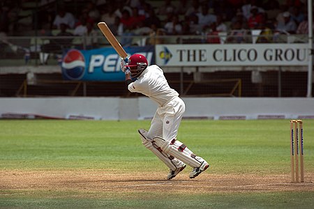




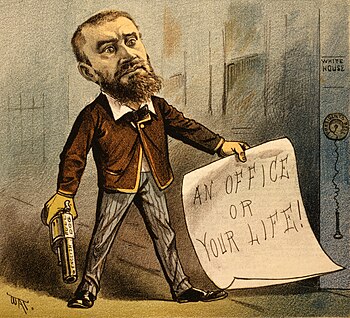


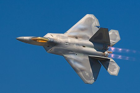




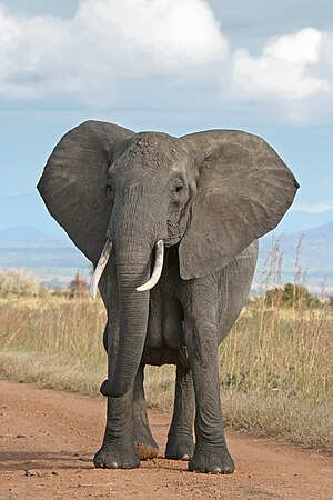


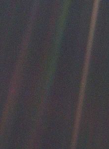

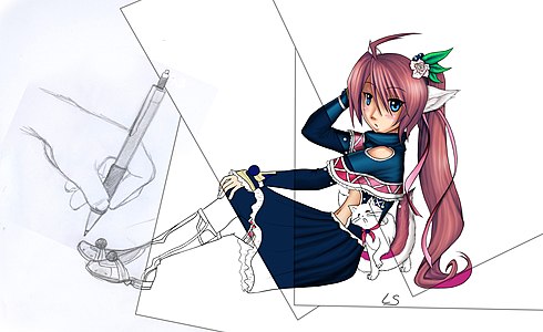


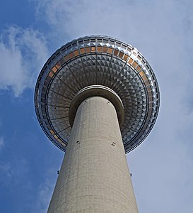


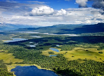

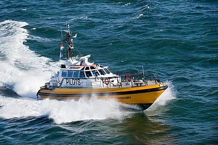
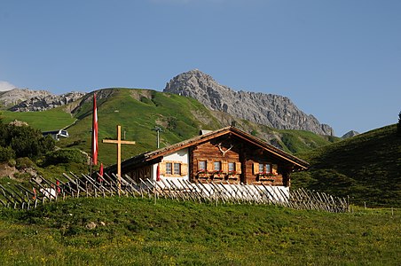


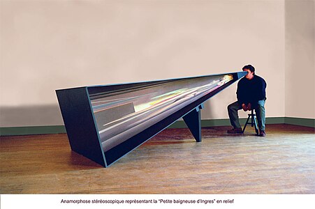
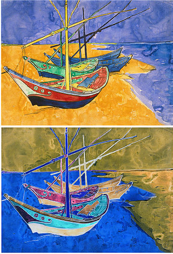
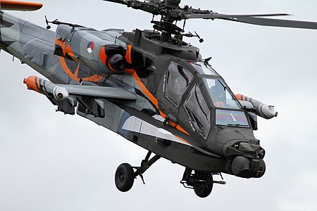
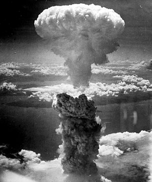


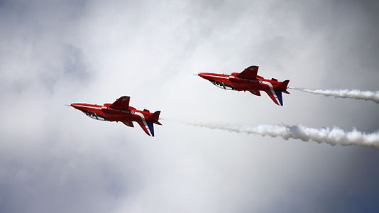






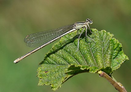
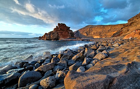


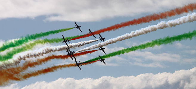

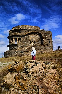


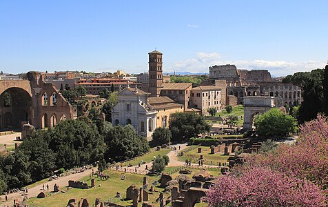

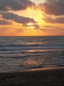
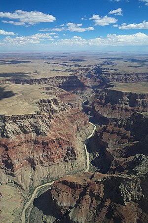


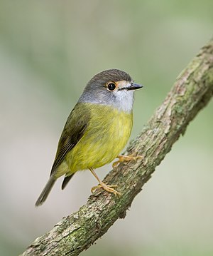
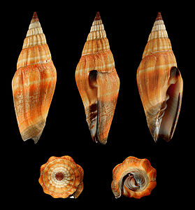
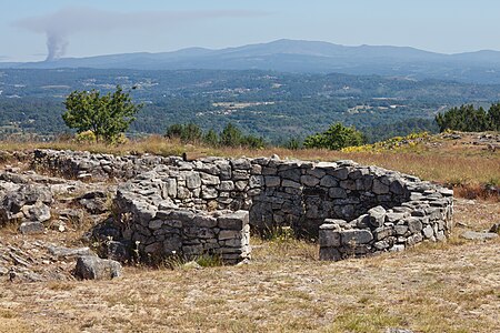


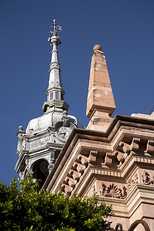


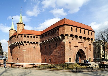
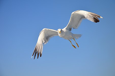


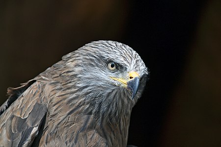

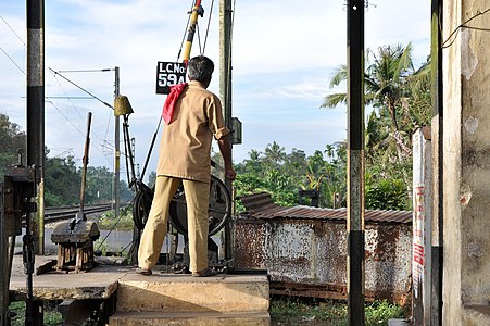



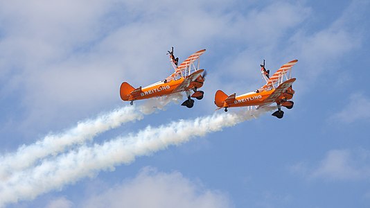

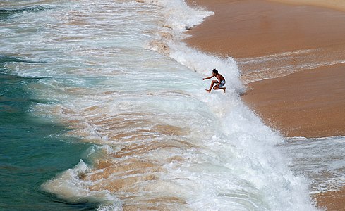


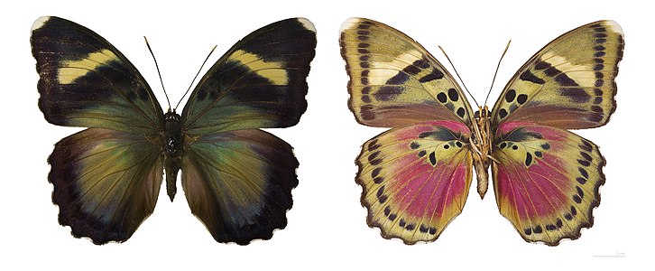
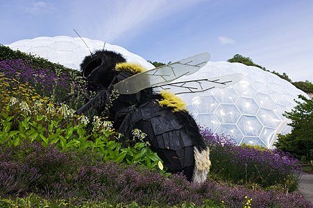


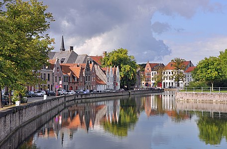
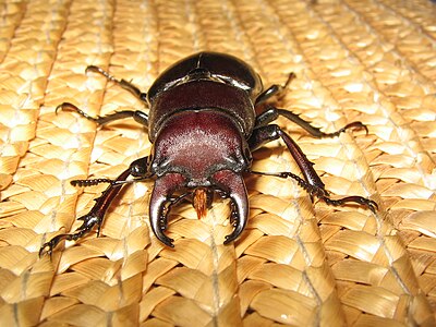

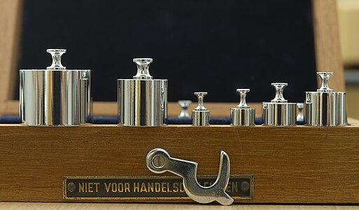
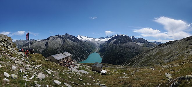

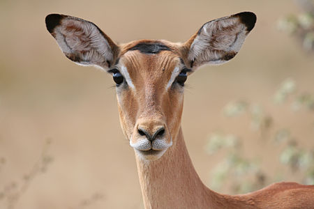
![Si-o-se Pol (Persian: سی وسه پل, pronounced [ˈsiː oˈseh ˈpol], which means 33 Bridge or the Bridge of 33 Arches), also called the Allah-Verdi Khan Bridge, is one of the eleven bridges of Isfahan, Iran. It is highly ranked as being one of the most famous examples of Safavid bridge design](https://upload.wikimedia.org/wikipedia/commons/thumb/c/c2/Si-o-se-Pol.jpg/412px-Si-o-se-Pol.jpg)
