Commons:Photography critiques/December 2010
 | This is an archive of past discussions. Do not edit the contents of this page. If you wish to start a new discussion or revive an old one, please do so on the current talk page. |
December 2010
Logo contest for Humanitarian OSM Team (HOT)
Would like some comments on this, there is a logo contest http://wiki.openstreetmap.org/wiki/Humanitarian_OSM_Team_Logo for the humanitarian team going on, you are all welcome to participate. Idea is that HOT = flame = danger. and the humanitarian team helps where there are problems.
- Cool idea. I think you should erase paper folds from under the magnifier because they wouldn't be the same scale as those around. — Yerpo Eh? 14:33, 25 December 2010 (UTC)
Pictures of electrical equipment
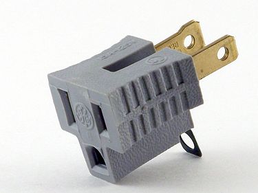
- My comment: To me the image seems to have some slight colour noise in the grey areas. Sharpening at the edges is clearly visible, I consider the magnitude borderline, but still the image is not really sharp. I presume it was the camera that sharpened. One the plus side I like the composition, lighting is ok. But before you go for QI or FP, this image is less than two Megapixels in size and hence not eligible for QI and FP. -- KlausFoehl (talk) 16:21, 22 December 2010 (UTC)
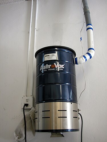
Several months ago, I took these pictures and uploaded them here. I'm new to Commons, so I'd appreciate a critique of these photos and whether they have any chance at promotion to VI, QI, or FP. I took the first using a Kodak EasyShare Z650 (JPEG artifacts?), the second using a Nikon Coolpix 5000 (as uncompressed TIFF). I have made minor editing (lossless cropping and/or color correction) and stripped the Exif data for privacy reasons, but I can provide relevant details here if necessary. Thanks, PleaseStand (talk) 04:27, 20 December 2010 (UTC)
- Uploading such an image as PNG is nonsense. Just upload a JPG at full camera resolution. Less waste of bandwith and better overall quality. --Dschwen (talk) 16:51, 22 December 2010 (UTC)
- I've changed the photo above to the JPEG version (which I already had uploaded). PleaseStand (talk) 05:58, 23 December 2010 (UTC)
- I think the cheater plug could be nominated at VI within the scope "Cheater plug", and maybe the centralized vacuum cleaner could be nominated as VI within the scope "Centralized vacuum cleaner". The latter photo has a more cluttered composition than the first, which is a good illustration of its subject IMO. I would not recommend nominating any of them as QI and FP. --Slaunger (talk) 07:58, 23 December 2010 (UTC)
November 2010
Dartmoor Pony

Hello! I would appreciate comments about this image. On the one hand, I like it, especially the motion. On the other hand, I find the head of the horse rather dark ...
- Yes, it is a bit underexposed. However, this is easy to fix with an editor. --The High Fin Sperm Whale 20:28, 22 November 2010 (UTC)
- This composition is very beautiful. My critique will be that the horse is underexposed. There is no detail on the dark areas. Could be much more dramatic. --Frankkas (talk) 11:06, 7 December 2010 (UTC)
Horse in the Gehrenberg, Lake Constance

Hi, I nominated this image several days ago as a Quality image. As far I can see it will probably be ignored, so I would be grateful for comments/opinions what is wrong with the image. Or what I could do better (crop?). Unfortunately it is not easy for me to find "problems" in images. If my own images are concerned, things get even worse. Thank you for your time. --Dietrich Krieger (talk) 16:40, 15 November 2010 (UTC)
- I guess somebody could ask you about encyclopedic value of the image. 巡 Mihajlo [ talk ] 07:57, 16 November 2010 (UTC)
- Thank you! --Dietrich Krieger (talk) 19:34, 18 November 2010 (UTC)
- There is a slightly darker spot on the left-hand side of the photo, just above the centre line, which appears to be a speck of dust on the sensor or possibly the lens. It should be fairly easy to clone out in this particular photo. —LX (talk, contribs) 22:57, 18 November 2010 (UTC)
- Now as you say ... thank you! --Dietrich Krieger (talk) 09:56, 20 November 2010 (UTC)
- Hmmm... the spot I was referring to is still there. It's located around 415×765 and has a radius of around 20 pixels. —LX (talk, contribs) 11:47, 20 November 2010 (UTC)
- You are right. I will start looking for the fixed image, should be somwhere on my HD, thank you. --Dietrich Krieger (talk) 18:05, 23 November 2010 (UTC)
- Impressive, very impressive. Critique: is tilted. --Frankkas (talk) 11:07, 7 December 2010 (UTC)
- Thank you for your comments, I am really grateful for! As my first corrected version is still hiding in my computer, I removed dust and tilt again --Dietrich Krieger (talk) 23:02, 7 December 2010 (UTC)
Saint Sava Monument near the Temple

Alright, I just got suggestion from Jebulon that something is wrong about the perspective here. But I seem to be a newbie enough to not know what was that one about, so lets start talk here. 巡 Mihajlo [ talk ] 17:01, 11 November 2010 (UTC)
- I've done some corrections but have little idea whether that was the right thing to do. 巡 Mihajlo [ talk ] 07:14, 12 November 2010 (UTC)
 Comment -- Not bad, considering the difficult conditions: dark subject and bright background. But the image quality in on the poor side, probably due to a small sensor and jpeg compression. What camera is this? -- Alvesgaspar (talk) 10:35, 12 November 2010 (UTC)
Thanks, but my question was referring to perspective issues rather. There is also the first (original) version of the photo. An user seemingly complained about the fact there is a vanishing point above so this was approximately fixed in the successor. And it is not a secret: I use Olympus C-500Z. 巡 Mihajlo [ talk ] 22:05, 12 November 2010 (UTC)
A photo of Genex Tower
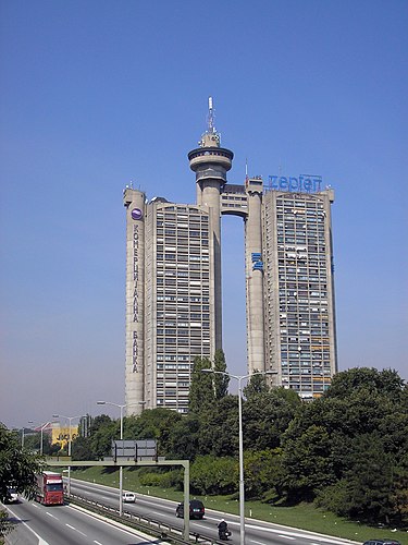
Did this image get any better when I applied Gimp's "auto color enhance" on it? Maybe I need to just rotate the original image without any enhancing? Look the version list for the previous one. 巡 Mihajlo [ talk ] 06:23, 7 November 2010 (UTC)
I saved it again without auto enhancing colors. Also removed two blurred birds. 巡 Mihajlo [ talk ] 09:00, 7 November 2010 (UTC)
 Comment -- Quality is on the poor side: noise and lack of detail, especially in the sky and darker areas. What camera did you use and where is the Exif file? Also the compostion is spoiled by the street lamp, just in front of the building. -- Alvesgaspar (talk) 10:30, 12 November 2010 (UTC)
- At the first glance, you have a point about the street lamp. However, if I shifted a bit to right, the trees would cover much more of the building thus spoiling the composition even more (i have that photo too). If I went to the left, we'd deal with more street lamps. This is the optimum for the selected location. And excluding the option of flying, street lamp climbing and such, this is the best spot over the highway E75 for picturing the south side of this building. 巡 Mihajlo [ talk ] 12:41, 15 November 2010 (UTC)
- I guess I can't really respond to the quality complaints without a new camera. Not going to happen as soon. 巡 Mihajlo [ talk ] 12:41, 15 November 2010 (UTC)
Skadarlija Street by Night

Hello for the first time. I would like if you commented what would prevent this picture to be quality image. Depending on your suggestions I'd be able to make better pictures. 巡 Mihajlo [ talk ] 14:34, 6 November 2010 (UTC)
Puškarnica on Kalemegdan
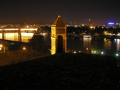
First of all, I've no idea how this is called in English. This is a small establishment, intended for a man with gun. Any suggestion would probably result in my request that the image be moved to an title in English (just to keep it convenient). Apart from that, the question is the same as above: what would prevent this picture to be quality image. 巡 Mihajlo [ talk ]
October 2010
Covered Bridge
This is the first time I've asked for comments. Any suggestions? My intention in taking this picture was mostly to get the inner structure and the outside of the bridge at the same time, but I think it turned out quite differently. Smallbones (talk) 13:37, 27 October 2010 (UTC)
- That magnitude of dynamic range is always a bit of a challenge, especially when shooting digital. One could deal with it by using a tripod and selectively combining multiple exposures during post-processing. Another approach is to change the actual light conditions using artificial light sources or to wait for the natural light to change. It appears that when you shot this, the sun was high in the sky on a clear day, so the sun did not shine into the bridge, and the light was not diffused. Instead, the natural light outside was strong, the inside was shaded, and the shadows were sharply defined. An early morning or late evening, perhaps with overcast weather, might provide more balanced conditions, depending on the location. The difference is more noticeable to a digital camera sensor than to our eyes.
- Other issues I see are the cyan-colored sky, which is most effectively addressed using a circular polarizer filter; an overall blue tint, most noticeable on the presumably white bargeboard, the unlit façade, and the shaded interior and ground; purple fringing, particularly where the dark tree trunks on the right-hand side contrast with the bright sky in the background; and a rather narrow depth of field, which appears to be centered on the sign to the left, leaving the far inside of the structure just out of focus. As I'm unfamiliar with the location, it's difficult to judge the angle you've chosen, but I do find the details seen through the opening (half of a basketball backboard?) a little distracting as well. —LX (talk, contribs) 17:13, 27 October 2010 (UTC)
- A polarizer could have definitively helped, its effect being more dramatic depending on the position of the sun. --Frankkas (talk) 11:09, 7 December 2010 (UTC)
Hill Hamlet

Can I have some comments on this photo? It was shot in Fujifilm A850 which does not allow much manual fine tuning opportunity, but still I would like to learn the rights and the wrongs about this photo and how could it have been best.
Koustav2007 (talk) 08:35, 27 October 2010 (UTC)
- The composition is balanced, though you could have chosen more beautiful buildings to put in the foregorund ;-). But the image quality is very, very poor because of the excessive grain (we call it "noise" in digital photography), which strongly affects detail. I wonder what kind of ISO/ASA sensitivity you used. Also, the sky seems overexposed (all white) -- Alvesgaspar (talk) 09:38, 27 October 2010 (UTC)
- The quality is indeed quite poor. But could it be because the picture was taken hand held and not stand mounted? Or is it only the iso? I do not own the digital camera, so would not immediately know the ISO/ASA sensitivity that was preset, so what could have been ideal? Also is there a thumb-rule to decide the sensitivity, as post clicking the picture it is only visible in the very small screen and these details only emerge on printing or viewing in a computer. As for the sky, what is the way out, if I had limited the exposure, would the subject have be ok? Koustav2007 (talk) 05:43, 29 October 2010 (UTC)
- Metadata says ISO 200, which shouldn't create so many problems even if the chip isn't top notch. I suspect image compression settings. — Yerpo Eh? 13:03, 29 October 2010 (UTC)
- Could you elaborate on that one? And is there a note/wiki guide available studying which I may be able to teach myself to optimize the settings according to conditions. Also what could have been done for the overexposed sky? Koustav2007 (talk) 16:29, 31 October 2010 (UTC)
- Oh, sorry, I didn't notice this wasn't a digital camera. In this case, it could've been an ISO/ASA issue, yes, I just wonder where the "ISO 200" came from (it says that in the "metadata" table at the bottom of the page, beside other strange info, such as the date 31 December 2050 and 6.1 mm focal length). As for the overexposure, there isn't really much that you could do considering the dynamic range present, apart from taking two pictures with different exposure settings and combining them digitally. — Yerpo Eh? 20:15, 1 November 2010 (UTC)
- Whay do you say that? It is indeed a digital camera! The date was not set properly. And yes the focal length is also odd! Considering that it is digital is there some setting guidelines that I may use to minimise these problems?Koustav2007 (talk) 08:29, 4 November 2010 (UTC)
- The focal length is not odd. 6.1 mm is the wide end of the A850's range, and for this particular camera, that corresponds to 36 mm in 35 mm equivalent terms. The ISO can be lowered to 100 when shooting in "manual" mode (M), which also enables exposure compensation (EV); see the owner's manual. The photo seems to exhibit both digital noise from the ISO setting (possibly compounded by over-sharpening in post-processing) and blurry edges, possibly from camera shake. The latter would be compounded by the increase in exposure time required to compensate for reducing the ISO, so a tripod would be recommended, although in theory, it should be possible to hand-hold exposures as long as 1/30 at that focal length. A tripod would also be needed to effectively use the aforementioned technique of combining several photographs shot at varying exposures. The only other trick I could think of is to use a hand-held ND grad filter. —LX (talk, contribs) 13:15, 4 November 2010 (UTC)
- Whay do you say that? It is indeed a digital camera! The date was not set properly. And yes the focal length is also odd! Considering that it is digital is there some setting guidelines that I may use to minimise these problems?Koustav2007 (talk) 08:29, 4 November 2010 (UTC)
- Oh, sorry, I didn't notice this wasn't a digital camera. In this case, it could've been an ISO/ASA issue, yes, I just wonder where the "ISO 200" came from (it says that in the "metadata" table at the bottom of the page, beside other strange info, such as the date 31 December 2050 and 6.1 mm focal length). As for the overexposure, there isn't really much that you could do considering the dynamic range present, apart from taking two pictures with different exposure settings and combining them digitally. — Yerpo Eh? 20:15, 1 November 2010 (UTC)
- Could you elaborate on that one? And is there a note/wiki guide available studying which I may be able to teach myself to optimize the settings according to conditions. Also what could have been done for the overexposed sky? Koustav2007 (talk) 16:29, 31 October 2010 (UTC)
- Metadata says ISO 200, which shouldn't create so many problems even if the chip isn't top notch. I suspect image compression settings. — Yerpo Eh? 13:03, 29 October 2010 (UTC)
- The quality is indeed quite poor. But could it be because the picture was taken hand held and not stand mounted? Or is it only the iso? I do not own the digital camera, so would not immediately know the ISO/ASA sensitivity that was preset, so what could have been ideal? Also is there a thumb-rule to decide the sensitivity, as post clicking the picture it is only visible in the very small screen and these details only emerge on printing or viewing in a computer. As for the sky, what is the way out, if I had limited the exposure, would the subject have be ok? Koustav2007 (talk) 05:43, 29 October 2010 (UTC)
Four-spotted Chaser
Can someone please explain to me, in detail, what I did wrong and right in taking this photo? --The High Fin Sperm Whale 18:16, 27 September 2010 (UTC)
- The image seems to be focused on the edge of the Chaser's front left wing instead of its main body, where I'd like to see most of the sharp details. Other than that, I like the nice, creamy background and that a lot of details still show well, despite where the picture is focused. I also assume this has been cropped due to the near-square aspect ratio. Is a non-cropped version available? LeavXC (talk) 04:35, 21 October 2010 (UTC)
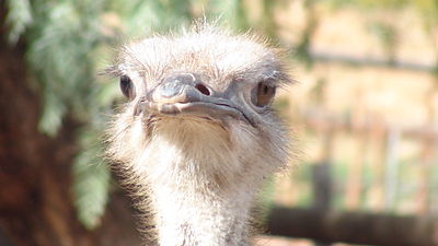
South African Ostrich
Is the exposition a problem here? Thanks!
Nicolas M. Perrault (talk) 11:57, 15 October 2010 (UTC)

