User:Intervex/PrideColours
This is a page where I talk about some original research I've been doing on colour-meaning associations in pride flags. This is a project that is under active development and information may change.
My motivations:
- I've been archiving pride flags here on Wikimedia Commons and have been wanting to figure out useful categorization schemes for them.
- I also want to make some nice infographics about the common colour-meaning associations.
- I want to improve the cognitive accessibility of pride flags by establishing the most common colour-meaning associations.
- I make pride flags sometimes and would like to know what the most common meaning associations are
I'm hoping this will be useful for:
- Archivists and people providing captions/alt text to flags, both for deciphering and for consistently describing flags.
- Flag designers, for creating flags with clear affordances.
- Flag users, for deciphering new flags.
Tables of the most common colour-meaning-associations are under Results. Probably the most important thing to know before jumping down there is that I am not using RGB or HSV or similar to do my analysis of colours. I'm using a different colour space called okLCH. In okLCH, colours are decomposed into lightness (0-1), chroma (0-0.37), and hue (0-360°). The hue values in this document are okLCH hue values, and those are different from the hue values in HSV/HSL!
Background
[edit]Pride Flags
[edit]There are so many pride flags. It can be kind of overwhelming even for ableminded people. Since developing long COVID I've found out extra hard with my brain fog and memory problems.
The MOGAI community has made some real strides in improving flag accessibility in terms of offering more sensory friendly flags and providing alt-text for images more reliably.
But I feel like we haven't really talked about cognitive accessibility.
Flags that follow common patterns are easier to understand. Patterns can arise in a bunch of ways like:
- Patterns can be in colour choices (pink means feminine, blue means masculine)
- and shading (light pink means girl, hot pink means attraction to girls, dark pink means AFAB).
- Patterns can be be in layout (e.g. ace & aro flags and derivatives).
- Patterns can be in icons used (like how a lot of romantic flags take the sexual version and add a heart)
I really really appreciate it when I see a new flag and I can figure out what it means from my knowledge of other flags. Here are some examples of flags that other people have made that I could immediately figure out:
-
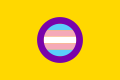
 Intersex and disabled. Swaps the intersex ring out for the disabled icon. Love it.
 -
 Trans and intersex. It's the trans flag and the intersex flag! Super clear, also love it.
 -
 Ace and kinky. The ace flag with the kink symbol. Again, clear!


Whereas some flags I've encountered I found confusing or unintuitive (at least at first). For example, despite openly identifying as bisexual for two decades, it was not until a month ago that I learnt its meanings are not "attracted to female-both-male" but actually "attracted to same gender, attracted to both/between, attracted to opposite gender".
-
 This is same-both-opposite, not female-both-male (I got this wrong for years!)
 -
 The green in the polygender flag means abundance (nonzero) and not gender neutral.


Similarly, it was not until I started this project, I mistakenly thought the polysexual flag was for attraction to women, men, and gender-neutral people. Because I read the green as gender-neutral. It is supposed to mean attraction to multiple genders but not all genders - green means nonzero but not infinite. I now understand this as associating green with abundance (nature!).
Indeed, learning the green was for abundance helped! It helps me out when flag designers explain their designs. Not just what all the colours mean but /why/. What the thought process was. It helps me not only understand a given flag but can help me understand similar flags.
I'm hoping that establishing a standard set of colour-messing associations will help improve cognitive accessibility. One thing I went into this project thinking is that we need to do a better job of differentiating greens. Green gets used in a lot of different ways and it would help if we were consistent about lime green meaning one thing vs forest green meaning another vs bluish green meaning yet another thing (etc).
What I didn't want to do was just... write down what I think the standards ought to be. Because I could be totally off-base from other people (an all too familiar experience as an autistic).
So rather that being prescriptive my goal here is to be descriptive. To catalogue what trends are already being used and make those trends clear (where they exist).
In gathering data for this project my goal has been to log everything without judging. Like a lot of people I have some opinions on flags. I have very deliberately included flags I don't like (be it on aesthetic, conceptual, etc grounds). The only limits I allowed myself were I could skip adding flags if the user posting them was openly and unambiguously a TERF in the given post, as well as I could skip adding flags where the poster was obviously and unambiguously shitposting. Wherever I was uncertain that a flag was posted in good faith I erred on the side of including it.
I was originally going to put a glossary of genders and attraction types here, but this has gotten rather long, so have instead put it in the Results section. See Results by Column for definitions.
Colour theory: an introduction
[edit]Colour is complicated. One thing making it complicated is there's a rather big difference between Colour: The Physical Phenomenon (i.e. specific wavelengths of light) and Colour: Human Perception Thereof. Our eyebrains do all sorts of wacky things with Colour: The Physical Phenomenon. For example:
- We see colours like pink that don't have specific wavelengths (our brains see certain mixes of blue and red and... make a colour with that.)
- The cones in our eyes are not uniformly sensitive: we see some wavelengths with more sensitivity than others. (See: Colour vision)
- Different cultures/languages draw the boundaries between common colours at different places. We have an easier time distinguishing colours we have more practices differentiating. We often don't really see colour as a uniform gradient so much as a series of categories. Where you draw the line between green and blue is something that tends to have strong cultural associations. (See: Blue–green distinction in language)
How we mentally model colour also is complicated. We get different results when we talk about mixing beams of light together vs. mixing pigments/paints together.
-
 Additive colour mixing: everything together combines to make white
 -
 Subtractive colour mixing: everything together combines to make black


Colour spaces
[edit]A colour space is a way of modelling colour. It sets up a system that can be used to relate colours to each other. This can then be used to determine what colour is "opposite" a given colour, as well as to determine what a mixture of two colours would be in this system.
Chances are, if you've learnt one colour model, it was RYB. It's an old system, developed for painting. It uses red, yellow, and blue as its primary colours, hence the name RYB. Secondary colours are created through mixing paints/pigments of the primary colours. Tertiary colours can be made through secondary-primary mixes and so on.
-
 RYB colour, a colour model developed for mixing paints
.svg)
RGB
[edit]Designing colour models for computers is a bit of a different animal than creating colour models for paint mixing. Chances are, if you've learnt one colour model for computer colour, it's RGB. In RGB, every colour is composed of how much red light there is (0-255), how much green there is (0-255), and how much blue there is (0-255). Unlike RYB, RGB uses green rather than yellow as a primary colour. What is or is not a primary/secondary/etc colour is dependent on the colour system you're using.
-
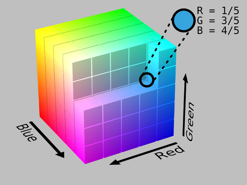 RGB forms a space that looks like a cube
 -
 This cube can be navigated as a three-dimensional space with R/G/B being x/y/z coordinates


When you see hex codes that represent colours, they are representing RGB: the first two letters are the red quantity converted into hexadecimal (base 16), the next two are the green quantity converted into hexadecimal, and the last two are the blue quantity converted into hexadecimal.
HSV and HSL
[edit]RGB values tend to be rather unreadable. If I tell you a colour is (202, 59, 104) can you figure out what kind of colour it would look like? I certainly would struggle, and I know I'm not alone.
Readability is a reason people tend to like HSV and HSL. These are two very similar colour spaces that take the gamut (total range of possible options) of RGB colours and convert the shape of the gamut from a cube into a cylinder. A colour in HSL space is composed of three values:
- Hue: 0-360° with red at 0°.
- Saturation: 0-1, sort of means how much grey is in the colour.
- Lightness: 0-1, sort of means how light the colour is.
-
 In HSL, the top of the cylinder is white and the most vibrant colours are at the bottom. In HSV, the most vibrant colours are at the top of the cylinder and black is at the bottom of the cylinder.

While HSL and HSV improve the readability of RGB, they still have a bunch of drawbacks. The remainder of this section is heavily influenced by these articles by Lea Verou[1], Geoff Graham[2], Keith J. Grant[3], and the next several examples come directly from this article by Alexei Boronine[4]
Problem #1: HSV value & HSL lightness have no consistent meanings
[edit]These two colours have the same lightness values in HSL, even though to human perception they look like they have wildly different lightness levels:
| HSL(250, 100%, 50%) | HSL(60, 100%, 50%) |
| HSL(250, 100%, 50%) | HSL(60, 100%, 50%) |
Problem #2: HSL/HSV saturation is also a mess
[edit]Here are two colours with the same saturation values in HSL (but different lightnesses). They do not look equally saturated:
| HSL(0, 90%, 40%) | HSL(0, 90%, 80%) |
| HSL(0, 90%, 40%) | HSL(0, 90%, 80%) |
Problem #3: HSL/HSV are not perceptually uniform
[edit]This means the hues are not spread out in a way that makes sense to human colour perception. For example, a 20° difference in hue in the yellow area of HSL/HSV is a much bigger difference to our eyes than a 20° difference in the blues:
| HSL(30, 100%, 50%) | HSL(50, 100%, 50%) |
| HSL(30, 100%, 50%) | HSL(50, 100%, 50%) |
| HSL(230, 100%, 50%) | HSL(250, 100%, 50%) |
| HSL(230, 100%, 50%) | HSL(250, 100%, 50%) |
A fundamental issue with HSL/HSV and RGB is that they were all designed around what is computationally/physically easiest to do with light and computer monitor technologies in the 1980s.
OkLCH
[edit]The good news is that we have much better alternatives to HSL/HSV and RGB!
OkLCH is a relatively new colour space that has a lot of nice features and has support in CSS, browsers, etc. One of the big things going for it is a perceptual colourspace. This means it has been designed so that it has been designed around Colour: Human Perception Thereof whereas RGB/HSV/HSL/etc were designed around Colour: The Physical Phenomenon.
A colour in okLCH space is composed of three values:
- Lightness (L): 0-100% with 100% being white. How light the colour is.
- Chroma (C): 0-0.37 though this range will likely increase with improvements in computer monitor technology. This is how vivid a colour is. A chroma of 0 is grey.
- Hue (H): 0-360°, with pink at 0°. While a similar idea as HSL, the actual values are different. Colours with a given hue in HSL will have a different hue in okLCH.
-
 The hue distribution in okLCH: 0° is pink, 180° is teal. 90° is yellow (brown if dark) and 270° is indigo.
 -
 The same hues, but with less lightness and less chroma.
 -
 Different hues have different maximum chroma. This is because it's a perceptual colourspace - remember human colour perception is not equally sensitive to every hue. (I don't actually know what colour space this image is from but okLCH has similar sorts of peaks.)
.png)
.png)

Feature #1: Lightness means something
[edit]If two colours with different hues/chromae have the same lightness value in okLCH, they actually look equally light! For example, a yellow with the same lightness as a dark blue winds up looking dark (brown)!
| oklch(59.47% 0.092 245.75) | oklch(59.47% 0.092 105) |
| oklch(59.47% 0.092 245.75) | oklch(59.47% 0.092 105) |
Feature #2: Chroma means something
[edit]Chroma, which is very roughly similar (but not equivalent) to saturation actually has consistent results across different hues and lightnesses! These reds have the same hue and chroma, but different lightness:
| oklch(47.19% 0.11 19.81) | oklch(79.19% 0.11 19.81) |
| oklch(47.19% 0.11 19.81) | oklch(79.19% 0.11 19.81) |
Feature #3: Perceptual uniformity
[edit]A 20° difference in hue is actually the same thing to our eyes when it's 20° of blues vs 20° of yellows:
| oklch(59.47% 0.092 245.75) | oklch(59.47% 0.092 265.75) |
| oklch(59.47% 0.092 245.75) | oklch(59.47% 0.092 265.75) |
| oklch(59.47% 0.092 105) | oklch(59.47% 0.092 85) |
| oklch(59.47% 0.092 105) | oklch(59.47% 0.092 85) |
One reason perceptual uniformity matters is for making gradients. HSV/HSL has this weirdness when it comes to gradients where it bunches up around certain hues. OkLCH and other perceptual colourspaces will instead have a smooth gradient:
-
 Comparison of HSV and okLCH with regard to a full-rainbow gradient. The okLCH is perceptually uniform, whereas the HSV has clear vertical lines which emerge.

Feature #3: More intuitive colour mixing
[edit]All of the computer-based colour spaces we've been talking about operate by treating colour as a 3D shape, with using three values to navigate the x/y/z or equivalent polar coordinates of this 3D shape.
This means we can do math with the numbers! If I want to get the midpoint of green and blue, I can take the coordinates for the green and blue and average them across each axis. So if I have a green with RGB (31, 159, 0) and a blue with RGB (91, 206, 250), I can calculate the mixture as:
- red: (31 + 91) / 2 = 61
- blue: (159 + 206) / 2 = 182
- green: (0 + 250) / 2 = 125
And then I get... a more bluish green than the one I started with! Exciting! Except... it's not a great midpoint now is it? You'd expect the midpoint between green and blue to be teal. And doing this with HSV gives me a green that looks somehow lighter than both the green and blue I started with.
But because okLCH is a perceptual colourspace, when I do the same thing in okLCH, I actually get a teal!
-
 Colour mixing by averaging coordinates in colour spaces: okLCH actually gives us a teal when we do this with green and blue!
 -
 Doing this with pink and blue, RGB gives us grey! Both HSV and okLCH give purples, with okLCH's purple matching the lightness of the input pink & blue.
_comparing_RGB_HSV_and_okLCH.png)
_comparing_RGB_HSV_and_okLCH.png)
Mixing pink and blue this way gets at another problem with RGB and HSV: Dead Grey Zones. Sometimes when you make gradients between two colours in RGB and HSV you wind up with greys in the middle. Here's an example of a gradient in HSL that yields grey in the middle.
Feature #4: MOAR GAMUT
[edit]Last thing I wanna mention is gamut. Gamut is the total range of colours that are available in a given colour space.
Not all colour spaces have the same size of gamut. RGB has a larger gamut than CMYK, a colourspace used for colour printing. This means there are some colours, like vibrant greens, that we can see on our computer monitors but if we tried to print the image/website/etc to paper, these greens would get desaturated.

If you've noticed that newer televisions and computer monitors seem to have more vibrant colours... it's because they literally do! Computer monitor technology has improved a lot recently.
Most monitors these days support a gamut of colours close to a standard called P3. P3 has a 50% larger volume than what traditional RGB supports.
This means that if you're using RGB for your webpages (CSS/etc), visual art, etc, you **cannot access** all of the possible colours that your monitor can actually show you.
The gains in gamut size have been overwhelmingly in the vivid parts of the colour spectrum. OkLCH supports P3 colours, meaning it gives us access to these vivid colours that are not in RGB but that computer monitors can actually show us.
On top of this, okLCH has been designed in a way that makes it future-proof.
Remember how I said Chroma ranges from "0-0.37 though this range will likely increase with improvements in computer monitor technology"? That's what I mean. Right now the maximum chroma supported by typical computer monitors is around 0.37. But there is no upper limit to chroma. In ten years it might be 1.0. In twenty it could be 2. Who knows? But the flexibility is there.
Feature #5: okLCH support
[edit]OkLCH is not the only perceptual colourspace in town. But being a newer one, it's been designed to fix minor issues with older colourspaces like CIELAB and old-school LCH.
The big thing here is that okLCH has CSS support. This means when you're making websites (or the tables in this page!) or the like, you can replace hex codes with okLCH codes. The okLCH codes look like this: oklch(59.47% 0.092 85)
okLCH is also supported by libraries like color.js and chroma.js. You can find more resources here and here.
Here's a great okLCH colour picker that will also let you do conversions between hex/RGB/etc.
Methods
[edit]I assembled a data set of colour-meaning associations in pride flags. It contains 2060 colour choices from 624 pride flags (meaning, on average, each flag had 3.3 colour choices). There are 1587 unique colours among the 2060 colour choices (77%).
The data set
[edit]Each row of the spreadsheet represents a colour choice made in a flag design. If there is a known meaning for this colour choice, the meaning is recorded in the appropriate column for this row.
In a flag like the trans flag, there are three colour choices: the pink (girl), blue (boy), and white (transition/intersex/nonbinary).
In a flag like the intersex flag, there are two colour choices: the yellow (not a gender) and purple (not a gender).
When flags come in a set, the common colour choices are shared. So the greys of the demigirl and demiboy flags are shared between them rather than repeated.
-
 Trans flag: there are three colour choices: the pink (girl), blue (boy), and white (transition/intersex/nonbinary).
 -
 Intersex flag: there are two colour choices: the yellow (not a gender) and purple (not a gender).
 -
 Demigirl flag: there's one colour choice here: pink (girl) because the white & greys are common to all demigender flags.


Data collection
[edit]I gathered flag data over the course of multiple weeks, in multiple ways. In chronological order:
- I started by working through pages that are compilations of common pride flags with their associated meanings, such as the one produced by UBC Okanagan's equity office and the one by Outright International.
- I then searched Tumblr for "pride flag meaning" and spent a bunch of time going through the newest flags posted here with meaning descriptions.
- I went through the intersex flags I already had on hand as somebody who makes/coins intersex flags, and added ones with known meanings.
- I went through LGBTQIA+ wiki's entire category of culturally-specific genders and recorded the ones that had known colour meanings. Turns out most colour choices in culturally-specific flags are to use the colours of the relevant nationality, such as in how the Muxe flag uses the colours of the Mexican flag. (Such meanings were not tagged as culturally-specific genders, but rather references to nations.)
-
 The green, white and red of the Muxe flag come from the Mexican flag.
 -
 The Kathoey flag is the Thai flag and the trans flag joined together.


At this point I was noticing I had very few stripes/colours for things that are not queer - for example, I had a ton of stripes that symbolize non-conformity, but very few that symbolize conformity.
So I searched Tumblr, Reddit, DeviantArt, LGBTQIA+ Wiki, and Google for flags that have meanings that contain "conformity", "binary", "straight", "heterosexual", "transhet", "queerhet", "traditional", "passing", "stealth", "questioning", and added the search results (most of which were the opposite of my search terms).
Later on, when I got to tagging for types of attractions, I realized I had relatively few flags which contained aesthetic attraction, so I searched tumblr and LGBTQIA+ wiki for aesthetic attraction and added what I found.
Similarly, when tagging for other identities, I realized I had relatively few flags for kink - Tumblr and LGBTQIA+ wiki seem to generally avoid kink flags. So I consulted fetish/kink pride flag galleries: that of Gay Fetish Goth and that of Twilight Guard.
Data tagging
[edit]I then started categorizing the meanings. I created five columns in my spreadsheet for tags:
- Gender (e.g. feminine, masculine, androgynous)
- Attraction (e.g. romantic, sexual, platonic)
- Values (e.g. freedom, openness, community)
- Disability (e.g. Deaf, blind, chronic illness)
- Other (e.g. non-Western, socialist, Jewish)
A colour choice can be tagged in multiple categories - for example, a colour choice which means "romantic attraction to women" would be tagged with "romantic attraction" in the Attraction column and "feminine/female/women" in the gender column. I did all my tagging in my LibreOffice spreadsheet - as such I did not see the actual colours while tagging their meanings, just their hex codes. (With the exception of white and black, I generally can't easily tell what a colour looks like from only its hex code.)
I started my tagging focusing on the meanings which signify a gender. I started by categorizing narrowly - e.g. "questioning" was an initial category, separate from "uncertain" and separate from "unknown". I refined categories iteratively and asked a friend for a second opinion in a handful of cases where categorization wasn't clear.
I refined my gender tagging over a period of a week - I wanted to make sure the categories felt stable in my mind. I ended up with 40 tags. For each tag, I converted all the colour choices to OkLCH space, and then took the median lightness, chroma, and hue, to yield a median colour for each tag. I made an image showing the median colours for the different tags.
Wanting to compare only the hues, I then made an alternative visualization where I set the lightness and chroma to 0.66 and 0.1. I then realized that many tags had the same hue. From this I clustered tags around common hues. My initial plan was to pick a weighted mean or median from the values in each cluster. Implementing this, I realized this was not great for spreading the hues around to be clearly distinct. Then I started tagging for attraction types and my plan went out the window, because the spread of hues was rather different for the attraction tags (more pinks!).
I decided to finish the tagging process before figuring out a hue-clustering plan. I spent another week tagging the other columns, focusing next on attraction. I added 24 tags for different kinds of attraction. I also tagged my columns for other identities. The end result is 84 tags for gender/attraction identities. (I'll post the disability & values results at a later time!)
I tried several approaches to clustering/bucketing the hues. I eventually landed on dividing the 360° of possible hues into twenty-four 15-degree buckets and rounding hues into these buckets. I wanted to be able to distinguish two types of yellow - which I've called gold and lemon - given how many yellows are in the set, so I set buckets at 90 and 105 to capture the two ends of the yellow range. The other buckets are all increments of 15° from 90° and 105°.
I made one alteration to this pattern, which is to move chartreuse from 120° to 115°. I wanted chartreuse to be more clearly in between yellow and green, and when it was at 120° I was having a hard time differentiating it from 135° ("lime").
Once I had my giant table of 80 (later 84) tags, bucketed into 24 hues, I realized there could also be overlap in lightness and chroma. So, I rounded lightness in buckets of 5%, and chroma in buckets of 1%. In cases where this yielded the same result for multiple tags, the tag with the most number of entries was given priority, and the other tag(s) were re-rounded to the next nearest lightness/chroma bucket(s).
Median hue calculation
[edit]A difficulty in calculating medians for hues is that hues are modular: a 355°-pink is closer to a 20°-red than it is to a 300°-purple.
If I have a set of hues like 350°, 5°, and 340°, I want the computed median to be 350° and not 340°.
So what I did for each set of hues was I found the largest gap between two sequential hues, and rotated the list so that the largest gap was at the end of the list. I then took the median of the rotated list (modulo 360°).
As an example:
- input list: 5, 15, 300, 320, 360
- add the first element plus 360° to the end: 5, 15, 300, 320, 360, 365
- calculate the difference between each element: 10, 285, 20, 40, 5
- the largest gap is: 285
- so the list rotates to: 300, 320, 360, 365, 375
- the median is then calculated: 360
- and if it is greater than 360, we subtract 360, yielding: 0
The convention in oklch as well as many other colour spaces is that monochromatic colours (white/grey/black) have a hue of 0°. Initially when I calculated median hues the monochromatic colours were included in the calculations. I realized this was biasing the results towards pinkish red (0°). I then changed my code to exclude the monochromatic values from the median hue calculation. (They are still used when calculating median lightness and median chroma.)
Clustering Tags by Opposites
[edit]Once I had my large table of 80 tags clustered by hue-buckets, I realized that many (but not all) tags were approximately 180° from their thematic opposites. For example, intersex and perisex (not intersex) were about 180° apart. Sexual attraction and romantic attraction were also about 180° apart.
I then started grouping tags which had their opposites in alignment. The column "set" in the table below is sets of up to four tags separated by 90° that are coordinate terms. For example, binary is 180° from non-binary and exobinary, trinary/quaternary is 90° from that, and xenogender is 180° from trinary/quaternary (anthrogender/non-xenogender). So they have been clustered into one set of four.
For another example of a set, I noticed that not only sexual & romantic attraction about 180° apart, alterous and sensual attraction were each 90° from sexual/romantic and 180° from each other. So sexual, romantic, alterous, and sensual attraction form another set.
Not all tags had quite so satisfying a set. The nearest "opposite" I could find for feminine was gender-ambiguous (rather than masculine). Feminine and masculine were 120° apart.
Clustering tags into these thematic sets yielded four more tags. I realized I had no opposite to "placeholder" (105°) so I went back to my data to see if I did have something appropriate to put in there. I noticed in my values column that my tag for something being in a current/present state had a median around 285°, so I moved this tag from the values column into the gender/identity analysis. (Post-hoc analysis to fit a pattern is a totally questionable research practice that I am justifying on the grounds that this is a fun hobby project.)
Once I'd done an initial round of opposite-clustering I noticed in my ungrouped tags that kinky/fetish was 180° from Christian. I was very amused at the prospect of putting Christian down as the opposite as kinky, and had that in my table for a while. Eventually I felt bad for the kinky Christians, so I went hunting in my data to see if I could reasonably create a vanilla tag. (I was unable to find a vanilla pride flag, though I tried.) I found an orange with the meaning "purity", a yellow with the meaning "simple and generic", and a purple with the meaning "generic", and tagged them all as vanilla, yielding a median yellow that actually looks vanilla-coloured.
Similarly, my data had no opposite for "love". When I showed my results to a friend, they pointed out that the opposite would be a green, and envy/jealousy is usually associated with green. So, I searched LGBTQIA+ wiki for "envy" and "jealousy" and found 15 flags with colour choices signifying envy/jealousy. Turns out gender envy is a thing. (Note: when I added the flags with envy/jealousy meanings, I only added the envy/jealousy stripes and not the entire flags.)
This yielded a median green of 158° for envy/jealousy that is honestly borderline between 165° (opposite of love) and 150°. But it is narrowly closer to 165° and makes thematic sense as an opposite to love so I'm keeping it there.
Finally, I realized I had no tag to act as a foil for culturally-exclusive genders. Once again I went to the existing tags in my Values column to see if there was anything suitable in the right hue range, and there was! "Universality/commonality" was approximately 90° to culturally-exclusive genders. So I pulled that tag into the gender/attraction analysis to complete that set.
These three post-hoc tags are all questionable in terms of internal validity, but they do make thematic sense. The vanilla tag is literally vanilla-coloured. The association of green and envy is a well established colour-meaning association. The "current/present" and "unviersality/commonality" tags were part of my initial tagging, just in the Values column before pulling them into the gender/identity analysis. I freely admit these tags came out of me wanting to find patterns rather than it emerging naturally from the data, and hope they make enough sense to warrant their inclusion.
Results
[edit]Results by tag
[edit]| tag | n | col | set | axis | cluster | refined-L | refined-C | refined-Hue | refined-colour | refined-H | refined-H-constLC | rawH-constLC | raw-colour | raw-L | raw-C | raw-H |
|---|---|---|---|---|---|---|---|---|---|---|---|---|---|---|---|---|
| monogamy | 2 | attraction | Rel | Q | rose | 0.4 | 0 | 360 | #484848 | #353535 | #c47890 | #c47890 | #353535 | 0.329979 | 0 | 0 |
| aesthetic attraction | 48 | attraction | Attr2 | B | amaranth | 0.65 | 0.16 | 15 | #df5f6f | #e36675 | #c8787e | #c8787e | #e46674 | 0.666758 | 0.15681632563553 | 15.2203398569623 |
| physical attraction | 12 | attraction | AttrG | G | red | 0.5 | 0.14 | 30 | #a43c2f | #a54033 | #c87a6d | #c87974 | #a53f3d | 0.50857 | 0.136148672236442 | 24.4142547385243 |
| fast | 26 | attraction | Abs1 | R | vermillion | 0.7 | 0.14 | 45 | #e57f4f | #e67c49 | #c57e5e | #c57e5c | #e57d47 | 0.695943 | 0.146306936335122 | 46.3779947133055 |
| passion / intense | 27 | attraction | Abs2 | R | vermillion | 0.65 | 0.15 | 45 | #d86d38 | #cd612a | #c57e5e | #c47f5a | #cb6320 | 0.616096 | 0.151948464649127 | 48.636806122327 |
| sensual attraction | 24 | attraction | Attr1 | A | orange | 0.8 | 0.14 | 60 | #ffa659 | #ffa95d | #bf8350 | #c28155 | #ffa86c | 0.8044315 | 0.144308761249727 | 54.0815483067796 |
| increasing | 25 | attraction | Qnt3 | H | amber | 0.6 | 0.16 | 75 | #ac7300 | #bf8100 | #b68947 | #b78848 | #c17f00 | 0.649669 | 0.154572123771914 | 72.8562128783697 |
| platonic attraction | 23 | attraction | Attr2 | B | lemon | 0.9 | 0.16 | 105 | #eee354 | #fef365 | #9b9648 | #9a9649 | #fcf466 | 0.9463 | 0.160927677604931 | 105.998845583834 |
| emotional attraction | 28 | attraction | AttrG | G | chartreuse | 0.7 | 0.14 | 115 | #9ca831 | #97a230 | #90994e | #8d9a50 | #93a435 | 0.6831315 | 0.135589054432078 | 117.748464637735 |
| self | 37 | attraction | Abs2 | R | lime | 0.7 | 0.11 | 135 | #80ae67 | #89b86e | #77a061 | #75a163 | #86b971 | 0.73149 | 0.113139577646575 | 136.963536548653 |
| romantic attraction | 32 | attraction | Attr1 | A | emerald | 0.7 | 0.16 | 150 | #43b966 | #4fc270 | #63a471 | #6ba26a | #62c063 | 0.727186 | 0.157149692274823 | 144.053114923865 |
| envy / jealousy | 22 | attraction | Qnt3 | H | viridian | 0.7 | 0.13 | 165 | #37b78a | #44bc90 | #4ea683 | #58a57b | #53bb85 | 0.7156375 | 0.125473171423396 | 158.234233268987 |
| polyamory | 10 | attraction | Rel | Q | pine | 0.65 | 0.09 | 180 | #47a191 | #51ad9c | #3ca694 | #42a68e | #56ad97 | 0.686207 | 0.0911599015389709 | 174.766416770558 |
| familial attraction | 11 | attraction | Attr2 | B | teal | 0.6 | 0.11 | 195 | #009393 | #1fb1b1 | #31a5a5 | #33a6a0 | #23b1ab | 0.690675 | 0.11269102470112 | 189.938405284585 |
| tertiary attraction | 9 | attraction | AttrG | G | cyan | 0.75 | 0.1 | 210 | #55bfd1 | #57b9c9 | #33a3b4 | #33a3b4 | #57b9c9 | 0.732793 | 0.0939965609408986 | 209.936026999465 |
| modest / faint | 19 | attraction | Abs2 | R | sky | 0.55 | 0.07 | 225 | #407a90 | #3f7e96 | #419fc0 | #3ea0be | #3d7f94 | 0.561563 | 0.0747344711573739 | 222.079871218789 |
| slow | 41 | attraction | Abs1 | R | sky | 0.6 | 0.1 | 225 | #2b8cad | #2d96b9 | #419fc0 | #439ec1 | #2f95ba | 0.629577 | 0.105539845765594 | 226.48883419564 |
| alterous attraction | 26 | attraction | Attr1 | A | cerulean | 0.7 | 0.11 | 240 | #58a7dc | #65b4ea | #549ac9 | #4f9bc7 | #5fb6e7 | 0.741757 | 0.110204356947417 | 235.901913202322 |
| opposite / different | 8 | attraction | Abs3 | H | azure | 0.65 | 0.09 | 255 | #6992c5 | #688dbc | #6795cf | #6795cf | #688dbc | 0.633834 | 0.0826653527884155 | 254.849153823084 |
| decreasing | 14 | attraction | Qnt3 | H | azure | 0.6 | 0.14 | 255 | #4081d2 | #3a7ccc | #6795cf | #6895cf | #3a7ccc | 0.581938 | 0.141002774414053 | 255.21135397594 |
| social attraction | 13 | attraction | Attr2 | B | violet | 0.7 | 0.09 | 285 | #9897d5 | #9694d5 | #8c89cd | #8a8acd | #9595d6 | 0.69365 | 0.0947175433900704 | 283.846828616532 |
| attraction-in-general | 31 | attraction | AttrG | G | lavender | 0.6 | 0.12 | 300 | #8c6ebd | #997dcb | #9c84c7 | #9885c8 | #967ecc | 0.647325 | 0.11630023187286 | 296.836219295817 |
| mspec | 8 | attraction | AttrG | G | lavender | 0.7 | 0.15 | 300 | #ad87ed | #b085f4 | #9c84c7 | #9b84c7 | #ae86f5 | 0.703018 | 0.161309924003514 | 299.107788953267 |
| sexual attraction | 36 | attraction | Attr1 | A | fuchsia | 0.6 | 0.14 | 330 | #ae5ea8 | #b764b0 | #b57baf | #b37cb2 | #b465b4 | 0.6239095 | 0.144336914071581 | 327.362806429727 |
| same | 25 | attraction | Abs3 | H | mulberry | 0.7 | 0.12 | 345 | #d37faf | #d07cad | #be79a0 | #be799f | #d17cac | 0.692409 | 0.12015253790689 | 346.00374325359 |
| love | 26 | attraction | Qnt3 | H | mulberry | 0.65 | 0.18 | 345 | #d859a8 | #dc5bab | #be79a0 | #bf789d | #de5aa6 | 0.658373 | 0.182832235208234 | 347.657988659713 |
| all / transcendent | 30 | gender | Qnt1 | Q | rose | 1 | 0 | 360 | #ffffff | #ffffff | #c47890 | #c5788e | #ffffff | 1 | 0 | 1.14846345016628 |
| none / agender / genderless | 56 | gender | Qnt2 | B | amaranth | 0.2 | 0 | 15 | #161616 | #3e3e3e | #c8787e | #c87880 | #3e3e3e | 0.364237 | 0 | 13.8095736509864 |
| xenine / xenogender | 51 | gender | GenB | B | amaranth | 0.75 | 0.12 | 15 | #f08d95 | #f08b94 | #c8787e | #c8787a | #f18c8f | 0.747753 | 0.122790407634573 | 18.3725832217812 |
| bodily-sex-in-general | 16 | gender | Flu2 | G | red | 0.7 | 0.12 | 30 | #df8071 | #da7f71 | #c87a6d | #c87976 | #da7e7a | 0.691104 | 0.11508356054484 | 22.6134692399601 |
| questioning / confusion / dissociation | 17 | gender | Clar | R | vermillion | 0.55 | 0.03 | 45 | #816c63 | #a48a7f | #c57e5e | #c67d60 | #a48a80 | 0.654788 | 0.0350490965934795 | 42.5027706328991 |
| strong / large | 32 | gender | Abs4 | R | vermillion | 0.6 | 0.16 | 45 | #cb5a1a | #cb5e25 | #c57e5e | #c38057 | #c86208 | 0.6089155 | 0.154114941519709 | 51.9687591891671 |
| aporine & maverine | 15 | gender | GenM | A | orange | 0.7 | 0.16 | 60 | #e58212 | #fa9b44 | #bf8350 | #c18253 | #fc9a49 | 0.772788 | 0.150515546716338 | 56.8595559899368 |
| non-conformity | 37 | gender | Flu1 | A | orange | 0.75 | 0.13 | 60 | #ea9952 | #f4a45f | #bf8350 | #bf8350 | #f4a55e | 0.784785 | 0.127671134299039 | 60.8394248108683 |
| outherine | 11 | gender | GenC | H | amber | 0.8 | 0.12 | 75 | #ebb25f | #f5bd6b | #b68947 | #b58947 | #f4bd6a | 0.832537 | 0.118932683563538 | 76.0104499452409 |
| culturally-specific-genders | 24 | gender | Abs3 | H | amber | 0.7 | 0.14 | 75 | #d0901e | #d9961e | #b68947 | #b38b45 | #d59917 | 0.722004 | 0.145022974173765 | 79.028797345418 |
| intersex | 55 | gender | Sex1 | Q | gold | 0.85 | 0.18 | 90 | #fac700 | #ffd457 | #aa8f44 | #a59245 | #fed600 | 0.884871 | 0.182053562380791 | 95.2649672918502 |
| single / one | 16 | gender | Qnt1 | Q | gold | 0.6 | 0 | 90 | #808080 | #9e9e9e | #aa8f44 | #a49245 | #9e9e9e | 0.699108 | 0 | 96.618026086304 |
| placeholder | 17 | gender | Qnt2 | B | lemon | 0.8 | 0.15 | 105 | #ccc23b | #e8de58 | #9b9648 | #a19346 | #f1da53 | 0.882929 | 0.1527068857674 | 99.4651993898076 |
| exobinary | 25 | gender | GenB | B | lemon | 0.85 | 0.14 | 105 | #dbd35c | #e7de67 | #9b9648 | #9f9447 | #ecdc64 | 0.885819 | 0.141159888197829 | 101.892208484019 |
| not-binary / abinary / enby | 38 | gender | GenB | B | lemon | 0.95 | 0.13 | 105 | #fbf488 | #f6ee80 | #9b9648 | #9b9648 | #f5ee81 | 0.933046 | 0.132052323601852 | 105.362460016255 |
| flux | 30 | gender | Flu2 | G | chartreuse | 0.9 | 0.07 | 115 | #dce4af | #dde5ae | #90994e | #909a4f | #dce6ae | 0.9028985 | 0.0732359743180664 | 115.440183267512 |
| neutral / null / neither | 78 | gender | Sex2 | G | chartreuse | 0.85 | 0.13 | 115 | #cbd870 | #d0dd72 | #90994e | #8a9b53 | #c7e078 | 0.8662115 | 0.133211723089875 | 120.341433283677 |
| autonine | 14 | gender | Clar | R | lime | 0.8 | 0.13 | 135 | #99d079 | #94ca76 | #77a061 | #7e9f5c | #9dc86f | 0.781682 | 0.126118489360212 | 130.048706219013 |
| stable / unchanging | 28 | gender | Flu1 | A | emerald | 0.65 | 0.08 | 150 | #6b9d75 | #76ae81 | #63a471 | #5ba478 | #70af87 | 0.6993475 | 0.0872135840093203 | 155.664445228415 |
| non-queer | 35 | gender | GenC | H | viridian | 0.55 | 0.09 | 165 | #358264 | #419171 | #4ea683 | #4ba686 | #3e9174 | 0.596489 | 0.0928240545175427 | 167.799424576436 |
| multiple / many | 35 | gender | Qnt1 | Q | pine | 0.7 | 0.11 | 180 | #3bb5a1 | #31ab98 | #3ca694 | #3ea692 | #34ab95 | 0.670689 | 0.108616744476186 | 177.723230032055 |
| ambiguous | 30 | gender | Sex1 | Q | pine | 0.75 | 0.05 | 180 | #8cb9af | #8eb7ae | #3ca694 | #3ba695 | #8eb7ae | 0.7461025 | 0.0458425203334553 | 180.738136978617 |
| anthrogender / trinary / quaternary | 18 | gender | GenB | B | teal | 0.7 | 0.12 | 195 | #00b5b5 | #00b3b3 | #31a5a5 | #31a5a4 | #00b3b2 | 0.693668 | 0.123241272041915 | 193.713306504591 |
| nonzero | 9 | gender | Qnt2 | B | teal | 0.75 | 0.08 | 195 | #6dbebe | #66b8b8 | #31a5a5 | #31a5a5 | #66b8b7 | 0.731378 | 0.0803684879091682 | 194.768959952987 |
| gender-in-general | 36 | gender | Flu2 | G | cyan | 0.7 | 0.09 | 210 | #51aebd | #50b2c2 | #33a3b4 | #38a1b9 | #53b0c7 | 0.710527 | 0.0936791655478423 | 216.382352095222 |
| clear / known / certain | 19 | gender | Clar | R | sky | 0.75 | 0.12 | 225 | #45bde7 | #3eb6df | #419fc0 | #439ec1 | #41b6e1 | 0.728717 | 0.119071125806762 | 226.48883419564 |
| weak | 19 | gender | Abs4 | R | sky | 0.7 | 0.08 | 225 | #64a9c4 | #5f9fb7 | #419fc0 | #499dc5 | #639dbb | 0.668152 | 0.0747344711573739 | 231.898700989513 |
| conformity / tradition | 25 | gender | Flu1 | A | cerulean | 0.6 | 0.05 | 240 | #65859b | #65869e | #549ac9 | #529ac9 | #65869e | 0.60435 | 0.0521223380275542 | 238.937990282791 |
| masculine / male / masc-aligned | 98 | gender | GenM | A | cerulean | 0.75 | 0.12 | 240 | #5fb8f2 | #5eb5ee | #549ac9 | #5699ca | #61b4ef | 0.741658 | 0.118534896682268 | 241.825074635534 |
| kenochoric | 35 | gender | GenC | H | azure | 0.55 | 0.08 | 255 | #5174a0 | #4d72a1 | #6795cf | #6994cf | #4f72a1 | 0.544691 | 0.0846500424907684 | 256.281238084094 |
| partial | 30 | gender | Qnt1 | Q | indigo | 0.8 | 0 | 270 | #bebebe | #9d9d9d | #7a8fd0 | #7c8fd0 | #9d9d9d | 0.696007 | 0 | 271.068467445242 |
| perisex (non-intersex) | 5 | gender | Sex1 | Q | indigo | 0.6 | 0.1 | 270 | #697dbc | #5d72b9 | #7a8fd0 | #838ccf | #676fb8 | 0.566647 | 0.112847723335138 | 277.367289212946 |
| current / present | 3 | gender | B | violet | 0.35 | 0.15 | 285 | #382483 | #3c2a89 | #8c89cd | #8e89cd | #3e2988 | 0.368025 | 0.149524825887405 | 286.69744156286 | |
| binary | 13 | gender | GenB | B | violet | 0.65 | 0.13 | 285 | #8882db | #9690eb | #8c89cd | #8f88cc | #9a8fea | 0.69678 | 0.131394807151904 | 287.91653253786 |
| both / between | 13 | gender | Flu2 | G | lavender | 0.55 | 0.16 | 300 | #8156c0 | #9065d1 | #9c84c7 | #9f83c4 | #9562cd | 0.598947 | 0.162523544318148 | 303.928576063234 |
| androgynous | 46 | gender | Sex2 | G | lavender | 0.65 | 0.17 | 300 | #a072e6 | #9e6ee5 | #9c84c7 | #a282c2 | #a86ade | 0.640396 | 0.174470693886117 | 306.705754957075 |
| intergender | 19 | gender | Clar | R | plum | 0.45 | 0.22 | 315 | #8003a6 | #7e00a3 | #a97fbc | #a680bf | #7a02aa | 0.443814 | 0.221753114714037 | 311.225143028373 |
| externally influenced | 6 | gender | Abs4 | R | plum | 0.6 | 0.11 | 315 | #996bad | #996cad | #a97fbc | #ac7eba | #9c6baa | 0.6021515 | 0.107159280034573 | 318.126035438266 |
| fluidity / change | 45 | gender | Flu1 | A | fuchsia | 0.7 | 0.13 | 330 | #cb7fc5 | #c47bbe | #b57baf | #b77bad | #c67aba | 0.682275 | 0.125157464066099 | 332.648698955608 |
| queer | 55 | gender | GenC | H | mulberry | 0.75 | 0.16 | 345 | #f381c5 | #ef80c2 | #be79a0 | #bd79a1 | #ee80c3 | 0.742086 | 0.155544523756761 | 344.035842851578 |
| feminine / female / fem-aligned | 95 | gender | Sex1 | Q | rose | 0.75 | 0.15 | 360 | #f982aa | #ff8bb1 | #c47890 | #c37893 | #fd8bb6 | 0.772749 | 0.144907426897526 | 357.20089360778 |
| non-human | 26 | other | GenB | B | amaranth | 0.7 | 0.15 | 15 | #ec7380 | #e7717e | #c8787e | #c87978 | #e87275 | 0.6904295 | 0.146157172535013 | 20.1523591576465 |
| socialist | 2 | other | G | red | 0.6 | 0.23 | 30 | #ea2413 | #e71604 | #c87a6d | #c87a71 | #e71120 | 0.587603 | 0.233611863302589 | 26.7913399528824 | |
| altersex | 36 | other | Sex2 | G | red | 0.85 | 0.11 | 30 | #ffbaae | #f6998a | #c87a6d | #c87a71 | #f6988e | 0.774407 | 0.114911950687943 | 26.9365827477031 |
| POC | 22 | other | R | vermillion | 0.45 | 0.08 | 45 | #7a462e | #7c472e | #c57e5e | #c57e5c | #7c472d | 0.456342 | 0.0822401988586509 | 46.5598397464506 | |
| non-Western | 15 | other | A | orange | 0.6 | 0.15 | 60 | #bb6800 | #ca7109 | #bf8350 | #bb864b | #c27700 | 0.63577 | 0.146780957185358 | 67.235269184561 | |
| vanilla | 3 | other | Rel | Q | gold | 0.9 | 0.07 | 90 | #f0dda9 | #ecd8a3 | #aa8f44 | #b28b45 | #f3d5a4 | 0.885343 | 0.0718657395135311 | 80.0079133432039 |
| Christian | 3 | other | Q | gold | 0.8 | 0.1 | 90 | #d7bb70 | #e6c978 | #aa8f44 | #aa8f44 | #e7c878 | 0.842535 | 0.106056254898574 | 89.4020344297427 | |
| neuroqueer | 25 | other | GenM | A | emerald | 0.8 | 0.12 | 150 | #83d494 | #7fcf90 | #63a471 | #68a36d | #85cf8c | 0.787479 | 0.11983255639218 | 146.597103751785 |
| universality | 14 | other | Abs3 | H | viridian | 0.6 | 0.12 | 165 | #19966e | #279972 | #4ea683 | #4ba686 | #1f9975 | 0.609748 | 0.115925048323524 | 167.672428233279 |
| non-altersex / protosex | 2 | other | Sex2 | G | cyan | 0.5 | 0.07 | 210 | #296e79 | #286c78 | #33a3b4 | #32a3b2 | #286d77 | 0.4948055 | 0.0694245045618231 | 208.347758042091 |
| Jewish | 10 | other | H | azure | 0.7 | 0.1 | 255 | #73a1dc | #6a97d0 | #6795cf | #6994cf | #6c96d0 | 0.6673025 | 0.0983886002738566 | 256.589017077213 | |
| kink & fetish | 85 | other | Rel | Q | indigo | 0.45 | 0.12 | 270 | #3c4f97 | #5065af | #7a8fd0 | #7690d0 | #4b66af | 0.52491 | 0.119127142782024 | 266.73296655693 |
| disabled | 23 | other | Q | indigo | 0.5 | 0.11 | 270 | #4b5ea2 | #5468ad | #7a8fd0 | #848ccf | #5f65ac | 0.534586 | 0.111214263164806 | 278.00116412004 | |
| abolitionist | 7 | other | R | plum | 0.7 | 0.13 | 315 | #bd84d6 | #b47dcc | #a97fbc | #aa7fbc | #b47dcc | 0.674264 | 0.127116543530852 | 315.299398500617 | |
| anarchist | 6 | other | A | fuchsia | 0.5 | 0.11 | 330 | #864a81 | #7b3f77 | #b57baf | #b57baf | #7b3f77 | 0.4642085 | 0.113115545523245 | 329.896850726201 | |
| drag | 15 | other | GenM | H | fuchsia | 0.65 | 0.17 | 330 | #c763c0 | #c775c0 | #b57baf | #bb7aa6 | #cf72b4 | 0.677046 | 0.14062025337685 | 339.169424447188 |
| feminist | 6 | other | Q | rose | 0.6 | 0.14 | 360 | #c1587d | #ce6388 | #c47890 | #c27897 | #ca6392 | 0.6368005 | 0.140604844000473 | 353.124724267926 |
Tags by hue
[edit]| hue | example-hex | colour-name | att-hex | L | C | attraction | gend-hex | L | C | gender | meta-hex | L | C | meta | other-hex | L | C | other |
|---|---|---|---|---|---|---|---|---|---|---|---|---|---|---|---|---|---|---|
| 360 | #c47890 | rose | #484848 | 0.4 | 0.0 | monogamy | #f982aa | 0.75 | 0.15 | feminine / female / fem-aligned | #ffffff | 1.0 | 0.0 | all / transcendent | #c1587d | 0.6 | 0.14 | feminist |
| 15 | #c8787e | amaranth | #df5f6f | 0.65 | 0.16 | aesthetic attraction | #f08d95 | 0.75 | 0.12 | xenine / xenogender | #161616 | 0.2 | 0.0 | none / agender / genderless | #ec7380 | 0.7 | 0.15 | non-human |
| 30 | #c87a6d | red | #a43c2f | 0.5 | 0.14 | physical attraction | #ffbaae | 0.85 | 0.11 | altersex | #df8071 | 0.7 | 0.12 | bodily-sex-in-general | #ea2413 | 0.6 | 0.23 | socialist |
| 45 | #c57e5e | vermillion | #e57f4f | 0.7 | 0.14 | fast | #816c63 | 0.55 | 0.03 | questioning / confusion / dissociation | #cb5a1a | 0.6 | 0.16 | strong / large | #7a462e | 0.45 | 0.08 | POC |
| 60 | #bf8350 | orange | #ffa659 | 0.8 | 0.14 | sensual attraction | #e58212 | 0.7 | 0.16 | aporine & maverine | #ea9952 | 0.75 | 0.13 | non-conformity | #bb6800 | 0.6 | 0.15 | non-Western |
| 75 | #b68947 | amber | #ac7300 | 0.6 | 0.16 | increasing | #ebb25f | 0.8 | 0.12 | outherine | #d0901e | 0.7 | 0.14 | culturally-specific-genders | ||||
| 105 | #9b9648 | lemon | #eee354 | 0.9 | 0.16 | platonic attraction | #fbf488 | 0.95 | 0.13 | non/exo-binary | #ccc23b | 0.8 | 0.15 | placeholder | ||||
| 115 | #90994e | chartreuse | #9ca831 | 0.7 | 0.14 | emotional attraction | #cbd870 | 0.85 | 0.13 | neutral / null / neither | #dce4af | 0.9 | 0.07 | flux | ||||
| 135 | #77a061 | lime | #80ae67 | 0.7 | 0.11 | self | #99d079 | 0.8 | 0.13 | autonine | #80ae67 | 0.7 | 0.11 | self | ||||
| 150 | #63a471 | emerald | #43b966 | 0.7 | 0.16 | romantic attraction | #83d494 | 0.8 | 0.12 | neuroqueer | #6b9d75 | 0.65 | 0.08 | stable / unchanging | ||||
| 165 | #4ea683 | viridian | #37b78a | 0.7 | 0.13 | envy / jealousy | #358264 | 0.55 | 0.09 | non-queer | #19966e | 0.6 | 0.12 | universality | ||||
| 180 | #3ca694 | pine | #47a191 | 0.65 | 0.09 | polyamory | #8cb9af | 0.75 | 0.05 | ambiguous | #3bb5a1 | 0.7 | 0.11 | multiple / many | ||||
| 195 | #31a5a5 | teal | #009393 | 0.6 | 0.11 | familial attraction | #00b5b5 | 0.7 | 0.12 | anthrogender / trinary / quaternary | #6dbebe | 0.75 | 0.08 | nonzero | ||||
| 210 | #33a3b4 | cyan | #55bfd1 | 0.75 | 0.1 | tertiary attraction | #296e79 | 0.5 | 0.07 | non-altersex / protosex | #51aebd | 0.7 | 0.09 | gender-in-general | ||||
| 225 | #419fc0 | sky | #2b8cad | 0.6 | 0.1 | slow | #45bde7 | 0.75 | 0.12 | clear / known / certain | #64a9c4 | 0.7 | 0.08 | weak | ||||
| 240 | #549ac9 | cerulean | #58a7dc | 0.7 | 0.11 | alterous attraction | #5fb8f2 | 0.75 | 0.12 | masculine / male / masc-aligned | #65859b | 0.6 | 0.05 | conformity / tradition | ||||
| 255 | #6795cf | azure | #4081d2 | 0.6 | 0.14 | decreasing | #5174a0 | 0.55 | 0.08 | kenochoric | #6992c5 | 0.65 | 0.09 | opposite / different | #73a1dc | 0.7 | 0.1 | Jewish |
| 285 | #8c89cd | violet | #9897d5 | 0.7 | 0.09 | social attraction | #8882db | 0.65 | 0.13 | binary | #382483 | 0.35 | 0.15 | current / present | ||||
| 300 | #9c84c7 | lavender | #8c6ebd | 0.6 | 0.12 | attraction-in-general | #a072e6 | 0.65 | 0.17 | androgynous | #8156c0 | 0.55 | 0.16 | both / between | #ad87ed | 0.7 | 0.15 | mspec |
| 330 | #b57baf | fuchsia | #ae5ea8 | 0.6 | 0.14 | sexual attraction | #c763c0 | 0.65 | 0.17 | drag | #cb7fc5 | 0.7 | 0.13 | fluidity / change | #864a81 | 0.5 | 0.11 | anarchist |
| 345 | #be79a0 | mulberry | #d859a8 | 0.65 | 0.18 | love | #f381c5 | 0.75 | 0.16 | queer | #d37faf | 0.7 | 0.12 | same | ||||
| 90 | #aa8f44 | gold | #f0dda9 | 0.9 | 0.07 | vanilla | #fac700 | 0.85 | 0.18 | intersex | #808080 | 0.6 | 0.0 | single / one | #d7bb70 | 0.8 | 0.1 | Christian |
| 270 | #7a8fd0 | indigo | #3c4f97 | 0.45 | 0.12 | kink & fetish | #697dbc | 0.6 | 0.1 | perisex (non-intersex) | #bebebe | 0.8 | 0.0 | partial | #4b5ea2 | 0.5 | 0.11 | disabled |
| 315 | #a97fbc | plum | #996bad | 0.6 | 0.11 | externally influenced | #8003a6 | 0.45 | 0.22 | intergender | #996bad | 0.6 | 0.11 | externally influenced | #bd84d6 | 0.7 | 0.13 | abolitionist |
Results by Column (Definitions and Tagging Notes)
[edit]Column: Attraction
[edit]| tag | n | colour | hex | L | C | H | definiton | notes |
|---|---|---|---|---|---|---|---|---|
| monogamy | 2 | rose | #484848 | 0.4 | 0.0 | 360.0 | Being in one romantic/sexual relationship at a time. | Not a lot of monogamy flags. Follows the trend of conformant flags being monochromatic. |
| aesthetic attraction | 48 | amaranth | #df5f6f | 0.65 | 0.16 | 15.0 | Attraction based on someone’s physical appearance and/or aesthetic. Is not necissarily sexual. | I included some kink/fetish flags here⸲ like being attracted specifically to bears (an aesthetic!). |
| physical attraction | 12 | red | #a43c2f | 0.5 | 0.14 | 30.0 | Physical attraction. Umbrella category which includes sexual attraction⸲ sensual attraction⸲ aesthetic attraction. | I expected this to be red and it was! Lines up nicely with the red of bodily-sex-in-general. |
| fast | 26 | vermillion | #e57f4f | 0.7 | 0.14 | 45.0 | Attraction (or a sense of gender) which is fast: falling rapidly in love etc. | This was not a tag I anticipated existing but it makes sense – we talk about falling fast or taking it slow etc. It lives nearby passion/intense which makes sense to me. |
| passion / intense | 27 | vermillion | #d86d38 | 0.65 | 0.15 | 45.0 | A kind of attraction or sense of gender which is intense in magnitude⸲ perhaps overpowering or overwhelming. | This came out as vermillion not so much because vermillion is used but more because the distribution is really <a bunch of reds> plus <a similar quantity of oranges>. |
| sensual attraction | 24 | orange | #ffa659 | 0.8 | 0.14 | 60.0 | Physical attraction which is oriented around the senses: wanting to touch⸲ kiss⸲ cuddle⸲ etc. Is not necissarily sexual. | This one was consistently orange. |
| increasing | 25 | amber | #ac7300 | 0.6 | 0.16 | 75.0 | A sense of attraction or gender which is increasing in magnitude. | This was a mix of red⸲ yellow⸲ and green. |
| platonic attraction | 23 | lemon | #eee354 | 0.9 | 0.16 | 105.0 | Emotional attraction based around wanting to be a specific person’s friend. | Pretty high consistency here: pretty much all yellows. |
| emotional attraction | 28 | chartreuse | #9ca831 | 0.7 | 0.14 | 115.0 | Umbrella term for attraction which is emotional (rather than physical) in nature. Includes romantic attraction⸲ platonic attraction⸲ familial attraction⸲ social attraction⸲ and alterous attraction. | This was another mix: yellow was most common followed by green then red and blue. |
| self | 37 | lime | #80ae67 | 0.7 | 0.11 | 135.0 | Referring to the self: autosexuality⸲ self-love⸲ having a gender that is “I’m just me”⸲ etc | Teal/cyan was the most common but there was still a fair bit of variance – orange and yellow also get used. |
| romantic attraction | 32 | emerald | #43b966 | 0.7 | 0.16 | 150.0 | Emotional attraction baseda round wanting to be in a romantic relationship with a specific person. Is not necissarily sexual. | High consistency again. Seems to be deliberately opposite (180deg) from sexual. |
| envy / jealousy | 22 | viridian | #37b78a | 0.7 | 0.13 | 165.0 | Feeling envy or jealousy of another person⸲ often for their gender (gender envy). | Tag added as part of post-hoc analysis to be a complement of love. |
| polyamory | 10 | pine | #47a191 | 0.65 | 0.09 | 180.0 | Being in multiple romantic/sexual/etc relationships at once. Umbrella category which includes open relationships⸲ polyfidelity⸲ and solo polyamory. | Mostly greenish blues and bluish greens. |
| familial attraction | 11 | teal | #009393 | 0.6 | 0.11 | 195.0 | Emotional attraction based around wanting to have a familial relationship with a specific person. This person may or may not be pre-existing family (e.g. wanting to connect with an estranged family member). | Bit of a spread here: some browns and teals but mostly cyans. |
| tertiary attraction | 9 | cyan | #55bfd1 | 0.75 | 0.1 | 210.0 | Umbrella term for forms of attraction which are neither romantic nor sexual. Examples include sensual attraction⸲ aesthetic attraction⸲ and familial attraction. | Similar spread as familiar attraction. |
| modest / faint | 19 | sky | #407a90 | 0.55 | 0.07 | 225.0 | A kind of attraction or sense of gender which is modest in magnitude⸲ the very opposite of passionate. A gentle sort of attraction or sense of gender which is present but may be taken for granted. | Was mostly violet/indigo but also a bunch of grey and brown. |
| slow | 41 | sky | #2b8cad | 0.6 | 0.1 | 225.0 | Attraction (or a sense of gender) which is taking it slow: getting to know somebody really well and openly and forming a deep connection (etc). | I included meanings like “openness in relationship communication” here. Fair bit of spread but the blue does win out. |
| alterous attraction | 26 | cerulean | #58a7dc | 0.7 | 0.11 | 240.0 | Emotional attraction based around wanting to be emotionally close to someone⸲ but not in a platonic or romantic way. | Had a lot of consistency. |
| opposite / different | 8 | azure | #6992c5 | 0.65 | 0.09 | 255.0 | Referring to the opposite (or a different) gender⸲ such as in opposite-gender attraction. | Not a ton of entries here but they clearly cluster around the purpler blues. |
| decreasing | 14 | azure | #4081d2 | 0.6 | 0.14 | 255.0 | A sense of attraction or gender which is decreasing in magnitude. | While purple was most common⸲ red and green also were contenders. |
| social attraction | 13 | violet | #9897d5 | 0.7 | 0.09 | 285.0 | Emotional attraction based around wanting to be like a specific person. For example wanting a mentor-protégé relationship with a specific person. Or having an “intellectual crush” on someone whose work you admire. | Purple was most common but there were a handful of flags committed to a theme of social attraction being red. |
| attraction-in-general | 31 | lavender | #8c6ebd | 0.6 | 0.12 | 300.0 | Used for denoting attraction as a general concept. | Large spread in the entries here. |
| mspec | 8 | lavender | #ad87ed | 0.7 | 0.15 | 300.0 | The multisexual spectrum is an umbrella category which includes bisexuality⸲ polysexuality⸲ omnisexuality⸲ pansexuality⸲ etc. | "Fairly purple. It makes sense to me that this aligns with “both” and “androgynous"" from the gender column.\" |
| sexual attraction | 36 | fuchsia | #ae5ea8 | 0.6 | 0.14 | 330.0 | Physical attraction which is oriented around wanting to engage in sexual activities with a specific person. | Red gets used a fair bit for this⸲ but purple was at least 2x more common. The a-spec community is pretty consistent about using purple for this. |
| same | 25 | mulberry | #d37faf | 0.7 | 0.12 | 345.0 | Referring to a gender being the same⸲ such as in same-gender attraction. | There’s a fair bit of overlap with the queer tag from the gender column because same-gender attraction was tagged as queer in that column. Not surprised these came out at the same hue. |
| love | 26 | mulberry | #d859a8 | 0.65 | 0.18 | 345.0 | Deep emotional connection⸲ which can vary in many ways (e.g. romantic⸲ familial⸲ platonic). | The spread is like 1/3 purple⸲ 1/3 pink⸲ 1/3 red. It winds up aligning with queer and same (like same-gender attraction) which maybe is not a coincidence. |
Column: Gender
[edit]| tag | n | colour | hex | L | C | H | definiton | notes |
|---|---|---|---|---|---|---|---|---|
| all / transcendent | 30 | rose | #ffffff | 1.0 | 0.0 | 360.0 | Referring to all genders/attraction types at once. Also the transcendence of gender: the unlimited potential of possible genders when in a liminal space. | "White was overwhelmingly the most common colour for representing all genders - such as the white in the pangender flag which represents the blend of all genders⸲ and the white in the attractionfluid flag which represents attraction to all genders. White was also used to represent concepts such as ``the limitless void of possibilities"" (genderapathy v2)⸲ ``all genders that are accessibile within one's experience"" (fluktuaz)⸲ and transcendence (altersex). I wound up grouping these with all genders because I felt they get at the concept of everything/all - a lot of the transcendence stripes had a context of infinite possibility. White makes sense for this - in an additive colour system⸲ white is the combination of all possible colours. " |
| none / agender / genderless | 56 | amaranth | #161616 | 0.2 | 0.0 | 15.0 | The absence of gender or attraction. Agender/genderless. Contrasted with gender neutral where there is a sense of gender and it is neutral (neither feminine nor masculine). | If I had been doing some sort of measure of mode instead of median⸲ this would have come out as black. There were a bunch of whites in here in addition to blacks. In an additive colour system⸲ black is the absence of colour. But in a subtractive colour system⸲ white is the absence of colour. I'm not too surprised that different flagmakers are referencing different colour systems. Additive colour logic tends to be most common in my data. |
| xenine / xenogender | 51 | amaranth | #f08d95 | 0.75 | 0.12 | 15.0 | Xenogender is an umbrella term for genders based on concepts rather than sociocultural constructs. E.g. sleepygender is a gender that feels sleepy and tired. Catgender is a gender for those whose gender is feline (catboy/catgirl). The gender quality for xenogender is xenine. | This lines up with aesthetic attraction⸲ which makes sense to me as many xenogenders are aesthetic in nature. That said this was a tag which had rather little consensus: the distribution was all over the rainbow. Given the nature of xenogenders this is unsurprising. |
| bodily-sex-in-general | 16 | red | #df8071 | 0.7 | 0.12 | 30.0 | Not a gender. Used to refer to bodily sex as an abstract concept. Contrast with gender-in-genderal. | Consistently red. |
| questioning / confusion / dissociation | 17 | vermillion | #816c63 | 0.55 | 0.03 | 45.0 | Being uncertain of one’s gender or dissociating from the concept. I put gender dysphoria here. | Mostly greys but enough reds to make it a greyish red. |
| strong / large | 32 | vermillion | #cb5a1a | 0.6 | 0.16 | 45.0 | Having a sense of gender that is strong or large – more than simply having a sense of gender (nonzero). | This winds up aligning with passion/intense from the attraction column which makes sense. I thought about trying to condense those two tags into one but there just wasn’t enough internal alignment between them. |
| aporine & maverine | 15 | orange | #e58212 | 0.7 | 0.16 | 60.0 | Maverique is a non-binary anthrogender which is independent of the gender trinary (masculine/feminine/neutral/androgyne/combinations thereof). Maveriques have a strong sense of gender and is not agender. Aporagender is an umbrella term for genders like maverique that also includes gender-neutral. | I didn’t have enough entries for aporine/aporagender and maverine/maverique to really warrant them having separate tags. They are fairly similar genders. Makes sense to me they would line up with a strong/large sense of gender and non-conformity. |
| non-conformity | 37 | orange | #ea9952 | 0.75 | 0.13 | 60.0 | Gender expression which does not conform to societal expectations. Will be contextual: culturally-specific genders are conforming in their cultural contexts but non-conforming in other cultural contexts. | While orange was the most common choice⸲ there was not a lot of conformity as to what non-conformity should be (lol). |
| outherine | 11 | amber | #ebb25f | 0.8 | 0.12 | 75.0 | An umbrella term for anthrogenders that are atrinary. Includes culturally-specific genders. Includes maverique and aporagender. Does not include xenogenders. | Was a mix of browns⸲ yellows⸲ and greens. |
| culturally-specific-genders | 24 | amber | #d0901e | 0.7 | 0.14 | 75.0 | Culturally-specific genders such as hijra and muxe. | While amber came out as the median⸲ there are a lot of reds here. The trend tended to be to either use red or brown. |
| intersex | 55 | gold | #fac700 | 0.85 | 0.18 | 90.0 | Intersex: one’s sex characteristics are naturally different from societal ideas of male and female sex development. Not a gender but can have a large impact on one’s sense of gender. | Intersex is not a gender. But there are a ton of intersex-exclusive gender identities⸲ modalities⸲ and expressions⸲ and they frequently use colours that have a meaning of intersex. Nearly all entries in this category were either purple or yellow (the colours of the Carpenter intersex flag). The remaining colours are white (2) and pink (1) which reference the Phlox intersex flag⸲ and one orange (1) that appears to be chosen as close to the yellow of the Carpenter flag. |
| single / one | 16 | gold | #808080 | 0.6 | 0.0 | 90.0 | A single gender. Used for referring to single-gender attraction or the concept of having a single gender. | Not a ton of tags here⸲ about half of them are grey and then most of the rest are yellow. |
| placeholder | 17 | lemon | #ccc23b | 0.8 | 0.15 | 105.0 | Not a gender/attraction. Used as a placeholder in sets such as demigenders and hypergenders where this colour is swapped out for colours representing specific genders. | Mostly yellow with some oranges. |
| exobinary | 25 | lemon | #dbd35c | 0.85 | 0.14 | 105.0 | Umbrella term for all genders that are not connected at all to the gender binary. Does not include genders like androgynous and demifemale. Does include maverique and xenogenders. I think it excludes (most) culturally-specific genders but am not 100%. | Mostly yellow with some greens and purples. |
| not-binary / abinary / enby | 38 | lemon | #fbf488 | 0.95 | 0.13 | 105.0 | Umbrella term for all genders that are not binary male and binary female. Includes linear combinations of male and female such as androgynous and demimale. | Like exobinary⸲ but it also has a bunch of whites added. |
| flux | 30 | chartreuse | #dce4af | 0.9 | 0.07 | 115.0 | The intensity with which one experiences their gender fluctuates. Their gender may or may not also change (fluidity). | A mix of orange⸲ yellow⸲ chartreuse and lime. I think the chartreuse fits (it’s a boundary colour) and it’s used in the genderfaun/floret/satyr/etc flags. |
| neutral / null / neither | 78 | chartreuse | #cbd870 | 0.85 | 0.13 | 115.0 | Genders which are neutral: neither female nor male. Contrasted with androgynous (is female AND male). Contrasted with agender (having no gender) – here there is a sense of gender. | About ½ green⸲ ½ yellow⸲ and the rest is reds and monochromatics. Wasn’t surprised it came out on the yellower side of green. Also wasn’t surprised it came out as the opposite of androgyne⸲ as many gender neutral flags explicitly cited the use of chartreuse or green as chosen to be the opposite of androgyne purple. |
| autonine | 14 | lime | #99d079 | 0.8 | 0.13 | 135.0 | One’s gender is unique and/or not influenced by societal concepts like male/female/intersex. Contrast with intergender (an intersex person whose gender is connected to being intersex). | Really a mix of equal amounts of yellow and teal. |
| stable / unchanging | 28 | emerald | #6b9d75 | 0.65 | 0.08 | 150.0 | Genders which are stable/unchanging. Contrasted with flux and fluid. | About 1/3 yellow⸲ 1/3 green⸲ 1/3 blue. Kinda expected it be bluer but them’s the data. |
| non-queer | 35 | viridian | #358264 | 0.55 | 0.09 | 165.0 | Genders which are non-queer in nature. Opposite-gender attraction. Being cisgender. | I expected this one to be blue because I associate blue with conformancy. And there were a bunch of blues⸲ but it seems like the prevailing logic was to take the opposite of queer (purple) which yields a proper green. |
| multiple / many | 35 | pine | #3bb5a1 | 0.7 | 0.11 | 180.0 | Multiple genders but not all genders. E.g. polysexual is attracted to multiple but not all genders. | This was mostly greens but also some blues and purples. I think using a cold green makes sense to differentiate it from the warm chartreuse of gender neutrality. |
| ambiguous | 30 | pine | #8cb9af | 0.75 | 0.05 | 180.0 | A gender or gender expression that is ambiguous: a mix of multiple genders that does not read as one definite gender. Refers to deliberate ambiguity and not questioning/confusion. | This one was like 1/3 grey⸲ 1/3 green (usually referencing the gender trinary)⸲ and 1/3 purple (usually referencing androgyny). Green won out by a slim margin but the purples pull it up to teal. |
| anthrogender / trinary / quaternary | 18 | teal | #00b5b5 | 0.7 | 0.12 | 195.0 | Anthrogender refers to genders which emerge from sociocultural stratification⸲ such as traditional genders like female⸲ male⸲ and culturally-specific genders like hijra and muxe. The gender trinary is an alternative view of gender to the gender binary: female⸲ male⸲ and neutral are at the three vertices⸲ and people with trinary genders are people who have genders that are some linear combination of female/male/neutral. The quaternary is a similar idea where androgyny is given a vertex. | Another mix of yellow/green/purple. I think the green is to evoke nature since anthrogender is “natural” genders. I initially tagged anthrogender and trinary separately but both had few tags and they followed the same patterns so I merged them. |
| nonzero | 9 | teal | #6dbebe | 0.75 | 0.08 | 195.0 | This is the opposite of agender/genderless – one has one or more genders. | Not a common one⸲ but fairly consistently a bluish green. |
| gender-in-general | 36 | cyan | #51aebd | 0.7 | 0.09 | 210.0 | This is not a gender but the idea of gender in the abstract. Includes being satisfied with one’s gender (whether it be questioning/known). | |
| clear / known / certain | 19 | sky | #45bde7 | 0.75 | 0.12 | 225.0 | Genders which are known with clarity/certainty. Contrasted with questioning and kenochoric. | A lot of greenish blues. It gives me the impression of clear blue water⸲ perhaps a metaphor for clarity. |
| weak | 19 | sky | #64a9c4 | 0.7 | 0.08 | 225.0 | Having a sense of gender/attraction but it is weak in magnitude. | This was basically “cool colours” plus “dark colours”. |
| conformity / tradition | 25 | cerulean | #65859b | 0.6 | 0.05 | 240.0 | Gender expression that is conforming and/or rooted in tradition. Is not necissarily binary as it includes aspects of culturally-specific genders. | This was about ½ monochromatic (a common choice for conformant flags) and the rest a mix of cool colours. |
| masculine / male / masc-aligned | 98 | cerulean | #5fb8f2 | 0.75 | 0.12 | 240.0 | Masculinity and its variants. Includes male-adjacent/masc-aligned genders such as demimale. | Like with feminine there was a strong agreement of blue for masclunie. I honestly expected this to be more cyan than azure but seems the purplier blues are more common. Like with feminine the notable exception was (once again) the Yinyang Ren flag⸲ a Chinese culturally-specific gender. The flag uses white (yang) to represent male. |
| kenochoric | 35 | azure | #5174a0 | 0.55 | 0.08 | 255.0 | Umbrella term for genders which are vast and unknowable. Centred around the idea of kenopsia (the vibe of an abandoned place). Not the same as questioning (one has resolved their gender as unknowable). Contrast with clear/known. | Similar distribution as weak sense of gender⸲ but with dark greens added to the mix. |
| partial | 30 | indigo | #bebebe | 0.8 | 0.0 | 270.0 | A gender that is partial: e.g. demigirl or paraboy. | Mostly greys but some blues and purples. |
| perisex (non-intersex) | 5 | indigo | #697dbc | 0.6 | 0.1 | 270.0 | Refers to sex rather than gender. Perisex means not intersex. | Not a ton of tags here but they’re consistent at least. |
| current / present | 3 | violet | #382483 | 0.35 | 0.15 | 285.0 | The current or present gender or attraction that one may have. Used for gender/attraction-fluid people to refer to a current state. | Was originally a tag in my column for values (e.g. community/joy/pride) that was moved over to this analysis to be a foil to the placeholder tag. |
| binary | 13 | violet | #8882db | 0.65 | 0.13 | 285.0 | Umbrella term for binary female and binary male. Also used for the abstract concept of the gender binary. | Generally if a flag is referencing binary genders it will have a pink and a blue rather than a single purple stripe⸲ but there were several that used such a stripe instead. Not surprised that purple is used as it is in between/both pink and blue. |
| both / between | 13 | lavender | #8156c0 | 0.55 | 0.16 | 300.0 | Referring to two genders at once (usually male and female) such as in bisexuality/biromanticism. | I vacillated on separating this from androgynous and eventually landed on keeping it separate. Some of its entries are combining two genders which are not M and F⸲ or combining two non-gender states (like isogender being between cis and trans). |
| androgynous | 46 | lavender | #a072e6 | 0.65 | 0.17 | 300.0 | Androgyne: being both feminine and masculine at the same time. Contrasted with gender-neutral which is having no gender markers. | This comes out as midway between feminine and masculine⸲ which pleases me. Notable exception to the purples: the red in the Yinyang Ren flag⸲ a Chinese culturally-exclusive androgynous gender⸲ is associated with “perfect androgyny”. |
| intergender | 19 | plum | #8003a6 | 0.45 | 0.22 | 315.0 | An intersex person whose gender is influenced or connected to being intersex. Usually presenting in a way that is between/both feminine and masculine (in a uniquely intersex way). Opposite is extergender which I have included with autonine. | Very consistent use of intersex purple. Full disclosure: a bunch of the entries are flags that I made well before I started this project. |
| externally influenced | 6 | plum | #996bad | 0.6 | 0.11 | 315.0 | A gender or attraction type which is externally influenced. For example⸲ intergender: one’s gender is influenced by being intersex. | Not a lot of entries here but it seemed useful to keep around since there are genders and attractions that are fluid/flux/etc and influenced by other people. |
| fluidity / change | 45 | fuchsia | #cb7fc5 | 0.7 | 0.13 | 330.0 | One’s gender changes over time. Gender fluidity refers to the gender changing and is distinct from flux (the intensity of one’s gender changes). I included some trans/transition concepts here. | This eventually converged on magenta but there’s a wide spread from teal to orange. |
| queer | 55 | mulberry | #f381c5 | 0.75 | 0.16 | 345.0 | Genders which are queer in nature. Same-gender attraction. Being transgender. The queer in “queerplatonic”. | Resaonably consistently a magenta though there’s a spread from purple to green. |
| feminine / female / fem-aligned | 95 | rose | #f982aa | 0.75 | 0.15 | 360.0 | Femininity and its variants. Includes female-adjacent/fem-aligned genders such as demifemale. | This was overwhelmingly pink or pink-adjacent. Two notable exceptions: the black (yin) in the Yinyang-Ren flag (Chinese) represents femininity⸲ and the yellow in the Bissu flag (Indonesia) is associated with women. |
Column: Other
[edit]| tag | n | colour | hex | L | C | H | definiton | notes |
|---|---|---|---|---|---|---|---|---|
| non-human | 26 | amaranth | #ec7380 | 0.7 | 0.15 | 15.0 | Not a gender. People who identify as not-quite-human⸲ perfaps for being unusual from societal ideas of what a person is (e.g. being plural⸲ being disabled in a way which makes one an actual cyborg). Includes alterhuman and otherkin. | Fair bit of overlap in this tag with xenogender⸲ which is unsurprising. |
| socialist | 2 | red | #ea2413 | 0.6 | 0.23 | 30.0 | Indicating politics aligned with socialism and/or social democracy. Generally in a context of LGBTQ+ liberation: redistributing wealth and resources so that LGBTQ+ people can be equal members of society. | Didn’t go into this expecting socialist to show up but it’s a good reminder that pride is political! The red makes sense as it is a common socialist colour. |
| altersex | 36 | red | #ffbaae | 0.85 | 0.11 | 30.0 | An umbrella term for people who desire (and may transition to having) physical sex characteristics which are different from typical binary female/male arrangements. | This lines up with bodily sex⸲ which makes sense to me. |
| POC | 22 | vermillion | #7a462e | 0.45 | 0.08 | 45.0 | Umbrella category for people who are not white. Often used to refer specifically to black people⸲ but includes other racialized groups such as Asian and Indigenous folks. | Not surprised this came out as brown. Black and red were the next most common colours. I initally tried to keep “black people” separate from “non-white” but so many flags used POC in an ambiguous way that I gave up and merged them. |
| non-Western | 15 | orange | #bb6800 | 0.6 | 0.15 | 60.0 | A highly ambiguous term with different meanings depending on geographic/cultural/economic/etc connotation. Generally refers to the Anglosphere (USA/Canada/Aus/NZ) plus the parts of Europe which practice Western Christianity (UK/France/Germany/etc). May or may not include countries or cultures associated with Eastern Orthodox Christianity (e.g. Russia⸲ Greece⸲ Ukraine). May or may not include Eastern Europe and/or Latin America. | Another ambiguous term that was convenient for reducing the number of distinct tags. |
| vanilla | 3 | gold | #f0dda9 | 0.9 | 0.07 | 90.0 | The opposite of kink/fetish. | This was added post-hoc to act as a replacement for the opposite of kinky being Christian. (which is still hilarious⸲ sorry Christians.) |
| Christian | 3 | gold | #d7bb70 | 0.8 | 0.1 | 90.0 | A lot of gold crosses and and brown to represent the wood of Jesus’ cross. | |
| neuroqueer | 25 | emerald | #83d494 | 0.8 | 0.12 | 150.0 | People whose gender feels connected to being neurodivergent. Refers more to the relationship to gender than a specific gender. Similar in concept to how intergender is when one’s gender is connected to being intersex. | The use of green I think is a good reminder that neurodiversity is greater than just autism (which tends to be associated with red and gold.) |
| universality | 14 | viridian | #19966e | 0.6 | 0.12 | 165.0 | What is conisdered universal or common – contrast with culturally-specific genders. | This was originally in my column for values (e.g. solidarity/community/joy) but was pulled into this analysis to be a complement to culturally-exclusive genders. |
| non-altersex / protosex | 2 | cyan | #296e79 | 0.5 | 0.07 | 210.0 | People who are not altersex. They have (or desire to have) bodies which conform to societal ideas of female and male. | Not a lot of entries here. |
| Jewish | 10 | azure | #73a1dc | 0.7 | 0.1 | 255.0 | Not surprised this came out as blue⸲ which is a colour associated with Judaism. | |
| kink & fetish | 85 | indigo | #3c4f97 | 0.45 | 0.12 | 270.0 | Umbrella category for kinks & fetishes. | Given the overlap in kink/fetish communities I found it difficulty to seperate them. This is a lot of black⸲ white⸲ blue⸲ and red – these four colours get used a lot in kink/fetish flags. The blue wound up being slightly more common than the other three common colours. |
| disabled | 23 | indigo | #4b5ea2 | 0.5 | 0.11 | 270.0 | This one I totally expected to wind up blue and nope. There were a bunch of purples! | |
| abolitionist | 7 | plum | #bd84d6 | 0.7 | 0.13 | 315.0 | Umbrella term for politics which advocate abolition of punitive⸲ carceral social institutions such as prisons⸲ the police⸲ involuntary mental health hospitalization⸲ etc. | ACAB. |
| anarchist | 6 | fuchsia | #864a81 | 0.5 | 0.11 | 330.0 | Indicating politics aligned with anarchism. Often in a context of LGBTQ+ liberation: advocating for the abolition of state institutions which are connected to LGBTQ+ oppression. | Again⸲ pride is political. Kinda expected this one to be black given the black anarchist flag⸲ but purple gets used with the black to indicate queer anarchism specifically and that wound up more common in my data. |
| drag | 15 | fuchsia | #c763c0 | 0.65 | 0.17 | 330.0 | People who perform drag: dressing in ways which are incongruent with their gender identity. | Was kind of relieved this didn’t land on the same pink as female because drag kings are drag too. |
| feminist | 6 | rose | #c1587d | 0.6 | 0.14 | 360.0 | Indicating politics aligned with feminism⸲ usually queer feminism. Often in a context of LGBTQ+ liberation. | This lines up with the tag for woman/female and that makes sense to me. |
Visualization
[edit]-
 Most common colours used for gender qualities
 -
 Distribution: gender qualities
 -
 Most common colours used for attraction types
 -
 Distribution: attraction types
 -
 Most common colours used for abstract modifiers of gender/attraction
 -
 Distribution: other identities


Discussion
[edit]While I put a lot of work into finding pride flags for this data set, a sample is at the end of the day a sample.
I was biased towards flags which have stated meanings - generally if a flag has no know meaning (and it seems like most flags don't) this meant it was not useful to my analysis. For any flag designers reading this, I encourage you to spell out your colour choices. They might be obvious to you but they probably aren't obvious to others. If you just picked colours based on vibes, that's also useful and helps autistic people like me understand the flag!
I was biased towards flags with meanings written in English. Unsurprisingly, my colour-flag associations follow Western ideas of colour - like pink and blue for female. Non-Western colour associations like the red, black, and white in the Yinyang Ren flag for androgynous, female, and male, tended to stand out as outliers.
I was biased towards flags posted on tumblr. While this is the most common place for pride flags to get posted, its demographics skew young and American. This was most obvious to me when I realized how few kink/fetish flags I had in my data set.
While I could tell from my own personal experience that things were missing when I had few kink/fetish flags, I'm sure I have other blind spots. Going searching for envy and discovering a dozen flags with gender envy as a meaning made me rather aware there are things I did not think to look for.
I'm gonna hope that if there are major types of genders/attractions/etc that I missed, people will let me know. I don't have the bandwidth to add every possible gender/attraction, so please only let me know if I'm missing a meaning that is used in at least six distinct flags (and point me to them!). Ty <3
I did not knowingly add any exclusionist flags made by TERFs/etc to my data set. I also did not put in any effort to vet the provenance of flags. My data set may very well include some. My goal was to add as many flags as I could before my hyper fixation started to run out of steam, and assume the best about flag origins.
Future work
[edit]I completed initial tagging the columns for Disability and Values, but decided to put them aside just to get everything else out the door. I plan to do another pass over those columns and incorporate the findings.
I'm also hoping to put together some recolourings of flags that match my results!
References
[edit]- ↑ Verou, Lea. 2020. LCH colors in CSS: what, why, and how? https://lea.verou.me/blog/2020/04/lch-colors-in-css-what-why-and-how/
- ↑ Graham, Geoff. 2023. Falling For Oklch: A Love Story Of Color Spaces, Gamuts, And CSS. https://www.smashingmagazine.com/2023/08/oklch-color-spaces-gamuts-css/
- ↑ Grant, Keith J. 2023. It's Time to Learn oklch Color https://keithjgrant.com/posts/2023/04/its-time-to-learn-oklch-color/
- ↑ Boronine, Alexei. 2022. Color Spaces for human Beings. https://www.boronine.com/2012/03/26/Color-Spaces-for-Human-Beings/