Commons:Featured picture candidates/Log/January 2005
This is an archive for Commons:Featured picture candidates page debates and voting.
The debates are closed and should not be edited.
Image:Espresso-roasted coffee beans.png featured (edited)
[edit]
Beautiful close-up of freshly dark-roasted coffee beans. Taken by a Wikipedian, very nice colour, contrast and clarity.
- Nominate and support --Oldak Quill 23:38, 11 Jan 2005 (UTC)
- Support. --Emuzesto 00:24, 12 Jan 2005 (UTC)
- Oppose. Needs diffuse lighting. --MarkSweep 15:10, 12 Jan 2005 (UTC)
- Oppose --Thomas G. Graf 18:00, 12 Jan 2005 (UTC)
- May I ask for a reason? --Oldak Quill 20:00, 12 Jan 2005 (UTC)
- As David said, the reflective highlights are ugly --Thomas G. Graf 20:02, 13 Jan 2005 (UTC)
- Oppose Reflective highlights are ugly. David.Monniaux 11:50, 13 Jan 2005 (UTC)
- Comment: I tried to fix it up a bit. --MarkSweep 18:19, 13 Jan 2005 (UTC)
- Support the second take. Much nicer. notafish }<';> 02:51, 14 Jan 2005 (UTC)
- Support second one; great improvement, and I'll put it in my local wiki's coffee article. Ranveig 22:23, 14 Jan 2005 (UTC)
- Support second one. David.Monniaux 18:05, 17 Jan 2005 (UTC)
- Support I like both, but the second one is better. CryptoDerk 08:14, 22 Jan 2005 (UTC)
- Supportboth--Fanghong 01:42, 24 Jan 2005 (UTC)
- Support only the second one. --Mbcmf217 09:36, 26 Jan 2005 (UTC)
A closed up, very detailed picture on a bee collecting pollen. It nearly activated my pollen allergy.
- Nominate and support --Emuzesto 00:45, 12 Jan 2005 (UTC)
- Support Very very nice. David.Monniaux 09:13, 12 Jan 2005 (UTC)
- Support Ranveig 20:07, 12 Jan 2005 (UTC)
- Support. I uploaded it, so I'm biased. --MarkSweep 22:25, 12 Jan 2005 (UTC)
- Support!. Greudin 10:40, 13 Jan 2005 (UTC)
- Support --Thomas G. Graf 20:07, 13 Jan 2005 (UTC)
- Support --Heidas 21:22, 13 Jan 2005 (UTC)
- Support notafish }<';> 02:52, 14 Jan 2005 (UTC)
- Support --Darkone (¿!) 21:31, 14 Jan 2005 (UTC)
- Support CryptoDerk 08:14, 22 Jan 2005 (UTC)
- Support mbcmf217 January 23rd 2005
- Support wombat 03:49, 24 Jan 2005 (UTC)
- Support FoeNyx 09:32, 27 Jan 2005 (UTC)
Image:Big Splash.gif not featured
[edit]This is the new version. Because of a new picture I started a new discussion. A version with english comments is here: Image:Big Splash (english).gif
This wonderful animation was made by Marvel based on a suggestion of Gbiten to animate the drawing i made for the Big Splash impact theory. The perfect example of wikipedia cooperation across the Atlantic Ocean. muriel@pt 10:42, 12 Jan 2005 (UTC)
- Oppose I just loaded this image with two different browsers to be sure: It looks to me like the moon goes forward, then stops, reverses its course, then goes forward again. I will remove my opposition if it can be explained to me that this is meant to illustrate something useful about bodies behaving contrary to the laws of physics. Puzzled, -- Infrogmation 02:41, 15 Jan 2005 (UTC)
- Disclaimer: IANAA. Looking at this static illustration, it seems to indicate that the object Theia which impacted Earth was at the stable (under ideal conditions) Langrangian point L4 on the same orbit as Earth and came increasingly closer to Earth during several excursions away from and back to L4. You don't see Earth moving in the animation, so what this shows is the camera tracking Earth's movement in orbit around the Sun (both Earth and Sun are stationary), and it is relative to Earth's movement that Theia's movement is shown. Maybe an astronomer could clarify? We could ask at the Reference desk. --MarkSweep 03:39, 15 Jan 2005 (UTC)
- Hm. Okay, I can follow that explanation. Still, though I appreciate the effort to create the image, I don't think the illustration is clear enough for me to change my vote. -- Infrogmation 04:08, 15 Jan 2005 (UTC)
- I think too, that the motion of Theia looks crazy, but I hadn't any idea, how to make it better. If you have an idea, say! --Marvel 21:44, 15 Jan 2005 (UTC)
- Disclaimer: IANAA. Looking at this static illustration, it seems to indicate that the object Theia which impacted Earth was at the stable (under ideal conditions) Langrangian point L4 on the same orbit as Earth and came increasingly closer to Earth during several excursions away from and back to L4. You don't see Earth moving in the animation, so what this shows is the camera tracking Earth's movement in orbit around the Sun (both Earth and Sun are stationary), and it is relative to Earth's movement that Theia's movement is shown. Maybe an astronomer could clarify? We could ask at the Reference desk. --MarkSweep 03:39, 15 Jan 2005 (UTC)
- Oppose I would love images (animations) which do not require an extra explanation which requires extra abstraction of the person looking at it. IMHO the explanation above is fine for a person which is usually thinking in moving coordinate systems but not for the common WikiPedia visitor. This could be fixed by a fixed camera view observing the Earth rotating around the sun while object Theia does his movement with the relative movement to the earth.
- Support. One minor comment on the animation: I think it would be better to show at least two full orbits of the moon around the earth, to reinforce the point that it's there to stay. --MarkSweep 03:39, 15 Jan 2005 (UTC)
- Oppose I agree, the animation doesn't really make it clear. I do think, however, that a similar image that is more self-explanatory would get my vote.
- Support You change the image title as "The formation of the Moon" may be better. --Fanghong 01:54, 24 Jan 2005 (UTC)
Image:Pulaski Skyway full view.jpg featured
[edit]Photo of the w:Pulaski Skyway taken as part of a historic engineering landmarks process by the US Government. --SPUI 15:17, 12 Jan 2005 (UTC)
- Comment: I didn't like the cropping (black borders on 3 sides, not enough space above), so I uploaded a new version. I like this image, but I'm biased, so I'll abstain. --MarkSweep 17:27, 12 Jan 2005 (UTC)
- Support I like B&W --Emuzesto 18:10, 12 Jan 2005 (UTC)
- Support --Heidas 18:48, 12 Jan 2005 (UTC)
- Support --Thomas G. Graf 20:14, 13 Jan 2005 (UTC)
- Support It deserves a close-up look, definitely. notafish }<';> 03:03, 14 Jan 2005 (UTC)
- Support CryptoDerk 08:14, 22 Jan 2005 (UTC)
- Support I came all the way here from the article. Gorgeous. JRM, who is by now getting real tired of creating new accounts 10:57, 24 Jan 2005 (UTC)
- Support FoeNyx 09:50, 27 Jan 2005 (UTC)
Image:Ecuador cajas national park.jpg featured
[edit]Photographed by Wikipedian Delphine Ménard (notafish).
- Nominate and support. MarkSweep 21:21, 12 Jan 2005 (UTC)
- Support -- Infrogmation 05:34, 13 Jan 2005 (UTC)
- Support Very nice CryptoDerk 08:14, 22 Jan 2005 (UTC)
- Support --Fanghong 01:41, 24 Jan 2005 (UTC)
- Support --Mbcmf217 09:40, 26 Jan 2005 (UTC)
- Support Greudin 16:32, 26 Jan 2005 (UTC)
- Support FoeNyx 09:50, 27 Jan 2005 (UTC)
Image:Stromboli Eruption.jpg featured
[edit]Photographed by Wikipedian .
- Nominate and support. MarkSweep 21:21, 12 Jan 2005 (UTC)
- Support -- Infrogmation 05:36, 13 Jan 2005 (UTC)
- Support David.Monniaux 11:37, 13 Jan 2005 (UTC)
- Support --Heidas 21:18, 13 Jan 2005 (UTC)
- Support notafish }<';> 02:48, 14 Jan 2005 (UTC)
- Support -- Ranveig 22:30, 14 Jan 2005 (UTC)
- Support--Fanghong 00:27, 21 Jan 2005 (UTC)
- Support --Thomas G. Graf 17:59, 21 Jan 2005 (UTC)
- Support CryptoDerk 08:14, 22 Jan 2005 (UTC)
- Support wombat 03:50, 24 Jan 2005 (UTC)
- Support --Jcornelius 21:23, 25 Jan 2005 (UTC)
- Support FoeNyx 09:50, 27 Jan 2005 (UTC)
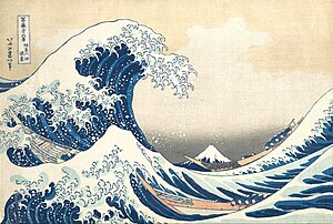
http://www.withlouis.com/hokusai/ The_Great_Wave_off_Kanagawa
w:Tsunami wave by w:Katsushika Hokusai in w:19th century Color w:woodcut, 10 x 15 in; w:Metropolitan Museum of Art, New York.
- Nominate and support --Piotrus 12:24, 9 Jan 2005 (UTC)
- support -- Ranveig 13:17, 9 Jan 2005 (UTC)
- Support. --MarkSweep 17:37, 9 Jan 2005 (UTC)
- Support'. -- Infrogmation 21:57, 9 Jan 2005 (UTC)
- Oppose. This is not Tsunami. This is Okinami(??). Okinami is offshore wave.--Shin-? T 07:14, 19 Jan 2005 (UTC)
- This seems to me more like a reason to improve the caption and image description than to oppose the image. Would you still oppose with the description changed? -- Infrogmation 03:53, 22 Jan 2005 (UTC)
- Support CryptoDerk 08:14, 22 Jan 2005 (UTC)
- Support Thuresson 18:23, 23 Jan 2005 (UTC)
Discussion:
- What happened? There are two versions of the image now and not enough information about which one is a more accurate representation of the original print. I'll try to look for this image in the LoC prints collection -- they tend to produce large format (4"×5" or larger) color slides under Tungsten light but with Kodak color separation guides in the picture. That way one can restore the colors of the print fairly well. Without color guides, it's mostly guesswork. --MarkSweep 19:21, 17 Jan 2005 (UTC)
- The earlier supports were all when only the top of the two images were here. -- Infrogmation 03:53, 22 Jan 2005 (UTC)
Image:Kraftwerk Heimbach03.jpg not featured
[edit]Three-phase-current generator of Kraftwerk Heimbach in the Eifel, Germany. Photo provided by Markus Schweiss
- Nominate and support -- Stahlkocher 19:32, 9 Jan 2005 (UTC
- Oppose (lighting and poor composition) --Thomas G. Graf 17:36, 10 Jan 2005 (UTC)
- Oppose. Sorry, but this should have been lit from the side. On-camera flash ruined it for me. --MarkSweep 05:59, 11 Jan 2005 (UTC)
- Oppose. Bad lighting, no depth. David.Monniaux 11:26, 13 Jan 2005 (UTC)
- Oppose Yeah, the flash is bad :( CryptoDerk 08:14, 22 Jan 2005 (UTC)
- Oppose Sad composition --Mbcmf217 09:35, 26 Jan 2005 (UTC)
Image:ChiangKaiShek-MemorialHall-LanternFestival.jpg not featured
[edit]Lanterns in Chiang Kai Shek's memorial hall
- Nominate and support -- Ranveig 15:48, 8 Jan 2005 (UTC)
- Oppose --Thomas G. Graf 17:40, 10 Jan 2005 (UTC)
- Support -- Arvind 22:24, 14 Jan 2005 (UTC)
- Oppose -- --Fanghong 04:05, 15 Jan 2005 (UTC) Since Chiang Kai Shek is a political feature and must raise a quarral even in Taiwan.
- Relax. It's just a picture. We're not voting on Chinese independence from Taiwan here. --MarkSweep 09:57, 15 Jan 2005 (UTC)
- Indeed. Judge it as a picture, not a political statement. A great, PD portrait of Adolf Hitler (no comparison to CKS, of course) could also be a featured picture. -- Ranveig 10:47, 15 Jan 2005 (UTC)
- Personally I don't care Taiwan announce independence or not. I just warn his name must make a lot people unhappy both Chinese communists and Taiwanese separatists. Adolf Hitler though may be a featured picture but your try a Hitler "memorial Hall"! --Fanghong 11:39, 16 Jan 2005 (UTC)
- So would you also oppose a picture of the Chairman Mao Memorial Hall? --MarkSweep 18:15, 16 Jan 2005 (UTC)
- Sure! Any person who may arouse disputation should be expressed in NPOV. All memorial halls are not in NPOV. But this picture may be used in en:Chiang Kai Shek or be changed name as "Lantern Festival in Taipei". Who will care what the background building is.--Fanghong 06:45, 17 Jan 2005 (UTC)
- Please, let's not get into a political discussion here; I don't think this is a relevent place for it. I think people can express their opinion to support or oppose an image without detailed political background explanation. -- Infrogmation 18:45, 16 Jan 2005 (UTC)
- What does the political symbolism behind Chiang Kai Shek have to do with the image being featured? David.Monniaux 21:20, 17 Jan 2005 (UTC)
- Neutral (we may get better pics from Chinese or Japanese festivals) David.Monniaux 21:20, 17 Jan 2005 (UTC)
Image:Lightmatter flamingohead.jpg featured
[edit]A flamingo, by Aaron Logan. Good color contrast between bright red and dark green. Not sure if this has been nominated before (I know how to tell on the English WP, but I'm not so sure here on the Commons); if it has, please delist and leave a message on my talk page.
- Nominate and support. --MarkSweep 14:41, 6 Jan 2005 (UTC)
- Support Greudin
- Support --Heidas 20:30, 6 Jan 2005 (UTC)
- Support but I would even prefer a photo of the full bird. David.Monniaux 15:46, 8 Jan 2005 (UTC)
- neutral - another image from this series (Image:Lightmatter flamingo2.jpg) is already a featured picture on commons. This one is beautiful, but the other one shows a little more of the bird. --Tsui 11:31, 13 Jan 2005 (UTC)
- Fair enough. The two pictures in question probably shouldn't be POTD too close together, but why not have both as Featured Pictures? --MarkSweep 03:52, 15 Jan 2005 (UTC)
Image:Corse-ile-rousse-panorama.jpg not featured
[edit]Panorama of L'Ile-Rousse, in Corsica. Greudin 17:26, 6 Jan 2005 (UTC)
Image:Dodecahedron.jpg not featured
[edit]The best, IMHO, of several images of polyhedra, rendered in POV-Ray by w:User:Cyp. Source code is available too as w:Image:Poly.pov.
- Nominate and support. --MarkSweep 21:05, 7 Jan 2005 (UTC)
Image:Dodecahedron.jpg, Not Featured
[edit] Nominate
— Shizhao 09:29, 16 February 2006 (UTC)
 Support — Shizhao 09:29, 16 February 2006 (UTC)

 Support but would have liked a SVG version ♦ Pabix ℹ 10:25, 16 February 2006 (UTC)
 Oppose Dodecahedrons are beautiful mathematical objects, but this picture of it is not well performed. The edges are far to thick and the upper right vertex of the front pentagon is clumsily placed. The colours are not well selected either (two browns and two dark greens adjacent to each other). Also, since the back edges are visible, so should be the colours of the back faces too, and therefore each front colour should show at least minor variations depending on which back face lies behind which part of it. Calderwood 10:38, 16 February 2006 (UTC)
 Oppose. Not impressive. Also, diagrams should be .png or .svg. — Erin (talk) 11:26, 16 February 2006 (UTC)
 Oppose don't like the colours and the edges Hein 16:45, 16 February 2006 (UTC)
- Comment to the new picture: I would not support this one either. The clumsy position of the front pentagon's upper right vertex is the same. Also, to colour everything in monochromatic blue is not recommendable either. I suggest a clever selection of an individual colour for every single face. Calderwood 22:40, 18 February 2006 (UTC)
2 Support, 3 Oppose => Not Featured --Shizhao 06:51, 3 March 2006 (UTC)
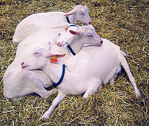
Image:Goats sleeping DSC04008 crop.jpg not featured
[edit]Sleeping goats, from Salon de l'Agriculture in Paris. By David.Monniaux, cropped and nominated by Ranveig
- Support by nominator. -- Ranveig 14:53, 3 Jan 2005 (UTC)
- Oppose, not bad (maybe you can correct the colors - it's yellowish), but I know there are many better photos on Commons. --Thomas G. Graf 16:07, 3 Jan 2005 (UTC)
- Agree on the color issue. I've tried to correct the yellowish cast, but I'm not convinced this will ever look good in color (don't look at the two color versions side by side, view them individually if possible), so I also made a black-and-white version. With some channel mixing that emphasizes the blue and green channels it's possible to get a better separation of subject and background. --MarkSweep 13:39, 6 Jan 2005 (UTC)
- Thanks for your help with the colours, Mark. I kind of agree about the colours; the picture is perfect apart from those. It goes to show animals are best photographed outside, I suppose. -- Ranveig 14:56, 8 Jan 2005 (UTC)
- Quick question before this gets delisted: Does anyone think the b/w version is any good? It's a decent picture, I especially like the expressions of the two goats in the center, but the color versions are obviously problematic. --MarkSweep 03:43, 15 Jan 2005 (UTC)
- I agree that the otherwise nice photo suffers from the color balance problem. Yes, I like the black & white version, just not enough to support as a featured. -- Infrogmation 17:10, 15 Jan 2005 (UTC)
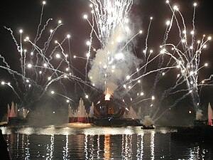
Image:World Showcase Lagoon during IllumiNations.jpg not featured
[edit]The World Showcase Lagoon at Epcot during IllumiNations: Reflections of Earth, the nightly fireworks show. This is a semi–self-nom: a family member took the picture and I uploaded it. bdesham 01:05, 31 Dec 2004 (UTC)
- Support, of course :-) BTW, I won't have an internet connection for the next few weeks, so I won't be able to respond to comments... sorry! --bdesham 01:05, 31 Dec 2004 (UTC)
- Support' David.Monniaux 08:37, 31 Dec 2004 (UTC)
- Oppose --Thomas G. Graf 12:46, 1 Jan 2005 (UTC)
- Oppose --Darkone (¿!) 21:32, 14 Jan 2005 (UTC)
Image:Íslenski hesturinn.jpeg featured
[edit]Another great Iceland photo created by Tillea: an Icelandic Horse – it's cute and it's fluffy. Beautiful warm light (warming filter?) and cold blue shadows in the snow. The scan has a few dust specks that could be cleaned up, but that's a minor detail. Nominated by MarkSweep 07:38, 28 Dec 2004 (UTC).
- Support. --MarkSweep 07:38, 28 Dec 2004 (UTC)
- Support --Thomas G. Graf 11:07, 28 Dec 2004 (UTC)
- Support. villy 21:03, 28 Dec 2004 (UTC)
- Support. -- Henryart 22:25, 29 Dec 2004 (UTC)
- Support David.Monniaux 19:47, 3 Jan 2005 (UTC)
- Support notafish }<';> 10:21, 6 Jan 2005 (UTC)
![]() Comment In 2005 File:Íslenski hesturinn.jpeg was deleted because the new file File:IcelandicHorseInWinter.jpg was considered superior. It was “based on the very same scan but the author Andreas Tille did some manual enhancements that made the image much better” (explained here). The FP status of the old file was silently transferred to the new version; seems that was feasible at that time. I add this comment here because at the first glance the relation of the files and their history is rather confusing for people (like me ;–) who try to take care of the Featured pictures and to identify fake FPs. – Aristeas (talk) 08:53, 15 March 2024 (UTC)
Comment In 2005 File:Íslenski hesturinn.jpeg was deleted because the new file File:IcelandicHorseInWinter.jpg was considered superior. It was “based on the very same scan but the author Andreas Tille did some manual enhancements that made the image much better” (explained here). The FP status of the old file was silently transferred to the new version; seems that was feasible at that time. I add this comment here because at the first glance the relation of the files and their history is rather confusing for people (like me ;–) who try to take care of the Featured pictures and to identify fake FPs. – Aristeas (talk) 08:53, 15 March 2024 (UTC)
Image:Konische Garnspulen ungefärbt.jpeg featured
[edit]Conical yarn coils made by spinning and winding. Credit: Agricultural Research Service. From: Ikiwaner. Nominated by villy 20:58, 28 Dec 2004 (UTC).
- Support. villy 21:01, 28 Dec 2004 (UTC) (nominator)
- Support - Good picture, though not that informative, but I like it. --Lennert B 21:01, 6 Jan 2005 (UTC)
- Support -- Infrogmation 17:09, 12 Jan 2005 (UTC)
- Oppose - not very informative --Thomas G. Graf 20:04, 13 Jan 2005 (UTC)
Image:Cranberrys beim Ernten.jpeg featured, delisted 6. April 2007
[edit]Cranberry harvest in New Jersey. Credit: Agricultural Research Service. From: Ikiwaner. Nominated by villy 21:01, 28 Dec 2004 (UTC)
- Support. villy 21:01, 28 Dec 2004 (UTC) (nominator)
- Support Ranveig 19:32, 2 Jan 2005 (UTC)
- Support --Thomas G. Graf 16:06, 3 Jan 2005 (UTC)
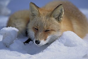
Image:Vulpes vulpes laying in snow.jpg featured
[edit]Red fox Vulpes vulpes in the snow by User:Conti. Nominated by Infrogmation 23:28, 23 Dec 2004 (UTC).
- Support. -- Infrogmation 23:28, 23 Dec 2004 (UTC) (nominator)
- Support. Beautiful photo. --Wanted 00:35, 24 Dec 2004 (UTC)
- Support. --Tsui 09:24, 24 Dec 2004 (UTC)
- Comment: A nice photo, but I'd like to have a bigger version. --Thomas G. Graf 13:24, 24 Dec 2004 (UTC)
- I just reuploaded the picture from en:. I just was about to ask the original uploader if he has a bigger picture when I noticed that the picture in the english Wikipedia now has a "copyright free use" tag on it (which wasn't there when I uploaded the picture to Commons), so it seems that this picture is unsuitable for this project. :( Maybe someone who can speak japanese can ask the copyright holder to release the picture under a free license and provide us with a bigger version of the picture? --Conti|✉ 14:46, 24 Dec 2004 (UTC)
- It seems copyrighted free use providing website source " http://www.all-hokkaido.net/marugoto/" is credited. Can we get word on the copyright status is acceptable here? It seems to have support to be promoted to featured if this can be clarified. -- Infrogmation 16:37, 12 Jan 2005 (UTC)
- CopyrightedFreeUse is suitable for the Commons. Unsuitable copyright tags have a large exclamation mark, like FairUse
- It seems copyrighted free use providing website source " http://www.all-hokkaido.net/marugoto/" is credited. Can we get word on the copyright status is acceptable here? It seems to have support to be promoted to featured if this can be clarified. -- Infrogmation 16:37, 12 Jan 2005 (UTC)
- I just reuploaded the picture from en:. I just was about to ask the original uploader if he has a bigger picture when I noticed that the picture in the english Wikipedia now has a "copyright free use" tag on it (which wasn't there when I uploaded the picture to Commons), so it seems that this picture is unsuitable for this project. :( Maybe someone who can speak japanese can ask the copyright holder to release the picture under a free license and provide us with a bigger version of the picture? --Conti|✉ 14:46, 24 Dec 2004 (UTC)
- Support. -- Henryart 22:24, 29 Dec 2004 (UTC)
- Support. -- Get It 02:38, 3 Jan 2005 (UTC)
- Support. -- Kpjas 20:44, 6 Jan 2005 (UTC)
- Support. --MarkSweep 03:09, 13 Jan 2005 (UTC)
Computer-generated Model of Purine Nucleoside Phosphorylase (PNP). Credit: NASA. Nominated by villy 13:09, 24 Dec 2004 (UTC)
- Support. Not only PNP, poetry too. villy 13:09, 24 Dec 2004 (UTC) (nominator)
- Support -- Infrogmation 17:30, 25 Dec 2004 (UTC)
- Support -- Henryart 22:19, 29 Dec 2004 (UTC)
- Support - Pretty and informative. -- Ranveig 19:25, 2 Jan 2005 (UTC)
- Support notafish }<';> 10:27, 6 Jan 2005 (UTC)
Image:V838 Mon HST.jpg featured
[edit]"light echo" around V838 Monocerotis becoming 600,000 times more luminous than our sun in January 2002. Credit: NASA. Nominated by villy 22:39, 22 Dec 2004 (UTC).
- Support. villy 22:39, 22 Dec 2004 (UTC)
- Support. -- Infrogmation 22:45, 22 Dec 2004 (UTC)
- Support --Thomas G. Graf 10:44, 26 Dec 2004 (UTC)
- Support --Ranveig 19:23, 2 Jan 2005 (UTC)
- Support - Kpjas 21:46, 2 Jan 2005 (UTC)
Image:Gooseneckbarnacles.jpg featured
[edit]Gooseneck barnacles in Thailand. Author: Tompagenet. Nominated by villy 22:57, 23 Dec 2004 (UTC)
- Support. villy 22:57, 23 Dec 2004 (UTC) (nominator)
- Support. -- Infrogmation 23:28, 23 Dec 2004 (UTC)
- Support --Thomas G. Graf 13:26, 24 Dec 2004 (UTC)
- Support David.Monniaux 09:02, 6 Jan 2005 (UTC)
Image:Coyote portrait featured
[edit]Beautiful picture. It's also nominated on en: at the moment and will very likely be a featured picture there soon.
- Nominate and support. --Conti|✉ 14:34, 21 Dec 2004 (UTC)
- Neutral. Fine picture for sure, even though I resent a bit the ears are cut. More generally, I don't know about nominating sxc.hu material. It's a wonderful site but we'd rather promote wikipedian/commoners original stuff imo. villy 18:34, 21 Dec 2004 (UTC)
- Yes, it's a shame that the ears are cut. Hmm, if only wikipedian's pictures should be promoted, maybe that should be stated somewhere? I don't see a real reason to do that tho, a beautiful free picture is a beautiful free picture IMHO. :-) --Conti|✉ 18:54, 21 Dec 2004 (UTC)
- OK let's say sxc.hu is fine (I just got the amazing Image:Sailing.jpg from there ...) but still, those ears :( villy 22:52, 22 Dec 2004 (UTC)
- Yes, it's a shame that the ears are cut. Hmm, if only wikipedian's pictures should be promoted, maybe that should be stated somewhere? I don't see a real reason to do that tho, a beautiful free picture is a beautiful free picture IMHO. :-) --Conti|✉ 18:54, 21 Dec 2004 (UTC)
- Oppose, shame on the ear und Ack to villy. Darkone (¿!) 21:02, 21 Dec 2004 (UTC)
- Support WeFt 21:18, 21 Dec 2004 (UTC)
- Support Xillimiandus 01:08, 22 Dec 2004 (UTC)
- Neutral: A really good photography, but the cutted ears ... --Thomas G. Graf 19:23, 22 Dec 2004 (UTC)
- Support I don't mind the ear at all. BrokenSegue 02:17, 23 Dec 2004 (UTC)
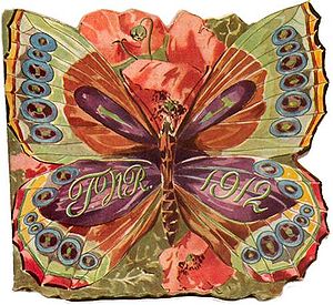
Image:TwelfthNightReverlersInvite1912.jpg not featured
[edit]New Orleans Twelfth Night Carnival invitiation, 1912. From: Infrogmation. Nominated by villy 23:03, 23 Dec 2004 (UTC)
- Support. villy 23:03, 23 Dec 2004 (UTC) (nominator)
- Oppose - Looks nice, but I don't think it should be a featured picture. --Thomas G. Graf 10:43, 26 Dec 2004 (UTC)
Image:Kranz Koelsch.jpg not featured
[edit]Glasses. Beer. Author: Avatar. Nominated by villy 20:44, 21 Dec 2004 (UTC).
- Support. Feeling thirsty now. villy 20:44, 21 Dec 2004 (UTC) (nominator)
- Oppose. Poor. --Thomas G. Graf 19:21, 22 Dec 2004 (UTC)
- Oppose. Poor lighting + background,... --Marsupilami04 13:32, 24 Dec 2004 (UTC)
Image:Hallgrímskirkja.jpeg featured
[edit][[:Image:Hallgrímskirkja.jpeg|300px|thumb|The tower of Hallgrímskirkja in Reykjavík, Iceland; drastically enhanced by User:MarkSweep]]
The tower of Hallgrímskirkja in Reykjavík, Iceland. Author: Tillea. Nominated by villy 07:31, 8 Dec 2004 (UTC).
- Support. villy 07:31, 8 Dec 2004 (UTC) (nominator).
- Oppose --Shizhao 18:22, 9 12? 2004 (UTC)
- Support --Ævar Arnfjörð Bjarmason 23:55, 9 Dec 2004 (UTC)
- Oppose bad image quality--Darkone (¿!) 19:58, 19 Dec 2004 (UTC)
- Oppose --Thomas G. Graf 19:59, 20 Dec 2004 (UTC)
Please note that I recently uploaded an enhanced version of the image that gathered the votes above. The original image was uploaded from somebody whom I offered a scanned image which was not identical in colors with the original slide (a fact that the uploader did not know). The current version is now better. I would love if the "Oppose" statements would have some reason to enable me to enhance my image quality. Tillea 06:57, 22 Dec 2004 (UTC)
- Support for the new version. (I didn't care for the old all blue one. I suspect some of the objections related to that older version. Perhaps you should have this as a new listing?) -- Infrogmation 22:36, 22 Dec 2004 (UTC)
- Support new version as of Dec. 20. villy 13:14, 24 Dec 2004 (UTC)
- Comment: First, the image that was originally nominated needed some perspective correction (look at the houses on the lower left and the lamp posts on the lower right side). Second, the sharpening was too much (look at the full image to see artifacts introduced by sharpening). Third, I didn't see much evidence for the magenta color of the light/clouds in the original slide (De:Bild:Hallgrimskrikja-winter.jpg or [1]). I've added an alternative version that tries to address these concerns. Some sharpness is lost in the full image, mostly due to the perspective correction, but when the image is scaled to 300px this is not an issue. --MarkSweep 09:43, 27 Dec 2004 (UTC)
Remark from the photographer: The links you quotet where not really the *original* slide but an atomatically done scan by a not really professional lab which produced the photo cd. The slide which resides in my cupboard here has some kind of red-magenta shine. It is somewhere in between all these versions. Thanks for the perspective correction. Tillea 08:11, 29 Dec 2004 (UTC)
- Ok, so it's the photo lab that messed up your slide. Not good, but not uncommon either. I think this could be made into an image worthy of "featured" status. Is there any chance that you could scan the original slide yourself? It's being opposed here mostly because of technical flaws in the post-processing. It would be a shame if the photo wouldn't get featured because of that. --MarkSweep 09:24, 29 Dec 2004 (UTC)
- oppose, sorry but still bad quality. Darkone (¿!) 13:29, 27 Dec 2004 (UTC)
- Support Bad quality? Then I definately need new glasses. --Biekko 03:24, 28 Dec 2004 (UTC)
- Support--Factumquintus 11:27, 28 Dec 2004 (UTC)
- Support-- Henryart 22:21, 29 Dec 2004 (UTC)
- Support (Alternate take only) --Thomas G. Graf 19:40, 1 Jan 2005 (UTC)
- Support - Anything which makes me go "Wow" is worth featuring. -- Ranveig 19:16, 2 Jan 2005 (UTC)
- Comment: Per TilleA's request, the alternate take was merged with the mainline. The two images listed here should now be identical (module cache issues or the second one having been deleted). --MarkSweep 14:57, 5 Jan 2005 (UTC)
Image:Pig DSC03969.jpg not featured
[edit]Pigs at the Paris agriculture salon, 2004. Photographed by myself (yes, shameless self-nomination). David.Monniaux 23:06, 17 Dec 2004 (UTC) I have a number of other photos in the same vein, see Category:ForAnthere.
- Support. Looks like the way many of us feel after Christmas -- Quistnix 12:05, 18 Dec 2004 (UTC)
- Oppose: Nothing special, I shot a lot of these photos as a child. --Thomas G. Graf
Lunds domkyrka (g) not featured
[edit]- Support.--Quistnix 06:24, 20 Dec 2004 (UTC)
- Oppose. Bad perspective, lower parts of the building not seen. (Yes, I know photographing such buildings is not easy. The pros generally go at times when there's nobody nearby (early in the morning in summer?) or have the location evacuated, and use a crane for a central position. David.Monniaux 07:35, 20 Dec 2004 (UTC)
- Oppose --Thomas G. Graf 20:17, 20 Dec 2004 (UTC)
- Oppose. It is a good photo, but not excellent or interesting enough to be a featured one. -- Infrogmation 21:08, 22 Dec 2004 (UTC)
- Oppose notafish }<';> 10:22, 6 Jan 2005 (UTC)
Lunds domkyrka (d) not featured
[edit]
I picked out my two favourite pictures of Lunds domkyrka. Is one of them a featured picture? Väsk 20:17, 19 Dec 2004 (UTC)
- Oppose: Disadvantageous incidence of light and a not-too-good composition. --Thomas G. Graf 20:23, 20 Dec 2004 (UTC)
- Oppose Darkone (¿!) 20:58, 21 Dec 2004 (UTC)
- Oppose notafish }<';> 10:29, 6 Jan 2005 (UTC)
Nativity scene, Lunds domkyrka not featured
[edit]Given the time of year, plus the alternatives I've seen, I prefer this photo above the others from Lunds domkyrka -- Quistnix 10:52, 20 Dec 2004 (UTC)
- Oppose The colors are very dull. (Besides, I've seen better nativity settings.) David.Monniaux 11:28, 20 Dec 2004 (UTC)
- I've enhanced the colors a bit now. I have seen better ones, too - but not on Wikicommons -- Quistnix 12:09, 20 Dec 2004 (UTC)
- Oppose - Being a featured picture does not mean being the best photo with a certain motif on Wikicommons. --Thomas G. Graf 20:21, 20 Dec 2004 (UTC)
- In my opinion, it is much better than the listed Christmas tree. Quistnix 23:36, 20 Dec 2004 (UTC)
- Oppose --Darkone (¿!) 21:07, 21 Dec 2004 (UTC)
- Oppose. -- Infrogmation 22:38, 22 Dec 2004 (UTC)
- Oppose -- Henryart 22:23, 29 Dec 2004 (UTC)
Image:Astrolabe-Persian-18C.jpg featured
[edit]An 18th Century Persian astrolabe - maker unknown. From the Whipple Museum of the History of Science in Cambridge. Author: Solipsist. Nominated by villy 16:20, 17 Dec 2004 (UTC).
- Support. villy 16:20, 17 Dec 2004 (UTC) (nominator).
- Oppose - Nothing special ... --Thomas G. Graf 20:13, 20 Dec 2004 (UTC)
- support --Darkone (¿!) 21:08, 21 Dec 2004 (UTC)
- Support WeFt 21:17, 21 Dec 2004 (UTC)
- Support - Tsui 18:35, 23 Dec 2004 (UTC)
- Support - Magical light Henryart 22:17, 29 Dec 2004 (UTC)
- Support - Good picture Sam k 21:47, 8 Jan 2005 (UTC)
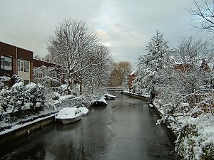
Image:Snow in Holland.jpg featured
[edit]Snow in Holland by Quistnix
- Nice but greyish. Was it really like that or could you spice up the image a bit? David.Monniaux 09:39, 17 Dec 2004 (UTC)
- Support but perhaps a little bit "postprocessing" would do. The other one is very nice too.
- Oppose --Darkone (¿!) 20:11, 19 Dec 2004 (UTC)
- Oppose: What is the statement of this photo, besides nothing? --Thomas G. Graf 20:10, 20 Dec 2004 (UTC)
- What's yours?
- Support: I like this photo. However, probably there is only restricted possibility to use it in any wikipedia, as it shows a quite unusual situation. --Franz Xaver 14:14, 23 Dec 2004 (UTC)
- Support: Nice image, as for its use it can be used to demonstrate a canal, winter. --Ævar Arnfjörð Bjarmason 18:25, 24 Dec 2004 (UTC)
- Support. villy 21:04, 28 Dec 2004 (UTC)


