Commons:Featured picture candidates/File:Sagrada Familia March 2015-1a.jpg
Jump to navigation
Jump to search
File:Sagrada Familia March 2015-1a.jpg, not featured
[edit]Voting period is over. Please don't add any new votes.Voting period ends on 23 Mar 2015 at 16:05:23 (UTC)
Visit the nomination page to add or modify image notes.
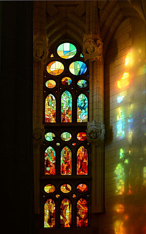
 Info Lateral stained-glass window of the Sagrada Familia Cathedral in Barcelona, Spain, by the Spanish Catalan architect Antoni Gaudí (1852-1926). -- Alvesgaspar (talk) 16:05, 14 March 2015 (UTC)
 Support -- Alvesgaspar (talk) 16:05, 14 March 2015 (UTC)
 Oppose
 Oppose. I'm going to disagree with Nobel's reasonings even if I agree with the vote. It is beautiful and it is educational to me. But again, the image quality is the issue.... And again, I think it's a missed opportunity due to the camera settings used. Why f/10?? You could probably use f/4 or f/5.6 without any loss of depth of field and then you could use ISO 125 instead of ISO 800. I don't mean to be a stickler for these things but camera settings matter. Also, it's unfortunate that the left quarter is completely blank. It's compositionally awkward. Diliff (talk) 18:24, 14 March 2015 (UTC)
 Support Its very interesting. Play of ligth, from dark to ligth, like renaissance. I think left dark part is good combined with rigth ligther part, maybe just some crop from above. Not QI, but its interesting. --Mile (talk) 19:38, 14 March 2015 (UTC)
 Oppose Sure it’s interesting, but poorly composed. I agree with Diliff. Pointing the camera more to the right would show more play of light instead of the dark shade. --Kreuzschnabel 20:17, 14 March 2015 (UTC)
 Oppose I lay my eyes on this photo for minutes, seriously, it's a graceful place. Notwithstanding the photo has so many mistakes that creates a feeling of a waste... A lot of noise at left, (ISO 800, even with a D800); lack of sharpness in the stained glasses, and in the architectural sculptures; the perspective is a little bit weird also... (OBS: I'm wasting my English to reatin some new words :P)-- RTA 21:07, 14 March 2015 (UTC)
 Support A very beautiful and moody photo which makes great use of light. I don't think the small technical issues are really a matter here. Maybe author could have gone more easy on NR (and choose better setting), but it's not like the points of it is in the details anyways. I agree that the left part brings nothing and probably may be removed with no regret. - Benh (talk) 21:46, 14 March 2015 (UTC)
 Oppose per Diliff, but a really good photo nonetheless. — Julian H.✈ 16:11, 15 March 2015 (UTC)
 Support I like it! --Tremonist (talk) 14:54, 19 March 2015 (UTC)
 Oppose --Hubertl (talk) 21:54, 19 March 2015 (UTC)
Confirmed results:
