Commons:Featured picture candidates/File:Hearst Castle Neptune Pool September 2012 005.jpg
Jump to navigation
Jump to search
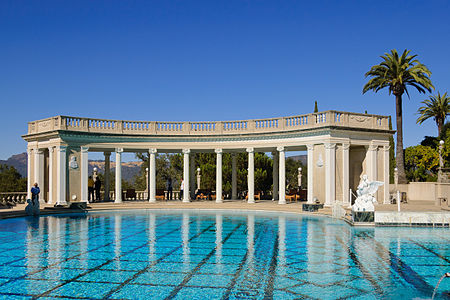
File:Hearst Castle Neptune Pool September 2012 005.jpg, not featured
[edit]Voting period is over. Please don't add any new votes.Voting period ends on 17 Nov 2012 at 09:06:14 (UTC)
Visit the nomination page to add or modify image notes.
 Info created by King of Hearts - uploaded by King of Hearts - nominated by King of Hearts -- King of ♥ ♦ ♣ ♠ 09:06, 8 November 2012 (UTC)
 Support -- King of ♥ ♦ ♣ ♠ 09:06, 8 November 2012 (UTC)
 Support --Stas1995 (talk) 09:17, 8 November 2012 (UTC)
 Support --Ivar (talk) 10:53, 8 November 2012 (UTC)
 Support -- Alborzagros (talk) 12:47, 8 November 2012 (UTC)
 Oppose Nice picture, and??? The people in the picture, in my opinion, are out of place. Furthermore, I ask what encyclopedic knowledge does this image contribute? --Tomascastelazo (talk) 13:12, 8 November 2012 (UTC)
- It shows the taste of and luxury enjoyed by Randolph Hearst? Kleuske (talk) 16:15, 8 November 2012 (UTC)
- Yes it does show the luxury of Hearst, but the architecture is really not original nor does it establish/represent a trend or a point of reference. A flower without scent? --Tomascastelazo (talk) 16:36, 8 November 2012 (UTC)
- It shows the taste of and luxury enjoyed by Randolph Hearst? Kleuske (talk) 16:15, 8 November 2012 (UTC)
 Support --Alex Florstein (talk) 15:29, 8 November 2012 (UTC)
 Support -- JDP90 (talk) 17:48, 8 November 2012 (UTC)
 Oppose -- As per above. Don't agree with the shadows - especially on the left corner. Should have been taken during different time of the day.Fotoriety (talk) 00:15, 9 November 2012 (UTC)
 Support --ComputerHotline (talk) 08:49, 9 November 2012 (UTC)
 Support --Claus (talk) 08:29, 11 November 2012 (UTC)
 Oppose The lines on this one cause nausea, just where is it trying to draw attention ? The markings in the pool go one way, the columns pull in another direction, cropping of the palms provide a lop sided effect, why are there people in the image ? why not take a few steps and create a proper image, or ask the people to move AND take a proper image ? As far as I can see, this is a tourist image, 'see, I was there'. I'd like to see at least a token EV in a FP. Penyulap ☏ 17:48, 13 November 2012 (UTC)
 Oppose mainly because of the composition, I think there should be more water in the picture and less sky (now they are 50% approx., there's too much sky in the picture), and I also feel there should be more space at the left side, it's a bit unbalanced, given the space we have on the other side. I wish those people weren't there, but only two of them are a bit disturbing for me (the security woman and the man in white t-shirt in the middle), that's not too bad. --Kadellar (talk) 22:19, 13 November 2012 (UTC)
 Oppose per Fotoriety --Dey.sandip (talk) 11:46, 16 November 2012 (UTC)
Confirmed results:
Result: 8 support, 5 oppose, 0 neutral → not featured. /A.Savin 21:02, 17 November 2012 (UTC)
