Commons:Featured picture candidates/Image:ArcticFoxSummer.jpg
Jump to navigation
Jump to search
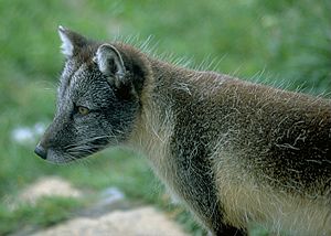
Image:ArcticFoxSummer.jpg, featured
[edit]- Selfnomination Andreas Tille 20:55, 24 May 2005 (UTC)
- I just adjusted the darkness in the direction suggested by Quasipalm. My version is not as bright as the suggestion and I also did not cropped the image because I wanted to leave some space to look at for the fox. Please tell me whether you like this change or if I should change more in the "Quasipalm"-direction. Andreas Tille 20:16, 26 May 2005 (UTC)
- One more change: On a secon thought I agree with Quasipalm about the cropping. I now cropped the original PNG at the exact same place as Quasipalm and left my imporeesion of the lightning (it was a cloudy day and thus I regard this version as realistic). Please update your browser cache. Andreas Tille 13:55, 27 May 2005 (UTC)
- tak (yes) / tsca ✉ 21:20, 24 May 2005 (UTC)
- support, but fox is too dark --Mateusza 22:46, 24 May 2005 (UTC)
- Support --Avatar 05:07, 25 May 2005 (UTC)
- Support --Malene Thyssen 06:59, 25 May 2005 (UTC)
Oppose good, but too dark for me --Quasipalm 22:37, 25 May 2005 (UTC)
- I support this updated image. --Quasipalm 19:26, 7 Jun 2005 (UTC)
 Oppose - Peregrine981 07:58, 26 May 2005 (UTC)
Result: 5 support, 1 oppose => featured norro 18:53, 14 Jun 2005 (UTC)
Image:ArcticFoxSummer Adjusted.jpg, not featured
[edit]I edited the levels and framing a little bit. I support this version:
Support --Quasipalm 22:44, 25 May 2005 (UTC)- Thanks for your engagement. I'm sitting now behind my laptop which has a more flat display and I see what you mean. The colors seemed natural to me on my CRT desktop screen. I think I should try to adjust the colors from the original PNG file to reduce compression loss. I'll do this today evening. Andreas Tille 09:24, 26 May 2005 (UTC)
- The CRT can not handle fine vertical lines like the hairs on the fox. Try this test image on your monitors.
- Thanks for your engagement. I'm sitting now behind my laptop which has a more flat display and I see what you mean. The colors seemed natural to me on my CRT desktop screen. I think I should try to adjust the colors from the original PNG file to reduce compression loss. I'll do this today evening. Andreas Tille 09:24, 26 May 2005 (UTC)
AlbertCahalan 00:46, 1 Jun 2005 (UTC)
- I'm moving my support back to the first image -- now updated. I used auto-levels in PS for this one, and now I believe that the contrast was too high. I hope other voters can take in to account that the first image was updated and they should move their vote their if they wish. --Quasipalm 19:38, 7 Jun 2005 (UTC)
 Support James F. (talk) 11:42, 26 May 2005 (UTC)
 Support Helix84 13:47, 26 May 2005 (UTC)
- Support --Avatar 12:49, 29 May 2005 (UTC)
- Support --Chun-hian 16:55, 1 Jun 2005 (UTC)
 Oppose - Rex 15:12, 3 Jun 2005 (UTC)
 Oppose norro 18:51, 14 Jun 2005 (UTC)
Result: 4 support, 2 oppose => not featured norro 18:51, 14 Jun 2005 (UTC)
