Commons:Featured picture candidates/File:Ypsilon bru rosa (1).jpg
Jump to navigation
Jump to search
File:Ypsilon bru rosa (1).jpg, not featured
[edit]Voting period is over. Please don't add any new votes.Voting period ends on 29 Dec 2017 at 12:29:36 (UTC)
Visit the nomination page to add or modify image notes.
- Category: Commons:Featured pictures/Places/Architecture/Bridges#Norway
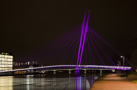
 Info All by Peulle. The Ypsilon pedestrian bridge in Drammen, Norway was opened in 2008 and has since won several awards for its innovative design. The 47 metres tall cable-stayed bridge is made of a steel construction with 16 cables holding the three spans (90m + 56m) in a "Y"-shape. In October 2017, the bridge was illuminated as part of the Breast Cancer Awareness campaign.
- (I wasn't sure which image of the set was worthy of nomination, but ended up choosing this one as I feel the bridge stands out more. If you think one of the others is better, please do let me know.) -- Peulle (talk) 12:29, 20 December 2017 (UTC)
 Support -- Peulle (talk) 12:29, 20 December 2017 (UTC)
 Support Yes, light and colors are outstanding. I don't know whether the motif offers a Fp in daylight, but at night of course. --Milseburg (talk) 14:33, 20 December 2017 (UTC)
 Comment - Nice photo, but the water doesn't really look like water to me. I may support, anyway, though. -- Ikan Kekek (talk) 17:06, 20 December 2017 (UTC)
- @Ikan Kekek: I think the reason it looks the way it does has something to do with the reflection from strong light sources like the library building right next to the bridge. Not entirely sure how it happened, but if you look at the other images in the series, you'll notice the same effect. :) --Peulle (talk) 18:21, 20 December 2017 (UTC)
- Yes, and reflections of other lights. I'll give this a little more time before voting, but so far, my reply to Benh is that this picture is just quite pretty and has a pretty good composition. I'd like a little more room on the right side, though: part of the bridge is cut off, and while the crop on the left side blends almost seamlessly into the building, the line through the triangular and circular figures on the right is a bit off-putting. I'll see if this still bugs me much some time later, but if I don't end up voting for a feature, that'll probably be why. -- Ikan Kekek (talk) 00:35, 21 December 2017 (UTC)
- @Ikan Kekek: I think the reason it looks the way it does has something to do with the reflection from strong light sources like the library building right next to the bridge. Not entirely sure how it happened, but if you look at the other images in the series, you'll notice the same effect. :) --Peulle (talk) 18:21, 20 December 2017 (UTC)
 Oppose I personally don't see what is special about that one. - Benh (talk) 22:28, 20 December 2017 (UTC)
 Oppose Black sky covers too much of the surface and I don't find the subject exceptionnal enough -- Basile Morin (talk) 03:53, 21 December 2017 (UTC)
 Oppose I like this view a lot more. Daniel Case (talk) 04:31, 21 December 2017 (UTC)
 Oppose Per others plus the crop on the left cuts the bridge. -- Colin (talk) 13:12, 21 December 2017 (UTC)
 Oppose Noise, cut composition and unbalanced , overexposition and low dynamic rang. --The Photographer 15:53, 22 December 2017 (UTC)
Confirmed results:
Result: 2 support, 5 oppose, 0 neutral → not featured. /PumpkinSky talk 13:59, 29 December 2017 (UTC)
